Entering a modern house and thinking “something is missing here” often happens for a simple reason: the wall is large, but it doesn’t have a hierarchy. The right modern painting serves this purpose: giving measure to the space , creating a point of attention, linking materials and colors without weighing it down.
But best modern paintings does not mean the best sellers. It means those most suitable for your environment: correct proportions compared to a sofa or bed, a finish consistent with the light, a palette that interacts with floors and fabrics, print quality (or authenticity of the work) that holds up over time.
In this guide you will find practical criteria for interior designers: which styles really work in contemporary homes , how to choose format and frame, which materials to avoid based on the room, and above all where to buy them (online and offline) with a checklist to recognize quality, return policies and reliability. Because a painting can be beautiful… and still wrong, if it is out of scale or in the wrong place.
What makes a painting truly modern (and what doesn’t)
A painting is modern when it does not imitate : it interprets. It can be abstract, photographic, graphic, material or minimal, but in all cases it has a quality in common: it looks good in a contemporary home because it dialogues with the space , not because it “fills” a wall.
Original painting, fine art print, poster: three different things
-
Original : unique piece (or in any case non-reproduction). It has artistic and often also collectible value. It requires more care (even if just mental) in choosing.
-
Fine art print : high quality reproduction (paper, pigments, print run, certificate). It is the most balanced option for many modern homes: high yield, manageable budget.
-
Poster/decorative print : perfect if you want to change often or if you are “building” the taste. It’s not a flaw: it’s a phase.
Little inconvenient truth: the picture is often not “bad”. It is too small or placed too high .
The 7 interior designer rules for choosing the best modern paintings
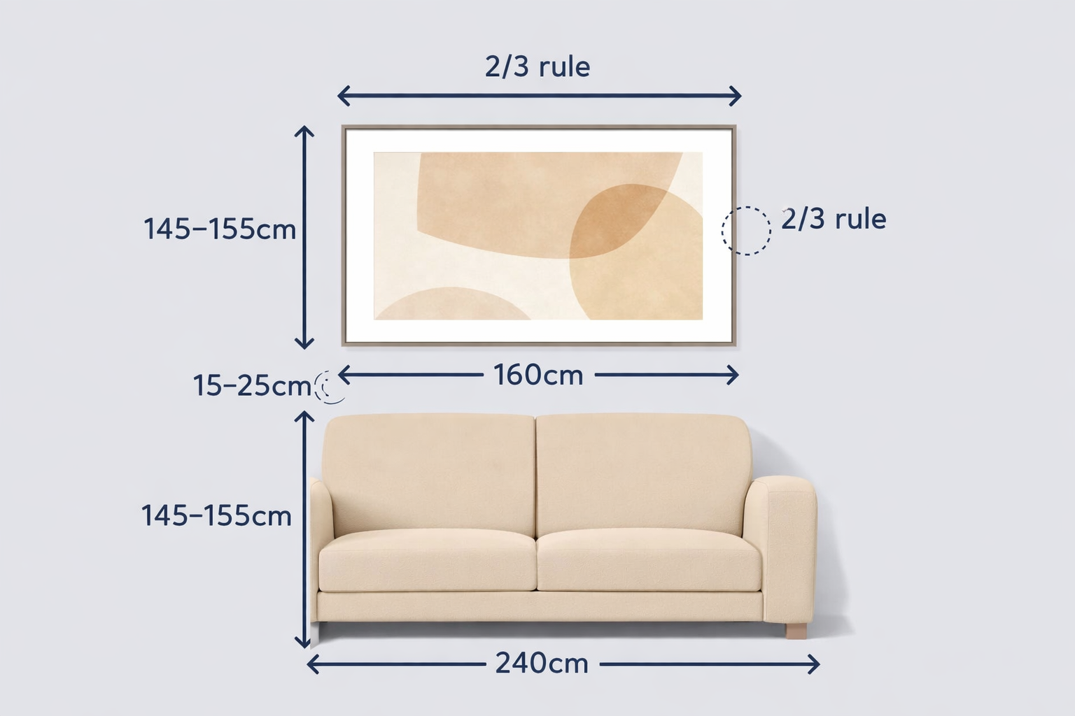
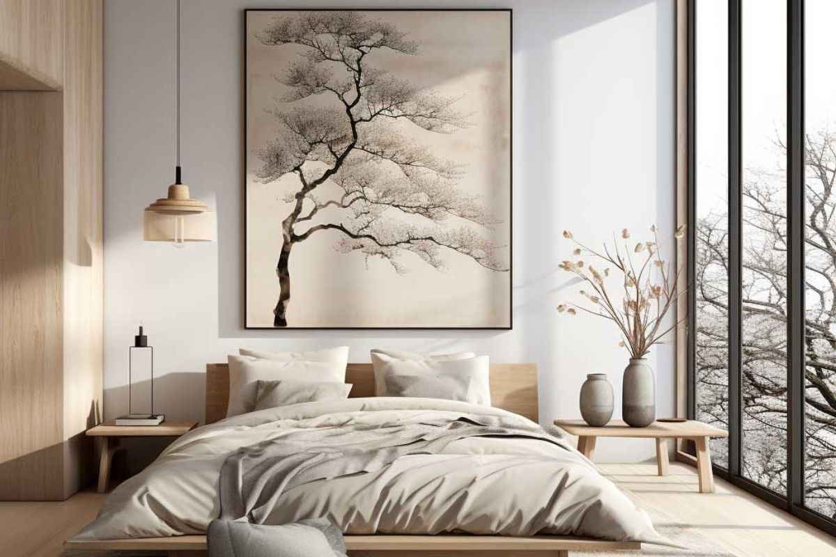
1) Scale before style: the 2/3 rule
If the painting goes above a sofa, a headboard or a console , the ideal width is approximately 2/3 of the width of the furniture underneath.
Practical example: sofa 240 cm ? single painting 150170 cm (or composition which, overall, reaches that size).
2) Correct height: not “to the ceiling”, but at a glance
The safest rule: the center of the painting must be approximately 145155 cm from the ground (eye height).
You can climb a thread over a sofa, but avoid the classic mistake: a tall “gallery” painting that seems detached and cold in the home.
3) Distance from furniture: breathe, but stay close
Above the sofa/bed: generally leave 1525 cm between the furniture and the painting.
If you place it 4060 cm, it visually separates and loses function.
4) Colors: choose the role of the painting (accent or harmony)
Ask yourselfone thing: you want the painting to be
-
Accent (focal point): 12 contrasting colors that pick up a detail (pillow, vase, rug).
-
Harmony (tone on tone): soft palette that amplifies materials and textures (wood, bouclé, stone, lime).
If you don’t know what to do, in a modern home it often works: neutral base + a guide color picked up in 23 places.
5) Light and reflections: the painting must “hold” the day
If you have large windows or front spotlights:
-
do you prefer matte finishes or anti-reflective glass
-
avoid surfaces that are too shiny in brightly lit environments (especially dark photos: they become mirrors)
6) Frame: in a modern house it is part of the project
Three choices that rarely betray:
-
thin black frame (graphic, contemporary, clean)
-
light natural wood (warm, Nordic, Japandi)
-
cassette/box frame (more gallery, perfect for fine art)
The overly decorated frame, however, “pushes” towards a classic which often clashes with modern lines.
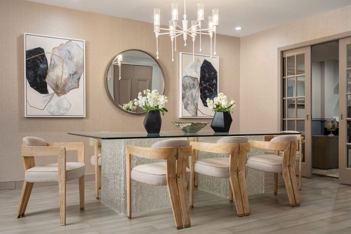
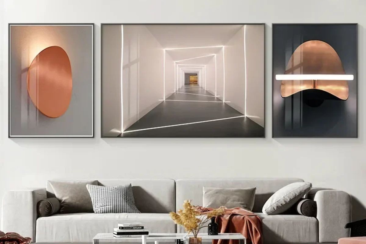
7) Composition: single painting or gallery wall?
-
Large single painting : immediate architectural effect, perfect for clean environments.
-
Diptych/triptych : modern and rhythmic, ideal on long walls.
-
Gallery wall : works if you have a common thread (palette or subjects). If it’s casual, after a month it will seem confusing.
Practical trick : before punching, make paper templates and attach them with tape. In 10 minutes you understand if the scale is right.
Quick Picks: What kind of modern painting looks good in your home?
-
Minimal house / cold colors ? black and white photographic, graphic, line art, thin black frame
-
Warm home / woods and neutrals ? material abstract, cream-earth palette, natural wood frame
-
Contemporary home soft luxury ? elegant abstract, large formats, anti-reflective glass, cassette frame
-
Young house / urban ? graphic posters, typography, full colors (but only one protagonist)
The Best Modern Painting Styles (And When They Really Work)
Material abstract: the silent luxury of walls
Perfect if you love plaster, stone, important fabrics. It works because it adds depth without becoming illustrative.
Where it performs best: living room, entrance, bedroom.
Contemporary photography: modern, but only if it is well chosen
Photos that are too “stock” get old quickly. Choose subjects with an authorial slant: stringsstructures, minimal landscapes, details.
Where it works: corridors, study, walls with controlled light.
Line art and minimal: cleanliness that doesn’t tire
It is the safest choice for those who are afraid to “dare”, but it can become anonymous if everything is too neutral.
Level it up with the right frame and generous size.
Graphic and color block: controlled energy
Excellent if the house is neutral and you want a point of character. The secret is not to “spread” too many colors: one commands , the others accompany.
Contemporary botanist: it’s not “flowers”, it’s composition
It works when it is stylized, essential, not vintage-romantic. Perfect in the kitchen and dining area if the palette is consistent.
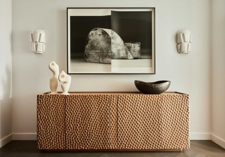
Supports and finishes: what really changes (more than you think)
A nice modern painting can become mediocre if the support is wrong for the room or the light. You don’t need to be an expert here: you just need to understand 4 things.
Canvas: material, warm, but not always premium
Canvas works when you want a softer, painterly effect, especially with abstracts and neutral tones.
Be careful though: some cheap canvases “fade” over time and the colors can appear dull.
Perfect for: abstracts, textures, warm houses, large walls.
Less suitable for: hyper-detailed photos (you lose micro-contrast).
Fine art paper: the most “project-friendly” choice
If you want high quality without necessarily buying an original, fine art printing is often the best compromise. The yield depends on the paper, pigments and color control.
Perfect for: photography, graphics, illustrations, line art.
Plus: frame + right glass = gallery effect.
Dibond / aluminum: modern, sharp, super stable
It is a rigid panel (often composite aluminum) that holds up well over time and gives a contemporary, clean look, with very defined details.
Perfect for: contemporary photography, architecture, minimal environments.
Attention: if the finish is glossy, carefully evaluate the reflections.
Glass: yes, but not any
If the room is bright, standard glass can ruin everything. Better:
-
anti-reflection (visual comfort)
-
matte (softer, less mirror look)
Where to buy modern designer paintings the best sites

Where to buy modern paintings? It depends on what you are really looking for: a unique piece with an identity, a quality art print, or a curated poster to renovate your home without stress. In a contemporary home, the difference is not only made by the subject: it is made by support, format, framework and return policy . Below you will find the most reliable channels, with essential pros and cons, and a quick checklist to avoid purchases that in person are “smaller, shinier or flatter” than they seemed online.
1) Marketplace of original art and author’s prints
Ideal if you want pieces with identity, even by emerging artists, with filters by style, size and budget.
-
Saatchi Art : large selection of original works and prints; it is also useful if you are looking for large statement formats with purchase assistance and clear return policies.
-
Artfinder : purchases directly from independent artists (originals and limited editions), with a very “artist-first” approach.
-
Artsy : more oriented towards galleries and auctions, therefore perfect if you want to raise the bar (also on photography and multiples) and think from a collection perspective.
-
Kooness : consultancy/curation slant (useful if you want a guided choice or a selection with a more “project-like” approach).
When to choose them: if you want a painting that doesn’t seem “taken from the pile” and you are willing to dedicate 20 minutes to searching by filters (style, palette, sizes).
2) design-ready prints and posters (curated, easy, with a contemporary look)
Perfect if you want to renovate the walls with a clean, modern result and a controllable budget (especially with a well-made frame).
-
Paper Collective : fine art giclée, Nordic curation, great for soft-minimal contemporary homes and natural palettes.
-
The Poster Club : very interior selection, emerging artists and premium quality; works well for consistent gallery walls.
-
Desenio : large assortment and easy to use if you want to build compositions (warning: to avoid the “already seen” effect, avoid bestsellers and work on scale + frame).
Project tip: two things win here: generous format and right frame (thin black / natural wood / cassette). A small poster on a large wall remains “cheap”, even if the subject is beautiful.
3) Museum shops and selections linked to art and design collections
If you love icons, designer graphics and “pedigree” prints, museum shops are a solid choice.
-
MoMA Design Store (prints & posters) : selections related to works and artists, often with formats and subjects that hold up well in modern homes.
When to choose them: if you want something recognizable, clean, and with a cultural aura (without having to “study” too much).
4) Etsy, social media, artists’ sites: excellent, but method is needed
Here you will find surprising pieces (and often customizations), but the quality is variable. A mini-checklist saves you.
Anti-rip-off checklist (30 seconds):
-
real photos in setting + close-up of the print
-
clear specifications (paper, technique, finishing, run length)
-
readable return/shipping policy
-
traceable payment (avoids “strange” transfers)
-
reviews with photos and shop history
To buy art online safely (returns, checks, shipments), this guide is a good “practical” reference.
5) Offline: galleries, fairs, local concept stores
It’s not romance: seeing scale, grain, reflections and frame in person changes everything. It is also the best way to avoid proportion errors.
When it makes sense: entrance and living room (large pieces), or when the house is already very “finished” and you want a work that holds the scene.
How to choose between the best sites where to buy paintings (based on the objective)
-
I want a unique piece / not seen everywhere ? Saatchi Art, Artfinder, Kooness
-
I want an easy, coordinated, budget-controlled contemporary result ? Paper Collective, The Poster Club, Desenio
-
I want something with a recognizable cultural/artistic imprint ? MoMA Design Store
-
I want to discover illustrators and micro-studios ? Etsy/artist websites (with checklist)
How to recognize a quality print
Anti-disappointment checklist: 7 fundamental considerations
-
Print run : Is this a limited edition print? Is there numbering?
-
Paper type : indicates weight and type (not generic “premium paper”).
-
Printing technique : better if declared (pigments/archival).
-
Color management : if they talk about calibration/quality control it’s a good sign.
-
Real images : close-up, details, frame, back, fixing system.
-
Returns and assistance : clear policies, times, who pays for the return.
-
Packaging : rigid tube for prints, anti-shock protection for frames.
Simple rule: if you can’t understand what you’re buying (materials, format, finish), it’s not mysterious: it’s a risk.
How much to spend on modern paintings (and what you’re really paying for)
Talking about price in a concrete way helps you choose better and avoid “gut” purchases. Rather than asking yourself how much a painting costs, ask yourself what type of result you want : decorative, “design”, or a piece destined to stay.
Posters and decorative prints
Sensible range: 2080 for printing (small/medium formats).
If you go up to large formats or matching sets, it is normal to get to 90200 overall.
What you’re paying for: instant aesthetics and the freedom to change often.
When it’s worth it: first homes, secondary rooms, hallways, home offices, or if you want to experiment with color and subjects.
Fine art print (interior quality print)
Sensible range: 90250 for a medium format, 250600 for large formats or more refined editions.
If the print is limited edition and signed, it can rise to 4001,200 depending on the circulation and reputation of the author.
What you are paying for: paper and pigments, color fidelity, black rendering, durability, and often the print run (hence rarity).
Originals (unique works)
Realistic entry range: 4001,500 for emerging artists (depends a lot on size and technique).
For more important works, large formats and authors with a consolidated path, the typical range becomes 1,5006,000+ .
What you are paying: uniqueness, authorial path and possibility of value over time. It’s not just material: it’s also history, research, signature.
The point that many underestimate: the frame (here the “premium” effect is decided)
In a modern house the frame is not an accessory: it is half the project.
Budget rule of thumb: allow about 3060% of the cost of the print for a well-made frame (especially a large one).
Indicatively:
-
ready basic frame: 2580
-
good frame (well-made wood/aluminium): 80200
-
custom-made frame + anti-reflective glass: 180450+
Typical mistake: spend 300 for a nice print and then choose a frame for 20 . The final result “lowers” immediately, even if the subject is excellent.
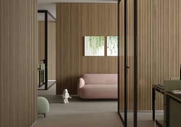
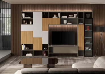
Where to put paintings in a modern house (room by room)
Living room: either large, or thoughtful
-
above the sofa: large single painting or diptych/triptych
-
on an empty wall: better an important format that “supports” the architecture
-
gallery wall: only if you have a thread (palette or style)
Bedroom: visual calm
-
above header: soft abstract, line art, soft photography
-
avoid too aggressive contrasts if you are looking for relaxation (unless it is a deliberate choice)
Entrance and corridor: rhythm and sequence
-
series of 24 coordinated prints work great here
-
or a single statement piece that welcomes you
Kitchen and bathroom: choose sensible materials
-
in the bathroom: better resistant supports and suitable frames, avoid unprotected paper
-
in the kitchen: ok prints, but away from steam and direct splashes