In Made in Italy design , Cattelan Italia is one of those names that naturally recur when talking about contemporary living alongside the great Italian brands that have built a recognizable imagination throughout the world. Founded in 1979 from the meeting between Giorgio and Silvia Cattelan , the company grew rapidly on foreign markets and in 1982 built the first factory in Carré (Vicenza) , transforming the initial intuition into an industrial structure capable of scaling without losing control over the product.
Today the brand is present in over 140 countries and its profile is that of an international reality, with a business that in 2024 will be around 101.6 million euros in turnover .
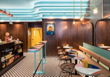
The stylistic code can be read in the codes that return: metal as a structural design, glass and crystal as depth, ceramics and stone-effect finishes as scenic material. It is no coincidence that the collection moves as a complete system tables, chairs, beds, cupboards, bookcases, lighting and accessories built to give visual continuity to the environments, from the living area to the details.
History: when intuition becomes a company (1979present)
The roots of Cattelan Italia have a clear trajectory: family, material, manufacturing. Giorgio Cattelan grew up in his father’s workshop, breathing wood and craftsmanship; Silvia brings order, culture, the ability to keep vision and organization together. In 1979 that balance became a business: the brand was born, with a vocation that immediately looked beyond the local market.
At the beginning they were tables in marble and crystal: objects that immediately put the “presence” of the materials at the centre, worked with techniques that were clearly contemporary for the time and with a recognizable stylistic imprint. Exports soon accelerated and in 1982 the first factory arrived in Carré, in the Vicenza district: a transition that marked the transformation from a laboratory to an industrial structure capable of growing without losing control over the product.
From then on, international expansion is built as a strong identity is built: presence in the best showrooms, fairs, sector publications, and a collection that over time stops being “just” a series of pieces and becomes a complete language for the living area. The second generation enters the company with Paolo and Lorenzo; in 2011 the acquisition of Arketipo also arrived in Florence to preside over the world of upholstery; in 2012 the Carré showroom was redesigned as a scenographic space; Paolo has been leading the brand since 2014.
Today Cattelan Italia moves on a global scale, with a widespread distribution (over 140 countries) and with a “total look” logic that allows you to design a complete environment, coherent in the finishes and in the references between shapes, surfaces and details.
The Keramik turning point: when matter becomes a signature
There are times when a marche finds a material and that material, more than a finish, becomes an identity. For Cattelan Italia that transition coincides with the Keramik collection: the search for a surface that is both functional and scenographic leads to a new aesthetic, more material, more “architectural”, capable of bringing everyday life and visual impact together.
Within this turning point there is a name that often returns because it functioned as a turning point: Skorpio Keramik , indicated by the brand as the symbolic model of the collection and stylistic icon. The reason is also interesting for those who design: a table is no longer just a top with legs, but an object that supports the space, structures it, “signs” it. Ceramic, with its vibrations and depth, helps to give the living room an authoritative center without falling into the rhetoric of luxury.
The Cattelan Italia style in 5 visual codes
1) Material as protagonist
Marble, crystal, ceramics: here the surface is never neutral. The choice of materials is as much a part of the project as the shape, because it builds atmosphere, reflections and density.
2) Designed structures
The support often becomes a graphic gesture: bases, intersections, cuts and geometries that act as a skeleton and a sign, not just a function.
3) Controlled contrasts
Glossy/opaque, warm/cold, full/empty: contemporary is achieved with tensions kept in balance, rather than with special effects.
4) Living room volumes as domestic architecture
Sideboards, bookcases, containers: not just storage, but masses and elevations that work with the wall and light, like small architectural fronts.
5) ductile and customizable collection
The sense of the system emerges from the variety of finishes and processes: transparent or decorated crystals, shaped wood, ceramics, lacquered and brushed, coverings and leather. It is this combinatorics that allows different environments to be held together within a single coherence of language.
From here we understand why some pieces become recognisable: when an object manages to solve a real need (function, proportion, duration) and at the same time bear a stable aesthetic sign. In the next block we enter into iconic pieces starting from the most “Cattelan” theme of all: the table as living room architecture .
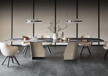
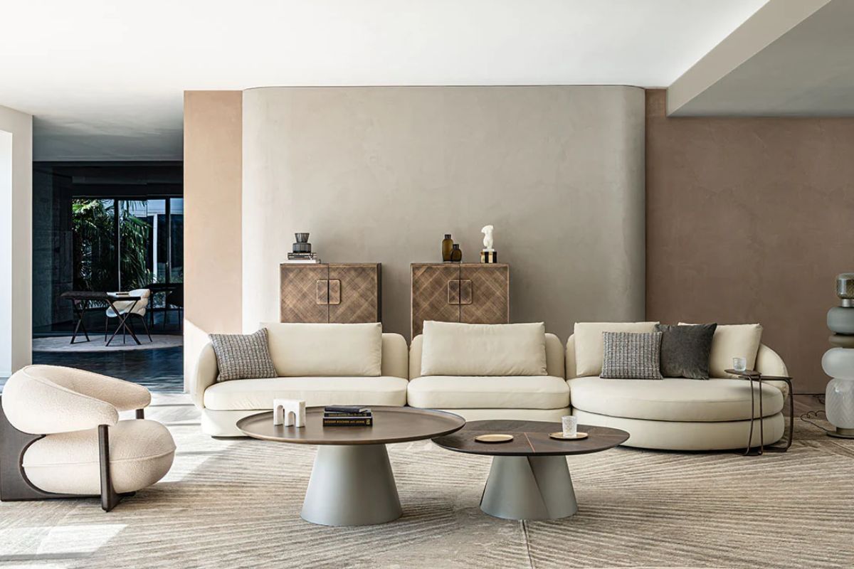
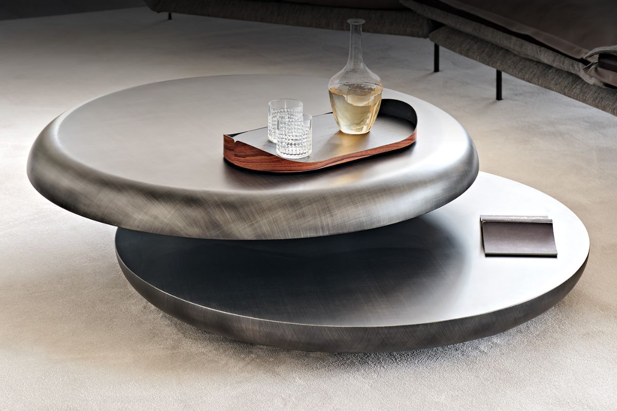
The table as living room architecture
In the Cattelan Italia lexicon, the table is not a “piece” among others: it is the object that organizes the space. This is where we understand the difference between simply beautiful furniture and furniture that supports an environment.
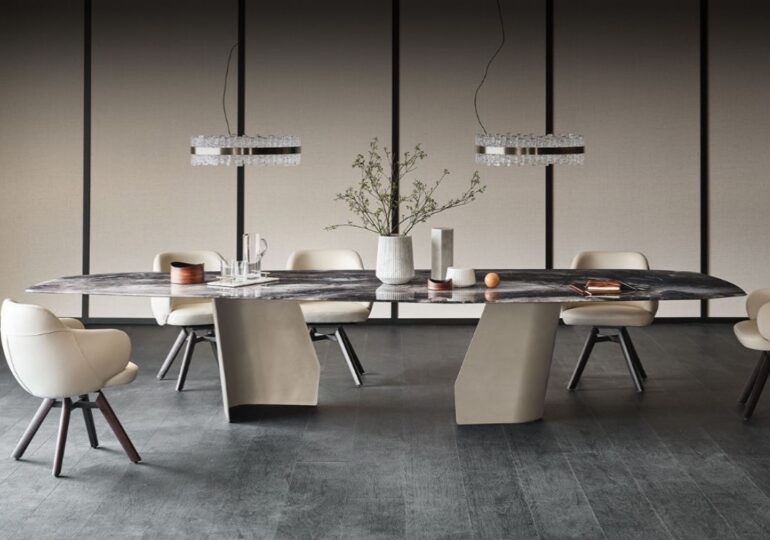
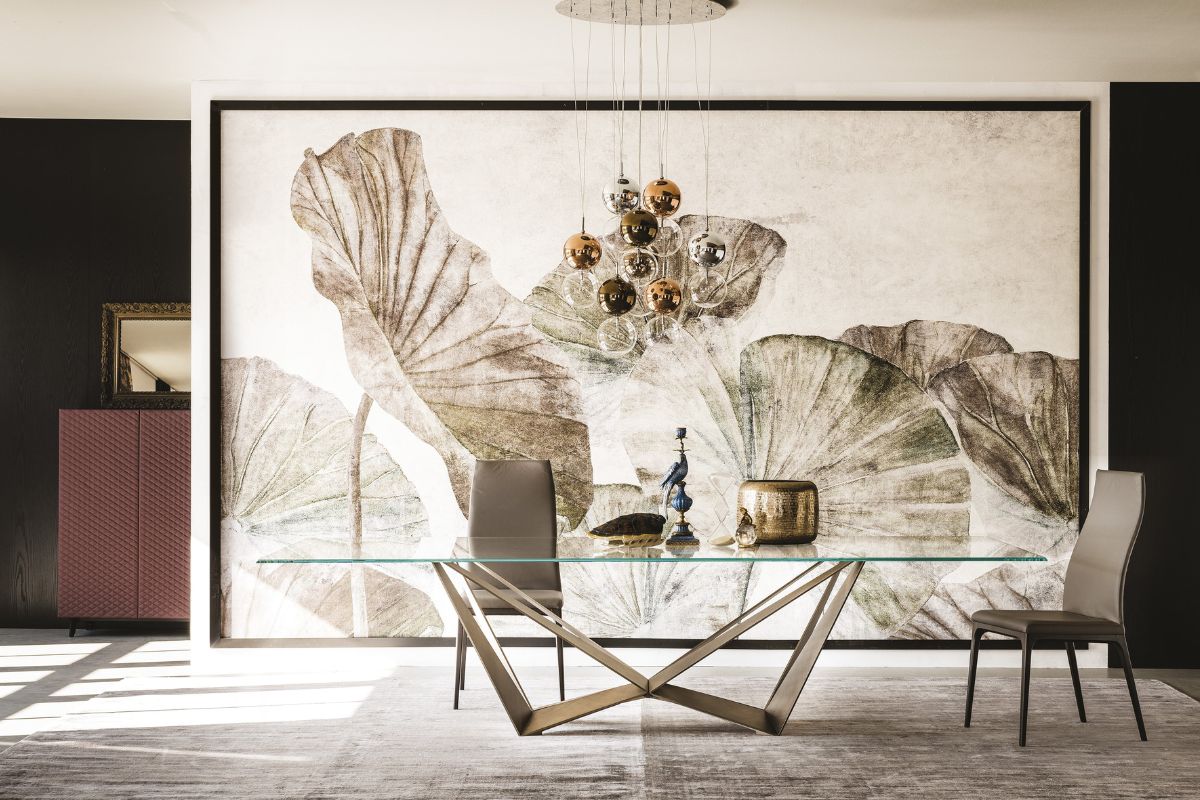
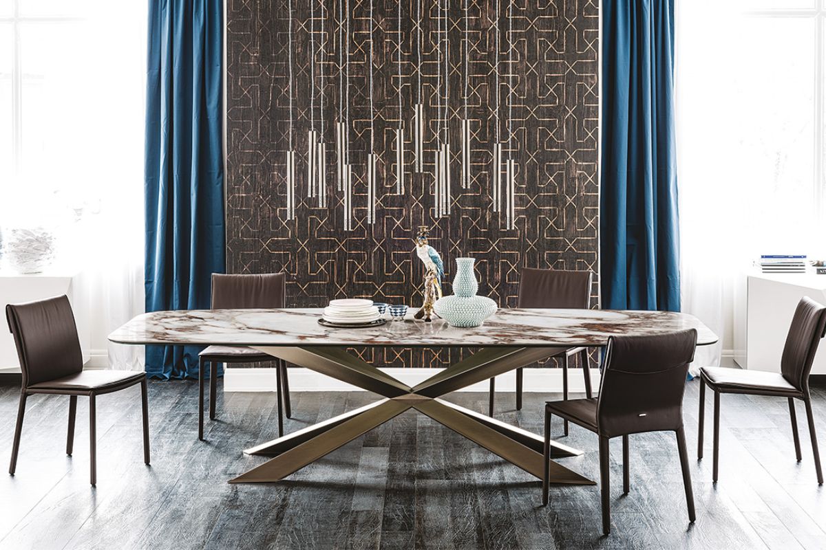
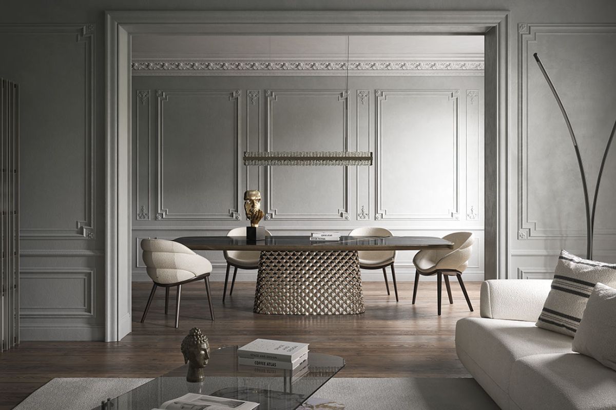
A first archetype is that of the base as a sign: structures that do not simply support, but design a geometry that is recognizable even from a distance. Skorpio was born exactly like this: the brand describes it as a model that “launched a new concept of table” and has become an icon of modern living, evolving over time in multiple versions.
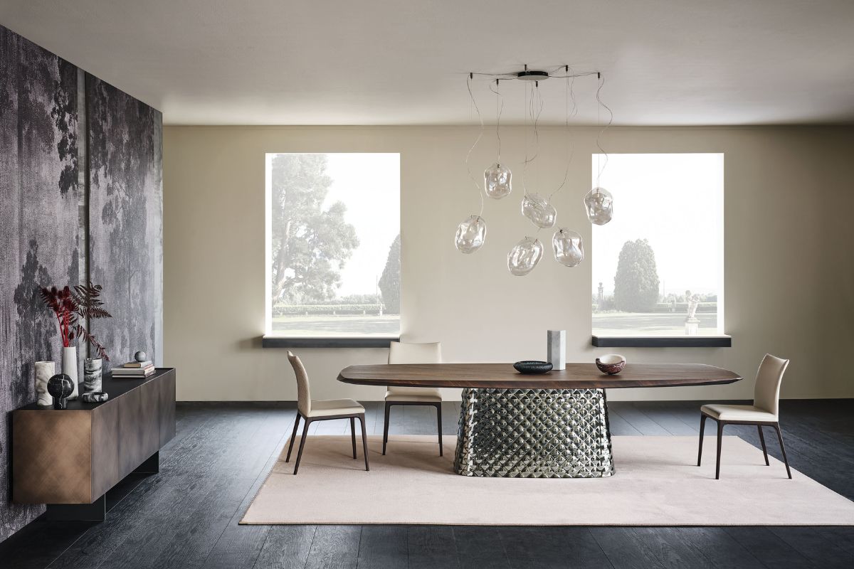
The Skorpio Keramik family takes that gesture into the territory of matter: steel base with embossed finishes and variants such as titanium, bronze, graphite, pearl or black, as well as brushed options; above, theceramic works as a scenic surface, with depth and vibration.
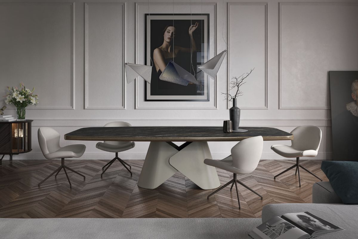
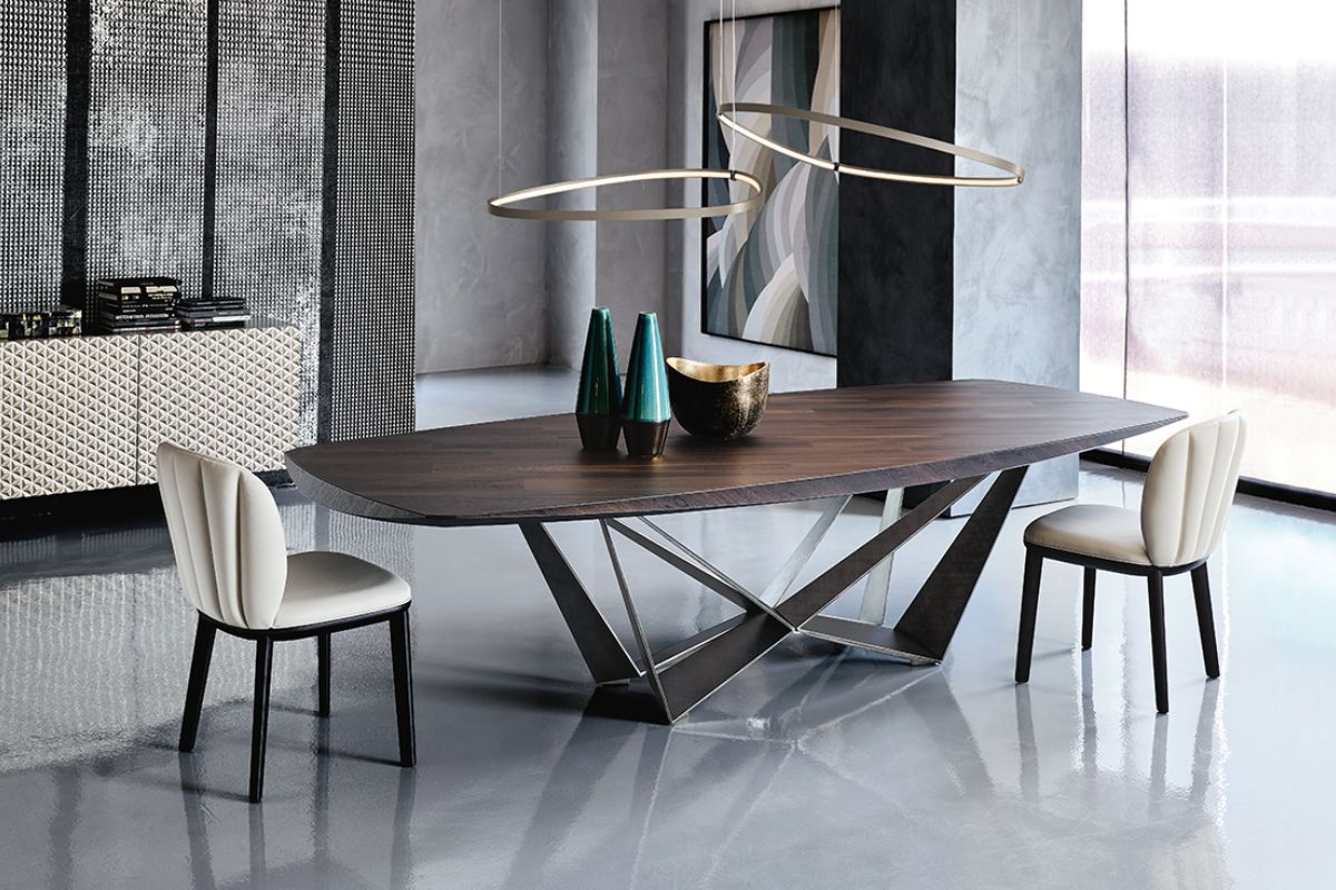
The second archetype is more essential, but equally effective: a “simple” shape that becomes powerful thanks to proportions and finishes. Spyder lives by this logic: X-shaped base in steel, designed to reflect light, and a family that changes skin without changing identity glass in the basic version, wood in Spyder Wood, ceramic in Spyder Keramik; up to the Premium variants with more sophisticated processing on the edges and round versions.
In practice, these two worlds solve two different needs:
-
when you want a sculptural center of gravity, go for a structure that draws space (Skorpio);
-
when you want a table that stands out with elegance, you work on the X-base, finishes and top (Spyder).
Sideboards and containers: volumes that make the wall
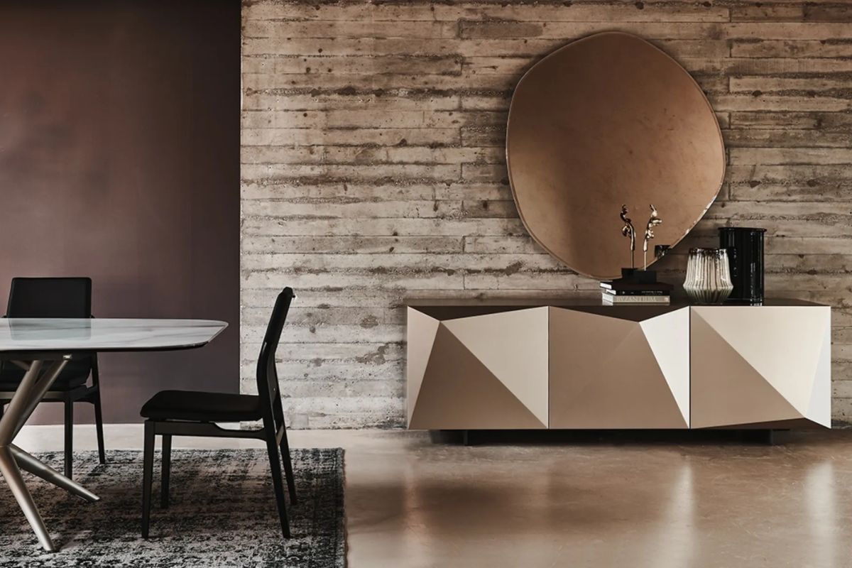
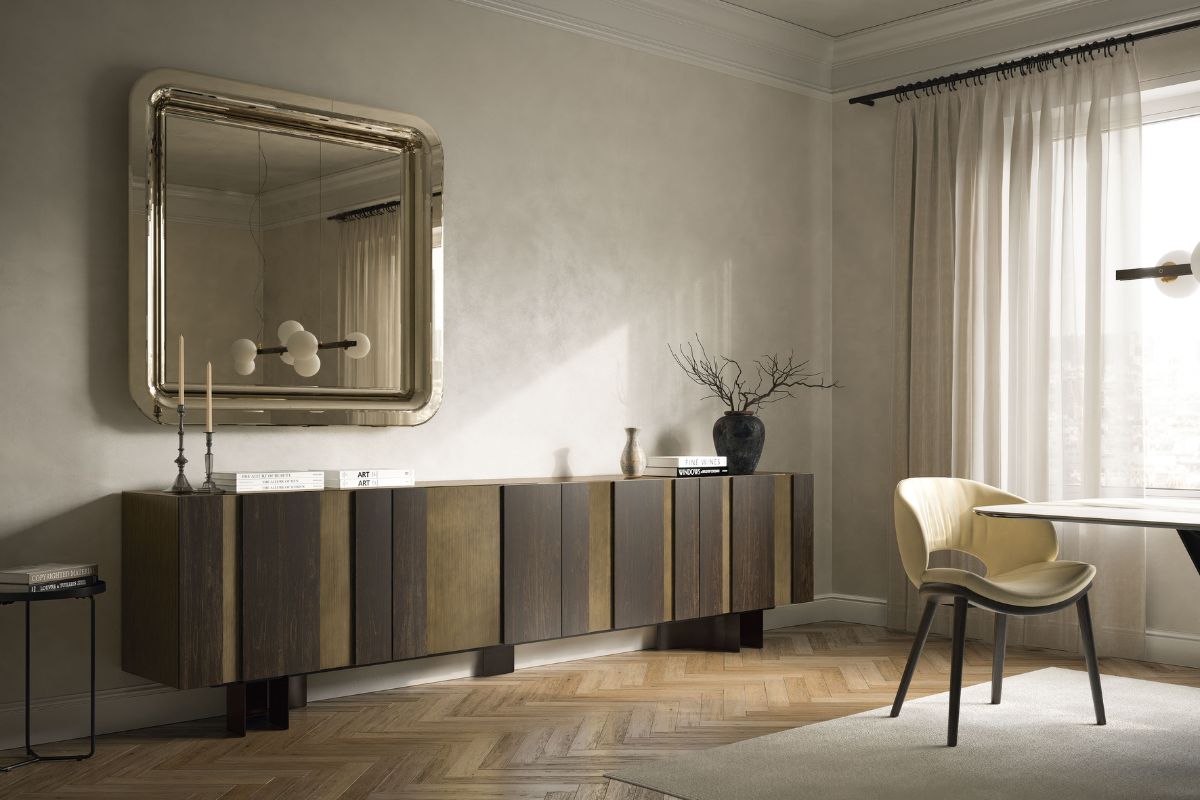
Cattelan Italia sideboards have a characteristic that comes back often: they are not designed as pure storage, but as volumes that build the wall. It is a very current way of designing, because it transforms a functional element into a point of domestic architecture.
Kayak is a clear example of this approach: it is presented as a sideboard with an eclectic and sculptural design, also suitable for contract projects, with evident research into the finishes (Brushed Bronze and Brushed Grey) designed precisely to create “kaleidoscopic” plays of light.
Here the difference is made by the details: the brushed finish is not a “colour”, it is a texture; and the way it receives light changes the perception of volume during the day.
Reflections, textures, light: when the surface becomes atmosphere
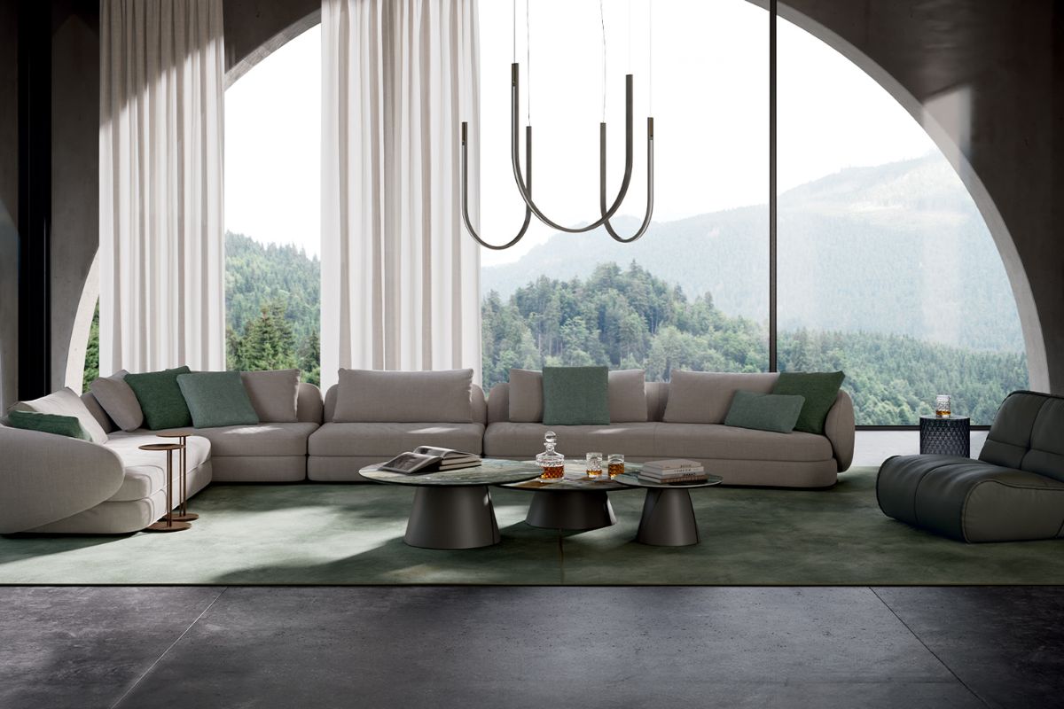
There is a more rarefied and scenographic trend that passes through glass and the theme of reflection. The Atrium family, for example, works on mirrored surfaces and on a three-dimensional “couture” process that recalls the quilted effect: the result is a soft reflection, not that of a pure mirror, which absorbs the environment and returns it with depth.
It’s a detail to keep in mind when designing: reflective surfaces don’t just amplify light, they also amplify what’s around them (including clutter). Here it works if the whole is clean and controlled.
Proportions and placement: how to make a strong piece “stand” without making it scream
Furnishings with presence are governed with a few concrete rules:
-
First style staircase
If the base is important, air is needed around it. A slightly smaller table with the right distances is better than a right table squeezed between walls and passages. -
One material is the protagonist, the others support
If you choose ceramic or highly distinctive brushed finishes, the rest must remain calmer: opaque textiles, continuous wood, walls without micro-patterns. -
Light: avoid flat “frontal” lighting
With metals and ceramics they make more lateral and punctual lights, which bring out edges and vibrations. Flat light kills matter. -
Palette: either warm or cold, not all together
Titanium/bronze and warm tones ask for a coherent context; graphite/black support clearer and more contrasted environments. Middle ways work, but they must be planned. -
Repeat a detail only once
If you have Brushed Bronze on a sideboard, repeat it in a small detail (lamp, handle, profile). Two takes are enough. Three become the theme. -
Chair and table must speak to each other by mass, not by “color”
A sculptural base supports simpler seats; a more essential table can afford seats with more volume. It’s a balance of visual weights.
Materials and finishes: the detail that makes the difference
On families with steel base and embossed finishes, the choice is not just aesthetic: it changes the way in which the piece “lives” in space. Titanium, bronze, graphite, pearl or black (and the brushed variants) react differently to the light and the layout of the environment.
It is here that it is decided whether the final effect is more “architectural” (graphite/black), brighter and softer (pearl), or warmer and more material (bronze).
Catalogs and official references
The official catalogs remain the cleanest way to orient yourself between collections, finishes and variants, because they show settings and technical details in a coherent way.
Iconic living room pieces
Skorpio
It is the table that transformed the base into a gesture. Skorpio was born as a “taut” geometry, almost metal origami, and in the brand’s story it is the model that imposed a new vision of the living room table, becoming an icon of modern living and expanding to eight versions.
Spyder
Same theme, another language: here the structure is an essential, clean X, which lights up with reflective finishes and lets the top speak. Spyder exists in multiple models and materials: glass in the basic version, wood in Spyder Wood, ceramic in Spyder Keramik.
Amsterdam
A sideboard that works like a facade: alternations, rhythm, chiaroscuro. Amsterdam combines two finishes on the doors and uses vertical strips of different sizes to create a “piano” effect; the structure is offered in a hand-brushed Oxybrass finish, with burnt oak inserts that protrude and give dynamism to the front.
Kayaks
Sculptural without losing practicality: Kayak was created to elegantly furnish residential environments and also contract projects, and is designed by Andrea Lucatello. The character lies in the finishes and “jewel” details, designed to let light work on the surfaces.
Airport
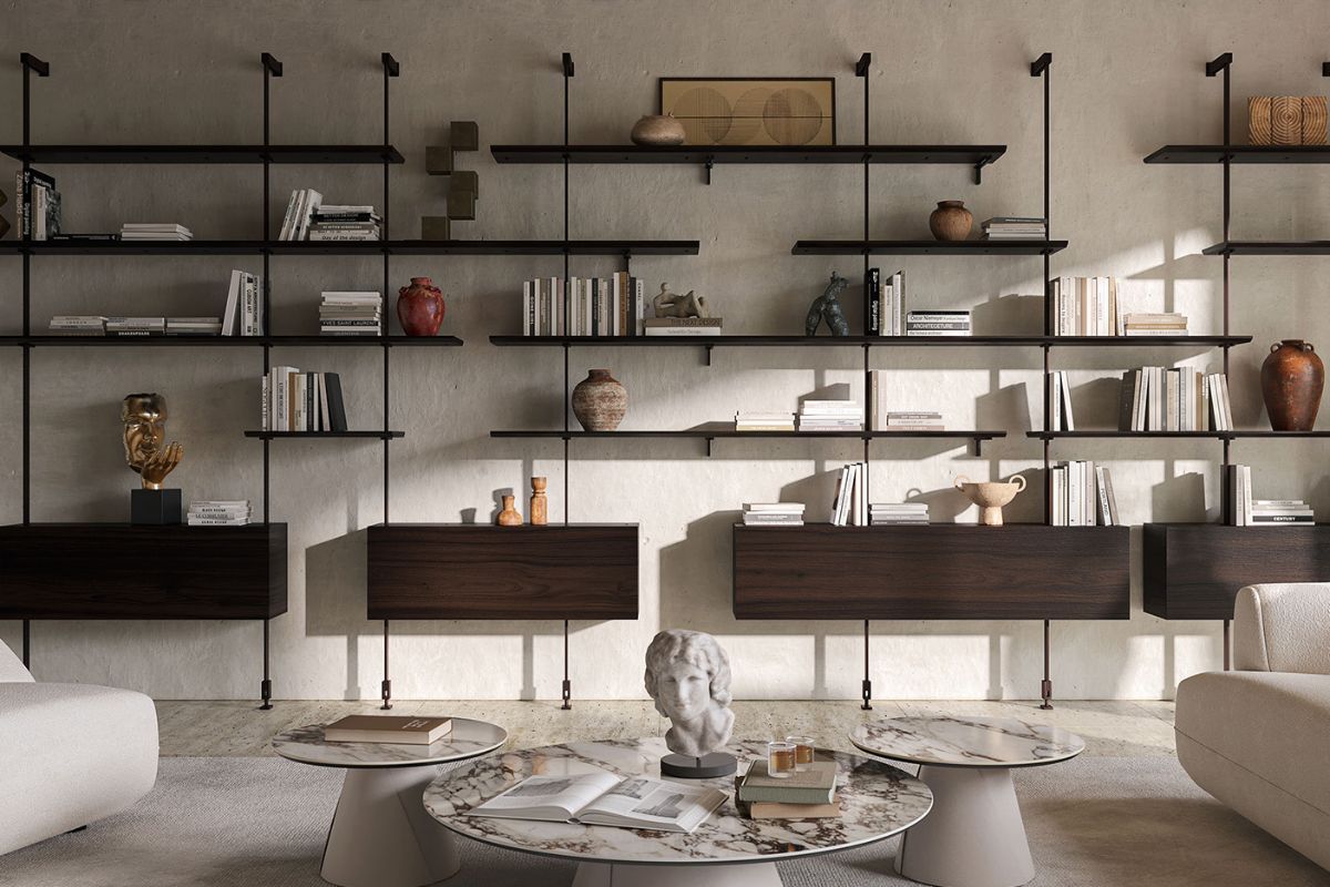
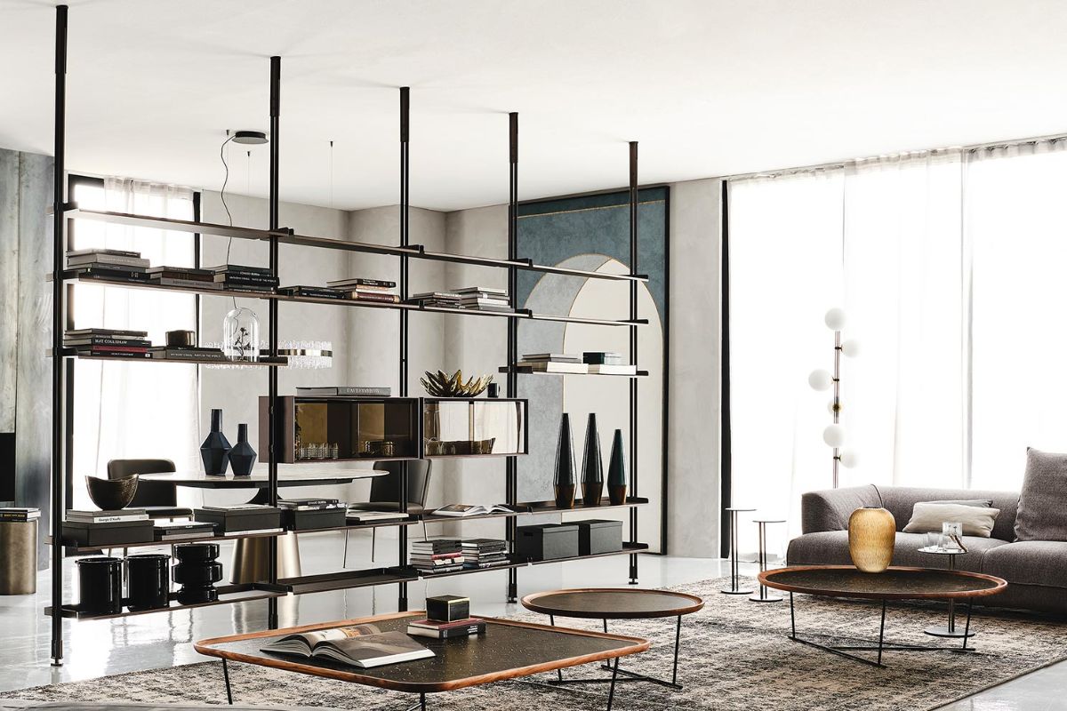
When a bookcase stops being a piece of furniture and becomes domestic architecture. Airport is a flexible and customizable modular system, which can be positioned on the wall or in the center of the room, also as a dividing element; on the site it is presented as a project by Giorgio Cattelan.
Magda
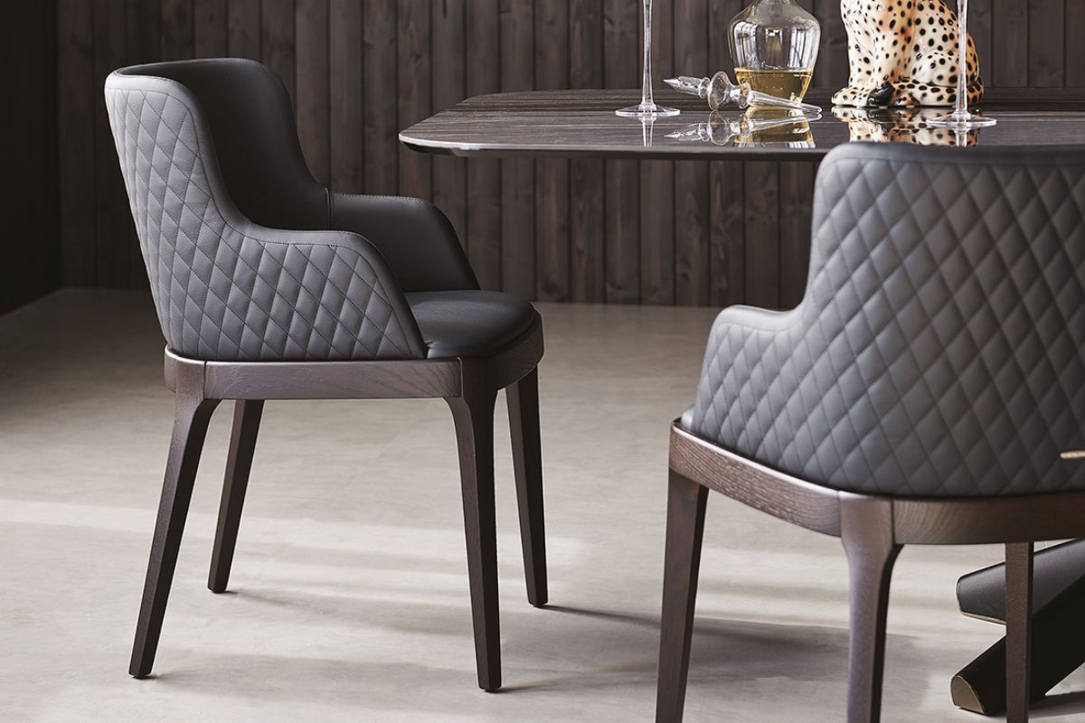
A chair that does not “make a scene” with excess, but with the quality of the posture: enveloping backrest, solid wood structure and a large family of variants (chairs,armchairs, stools; including ML and Couture versions).
Hawaii
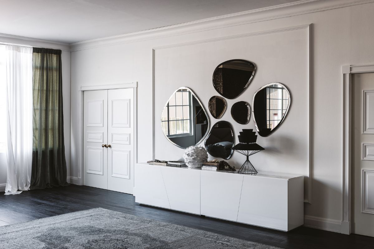
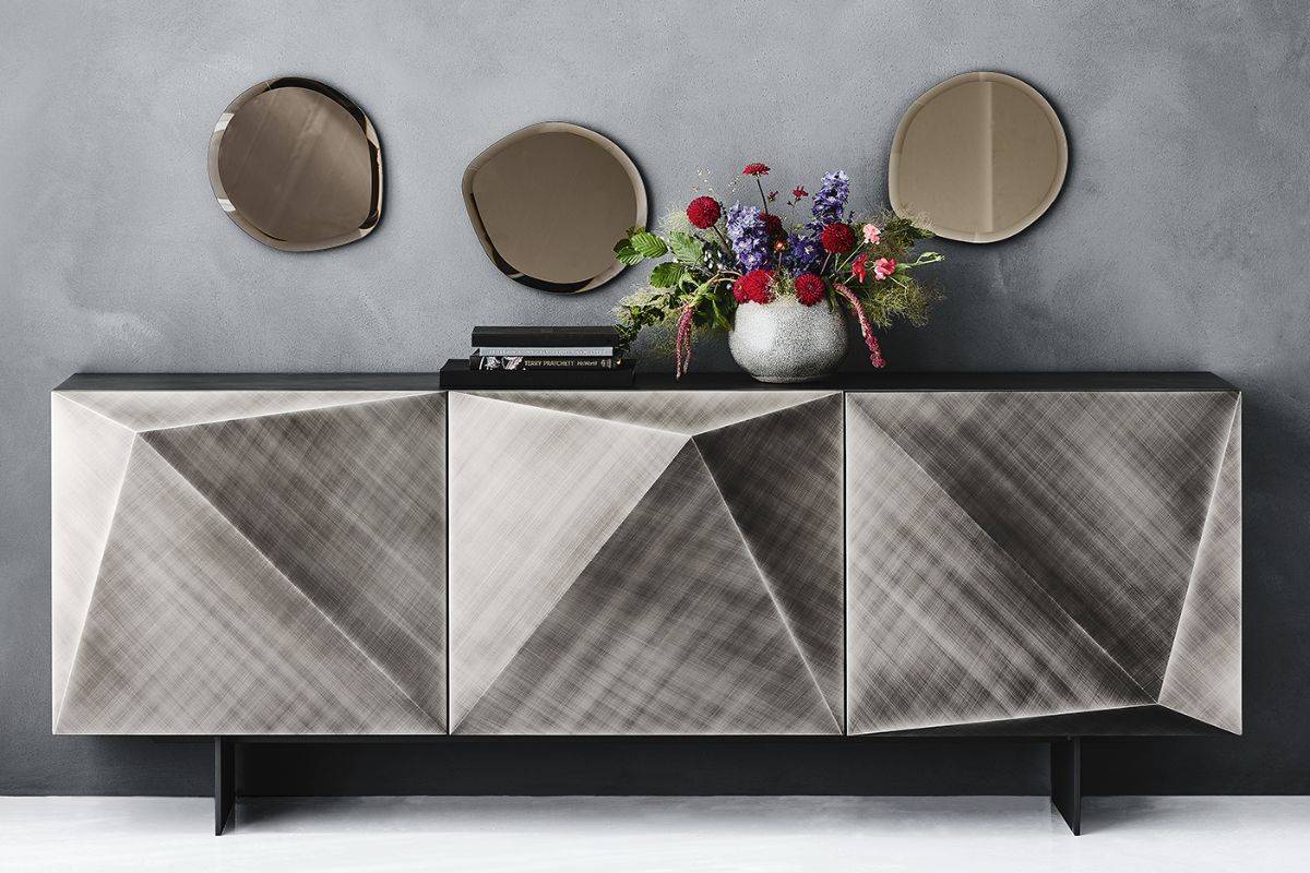
It is a different way of understanding the mirror: not a functional rectangle, but a composition. Hawaii was born as a series of five wall mirrors, inspired by the islands of the archipelago, with irregular shapes and bevelled edges; available in mirrored glass (also smoked or bronze).
Cosmos
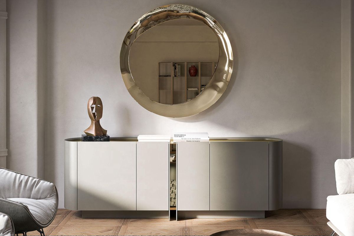
A piece that takes the mirror out of “decoration” and places it in an almost narrative dimension. Cosmos is presented as a design mirror created by Lorenzo Remedi; on a technical level it is a wall mirror in smoked or bronze mirrored glass, with predisposition for horizontal or vertical installation.
Atrium
Here the protagonist is the reflection, but treated like fabric: the brand describes a “couture” process of mirrored crystal with a three-dimensional quilting-like effect, capable of creating soft and not “hard” reflections. Atrium exists as a family of tables, and also as a console in versions with ceramic or wooden top.
Cattelan Italia sofas: the novelty for 2025
In 2025 , among the previews of contemporary living, Cattelan Italia brings attention to upholstered furniture with Craig : a modular sofa with soft lines, where the enveloping backrest accommodates cushions completely removable covers and the armrest becomes the recognizable sign of the composition, like a gesture that “embraces” the base and makes the seat more intimate. It is an entry into comfort conceived with design logic: modular configurations, leather or fabric coverings (removable covers in the fabric version) and a construction that combines a wooden structure and technical padding.
How to “read” Cattelan Italia in a project: three levers that always come back
1) Matter is the first choice, not the last
In many Cattelan Italia collections the surface is not a covering: it is the content. Keramik, brushed finishes, mirrored glass, wooden inserts… change the perception of the volume and, above all, the light of the living room.
2) The base is a signature
Skorpio is the clearest example: the brand describes it as a table that introduced a new concept and evolved up to eight versions, precisely because the base is a “sign” even before a structure.
Spyder works on the same theme with a more essential register, and the family moves between glass, wood and ceramic.
3) The container becomes a wall
Amsterdam shows this well: vertical alternations of finishes as a visual rhythm, hand-brushed Oxybrass and burnt oak inserts that “come out” from the front.
When a container works like this, you don’t “fill” a wall: you build it.
Three typical living scenarios and what really works
Bright living, light palette
Here the pieces that work for depth and reflection, without weighing them down, win.
-
a table with a large top (light ceramic or glass) and a graphic base
-
a sideboard that supports the wall, but with a “calm” rhythm
Amsterdam, for example, works precisely because the dThe vertical sign creates order and movement together.
Nocturnal living, dark tones and punctual light
It is the ideal territory of metallic finishes and surfaces that react to light.
-
Brushed / embossed: they give texture even with low lighting
-
smoked or bronze glass: they increase the scenic density
Atrium, with a base in mirrored and “quilted” glass (smoked or bronze) and a ceramic top, is literally built on this principle: light + matter = atmosphere.
Open space: when you need a “system”, not individual pieces
In an open space the difference is made by the ability to divide without closing. Airport is designed exactly like this: customizable modular system, also freestanding as a room divider.
It is one of those cases in which furniture stops being an object and becomes a domestic infrastructure.
Surfaces and details that change the final result
Brushed: beautiful, but alive
Kayak is a good reminder: the brand specifies that variations in color and brushing are characteristics of craftsmanship (not defects).
Translated into the project: it must be foreseen that the surface “moves” with the light, and must be placed in an orderly context.
Mirrored glass (smoky / bronze) and 3D processing
Atrium returns here too: the quilted effect on the glass creates softer and deeper reflections than a flat mirror.
It works a lot when the wall is clean and the lighting is studied (wall washer or lateral points).
Mirrors as spatial device
Cosmos is presented as a mirror designed by Lorenzo Remedi, with a deliberately “majestic” and scenographic narrative.
In practice: it is a piece that enlarges and theatricalizes, so it must be given breathing space (free wall, distances, quieter nearby furnishings).
Hawaii: clean cut, bevelled edge
Hawaii is described as a wall mirror in mirrored glass (also smoked or bronze) with bevelled edge and brackets with multiple fixing options.
It is a simple object only in appearance: the bevel “turns on” the light even when the rest is minimal.
Project checklist
- Leave a comment
Other Posts
- Related Articles
- More from Author
No related posts.