
Petrol green is one of the most fascinating shades of the contemporary color panorama: intense but discreet, sophisticated but natural, capable of inhabiting both classic environments and the most modern architecture. It is a nuance that combines the depth of petrol blues with the rich elegance of dark greens, creating a unique visual effect: scenographic but never intrusive.
It is a shade that is experiencing new success in interior design thanks to its ability to transform spaces into theatrical backdrops of great charm, especially when combined with porous materials such as velvet, solid wood or polished stone. Whether it is a sophisticated living room, an accent wall in the bedroom, or a corridor seeking identity, petrol green gives depth and character, going beyond seasonal fashions.
The meaning of the color petrol green in interior design
Petrol green is a shade that belongs to the family of deep colors, halfway between forest green and ocean blue. Its hybrid nature amplifies its evocative power: it recalls the density of cold waters, the depth of natural landscapes and the mystery of the intense pigments used in ancient and modern art.
In interior design, petrol green is chosen for its ability to generate:
-
Enveloping and contemplative atmospheres , which favor concentration and meditation;
-
Elegance without excess , capable of enhancing formal and domestic spaces with the same intensity;
-
Measured visual contrast , perfect for balancing cold materials like metal or warm materials like wood.
It is a color that communicates depth without darkness, which brings with it a sense of stability and at the same time of discovery. Used in the right proportions, it can become the cornerstone of a contemporary interior project that aims at visual identity and perceptive well-being.
How to match the color petrol green: color palettes and materials
Petrol green is a color that welcomes multiple combinations and expresses itself differently depending on the materials with which it enters into dialogue. Its deep and slightly desaturated nature makes it perfect as an accent tone, but also as a dominant color for formal environments, relaxation areas or spaces designed to impress.
Petrol green and neutrals: balance and brightness
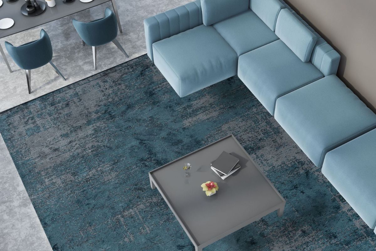
Combining petrol green with neutral shades such as dove grey, warm beige, silk gray or ivory white allows you to obtain a refined and never invasive contrast. Perfect for contemporary living rooms and minimal interiors, this pairing guarantees sober elegance and controlled brightness.
Petrol green and metals: scenographic accents
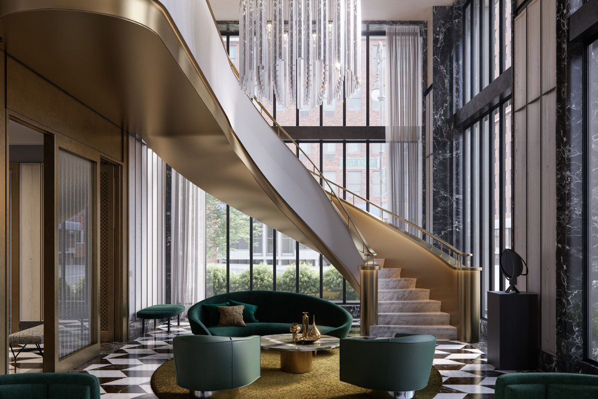
Satin brass, brushed copper and antique gold are ideal companions for petrol green. Their reflective surfaces create points of light that emerge naturally from the deep background of the colour, making every detail – handles, lamps, frames – a protagonist element, especially in living rooms or dining areas.
Petrol green and dark woods: sophisticated atmosphere
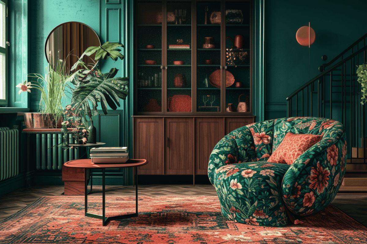
Combining petrol green with woods such as canaletto walnut, heat-treated oak or teak creates a warm and enveloping effect, ideal for environments that aim for material elegance. This combination is particularly suitable for prestigious residential spaces or boutique hotels.
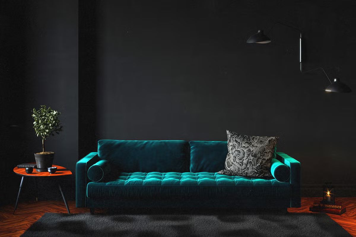
Petrol green and soft surfaces: velvet, paper and plaster
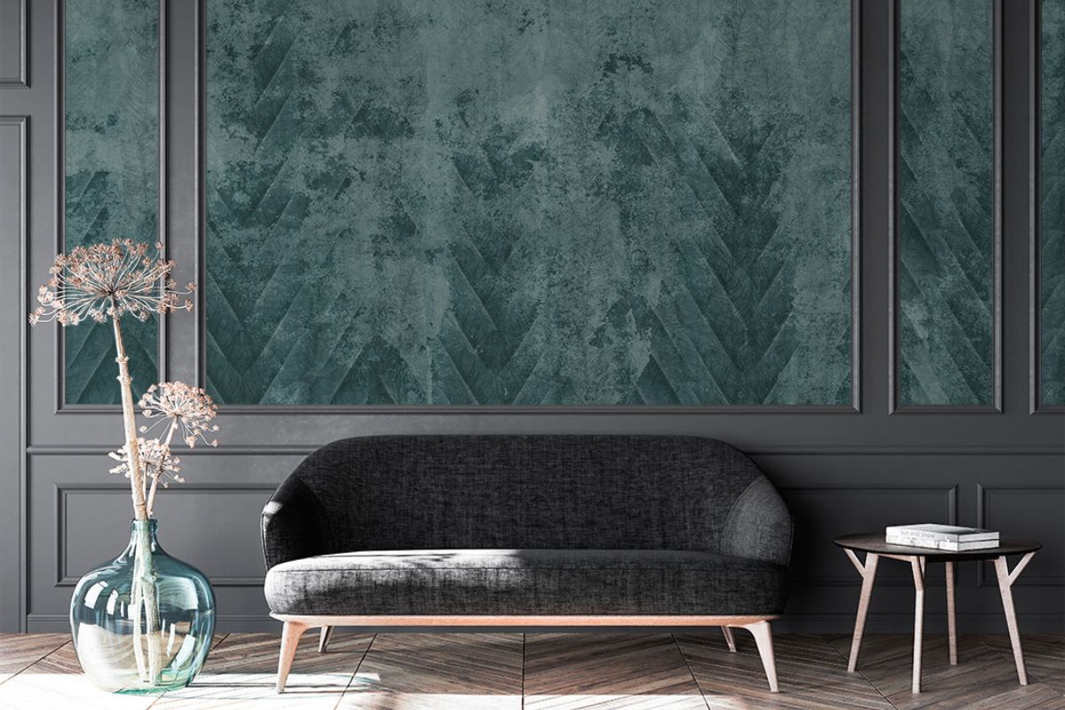
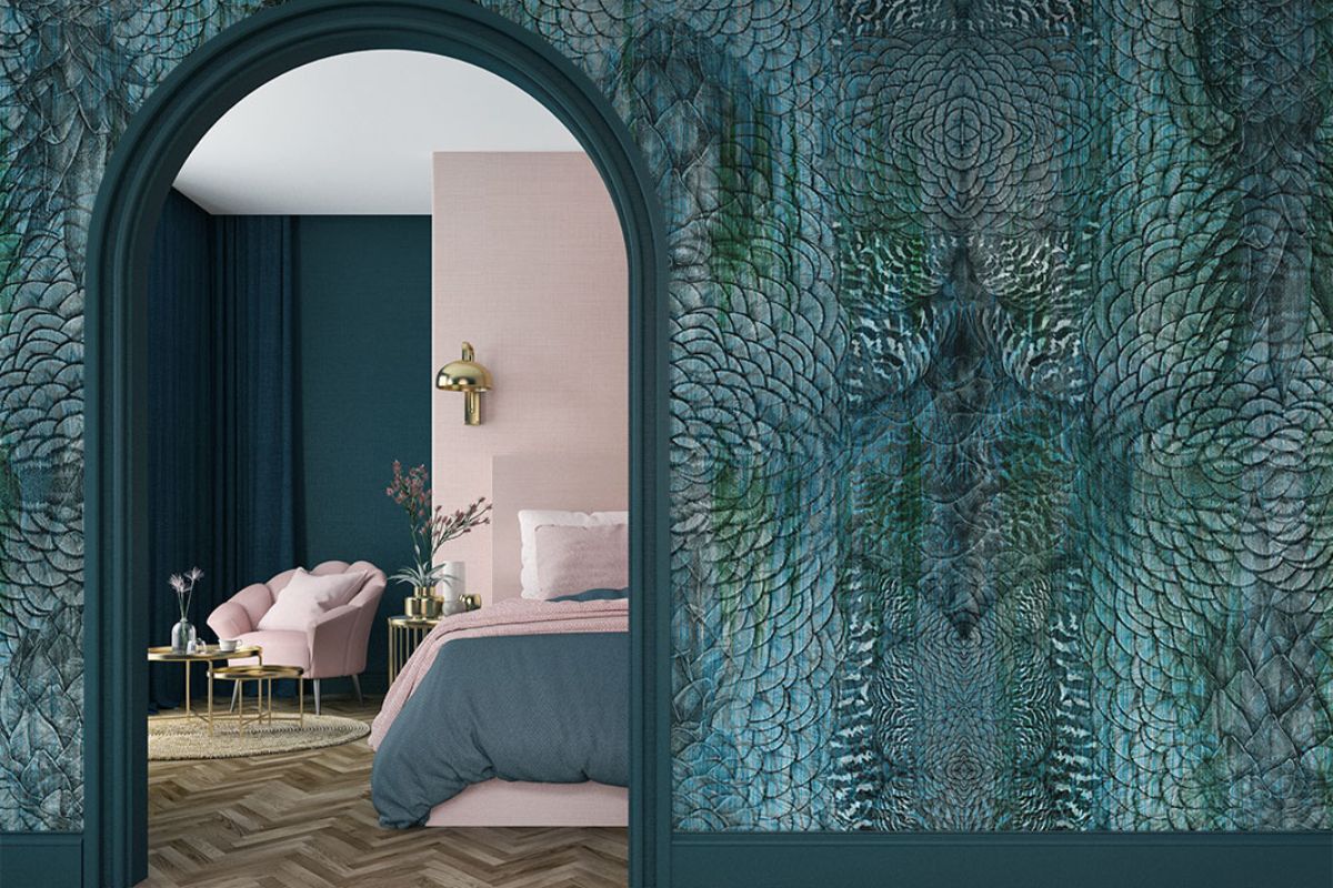
Porous or slightly absorbent textures, such as velvet, textured wallpapers or material plasters, enhance the petrol green in a natural way, amplifying its chromatic depth. An ideal combination for bedrooms, corridors or relaxation corners that want to evoke a sensation of scenic quiet.
The shades of petrol green in design

Petrol green is not a single color, but a set of shades that move between dark green, deep blue and grey-green, varying in intensity depending on the light and context. Choosing the right shade is essential to define the atmosphere of the space and determine the degree of contrast with furnishings, floors and coverings.
Here are the main variations used in the design:
-
Light petrol green : ideal as a background for minimal environments or to give personality to passage areas such as corridors and entrances.
-
Pure petrol green : with a balanced balance between green and blue components, it is perfect for accent walls or modern boiserie.
-
Deep petrol green : almost nocturnal, it is close to a mix of forest green and ultramarine blue, perfect for intimate spaces such as studies, private living rooms or boutique-style bedrooms.
-
Gray petrol green : desaturated and sophisticated, it is best expressed in contemporary environments, with light woods or concrete. Excellent as a base for textiles or soft-touch surfaces.
In the professional field, some useful color references for those who work with precise coding:
-
RAL 5001 (Green Blue) often used as a reference for dark petroleum.
-
Pantone 5483 C versatile and less saturated green-blue shade.
-
NCS S 6030-B10G deep, elegant petrol-green, with a specific blue component.
Petrol green room by room: atmospheres and inspirations
Petrol green is a versatile color that adapts to different rooms in the house, modifying the perception of space depending on the light and surrounding materials. Its chromatic depth allows you to create intimate and contemporary scenarios, without ever being excessive.
Living room: character and visual balance
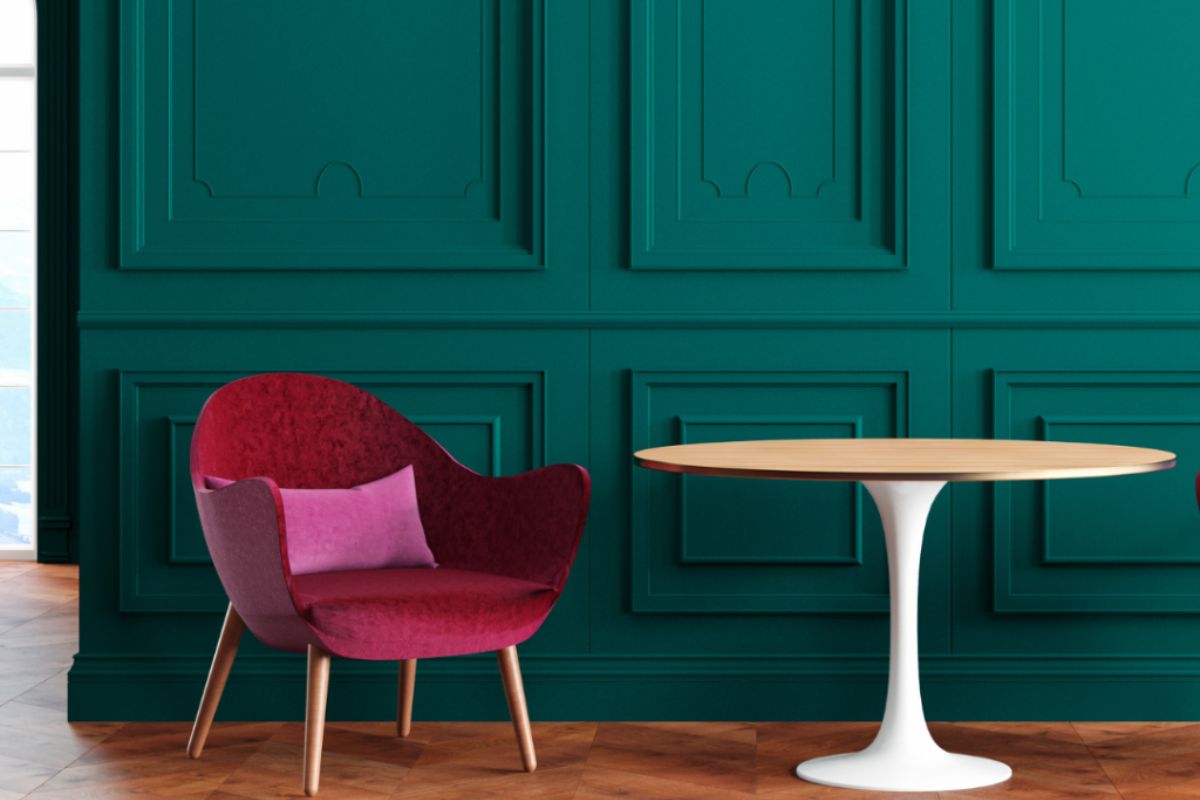
In the living room, petrol green can be used to enhance main walls, boiserie or fabric sofas. Combined with brass or dark wood elements, it creates an atmosphereelegant and balanced. In large spaces, it can also be applied to ceilings or paneling, obtaining a scenographic effect of great visual coherence.
Bedroom: comfort and depth
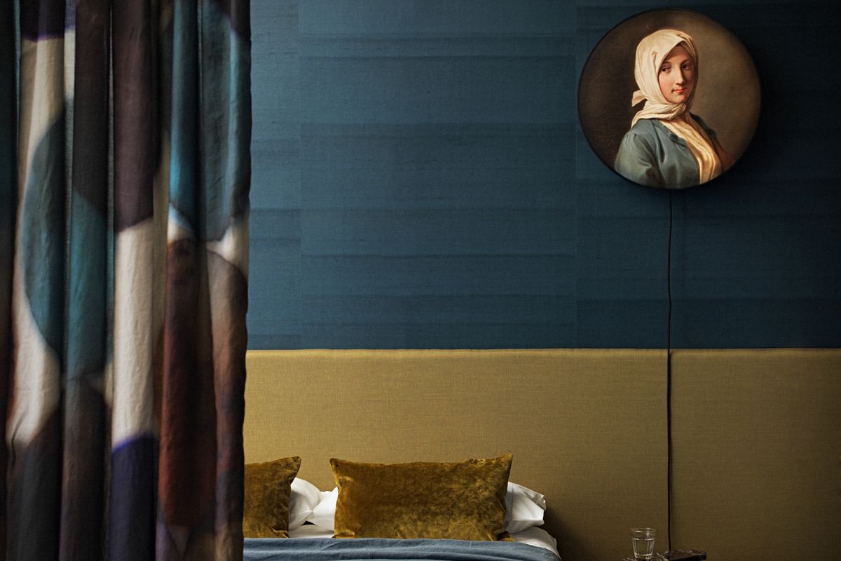
In the bedroom, petrol green becomes a shade that promotes relaxation, especially when combined with soft fabrics and matt surfaces. The more desaturated shades, tending towards gray or blue, create calm and enveloping environments, ideal for the sleeping area. Perfect on a single wall or as the main color for headboards and upholstered accessories.
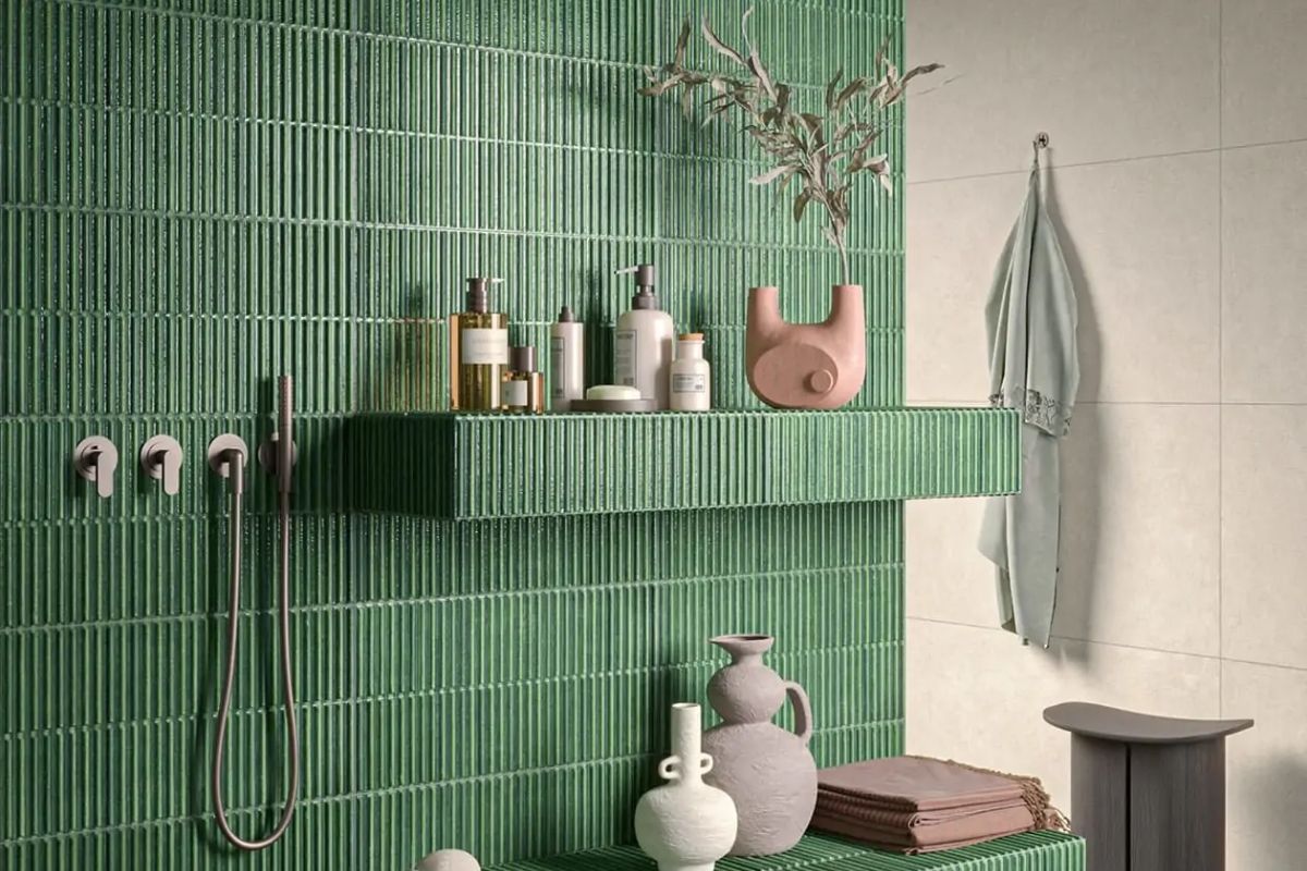
Bathroom: material elegance
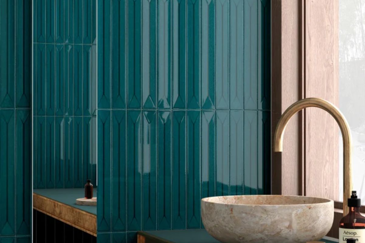
In the bathroom, petrol green lends itself well to stoneware, shiny ceramic or microcement coverings. Its visual intensity is amplified by the reflection of natural or artificial light, creating a refined and contemporary environment. Also interesting is the combination with golden or matt black taps for a sophisticated result.
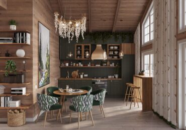
Kitchen and dining area: sophisticated functionality
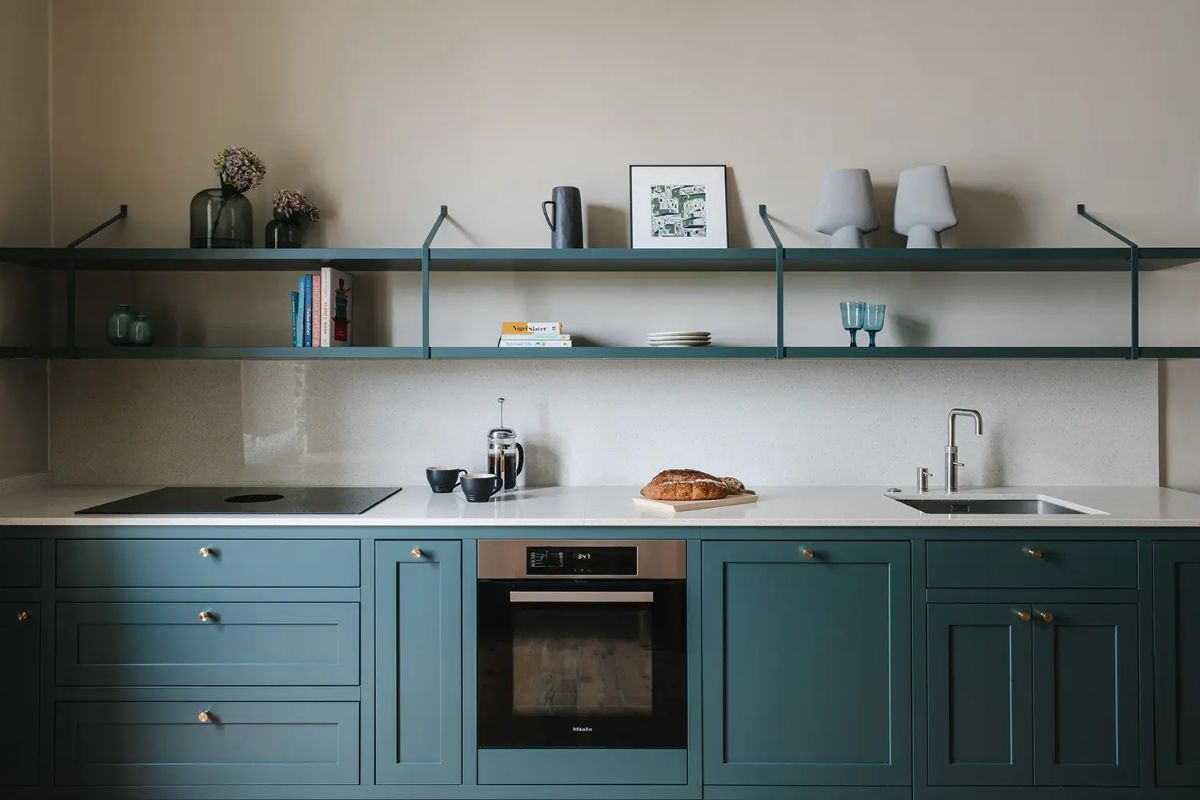
In the kitchen, petrol green works as an accent on base units and wall units, or as a predominant color in contemporary kitchens with wood or stone finishes. Associated with light tops or metal surfaces, it creates an elegant contrast that restores identity and visual rhythm to the environment.
Entrance and corridor: passage shades
In transition spaces, such as entrances or corridors, petrol green helps define the chromatic continuity between the rooms. It can be used to emphasize portals or niches, or to create visual depth effects, especially if illuminated by warm lights or directional wall lamps.
Petrol green between art, fashion and design: cultural contaminations
Petrol green is a shade that crosses eras and languages, preserving a rare ability over time: that of combining rigor and emotional intensity. It is a color that arises from the encounter between natural pigments and modern chemical processes, and for this reason it brings with it a double soul – artisanal and industrial – which makes it particularly close to the world of design.
Art and symbolism: the color of depth
In art, petrol shades are often associated with water, mystery and the inner dimension. From impressionist canvases to contemporary abstractions, deep green-blue represents the search for balance between light and shadow, between visible and invisible. It is a color that invites contemplation, evoking the seascapes of Northern Europe and the suspended atmospheres of Abstract Expressionism.
Fashion and trends: seasonless chromatic elegance
In fashion, petrol green stands out for its sophisticated neutrality: it is a shade that adapts with the same force to opaque and shiny fabrics, to winter outerwear as to summer collections. Stylists and fashion houses use it for its power to make every dress immediately recognisable, without the need for bright colours. It is a sign of silent elegance, consistent with contemporary aesthetic sensitivity.
Designof interiors: balance between matter and light
In interior design, petrol green is today one of the most loved nuances for its ability to build balanced and identifying spaces. Used on walls, coverings or upholstery, it fits naturally into the languages ??of Scandinavian design, Italian modernism and contemporary décor. It is a color that accompanies, not that imposes: its strength lies in its measure.
Leave a comment