Update (January 18, 2026)
The official Pantone 2026 color is PANTONE 11-4201 Cloud Dancer .
Pantone has announced the Color of the Year 2026: PANTONE 11-4201 Cloud Dancer , an airy and quiet white, far from both the “showroom” optical and clinical white. It is a choice that speaks of subtraction: less visual noise, more light, more matter, more perceptual comfort. And, above all, of a collective need for spaces that calm, rather than stimulate.
In this article you will find two levels of reading: on the one hand what Cloud Dancer really means and how to use it in interiors (palettes, materials, combinations, mistakes to avoid); on the other our predictions published before the official announcement , because the value of a color is not just “guessing” it, but understanding which cultural direction design is taking.
Official Pantone 2026: Cloud Dancer in 60 seconds
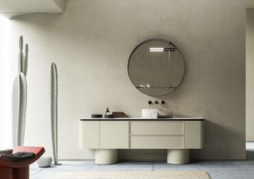
Cloud Dancer is a white soft and atmospheric : non-optical, non-clinical. It functions as a silent base that brings out light, proportions and materials .
Where it works best in interiors
-
material walls (lime, gypsum, plaster, microcement)
-
quiet luxury living rooms and bedrooms with light woods and satin metals
-
small spaces: increases the sensation of air without becoming cold
2026 pairings that really hold up
-
cream / oat milk / warm beige
-
milky blues and misty blue-greys
-
dusty sage + satin nickel / light bronze
What is Pantone and why is it a global reference on colors
Founded in the United States in 1963, Pantone is today the undisputed authority in the field of color coding and standardization. The Pantone Matching System has revolutionized the way designers, graphic designers and manufacturers talk about color, creating a common language made of universal codes.
Each year, through the Pantone Color Institute, an international team of experts observes global macro-trends, cultural influences, design innovations and social movements. The result is a choice that has an immediate impact on the creative supply chain. For 2026, the official color is Cloud Dancer (PANTONE 11-4201) : a luminous and “quiet” base that shifts the attention from the color to the material.
Before the announcement: our forecasts (original text July 2025)
This section was written and published before the official announcement . We leave it here because it tells how signs are read: not as a guessing exercise, but as an observation of patterns (recurring palettes, collective moods, materials and surfaces that return in the projects). Today we know that Pantone has chosen Cloud Dancer , and this is precisely why the predictions become interesting: they show the direction that design was already taking.
The color of 2025: Mocha Mousse
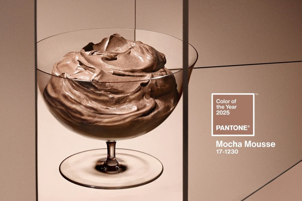
The Pantone Color of the Year 2025it is Mocha Mousse : a sophisticated, warm, enveloping shade. An elegant brown with powdery undertones, capable of transmitting stability, awareness, but also introspection and authenticity. In an era marked by the need to slow down, rediscover natural rhythms and live in harmony with oneself and the environment, Mocha Mousse embodied the desire to return to substance, to the essential.
It is a versatile shade, suitable for interiors as well as fashion, and has had a significant impact in redefining the neutral palette in a more contemporary way.
After the announcement: what does Cloud Dancer confirm compared to the forecasts
With Cloud Dancer, Pantone confirmed a trend that was already perceived: less saturation, more light, more visual silence . Our four hypotheses are not “disproven”: they are partly absorbed by the official choice.
-
Oat Milk and Smoky Sage anticipated the aesthetics of material comfort.
-
Azzurro Nebbia anticipated the need for air and calm.
-
Terracotta remains the ideal warm accent to give root to a light base like Cloud Dancer.
Our analysis: Archi&Interiors studies 2026
To propose our 4 possible candidates for the title of Pantone Color of the Year 2026 , we analyzed:
-
The color trends seen in the international design fairs 20242025
-
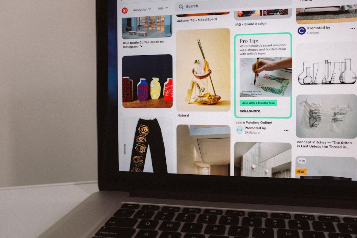
Pinterest Predicts data, Instagram Trends and galleries of colorful concepts on Behance and Adobe
-
The visual sentiment present in the most shared interior, fashion and graphics projects in recent months
-
The history of Pantone colors in recent years (see next paragraph)
Starting from these observations we identified the recurring palettes, the predominant moods and the most emerging social themes.
Pantone: colors of the year from 2020 to today
Here is a quick overview of the colors chosen by Pantone in recent years:
-
2020 Classic Blue (19-4052): confidence and stability
-
2021 Ultimate Gray + Illuminating: resilience and hope
-
2022 Very Peri: creativity and transformation
-
2023 Viva Magenta: strength and vitality
-
2024 Peach Fuzz: delicacy and inner well-being
-
2025 Mocha Mousse: introspection and authenticity
2026 furnishing trends told by the Salone del Mobile
The 4 eligible finalists according to Archi&Interiors

After a careful selection, these are the 4 colors that according to our team best embody the spirit of 2026:
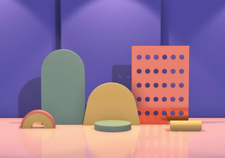
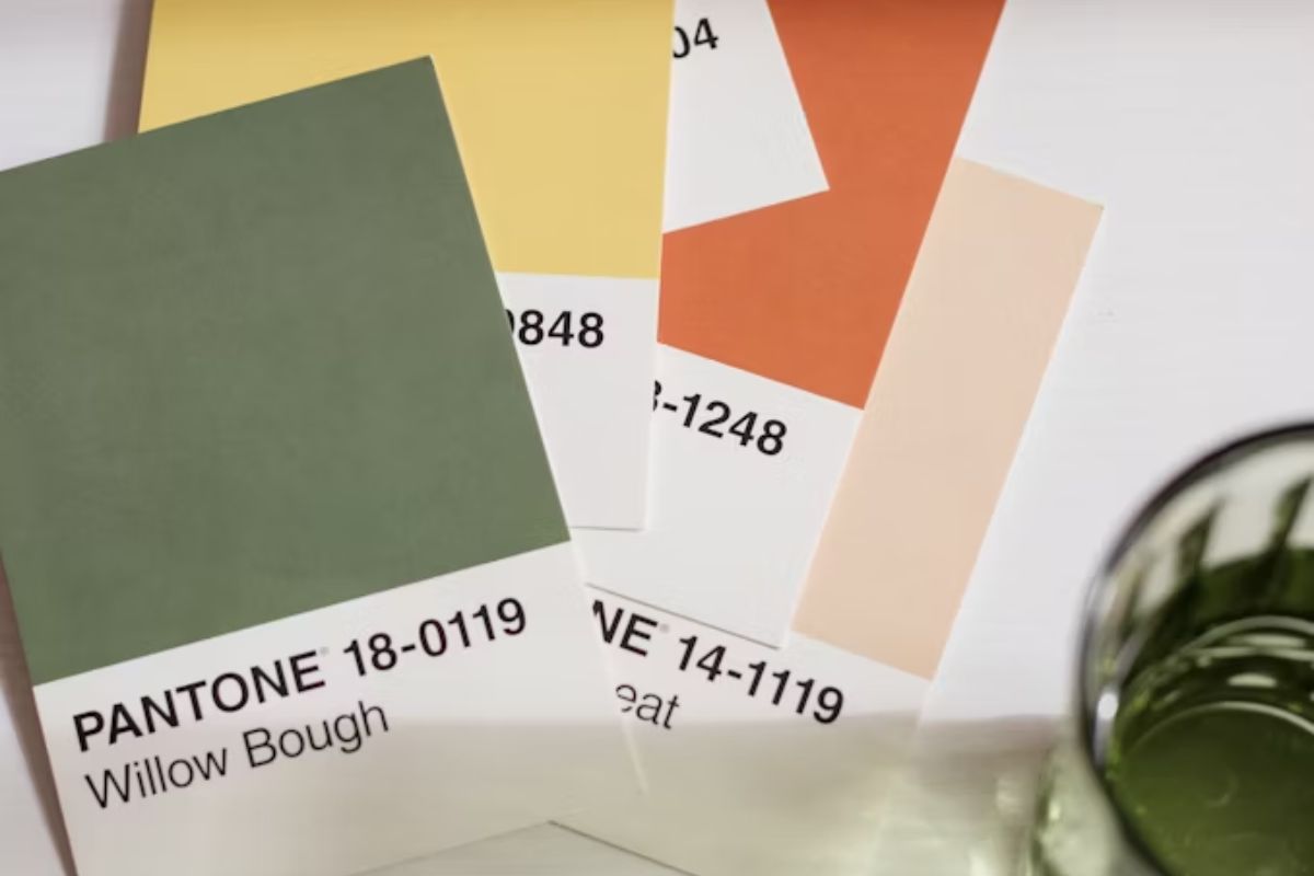
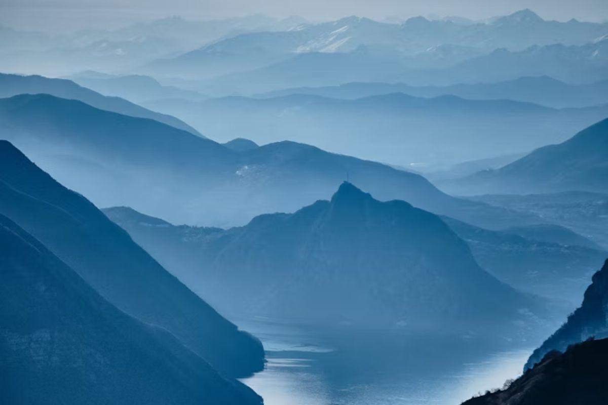
1. Azzurro Nebbia (Soft Mist Blue)
A rarefied blue huette, fresh but not icy. It refers to mental clarity, the need to breathe, the desire for transparency and emotional calm. A color that combines air and water, suitable for minimal environments, soft tech and holistic design.
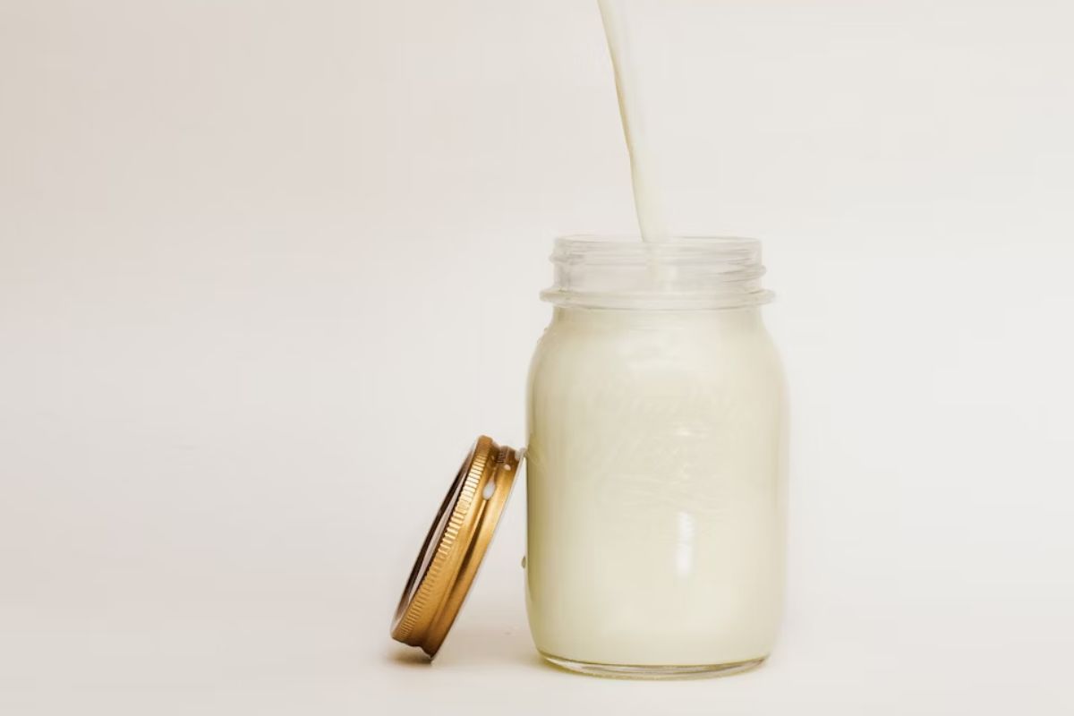
2. Oat Milk
A creamy, natural neutral, linked to the idea of comfort and inner well-being. The color of new home-work spaces, slow kitchens, self-care. It brings with it the concept of kindness and hospitality, in clear antithesis to the aggressiveness of the digital palettes of the past.
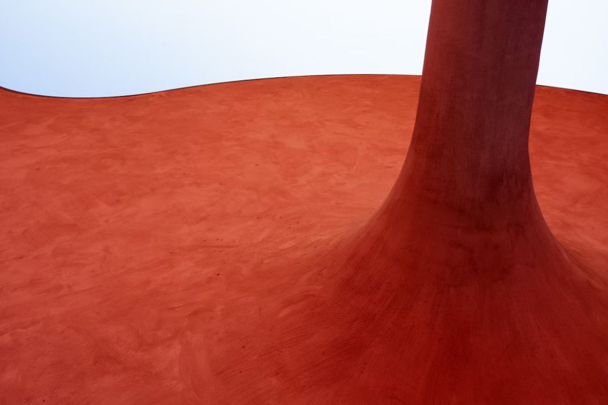
3. Red Terracotta Caldo (Warm Terracotta Red)
A more “earthly” variant of the classic red: less bright, more lived-in. It expresses rootedness, authenticity, materiality. It connects to Mediterranean design, to artisanal ceramics, to the imperfect beauty of nature.
4. Smoky Sage Green (Smoky Sage)
It’s not the usual green. It’s deeper, more sophisticated. It contains a botanical but also urban soul. It is the green of eco-chic renovations, recycled materials, circular design. A color that speaks of rebirth, but with awareness.
COLOR TRENDS 2026: SOFT MIST BLUE
The color of breath and transparency
Why it could be Pantone 2026
Fog blue represents an idea of mental lightness and the need for inner space. In an era where we are increasingly talking about mental health, burnout and digital detox, this soft shade evokes peace, concentration and openness. It is not a classic, rigid or institutional blue: it is a blue that fades into milky grey, delicate like a veiled sky or the calm surface of an Alpine lake.
Trends that support it
-
It is among the most searched for colors on Pinterest in the calming interiors, digital wellbeing and Japandi style categories.
-
Used in skincare packaging and wellness technology (e.g. meditation devices).
-
Present in many S/S 2025 fashion collections, from Loewe to The Row, in satin and padded versions.
Applications in interior design
-
Whitened but not cold walls, ideal for Nordic, minimal environments and therapeutic spaces.
-
Upholstered accessories (armchairs, curved sofas) in powder velvet, increasingly present in furniture salons.
-
Matt resin surfaces, glazed ceramics and etched glass.
Associated mood : emotional security, personal space, gentle minimalism.
COLOR TRENDS 2026: OAT MILK
Gentle comfort, affective design
Why it could be Pantone 2026
We are in the era of “caring design”: designing means creating environments that welcome us, reassure us, help us find balance. Oat Milk is the color that translates all this in a visual way: a shade between cream and light, creamy and luminous sand. It is the color of slow rituals, of conscious breakfasts, of the home as a refuge.
Trends that support it
-
Dominant in soft minimal feeds on Instagram and in updated Japandi collections.
-
Chromatic basis for interior therapy (holistic design method).
-
Highly sought after in textiles, microcements, matt lacquered MDF furniture.
Applications in interior design
-
Open space kitchens and living rooms with warm neutral palettes (Oat Milk + light oak + butter white).
-
Sophisticated total look with material textures: raw cotton, linen, bouclé wool.
-
Perfect as a bridge color to balance more intense or natural palettes.
Associated mood : slowness, warmth, self-care.
COLOR TRENDS 2026: WARM TERRACOTTA RED
The earth under your feet, the house as a root
Why it could be Pantone 2026
In response to global instability, the desire to rediscover authentic contact with matter, with nature, with the human gesture is growing. Terracotta red is a symbol of belonging, but also of restrained passion. It’s not brash, it’s not glamorous: it’s an archaic, dusty, architectural red.
Trends that support it
-
Very strong return in artisanal ceramic collections and porous coverings.
-
Color-icon of Mediterranean, Arab, but also South American design (see the Oaxaca style or the villas of Puglia).
-
Present in the world of fashion as a shade of skin and clay.
Applications in interior design
-
Pigmented walls, terracotta floors, hand-dyed cement tiles.
-
Contemporary rustic accessories: solid wood tables, glazed clay lamps.
-
Mix with warm neutral tones or with raw materials (burnished brass, limestone).
Associated mood : stability, instinct, rituality.
COLOR TRENDS 2026: SMOKY SAGE GREEN (SMOKY SAGE)
Urban botanist, conscious elegance
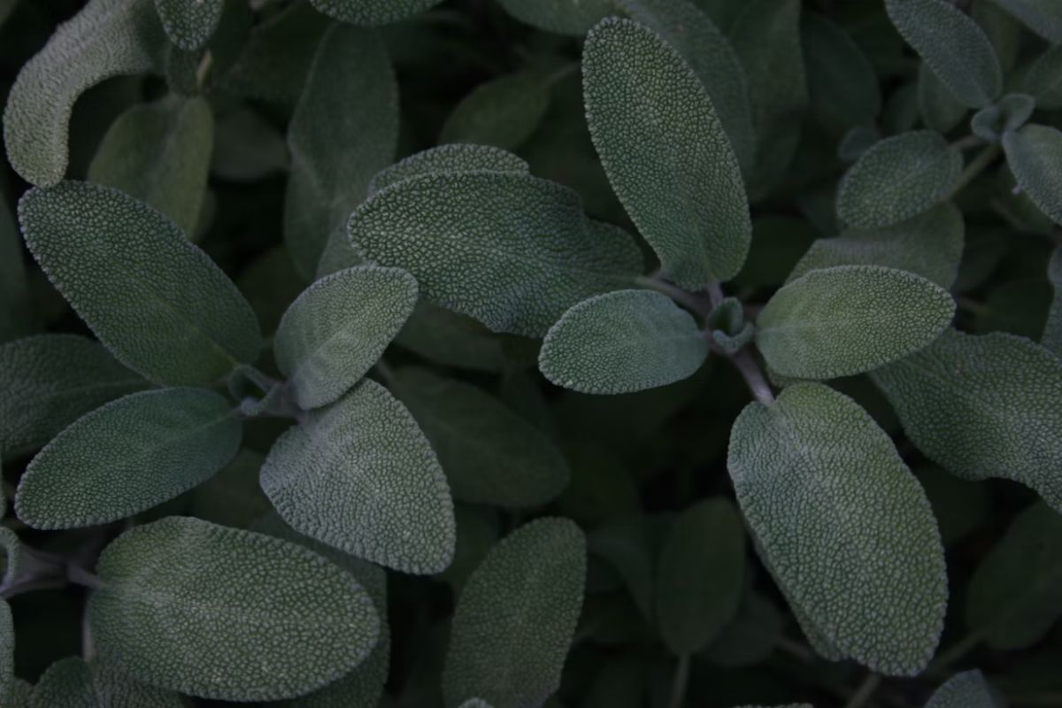
Why it could be Pantone 2026
Green continues to dominate the post-pandemic visual imagination, but Smoky Sage is its most mature evolution. Less greenwashing, more substance. It is neither bright nor too dark: it is that tone of green that can be silent but profound, refined but concrete. His strength is in sobriety.
Trends that support it
-
Seen everywhere in the new outdoor/indoor collections (sofas, textiles, technical curtains).
-
Recurring in updated Nordic design: organic minimalism.
-
Material surfaces based on lime or clay paint.
Applications in interior design
-
Slow luxury environments: enveloping bedrooms, home spas, eco-luxury boutique hotels.
-
Elegant mix with satin brass, green Alpi marble, natural leather.
-
Green-oriented contract projects (medical practices, sustainable co-working, ethical brand showrooms).
Associated mood : awareness, balance, biophilia.
Why Cloud Dancer is a signal (not just a color)
Cloud Dancer is not a neutral white in the banal sense of the term. It is a choice that shifts attention to what really matters in interiors in 2026: matter, light, proportions, quiet .
If you want to delve deeper into the meaning, palette and practical applications in spaces, you can find the dedicated article here: Cloud Dancer: Pantone 2026 white .
We at Archi&Interiors will continue to monitor, explore and talk about the chromatic evolution of society, with an always curious and profound gaze. Whether the blue of the breath wins, the oat milk of kindness, the terracotta of the earth or the sage of rebirth… 2026 will certainly be a year to observe in color.
FAQ Pantone 2026: Cloud Dancer
What is the Pantone 2026 color?
It is PANTONE 11-4201 Cloud Dancer , a soft, atmospheric white.
Is Cloud Dancer a cool white?
It is not an optical white: it works better if combined with warm materials and material textures (light woods, linen, light stones).
What colors does Cloud Dancer match with in 2026?
Warm neutrals (oat milk/cream), milky blues, dusty sage and satin metals.
How to use it on walls without a “clinical” effect?
Choose matt/material finishes and add soft contrasts (wood, textiles, non-shiny metals).