In 2026 the 2016 trend is literally invading social media and beyond. It's everywhere: in the reels, in the filters, in the pop references, in the palettes that return to circulation as if they had been dormant for ten years. And when a year returns with this insistence, the same thing always happens: first …
In 2026 the 2016 trend is literally invading social media and beyond. It’s everywhere: in the reels, in the filters, in the pop references, in the palettes that return to circulation as if they had been dormant for ten years. And when a year returns with this insistence, the same thing always happens: first it seems like a platform game, then it becomes cultural language .
In the editorial office, at a certain point, we realized it: 2016 was not only falling within digital aesthetics. He was also entering into interior design . As? With a precise lexicon: more colour, more matter, more scene; interiors that are less perfect and more lived-in, more expressive, more dense.
For this reason we decided to stop and observe the phenomenon with the lens that really interests us: the domestic space . Because the world of design, faced with such a powerful return, does not hold back: it absorbs, interprets, translates. And it does so by transforming a trend born online into very concrete choices finishes, lights, patterns, iconic objects, and a new desire for visible comfort.
But beware of the misunderstanding: 2016 is not “just” millennial pink and instagrammable sets. It was also the time when many houses started to move away from cold minimalism towards a warmer and more personal idea: controlled maximalism , statement patterns , jewel tones , black as new neutrals , tactile materials that ask to be experienced (not just looked at).
And then the question, for those who deal with interiors, becomes inevitable: what is really coming back from 2016 – and how can it be recognized today inside the home, without cosplaying an era?
We will tell you about it in this article.
Where does the 2026 is the new 2016 trend really come from
Nostalgic trends never explode by chance: they almost always have a recognizable grammar. A temporal pretext (which makes the memory activable), a platform trigger (which transforms it into format), and an emotional reason (which makes it contagious).
In the case of the 2016 return, the pretext is as simple as it is effective: a decade has passed . Ten years is the perfect distance to transform a recent era into myth: close enough to be recognisable, far enough to be rewritten. But the real spark is not the calendar. It’s the platform.
Between the end of 2025 and the beginning of 2026, a story takes shape on TikTok that we could call a “cultural reset”: the desire to return to an internet perceived as more spontaneous, less polished, less constructed. It is also a reaction – explicit or underground – to the saturation of hyper-curated content and the sensation of living in a continuous flow of “perfect” and replicable aesthetics. In this context, 2016 becomes a powerful shortcut: a label that condenses a mood even before an aesthetic.
This is where nostalgia stops being a private memory and becomes a collective movement . It’s not (just) posting an old photo: it’s putting a precise imagery back into circulation – filters, more aggressive colours, deliberately “poor” definition, more naive but shared memes, away of being online that seems less performative. Various journalistic reconstructions have noted how, within a few days, searches, hashtags and filters linked to “2016” began to grow rapidly, and how the trend was adopted not only by users, but also by creators and well-known faces: a typical sign of when nostalgia stops being niche and becomes mainstream language.
The emotional reason is the most delicate part – and also the truest: we don’t regret 2016 as it was, we regret how it made us feel . The narrative selects the “emotional tone” of that year: an internet remembered as less fragmented, less aggressive, more communal. And this idealization also works because 2016 is often perceived as the “before” of some fractures that have changed the digital and cultural climate: the pandemic, the intensification of algorithmic life, the acceleration of social performativity.
So yes: the trend was born online. But it doesn’t stay online. When a nostalgia becomes so shared, it soon demands a translation into concrete languages: fashion, music, visual aesthetics and, inevitably, home . Because interior design is always a cultural barometer: it absorbs the desires of the present and transforms them into matter, color, light, objects. And at that point the question becomes inevitable: how do we recognize “2016” within interiors today – without turning it into a caricature?
Why this nostalgia ends up inside the interior (and why it concerns us)
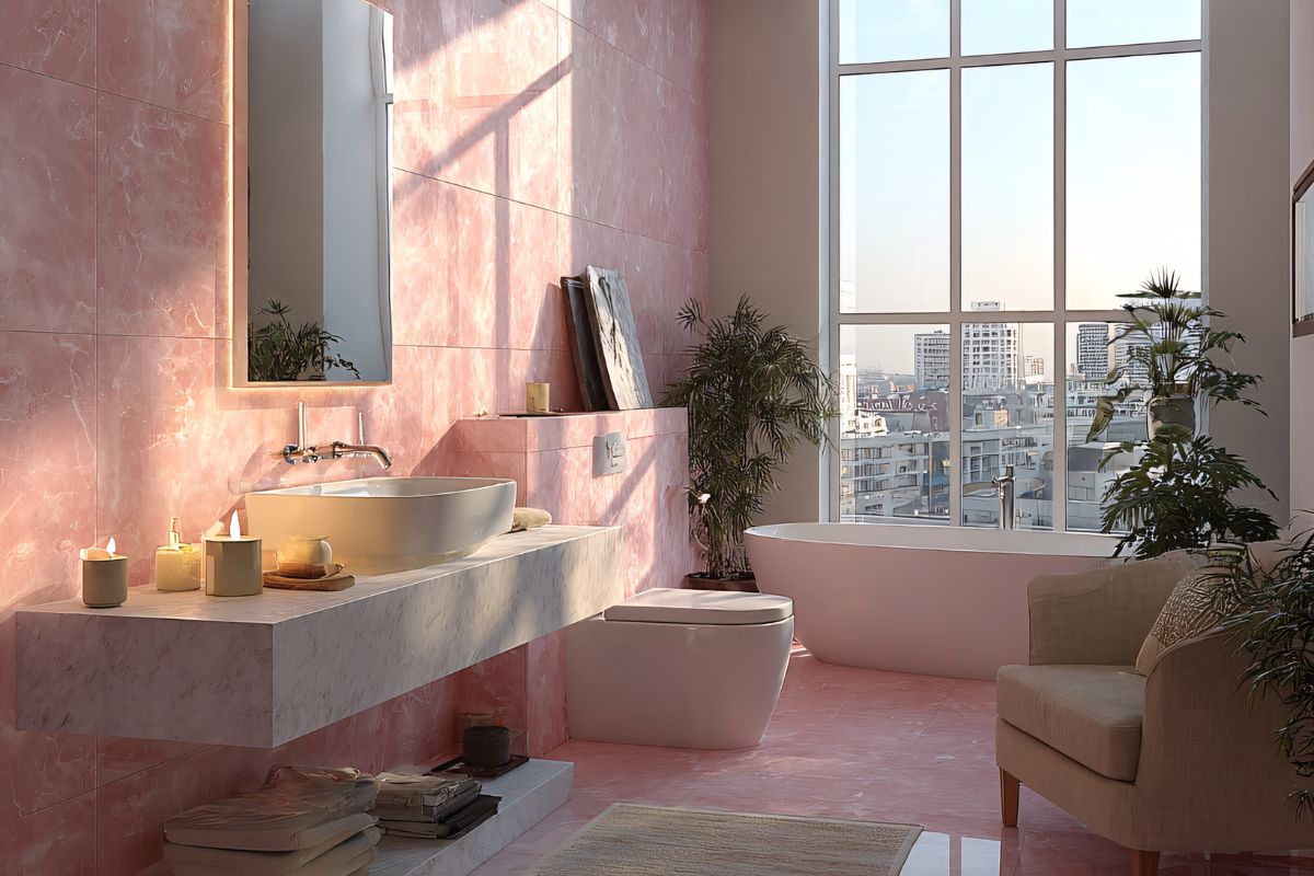
At this point the question is not is 2016 coming back?, but: which version of 2016 are we importing into the world of interior design? If the 2016 era is remembered as “lighter” and less draining on social media, that lightness was then also reflected in the interiors maximalism and color saturation , jewel tones, declared patterns, and the return of a more expressive idea of ??home. The millennial pink “case” also falls within this narrative, read not as a chromatic quirk but as a cultural signal (spaces such as The Wing, the imaginary Instagram, and even the double Color of the Year Pantone 2016: Rose Quartz + Serenity).
And it is here that, in the ArchieInteriors editorial team, we stopped to think: if the trend is a return of the 2016 atmosphere (freer, denser, more courageous), how does it translate into the lexicon of 2026 interior design without becoming a caricature? The analysis of signals in the home starts from this question – palettes, patterns, mood lighting, re-edited icons, statements in the kitchen – and above all the rules for doing it well.
How to recognize the 2016 trend inside the home today
When 2026 is the new 2016 enters the interior, it does not do so as a literal quote. It is not a collage of objects “from that year”. It is rather a return of design attitude : the house stops being merely tidy and returns to being expressive . Return to indulge in density, color, atmosphere. And above all, go back to choosing.
Color: jewel tones and saturated palettes, but with maturity
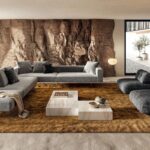
The first signal is the end of neutral as an automatic response. jewel tones return petrol, plum, ruby, forest green and do so differently than the more ingenious revivalsnui: not as a decorative “accent”, but as backgrounds that build identities .
They are colors that do a specific thing: they give depth. In an era of fast images, saturated color restores weight and permanence: a room no longer seems temporary, but decisive .
Pattern and decor: walls speak again
2016 was one of the turning points in which minimalism began to lose its monopoly on good taste. Today that same push returns with more control: wallpaper, textures, material surfaces, light paneling, important prints.
It is not an invitation to accumulation: it is a return of the wall as a narrative element. The house no longer wants to be just “clean”. He wants to have pace .
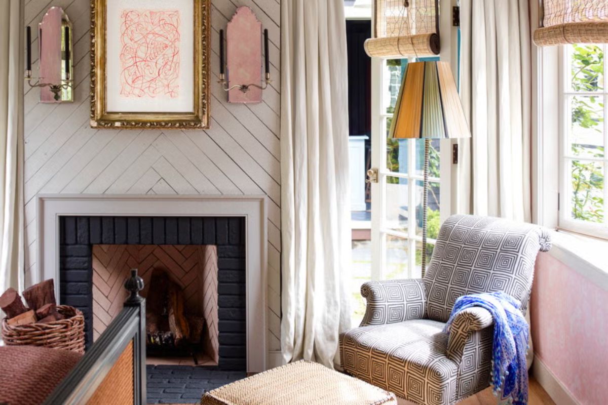
Millennial pink: not a color, a cultural code
Pink in 2016 wasn’t just a pretty color: it was a signal. He said that the interior could be professional and pop, serious and soft at the same time. In 2026, that vibration often returns in more sophisticated variations: dusty rosés, earthy blushes, warm nudes.
The difference is fundamental: it is not sugar. It is temperature . It is a shade that humanizes metals and stones, softens severe lines, and brings a non-naive idea of ??optimism to the interior.
Mood lighting everywhere: light becomes mobile
Here the trend becomes almost technical: light enters forcefully as an atmosphere, not as a system. Portable, rechargeable lamps, widespread light points: the house no longer has just one scene. It has many, and they change with the hours.
It is one of the most contemporary signs of the “2016 return”: light is no longer an invisible infrastructure. It’s a daily gesture. A way of living.
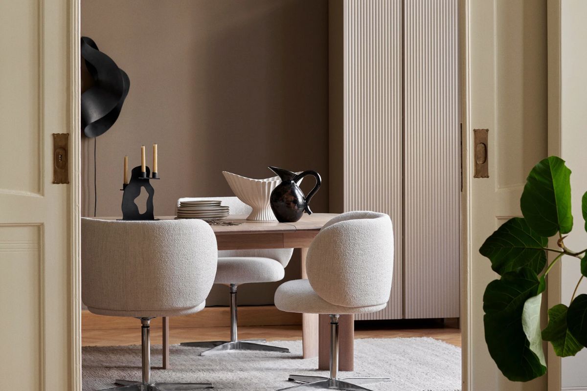
Re-edited icons: history made domestic
Another clear symptom is the growing demand for recognizable objects: re-editions, new finishes, smaller formats, color variations. Design comes back to say: I don’t just want something that works; I want something that tells .
This is not sterile collecting. It is a desire for an interior with memory and with a point of view.
Statement in the kitchen: the appliance becomes a signature
Finally, the kitchen. In 2016 the idea of ??the “invisible” household appliance began to coexist with its opposite: the object that shows itself. In 2026 we see it even more clearly: exposed pieces, colours, finishes, accessories as aesthetic choices.
The kitchen returns to being front stage : social, identity, representative place. And when even the useful becomes beautiful, you understand that you are not talking about decor. You’re talking about the culture of living.
2016 nostalgic in the interior designer: the golden rules for doing it “well” in 2026 (without cosplay)
The border between revival and caricature is played on a word: editing . 2016 is part of it, yes, but it only works if you translate it with today’s sensibilities.
1) Only one statement per environment, then it’s directed
Choose a real protagonist (a wall, a seat, a lamp, a sculptural piece) and let the rest support it. Multiplying strong pieces creates noise, not personality. In 2026, excess is no longer “cool”: it creates visual disorder.
2) Full color, but in mature materials
Contemporary color should appear incorporated, not applied. Velvets, wools, dark woods, stones, satin metals: the palette comes back strong when supported by the material. This is how the 2016 aesthetic becomes adult: less filter, more substance.
3) Portability as contemporary luxury
Mobile light, small functional but beautiful objects, elements that move with you: today’s home is constantly changing scenes. Portability is not a gadget: it is a smarter way of inhabiting hybrid spaces (work, break, evening, guests) without stiffening the interior.
4) Controlled contrast: full and empty must coexist
2026 maximalism is not accumulation. It’s composition. Patterns and calm zones, deep saturated and neutral tones, rich materials and breathing surfaces. A house can speak, but it must also know when to be silent .
10 design products launched in 2016 that explain the return better than a thousand moodboards
1) Muuto Outline Sofa (Anderssen & Voll, 2016)

The sofa that taught Nordic minimalism to be warm : architectural profile, but true comfort. In 2016 Muuto presents Outline as a new chapter of “quiet” but central elegance in the living room.
2) ferm LIVING Herman Chair (Herman Studio, 2016)
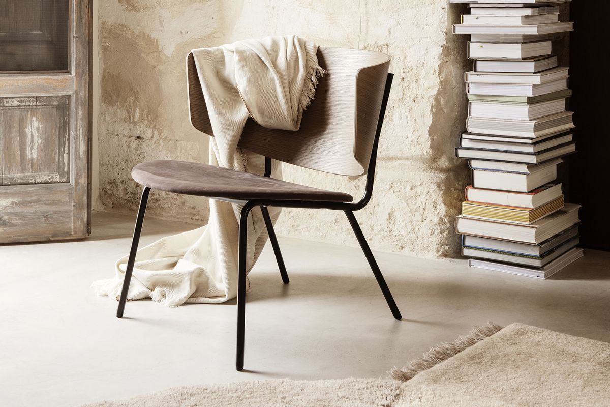
An instant classic because it doesn’t scream: gentle proportions, wood/texture that looks good anywhere. It is one of those pieces that made mainstream a certain Danish way of understanding the home: sober, but not cold.
3) Vitra APC All Plastic Chair (Jasper Morrison, 2016)

Serious plastic: not cheap, not toys. Morrison updates the archetype of the wooden chair in a technical, practical and resistant way. Vitra clearly dates it 2016 .
4) Louis Poulsen Panthella MINI (Verner Panton, launch 2016)

Here nostalgia becomes strategy: a historical icon falls on a more domestic and collectible scale. Louis Poulsen talks explicitly about the 2016 launch of the Panthella MINI (with colored metallic lampshades).
5) Kartell Lantern (Fabio Novembre, 2016)

Portable, rechargeable, transparent: it is one of the pieces that anticipate “putting the light where it is needed”, not where the cable passes. November signed for Kartell in 2016 .
6) Kartell Piuma (Piero Lissoni, 2016)

2016 is also technology disguised as lightness: Piuma is very thin, almost impossible, yet industrial. Presented as a novelty for 2016 (and described during that Salone season).
7) Flos Captain Flint (Michael Anastassiades, 2016)

Marble base, essential stem, adjustable cone: it is the “brass + stone + silhouette” grammar that dominated half the decade. In 2016 Captain Flint is already described as a new retail availability and immediately becomes a recognizable signature.
8) Audo Copenhagen (ex MENU) JWDA Pendant (Jonas Wagell, 2016)
The pendant was born as an evolution of the table JWDA (which had arrived shortly before), but in 2016 it took off and defined a new idea of “soft industrial”: opaline, brass, primary shape.
9) Smeg x Dolce&Gabbana Art Refrigerators (FAB28, April 2016)
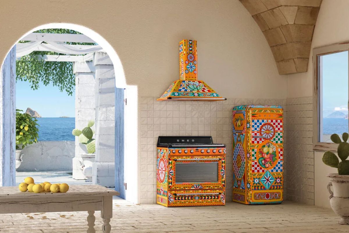
In 2016 the kitchen stops being just functional: it becomes an identity setting. Dolce&Gabbana talks about the collaboration with Smeg dating it April 2016 : numbered pieces, hand painted, appliances as applied art.
10) Magis Officina Chair (Ronan & Erwan Bouroullec, 2016)

A return to the honesty of the materials (wrought iron, “workshop” sign) but with contemporary elegance. Magis clearly indicates it as a project 2016 : perfect to explain why today a certain controlled roughness is included.
Nostalgia in 2016 in interior design: questions and answers
Is millennial pink really coming back in 2026?
It returns above all as an idea : a colour-symbol of cultural optimism and more expressive interiors. Not necessarily identical, often deeper and less “sugary”.
What is the difference between 2016 maximalism and 2026 maximalism?
In 2016 it was often visual euphoria. In 2026 it works when it is looked after : more quality, more selection, less accumulation.
Which 2016 objects are still relevant?
Those that do not depend on the color of the moment: sofas with the right proportions, archetypal seats, portable lights and intelligently re-edited icons (Outline, APC, Panthella MINI, Captain Flint).