In recent years, the evolution of living habits has led the kitchen to move away from its traditional role to take on a hybrid identity: technical and convivial, operational and scenographic, increasingly integrated with the living room. In this new context, choosing color means coordinating volumes, materials, textures and proportions with a logic that is …
In recent years, the evolution of living habits has led the kitchen to move away from its traditional role to take on a hybrid identity: technical and convivial, operational and scenographic, increasingly integrated with the living room. In this new context, choosing color means coordinating volumes, materials, textures and proportions with a logic that is no longer decorative, but architectural . This is what distinguishes a well-designed composition from a kitchen that, after a few months, appears “already dated”.
The answer to the question ” which color to choose for the kitchen? ” cannot be universal and for this reason it is interesting. Some shades work because they amplify the light, others because they order the space; certain shades make the materiality of the wood or stone perceptible, others still define a more sophisticated character without overloading the environment. International research on color trends, crossed with observation of the best Italian projects, shows recurring patterns: neutral palettes that evolve towards warmer temperatures, soft greens that stabilize the space, desaturated blues that visually clean the scene, dark shades that acquire value when the project is mature.
This guide was born from here: from the idea that color, in the kitchen, is not an aesthetic gesture but a strategic decision , capable of influencing comfort, visual order, durability and above all the identity of the space. Not a passing trend, but a technical choice with concrete repercussions on the quality of living.
Which color to choose for the kitchen?
When an architect chooses the color for the kitchen, he does not choose a shade: he chooses a behavior of the space. The colour, in a kitchen, determines how the gaze flows over the surfaces, how the shadows shape the worktops, how the materials interact with each other. It is a choice that defines atmosphere, operation, visual duration. The question, therefore, is not what is the most beautiful color for the kitchen?
The correct question is: Which shade allows this kitchen, in this context, with this light, to function in the most intelligent way possible? Only in this way does color become a design tool, not an aesthetic preference.
The kitchen is not a room: it is a color system
Before analyzing the shades, it is useful to remember that the contemporary kitchen is an organism in balance between:
-
natural and artificial light
-
reflective and absorbent materials
-
horizontal and vertical planes
-
visual rhythms and full/empty
-
relationship with the living room (in open spaces it is fundamental)
Color is not a covering: it is the mediator between all these elements.
A sage green can work in a north-oriented kitchen but be dull in a south-facing open space; a warm white can be bright in the morning and too soft in the evening; a matte black can be stunning on a center island but claustrophobic on a culinear china in a small apartment.
For this reason, color in the kitchen must be evaluated as a material. It should be observed in relation , not in the abstract.
The colors that an interior architect really chooses in the kitchen
1. Warm white: the invisible structure of space
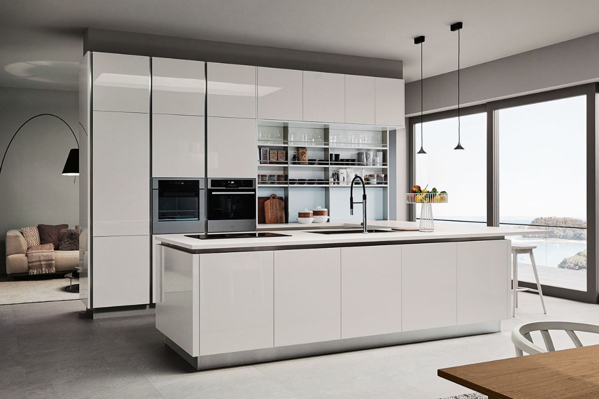
It is not a pure white. It’s not a brochure white. It is a “breathing” white, often with shades of milk, ivory, butter, almond.
Why an interior architect chooses it:
-
opens the space without making it sterile
-
reflects light softly
-
does not interfere with stones, wood, steel
-
allows the design geometry to emerge
Warm white is an invisible grid that allows volumes, shadows and materials to become protagonists.
It always works when the objective is not to “decorate”, but to elevate the kitchen as architecture.
2. Sage green (and gray greens): the color that regulates the visual rhythm
It’s not a trend.
It is a design response to the most complex need of contemporary cuisine: finding order in daily dynamism.
Sage green:
-
stabilizes the gaze
-
dampens the visual noise of objects
-
creates a natural backdrop to organic materials
-
reduces the impact of large volumes
In a kitchen open to the living room, it is one of the most intelligent colors: it unites, harmonizes, calms .
It is the color of “elegant living”, not of “cold minimalism”.
3. Greige, sand, dove grey: the neutrals that are not neutral
The kitchen needs a chromatic base that is neither fragile nor intrusive.
The pure gray of the 2000s no longer works: it is cold, detached, not very coherent with contemporary materiality.
Current neutrals are calibrated to light :
-
silky greige
-
desaturated sand
-
dove gray with a hint of rosé
-
light cappuccino
Why they are the ideal colors for the kitchen and they work so well:
-
interact with the skin of steel appliances
-
enhance the design of natural stones
-
make the environment more sophisticated without dominating it
-
convey visual warmth, not monotony
They are adult, mature, deep colours.
Colors from the project, not from the catalogue.
4. Dusty and desaturated blues: perceptual cleanliness
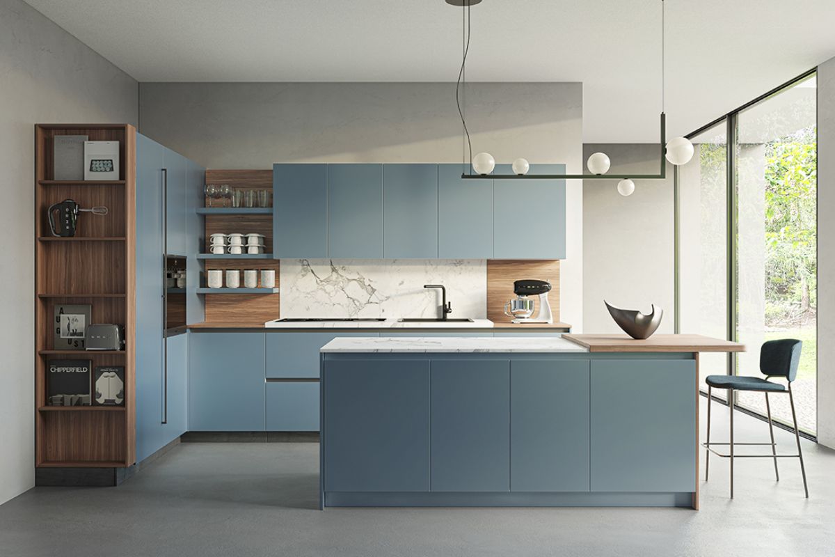
Blue, in its desaturated version, is one of the most technical coloursfor the kitchen.
Not because it calls for hygiene – a cliché to avoid – but because it organizes the look .
In architecture this type of blue:
-
generates a sense of visual order
-
reduces gaps between shelves and wall units
-
allows you to use light wood and warm stones without conflicts
-
maintains brightness even where white would be excessive
It is the perfect choice for those who want a kitchen that “breathes”. It’s a color that isn’t very noticeable, but works a lot .
5. Matte black, carbon, graphite: the colors that sculpt
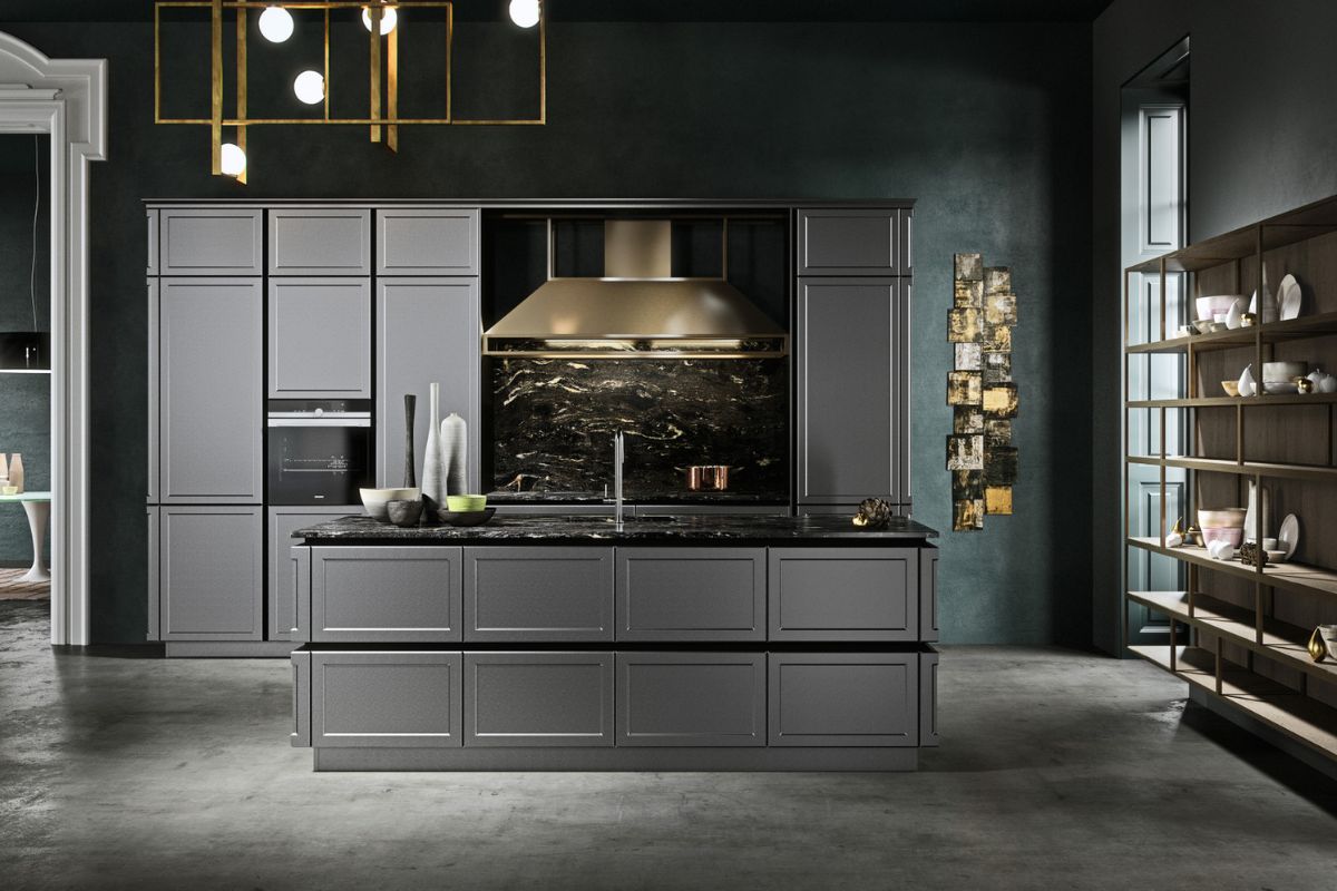
Black is not a color: it is an architectural act. In the kitchen it must be dosed with surgical precision. Works when:
-
the room is large
-
there is an abundance of natural light
-
the volumes are clear and well proportioned
-
the materials are material (dark stones, smoked woods, satin steels)
Black sculpts. Reduces visual noise. It makes the kitchen an architectural object. Not a piece of furniture, but a volume. It’s a beautiful choice, but requires expertise .
Colors to be treated with caution (not because they are “wrong”, but because they are unstable)
What are the least suitable colors for the kitchen and why?
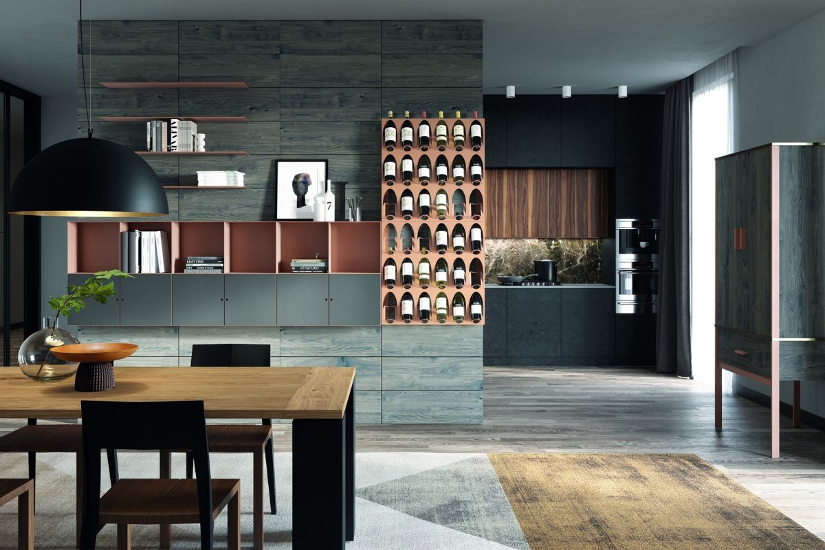
Strong reds, oranges and yellows
The problem is not liveliness. The problem is the visual rhythm : these colors interfere with the perception of the food, with the continuity of the open space, with the balance of the technical surfaces.
An architect uses them:
-
in micro-details
-
in seating, accessories, accent walls
-
never as a predominant basis
They are micro-narrative colours, not structure colours.
How an interior architect really chooses the right color for the kitchen: professional criteria
A designer evaluates the color of the kitchen considering:
1. The light
-
exposure
-
width of windows
-
height of wall units
-
artificial light temperature
2. The relationship with the living room
The kitchen is no longer isolated: it must communicate with the living room.
3. The materials
Each material asks for a different color:
-
light wood requires desaturated tones
-
the veined stone requires stable neutrals
-
steel calls for warm colors to balance
4. The visual rhythm
Color must make the voices worklights:
-
if too many, neutrality is needed
-
if few, character is needed
5. Perceptual duration
The kitchen doesn’t change every three years.
The color must psychologically stand the test of time.
The color suitable for the kitchen is not an aesthetic choice, but a studied design gesture
Choosing the color of the kitchen means intervening on the perception of space, on light, on materiality, on the relationship between daily gestures and volumes. A warm white can make a kitchen a place of luminous calm. A sage green can transform it into a natural and stable space. A warm greige can give her visual maturity. A dusty blue can restore order and depth. A matt black can make it become pure architecture. Beauty comes later. First comes the chromatic functionality of the space.
Because in the kitchen – more than in any other environment – color is not decoration. It’s a project.