Every era has its colors, and the walls of the houses are the most faithful thermometer. In the wall color trends of 2026, color becomes an act of self-narration. After years of global uncertainty and emotional minimalism, people are looking for interiors that protect but also inspire, spaces that stimulate creativity and create sensory comfort. …
Every era has its colors, and the walls of the houses are the most faithful thermometer. In the wall color trends of 2026, color becomes an act of self-narration. After years of global uncertainty and emotional minimalism, people are looking for interiors that protect but also inspire, spaces that stimulate creativity and create sensory comfort.
International observers speak of chromatic shift , a transition towards colors that tell stories: from soft shades that envelop, to sharp contrasts that energize. Pinterest records a double-digit increase in searches related to “accent wall” and “color blocking interiors”, while market reports indicate a +20% increase in sales of decorative paints compared to 2024.
From neutral palettes to chromatic cocooning
The transition is clear: if the first post-pandemic years were characterized by neutral and silent spaces, today color returns to shine on the walls. Designers talk about chromatic cocooning , the use of deep, warm colors to transform rooms into true emotional refuges.
It’s not just a change in taste: it’s a response to a society that lives more time at home, works in smart working and feels the need for spaces that speak to the mind and body. The decorative finishes become more material, tactile, capable of modulating the light and changing perception of the environment throughout the day.
1. Eucalyptus green: the color of well-being
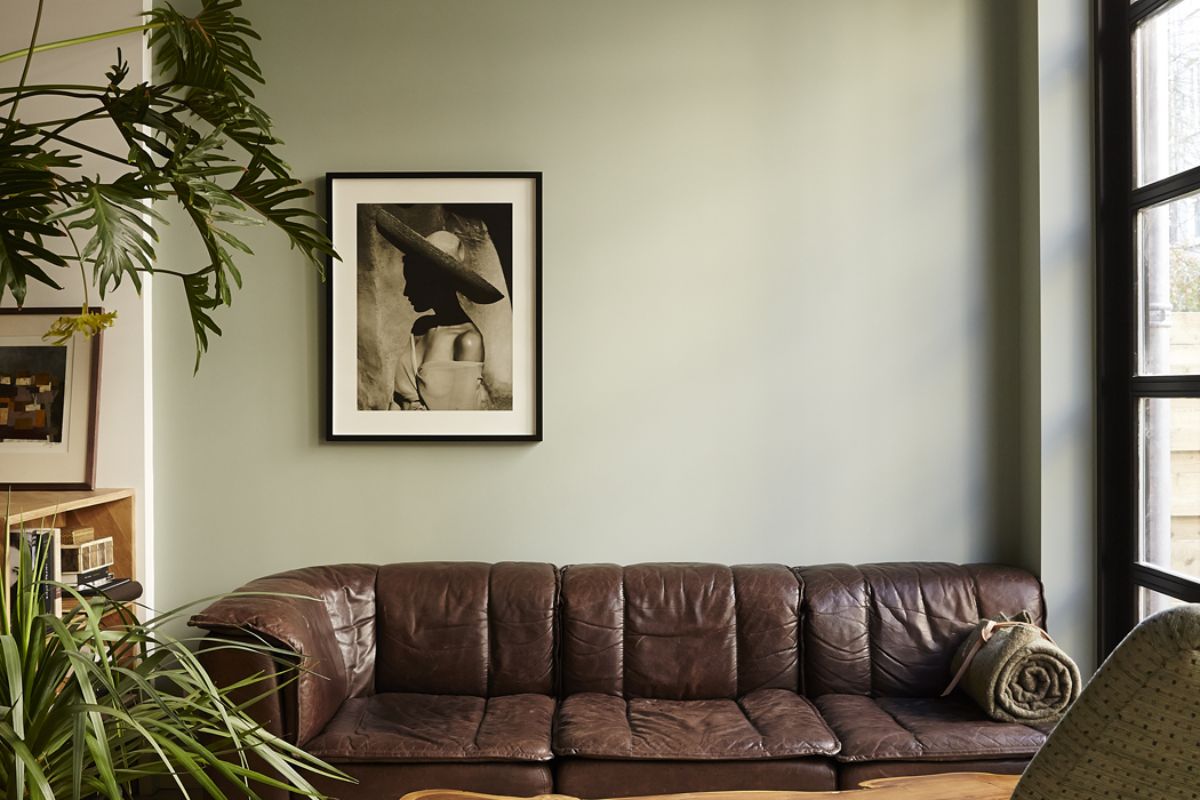
Green in all its shades eucalyptus, sage, myrtle is the symbolic color of 2026. It speaks of connection with nature and the desire for balance. Market research indicates that green tones are present in over a third of mid-to-high-end interior designs, especially in living rooms and bedrooms.
This shade works for entire walls or accent areas, and is perfect when combined with natural materials, stone, light wood. It is not just a choice of style, but a message of continuity between inside and outside, consistent with the growth of biophilic design.
2. Terracotta and muted reds: roots and intimacy
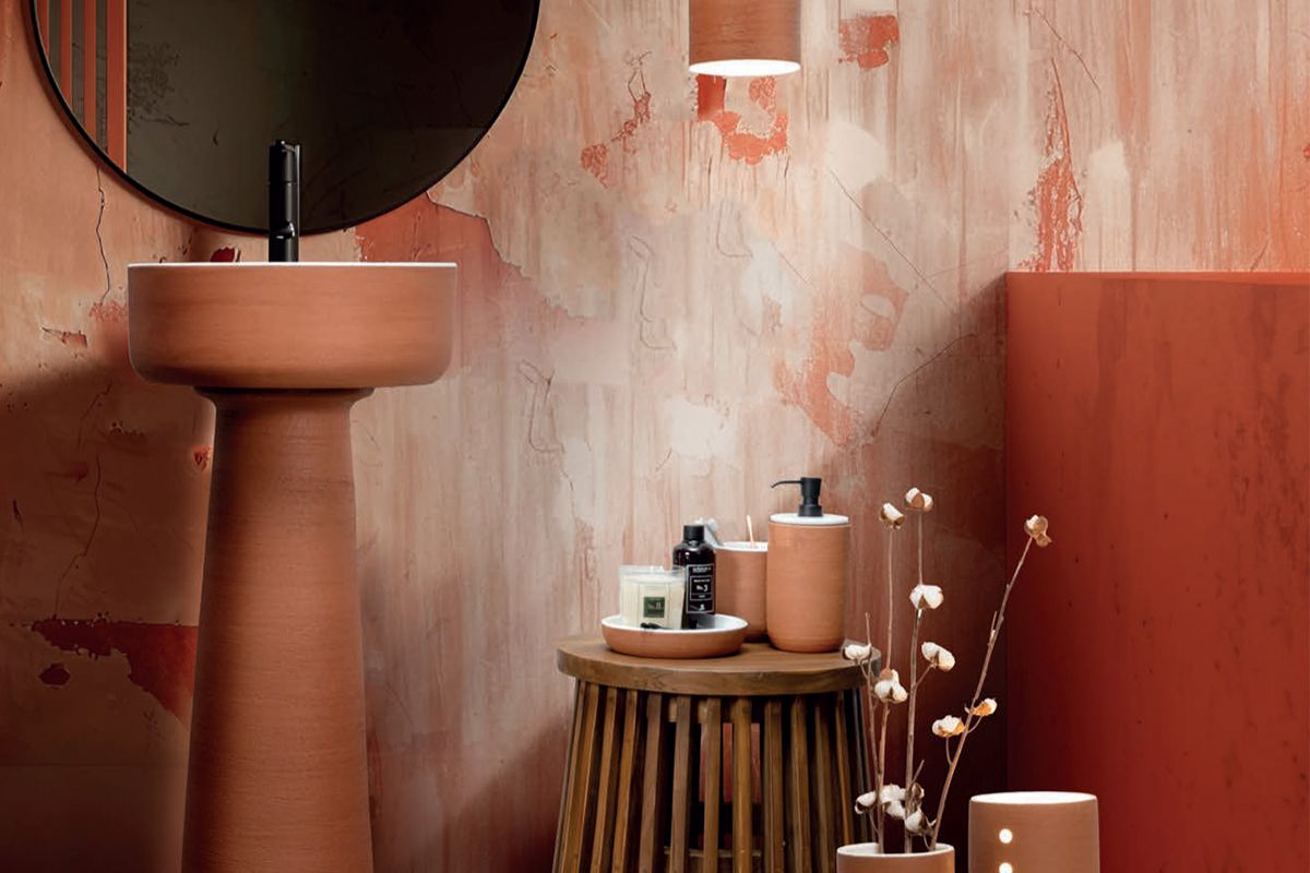
Earthy tones return as protagonists, bringing a sense of roots, warmth and craftsmanship into homes. From terracotta to coral, from burnt reds to rust shades, these palettes evoke a return to origins and are combined with material surfaces, terracotta, glazed ceramics and raw fabrics.
It is a response to digitalisation: an “earthly” color that reconnects to the senses and brings stability. Industry analyzes show constant growth in sales of “warm clay” and “rust” colors, especially in kitchens and dining areas.
3. Evolved neutrals: the new white
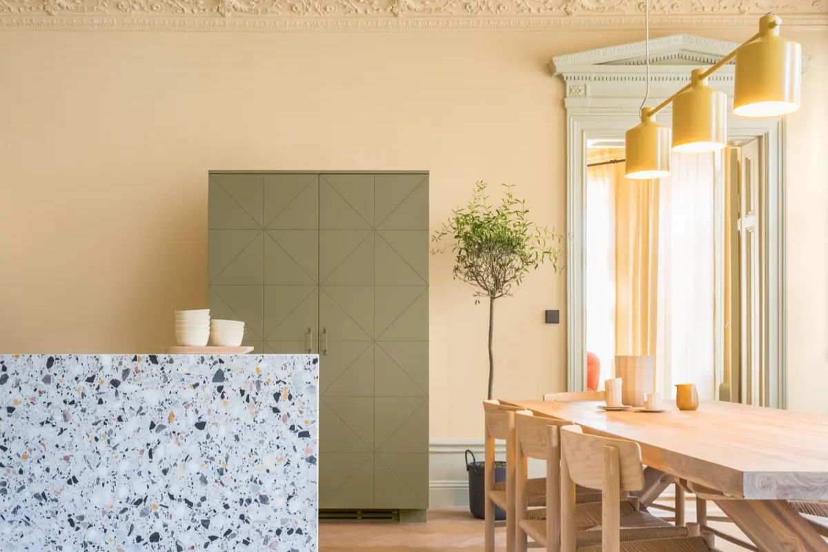
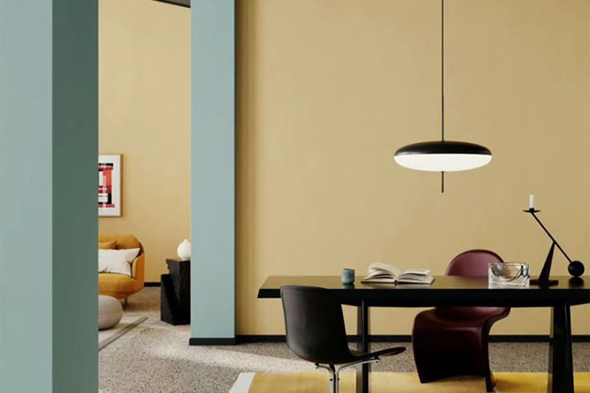
Neutrals do not disappear but transform. Pure white gives way to more enveloping shades: ivory, butter white, sand beige. These shades still represent around 40% of interior color choices, but today they have warmer and less hospital undertones.
They are the ideal base for welcoming chromatic accents or for experimenting with decorative finishes and tone-on-tone boiserie. They work well to create spaces that convey calm but are not anonymous.
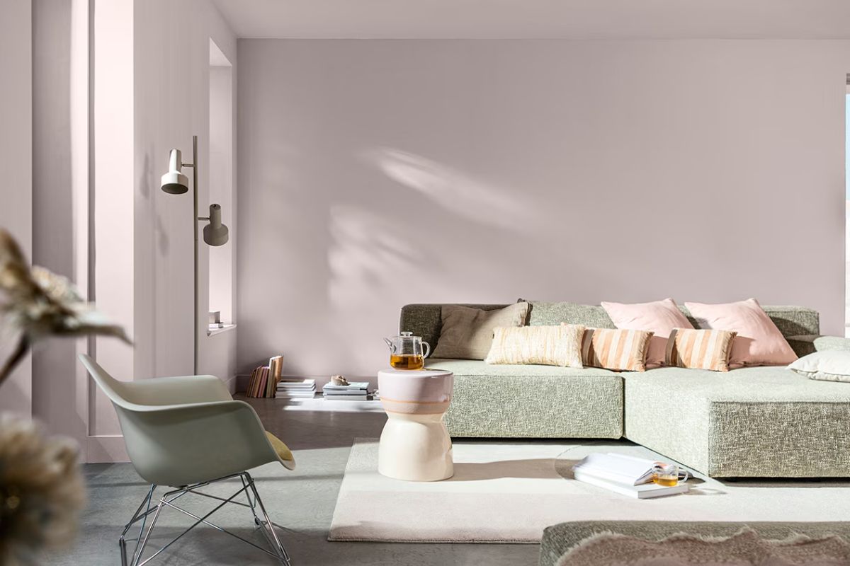
4. Powder blue and petrol blue: the noova sobriety chic
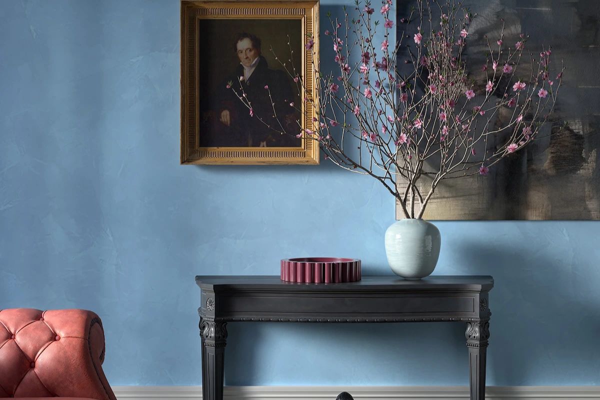
Blue remains one of the most popular shades for walls. In 2026, the dusty and velvety versions are preferred for a refined and relaxing effect, or the petrol and teal variations for a more scenographic impact.
Pinterest reports a +50% of searches for “powder blue walls”, while industry magazines anoint it as the color of new kitchens and sophisticated living rooms. It is the perfect choice for those who want to combine elegance and introspection, visually expanding spaces.
5. Color blocks and geometries: walls as installations
More and more designers are proposing color block solutions and pictorial geometries: arches, diagonal bands, two-tone walls. It is a language that appeals especially to younger people because it allows you to radically change the impact of a room without structural interventions.
This trend is linked to the need for creativity and experimentation: the home becomes a chromatic laboratory in which one can dare with new contrasts.
Texture, light and sustainability
It is no longer just a question of color, but of materiality and light . The surfaces become scenographic sets that change during the day: lime, cement, sand or metal effect finishes that absorb or reflect the sun’s rays. The demand for sustainable products is also growing: over 60% of paint requests today concern low VOC paints and bio-based ingredients.
Sociology of color
The return to warm, natural palettes is a collective response to a period of uncertainty. Butter yellows, terracottas and deep browns bring positive energy; greens promote concentration and meditation; blues lower stress levels. The walls therefore become instruments of well-being, capable of influencing mood and productivity.
Walls as a life setting
2026 marks a turning point: walls are no longer neutral backgrounds but become protagonists of a more conscious interior project. Whether you choose an immersive eucalyptus green palette, an elegant powder blue or a bold color block, the choice of color is today an identifying and strategic act.
More than following a trend, it is about creating a personal and lasting scenography , investing in quality products, material finishes and sustainable choices. Because home is not just the place where we live, but the most intimate representation of who we are.