The Art Déco style is the origin of an aesthetic that has been able to pay homage to modernity with an elegance that is still unsurpassed. Born in the 1920s as a reaction to the organic flow of Art Nouveau, Déco transformed geometries and materials into a precise grammar of prestige, capable of crossing oceans and decades without losing strength or relevance.
It is the first fully international expression of modern design: from New York facades to Parisian tea rooms, from ocean liners to the nascent film industry. But while the world was racing towards progress, Art Deco married the avant-garde with an artisanal taste, combining rigorous lines with exotic materials, mirrored surfaces with full volumes, without ever losing contact with the sense of the sublime.
Today, after years of exasperated minimalism, Art Déco returns to speak the language of desire: a desire for material, for detail, for visual identity. But he does it with a new awareness. In contemporary Italian projects, it is no longer ostentation that guides it: but knowing how to dose – a measured use of brass, a calculated glossy boiserie, a geometric carpet capable of lighting up an entire living room.
Abroad, however, there remains an immediately recognizable code to communicate exclusivity (think of the boutique hotels in Miami Beach or the residences in Midtown Manhattan), but even in the new buildings of Dubai or Doha, we find it sedimented in the lobbies, in the panoramic restaurants, even in the spas.
If we look at market trends, it is clear: what returns from Déco is not a decorative nostalgia, but the need – strong and current – for a luxury that can be narrative, tactile, tailor-made . And it is precisely here that today’s interior design meets its most refined challenge: reinventing Art Deco without imitating it, internalizing its logic without replicating its form.
Materials that tell a story: Deco beyond gloss
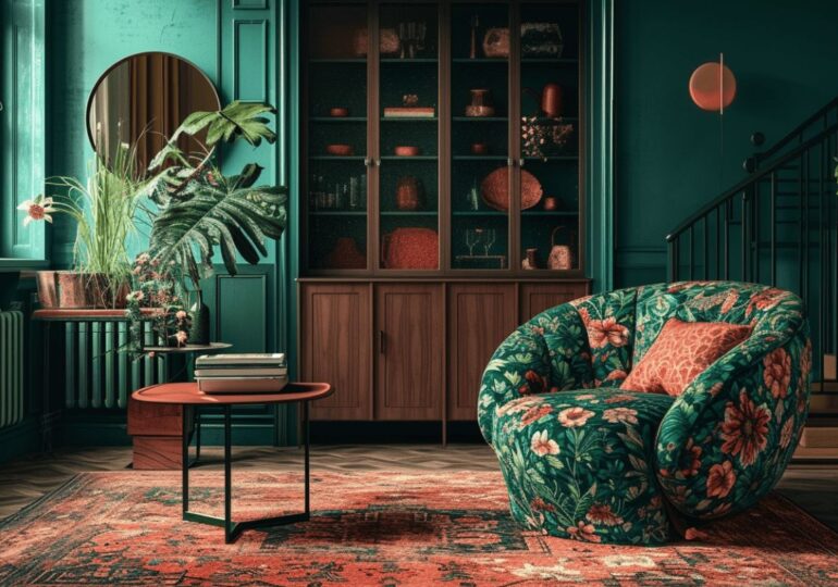
The material language of Art Déco is not limited to shine: it tells stories. It’s not enough to say “brass and velvet”: you have to know how to lay them , balance them, contextualise them. And today, in the panorama of contemporary interior design, what really defines an interior as “Déco” is not the material itself, but the relationship between geometry, tactility and light .
-
Brass: from protagonist to accent
If in the 1930s metal was seen as a pure symbol of modernity, today it returns with a sophisticated patina. Brushed, satin, slightly darkened: never too shiny, never brand new. In Italy, ateliers that work brass by hand are experiencing a renaissance, starting with companies such as De Castelli and Ghidini 1961. Abroad, names such as Apparatus or Lambert & Fils reinterpret brass with plastic compositions that Ruhlmann would have liked.
-
Dark woods and boiserie: the return of volume
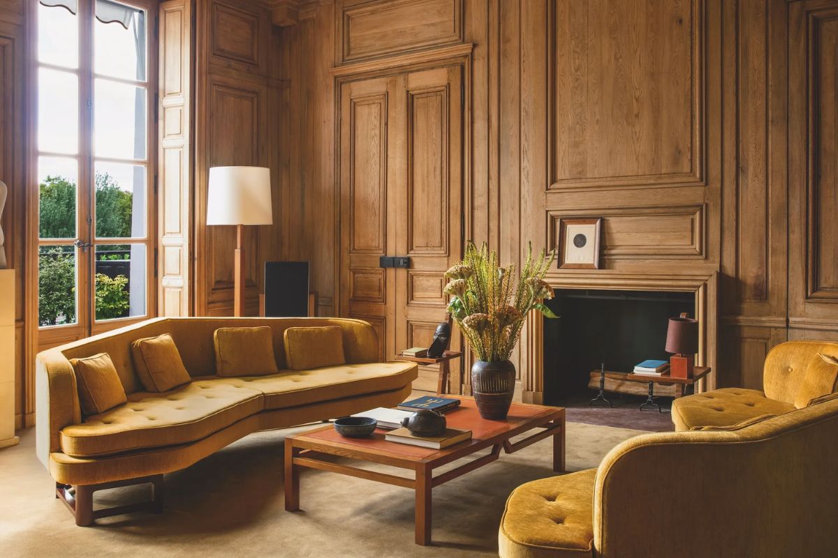
Macassar, Canaletto walnut, coffee-stained ash: the new Déco aesthetic welcomes dark wood as depth rather than as ornament. It is chosen not to be “antique”, but to contain the light . The boiseries become architectural frames, supports for the lightgrazing ce, elements that design the space before they even decorate it.
-
Grooved glass and opaline: surfaces that filter
Among the strongest trends of the last two years, fluted glass is one of the most explicit Deco references, used to separate without dividing, shield without closing. It matches with lamps in opaline or layered frosted glass: a balance of light diffusion and geometric refraction.
- Marble: fewer veins, more narrative
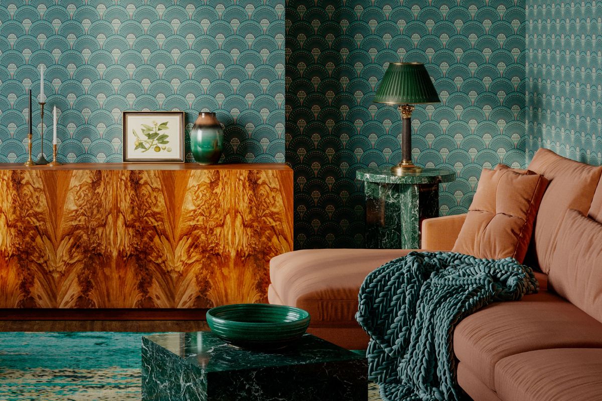
Veined white? Passed. Today the Deco soul manifests itself in Guatemalan green , in Levanto red , in shiny Portoro: marbles that convey luxurious geological complexity, often designed in geometric inlays or large backgrounds.
In all this, one thing is certain: the new Art Déco does not seek “instagrammable” richness, but matter that becomes culture .
The Déco color palette today: the new luxury is made of shades (and subtractions)
Color in historical Art Déco has always been a territory of declaration: clear contrasts, jewel tones, vibrant combinations that wanted to impart a sense of scenographic modernity. But in the context of contemporary design – especially Italian – the Déco palette has become lighter, more refined, and it is perhaps precisely in this subtraction that we find all its narrative strength.
From jewel colors to the sensuality of the earth
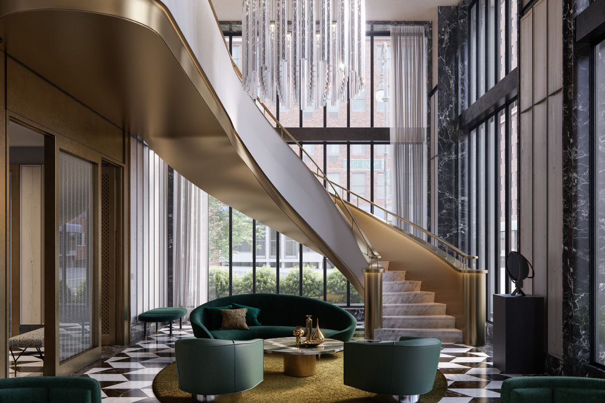
The “jewel tone” shades – emerald green, sapphire blue, ruby red – resist, but are dosed intelligently: only dared on a sofa or a protagonist wall, never on the entire room. Around them, the space breathes with sophisticated neutrals: milk, butter, oyster, dove grey, soft greys, pink pepper. This dialogue creates interiors that speak of unostentatious opulence, and works both in Milanese living rooms and in London penthouses covered in lacquered boiserie.
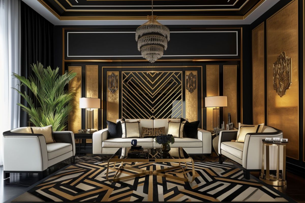
Black: the line that structures
No other color embodies the graphic framework of Art Deco like black. Today it returns with thin edges, metal threads, visible structures. It is a visual container, not a wall. And it generates depth without closing space.
Brass and bronze: the color that doesn’t exist but changes everything
Metal is not just material: it is also shade. Solid gold is off the radar, while brushed brass, bronzed finishes and reflections of antique copper dominate. They are inserted as warm light in cold tones, or as a graphic reverse field on light tones.
Material contrast before chromatic
One of the key points of the new Déco is not the combination of colors, but of materials: velvet against marble, opaline against brushed wood, matte metal against glossy lacquer. The palette is never static: it lives in the dialogues between surfaces .
And in the bolder versions of the new international Art Deco? In Miami we still dare with apricot pink and teal, while in Shanghai we see lamé and petal-colored nail polishes. In Italy, however, the trend continues to move towards tonsdusty quality that between gray and powder, between cognac and cardamomwhich makes Déco a sensorial and urban code.
Today’s designers who rewrite Déco: beyond the revival, a new design language
The Art Déco style does not return to today’s projects as an archive to be browsed, but as a living legacy that shapes shapes, volumes, materials and atmospheres. It is not just the big luxury brands that are reinventing it with rigor and poetry, but a select group of designers and studios who speak an international, cultured and transversal language: between Milan, Paris, New York, Beirut, Shanghai.
Here they are: the names that do not mention Deco reactivate it.
Dimore Studio (Milan) Deco that becomes silent theater
Britt Moran and Emiliano Salci never declare let’s do Art Déco: they evoke it. Their use of soft light, of geometries in dialogue with time, of materials bordering on the tactile – satin brass, ivory velvets, ribbed glass – creates suspended, almost cinematic environments , in which Deco enters from one side and the back , like a memory embodied in the air.
Humbert & Poyet (Monaco/Paris) Structure like jewel
The Franco-Monegasque duo made the internal architecture a continuous homage to symmetries and Deco patterns. Their work for the “Beefbar” restaurant in Paris is iconic: dark boiserie, green onyx inserts, metal profiles like garnishes of a couture dress. Here Deco does not arise from objects, but from the entire spatial gesture .
India Mahdavi (Paris) Deco as physical color
The Franco-Iranian designer has made pink a design anthem (Gallery at Sketch, London is very famous). But his real point of contact with Deco is the ability to make color a volume, not a theme. Laying a tone as if it were a material is his signature a direct legacy of a Déco that loved to saturate the gaze.
Kelly Wearstler (Los Angeles) Excess as a method
In America, Deco never really disappeared. Its most daring contemporary interpreter is Kelly Wearstler: zigzag patterns, strong veined marble, full and dynamic volumes, sculptural lamps. She is the luxury maximalist who translates the glamor of the Chrysler Building into sculpted and sensual interiors for high-class Californian hospitality.
Michael Anastassiades (London) Deco in its most secret form
Talking about Deco in Anastassiades means turning it upside down: reducing it to the pure essence. Thread-like lines, satin brass, spherical opalines that recall the Parisian wall lamps of ’32 – but in total subtraction. His lights are a kind of Zen Deco, used to give rhythm and hierarchy without ever falling back into replication.
Formafantasma (Milan/Rotterdam) Deco as critical memory
The Italian-Dutch duo works on the material as history. They never formally mention Deco, but in projects such as “Ore Streams” or the installations for Louis Vuitton Fondation a typically Deco ability emerges: that of transforming the material into a cultural manifesto .
If in a century someone will try to cTo understand what “elegance 2025” was, one cannot ignore these names. Deco, today, does not need to be remade: it lives within the most conceptual architecture, in the calibrated curves of lighting design, in the couture velvets of the new contract hotels, in the minimalist profiles of sculptural furnishings.
How to furnish in Art Deco style today: 5 (truly) contemporary objects selected by those who know the language
Furnishing today in Art Deco style does not mean re-proposing a past in a caricatured form. It is an operation of project culture: proportion, light, finishes, and above all material.
The risk? Falling into the stereotype of gold everywhere, forced curves or geometric carpets from a theater set. True contemporary Déco inhabits projects in a calibrated, literary way, building charm through rigor and material sensuality.
Here are 5 real Italian objects that interpret this grammar consistently:
Talos table – Bontempi
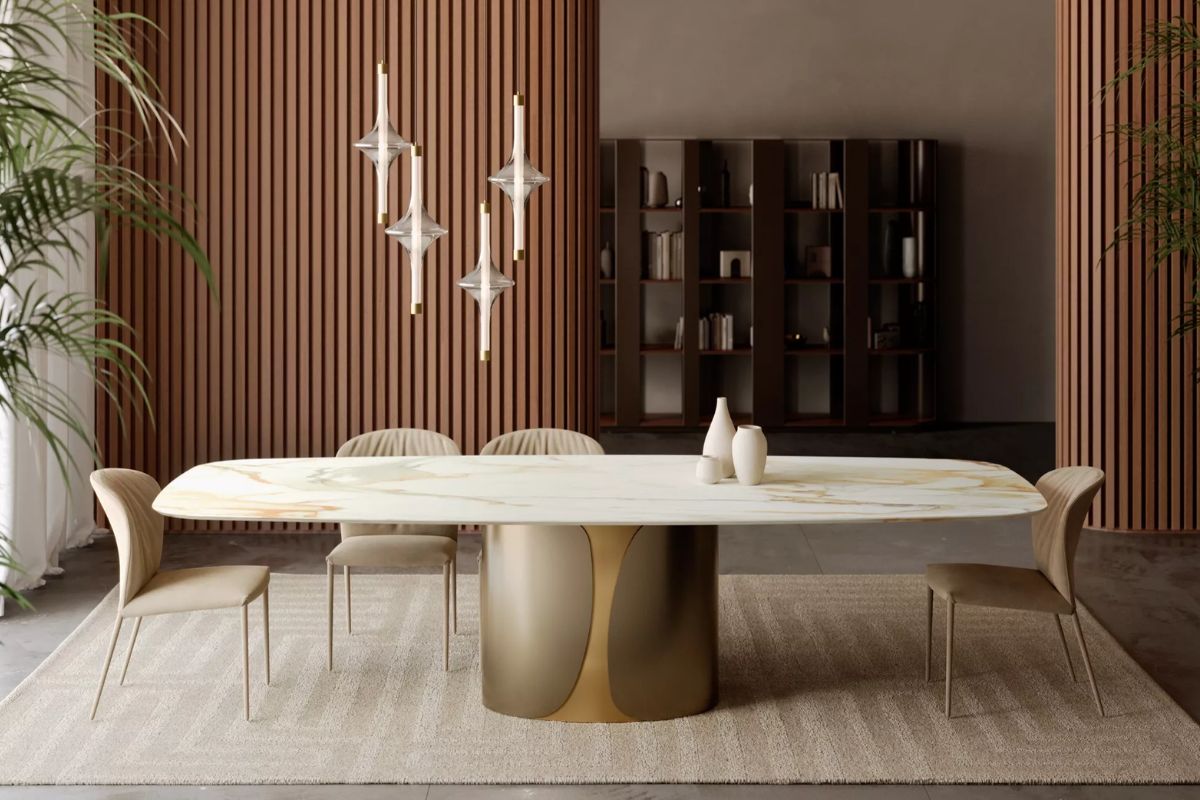
Designer: Studio Contromano
Materials: Base in lacquered metal (available in brass gold finish), top in ceramic, glass or veneered wood.
Why it is Déco: the monumental elliptical base and the brass lacquering evoke the architectural and refined spirit of Art Déco, without nostalgia. The refined top in ceramic or smoked glass completes the sophisticated aesthetic, perfect for a scenographic dining setting.
Dolcevita bed Cantori

Designer: Loriano Barani
Materials: metal structure with pale gold galvanic bath, padded bed frame (customizable coverings in fabric, velvet, leather, eco-leather)
Why it is Déco: the golden scrolls of the headboard evoke the decorative style of the 1930s, the metal + upholstery combination dialogues with the formal depth typical of Art Deco.
Dorian mirror FIAM Italia

Materials: Curved and back-silvered fused glass; smoky gray or bronze version
Why it is Déco: the alternation between faceted surfaces and reflective continuity evokes the solid and geometric architecture of 1930s interiors.
Tarantino bar cabinet Ghidini 1961

Designer: Lorenza Bozzoli
Materials: Cast brass, polished marble, lacquered wood
Why it is Déco: it is a sculpture-object that combines bourgeois living room rituals, material luxury and architectural structure: an updated synthesis of the idea of cocktail cabinet.
Budapest Soft sofa Baxter

Designer: Paola Navone
Materials: Full-grain leather, visible stitching, generous depth
Why it is Déco: celebrates volume as a stage presence, with a soft curve that does not give up character. An elegant, sober, essential but highly evocative gesture – like the ifdue of a Parisian suite reinterpreted today.
How to insert a single Art Deco piece into a modern space (without ruining the balance of the project)
Inserting an Art Deco object into a modern interior is an art of balance. It is not a question of “setting up a space”, but of activating it : like a narrative vanishing point, a strong but calibrated visual accent, which does not compromise the purity of the project but enriches it. Here is a practical, reasoned and professional guide.
Choose an object with an architectural character, not just a decorative one
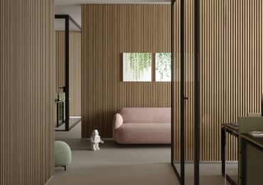
A true Deco piece is never just “beautiful”, it is structural: a coffee table with a sculptural base, an important mirror, a lamp that “furnishes” even when turned off. Avoid purely ornamental objects (frames, ornaments) and choose elements that intervene on the perception of space .
Effective example: a shaped mirror with a satin brass frame instead of a painting above the sofa ? creates verticality and introduces light, dialogues with the environment without dominating it.
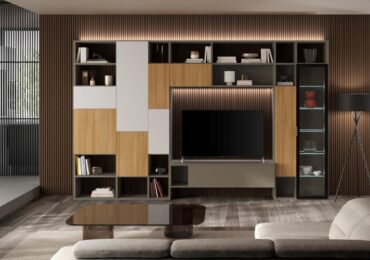
Work with material contrast, not just formal
A Déco object works if it manages to communicate with what is around it: if you have a minimal interior in light wood and stoneware, inserting a wood and brass sideboard with a shiny surface creates a sophisticated and intentional contrast , not an intrusion.
Practical example: in an open space with a minimal white kitchen and microcement floor, a shiny petrol-coloured bar cabinet with brass inserts becomes the “narrative” that elevates the whole.
Set it with the right light
Art Deco lives (and dies) with light. If you include an iconic element like an opaline and brass lamp, make sure you have a dimmer or a warm temperature that lets the texture shine. It must not look like a foreign body that has just been lit.
Hint from interior designer: a grazing light on a mirror or cupboard with a shiny surface creates a silent and precious “cinematic” effect.
Make him breathe: the rule of the negative
The single Déco piece must have visual space around it. No adjacent boiseries, no patterns behind: leave the background clean, in a solid colour, preferably light or slightly satin. This allows the object to emerge as a sculptural presence .
Designing air: a cream-colored sofa placed on a neutral carpet is the perfect base to host a Deco floor lamp in fluted glass, without distracting the eye.
Opt for coordinated, unmatched palettes
Avoid tone-on-tone or perfect matching with the rest of the space. The Déco object must insert a new chromatic vibration : petrol blue in a beige interior, brass in a light gray space, glossy black in a living room with warm tones. The unconventional nuance is part of the game.
Pro tip: combine small details in the same metal (e.g. door knobs or thin square frames insatin brass) helps consolidate the “logical link” of the object with space.
Don’t call him the protagonist: let her be discovered
A single Deco piece placed in a contemporary space works best if it is not declared. Let the visitor discover it gradually: a slow effect, which settles and gives identity to the space.
It works well in passages: entrances, corridors, bar corners, bookcases, side-view walls.
Choose a signed piece (or well made), always
The Deco taste is not enough. The chosen object must be impeccable in manufacturing. Choose companies that work materials with care: De Castelli, Baxter, CTO Lighting, Gallotti&Radice, Glas Italia, Lema, or artisan brands with soul (Portego, Hannes Peer Design for custom-made furniture).
The designer’s takeaway
A single well-placed Art Deco piece does not create a vintage space : it creates a space with memory . In an era of interiors that are all the same, a cultured and proportionate gesture can restore character, culture and beauty to a space without weighing it down.
Leave a comment