antique pink is back at center stage. This soft and dusty nuance warms rooms, makes them more welcoming and gives a discreet elegance that adapts to both contemporary homes and more classic interiors. It is not a color that requires attention: it conquers it in a natural way, thanks to its balance between sweetness and modernity.
In recent years it has appeared with increasing frequency in Pinterest mood boards and interior design projects. Precisely for this reason many designers define it as an “evolved neutral” : perfect on walls, ideal in textiles, surprising on furniture and incredibly versatile in color combinations.
Why choose antique pink at home
Using antique pink at home means introducing a shade capable of transforming spaces without excess. This color is soft but not childish , elegant but not formal , and brings an immediate sensation of warmth and comfort to environments. Furthermore, it softens contrasts, illuminates surfaces and easily combines with both neutrals and dark colors. Thanks to these characteristics it is often considered a true soft neutral .
On a psychological level it offers a further advantage: it transmits calm, promotes concentration and supports daily well-being. It is no coincidence that it is particularly effective in bedrooms and rooms dedicated to quiet.
How to use antique pink in your home: walls, furnishings and accents
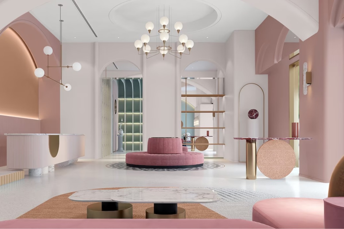
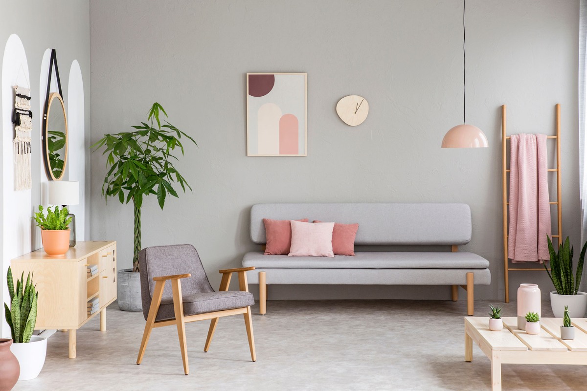
The use of antique pink in furnishings is no longer a bold choice, but rather a consolidated trend. The most saved palettes show a strong interest in soft luxury atmospheres, Scandinavian environments and relaxing rooms built around pink shades that interact with light wood, dusty grays and satin metals.
Antique pink walls
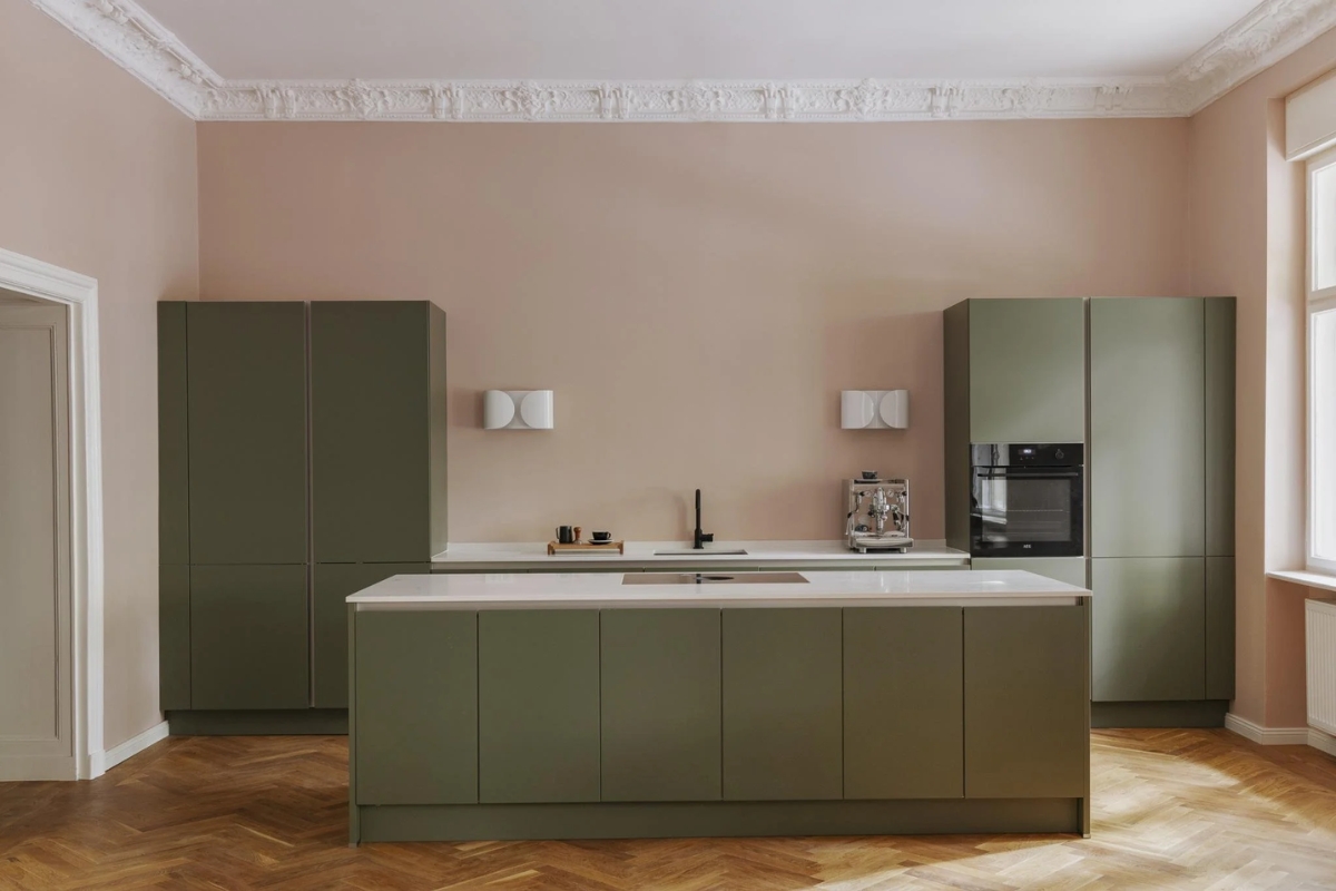
The antique pink diffuses a soft and enveloping light on the walls. The lighter shades are bright in small spaces, while the dusty ones add character to living rooms. The greige variations work particularly well in bedrooms and bathrooms. In the kitchen, however, richer nuances emerge, sometimes close to terracotta, perfect for a warm and metropolitan accent.
Furnishings and details
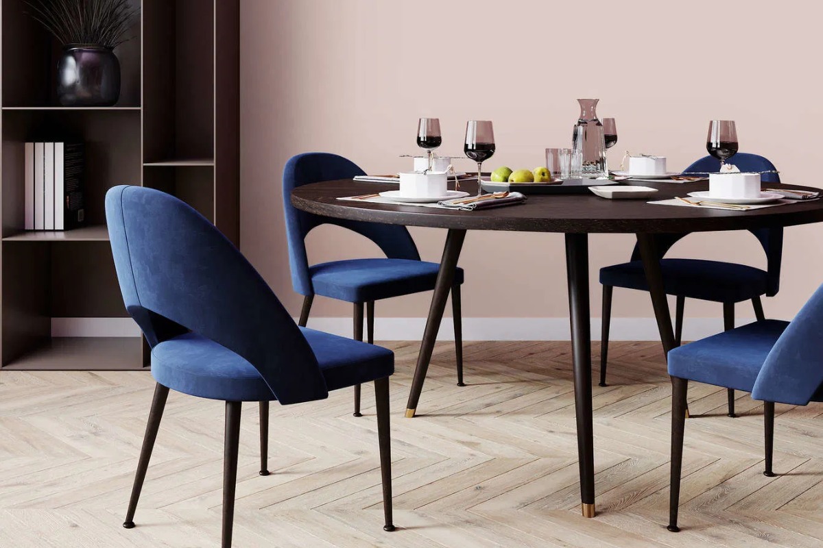
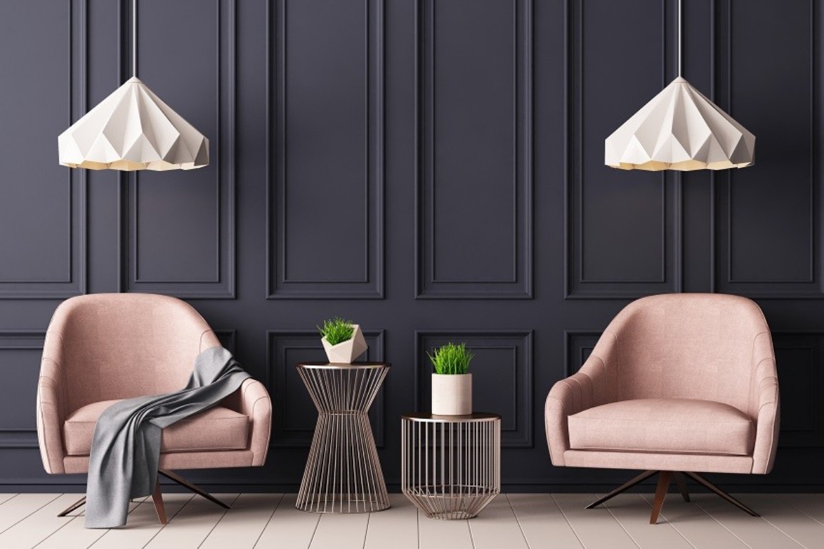
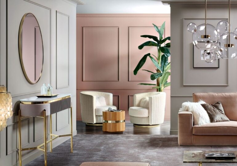
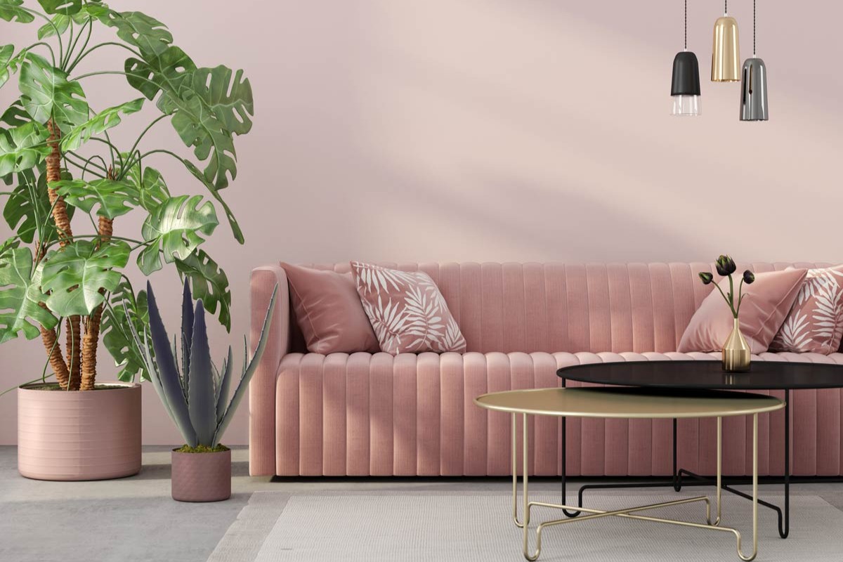
Even in furnishings this nuance offers surprising results. In the living room it can introduce discreet elegance through an accent wall, a modern boiserie or a sofa in matt fabric. Alternatively, it can appear in small accessories such as poufs, cushions, rugs and decorative vases. In combination with midnight blue or anthracite it takes on a more decisive character; with natural wood and sage green it creates a calming and relaxing atmosphere.
Sleeping area
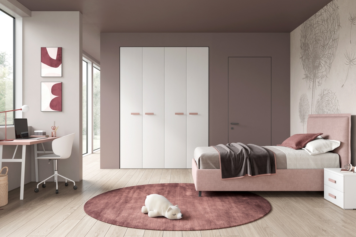
In the bedroom, antique pink best expresses its decorative strength. It lends itself to the wall behind the headboard, to linen or cotton textiles and ton sur ton palettes with powder pink and desaturated rosé. For a more spectacular effect it can be combined with petrol blue, satin gold or mini design lampsbad.
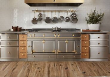
Kitchen and bathroom
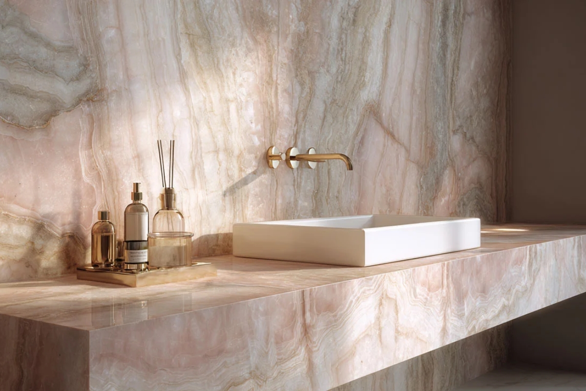
In modern kitchens it appears on matte surfaces, natural wood furniture or shiny tiles. The result is fresh, contemporary and very photographic. In the bathroom, however, it creates bright and elegant environments, especially when combined with light marble, satin gray or brass details.
Bedroom and guest room
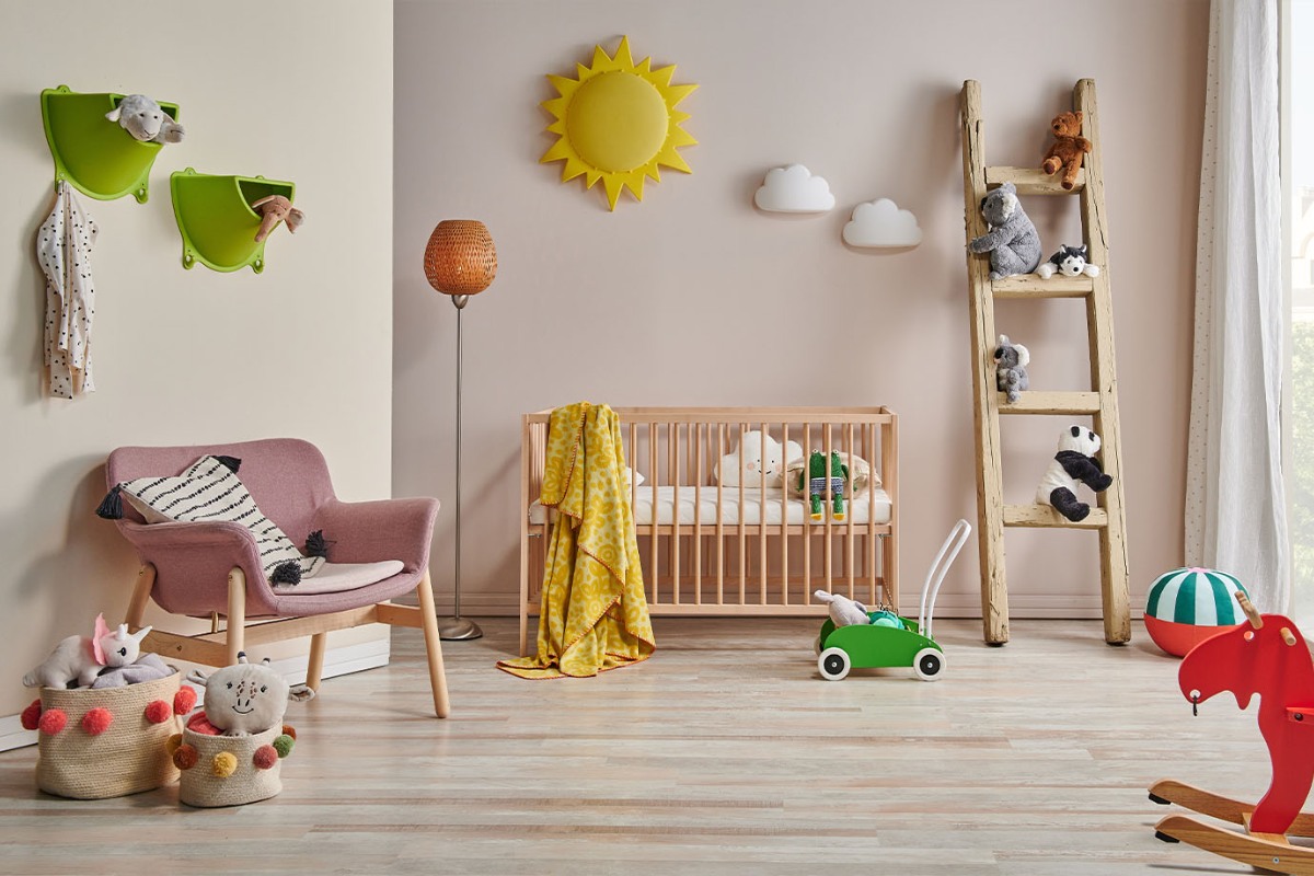
In bedrooms, antique pink represents a more mature alternative to traditional pastel pinks. It is transversal, welcoming and easily combined with light woods. Furthermore, in the guest room it works as a strategic colour: discreet, soft and perfect for transformable wardrobes, shelves and space-saving solutions.
How to match antique pink: trendy palettes and combinations
Antique pink interacts with a great variety of colors . Precisely this versatility makes it an ideal choice for those who want to create contemporary, harmonious and easily customizable environments. The most effective palettes, often at the center of Pinterest mood boards, combine natural materials, soft surfaces and balanced contrasts.
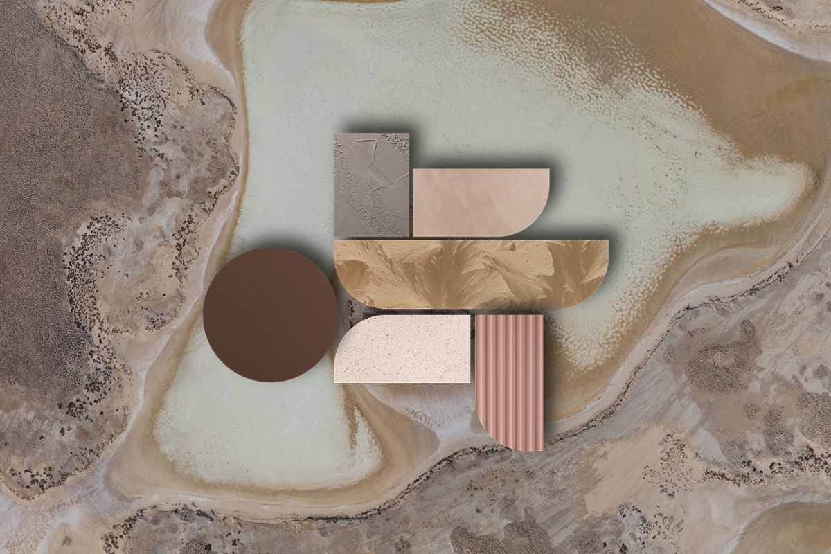
The most effective palettes according to interior designers + Pinterest
| Pairing | Visual effect | Suggested style |
|---|---|---|
| Antique pink + White | Airy and bright atmosphere | Minimal, scandi |
| Antique pink + Light gray | Balanced elegance | Contemporary |
| Antique pink + Taupe | Soft refinement | Soft luxury |
| Antique pink + Sage green | Natural and relaxing mood | Nordic, country chic |
| Antique pink + Midnight blue | Sophisticated contrast | Boutique hotel |
| Antique pink + Gold / Brass | Precious accent | Art deco, Parisian chic |
These combinations contain the essence of current trends: soft, enveloping environments rich in chromatic identity. Furthermore, they work well in both the living and sleeping areas, making antique pink a surprisingly transversal colour.
Why antique pink remains one of the most loved colors
Antique pink is a shade capable of combining aesthetics and well-being. It is scenographic but discreet, romantic but contemporary, delicate but with visual presence. It works in bright homes as well as in shadier ones, in large spaces as well as in small rooms.
Ultimately, antique pink is not a simple trend. It is a style choice : a color that conveys comfort, hospitality and personality, always maintaining a surprising balance.
How to obtain the antique pink color
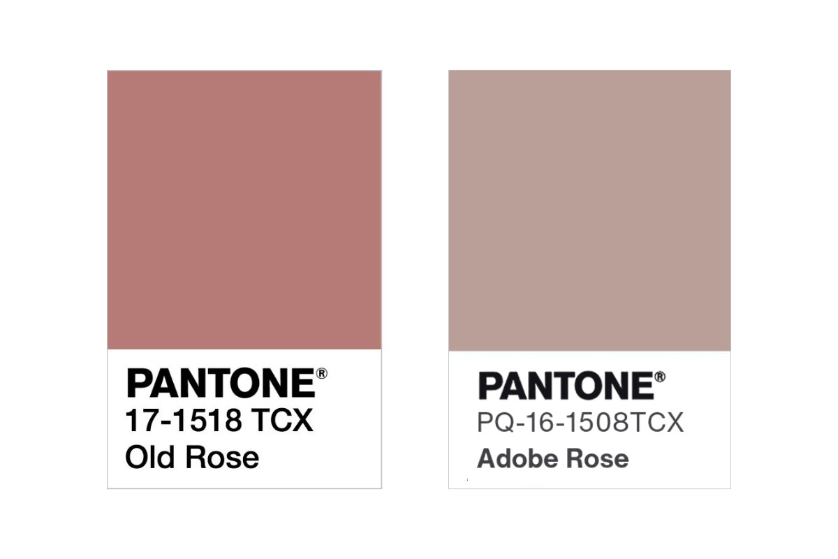
Old pink belongs to the family of “dusty” pinks, those with a small desaturated component that makes them more adult and sophisticated. In chromatic terms it is obtained by mixing red, white and a minimum percentage of gray or beige , which dampens the brilliance typical of the most vivid pinks.
In design and graphics this nuance is often identified through precise color codes:
-
Pantone Old Rose 17-1518
-
RGB 180, 123, 119
-
HEX #B47B77
These references are not only useful for designers: they also help those who want to paint a wall in their home, choose a more suitable wall paint or precisely match textiles and accessories.
The reason for its success is precisely this special balance. It’s not a bright pink, it’s not a beige, it’s not a nude: it’s an extremely modern middle ground, ideal for creating warm and harmonious environments without giving up a touch of personality.
Antique pink in fashion: how fashion trends influence interior design
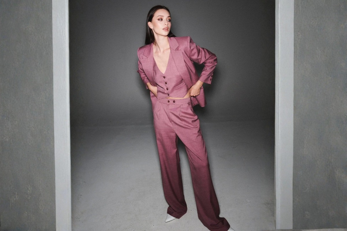
antique pink is not only one of the most loved shades in furnishings: it is also an iconic color of contemporary fashion , present in the palettes of ready-to-wear collections and in the most saved looks on social media. On the catwalks it translates into dusty pink , old rose and dusty powder pink, sophisticated shades that have redefined the concept of soft elegance. Fashion interprets it as an evolved neutral , capable of blending romanticism and modernity, just as happens in contemporary interiors.
The antique pink fashion trends directly influence interior design: fabrics such as matt velvet, bouclé wool, washed silk and matt leather return to the home through sofas, cushions, curtains and soft-touch surfaces. It is a continuous dialogue that creates a recognizable style, close to the soft luxury and the dusty palettes that today dominate the visual lifestyle, from the pink aesthetic to the most saved moodboards on Pinterest.
This fashioninterior contamination has transformed antique pink into a seasonless shade: elegant, versatile, perfect for those looking for warm neutral colors but with personality. It is not surprising that research on antique pink fashion , antique pink palette and color trends 2025 are constantly growing: fashion anticipates and home follows, building harmonious environments that convey style, well-being and identity.
Leave a comment