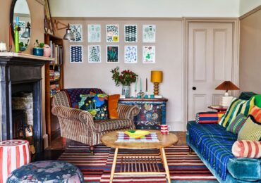
Pastel colors are no longer just synonymous with sweetness or romance: today they represent one of the most refined trends in contemporary interior design. Powder pink, sage green, powder blue and butter yellow have become tools for building sophisticated, never banal environments.
Their secret lies in balance: they know how to bring light and lightness into compact urban spaces, add softness to minimalist interiors, become the delicate counterpoint of important furnishings. Pastels, if used with skill, create domestic scenography that convey calm and personality, giving visual continuity between one environment and another.
Furnishing with these shades means designing with chromatic sensitivity, combining natural materials and velvety finishes, calibrating contrasts and metallic details, transforming each room into a story of atmospheres: from the kitchen that invites conviviality to the living room that welcomes, up to the bedroom that becomes an intimate and timeless refuge.
Furnishing with pastel colours, the protagonists of today’s interior design
Pastel colors are back as protagonists, but in a completely new version: no longer confined to bedrooms or romantic environments, today they enter the most refined urban spaces, are contaminated with material materials and become true allies of designers and interior decorators. Powder pink, sage green, powder blue, butter yellow: dusty and velvety shades that lend themselves to infinite interpretations.
The use of pastel color in contemporary interior design is never casual: it requires a careful project that takes into account the light, proportions and character of the house. They are shades that bring light and delicacy, but which also know how to surprise when combined with strong contrasts, metals, shiny surfaces or natural textures.
Decorating with pastels means designing a chromatic story that accompanies those who live in the house room after room, creating continuity and a sense of visual comfort.
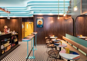
Furnishing the living room: pastels and textures for a sophisticated balance
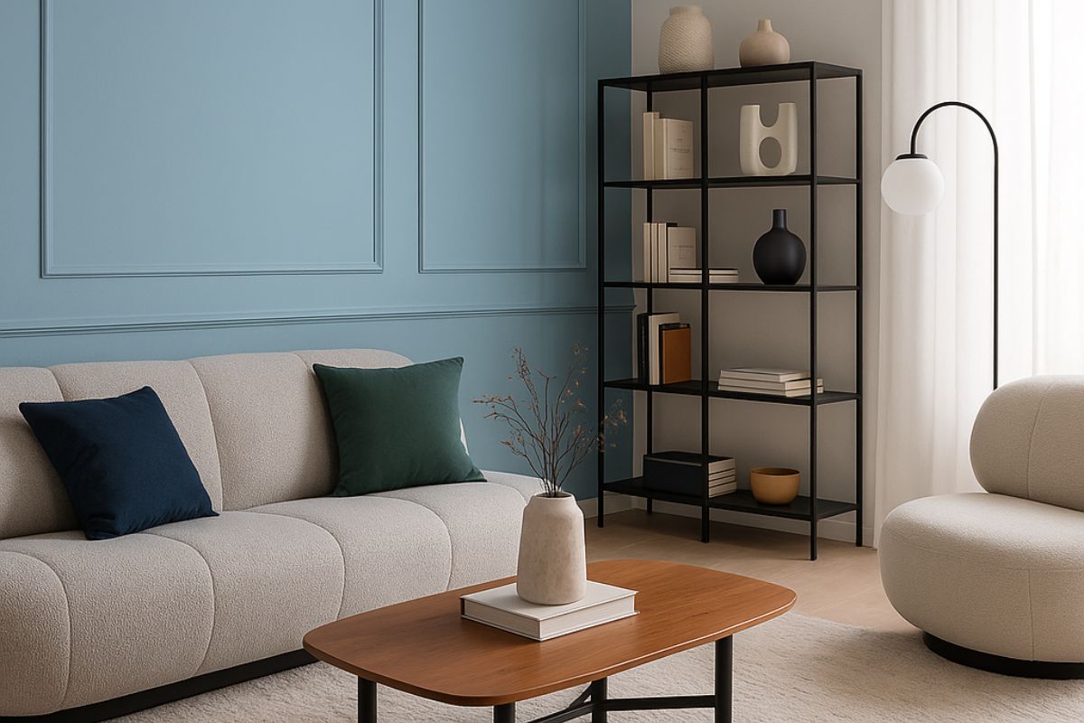
The living room is the heart of the home and the place where pastels can truly express their scenographic potential.
-
Walls: a sage green or powder blue on all the walls gives an elegant and relaxed atmosphere. Those who love to dare can paint a single wall in a more saturated shade, creating a backdrop for the sofa.
-
Furnishings: sofas in natural fabrics, such as linen or velvet, in neutral or slightly powdery nuances, go well with gray or beige wool carpets.
-
Metallic details: pastel finds its strength when combined with touches of satin brass or matt black for lamps, tables and handles.
-
Lighting: opaline glass pendant lamps or diffused wall lamps help maintain the soft atmosphere.
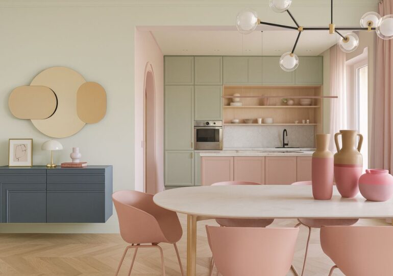
Kitchen: pastels for convivial and contemporary kitchens
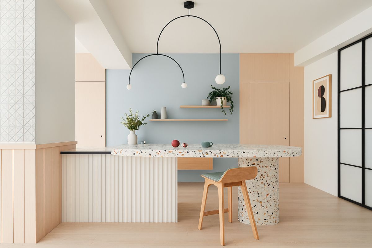
In today’s kitchens, pastels replace total white, giving character and warmth:
-
Doors and wall units: a delicate sage green or a grey-blue make the kitchenwelcoming without sacrificing elegance. Brands like Arclinea and Dada offer them with ultra-modern matt lacquered finishes.
-
Worktops: contrasting with white quartz or marble-effect Dekton tops creates a sophisticated look.
-
Seating: light wooden stools or transparent polycarbonate chairs lighten the composition.
-
Accessories: ceramic accessories and coordinated textiles complete the color palette.
Bedroom: soothing palettes for a private retreat

In the bedroom, pastel colors are the key to creating an oasis of well-being.
-
Walls: powder pink, pearl gray or dusty lavender go well with upholstered beds and washed cotton linens.
-
Cabinets and containers: light lacquers or bleached wood paneling maintain visual lightness.
-
Textile details: light curtains, cashmere throws and tone-on-tone cushions amplify the sensation of softness.
-
Lighting: bedside lamps with warm light and linen lampshades complete the enveloping effect.
Bathroom: the charm of colored surfaces
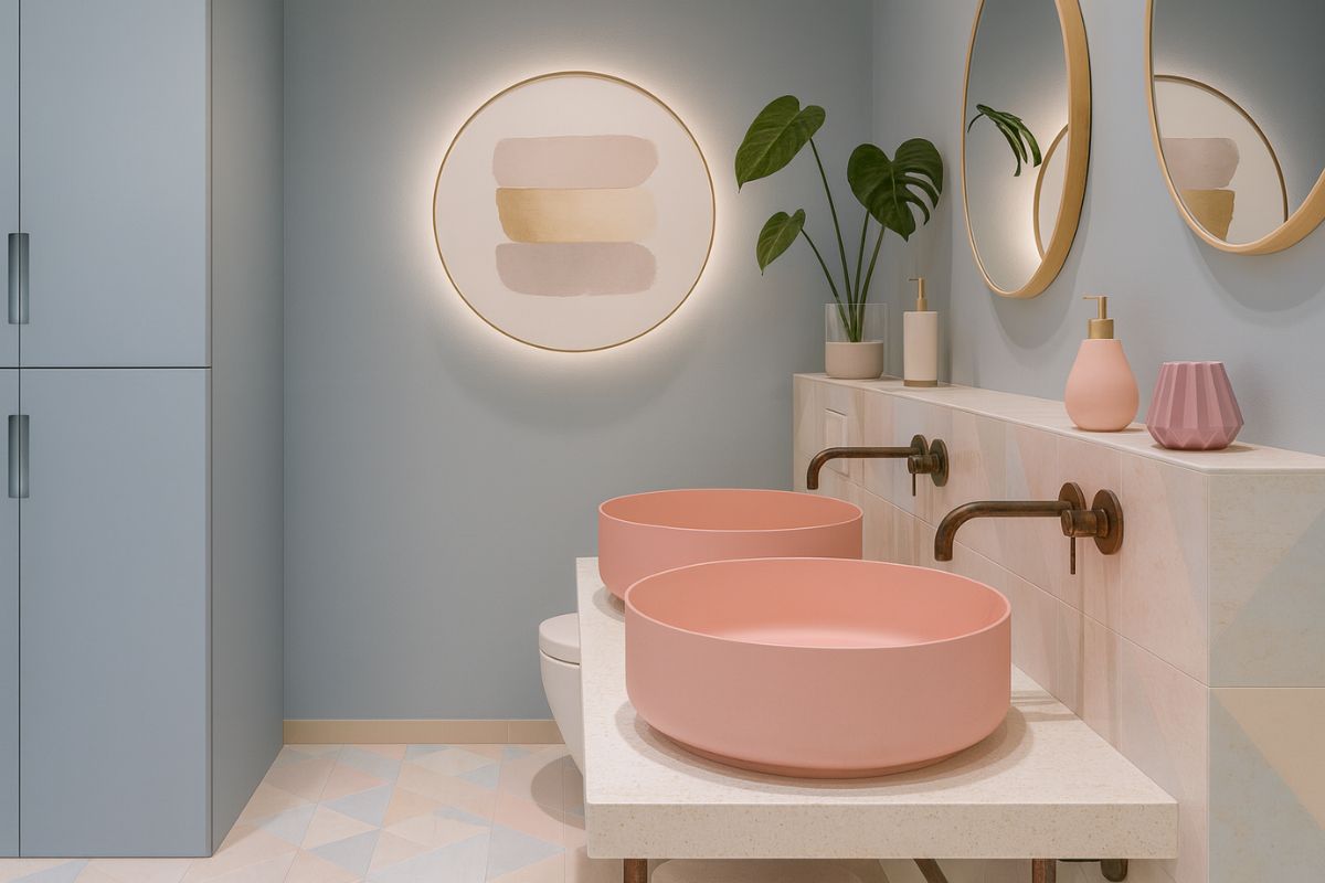
The bathroom is the ideal space to experiment with pastels thanks to coverings and tiles.
-
Coverings: satin stoneware tiles in shades of aqua green, dusty pink or light blue create a spa-like environment.
-
Sanitary ware: the most innovative manufacturers offer colored washbasins and sanitary ware, perfect for those who want a bathroom with character.
-
Taps: brushed brass or satin stainless steel add an elegant contrast.
-
Mirrors and accessories: rounded shapes and thin frames enhance the soft character of the environment.
Studio and hybrid spaces: energy and creativity
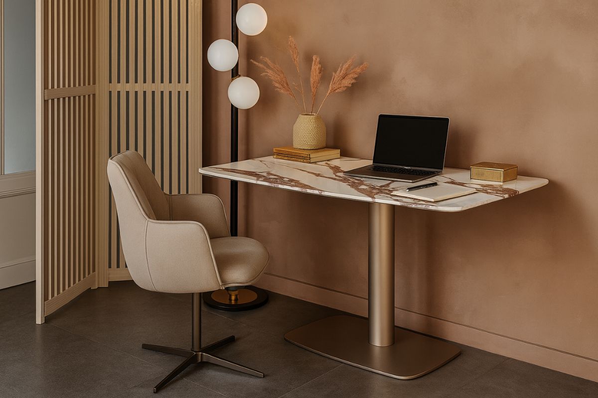
In domestic work spaces, crayons help stimulate concentration without being aggressive:
-
Walls: a mint green or soft butter yellow creates a positive and productive atmosphere.
-
Desk and seat: light wood surfaces combined with upholstered chairs in soft tones keep the space comfortable also visually.
-
Decoration: graphic prints with bolder color accents break up the monotony and stimulate creativity.
The secret is harmony
Using pastel colors does not mean giving up character: the important thing is to maintain a coherent palette and balance opaque, shiny and natural materials. An environment built on these shades becomes a welcoming space, without ever being excessive.
The designers’ advice is to start from a dominant nuanceand and build around it, alternating lighter and more intense tones, to give visual depth. Pastels, when used consciously, are never childish: they are sophisticated, current and capable of giving identity to even the most minimalist interiors.
Matching pastel colors to materials: author’s guide
For pastel colors to really work in a project, they must communicate with the textures and materials present. This table summarizes some combinations that always work, according to interior designers.
| Pastel Color | Ideal Materials | Visual Effect | Mood |
|---|---|---|---|
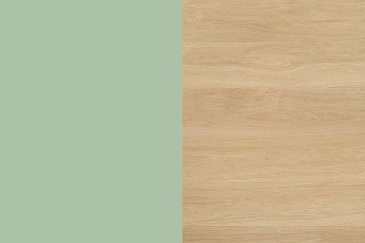
| Sage Green | Light oak, travertine stone, bronze or satin brass metals | Elegant and natural | Sophisticated, wellness, spa inspired |
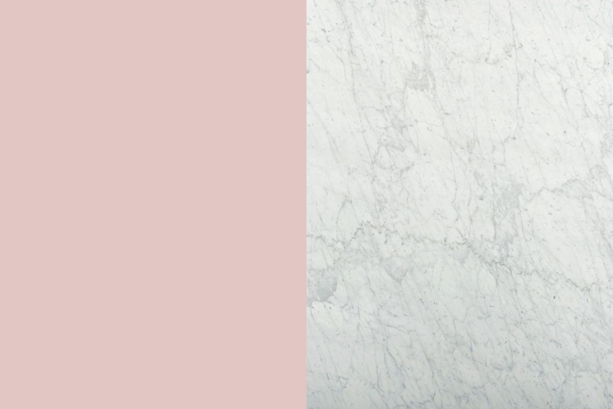
| Powder Pink | White marble, velvet, copper metal | Soft and romantic | Enveloping, delicate, perfect for sleeping areas |
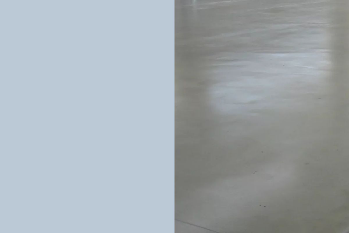
| Powder Blue | Polished concrete, satin steel, raw linen | Clean and contemporary | Urban calm, soft minimalism |
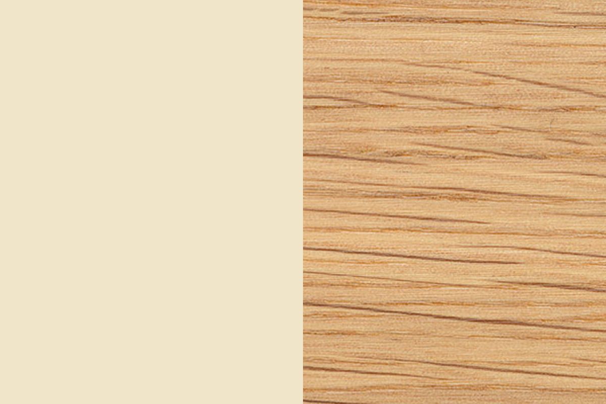
| Butter Yellow | Vienna straw, ash wood, shiny ceramic | Radiant and welcoming | Freshness, conviviality, ideal for the kitchen and dining room |
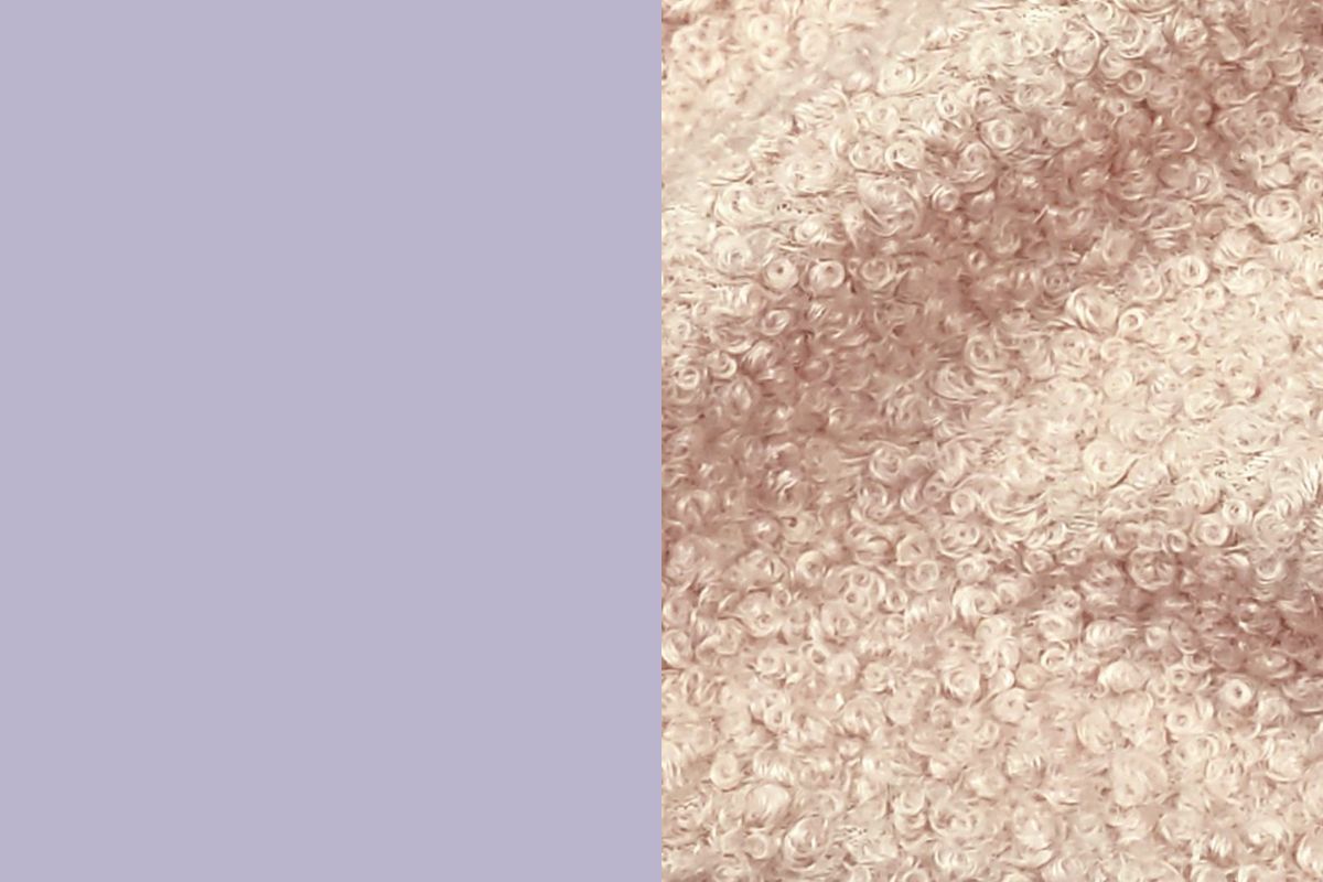
| Dusty Lavender | Bouclé fabrics, opaline glass, matt lacquered surfaces | Ethereal and light | Dreamlike atmosphere, ideal for reading and relaxation |
Today’s Designers to Watch (for pastel interiors)
The use of pastels in interiors is not the result of chance, but of precise research carried out by some of the most interesting names in contemporary design. Patricia Urquiola , with her collections for Moroso and Mutina, transformed powder pink and sage green into mature architectural languages, applying them to modular sofas and three-dimensional coverings. India Mahdavi , defined as the “queen of colour” , made pastel pop, sophisticated and never banal, designing iconic restaurants and hotels such as the Gallery Sketch in London.
Even emerging studios such as Studiopepe and Helle Mardahl work on pastels with an almost artistic approach: chromatic installations, blown glass with soft shapes, palettes that mix dusty shades and saturated accents to create vibrant and never predictable interiors. These designers demonstrate that pastel is a true design tool, capable of expressing character and contemporaneity without falling into decorativeness as an end in itself.
Pastels as a design language
Choosing pastel colors for your home means having the courage to dare with delicacy. They are shades that don’t scream but suggest, that don’t fill the spacebut they let him breathe. Inserting them into an interior project is an invitation to experience the house slowly, to notice how the light changes on the walls during the day, to transform each room into a small sensorial experience.
True luxury today is living in environments that resemble us: pastels , with their timeless elegance, allow us to do so naturally, giving character without aggression and continuity without monotony. In a word, they transform the house into a contemporary refuge, capable of telling who we are through the most poetic of materials: colour.
Leave a comment