The dove gray color is one of the most loved nuances in the world of contemporary interior design. Elegant, timeless, extremely versatile: dove gray moves with ease between neutral and bolder palettes, managing to interpret any space with delicacy and character. Not a simple grey, not just any brown: dove gray is an intermediate and sophisticated shade, capable of blending warmth and sobriety in a visual story that never tires.
Thanks to its natural aptitude for combining with materials such as wood, metal or stone, dove gray is a privileged choice both for minimal and Nordic environments, and for more classic or decorative contexts. Used as a chromatic base for walls, furnishings or fabrics, it gives a feeling of balance, sobriety and hospitality, creating intimate but contemporary atmospheres.
Furnishing with the dove gray color means choosing a visual language made of softness, balance and details that emerge lightly, without shouting. In this article we explore many ideas, combinations and inspirations to elegantly insert it into your interiors room by room, style by style.
The meaning of the dove gray color in interior design
Dove gray is one of those colors that cannot be defined with a single label. It is a chameleon shade, capable of creating reassuring and sophisticated environments at the same time. Halfway between gray and beige, it tells a story of balance and visual calm: it does not impose its presence, but whispers it, leaving room for details, textures and light.
In the symbolic language of color, dove gray embodies:
-
Elegant neutrality : transmits a sensation of emotional balance, making spaces tidy and relaxing.
-
Discreet warmth : despite being a “non-colour”, it never appears cold or impersonal.
-
Absolute versatility : it dialogues with the boldest shades, but also with the softest natural shades, enriching the palette without overwhelming it.
It is a shade that invites reflection, harmony, and unostentatious beauty. Designers often choose it for its ability to transform the background into a silent protagonist, enhancing both important furnishings and simpler pieces.
Used in the right proportions, dove gray becomes a truly neutral canvas on which to build an authentic style: never rigid, always welcoming.
How to match the dove gray color: color palettes and materials
The real strength of dove gray is its ability to harmonize with a wide range of colours, finishes and materials. It can dialogue with the warm tones of wood, be illuminated by metals or convey calm if combined with lighter neutrals. Here are some winning combinations to compose refined and always current palettes.
Taupe and neutrals: essential elegance
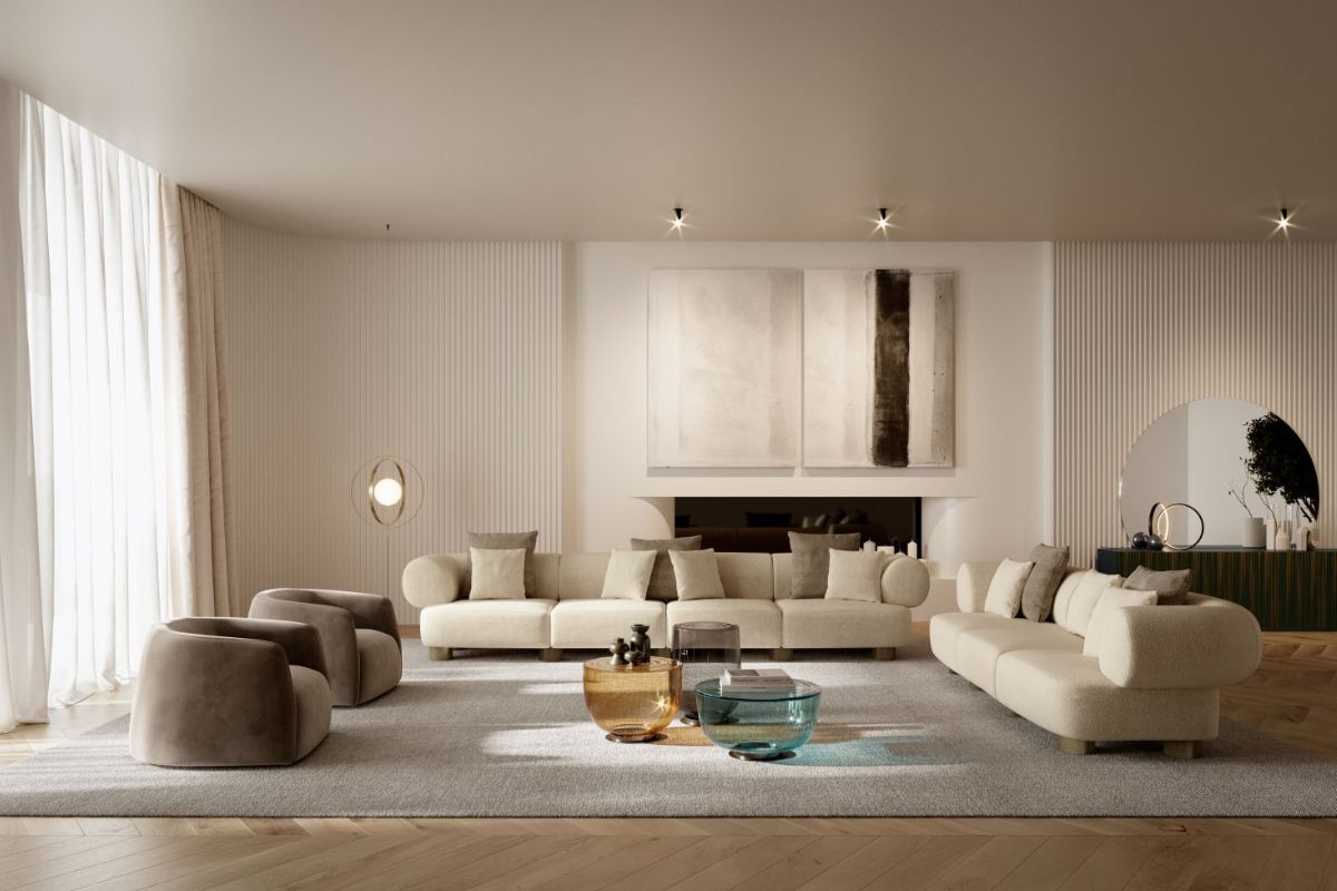
Combining dove gray with neutral shades such as warm white, ivory, beige or pearl gray is the ideal solution for those who love relaxed and timeless environments. The result is a clean and bright aesthetic, perfect for minimal living rooms and essential bedroomstional or contemporary kitchens.
Taupe and dark tones: sophisticated depth
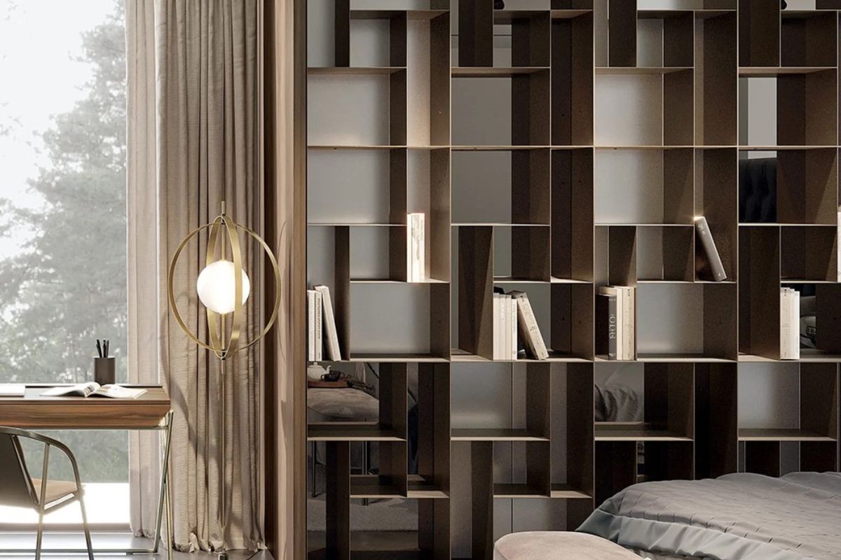
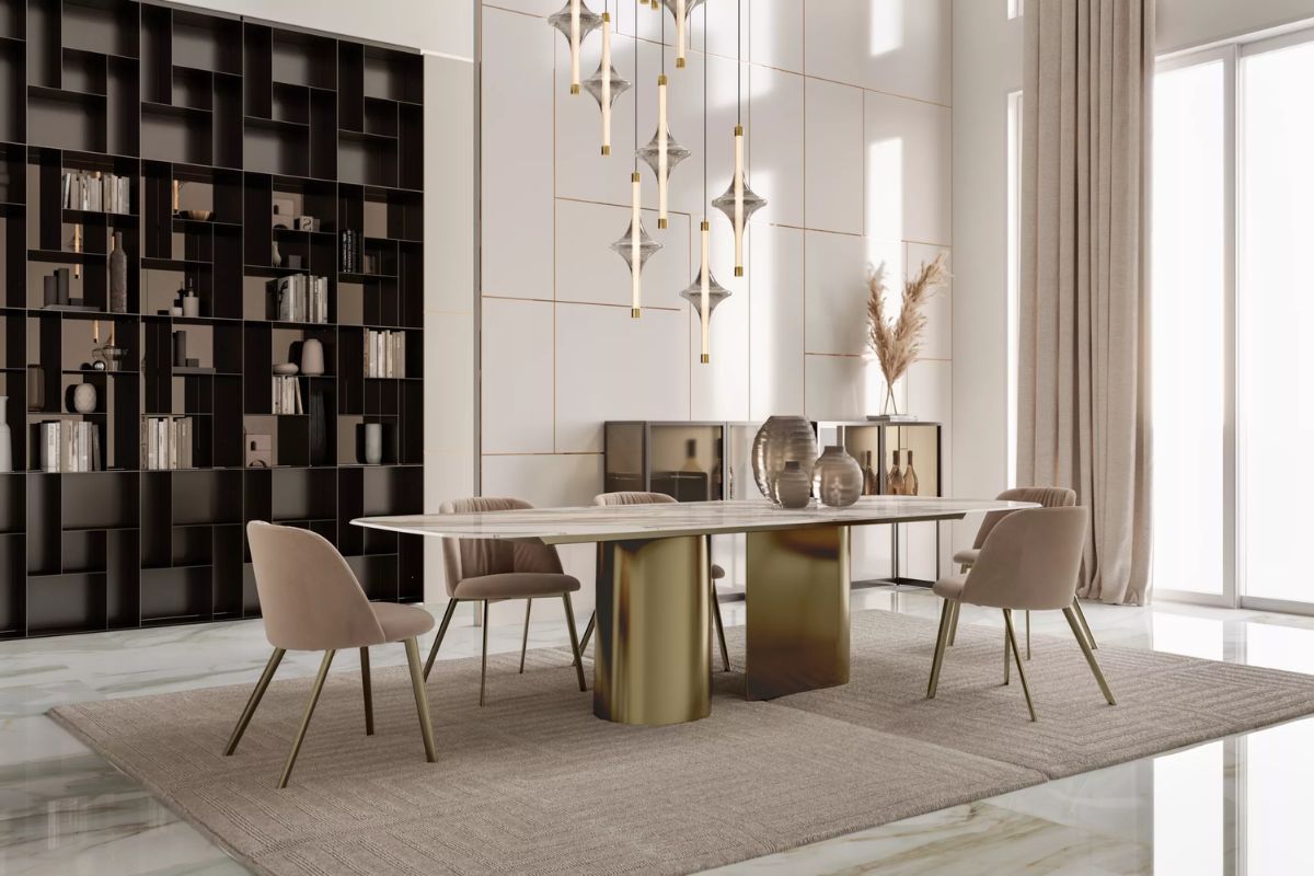
Dove gray acquires character when it meets more intense nuances such as anthracite, midnight blue or forest green. This contrast creates a pleasant depth, ideal for enhancing architectural details or giving a more intimate mood to spaces such as the living area or home office.
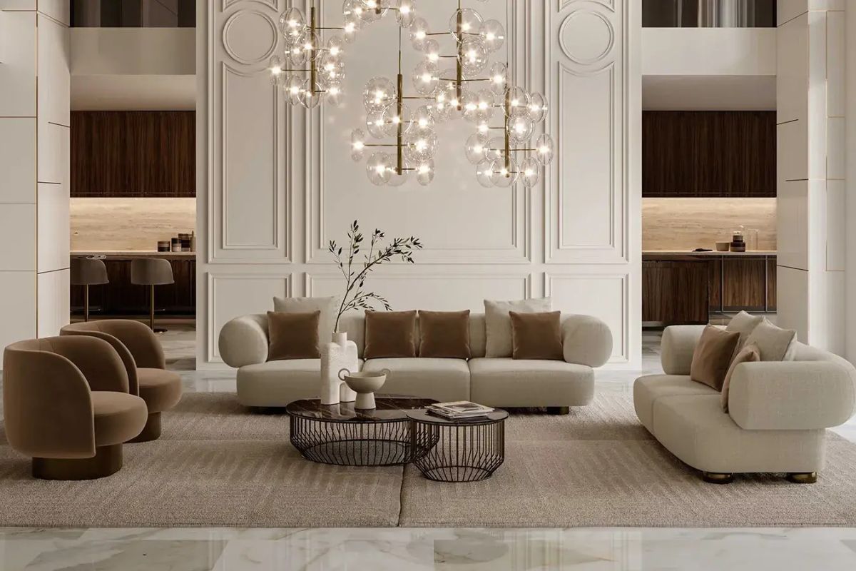
Taupe and metals: quiet luxury
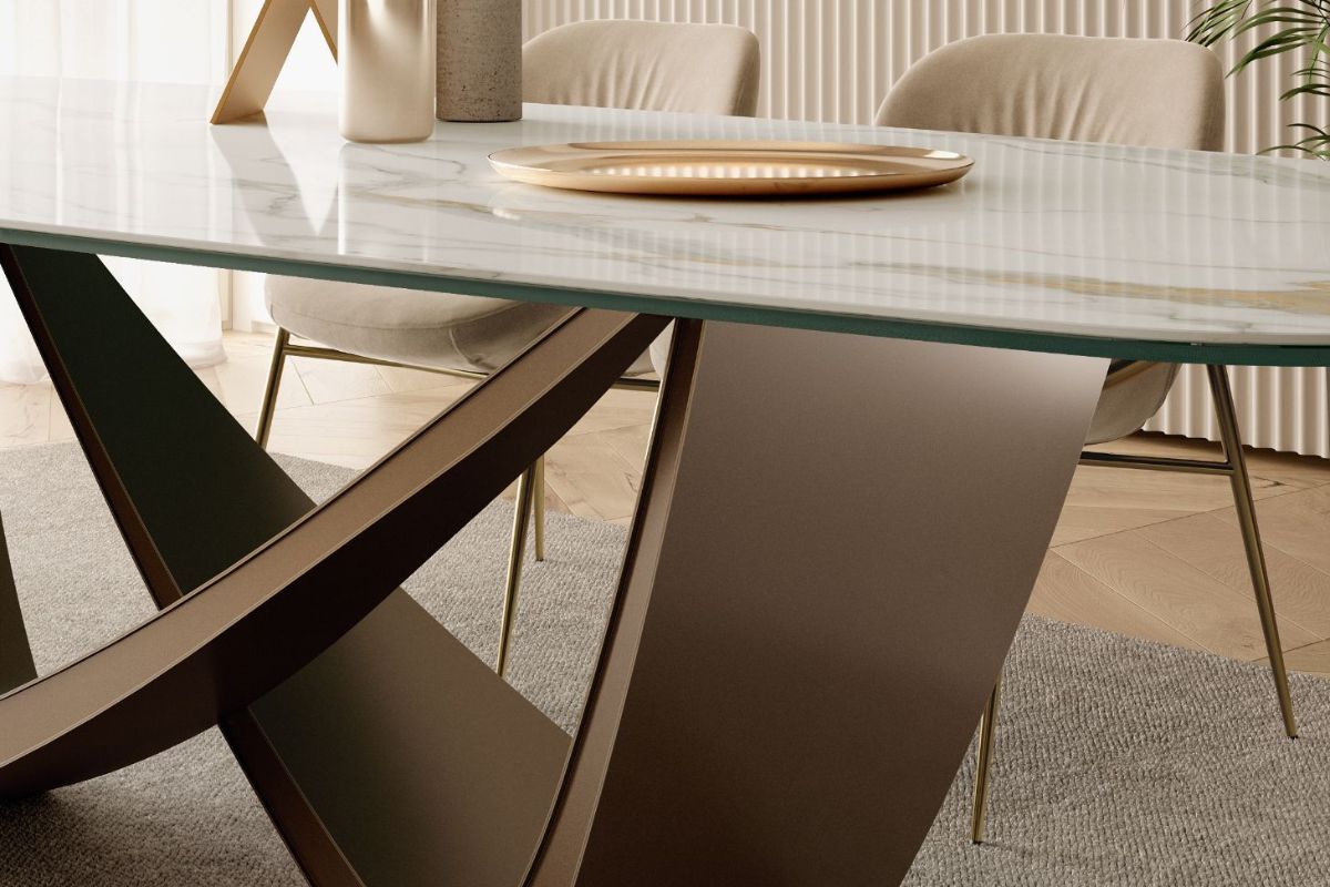
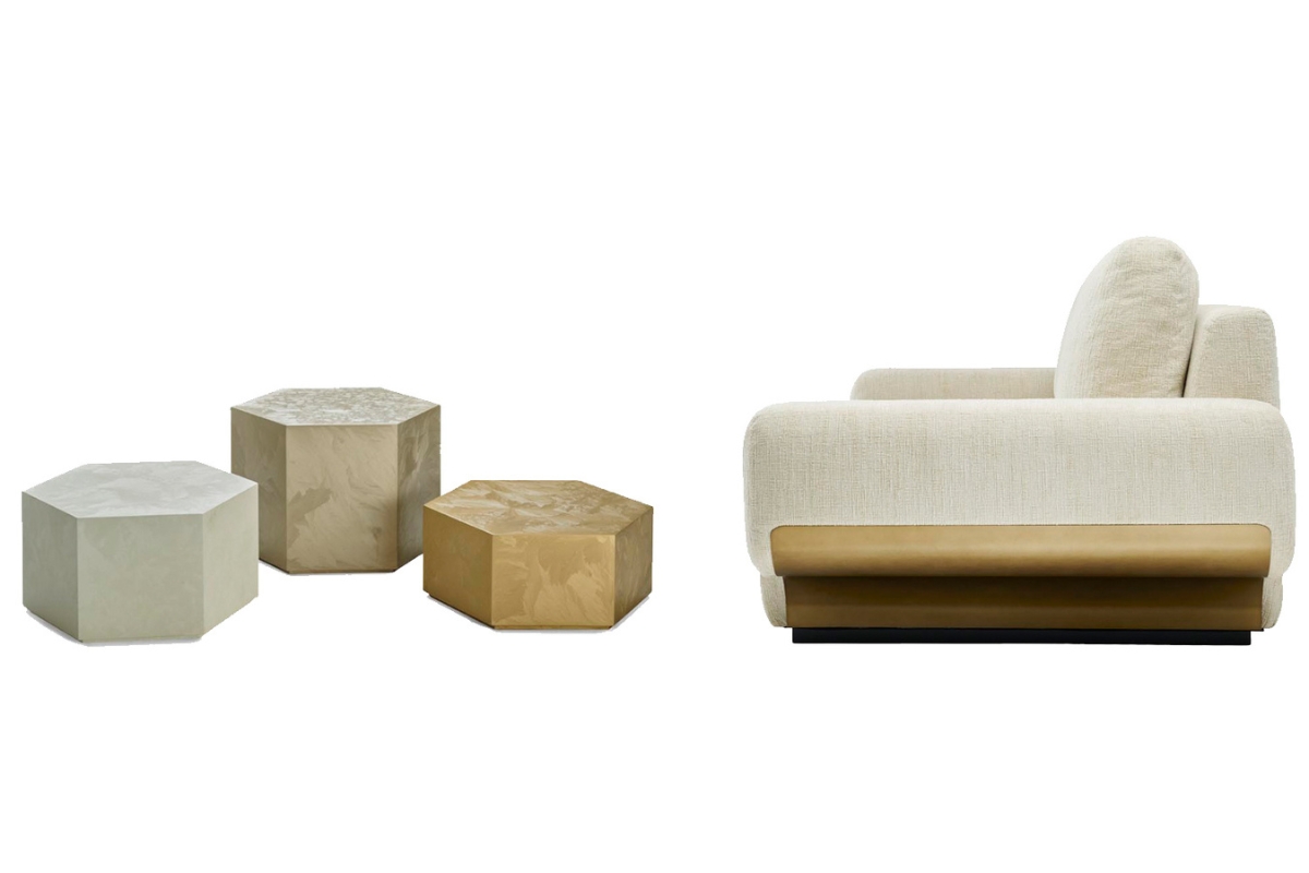
Satin gold, bronze or brushed copper enhance the warm component of the dove grey, giving the interiors a precious but not intrusive note. From lamps to handles, through to frames or seat details, metals become the ideal decorative touch for a contemporary and refined style.
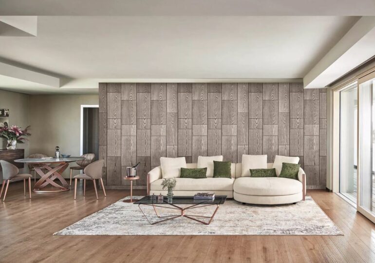
Taupe and natural materials: material harmony
Dove gray is a perfect complement to materials such as light wood, rough stone, linen or jute fibre. Combined with these organic textures, it helps to create a warm and welcoming atmosphere, putting living well-being and the connection with nature at the centre.
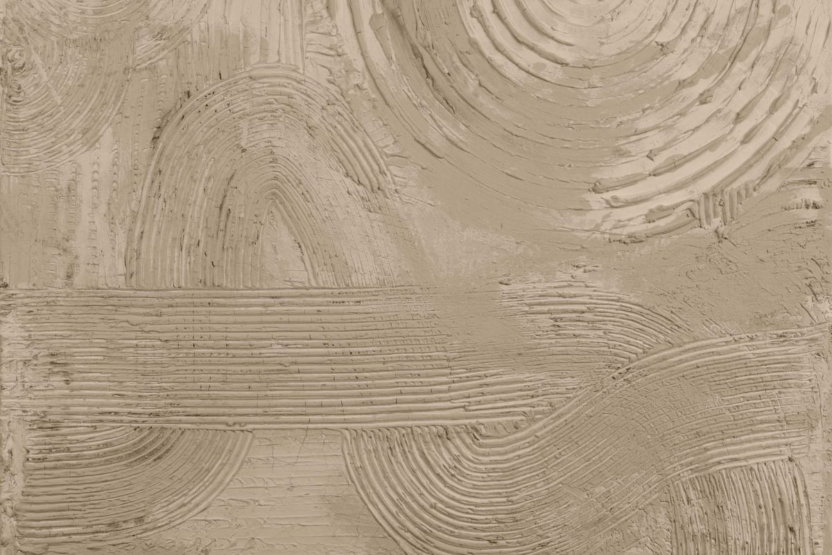
The nuances of dove gray color in design
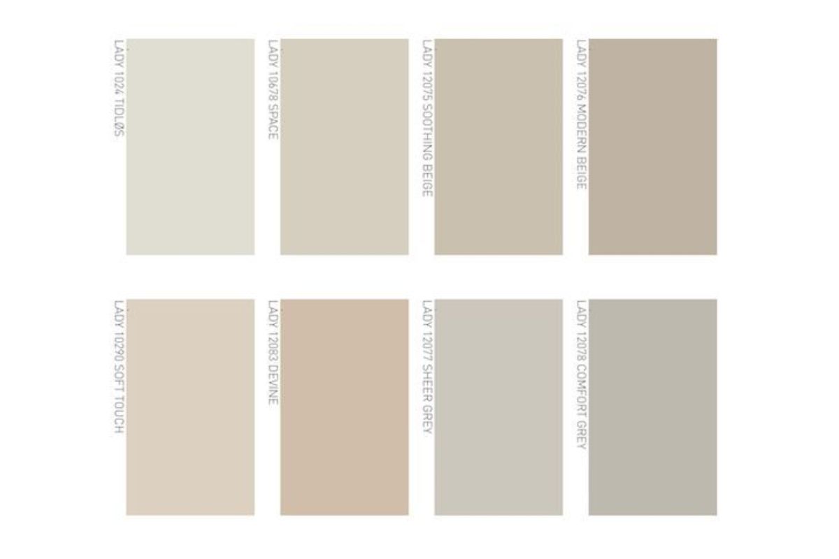
The dove is never just one. It is a range of enveloping shades that range from the lightest grey-beige to the most intense cold browns. Its shades are distinguished by the different presence of warm or cold pigments, making it a color with an extremely flexible interpretation.
Here is an overview of the main variations of dove gray used in interior design:
-
Light dove gray (pale beige-grey) : ideal for walls and furnishings that need to illuminate the space discreetly.
-
Medium dove gray (warm neutral) : the go-to choice for coverings and textiles, suitable for every style.
-
Dark dove gray (deep grey-brown) : perfect for structural elements or furnishings with a great visual impact.
-
Pink dove gray : with a warm and feminine edge, sought after in modern environments with vintage references.
-
Taupe greige : where gray meets beige in precise proportions, for a sophisticated and contemporary look.
These shades allow you to build harmonious color projects, alternating different intensities of the same color to obtain depth, visual rhythm and an elegant atmosphere, from the living room to the sleeping area.
The dove gray room by room: atmospheres and inspirations
Dove gray is one of those colors that seem made to flow through the rooms of the house naturally. It changes tone and character depending on the light, materials and furnishings with which it is accompanied, but always maintains a reassuring and timeless aesthetic coherence. Here’s how to apply it to the different spaces of the house.
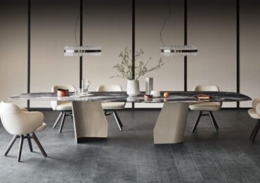
Living room: balance between comfort and style
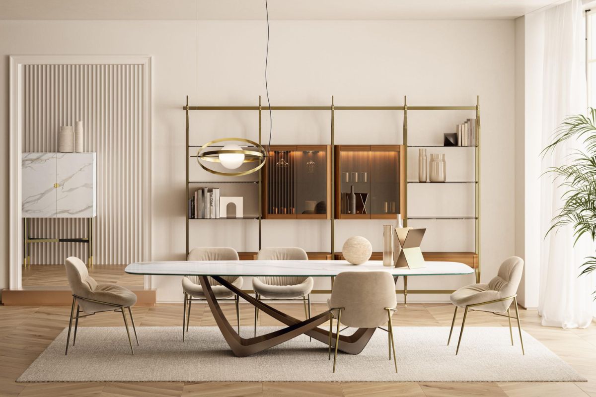
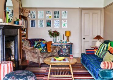
In the living room, dove gray can be the protagonist or discreet accomplice. Choose a light dove gray wall for a soft and classy mood, or dare to mix it with velvets, sc woodsures and golden details for a neo-deco style. A medium dove gray sofa accompanied by cushions in brighter shades will always be a sophisticated and welcoming choice.
Bedroom: relaxation and enveloping

Perfect for creating a calm and regenerating atmosphere, dove gray in the sleeping area best expresses its whispered elegance. Walls in warm shades, raw linen textiles or powdered velvet bedspreads can transform the space into an intimate and chic refuge. A palette of light dove gray and ivory is an invitation to deep rest.
Cuisine: natural modernity

In the kitchen, dove gray goes well with matt lacquered furniture, quartz worktops and cementina effect tiles. For an elegant but practical result, combine it with light or medium wood elements, or create contrasts with burnished metals and white ceramic sinks. A dove gray kitchen is sober but full of character: it never goes out of fashion.
Bathroom: contemporary quiet
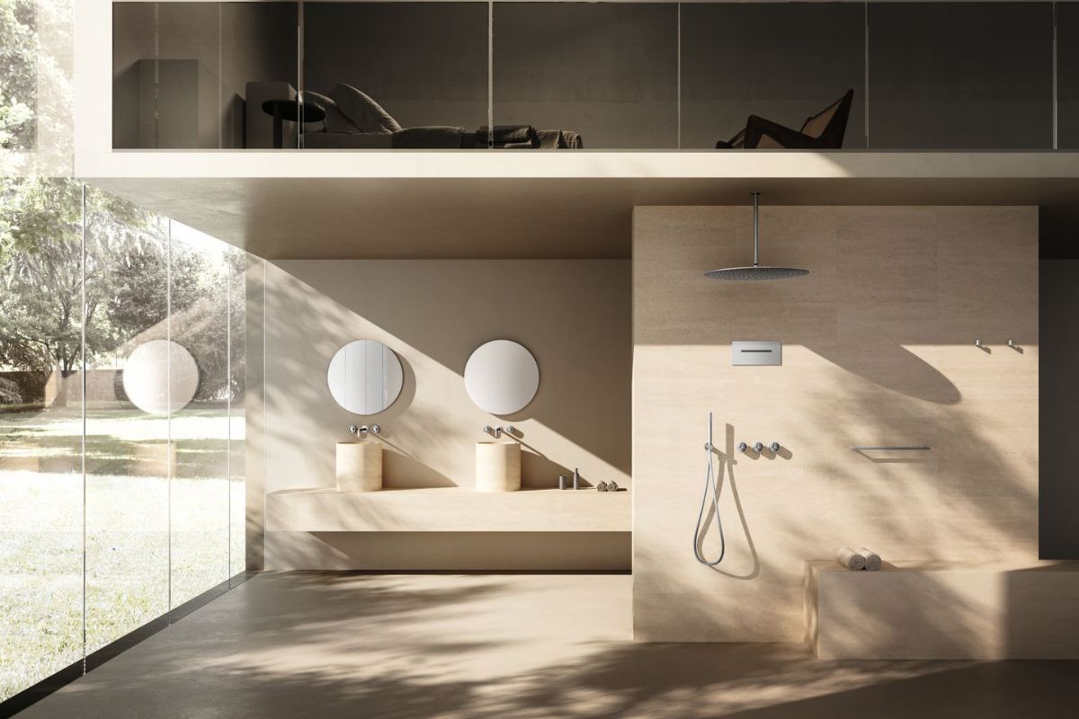
In the bathroom, dove gray evokes spa and well-being. It can become the chromatic basis of a modern environment with textured porcelain stoneware coverings, or combined with marble and brass for a more spectacular effect. Illuminated by natural light or warm lamps, this color amplifies the feeling of cleanliness and order.
Dove gray between art, fashion and design: cultural contaminations
Dove gray was not born in interior design, but established itself as a transversal and sophisticated color already in the world of fashion and art, becoming a true icon of contemporary taste. It is one of the few colors that manages to speak both the language of classic elegance and that of the most current creativity, positioning itself as the perfect balance between luxury and naturalness.
Art and symbolism: the neutrality that tells
In the history of art, shades similar to dove gray have often been associated with matter, earth and the unsaid: a canvas on which time deposits traces, shadows, light. Contemporary artists use it as a chromatic basis to reflect on the relationship between finite and infinite, matter and idea. A symbol of absence and depth at the same time, dove gray allows shapes to emerge without deceiving the eye.
Fashion and trends: minimalism with character
Dove gray has conquered catwalks and ready-to-wear collections thanks to its ability to match with any fabric or accessory without ever appearing banal. In haute couture collections it is often interpreted in a material key, with fabrics such as cashmere, chiffon and suede, elevating the idea of ??discretion to a new sensorial luxury.
Interior design: continuous inspiration
In contemporary design, dove gray is the answer to the search for a unique color that tells the present without shouting. From walls to lacquered furniture, from ceramics to furnishing fabrics, this shade lends itself to infinite interpretations, filtering trends and always remaining current. Its strength lies in its kindness: a bridge between Nordic minimalism, Mediterranean rustic-chic and colder modernism.