Among the infinite shades that inhabit the project’s palette, the ivory color occupies a singular place. It is not the pure and immaculate white of rationalist architecture, nor the sandy beige of Mediterranean atmospheres: it is a threshold colour, a warm and sophisticated neutral that has gone through centuries of history, from classicism to contemporary interiors, reinventing itself without ever losing its evocative strength.
Used in the walls of noble palaces, in the silks of ceremonial clothes and even in architectural coverings, ivory is today a point of reference for those seeking sobriety, brightness and chromatic harmony . It is a color that does not “shout” but “whispers”, offering a refined base for materials and furnishings, without ever appearing anonymous.
What is the color ivory? The Pantone code
Defining ivory means placing yourself in an intermediate space, between the rigor of white and the softness of beige. It is not a “non-color”, but a precise shade that arises from the fusion of white with light yellow-cream shades. It is the color of measured elegance, of light that fades without going out, of a neutrality that does not give up character.
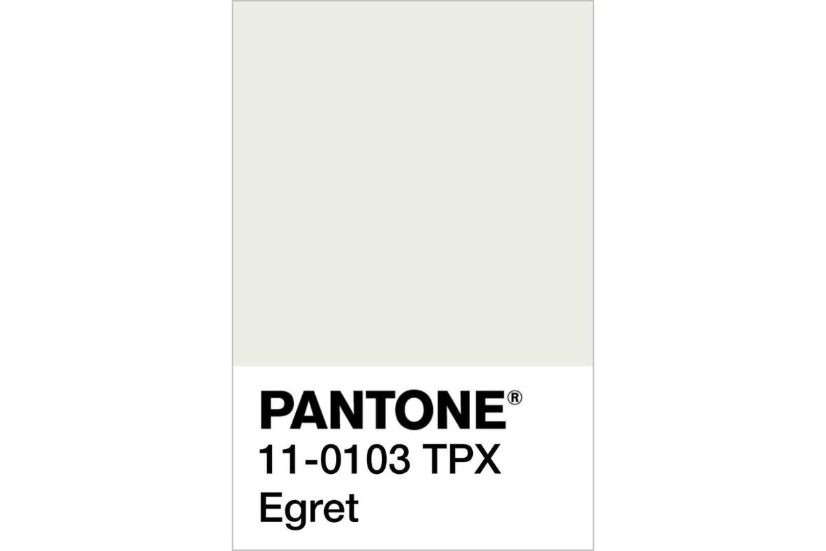
From a technical point of view, in the color codes most used in design and architecture, ivory corresponds to shades very close to RAL 1014 (Ivory) or Pantone 11-0103 TPX , with a hexadecimal value that fluctuates around #FFFFF0 . It is important to underline that there is not just one “ivory”, but a range of subtle variations that make it a lively and changeable colour, capable of adapting to materials, natural light and context.
Historically, the term “ivory” refers to the natural material obtained from elephant tusks, used since ancient times for precious objects, sculptures and inlays. Over time, the color of that rare substance and symbol of luxury has become a chromatic reference, freeing itself from the material and acquiring an autonomous dignity. Today, talking about ivory means evoking an image of refinement and sobriety, rather than a direct material reference.
In architecture and interior design, the color ivory is appreciated for its ability to capture and diffuse light without the blinding cold of optical white. It is the color of transition, of the detail that unites tradition and modernity: a neutral canvas that can enhance both contemporary minimalism and classic or boho-chic interiors.
Is the ivory color warm or cold?
Ivory belongs to the family of warm neutrals , but with a peculiar characteristic: it manages to modulate its perception based on the light and materials with which it interacts. When combined with natural woods, leathers, raw fabrics, ivory releases its warmer and more enveloping side, recalling the light of a candle or the soft glow of ancient walls. In environments exposed to cold northern light or white LED sources, however, ivory tends to cool, approaching a neutral white which still retains an underlying softness.
It is precisely this thermal versatility that makes it one of the colors most loved by architects and interior designers: ivory moves on a ridge, not rigiddark like pure white nor monotonous like beige, but always capable of adapting. In a contemporary kitchen with marble tops and metal details, it can appear almost “cold”, elegant and minimal. In a living room with parquet and velvety fabrics, it transforms into a warm and welcoming tone, which invites conviviality.
This “changing” nature also explains why ivory is often chosen in ton sur ton palettes : it allows you to build delicate and dynamic shades without creating excessive contrasts. It is color that communicates, that unites, that balances.
What is the difference between beige and ivory?
At first glance they may seem like close relatives: both belong to the family of elegant neutrals, both evoke naturalness and sobriety. But beige and ivory are not synonymous.
The beige comes from a sandy bottom, with a more earthy and opaque chromatic component. It is a color that tends towards light brown, with warm shades that recall desert sand, limestone, untreated natural fabrics. It is often used to create reassuring environments, with a Mediterranean or country chic aesthetic, where the sense of comfort and naturalness dominates.
ivory , however, is brighter and more refined. It has a light base that is close to white, but with a barely noticeable yellow-golden undertone. If beige brings with it the memory of the earth, ivory recalls light, the silkiness of fine fabrics, the smoothness of noble materials. It is a color that elevates space, more suitable for formal and contemporary contexts, without ever being as rigid as pure white.
In architecture and interior design the difference is substantial: using beige means choosing a more material and warm approach, while ivory is the ideal solution when you want a balance between neutrality and sophistication , a background that knows how to welcome color without ever turning it off.
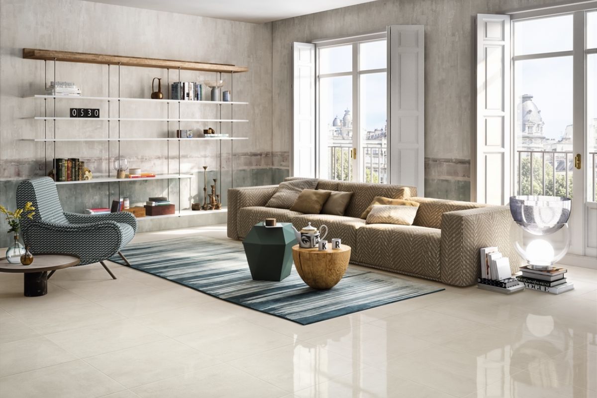
Ivory color of walls
Choosing ivory for the walls means working with light . It is a color that has the ability to capture and restore natural brightness, without the coldness of optical white. In historic houses it was used to enhance stucco and decorations, today it finds space both in minimal apartments and in prestigious residences, thanks to its versatility.
An ivory wall is never flat : it changes intensity depending on the time of day, taking on warmer reflections at sunset and more neutral under artificial light. It is the ideal choice for those who want walls that act as a backdrop, without appearing impersonal.
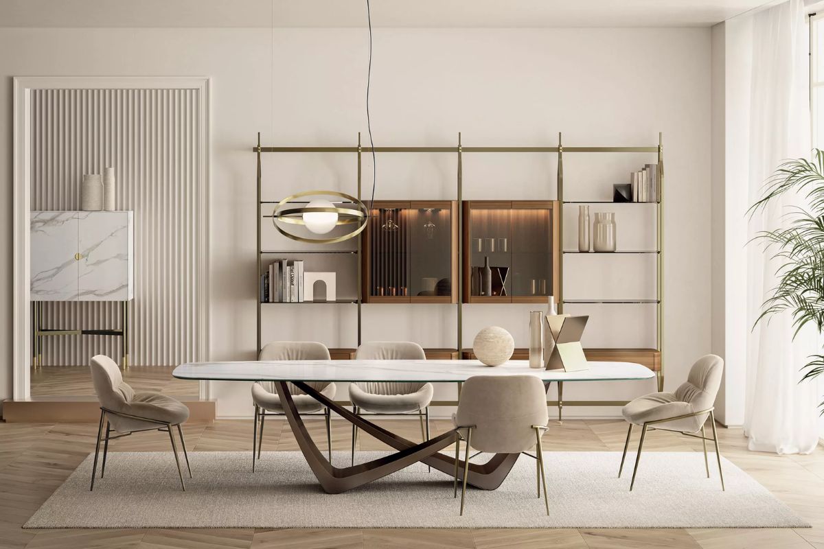
In a living room, ivory on the walls can become the common thread that ties together wooden furnishings, natural textiles and metallic details. In the bedroom, however, it gives a feeling of enveloping calm , perfect to combine with dusty shades such as dove grey, sage green or petrol blue.
Ivory also works very well in professional contexts: offices, boutiques and architectural firms use it to communicate seriousness and refinement , while leaving creative space for the customization of furnishings and accessories.
An important detail is the finish : an opaque ivory givesintimacy and discretion, while a satin or pearl finish gives movement and depth, reflecting the light in an elegant way.
In summary, ivory walls are like a neutral but vibrant canvas , capable of adapting to different styles without ever giving up character.
Furnishing with ivory: interior design tips
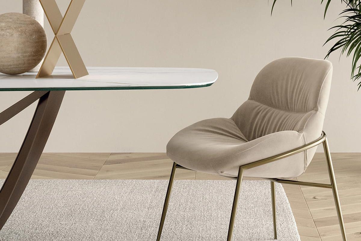
Furnishing with ivory means working with a neutral palette that is never banal. Unlike pure white, which tends to stiffen environments, ivory introduces a warm and velvety note which enhances both classic and contemporary spaces.
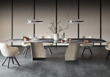
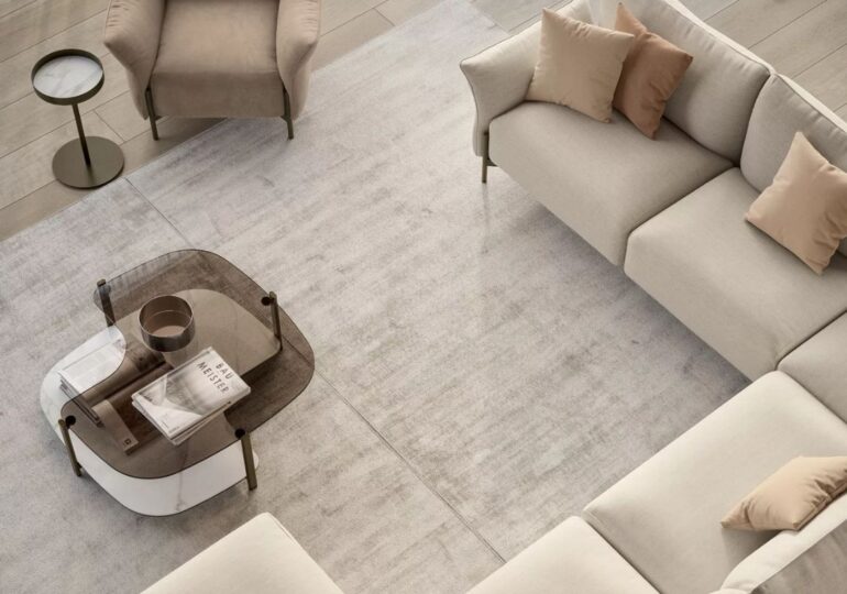
An ivory living can start from light walls that become the backdrop for linen sofas, hand-woven carpets and natural wood coffee tables. The result is a welcoming and bright space, where ivory does not dominate but harmoniously orchestrates the materials.
In the kitchen, ivory becomes the protagonist if used for the matt lacquers of the furniture , to be combined with marble, quartz or solid wood tops. This choice creates a refined and at the same time practical environment, because ivory surfaces have the advantage of masking small marks or imperfections better than optical white.
In the sleeping area, ivory textiles and accessories curtains, bed linen, padded poufs contribute to building an atmosphere of serenity and intimacy . The advice of interior designers is to combine it with deep colors such as midnight blue or forest green, which create sophisticated contrasts without extinguishing the background brightness.
Ivory also pairs well with natural materials such as stone, terracotta and rattan , perfect for giving warmth to modern or boho-chic spaces. For those who prefer a more urban and contemporary style, however, it works well alongside satin metals (brass, bronze, brushed steel), which enhance its elegant character.
Ivory color: the perfect combinations
One of the reasons why ivory is so loved by architects and interior designers is its versatility in color combinations . It is not a “flat” neutral color, but a dynamic base that changes character depending on what is placed next to it.
-
Tone-on-tone combinations
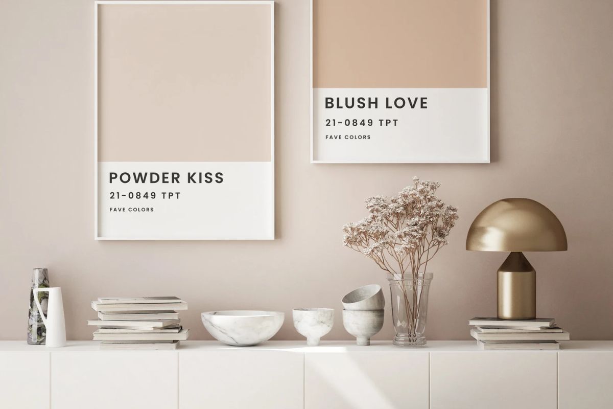
Ivory dialogues perfectly with shades of the same family: warm white, beige, sand, champagne. The result is an elegant, soft and bright environment, ideal for those who want a minimal chic style without excess. -
Refined contrasts
To obtain environments with character, ivory can be combined with deep colors such as ultramarine blue, forest green, anthracite or burgundy . This play of chiaroscuro enhances the brightness of the ivory and gives visual depth to the spaces. -
Metallic accents
Ivory finds its maximum expression when combined with satin metals such as brass, bronze and rose gold, which underline its luxurious dimension without being excessive. Perfect for lighting details, frames or furnishing accessories. -
Natural materials
In combination with light woods such as oak and ash, or with dark woods such as walnut and teak, ivory creates warm and welcoming environments. Stone, travertine and natural fabrics such as linen and cotton complete the palette, giving balance and materiality. -
Vivid color accents
For a more contemporary feel, ivory can be jazzed up with details in mustard, terracotta, sage green or even gloss black . In this case the ivory acts as a “visual cushion” that balances and harmonizes the more intense tones.
In all its variations – from pearly ivory walls, to lacquered furniture, to decorative fabrics – this color proves to be a transversal ally , capable of adapting to different styles, from classic to minimal, from boho chic to industrial.
The shades of ivory color: light, dark, antique, pearly
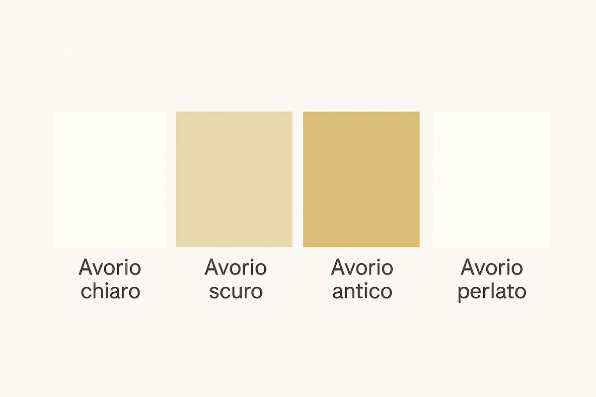
Ivory is never a “single” color: on the contrary, it comes in a series of tonal variations which allow interior designers and architects to personalize each project with great precision.
-
Light ivory
Close to white, with a hint of warmth. Perfect for walls in small or dimly lit rooms, because it amplifies natural light and gives a sense of airiness. -
Dark ivory
Tends to beige with earthier undertones. Ideal for resin floors, material coverings or furniture with a strong character. It gives depth and solidity, while remaining refined. -
Ancient ivory
Full of historical suggestions, with slightly golden veins. Often used in restorations or projects that want to evoke a classic and timeless atmosphere. It works very well with solid woods, velvets and bronze details. -
Pearlized ivory
An ivory that reflects light with light iridescence. Perfect for decorative walls, boiserie or fine fabrics. It gives a luxurious and contemporary touch without being ostentatious.
These declinations allow you to play with the perception of space , creating sober, sophisticated or warmer atmospheres depending on your needs. Choosing the right shade of ivory means giving a precise identity to every environment, without ever giving up the versatility that distinguishes this color.
How to obtain the ivory color
From a technical point of view, the ivory color begins as a warm shade of white , enriched by light notes of yellow or very light brown.
-
In wall painting it is obtained by mixing white with small quantities of ocher, light yellow or beige. The dosage is fundamental: too much pigment risks shifting the color towards cream or sand, losing the typical delicacy of ivory.
-
In furnishings and lacquered furniture it is obtained with neutral-based paints, enriched with warm pigments and sometimes with pearlescent or satin finishes.
-
In fabrics and material surfaces (such as marble or resins) ivory may present natural variations, due to the processing or composition of the material itself.
From a perceptual point of view, the ivory color works because maintains the purity of white , but “warms” it with a chromatic hint that makes it more welcoming and less cold. It is precisely this nature that makes it so versatile in interior design: neither too sterile nor too marked.
An important detail: in digital graphics and color codes , ivory is generally represented with the code HEX #FFFFF0 , a very light shade of white with a very light yellow undertone.
The color that will never go out of fashion
Furnishing with the ivory color means choosing a shade capable of lasting beyond fashion. It is not an imposing color, but a refined background that lets the materials, architectural volumes and natural light emerge.
From the pearly ivory walls to the lacquered ivory furniture , up to the fabrics and decorative details, this nuance adapts to different styles: from contemporary minimalism to elegant classic, from bright Scandinavian to welcoming Mediterranean. Its strength lies in the ability to harmonize with everything , creating balanced and never banal environments.
Compared to pure white, which can be cold, or beige, which risks weighing you down, ivory remains a sophisticated middle ground. It is the ideal color for those looking for visual comfort, brightness and discreet warmth .
In an interior design project, introducing the color ivory into the walls, coverings or accessories means building a neutral but vibrant canvas, which welcomes the furnishings and dialogues with them. It is no coincidence that architects and designers consider it a point of chromatic balance : a choice that enhances every space and restores a feeling of living harmony.