Every year, the announcement of the Pantone Color of the Year marks a symbolic transition in the world of design, interiors, fashion and global visual culture. And it is Pantone, in the last few hours, that confirms the most awaited moment: the new color of 2026 will be revealed on December 4th .
The communication came through an official LinkedIn post from Pantone, which has started a real international ferment: designers, art directors, creatives, interior stylists and color professionals are already expressing their predictions, fueling a debate full of nuancesliterally.
When will the Pantone Color of the Year 2026 be announced?
The answer is official: 4 December 2025
Pantone also invited the global community to predict the color family of 2026 , opening a public survey which, in the first hours, recorded hundreds of comments. For the first time in years, the company seems to want to actively involve the public before the official unveiling.
What can we expect from Pantone 2026? Signals from the international community
Scrolling through the comments on the postdesigners from all over the world, brand managers, color specialists, illustrators, interior designersa surprising fact emerges:
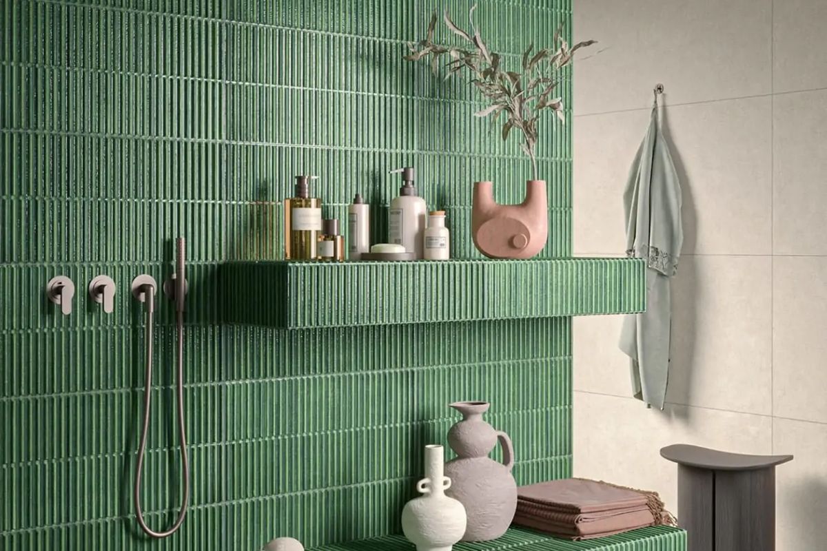
the almost total majority hopes for a return to greenery .
The most recurring keywords in predictions:
-
Soft green
-
Sage-olive
-
Calm nature-inspired shade
-
Forest green or teal shade
-
Soft Aqua
-
Ground green
-
Teal color
Many professionals say it openly: We need to get a green this time.
After Mocha Mousse (2025), Peach Fuzz (2024) and Viva Magenta (2023), the collective desire for a calm, natural, reconnective shade begins to be evident.
Green, in its softer variations, is perceived by designers and creatives as the ideal shade to interpret the widespread need for balance, contact with nature and more “breathing” palettes after several years of warm, emotional and intense colours.
Why could 2026 really be the year of green?
In addition to public comments, there is objective evidence:
1. Pantone chromatic cycling
The last green was chosen in 2017 ( Greenery ).
Since then Pantone has favored reds, pinks, peaches, browns and purple blues.
The natural rotation suggests a return towards vegetal tones.
2. Color trends 20252026
The most important American and European paint brandsValspar, Sherwin-Williams, Dunn-Edwardshave already announced 2026 palettes dominated by:
-
eucalyptus green
-
sage green
-
pale olive
-
neutral oat milk and soft khaki
3. Nature-driven aesthetics
In interiors, in hotels immersed in natural landscapes, in spas, in product design, green is re-emerging as a psychological color of quiet, balance and contemporary “quiet luxury”.
Just as we showed in our article dedicated to 15 design hotels immersed in nature , published on Archi&Interiors: a selection curated by architects and interior designers which highlighted how earth tones and soft greens are now central in spaces designed for well-being.
The three most likely color directions for Pantone 2026
Looking at trends, international comments and Pantone logic, the three most plausible color directions are:
1. Warm olive green
Natural, velvety, therapeutic.
The nuance most cited by designers on LinkedIn.
2. Soft teal (pale blue-green)

Perfect hybrid between nature and technology, elegant and contemporary.
3. Neutral oat milk / soft khaki

It could be the “supporting” color that Pantone loves to enhance in the palette.
What does this mean for the world of design?
At market level:
-
Interior design
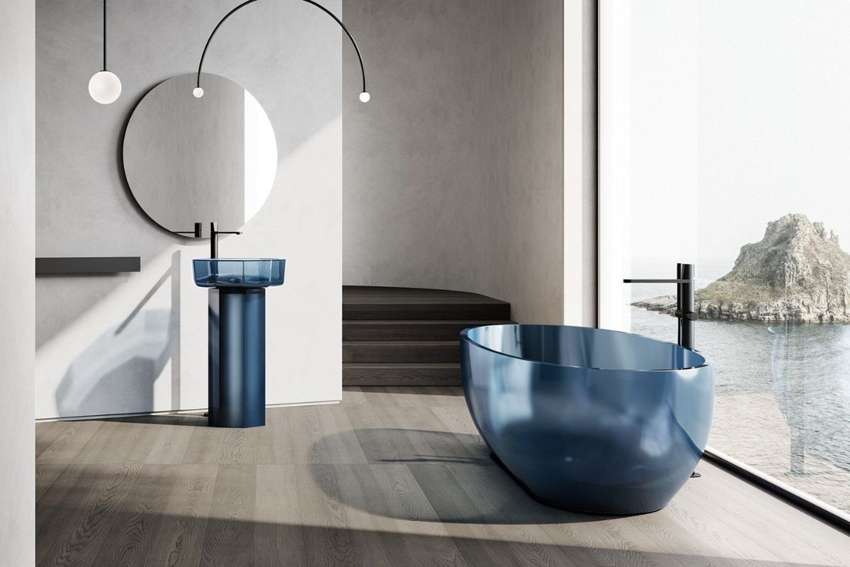
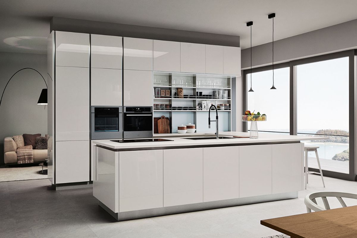
Sage green, olive, eucalyptus and teal are already dominating palettes of kitchens, living rooms and hospitality spaces. -
Graphics and branding
Nature & tech brands are veering towards green-blue palettes, perceived as more reliable and futuristic. -
Fashion
Sage green is once again on the rise on catwalks and ready-to-wear. -
Lifestyle and decor
Natural materials (warm woods, stones, fibres) interact perfectly with these shades.
What happens now?
Until December 4th, Pantone will leave the survey open and continue to build anticipation.
The strategy is clear: create a global community around the ad, transforming the Color of the Year into a cultural as well as aesthetic phenomenon.
We at Archi&Interiors will follow the evolution day by day, updating our editorial team with analyses, moodboards, market readings and design interpretations.
Why the community is (almost) always wrong: a critical reading of the predictions
Looking at the last twenty years, there is an almost ironic fact: the comments and predictions of designers on social media rarely anticipate the correct Pantone.
It happens for three reasons:
-
Desire bias we tend to choosethe color we would like to see, not the one that reflects the global color cycle.
-
Over-representation of some sectors graphic designers and digital creatives prefer palettes other than fashion and interior.
-
Pantone thinks on macro-scenarios (socio-cultural, psychological, economic), not just on aesthetic trends.
This opens up an interesting question:
What if Pantone 2026 isn’t green at all, despite the community wanting it?
For this reason we analyzed the less cited nuances , but which Pantone could choose for symbolic, narrative or global context reasons.
Little mentioned (but possible) colors for Pantone 2026: professional analysis
1) Pink (soft mauve, blush, petal)
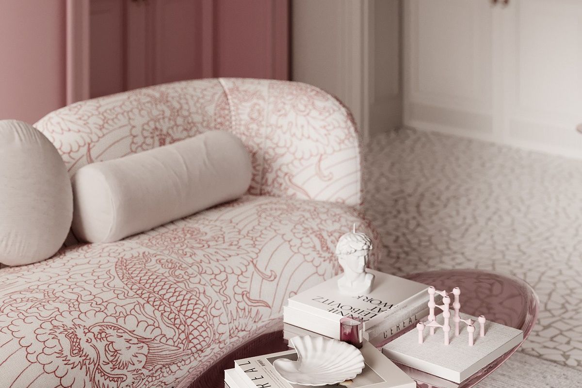
Why it could be chosen
Pantone could only return to pink if:
-
wanted to propose a strong emotional message similar to “compassion”, “care”, “humanity”;
-
chose a desaturated and mature pink , very far from Viva Magenta and 1910s pinks;
-
followed beauty/wellness trends, which continue to evolve towards very delicate “skin-like” nuances.
Pink 2026 possible
-
Soft Mauve
-
Petal Dust
-
Quiet Blush
-
Rosy Minimal
Why it is unlikely
Pantone has chosen:
2023 Viva Magenta
2024 Peach Fuzz
2025 Mocha Mousse
Three warm/pink shades in three years: a “fourth hit” is difficult.
2) Lilac / Lavender / Cold Mauve
Many designers have mentioned it peripherally (Lilac!), but it is an interesting pitfall.
Why he might be chosen
-
It is a digital and metaphysical color, linked to AI-driven scenarios.
-
Works well in tech and lifestyle communication.
-
It is psychologically calming and introspective: perfect for a hyper-saturated world.
Lilac 2026 possible
-
Mineral Lilac
-
Digital Lavender 2.0
-
Meta-Mauve
Why it is less likely
Pantone has already chosen a blue-purple in 2022 ( Very Peri ).
Chromatic rotation usually does not return to the violet spectrum within 35 years.
3) Yellow (bright, butter, mellow gold)
There are those who have suggestionserito bright yellow, chi butter.
Why he might be chosen
-
Historically yellow is used in moments of social crisis as a color of optimism.
-
The world of food and Scandinavian design are bringing back buttery and delicate tones.
-
Mellow yellows work great in contemporary design.
The mystery 2026 possible
-
Warm Butter
-
Soft Mellow Yellow
-
Golden Oat
Why it is unlikely
Pantone has already chosen Illuminating Yellow in 2021 too close in time.
4) Blue (mineral, deep, soft aqua)
Many comments point to a mineral blue or soft aqua.
Why he might be chosen
-
It is perceived as a color of trust, stability and responsible technology .
-
Marine aesthetics and water-centric biophilic design are growing.
-
It is a natural bridge between nature and the digital.
Blue 2026 possible
-
Soft Aqua
-
Mineral Blue
-
Deep Horizon
Why it is unlikely
Pantone chose Classic Blue in 2020 and Very Peri in 2022: the blue-violet spectrum is already very recent.
5) White (pristine white, pure calm)
Very few mention it, but it would be an ultra-conceptual choice.
Why he might be chosen
-
In times of digital overload, white represents reset, mental space, visual pause .
-
Communicates sustainability, purity, natural materials, minimalism.
White 2026 possible
-
Pristine White
-
Pure Calm
-
Cotton Air
Why it is unlikely
Pantone rarely chooses a white as Color of the Year: it is too neutral for the mainstream message.
6) Orange (burnt earth, pumpkin, radiant orange)
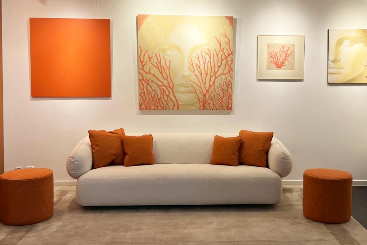
Someone mentions orange for Taylor Swift with irony, but orange soft is not to be discarded.
Why he might be chosen
-
It is the color of gentle energy, creativity, sociability.
-
Mediterranean and South American design are bringing it back into vogueand in natural and earthy versions.
Orange 2026 possible
-
Clay Orange
-
Mellow Pumpkin
-
Muted Terra
Why it is less likely
Warm and earthy shades are already the protagonists of 2025 (Mocha Mousse).
Pantone 2026 could surprise
The global community seems convinced that it will be green in all its most soothing shades.
And statistically he might be right.
But the history of Color of the Year teaches:
Pantone rarely chooses what everyone expects.
This is why it remains essential to monitor even the less cited color families: pink, lilac, mineral blue, buttery yellow, white, earthy orange.
We will find out on December 4th.
Table Analysis of the least cited colors for Pantone 2026
| Color family | Possible shade | Why Pantone might choose it | Because it is unlikely | Estimated probability 2026 |
|---|---|---|---|---|
| Pink | Soft Mauve / Quiet Blush | Message of care, empathy, humanity. It works in wellness spaces and in post-trauma narrative. Strong psychological color. | Pantone has already chosen colors from the same emotional area for 20232025 (Magenta ? Peach Fuzz ? Mocha). A fourth year on warm-rosé would be atypical. | Low (10%) |
| Lilac / Cold Mauve | Digital Lavender / Mineral Lilac | Perfect for tech, AI, ethereal digital aesthetics. Calming, introspective color, much loved by Gen Z and fashion. | Very Peri is from 2022: too recent in the purple-blue cycle for a new choice. | Medium-Low (20%) |
| Yellow | Butter / Soft Mellow Yellow | Symbol of hope, light, restart. Perfect in complex socioeconomic scenarios. Strong in food and in Northern Europe. | Pantone has already chosen Illuminating Yellow in 2021. The yellow spectrum is rarely repeated within 5 years. | Very low (5%) |
| Mineral Blue / Soft Aqua | Mineral Blue / Deep Horizon | Elegant, reliable, linked to trust, responsible technology, well-being. Growing in spa design and nature-water hotels. | Pantone chose blue in 2020 ( Classic Blue ) and blue-purple in 2022. Too close cyclically. | Average (30%) |
| White | Pure Calm / Pristine White | Conceptual, symbol of reset, mental break, I knowstenability. Perfect for less noise narratives. | Pantone almost always avoids whites for CoY: too neutral, not very photographic and not very “iconic” for global media. | Very low (5%) |
| Orange / Soft earth | Clay Orange / Mellow Pumpkin | Natural, creative, Mediterranean. Perfect for the artisanal + warm minimalism wave. | Too close to the warm, earthy tones already chosen for 2025 ( Mocha Mousse ). | Low (15%) |
| Green (despite being widely cited) | Olive / Sage / Eucalyptus | Psychological: calm, nature, connection. Cyclically missing since 2017. Highly requested by the community (but this doesn’t count for much). In line with the giant color trends 2026. | The only risk: it is too desired . Pantone loves to surprise and choose what is “missing”, not what is expected. | High (70%) |
| Teal / Green-blue | Soft Teal / Gentle Aqua | Perfect balance between digital and nature. Elegant, contemporary, very versatile in design. | Less mentioned than the olive family but still close. You risk the “already seen” effect post Very Peri. | High (60%) |
How to read the table
-
High Probability (6070%) ? Greens (olive, sage, eucalyptus) + soft teals ? narrative line calm, nature, soft futurism .
-
Medium Probability (2030%) ? Mineral blue ? narrative line technological, reliable, clean future .
-
Low Probability (< 15%) ? Pink, orange, white, yellow, lilac ? only possible if Pantone wants to totally surprise the community
Read also Pantone Palette Generator: AI to create professional color palettes on Pantone Connect
Leave a comment