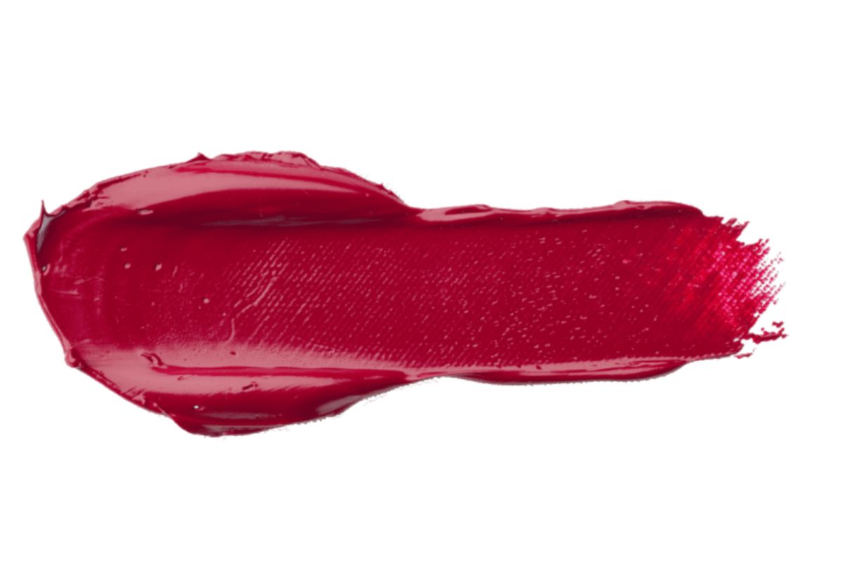
Born from a battle, grown in art and reborn in fashion, the magenta color is today the symbol of a contemporary sensitivity that combines strength and intuition.
Halfway between red and blue, magenta vibrates in its own dimension, suspended between heat and coldness, passion and reflection. It is the color of ambiguity, but also of rebirth: the energy of red and the spirituality of purple, the vitality of pink and the depth of blue coexist in it.
From nineteenth-century chemistry to digital design, magenta tells our story: that of a society that has learned to see the world in a more sensitive, more emotional, more aware way.
When was the color magenta born and why is it called that
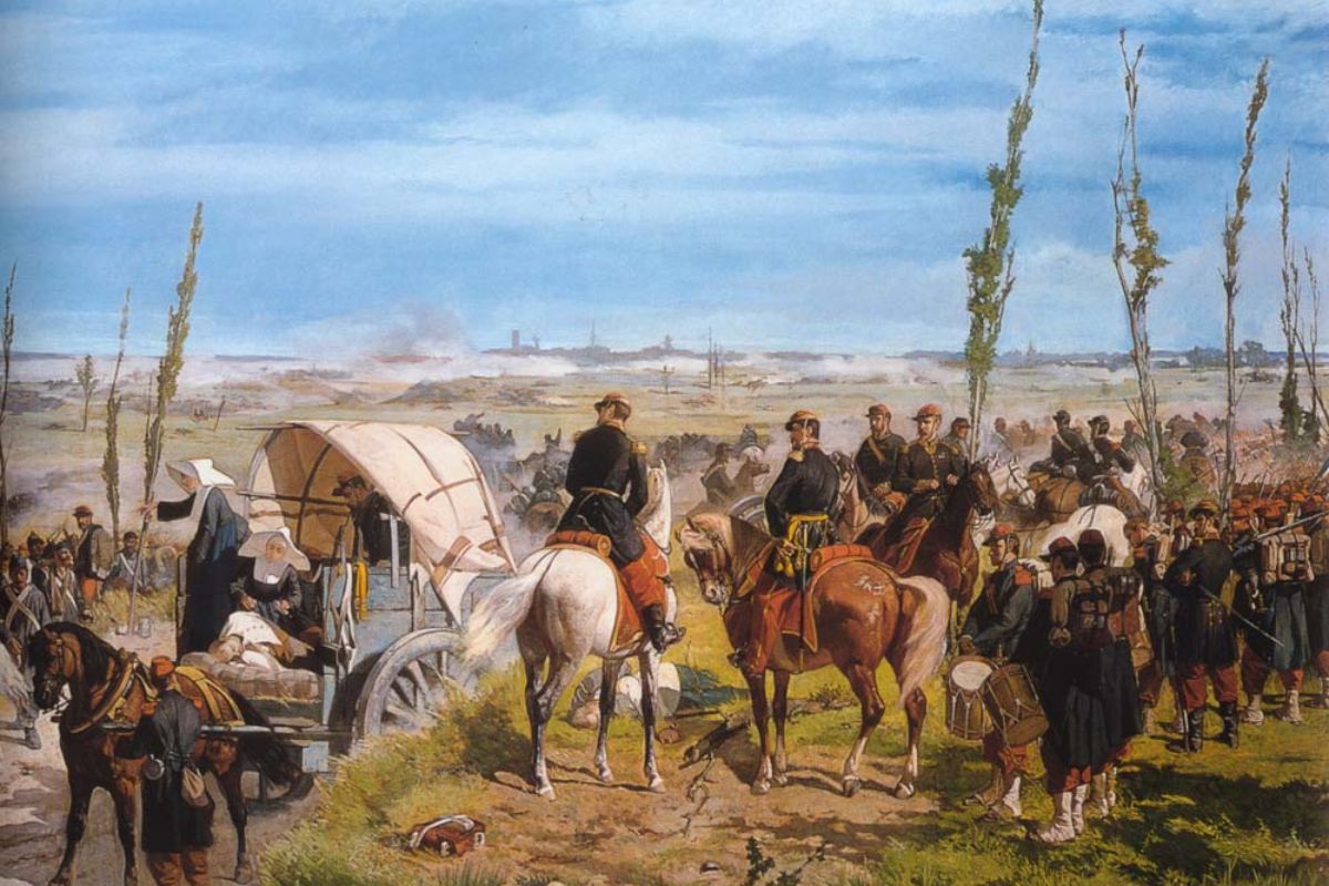
Magenta was born in 1859, the year in which the French chemist François-Emmanuel Verguin discovered a new synthetic dye based on aniline.
It was baptized Fucsina for its pink tone inspired by the fuchsia flower, but after the battle of Magenta – won by the Franco-Piedmontese troops against the Austrians – the name changed.
That colour, symbol of a patriotic victory and of a united Italy, thus became Magenta , in honor of the Lombard town where the clash took place.
At that time, the discovery of artificial dyes was revolutionizing the world: for the first time chemistry surpassed nature, opening the doors to industrial design, modern fashion and, later, color printing.
Magenta in color theory: a color that does not exist (but which we see)
Curiously, magenta does not exist in the visible spectrum of light .
It is not a primary color of physics, but a construction of our perception: it arises when the eye mixes red and blue , two wavelengths that do not touch each other.
The brain, to fill that void, invents a third color: magenta.
This perceptual ambiguity makes it unique. It is a color of synthesis , not of nature, and for this reason it is often associated with creation, metamorphosis and intuitive thought .
In printing, however, magenta becomes a pillar: together with cyan and yellow (CMY) it is one of the three primary colors that generate the entire chromatic spectrum on paper.
Symbolism and meaning of the color magenta
Magenta is a color full of symbolic energy.
It represents the balance between body and spirit , between love and intuition .
In the psychological language of colors it is often associated with transformation and healing , but also with feminine power and emotional freedom .
It is the color of rebirth , of the ability to let go and start again, and for this reason it is often used in visualization or meditation practices.
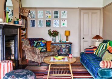
In interior design, magenta is a bold choice: a shade capable of warming up a neutral environment or giving character to an overly minimalist project.
Magenta, fuchsia, pink and red: the differences that matter
Although they are often confused, magenta and fuchsia are not synonymous .
Fuchsia tends to be brighter, brighter and with a dominant red component, while magenta is more balanced, with a light purple shade that gives it depth.
The red on the other hand is pure heat, a vital drive; magenta , on the contrary, represents a more elaborate, more mental emotion.
In fashion, magenta is considered an intelligent and sophisticated color : it communicates creativity and independence, while fuchsia speaks of creativity and vitality.
They are similar, but not the same: the first invites reflection, the second to action.
Is magenta a warm or cold color?
It is both.
And its strength lies precisely in this duality.
Magenta contains the warmth of red and the coolness of blue: it can warm or cool a palette depending on how it is used.
In interior design projects, it lends itself to dialogue with cold materials such as metal or glass, but also with warm textures such as velvet, wood or leather.
It is a hybrid and multifaceted color , which finds harmony in contradictions. And that’s perhaps why it never goes out of fashion.
How the color magenta is created (and how it harmonizes)
In painting, magenta is obtained by mixing red and blue in equal parts , with a small addition of white to make it brighter.
In graphics and printing, as mentioned, it is one of the three subtractive primary colors (along with cyan and yellow).
In digital photography or video, it is key to balancing skin tones and creating a warm yet sophisticated atmosphere.
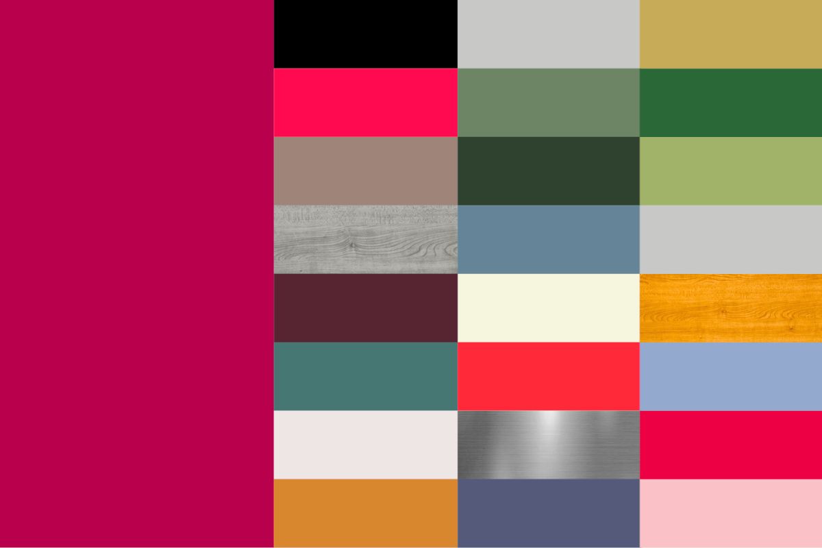
In contemporary color projects, magenta harmonises with neutral shades (light grey, dove grey, sand) or with strong contrasts (sage green, midnight blue, light gold).
The result is always the same: controlled intensity, pure emotion.
Magenta as the color of rebirth
Every era has its symbolic color, and magenta represents our era of rebirth .
It is the color that unites nature and technology, matter and spirit, artifice and emotion.
In an increasingly digital world, magenta recalls humanity: it reminds us that beauty arises from the balance between passion and awareness, between instinct and reason.
It is the color of those who are not afraid to change, of those who dare.
Like its very name, born from a battle, magenta is proof that from revolutions – chromatic or internal – something wonderfully new can be born.
Magenta in design
From Bauhaus to Pop: color as a design language
In the 20th century, with the birth of modern design, color ceased to be a simple decoration and became an integral part of the project.
magenta , due to its ambiguous and synthetic nature, found fertile ground in movements that sought to break traditional color schemes.
In the years of Bauhaus , although the school preferred the purity of the primaries (red, blue and yellow), magenta represented the threshold between these worlds, a “transit” color that anticipated the chromatic freedom of the post-war period.
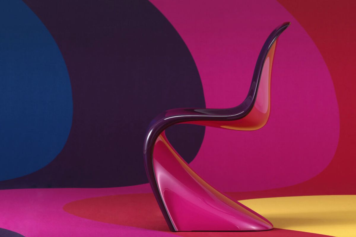
However, it will be with the Pop Design of the 60s and 70s – from Verner Panton to Ettore Sottsass – that magenta explodes as the color of visual rebellion : a symbol of vitality, sensuality and the future.
The famous Sacco by Zanotta (1968) and the colored plastics of Serie 7 by Arne Jacobsen in bright chromatic variations mark the birth of color as a democratic sign.
Magenta, in particular, becomes a political act: a color that rejects neutrality.
Magenta as an emotional code in contemporary design
In contemporary design, magenta has returned to the forefront as an emotional and technological color .
Companies use it to convey energy and sensitivity, balance between strength and empathy a dualism that reflects the values ??of the new digital aesthetics.
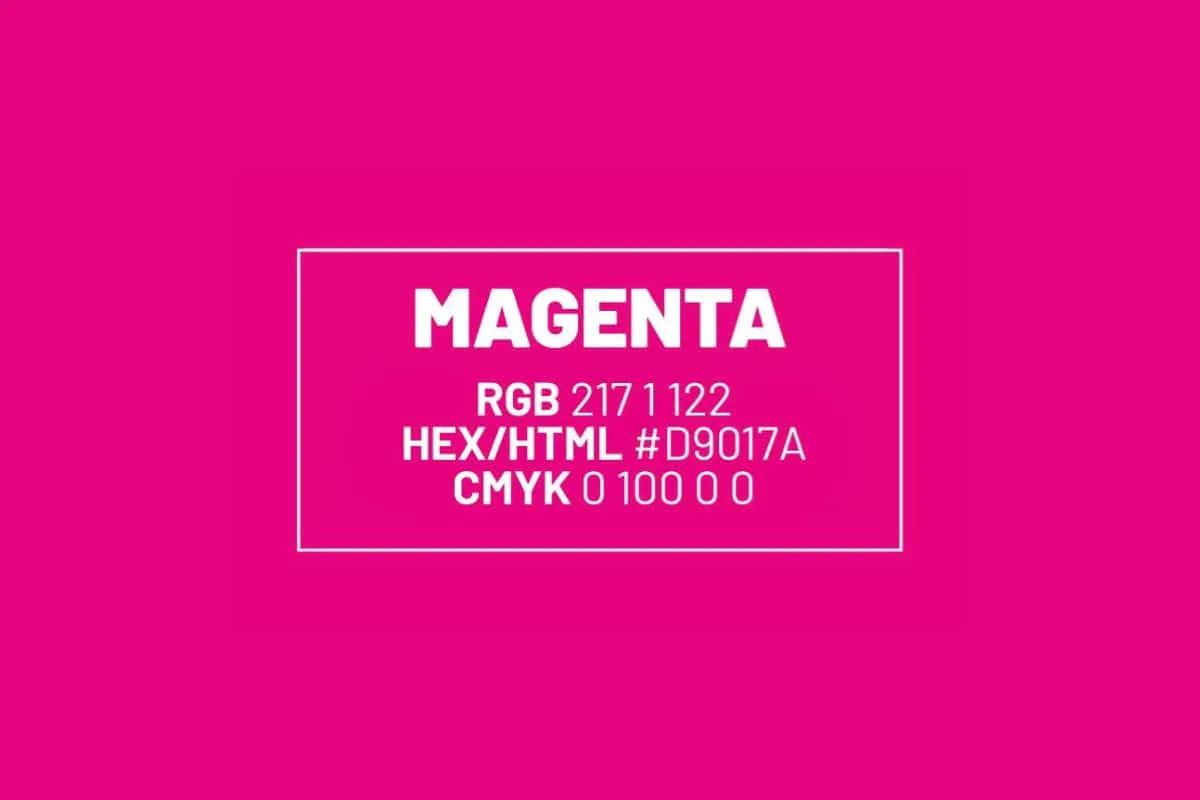
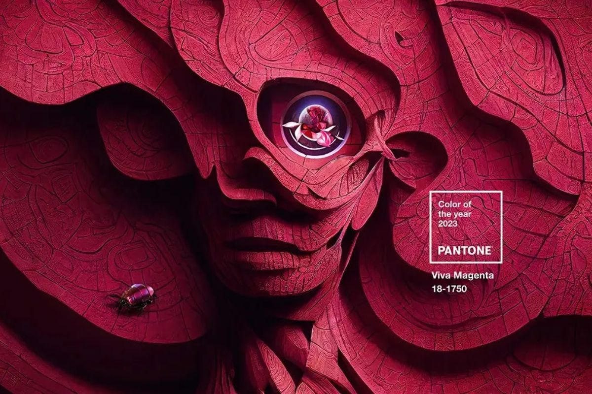
In 2023, the choice of Pantone Viva Magenta (18-1750) as Color of the Year sanctioned this return: not only as a trend, but as a philosophy.
The key words that accompany it courage, expression, hybridization between real and virtual perfectly describe the way in which design today deals with matter and color.
From Moroso to Kartell , from Vitra to Muuto , magenta has reappeared in collections as a signal of vitality and conscious optimism.
In particular, Patricia Urquiola has made it a vibrant language: in her projects for Cassina and Haworth, magenta is always a subtle but strategic presence, capable of creating visual rhythm and psychological depth.
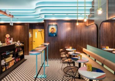
Magenta in interiors: when color becomes architecture
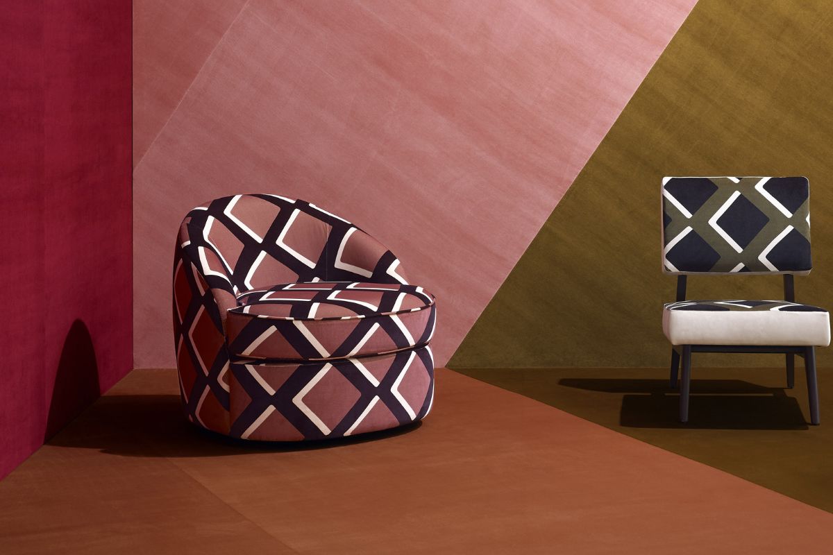
In interior design , magenta is never a compromise: either you love it or you avoid it.
But for those who know how to dose it, it becomes a powerful means for transforming the perception of space.
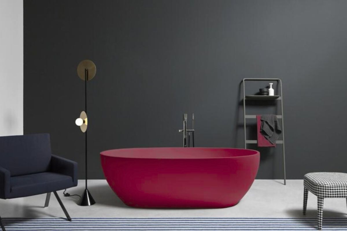
In contemporary homes, it is used as a accent color , capable of creating a focal point in environments dominated by neutral materials such as concrete, wood or stone.
In the 2000s, studios such as Studiopepe and India Mahdavi explored shades of magenta and deep pinks as tools of emotional architecture .
No longer a decorative color, but a vector of psychological energy: in restaurants, hotel lobbies or retail spaces, magenta creates an immersive and sensorial atmosphere.
Combined with warm or diffused lights, it amplifies the tactile perception of materials and adds a note of contemporary theatricality.
Today, in new generation residential projects, it is often used in contrast with “technical” materials – glass, steel, resin – to create a dialogue between artifice and organicity.
It is the color of aesthetic hybridization : the encounter between the analogue and the digital, between matter and light.
Architecture and magenta light: the new sensorial frontier
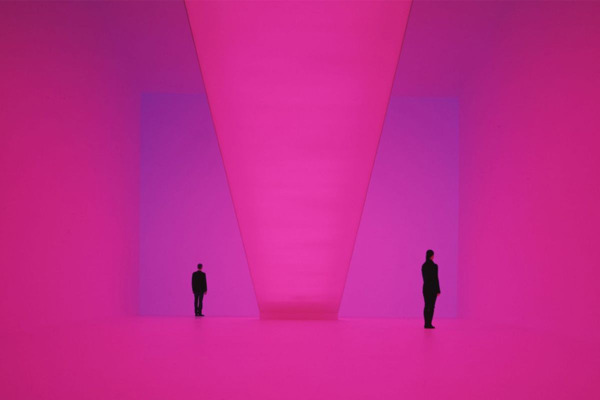
In contemporary architecture, magenta is no longer just a pigment, but light and atmosphere .
Installations such as The Illusion of Light by James Turrell or the LED facades of architects such as Herzog & de Meuron and Jean Nouvel demonstrate how color can become an integral part of spatial structure.
In these projects, magenta is often used as chromatic frequency : a light between red and blue that modifies the perception of volumes and the emotional temperature of the space.
In the Serpentine Gallery pavilion in London in 2002, Toyo Ito and Cecil Balmond introduced reflective surfaces with magenta shades to create a visual suspension effect.
The same principle is today taken up in many experiential and museum architectures: think of the Museum of the Future in Dubai or the M+ Museum in Hong Kong , where the interactive magenta lights create emotional connections with the visitor.
In the nocturnal urban landscape, magenta has become the color of the contemporary city : no longer just a sign or advertisement, but part of the architectural language a form of light that speaks of energy, femininity and the future.
Magenta as a code for the digital future
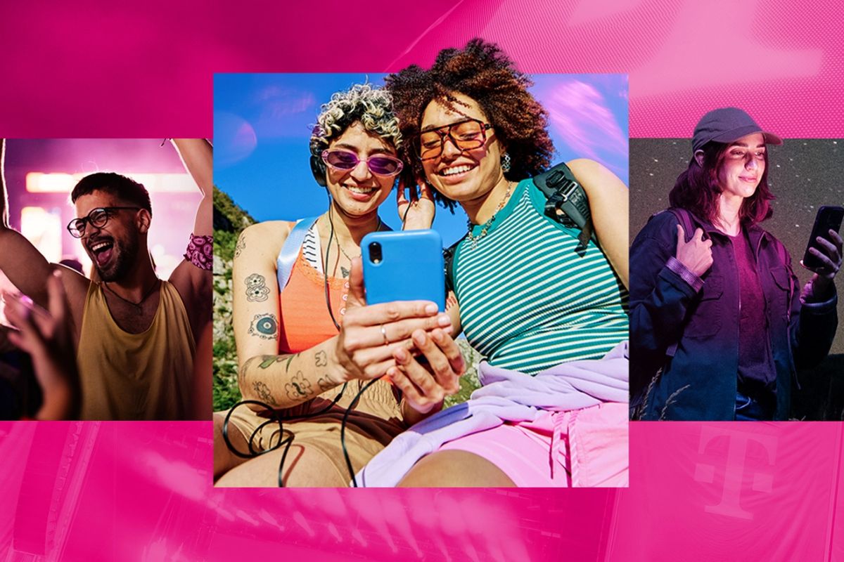
Today magenta is experiencing a second revolution, that of the metaverse and immersive design .
In the digital world, it is the color of the transition between real and virtual: it evokes sensations of human warmth in environments dominated by screens and pixels.
Not surprisingly, many technology brands from T-Mobile to Adobe have chosen it as their institutional color to represent creativity, connection and empathetic innovation .
In interface design, magenta is used to attract attention without attacking, to communicate emotion immediately.
It is the color of interaction and technological sensitivity, a shade that humanizes the algorithm and translates digital language into sensorial experience.
In architecture, its luminous and interactive version is today the protagonist of parametric-luminous installations , where the color changes based on data or people’s movements.
It is, in the full sense, an intelligent color : capable of reacting, adapting and communicating.
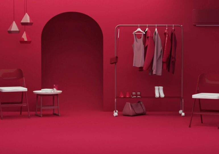
The color magenta in spaces: how to combine it and how to use it in furnishings
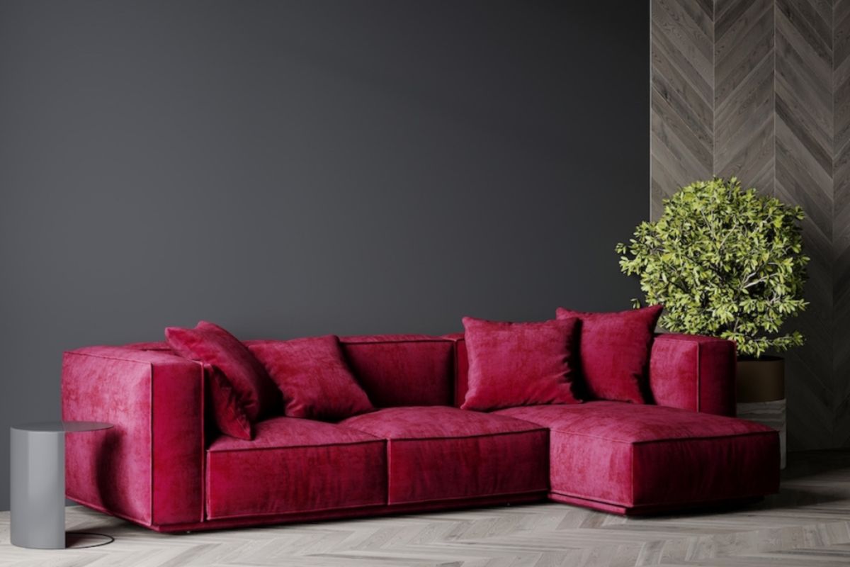
The magenta color in the spaces tells a precise vision of living: intense, emotional, but also balanced. It is a tone that does not simply fill, but constructs space, defines it and orients it.
Its strength lies in the ability to dialogue with different materials, lights and textures, taking on a new role from time to time – accent, counterpoint or leitmotif of the project.
Used with measure, magenta becomes an architectural sign: it transforms interiors into sensorial experiences, restoring warmth, character and visual depth.
Magenta as an architectural presence
Magenta is not a contour color: it enters the space like an architectural presence , capable of modifying the perception of volumes and light.
Used in the right way, it can change the visual hierarchy of an environment, transforming an anonymous point into an emotional fulcrum .
Due to its intensity, it is never neutral: it should be thought of as a material, not as a colour.
In modern spaces, its strength is balanced with tactile and natural elements: light wood, porous stone, raw linen, opaque ceramics.
In this dialogue between matter and chromatic vibration , magenta loses any pop connotation and becomes sensorial architecture.
Where to use it: each room, a different character
-
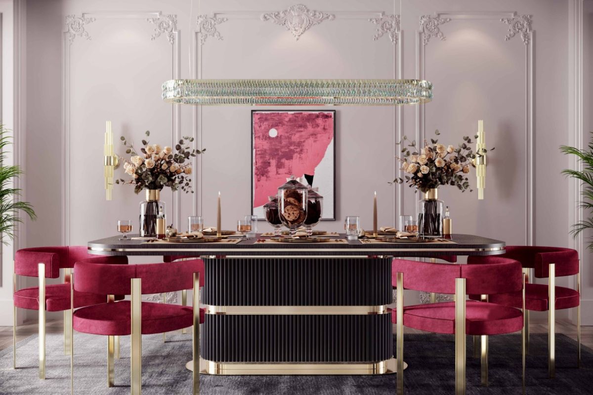
Living room ? The place of dialogue and relationship.
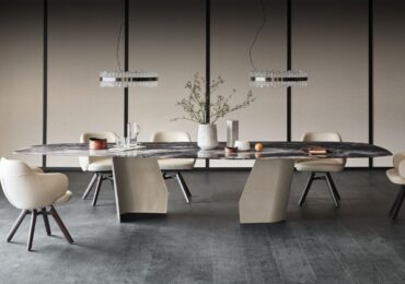
Here magenta works as an accent color: a wall, a sofa, a lacquered sideboard or a geometric carpet that becomes a focal point.
Combined with warm greys, beige or deep blue, it creates harmony. In more contemporary palettes, it can coexist with satin gold or graphite black. -
Kitchen ? Vitality space.
In small doses – for example on wall units, seats or scullery panels in colored glass – magenta stimulates appetite and conviviality.
It works well with white surfaces or brushed concrete, which absorb its intensity. -
Bedroom ? The risk is excess.
Here magenta should be used delicately, in dusty shades or controlled flashes (headboard, throw, works of art).
In duller shades, it turns towards mauve and becomes an introspective color, which promotes calm and introspection. -
Bathroom and home spa ? Magenta interacts well with shiny and translucent surfaces.
It can be used on resin or mosaic coverings to create contemporary atmospheres, especially if accompanied by warm light and neutral materials.
It is the perfect color to interpret a bathroom as a space of rebirth, not just a simple function.
-
Study or home office ? In this environment it becomes a color activator : it promotes creative concentration and a sense of energy.
It can appear in an ergonomic chair, an acoustic panel or an abstract painting. Combined with natural wood or optical white, it balances emotion and mental clarity.
Color combinations with magenta: the rule of breathing
Magenta thrives on balance.
To avoid overloading the space, it should always be combined with tones that give it breathing space .
Among the most successful combinations:
-
Magenta + pearl gray or warm dove gray ? Balanced elegance.
-
Magenta + sage green or olive ? Natural and sophisticated contrast.
-
Magenta + midnight blue ? Depth and introspection, perfect for living areas or bedrooms.
-
Magenta + sand and chalk white ? Emotional minimalism, ideal for Nordic interiors.
-
Magenta + light gold or brass ? Discreet luxury, for contemporary spaces and hospitality.
In bright environments magenta reflects light and becomes almost transparent; in the shady ones, it acquires material density.
It is a dynamic color , which changes depending on the amount of natural and artificial light: an element to be designed, not applied.
Materials and textures: how to make it breathe in space
The secret is to balance its visual power with materials that absorb its vibration.
Magenta goes beautifully with:
-
Light woods or brushed oak , which soften the saturation.
-
White or green marbles , for classic but refined contrasts.
-
Opaque or satin metals (brass, bronze, brushed steel), which enhance its brightness.
-
Velvety fabrics or melange wools , to give body to the shade without making it invasive.
-
Back-painted glass or glossy resins , perfect for bathrooms, kitchens or scenographic furnishings.
Magenta must never be confined to a decorative role: when it enters the project, it must have a narrative function .
Magenta and spatial identity: between emotion and measurement
Each color tells a character, but magenta tells two: passion and awareness .
It is the tone of those who dare, but with measure; of those who want to give an identity to the space without shouting.
In contemporary interior design, it represents a new form of expressiveness: empathetic, evolutionary, feminine and technological together .
In a world that tends towards the neutral and anonymous, magenta restores intensity.
It is not a color to hide, but to declare.
Used well, it acts as a mediator between matter and light, between project and emotion – and it is there, in that fragile balance, that the house finds its soul.
Frequently asked questions about the color magenta in the interior

How do you match the color magenta?
Magenta pairs perfectly with neutral tones such as pearl grey, sand and dove grey, or in contrast with bold colors such as sage green, midnight blue or light gold. The key is balance: giving him room to breathe.
In which rooms to use magenta?
Ideal in the living room as a focal point or in the study area to stimulate creativity. In the bedroom it works in the dustiest shades, while in the bathroom it creates contemporary and regenerative atmospheres.
How to use magenta in furnishings?
It can appear on fabrics, walls, accessories or light elements. It is a color to be designed with measure: a detail is enough to give energy and personality to the environment.
Is magenta a warm or cold color?
It is a transition color: it combines the warmth of red with the depth of blue. Precisely because of this duplicity he manages to create vibrant and harmonious spaces.
What is the meaning of magenta in interior design?
Symbol of rebirth, creativity and balance between instinct and rationality. It is the color of those looking for a home capable of conveying emotion and awareness.
Recommended palette with the color magenta
1. Contemporary Elegance
Magenta + Pearl G