At Marta gallery in Los Angeles, Veronica Ditting brings together 258 miniature publications, from the late 19th century to artists’ books. The newly opened show proves that shrinking an object is never just making it smaller: format, paper, typeface, binding and display all have to be rethought together.
The smallest book measures 2.4 by 2.9 millimeters. It is bound in leather, printed with a specialist technique and can only be read through a magnifying glass. Around this almost invisible object, Small Print builds a miniature books exhibition that is about scale without treating it as a curiosity. The second edition of Veronica Ditting’s project opened on November 7 in the Anteroom of Marta gallery in Los Angeles and runs until December 19, 2026.
The collection has grown quickly: from its first showing at Tenderbooks bookshop in London, with around one hundred titles, it now numbers 258 publications. What’s new is the American debut and the fresh installation; the collection itself spans more than a century. Mini dictionaries, artists’ books, foldouts, commercial editions and hybrid objects show that size is not an afterthought to content. It is already an editorial, production and even ergonomic decision.
Shrinking a book is not just making it smaller
When a book is reduced to a few centimeters, every component becomes more exposed. The weight of the paper changes how a page opens; the margins must keep some breathing room without eating up the available space; the sewing and the spine can no longer be treated as minor details. Typography behaves differently too: a typeface that reads perfectly in an ordinary volume can lose its structure, rhythm and contrast when pushed to the limit.
The selection makes very different solutions visible. David Bryce’s The Thumb Dictionary, published in the 1890s, uses ultra-thin paper to pack its text into a pocket-sized object. Das Kleinste Buch der Welt by German artist Josua Reichert, the tiny 2.4 by 2.9 millimeter volume, pushes printing and binding toward microfabrication. A rare Webster’s dictionary is housed in a silver Tiffany case: here the container does more than protect the book, it shapes how the book is used and what it symbolizes.
Among the most recent acquisitions is Yoshū Mame Tengoku, a series of 36 booklets produced in the 1960s for Suntory Whisky, covering subjects from gardening to glass. Alongside them sit Dieter Roth’s conceptual books, Robert Filliou’s accordion-fold Filliou Standard-Book and original Hanuman Books, the imprint founded by Francesco Clemente and Raymond Foye. The small format has no single lineage: it can be a practical tool, a promotional vehicle, an artistic experiment or an object meant to be carried close to the body.
This is the most useful takeaway for product designers. A change in size is never a neutral transformation. It changes tolerances, assembly sequence, grip, material strength and reading distance. A scale model and a miniaturized object may look alike, but they answer opposite questions: the first represents something that will exist elsewhere; the second has to actually work at its own dimensions.
An exhibition design that asks you to lean in
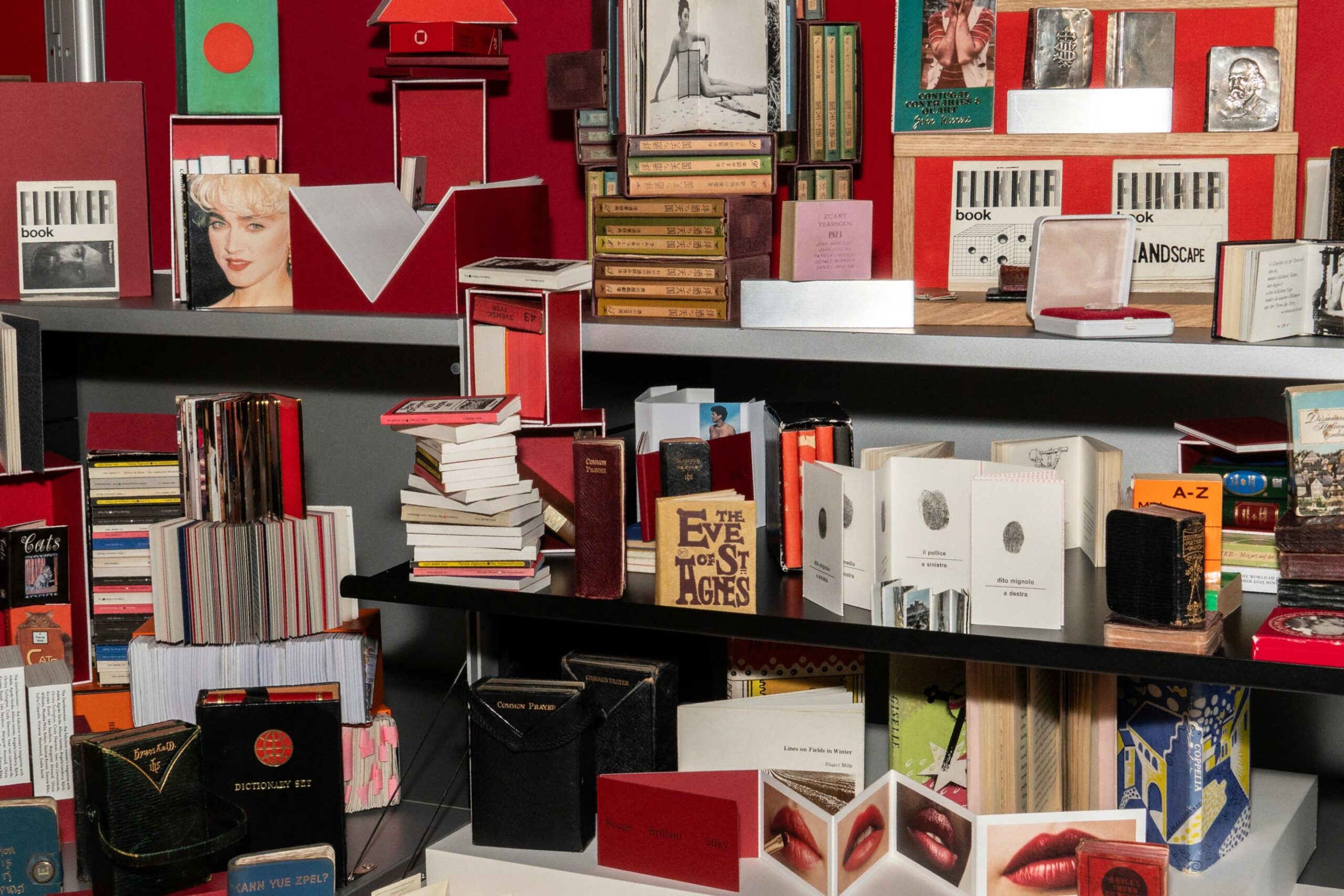
Moving from an intimate bookshop to a gallery raises another question: how do you display objects that risk disappearing into the space? Marta hosts Small Print in its Anteroom, avoiding the trap of diluting the collection in an oversized room. The official image shows a dense composition of shelves, blocks of red, open books, cases and vertical sequences. Placing the pieces close together invites comparisons of proportion and structure; at the same time, it forces the eye to slow down.
The audio tour follows the same logic. There is no app to download: visitors call a phone number, listen to a recorded menu and select the tracks matched to the small labels beside each volume. The voices include design historian Emily King, Fernando Augusto Pacheco of Monocle Radio and Dal Chodha of Central Saint Martins. The digital layer does not replace the object with a screen; it adds stories that the eye alone cannot reconstruct.
For exhibition design, the miniature is a tough test. Display case height, reflections, lighting, viewing distance and the density of captions decide whether visitors see an archive or just a row of cute things. There is also an unresolved tension: many of these books were made to be handled and leafed through, while their rarity demands protection. The audio narrative can partly make up for the lost gesture, but it cannot give back the weight, the friction of the paper or the resistance of the spine.
What miniature books teach designers
Small Print arrives at a time when most reading is detached from physical format. On a screen, text can be enlarged without changing the medium; these books are a reminder that size, content and use are inseparable. This is not a nostalgic exercise about paper. It is a test of how much design depends on the relationship between hand, eye and material, the same relationship at the heart of sensory design when it goes beyond the image alone.
For graphic designers and editors, the lesson is about hierarchy: when space shrinks, whatever isn’t essential has to go, and whatever stays has to become more precise. For designers of furniture, accessories or interiors, the issue is proportion: scaling down a handle, a compartment or a table without rethinking how the body uses it only produces a caricature. And for exhibition makers, what matters is directing attention. Making something bigger is not always the way to make it important; sometimes it is more effective to create the conditions that draw people closer.
The miniature still carries a risk: turning technical skill into a collector’s fetish. The precious case, the size record or the rare edition can seduce more than the design itself. Ditting partly avoids this trap by placing artworks, everyday tools and commercial publications side by side. The value of the exhibition lies not in a race to find the smallest book, but in making legible the decisions that hold form and content together. Even for anyone looking for new design and architecture books, the most interesting question is not only what to read. It is why a text has taken that particular form.
Sources
- Marta Los Angeles, “Veronica Ditting: Small Print”, primary source for dates, venue, works, dimensions and the audio tour.
- Wallpaper*, “A new exhibition in Los Angeles showcases the visual delight of teeny tiny books”, published November 7, 2026, independent confirmation of the number of works, the opening and the move from London to Los Angeles.
- Wallpaper*, first showing of Small Print at Tenderbooks, published December 17, 2025, background on the origins of the collection and the production challenges of the small format.