Spring does not enter the house with a bouquet of flowers: it enters with a change in light . It is an almost imperceptible variation, but ruthlessly sincere: it lengthens shadows, reveals defects, makes textures more evident, transforms "warm" colors into "heavy" colors and "cold" ones into "tired" ones. In 2026 this transition has a …
Spring does not enter the house with a bouquet of flowers: it enters with a change in light . It is an almost imperceptible variation, but ruthlessly sincere: it lengthens shadows, reveals defects, makes textures more evident, transforms “warm” colors into “heavy” colors and “cold” ones into “tired” ones. In 2026 this transition has a precise effect on design: it shifts attention from the image to rendering , from scenography to perceptual quality . We realize that it is not enough to choose “beautiful” furniture: we need furniture that remains beautiful when the sun hits a surface at five in the afternoon, when the room is backlit, when the artificial light turns on the metal and turns off the wall.
This is why the spring 2026 furnishing trends, if read well, are not a list of new objects: they are a series of micro-decisions that change the feeling of home. More opaque finishes, less aggressive contrasts, more tactile textiles, a palette that does not limit itself to “colouring” but directs the gaze. And above all: a more adult idea of ??comfort, where acoustics, order, ease of use, micro-functions count (a light point in the right place, an extra support surface, a space that can be quickly freed up). Spring 2026 means lightening without emptying, updating without redoing, making the house more “breathable” without making it seem temporary. It is a season that rewards coherent interiors, those in which each room has a personality, but all speak the same language.
Before we begin: the invisible rules of spring 2026
There are trends that are seen and trends that are felt. In 2026 the most interesting part is the second: a house no longer appears contemporary because it has an iconic object, but because it works well in real life and the light makes it credible. Before going room by room, it’s worth staring at five choices that have a huge impact and are often overlooked.
The first is real light : exposure, curtains, and lamp temperature. It is not a technical detail, it is the emotional filter of the entire interior. In spring, natural light becomes more generous and more “sharp”: if you have surfaces that are too shiny, they bounce; if you have oversaturated colors, they scream; if you have too cold whites, they become clinical. The second is the management of dominant surfaces : floors, walls, large volumes (sofa, kitchen, bathroom cabinet). They define the character of an environment. In 2026 we see a clear preference for opacity, micro-textures, materials that absorb the gaze instead of repelling it.
The third is the palette designed in three levels : base, accent, depth. A base of warm neutrals (even very light ones), a measured accent (one or two shades), a depth that can be a brown, a soft black, a satin metal, or a more “graphic” but not violent note. The fourth concerns touch : if you want a spring interior that does not seem fragile, insert at least two “soft” materials per room (textiles, satin wood, velvety paints, brushed stones). The fifth is the most contemporary: the micro-functions . Let’s not talk about technology at all costs; let’s talk about choices that make the home easier: a light point where you need it, a countclarity that disappears, a corner that is prepared in thirty seconds. These are details that do not create a scene, but create quality.
A useful warning: when we say spring, the brain runs to pastels and florals. In 2026 this is the association that risks trivializing everything. The most interesting spring is the sophisticated one: dusty colours, warm neutrals, light and airy blues, gray greens, barely noticeable powdery pinks. And then: a lot of work on matter and light, rather than on color “for color”.
Living room: light comfort, intelligent layering
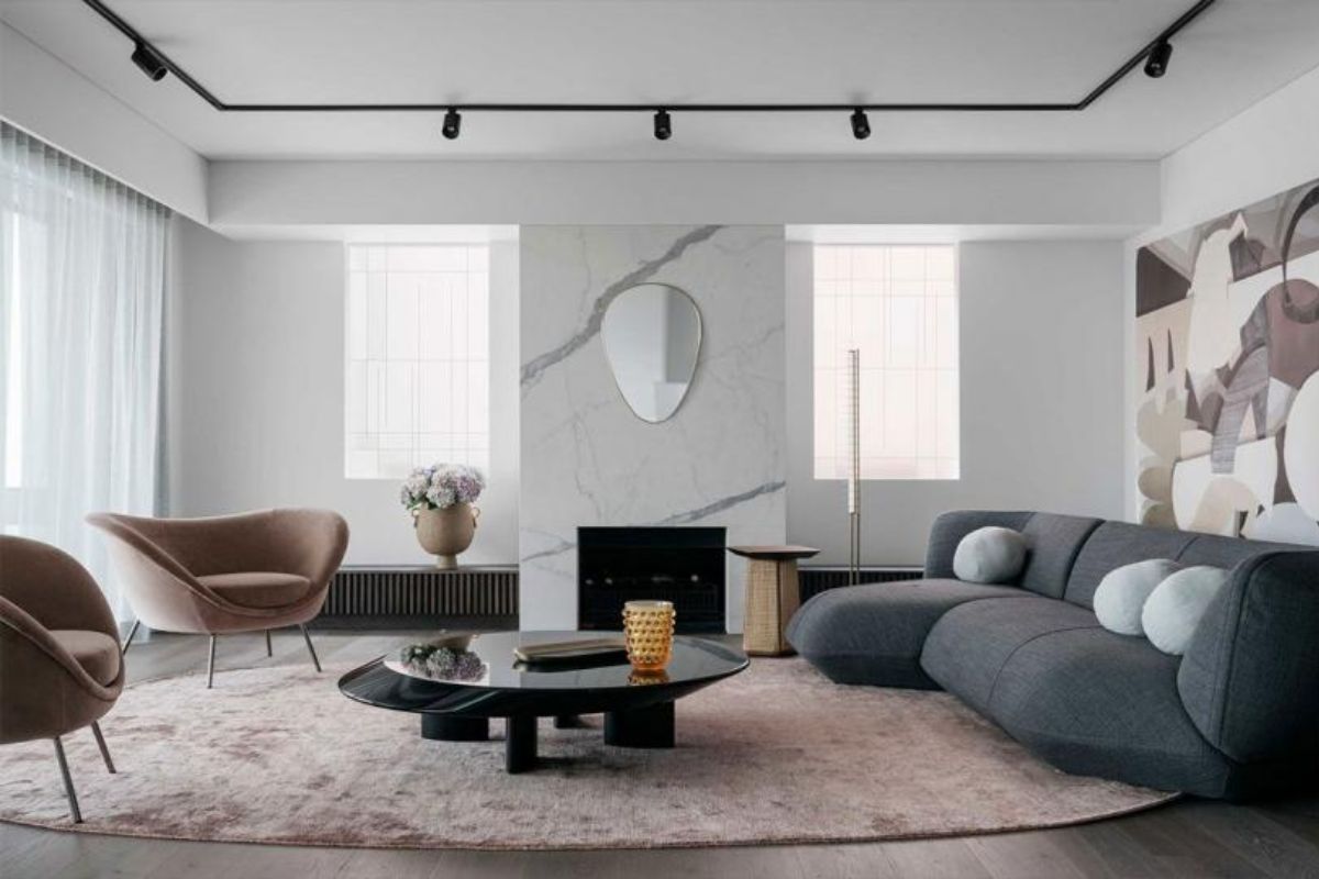
The living room is the environment that immediately announces the season. As the days change, you notice if the space is too dark, too shiny or too full. In 2026, the trend in spring is not minimalist in the strict sense of the word: it is light . It means that comfort remains central , but the way you tell it visually changes. An important sofa can remain, even large, even deep: the difference is that it stops being a “block” and becomes a soft island, defined by tactile fabrics and shades that do not attack the light.
The first quality move is to work on the surfaces that catch the eye: tables, bookcases, containers, walls. Spring 2026 favors satin metals over bright chrome, light but warm woods (more honey than ash), and matte finishes that create depth. If you want an effortlessly contemporary effect, think of the living room as a flash-free photograph: less reflections, more matter. The lacquers also remain, but they become more sophisticated: velvety matt, not showroom gloss.
Color changes role in the living room. It is no longer the shouted accent that serves to “modernize” the room; it becomes an emotional basis. evolved neutrals workwarm creams, sand, oat milk-like shades because they are a backdrop that holds objects, art, textiles and light. On this basis, the accent can be a very airy light blue (not blue, but a tone that resembles the veiled sky), or a grayish green which gives calm without becoming rustic, or a almost powdery powdery pink which makes the perception of the entire space softer. Depth, however, comes from the details: a brown, a satin bronzed metal, a thin black line in the lamps or frames.
The most concrete trend of the spring 2026 living room, however, is lighting. Not as a design lamp put there for the photo, but as a project. General light is no longer enough, especially in spring when you spend more time between late afternoon and evening. The high-end interior can be recognized by this: you have at least two or three light points that create different atmospheres . A soft light for welcoming, a precise light for reading, a background light to avoid collapsing the space in the dark. And if you really want a noticeable upgrade, work with a floor lamp that illuminates vertically and a lower light near the sofa: change the room without changing the furniture.
Finally, textiles. Here spring 2026 asks you to lighten without impoverishing. Not “remove”, but change weight: airier curtains, visible textures, lighter throws, less contrasting but more tactile cushions.The carpet returns as a protagonist not because it is a trend, but because it solves a real problem: acoustics and comfort. In a contemporary home full of hard surfaces, a well-chosen rug is more luxurious than many haphazardly placed objects. And in spring, its texture becomes part of the experience: it doesn’t just have to feel good, it has to be pleasant.
Bedroom: sensorial calm, palette that does not tire
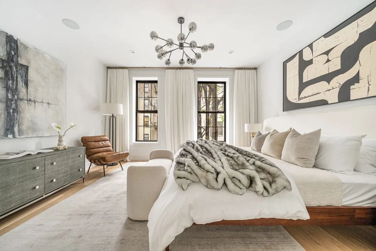
If the living room is the environment of sociality, the bedroom in spring becomes the place where the house shows its intelligence. In 2026 the bedroom does not pursue the hotel effect; follows the effect real rest . There is a subtle but decisive difference: the hotel focuses on photogenic neutrality, the contemporary room focuses on a neutrality that protects you. The strongest trend is a palette that does not tire: t light but warm onions, dusty colors, low contrasts, and materials that invite the touch .
Here color works best when it is “atmosphere” rather than gesture. A wall behind the bed can become a soft backdrop a warm cream, a sand, an almost imperceptible powdery pink, or a light and milky blue that gives air . Avoid too cold tones: in spring they immediately seem distant. If you want depth, you don’t need to darken: just insert a “denser” tone in the detailsa textile headboard, a blanket, a lamp with a satin finish.
Material is the true protagonist of the spring 2026 bedroom. Breathable fabrics, natural or mixed textures, linen and cottons with a full feel, but also light bouclé and fabrics with visible weaves . It’s a way to make the room sophisticated without loading it with objects. The sensation to look for is this: open the door and feel that the environment is “calm” before you even observe it. To achieve it, reduce visual noise: bedside tables with free surfaces, hidden cables, a few well-chosen objects.
Then there is a theme that is becoming increasingly central: the light in the room. In spring we wake up to more light, and this changes the way we perceive colors in the morning. In 2026 we see a preference for “companion” lights and not “floodlights”: soft wall lamps, adjustable light points, a low evening light that does not dazzle. The upper room, today, is not the one with the scenographic chandelier: it is the one in which you can choose the intensity and height of the light without thinking about it.
And finally the function: spring 2026 means a tidier room, but not in a punitive way. Order is not aesthetics: it is well-being. This is why integrated containers, container benches, wardrobes that do not look like “walls” but light volumes come into play. If you want a truly contemporary detail, work on a small but precise corner: a small armchair, a light point, a table top. It is a design gesture because it creates a ritual: reading, writing, breathing. The room becomes less of a “room” and more of a “recovery space”.
Cuisine: visual cleanliness, sincere materials, details that work
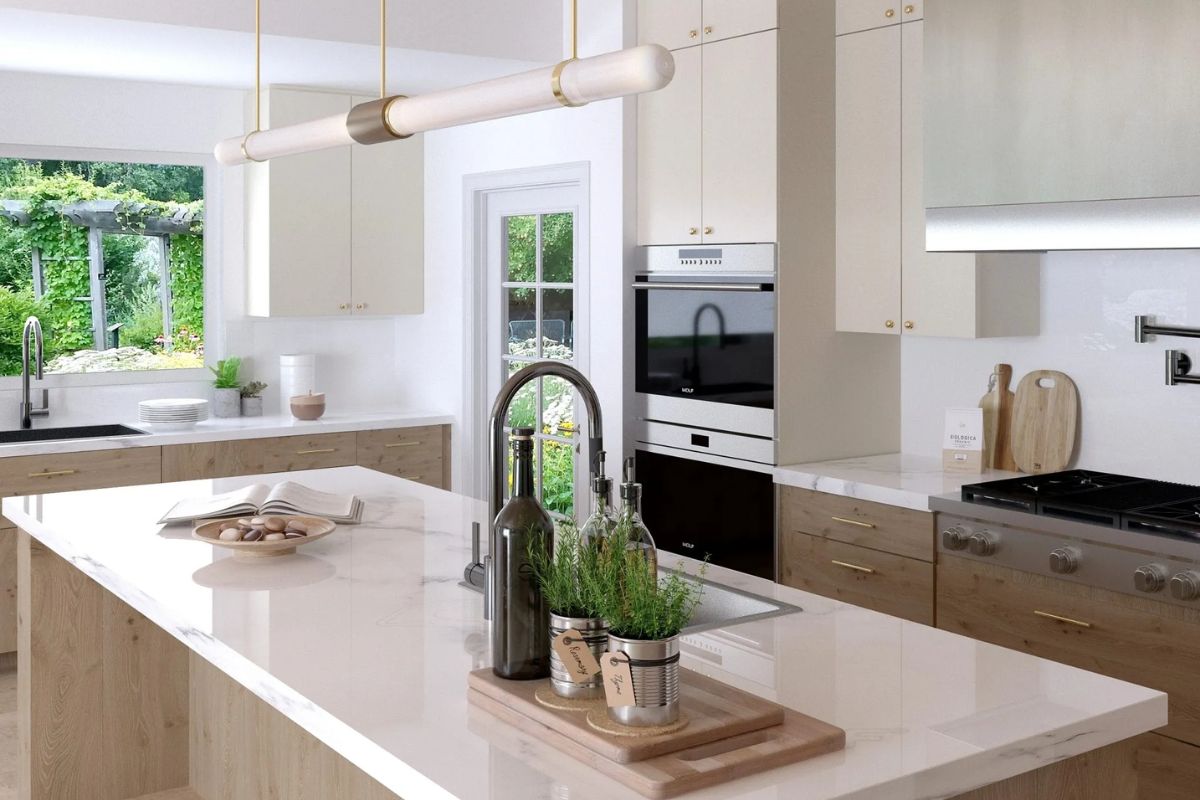
The kitchen in spring is a test bed: if it is well designed, the season makes it brighter and more livable; if it is not, the light reveals clutter, reflections and overload. In 2026 the kitchen trend isn’t about putting on a show: it’s about making things clear. Visual cleanliness does not mean an empty kitchen; it means everything has a place, and the design eliminates the noise.
Here the most important choice concerns the finishes. Spring 2026 rewards opaque or semi-opaque surfaces , more resistant to the perception of fingerprints and reflections. This applies to doors, tops, even some metals. Kitchens that are too shiny become “hard” under strong natural light. The most elegant direction is a sophisticated matt: l velvety finishes, new generation laminates with textures, stones and ceramics that do not shine but have depth .
On a chromatic level, the 2026 kitchen is not forced into white. Indeed: the white remains, but it warms up . Shades like cream, sand, oat milk work because they maintain brightness without coldness. If you want a touch of colour, the most credible trend is to insert it as a “second item”: a neutral base and a color in an element (columns, island, niches). Gray greens, dusty light blues, and some very muted terracotta shades are choices that hold up well to spring light and don’t get tired in the long run.
The kitchen, however, is also a question of micro-functions: spring 2026 means more home living, more guests, more time at the tables. And therefore: more free planes, more targeted light points, more order . A contemporary interior can be recognized by how technology “disappears”: integrated sockets, small hidden appliances, systems that free up the top. It’s not a sterile aesthetic: it’s an aesthetic that makes cooking easier. If you want a truly trendy detail, work on managing the light under the wall unit, and on a warm light above the table: transform the kitchen into a convivial place without changing anything structural.
Finally, the table . In spring it returns to central . The 2026 trend is a table that does not necessarily have to be huge, but must be comfortable, stable, tactile . Satin woods, matt surfaces, comfortable but light seats. This is where you see the difference between design for photos and design for life: a chair that looks good but isn’t used is no longer contemporary. Contemporaneity means choosing comfort and beauty together.
Bathroom: designed well-being, surfaces that calm
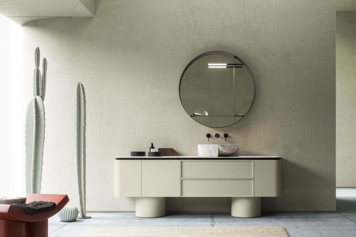
The bathroom, in 2026, is the environment in which the home most clearly shows its relationship with well-being. In spring this theme grows: longer light, desire for rituals, desire for perceptive cleanliness. But be careful: the spring 2026 bathroom trend is not to transform everything into a catalog spa. It’s about creating a calmer, easier, more coherent bathroom.
The first direction is on surfaces. Opaque, once again, but with a nuance: opaque does not mean “flat”. It means subtle textures, brushed stones, ceramics with micro-grains, resins or paints that absorb the gaze . In the bathroom, this choice is doubly powerful because it reduces the aggressiveness of artificial light. And in spring, when natural light enters more, it prevents the bathroom from feeling too “cold” or “clinical”.
The 2026 bathroom palette moves well on warm neutrals and sophisticated natural tones. The cold whites remain in the details, but the backdrop warms up. Cream, sand, warm greys, and then measured accents : a light blueiaro water, a grayish green, a powdery pink almost like stone. The important thing is not to fall into the decorative: in the bathroom the color works when it seems part of the material, not when it seems “painted on”.
Then there is the topic of hardware and metals. In spring 2026, satin, brushed, soft finishes are preferred. Shiny metal tends to look harder in strong natural light. Here too the quality trend is a more discreet presence: taps that do not try to become protagonists, but which elevate the whole. And above all: consistency. In the bathroom, mixing too many finishes is the mistake that is immediately noticed in spring.
Finally, function: the contemporary bathroom is a tidy bathroom. Not in the aesthetic sense, but in the easy maintenance sense. Niches, well-integrated containers, free surfaces, mirrors that amplify the light without turning into an “effect”. If you want a smart spring choice, work on the mirror (size and lighting) and on a comfortable support point near the sink. These are details that change the daily experience more than a new covering.
Entrance and corridor: the new elegance is the threshold
The entrance is the most underrated room and, at the same time, the one that makes the house immediately “contemporary”. Spring 2026 means tidier, brighter, kinder threshold . It’s not just an aesthetic thing: with the season the rhythms change, you come in and out more, and the entrance must work.
The trend here is a silent design: few elements but well chosen. A light console (or shelf), a mirror that multiplies the light, a light point that does not dazzle, a discreet container for what would otherwise “invade” the living room. And then something that becomes central again in 2026: matter. In an entrance, even just a wall with velvety paint or a light covering immediately creates quality, because it is a design gesture. It is the idea that the home begins before the living room.
If you have a long corridor, spring 2026 suggests a very contemporary way of treating it: not as a neutral passage space, but as a soft gallery . Few paintings, well-calibrated light, a coherent palette. The tendency is to let it breathe, not fill it. And if you want a high makeup look, work on a single accompanying color decision: a continuous warm neutral, interrupted by subtle dark details or a very light accent in a doorway or niche.
Home office and study corners: spring 2026 brings gentle ergonomics
Not everyone has a study room, but almost everyone has a corner where they work, organize and write. Spring 2026 means making this space lighter and less “temporary”. The high trend is gentle ergonomics: a comfortable chair that doesn’t look like an office one, a desk with a pleasant surface, a light that doesn’t tire.
Here the project is not aesthetic: it is psychological. In spring the natural light increases and invites you to stay closer to the windows. So the most contemporary choice is to position the desk so as to have side light, and insert a warm evening light. The palette also matters: warm neutrals, satin woods, and a very measured accentRated (light blue, gray green) work because they calm you without making you fall asleep.
Another key element of 2026 is the management of cables and small objects. If the work corner is always messy, the house loses perceptive quality. Simple solutionscable holders, small containers, a shelfare more trendy than decoration. It’s design because it improves life.
Outdoor, balcony and terrace: continuity between inside and outside
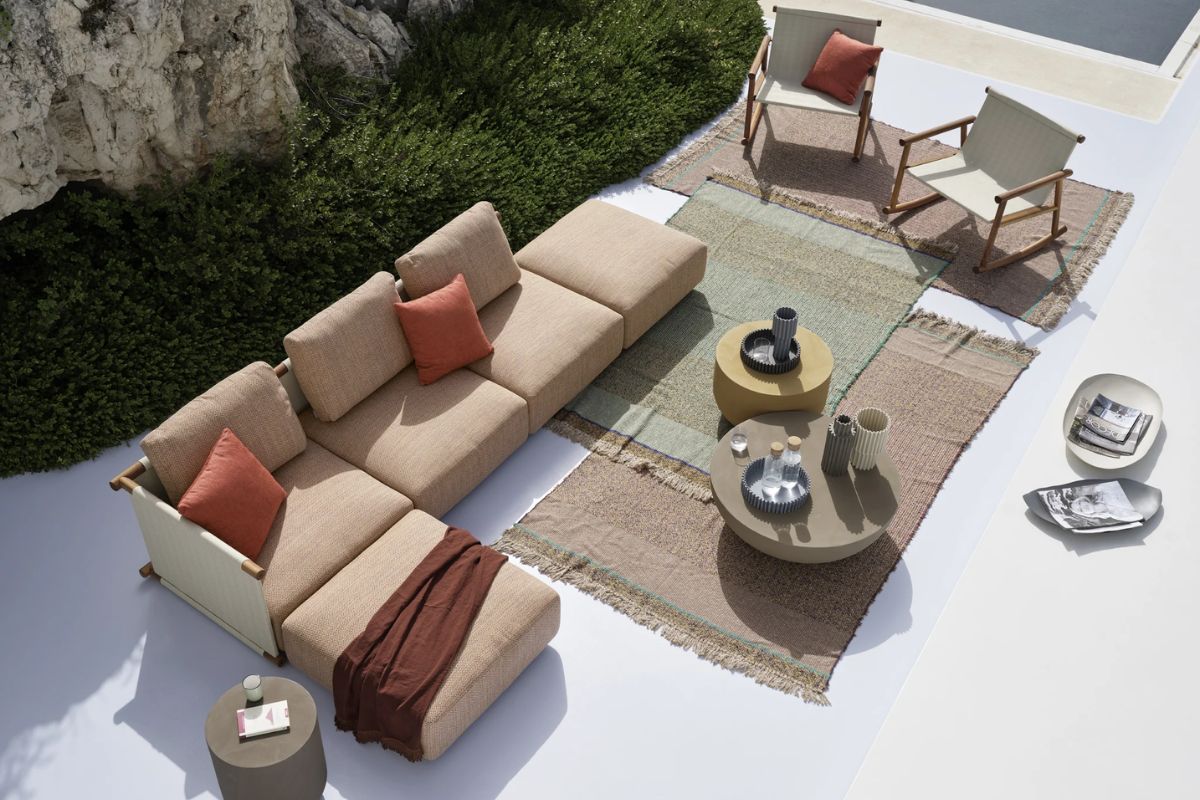
In spring, the most Italian trend of all returns as protagonist: the continuity between inside and outside. In 2026 we are not just talking about “outdoor furniture”, but about a domestic atmosphere that comes out: outdoor carpets, warm lights, resistant textiles, small tables as an extension of the kitchen or living room .
Here the risk is falling into the standard spring boho. The highest direction is a clean but sensorial outdoor: resistant materials, a palette consistent with the interior, and few elements that create rituals. A comfortable chair, a light point, an important vase, a coffee table that is actually used. The contemporary outdoors is not filled: it is inhabited.
If you want a spring 2026 gesture that immediately raises the quality, think about lighting. Low, warm, distributed lights. You don’t need much: just make sure the outside looks inviting even after dark. This is where the house becomes bigger without extra square meters.
Spring 2026 design trends
What are the trendy colors for the home in spring 2026?
Warm and light neutrals (cream, sand, oat milk) as a base, with dusty accents: light air blue, gray green, very muted powdery pink. Depth comes from browns and satin metals.
Better matte or glossy in 2026?
For spring 2026, matt (or semi-matt) wins because it manages natural light better and makes spaces softer and more sophisticated. The gloss remains, but used with moderation.
How to make the living room more “spring” without changing furniture?
Act on textiles (weight and texture), carpet (comfort and acoustics) and light (at least two levels). Reduce reflections: satin metals and less shiny surfaces change perception immediately.
What is the most common mistake when following trends?
Confusing trend with accumulation: adding objects without changing the dominant choices (light, surfaces, palettes). In spring the light unmasks everything.
Which interior design materials 2026 are most consistent with spring?
Satin and warm woods, ceramics and matt/brushed stones, fabrics with visible texture, satin metals. More textures, fewer mirrored surfaces.