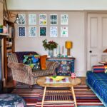
Leafing through the 2026 bathroom catalogues, a revealing detail emerges, capable of saying much more than a simple aesthetic preference: quiet luxury has established itself as one of the most recognizable languages ??of the moment. "Silent luxury" has become a cultural key even before a stylistic one, and tells of a precise change in the …
Leafing through the 2026 bathroom catalogues, a revealing detail emerges, capable of saying much more than a simple aesthetic preference: quiet luxury has established itself as one of the most recognizable languages ??of the moment. “Silent luxury” has become a cultural key even before a stylistic one, and tells of a precise change in the way in which designers, enthusiasts and people sensitive to design today seek elegance, well-being and perceptive quality : less gesture, more substance. More attention to detail, less need to declare.
In the bathroom this sensitivity finds an immediate translation, because here every choice is close-up, daily, physical: the color does not remain in the background, it builds the scene . It is the first layer that orients the perception of cleanliness, light and calm; what makes a technical room a “central”, domestic, almost ritual room. This is why, in 2026, the bathroom project increasingly begins with an apparently simple and actually decisive decision: a conscious palette .
Bathroom color trends 2026: the room design that starts from a shade
Beneath the quiet surface of the 2026 catalogues, the most interesting fact remains the persistence of neutrals and the way in which they change: less optical, warmer, more material. According to the market analysis published in the document 2025 U.S. Houzz Bathroom Trends Study : white remains the most frequent choice for bathroom walls, both in the shower (36%) and outside the shower (25%), followed by off-white (18% in the shower; 21% in non-shower areas). Greys, beiges and blues appear, but in smaller quantities.
The point, however, is not “white wins”: it is which white and, above all, which finishing system is built with. The 2026 Bath Trends Report of the NKBA/KBIS area says it explicitly, in terms of preferences collected among professionals: 96% of interviewees identify neutrals as the most chosen range for the bathroom, with off-white (58%), light brown/tan (54%) and white (40%) among the most recurring responses. Alongside neutrals, burnished and natural greens emerge: sage (64%) and olive (43%) are indicated as stronger expected choices compared to bolder shades.
Then there is a perceptual level that designers know well and which is worth stating: in the bathroom color also works as a sensorial signal. In Formica research on the washroom/hospitality world, whites and creams are the colors most associated with a “clean and well-kept” bathroom (39%) and a share of interviewees declares that lighter shades even influence the perception of odor. It is a data born in the contract sector, but useful for reading because, even in the residential sector, the light palette remains such a “strong” basis.
Even the trade fairs describe the as more than the what . At ISH (Frankfurt), the Pop up my Bathroom trend exhibition showcases bathrooms designed as holistic spaces, where walls, floors, colors and light are designed in harmony with bathroom fixtures and taps: a very clear indication that color in 2026 is designed as a system and not as an isolated choice. And at Cersaie, look at the Exhibitors Catalog (and the collections presentate) means seeing the grammar of the surfaces up close: nuanced, delicately luminous palettes, often available in matt and glossy to control reflection and depth.
This is where this dossier starts: not from the question “which color is the most trend in the bathroom in 2026 “? but from a more useful one for those who design – where color lives in the bathroom (walls, volumes, accessories) and how a credible palette is built between light, material and detail.
From color as an idea to color as composition: two Cerasa readings from 2026
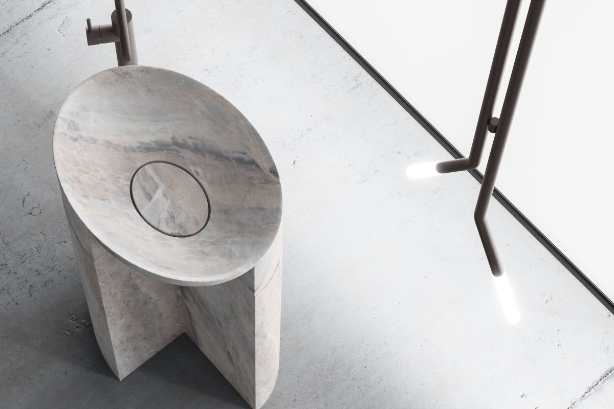
If neutrals remain the most solid basis of the modern bathroom, the difference in 2026 depends on how they are orchestrated. A palette works when it is a system: a dominant tone, a guiding material, a metal used as punctuation, a light capable of restoring depth without altering the balance. In this grammar, some Cerasa compositions offer two clear examples of quiet luxury applied to the project: control of reflection, quality of surfaces, measurement of detail.
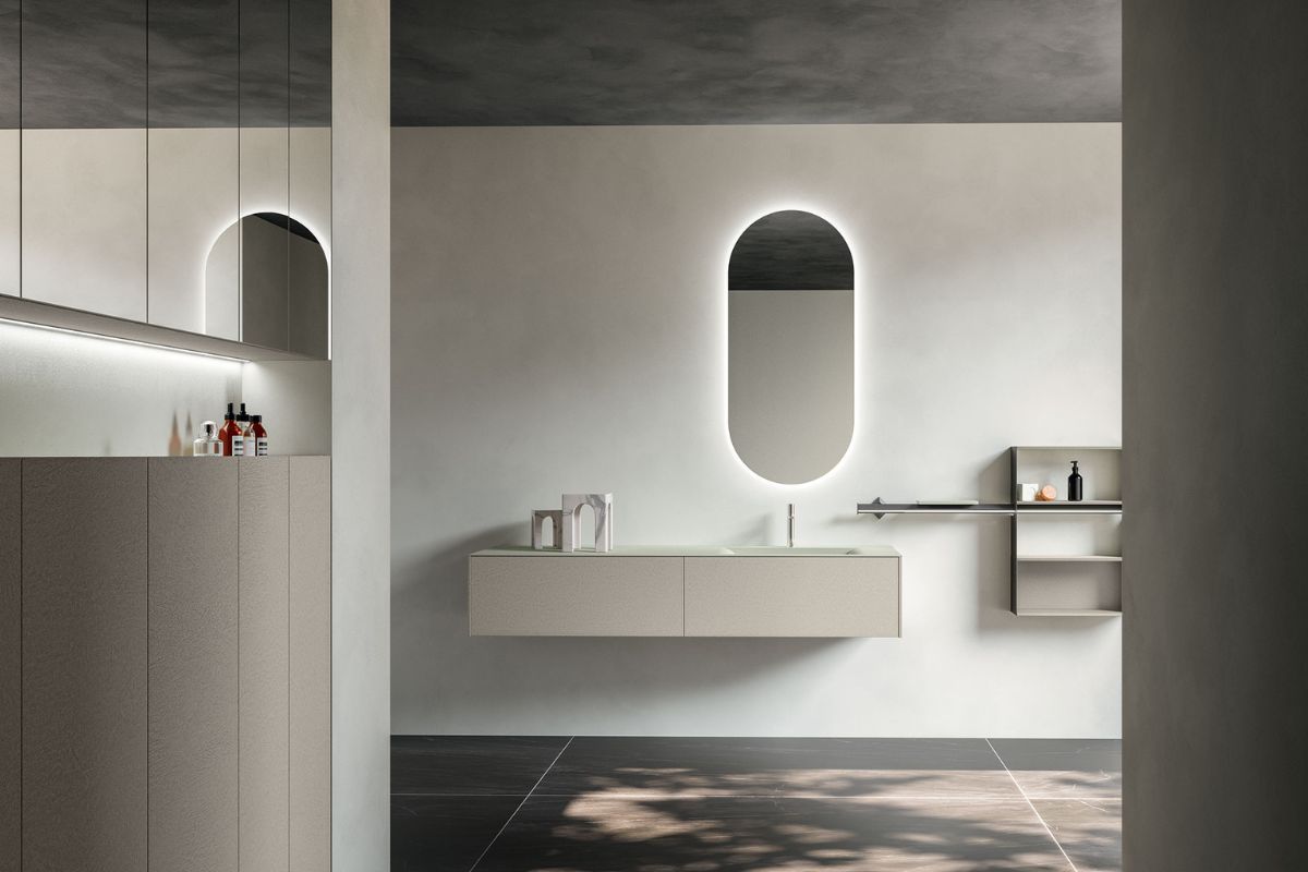
Honey, 2022 (integrated 2025): the ethereal built on stone, ice and light
Designed by architect Michele Marcon , Honey interprets neutrals as atmospheric shades. The identity of the collection is recognized in the inclined metal terminals: a discreet sign that defines the composition, gives rhythm to the volumes and introduces a sophisticated accent without resorting to protagonist colours.
In the composition with sink base and chest of drawers, the panel in glossy Laminam Statuarietto and the lower drawer in matt Ghiaccio lacquer with 3D effect create a clear and layered palette, made of controlled reflections and soft opacities. The LED lighting on the front warms the whole and makes the white more “habitable”, transforming the atmosphere without changing the background tone. The Lingotto washbasin, placed on a glossy Laminam Statuarietto top, takes up the characterizing lines of the collection; the Elegance mirror, illuminated by LED (diameter 110 cm), completes the composition with Nickel lacquered decorative elements.
Honey also extends to the finishing elements: the Grigio Ghiaia matt lacquered columns, with inclined metal details, introduce a mineral neutral that works as a controlled shadow, adding depth without weighing it down.
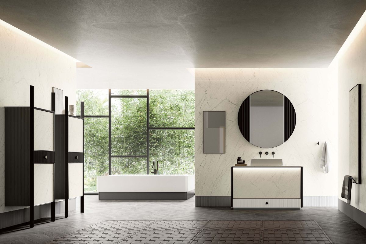
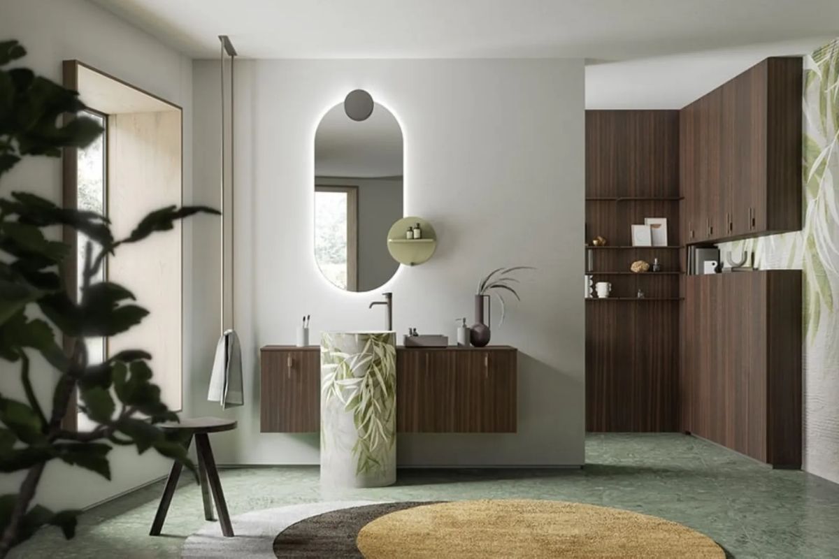
DES Evolution, 2024: the mineral neutral between personalization and tactility
Designed by Stefano Difesatto and available from 2024, DES Evolution puts customization at the center and translates it into a system rich in materials and finishes. The catalog also reflects this approach, dividing the collection into four sections associated with moods and personality archetypes: a contemporary way of telling how the palette becomes an identity choice even before a trend.
In one of the selected compositions, the protagonist is the freestanding Pila RS washbasin in Solid Surface, covered with Stone Deckblend Resin in a Pearl Gray finish. The workmanship, inspired by Renaissance frescoes, brings an elegant materiality and a “full” light, typical of mineral surfaces, to the bathroom. The Visio freestanding mirror, fixed on a swivel support and with lighting onLED top, is made of light oak; the back integrates hangers and shelves in nickel metal, confirming the role of the details as an integral part of the palette.
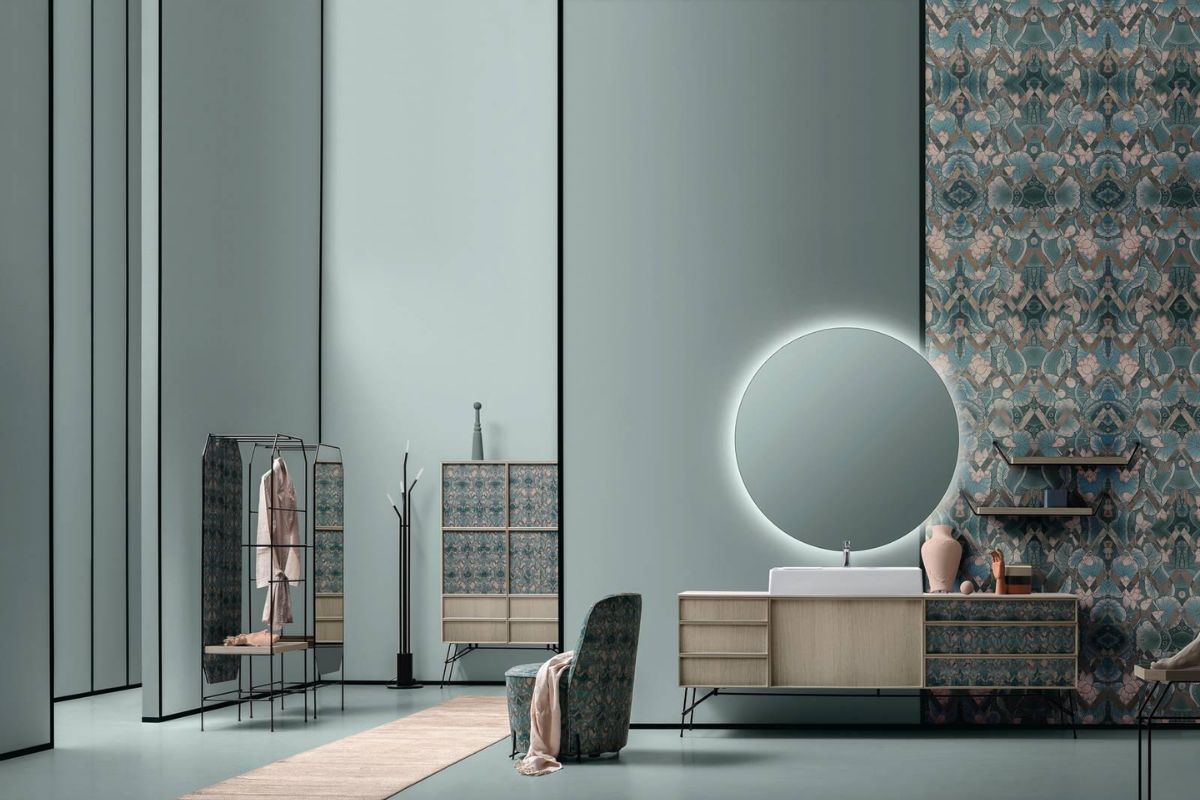
In another chromatic interpretation, the matt RAL 7032 dominates the composition and creates a light, almost suspended atmosphere. The dynamics arises from the play of full and empty spaces and the alternation between straight and curved elements: terminal doors, cylindrical bases, Tondo 5 mirror. The Zefiro top and countertop washbasin take up the Pearl Gray Deckblend Stone Resin, maintaining material and chromatic coherence.
In the compositions with a matt RAL 7032 lacquered structure, the insert of the fronts in matt Laminam Statuarietto introduces a calibrated variation: not a contrast, but a breath. The marble resin sink shelf takes up the same shade as the structure and interacts with the Duo mirror cabinet, characterized by two doors, a central open compartment and upper LED lighting. Columns and container poufs reflect the finishes of the composition, reinforcing the idea of ??the bathroom as an environment designed for continuity.
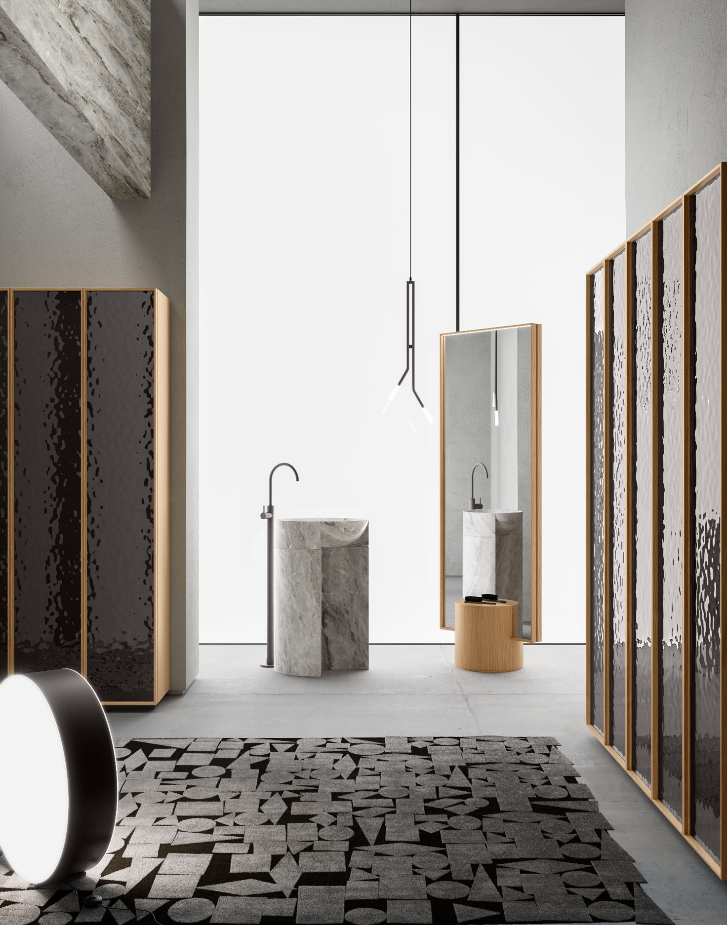
These two readings – the controlled ethereal of Honey and the customizable mineral of DES Evolution – clearly show how color in the 2026 bathroom is the invisible director of surfaces, materials, metals and light. This is where quiet luxury stops being a label and becomes a method: choosing tones capable of lasting and building around them an environment that is perceived as calm, even before style.
Images and technical data sheets: Cerasa.
Bathroom colors 2026: which ones to choose and how to match them
If color in 2026 is an invisible direction of surfaces, materials, metals and light, then the question becomes operational: which colors really work in the 2026 bathroom, and how they match walls, volumes and accessories without losing coherence over time. The answer lies not in a “fashionable” shade, but in a chromatic hierarchy: a stable base, materials that give depth and measured accents that bring character. It is here that quiet luxury shows its most useful rule: designing a palette that can withstand everyday life, light and durability, even before photography.
The most chosen shades of bathroom colors 2026
Warm white and off-white
They remain the most effective base because they amplify the light and make the bathroom larger and tidier. In 2026 they work when they are slightly warm and opaque: more skin than paper, more atmosphere than contrast.
Milky greige and beige
They are the tones of contemporary domesticity: they warm without weighing down, they dialogue with sand stones, light woods and material surfaces. They are the ideal choice when the bathroom must become a room, not just a function.
Mineral grays and pearl
They add depth and precision. In the 2026 bathroom, a well-chosen pearl gray does not “darken”: it creates three-dimensionality, enhances resins, solid surfaces and sheets, and makes soft metals sophisticated.
Burnished greens (sage and olives)
They enter as an elegant accent or as a guiding tone in the most natural compositions. Their strength is stability: they are not aggressive colours, but shades that integrate with light materials andsatin finishes.
Dusty blues
They are not a decorative blue: they are an atmospheric shade. They work when they are desaturated, combined with warm whites and matte surfaces, with well-calibrated light.
Where to use bathroom colors 2026
Walls
The most convincing base remains light (warm white, off-white, greige). The most characterizing color is concentrated on a curtain wall, a niche, a sink area: a measured gesture that builds depth.
Volumes and furnishings
Here 2026 rewards continuity. Solid neutrals, matte finishes and consistent materials make the bathroom “calmer” and more durable. Color works by layering, not by contrast.
Complements and accessories
It is the space of controlled freedom: textiles, objects, small accents. This is where you can change the season without rewriting the room.
Bathroom color combinations 2026: four palettes ready for design
1) Off-white + light stone + Satin nickel
A bright and rigorous palette, perfect for small or poorly exposed bathrooms. The stone (or the stone effect) gives depth, the nickel adds precision without ostentation.
2) Greige + light wood + soft metal
The most domestic version of quiet luxury: warm, welcoming, contemporary. It works with silky mattes and with a soft light, never too cold.
3) Pearl gray + material resins + warm white
An “architectural” palette: material, elegant, with a very clear sense of design. The warm white avoids the technical effect, the resin brings tactility.
4) Dusty blue + off-white + satin details
Atmospheric and light. The blue remains in the background like air, the off-white holds the whole, the satin details give rhythm.
How to choose 2026 bathroom colors in a professional way
A successful palette does not arise from a “right” color, but from an order of decisions that brings together light, material and detail . In the bathroom this order matters more than elsewhere, because the color is looked at closely, every day, and changes radically between morning and evening, between natural light and LED. In 2026, color planning is above all control : of the reflection, of the undertones, of the transitions.
1) Light, before color
Before choosing an off-white or a pearl grey, you decide what light the bathroom will have and at what temperature. It’s not a technical step: it’s the filter that rewrites the colors. The same palette, with cold light, becomes clinical; with warm light, it becomes domestic. And when lighting is integrated into the furnishings and mirrors, it becomes part of the composition: a way to make a light more habitable, to give depth to a white, to prevent the room from becoming flat.
2) Fixed surfaces command undertones
Floors, coverings, slabs, resins : they decide whether a neutral veers towards hot or cold, whether it remains quiet or becomes sterile. This is not about choosing a materialand beautiful”, but to make it become the grammar of the palette. A marble-effect slab, bright and precise, sets a stone-white; a mineral finish, full and tactile, shifts the atmosphere towards a more material pearl grey. The rest of the bathroom must follow that direction, otherwise the color loses coherence.
3) Opaque and shiny are a direction of the reflection
In 2026, opaque dominates in terms of perceptive quality, but an entirely opaque bathroom risks becoming “mute”. The most successful strategy alternates soft opacities and controlled reflections , using the transparency as a point of light, not as noise. This is how a matt lacquer can remain calm and, next to it, a brighter surface can give air without turning into contrast.
4) Metals are punctuation, not protagonist
Nickel, steel, soft or black bronzes: they don’t “colour” the bathroom, they put it in rhythm. A well-chosen metal connects different elements and raises the perceptual level without changing the palette. Nickel details, when measured and repeated consistently, work like a discreet signature: they mark the geometries, give precision, hold the surfaces together without asking for attention.
5) Duration is a design criterion, not a final thought
Wondering whether that color will be credible in three years is not prudence: it is professionalism. Duration does not mean absolute neutrality, but hierarchy : a stable base (evolved, warm or mineral neutrals), materials with identity, replaceable accents. It’s the difference between a room that holds up and a room that lives only in the photograph.
Bathroom colors 2026
What are the most requested bathroom colors in 2026?
Evolved neutrals: warm white, off-white, greige and mineral greys. Burnished greens and dusty blues enter as measured accents.
Which 2026 bathroom colors to choose for a small bathroom?
Clear and warm base on the main surfaces, a single accent (niche or sink wall) to give depth without losing light.
Matte or shiny in the 2026 bathroom?
Matt dominates in terms of perceptive quality and quiet luxury; the gloss comes in as a detail, to reflect light in a controlled way.
Therefore, the theme is no longer choosing “a color”, but building a room that remains coherent when the light changes, when daily gestures change, when objects change. In 2026 the most successful bathroom is the one in which the palette is not immediately noticed, but is perceived: as calm, as order, as quality.
To learn more and consult the materials, compositions and finishes mentioned in the dossier, you can download the catalogs and visit the Cerasa brand page on Archi&Interiors : https://www.archieinteriors.com/brand/cerasa/ or contact the company via the form Contact .