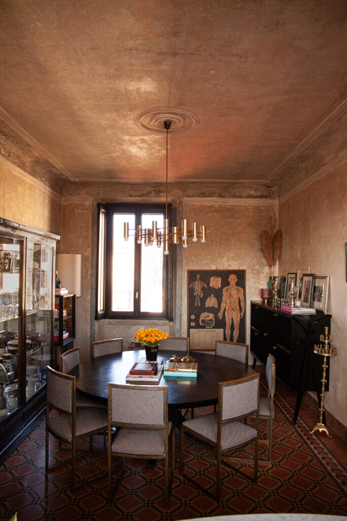
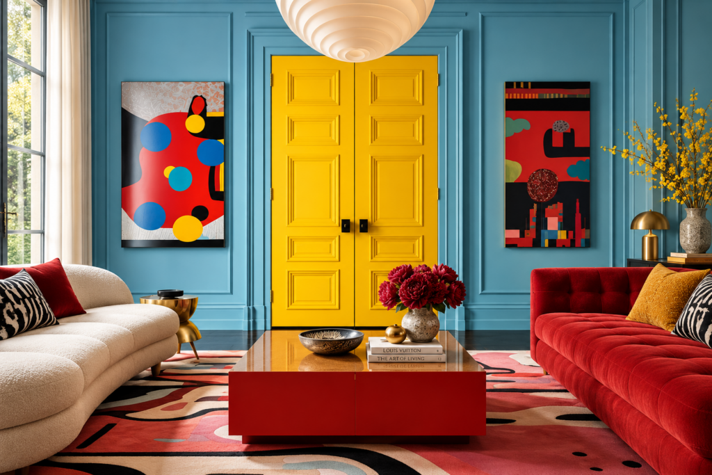
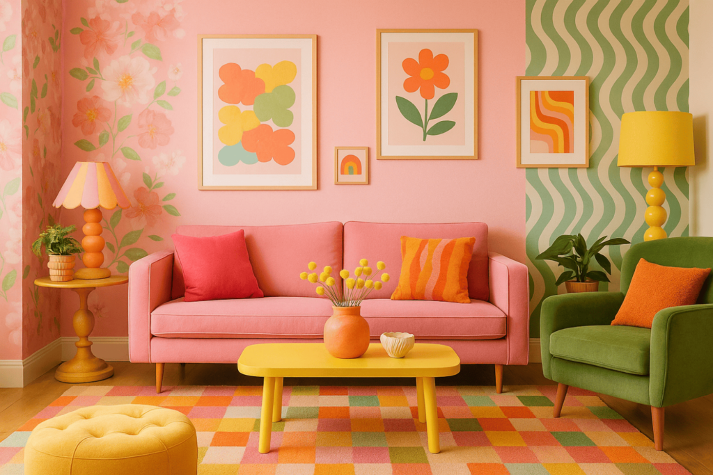
Color drenching is a colour technique that extends the same shade, or in some interpretations closely related tones, across walls, ceilings, doors, skirting boards, cornices and joinery. The aim is to reduce the visual interruptions created by the traditional contrast between coloured walls and white architectural details, allowing the room to be perceived as a …
Color drenching is a colour technique that extends the same shade, or in some interpretations closely related tones, across walls, ceilings, doors, skirting boards, cornices and joinery. The aim is to reduce the visual interruptions created by the traditional contrast between coloured walls and white architectural details, allowing the room to be perceived as a more continuous volume. In 2026, the term continues to be widely used by the international interior design press, but it is more useful to consider color drenching a spatial design tool rather than simply a colour trend: colour, light reflectance and finish can alter the way we perceive height, depth, doors, niches and architectural details.
What is color drenching and what does “one colour” really mean?
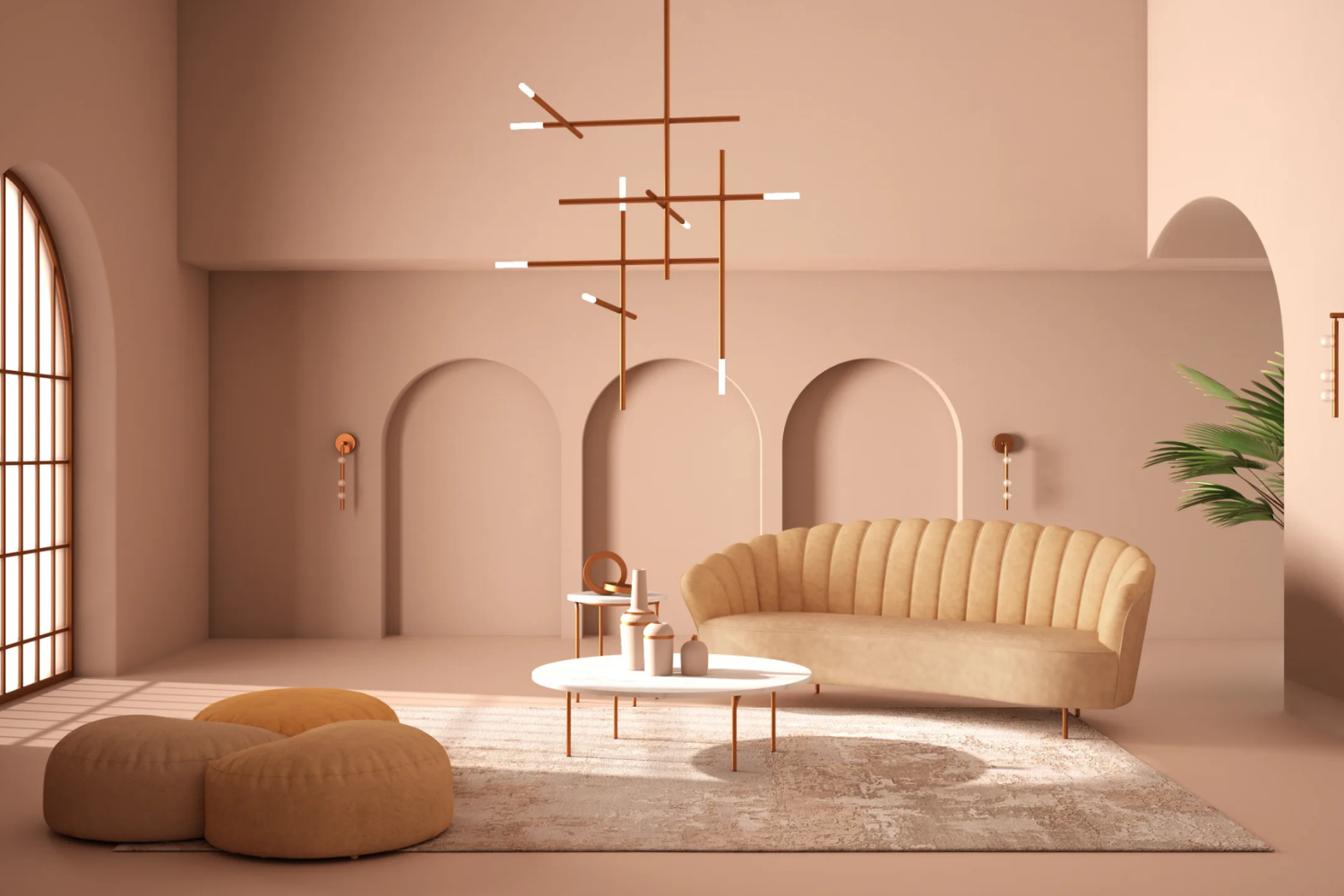
In its most rigorous form, color drenching uses a single colour across all the main surfaces of a room. Walls and ceiling share the same shade, as do skirting boards, door frames, doors, cornices and any built-in furniture. Little Greene defines the technique precisely as extending one colour from the skirting boards up the walls and onto the ceiling and doors, while Architectural Digest describes it as a monochromatic treatment that can also include mouldings, window frames and other permanent architectural features.
“The same colour” does not necessarily mean “the same surface finish”. A room can be painted in a single shade using a flat or matt finish on the ceiling, matt or eggshell on the walls and satin on doors and joinery. Changes in reflectance allow architectural details to emerge as the light shifts without interrupting the overall chromatic continuity. Benjamin Moore identifies the use of different sheens as one way to add dimension to a monochromatic scheme, while Little Greene similarly proposes using the same colour in different finishes across ceilings, walls and woodwork.
This is an important distinction: well-designed color drenching does not have to create a flat interior. Depth can come from light, materials, texture and variations in sheen rather than from contrasting colours.
Color drenching, tonal dressing, color blocking and color capping: the differences
The colour vocabulary used in interior design has expanded, and some definitions increasingly overlap. It is useful to separate them.
Color drenching, in its strictest sense, is based on continuity: one colour dominates walls, ceiling and architectural details.
Tonal dressing, or more accurately a tonal scheme in interior design terminology, instead uses several shades from the same colour family. A pale green might sit alongside a mid-tone green and a deeper green; the overall relationship remains monochromatic, but individual surfaces are differentiated. Dulux defines a tonal scheme as the use of different tones of the same colour, while Little Greene distinguishes a tonal palette from the use of one shade across an entire room.
Color blocking works in the opposite direction: it uses clearly defined areas of different, complementary or contrasting colours, with intentionally visible boundaries. Surfaces are therefore divided rather than visually merged. Dulux documentation for its 2026 colour collections describes color blocking through defined blocks and combinations of contrasting or complementary shades.
Color capping, a term brought into greater focus by the design press through Benjamin Moore in 2025, uses two or more shades from the same colour family and typically intensifies the colour as it moves towards the ceiling: lighter walls, intermediate mouldings and a deeper ceiling. It therefore creates a vertical layering effect that traditional color drenching tends to minimise.
How color drenching changes the perception of space
The most interesting aspect of the technique is what happens to the boundaries of the room.
In a conventional colour scheme, a painted wall meeting a white ceiling creates a very clear visual line. The same happens between the wall, skirting board, door and frame. Repeating these interruptions gives the eye a series of strong cues about the dimensions and proportions of the room.
By extending one colour across all these elements, many of those lines become less prominent. Walls can appear to continue towards the ceiling, while doors, built-in wardrobes and radiators become visually quieter. Architectural Digest highlights the ability of the technique to reduce visual noise and, in certain smaller spaces, create a stronger sense of spatial continuity. Little Greene similarly associates the absence of strong contrast between walls and ceiling with making the upper boundary of a room less obvious.
This does not mean that color drenching automatically makes every room look larger. The result depends on tone, brightness, natural light and proportions.
A light or mid-tone colour with relatively consistent values can make boundaries less distinct. A very dark colour, by contrast, tends to emphasise the mass of the volume and can create a more enclosed or intimate perception. In a very tall room, this can be useful precisely because the ceiling no longer feels like a distant, separate surface.
Choosing colour and undertone before painting the entire room
A colour used on four walls already covers a substantial area; once it continues onto the ceiling, doors and joinery, its presence increases dramatically. For this reason, the choice should never be made from a small colour chip alone.
The first factor is the amount of natural light. The second is its direction. The same paint can appear very different in a bright room and in a more shaded space. Designers and paint manufacturers recommend testing samples within the actual room because orientation, scale and lighting can significantly alter how a colour is perceived.
Then there is the undertone. Two beige shades may look similar on a colour card, yet one may have a pink undertone while the other leans more yellow or grey. The same applies to greens, blues and earthy shades. When the colour also extends across the ceiling, these differences become more noticeable because vertical and horizontal surfaces receive light differently.
The most reliable approach is to test a reasonably large area and observe it in the morning, during the afternoon and under artificial lighting in the evening, while also considering its relationship with flooring, stone, timber, fabrics and existing furniture.
Walls and ceiling in the same colour: when it works
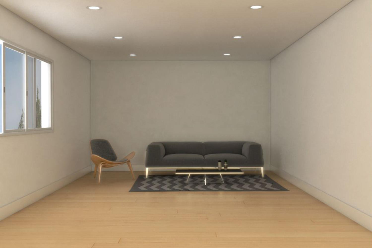
The ceiling is the element that transforms a conventional monochromatic room into a true color drenching scheme.
Leaving it white keeps the geometry of the room clearly visible. Painting it in the same shade as the walls removes the most significant visual boundary and brings the so-called “fifth wall” into the colour scheme. Little Greene explicitly includes walls, ceilings and woodwork within its most complete definition of color drenching.
With low ceilings, a light or medium shade without strong contrast can avoid constantly emphasising the height. With very high ceilings, a deeper colour carried upwards can instead give the overall volume greater visual presence.
Cornices, ceiling roses and mouldings do not necessarily need to be picked out in white. When painted in the same colour, they remain visible through shadow and relief. The distinction becomes three-dimensional rather than chromatic.
Doors, skirting boards and joinery: the step that really changes the result
One of the most common mistakes is to paint walls and ceiling in the same colour while leaving doors, door frames and skirting boards white. The result can still work, but much of the logic behind color drenching is lost.
When the door matches the wall colour, its visual presence is reduced. The same applies to a bespoke wardrobe or built-in bookcase: the volume is read more as part of the architecture than as an object placed within the room. This is one of the reasons why the technique can be particularly effective in corridors, entrance halls and spaces with numerous openings.
This is where different finishes become useful. A matt wall next to a satin door in the same shade preserves the chromatic unity while allowing the joinery to respond differently to light.
For surfaces exposed to greater contact and frequent cleaning, the finish should also be selected according to the performance stated by the manufacturer. In general, paints with a higher sheen have traditionally been used on doors and trim because they are easier to clean, although actual performance varies between contemporary paint formulations.
Color drenching in small rooms
Entrance halls, corridors, home offices, cloakrooms and compact bedrooms are particularly interesting because they contain many visual boundaries within a limited area.
Using different colours on the ceiling, doors, frames and walls emphasises every transition. A continuous colour can instead reduce this fragmentation. There is no need to choose an extremely pale beige: greens, blues, browns and earthy shades can also work if a stronger reading of the volume is desired.
The idea that small rooms should always be white is therefore too restrictive. A monochromatic scheme can make the geometry of the room less obvious; what matters is the relationship between the value of the colour and the amount of available light, rather than a universal rule that lighter is always better.
What about larger rooms?
In large living rooms, bedrooms with high ceilings or spaces rich in mouldings, the problem is often the opposite: there may be many architectural elements competing for attention.
Color drenching can use colour as a unifying background, allowing furniture, artworks, timber, stone and textiles to generate the contrast instead.
In a historic interior with cornices and wall panelling, painting everything in the same shade does not erase its character. Profiles and reliefs remain visible through grazing light and shadow, while the need to highlight every detail with a second colour disappears.
Which palettes work best with color drenching?
There is no mandatory palette. The more useful question is how much contrast should be transferred from the architecture to the furniture and materials.
Warm neutrals, from mineral beiges to taupes and pale earthy tones, create subtle continuity. Sage green, olive and grey-green introduce clear colour without requiring high saturation. Dusty blues and petrol tones can emphasise the volume more strongly, while browns, deep reds and burgundy create rooms where walls and ceiling become a much more dominant element.
The selected colour does not necessarily have to be dark or highly saturated. In 2026, the international design press uses the term for both interiors fully wrapped in deep shades and lighter, more tonal interpretations: it is the continuity between surfaces, rather than the intensity of the pigment, that primarily defines the technique.
Color drenching mistakes to avoid
The first is choosing the colour from a screen or an overly small sample. A shade extended across the ceiling can behave very differently from the same colour viewed on a single wall.
The second is ignoring finish. Applying a highly reflective paint indiscriminately to uneven surfaces can make imperfections and irregularities more visible; Benjamin Moore notes that increasing sheen generally makes surface defects more noticeable.
The third is stopping halfway without making that decision deliberately. Green walls, a green ceiling and a random sequence of white doors, skirting boards and radiators create a very different effect from a genuinely immersive color drenching scheme.
The fourth is confusing continuity with monotony. When everything shares the same pigment, materials and textures become even more important: timber, metal, stone, textiles, glass and different levels of sheen prevent the room from being perceived as one indistinct surface.
Finally, the technique should not be used simply because it is labelled a “trend”. Color drenching works best when it solves a genuine spatial problem: softening the separation between walls and ceiling, integrating numerous doors, unifying complex joinery or creating a clearly defined chromatic volume. It is this ability to influence the perception of architecture, rather than its editorial popularity, that makes color drenching a useful tool in interior design.