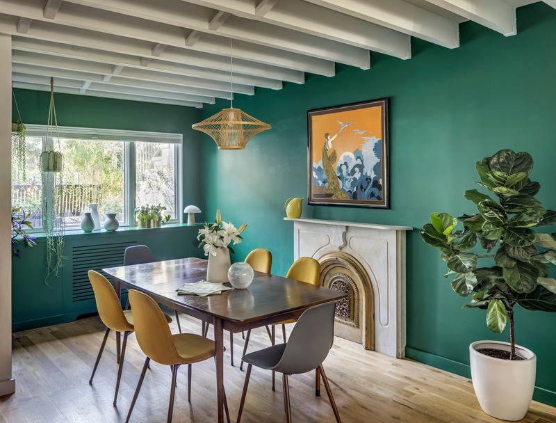
Dopamine decor is an interior design approach built around colour, pattern, playful forms, art and objects chosen for their personal and expressive value. The name, however, should be understood as a cultural metaphor, not as a neuroscientific theory: there is no rule stating that a pink wall, a yellow sofa or a geometric print “produces …
Dopamine decor is an interior design approach built around colour, pattern, playful forms, art and objects chosen for their personal and expressive value. The name, however, should be understood as a cultural metaphor, not as a neuroscientific theory: there is no rule stating that a pink wall, a yellow sofa or a geometric print “produces dopamine”. The term developed from the earlier fashion concept of dopamine dressing and became particularly widespread in interiors from 2022 onwards through the press, Pinterest, Instagram and TikTok. Its most convincing form is not about indiscriminate accumulation, but about visual hierarchy, recognisable palettes and objects that reveal something about the people who live in the space.
What is dopamine decor really?
Saturated colours, apparently unusual combinations, stripes, checks, florals, ironic objects, softly shaped furniture, graphic art and nostalgic references are some of the elements most frequently associated with the term.
There is, however, no dopamine decor manifesto or codified set of rules. Architectural Digest describes it as a highly individual language in which colour, texture and composition are used to create interiors connected to the personality and memories of the people who inhabit them. A “dopamine” home can therefore be completely immersed in colour or remain relatively restrained, concentrating its energy in a single piece of furniture, one wall or a collection of objects.
The key idea is therefore less about maximalism than it may initially appear, and more about personal expression.
An interior filled with colours purchased because they all appear on the same moodboard can feel more impersonal than a neutral room containing a red lamp, a family photograph, a vintage chair and a piece of art collected over time.
Where dopamine decor comes from: from dopamine dressing to interiors
Its most direct origins can be found in fashion.
Fashion psychologist Dawnn Karen credits herself with coining the expression dopamine dressing, used to describe choosing clothes in relation to mood and personal associations. The term gained widespread visibility during and immediately after the most restrictive phase of the pandemic: in July 2021, Vogue Business described growing demand for intense colours, playful prints and more optimistic fashion, also linking it to the spread on TikTok of micro-aesthetics such as kidcore, crochet and highly saturated palettes.
The transition from fashion to the home happened quickly. In April 2022, the Irish Independent was already explicitly referring to dopamine décor as the domestic equivalent of dopamine dressing; during the same year, the term appeared with increasing frequency in the interiors press. In 2023, Architectural Digest brought it further into the design mainstream, linking it to bright colours, pattern, nostalgia and personal objects.
By 2026, the expression continues to circulate in international interior design media, suggesting that it has survived its first social-media cycle even as its visual forms continue to evolve.
Dopamine and colour: where science ends and metaphor begins
The most important point is to avoid pseudo-neuroscience.
Dopamine is involved in complex systems related, among other things, to motivation, learning, reward and reward prediction. Contemporary neuroscience does not describe it simply as the “happiness chemical”. Research into reward prediction error, for example, shows a much more complex role in the processes through which the brain updates expectations and learns from the relationship between expected and received rewards.
Claims such as “yellow increases dopamine” or “pink makes people scientifically happier” are therefore not supported by the available evidence.
Research into the psychology of colour suggests that colour can influence perception, meaning, emotion and behaviour in specific contexts, but its effects depend on culture, situation, personal associations and individual characteristics. One of the most frequently cited reviews in the field specifically stresses the need for caution before turning these findings into universal design prescriptions.
Within dopamine decor, then, “dopamine” works better as a popular shorthand for choosing what creates visual pleasure, memory, curiosity or a sense of personal identification.
Colour works better when there is a clear hierarchy
Visual chaos rarely comes from the absolute number of colours. More often, it comes from the absence of relationships between them.
One effective way to approach dopamine decor is to identify a dominant colour, one or two secondary shades and several accents. This does not mean applying a mathematical formula, but creating a hierarchy that can be read clearly.
A living room might have powder-blue walls, a green sofa and small orange elements; alternatively, it could have a white base with a large blue bookcase and red and yellow objects. In both cases, the aim is to prevent every surface from demanding the same level of attention at once.
Architectural Digest similarly suggests maintaining a degree of chromatic coherence even within deliberately lively interiors, using colour families or repeated combinations throughout the space.
Even a very intense colour becomes easier to read when it reappears in three or four different places instead of appearing only once with no visual connection to the rest of the room.
Patterns: mix them, but vary the scale
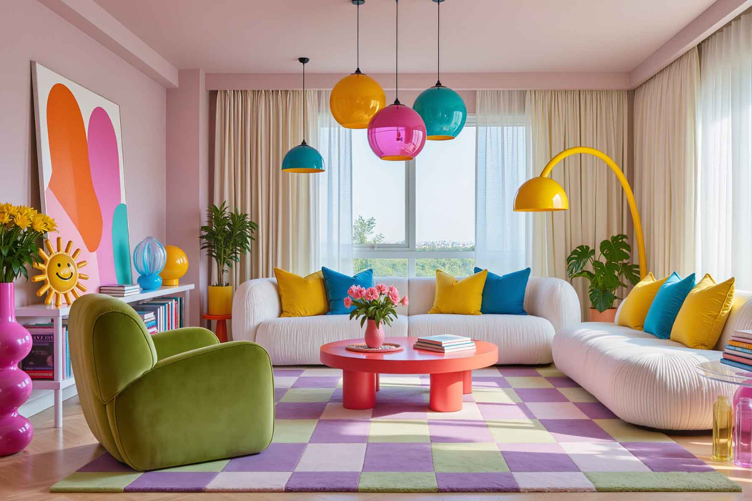
Florals, checks, stripes, abstract geometries and animal prints can coexist. The key is to avoid giving them all the same scale, contrast and intensity.
Wallpaper with a large-scale motif can be paired with a fabric carrying a much smaller pattern. A highly graphic checked rug can work with almost plain curtains. A floral armchair can become the focal point if the sofa beside it remains visually quieter.
The principle is not to make everything match, but to create rhythm.
Design history offers precedents far more established than contemporary social-media language. Memphis, founded around Ettore Sottsass in 1980–81, used bright colours, decorative laminates, graphic patterns and deliberately unconventional forms, loading objects with symbolic and emotional meaning beyond pure function. Dopamine decor is not a direct continuation of Memphis, but part of its visual language demonstrates that the relationship between colour, irony and expressive objects predates TikTok by decades.
Soft shapes and unusual objects can replace a colourful wall
Colour is not the only way to create a dopamine interior.
In recent years, curved furniture, wavy mirrors, chunky tables with simple geometries, deliberately naïve ceramics and objects that resemble enlarged toys have gained considerable visibility. The work of Gustaf Westman, including the Chunky Table, Curvy Table and rounded mirrors, shows how a recognisable silhouette can give a room character even when only a few pieces are used.
The design advantage is clear: a single unusual object can create visual tension without requiring ten additional decorative elements.
It is the same reason why an oversized lamp, a red chair or a large ceramic piece can work better than a collection of small accessories scattered throughout the room.
Art, photographs and vintage pieces make dopamine decor less generic
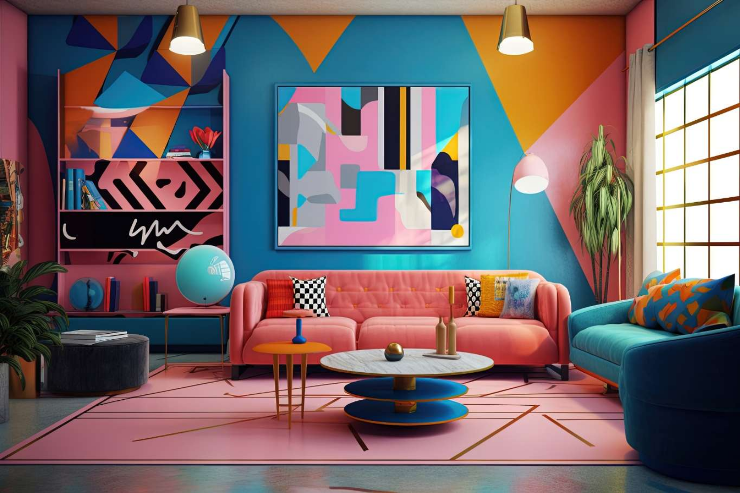
One of the risks of aesthetics born or amplified on social media is immediate reproducibility. If every interior uses the same wavy mirror, the same checked rug and the same pink vase, a language that is supposed to celebrate individuality quickly becomes uniform.
Art, photography, vintage pieces and objects already owned are an effective antidote.
Architectural Digest explicitly includes vintage pieces, reclaimed elements, personal photographs and objects connected to memory among the most interesting tools of dopamine decor, precisely because they introduce a biographical dimension that is difficult to replicate.
An inherited cabinet can be repainted. An old chair can be reupholstered in an unexpected fabric. A poster collection can be framed according to a shared palette.
The result becomes less about “trend” and more about home.
How to use dopamine decor in small spaces
In a small room, the problem is not necessarily intense colour. It is the amount of visual micro-information.
Many small objects, numerous small prints, different pieces of furniture and fragmented surfaces can make a room feel more congested. One large, decisive intervention is often more effective.
A fully coloured wall, curtains with a strong pattern or one graphic rug can feel more orderly than ten small colour accents.
Ceilings, niches and doors can also introduce colour without occupying useful floor space. The important thing is to preserve some areas of visual pause: a quieter wall, a monochromatic piece of furniture or a relatively uniform floor.
Visual pause does not necessarily mean beige. It can be a broad field of blue, green or terracotta left almost completely free of decoration.
The most useful rules for avoiding visual chaos
The first is to decide what should be seen first. If the focal point is a purple sofa, the wall behind it does not automatically need to compete with an equally intense pattern.
The second is repetition. A colour, curved shape or material that reappears in different areas creates continuity.
The third is to vary pattern scale rather than accumulating motifs with the same visual strength.
The fourth is to leave some surfaces free. Objects become more meaningful when they have space around them.
The fifth is to use contrast intentionally. Red and pink, green and lilac, or orange and blue can work precisely because they contrast; adding another six unrelated contrasts makes the structure of the room much harder to understand.
The sixth is to work with light. A room already rich in colour and reflections does not necessarily require uniform, very intense illumination. Daylight, localised lamps and different lighting levels can allow materials to emerge without flattening them.
Personality does not mean accumulation
Dopamine decor becomes more interesting once it stops being interpreted as an obligation to use everything at once.
You do not need fuchsia walls, a geometric rug, a blue sofa, a wavy table, an orange lamp and a gallery wall in the same room to create an expressive interior. The principle can work just as well with a relatively calm base and two strongly personal elements.
Its real distance from the most impersonal forms of minimalism is therefore not the number of objects, but the permission given to those objects to be emotional, ironic, imperfect, colourful or even slightly strange.
This is where the phenomenon moves beyond its social-media label. Colour and decoration have a much longer history than dopamine decor, from Memphis to pop and postmodern cultures; what the contemporary term has done is bring these possibilities together under an immediately understandable language, emerging at a time when both fashion and interiors were seeking more explicit forms of personal expression.
Using it well therefore means forgetting the promise implied by its name. No colour guarantees happiness and no pattern produces dopamine on demand. A home can, however, be designed to contain more memory, more colour, more humour and greater visual freedom. That is already a sufficiently compelling design reason.