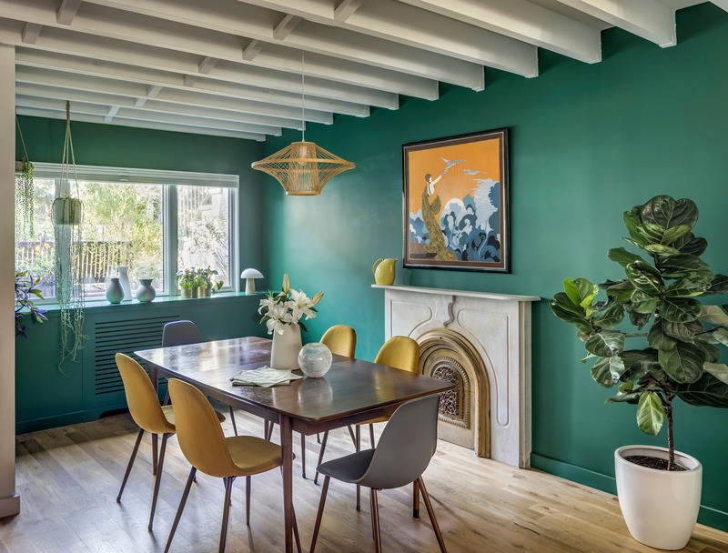
Color capping is a colour technique that organises walls, mouldings and ceilings through tonal variations of the same colour, rather than treating the ceiling as a separate white surface. The most recognisable configuration today begins with relatively light walls, intensifies the colour on cornices or across the upper section of the room, and finishes with …
Color capping is a colour technique that organises walls, mouldings and ceilings through tonal variations of the same colour, rather than treating the ceiling as a separate white surface. The most recognisable configuration today begins with relatively light walls, intensifies the colour on cornices or across the upper section of the room, and finishes with a deeper shade on the ceiling. The term is recent: according to Livingetc and ELLE Decor, Benjamin Moore introduced it in its Autumn/Winter 2025 lookbook, and between late 2025 and 2026 the idea was taken up by numerous interior design publications. Its definition, however, is not yet completely standardised.
What is color capping and why is the definition still fluid?
In the formulation reported by Livingetc, color capping consists of a tonal wash that becomes progressively more intense as it moves towards the ceiling, incorporating what is often described as the “fifth wall”. Homes & Gardens describes a similar configuration: lighter walls, an intermediate shade on the mouldings and the darkest colour on the ceiling.
This is the most precise meaning to use today, but it is not the only one.
Apartment Therapy also includes simpler solutions under the same label, where a shade from the same colour family is carried onto the ceiling or brought several centimetres down beyond a picture rail. Martha Stewart uses an even broader definition, including gradients made up of multiple bands and even the reverse progression, with darker colours at the bottom and lighter tones towards the ceiling.
This difference is significant. In 2026, color capping is an emerging term in decorative design language rather than a codified technique governed by a universal rule.
Its common core is more stable: at least two related colour intensities, a clear vertical relationship between wall and ceiling, and the use of colour to alter the architectural perception of the room.
Color capping vs colour drenching: what is the difference?
The distinction from colour drenching is clearer.
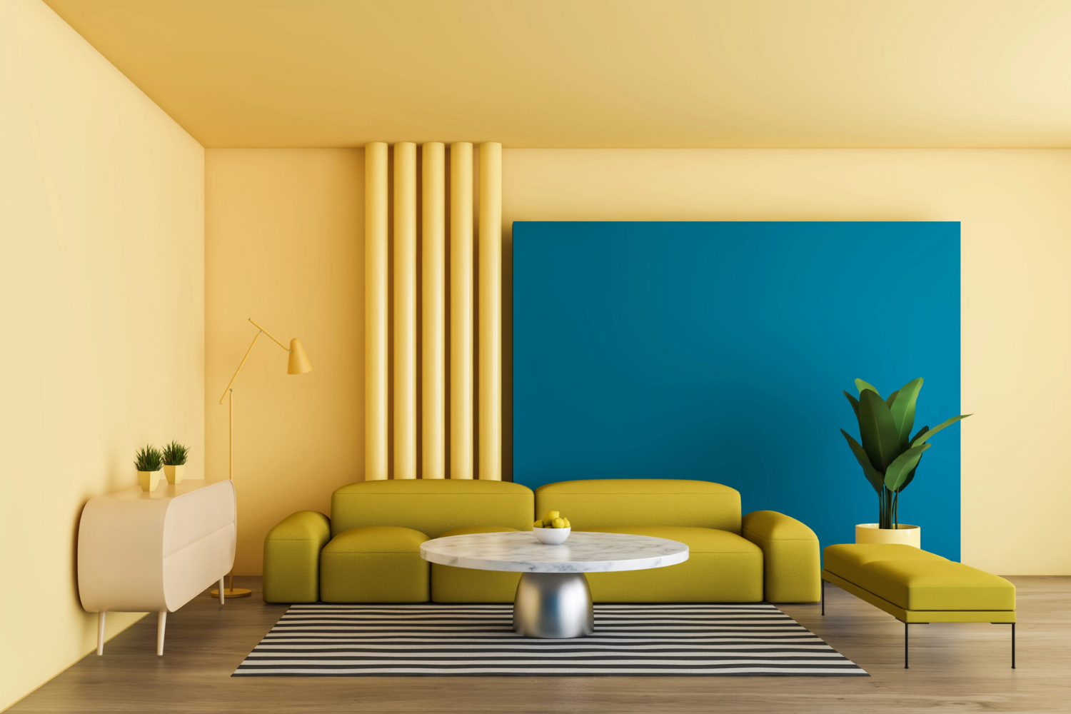
Little Greene defines colour drenching as the use of a single shade across walls, ceiling, skirting boards and joinery, removing the traditional contrast with white. Color capping, by contrast, remains within the same colour family but introduces differences in intensity that keep the various parts of the room visually distinct.
| Technique | Colour principle | Wall-ceiling relationship |
|---|---|---|
| Color capping | Lighter and deeper shades from the same colour family | The ceiling is highlighted or “framed” through a tonal shift |
| Colour drenching | One dominant colour applied continuously | Walls and ceiling tend to merge visually |
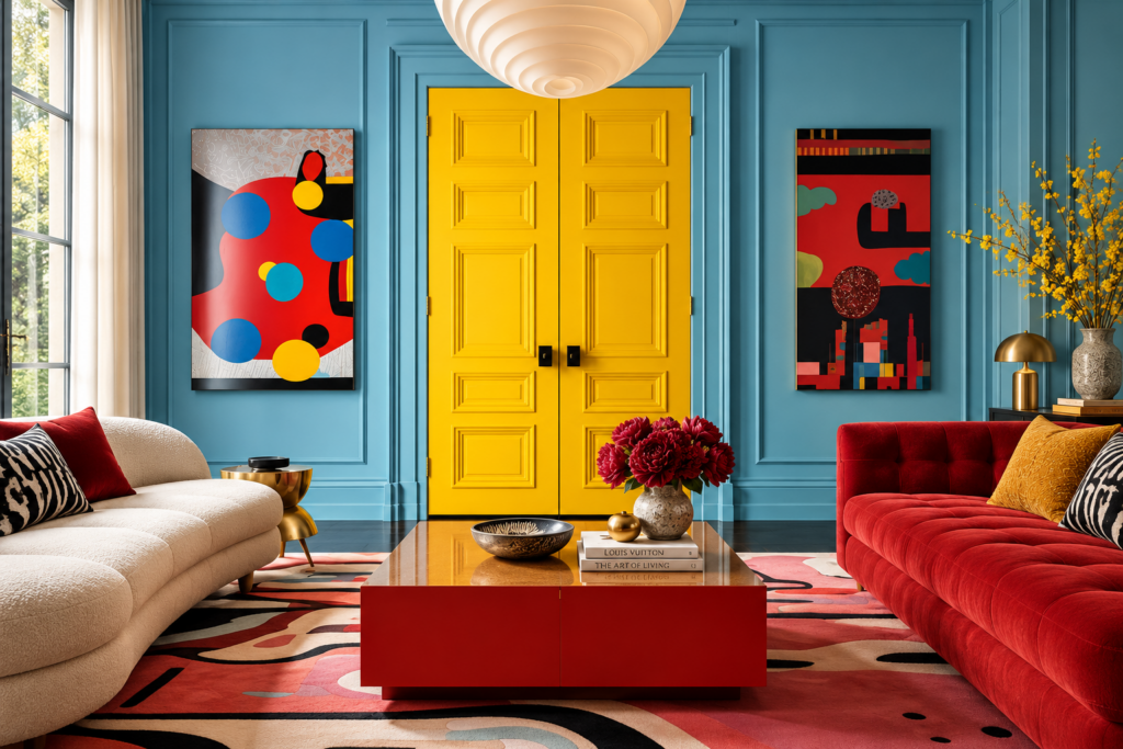
| Colour blocking | Distinct colours, often with strong contrast | Boundaries become clearly visible graphic elements |
There is also an area of overlap with what Little Greene calls Double Drenching, where two or more related colours are distributed across walls, ceiling and joinery. The company specifies, however, that Double Drenching can also work through changes in hue and undertone, whereas color capping is described primarily through differences in intensity within the same colour family.
Contemporary terminology therefore inevitably contains areas of overlap.
How colour can change the perception of room proportions
The most interesting aspect of color capping is not the fashion for painted ceilings, but the way a line of colour can visually redefine the volume of a room.
A cornice, moulding or painted band establishes a new perceptual boundary. When the colour transition happens very close to the ceiling, the eye tends to follow the composition upwards; when a darker shade extends further down the wall, the upper part of the room can acquire greater visual weight.
Several designers interviewed by the international design press describe color capping as a tool capable of drawing the eye upwards and, in some cases, increasing the perceived sense of height. The same experts also point out that deeper shades and dark ceilings can make a large room feel more intimate.
It is therefore inaccurate to turn the technique into a simple formula such as “dark ceiling = taller room”.
Benjamin Moore notes more generally that a light ceiling tends to increase the sense of openness, while a dark shade can create greater intimacy and can be particularly effective in tall rooms. The result depends on colour lightness, the position of the tonal transition, natural light and the actual proportions of the room.
Wall and ceiling: where should the colour transition happen?
Interiors with cornices, ceiling roses, picture rails or mouldings already contain architectural lines capable of guiding the colour scheme.
In these cases, color capping can work with the existing architecture: the wall remains relatively light, the cornice takes an intermediate shade and the ceiling completes the composition with a deeper colour.
In a completely contemporary space without mouldings, the question becomes more delicate. Adding a horizontal band purely to follow a trend can produce an arbitrary result. It is often more effective to let the natural junction between wall and ceiling mark the transition, or to introduce a band only when it genuinely helps correct or emphasise the proportions.
The cap should feel like part of the room rather than decoration applied on top of it.
How much contrast should there be between the shades?
Color capping works through differences that are noticeable but coordinated.
The model initially described by Benjamin Moore uses colours from the same family: for example, dusty pink, mid-tone pink and a deeper shade on the ceiling, or different intensities of blue, green, ochre or chromatic neutrals. Homes & Gardens and Livingetc both emphasise tonal continuity as the element that distinguishes capping from straightforward colour blocking.
Choosing two shades that are almost identical can make the variation virtually imperceptible. At the opposite extreme, moving abruptly from pale pink to burgundy or from light blue to almost-black navy can make the surfaces read as two separate graphic fields.
The most balanced solution is to work with value, saturation and undertone, observing samples in the actual room. Benjamin Moore also notes that orientation and natural light can significantly alter the perception of any colour throughout the day.
Color capping with low ceilings
In a room with a low ceiling, the colour scheme needs to be particularly controlled.
A very dark and deep upper band can emphasise the presence of the ceiling rather than make it recede. If the aim is to increase the sense of verticality, a more cautious approach is to maintain moderate contrast and relatively light shades, avoiding bringing the colour boundary too far down the wall.
Some examples published by Homes & Gardens, however, use ceiling colour precisely to draw the eye upwards in small living rooms. The point is that the effect comes from the composition as a whole, not simply from the presence of a darker surface.
In a low room, therefore, color capping should be tested as a tool for adjusting proportions rather than applied automatically.
With high ceilings, the cap can make a room feel more intimate
With generous ceiling heights, the problem can be the opposite: a room may feel insufficiently contained or visually dispersed.
Here, a darker ceiling, potentially combined with a cornice in the same colour family, can give greater visual weight to the upper part of the room and create a more enveloping atmosphere. Benjamin Moore specifically identifies deeper ceiling colours as an effective option in tall rooms when a more intimate effect is desired.
In historic buildings, contrast can also highlight cornices, mouldings and ceiling roses without necessarily returning them to white.
The technique then acquires a more architectural character: colour helps reveal the articulations already present within the space.
Which colour palettes work with color capping?
The technique does not require particularly bright colours.
Design publications documenting it between 2025 and 2026 show examples using dusty pinks, pale blues, deep blues, greens, ochres, terracotta, chromatic greys and warm neutrals. ELLE Decor identifies colour families with a certain depth as particularly suitable, including soft blues, charcoal, earthy ochres and desaturated mauves.
With a neutral palette, the technique can be almost imperceptible: pale sand on the walls, taupe on the cornice and a mineral brown on the ceiling.
With saturated colours, the effect changes completely. Green walls with a forest-toned ceiling, or dusty pink framed by burgundy above, can turn the cap into the main visual element of the room.
The choice should follow the desired atmosphere rather than the need to make the technique immediately obvious.
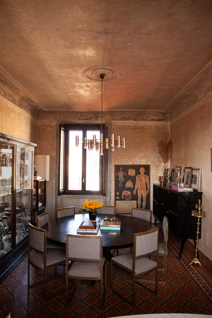
An interesting example existed before anyone called it color capping
The speed at which trend vocabulary develops is particularly evident in the Paris apartment designed by Uchronia for a couple of jewellery designers.
In 2023, ELLE Decor had already documented gradient dining-room walls developed with Atelier Roma and inspired by the striations of malachite. In 2025–26, the publication reused the same image to explain color capping, even though the project predates the widespread use of the term.
It is a useful case because it shows that the practice predates the label.
Gradients, painted ceilings and tonal compositions existed long before 2025; what is new is their grouping under a specific name and the growing editorial attention paid to the relationship between wall and ceiling.
HGTV, updating its own feature in January 2026, also uses the term for freer configurations, including the combination of earth-red panelling with a deep blue-green ceiling. This is further confirmation that the semantic boundaries of the term are already expanding.
Mistakes that make color capping feel artificial
The first is treating any painted ceiling as color capping. A contrasting ceiling on its own is not enough: in the most established definition currently in use, there should be a deliberate colour relationship with the walls or architectural elements.
The second is creating too many bands. Three-, four- or five-step gradients do appear in the design press, but in an ordinary room they can quickly become a tonal rainbow rather than a considered adjustment of proportions.
The third is ignoring cornices and doors. When the colour meets a moulding, it is important to decide deliberately whether that element belongs to the wall, the cap or should act as the transition between the two.
The fourth is using colours with incompatible undertones simply because they nominally belong to the same family.
The fifth is expecting an automatic spatial effect. Color capping can draw the eye upwards, emphasise a ceiling or make a room feel more intimate, but these effects do not happen simultaneously or in every space.
Color capping deserves attention in 2026 precisely because it moves colour design from the wall to the entire volume of the room. Yet the definition is still evolving: the strictest version works with progressively deeper intensities from the same colour family and concentrates the darkest tone towards the top, while more recent interpretations allow reverse gradients, just two shades or stronger contrasts. Rather than reproducing a fixed formula, the more useful principle is to use colour to read and, where necessary, visually correct the architecture, making the ceiling an intentional part of the design.