Cinnamon, deep blue, mineral green and dusty pink: build combinations through light, finishes and materials, moving beyond familiar seasonal palettes.
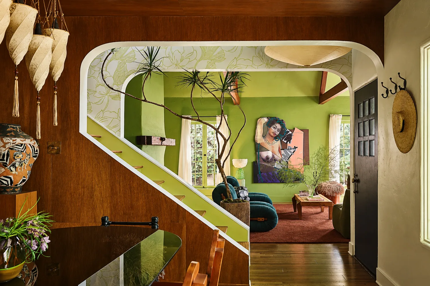
Autumn 2026 interior colours can move beyond terracotta and beige while retaining a welcoming atmosphere. Our selection explores five colour families: cinnamon, deep blue, mineral green, aubergine and earthy neutrals. These are editorial palettes to test in a project, not sales rankings or official colour-of-the-year announcements.
The starting point is a relationship between walls, materials and light, rather than adding a fashionable shade to a finished room. A colour might cover an entire surface or appear only in a fabric. Its role depends on what the room already contains and how much contrast you want.
Cinnamon, chalk and wood: a softer kind of warmth
The first palette pairs cinnamon with a chalky white and timber with a compatible undertone. Instead of a highly saturated terracotta, we suggest a muted spice brown that can work with warm surfaces without making every element read as a variation of orange.
In a living room, introduce cinnamon through an armchair or curtains and keep the walls light. A reddish floor makes sampling particularly important: two apparently similar warm colours can clash when one leans pink and the other yellow. Repeating the shade in two clear locations may be more effective than scattering it across many small accessories.
Deep blue, oat and stone: building depth
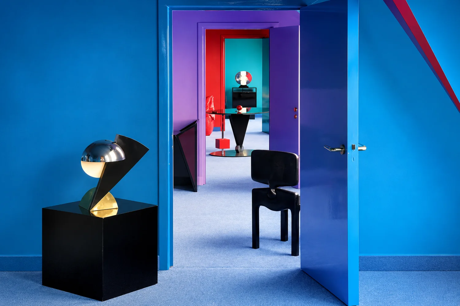
A dark blue can provide a background for shelves or the wall behind a bed. Oat-coloured textiles and pale stone create a counterpoint, preventing every surface from carrying the same visual weight. “Midnight blue” is not a precise specification: violet-leaning and green-leaning blues relate differently to wood.
In a room with limited daylight, test blue on a contained element first. Assess it with the lamps that will actually be used. A dark surface is not automatically sophisticated; the arrangement still needs to make furniture, routes and practical surfaces easy to read, particularly in the evening.
Mineral green, linen and dark metal
Here we suggest a greyed green with a mineral rather than leafy character. Natural linen and dark metal details can give it structure, creating an enveloping interior without seasonal decorations. Compare the green with existing finishes, especially stone or flooring with complex undertones, before deciding how much of it the room needs.
The V&A explores colour and furnishings in Aesthetic Movement interiors. This is historical context, not evidence of a 2026 trend. It reminds us that the relationship between objects and their background predates seasonal colour forecasts. A contemporary room can address the same question in a personal way.
Aubergine, dusty pink and Rosso Levanto
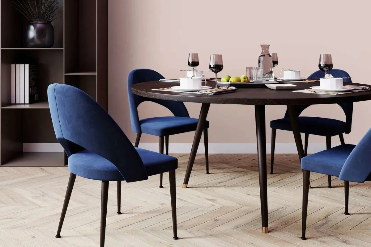
The fourth palette is more intense. Muted aubergine can meet dusty pink, while Rosso Levanto stone introduces its own natural pattern. Stone should not be selected as though it were a solid paint colour: veining and variation make inspection of the actual slab important.
To retain balance, choose one dominant surface and give it a quieter counterpart. A fabric headboard may be enough in a bedroom; a chair beside a stone table may work in a living room. Our profile of India Mahdavi and her use of colour offers a starting point for thinking about confident combinations without mechanically copying her style.
Earthy neutrals: let materials create the differences
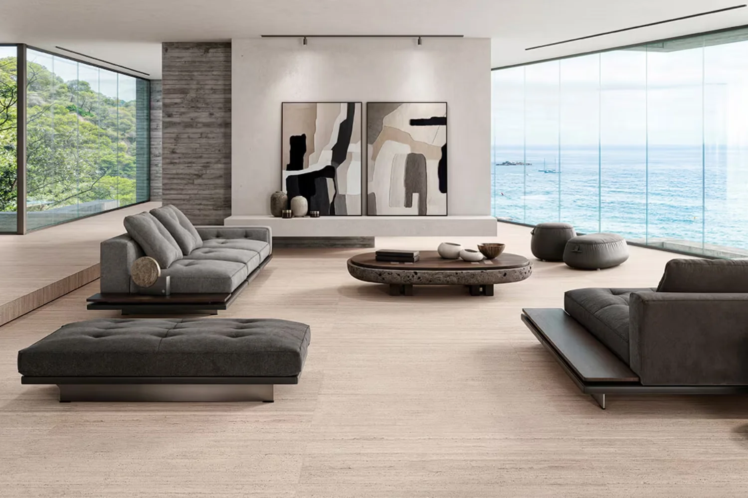
A neutral interior does not require everything to match. Greige, pale clay and brown can work together when fabrics, painted surfaces and timber have different textures. The most interesting contrast may be between matt and polished, tightly woven and smooth, rather than between distant colours.
Before adding another neutral, identify the undertone of the room’s largest fixed surface. A floor deserves more attention than a replaceable cushion. If the composition feels flat, try a different material before introducing a sixth colour. The missing element may be a clearer hierarchy between surfaces.
Test the palette before painting
Prepare movable samples large enough to reveal the colour’s character, following the intended product system. Position them beside the floor, sofa and curtains. Observe them in the morning, afternoon and under evening lighting. Photographs help compare options, but a screen cannot replace seeing the sample in the room.
Our guide to interior paints helps distinguish colour from finish performance. Products in a similar shade can differ in appearance and maintenance requirements. Before buying the full quantity, decide on sheen, required durability and compatibility with the existing surface as well as the colour itself.
Make an autumn palette last beyond the season
If you enjoy frequent updates, keep the most distinctive colour in textiles or smaller pieces. For a lasting intervention, compare it with elements that will remain: doors, kitchen cabinetry and flooring. No universal percentage needs to govern the composition. What matters is a clear background, a leading element and areas where the eye can rest.
Our Pantone 2027 predictions belong to the realm of interpretation, just like these palettes. The final decision belongs in the actual room. A successful colour continues to work when the light changes and the space is used, rather than only looking convincing in a carefully styled photograph.
Images and credits. Photographers and rights holders can contact redazione@archieinteriors.com about image credits or requests to amend or remove an image. Please identify the article and the image concerned.