Discover seven interior colour combinations for 2027, from burgundy and powder blue to olive green and champagne gold, with real design projects.
From burgundy and powder blue to olive green and champagne gold, seven distinctive colour pairings reveal the interplay of hue, material and light in contemporary interiors.
Nature-inspired hues, rich earth tones, subtle metallic reflections and a renewed appetite for expressive colour are shaping the conversation around interior design in 2027. Neutral palettes have not disappeared, but they now coexist with more personal combinations, where saturated shades meet muted tones and carefully considered surfaces.
Colour is once again an architectural tool: it lends depth to walls, defines volumes, softens furniture and reveals the texture of materials. Burgundy meets powder blue, antique pink sits alongside cherry red, and satin-finished gold brings warmth to botanical greens. Velvet, lacquer, marble, natural wood and ceramics all contribute to the final impression.
These 2027 interior colour combinations are an editorial selection by Archi&Interiors, inspired by emerging directions in interiors rather than an official list of prescribed palettes.
Interior colour trends for 2027: richer shades and unexpected contrasts
International forecasts point to an increasingly varied landscape of vivid blues, botanical greens, earthy pigments and expressive accents. WGSN and Coloro named Luminous Blue their Colour of the Year 2027, highlighting the appeal of assertive blue shades. Yet the growing interest in colour does not mean every room needs to become saturated. The most compelling spaces combine intensity with restraint, paying close attention to material and light.
1. Burgundy and powder blue: a surprisingly balanced contrast
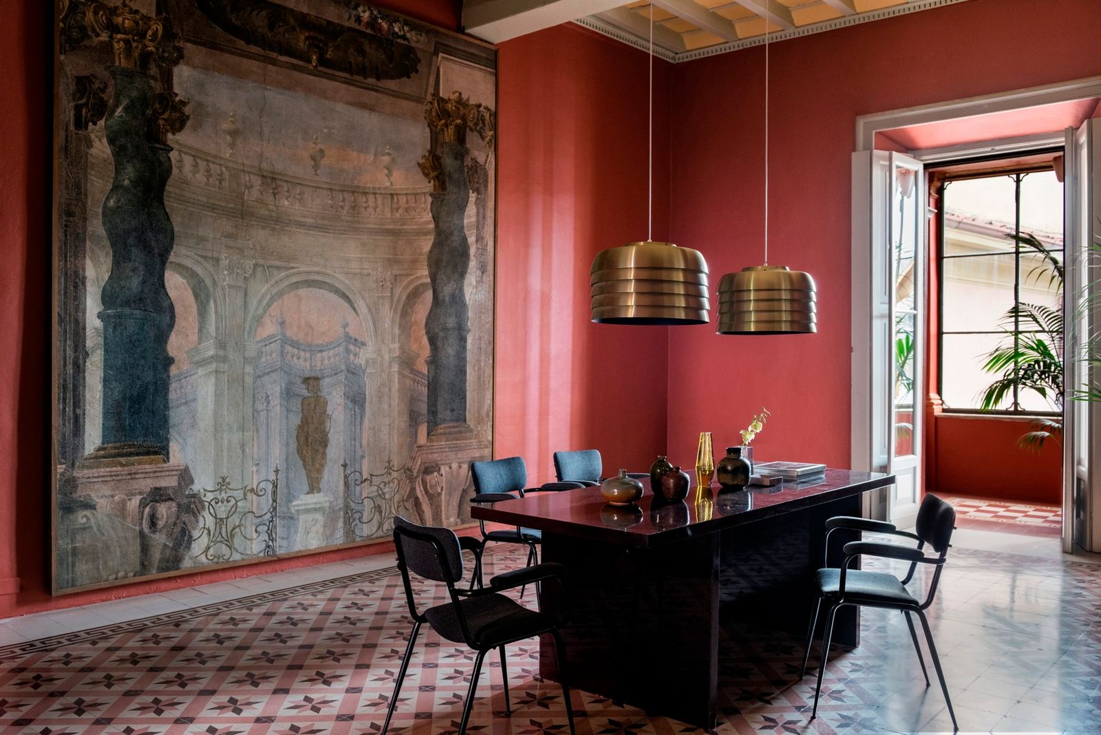
Burgundy has the gravitas of historic interiors, panelled rooms and luxurious textiles. Powder blue introduces a cooler, lighter note, allowing the deep red to feel fresher and more contemporary. The relationship works particularly well in rooms with distinctive architectural details.
A burgundy wall can provide a backdrop for blue velvet seating, while bedrooms can explore the pairing through upholstered headboards, curtains and painted surfaces. Dark timber, pale marble and aged metals add depth. Rather than giving both colours equal visual weight, allow one to dominate and use the other to articulate furniture or smaller details.
2. Cherry red and antique pink: a contemporary tonal pairing
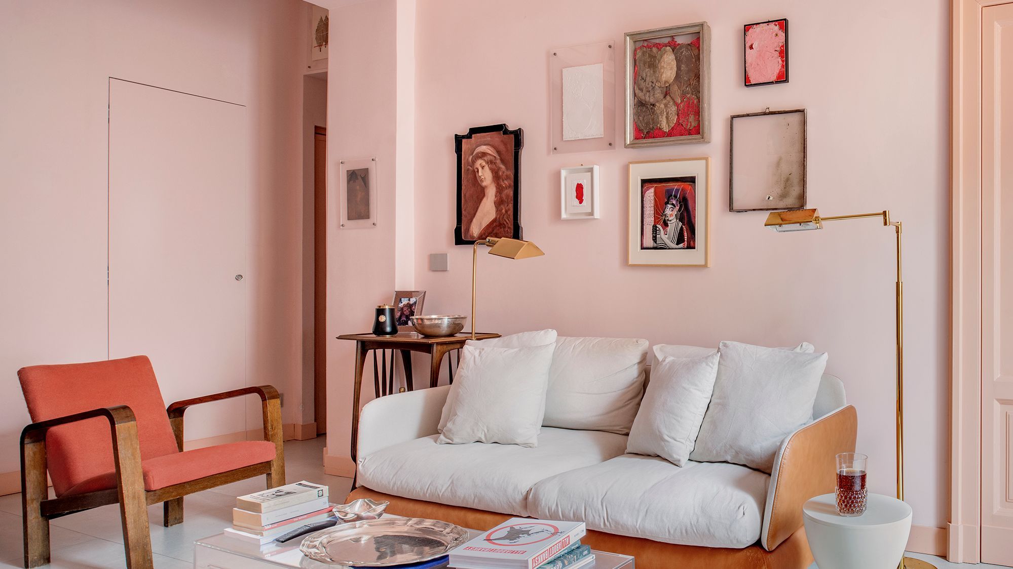
Red and pink belong to a closely related colour family, yet their combination can feel unexpectedly bold. Cherry red lends energy; antique pink softens its intensity. Together, they evoke the warmth of 1970s interiors while remaining adaptable to contemporary design.
Consider a cherry-red lacquered table against dusty-pink walls, or a vibrant sofa within a muted rose living room. Glossy finishes, ceramics and velvet enrich the combination; pale woods and ivory surfaces allow the eye to rest. The result can be decorative without becoming overly ornate.
3. Olive green and champagne gold: botanical warmth
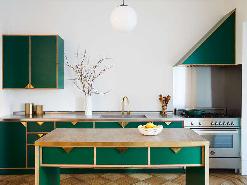
Olive green and champagne gold offer a restrained interpretation of luxury. Olive’s warm, earthy undertones recall Mediterranean landscapes and mature foliage, making it versatile across both traditional and contemporary interiors.
Champagne gold has a softer glow than polished yellow gold. Used on handles, faucets, light fittings and slim furniture frames, it complements the green rather than competing with it. In kitchens, olive cabinetry pairs with satin brass and pale stone; bathrooms can use the same approach through tiles and fixtures. Natural wood and linen lend an additional tactile dimension.
4. Cobalt blue and butter yellow: energy and softness
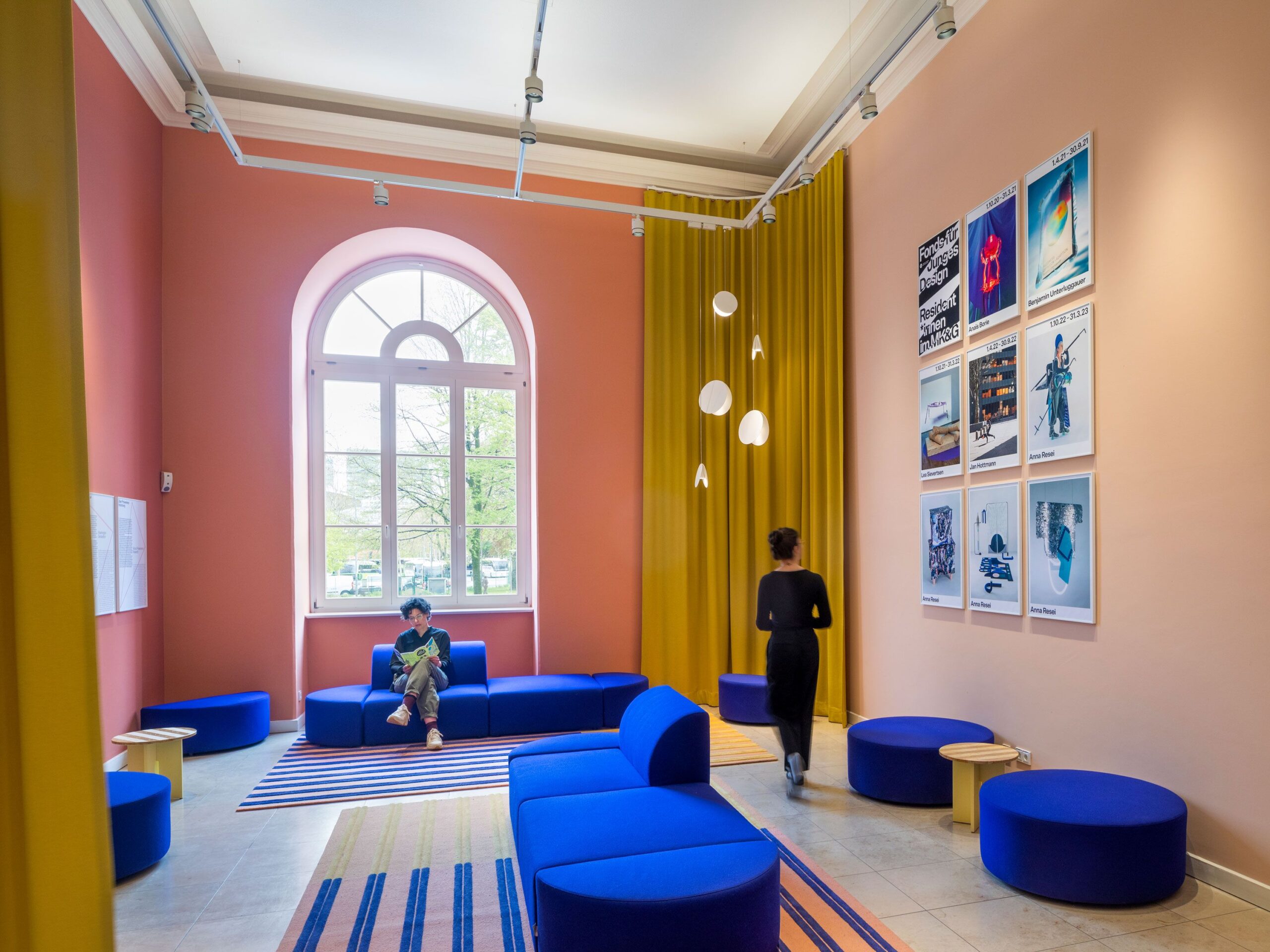
Cobalt blue has a vivid, unmistakable visual identity. Butter yellow brings a gentle warmth that balances its graphic intensity. Softer than lemon and lighter than ochre, the yellow creates an inviting counterpoint to the blue.
Try cobalt upholstery against buttery walls, or muted yellow cabinetry with cobalt details. Sculptural furniture, matte finishes and pale stone support the combination, while natural timber helps keep the room from looking overly graphic. The photographed Hamburg foyer illustrates a more saturated yellow variation of this broader pairing.
5. Chocolate brown and lavender: depth meets delicacy
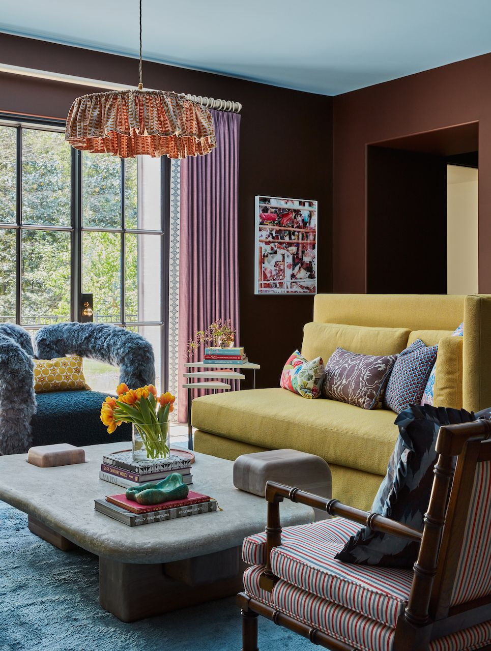
Chocolate brown has re-established itself as a sophisticated alternative to black and charcoal in interiors. Its depth makes natural wood, leather and tactile finishes particularly expressive. Lavender, especially when slightly greyed, introduces a surprising lightness.
A brown bedroom can be softened by lavender bed linen and ivory textiles; a living room can pair dark upholstery with lilac curtains or an accent chair. Walnut, smoked oak, glass and pale stone enrich the scheme. Warm lighting gives the pairing a more intimate character.
6. Aubergine and pistachio green: a dialogue of opposites
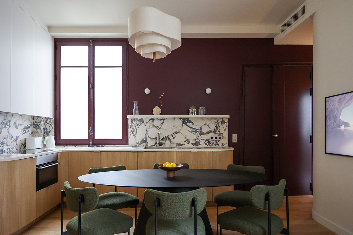
Deep aubergine evokes rich textiles and atmospheric rooms, while pistachio green offers freshness and a subtle yellow undertone. When used together, they create an expressive contrast without relying on stark complementary colours.
A lacquered aubergine cabinet can sit against pistachio walls, or upholstered green dining chairs can temper a plum-toned setting. Ivory, cream, warm timber and light stone provide visual continuity. As with all strongly coloured interiors, room size and daylight are important considerations.
7. Bordeaux and burnished gold: ornament, reconsidered
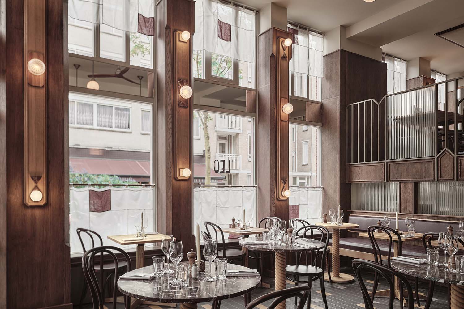
Bordeaux and burnished gold refer to historic decorative traditions, yet they can feel decidedly modern when applied with restraint. Matte bordeaux walls, lacquered joinery and sculptural upholstered furniture provide depth; aged gold appears as a subtle highlight on lighting, profiles and handles.
In kitchens, bordeaux fronts can meet patinated metal and natural stone. In a living room, burnished fittings bring warmth to deep wine-red textiles. Daylight reveals brown or purple undertones in the bordeaux, while metallic finishes shift their reflections throughout the day. The impact lies in proportion and finish rather than excess.
How to combine colours at home in 2027
Good colour schemes start with the architecture of a space. Walls, flooring and large pieces of furniture establish the atmosphere. Smaller upholstery, curtains, rugs and decorative objects introduce supporting shades. There is no universal formula: ceiling height, daylight, orientation and existing finishes all shape the outcome.
Natural materials bring different colours together
Wood, stone, linen, wool and ceramics can reconcile hues that might otherwise appear unrelated. Pale oak can soften a blue-and-yellow contrast; a lightly veined stone can lift a dark burgundy room. Texture is equally important: velvet absorbs light, plaster adds nuance and gloss enhances reflections.
Champagne gold, brass and burnished metal
Champagne gold works beautifully with botanical greens and warm neutrals, while burnished gold suits bordeaux and chocolate brown. Consistency across hardware, lighting and furniture details is usually more effective than adding too many different metallic finishes.
Daylight changes the way we see colour
A digital palette cannot fully predict the effect of paint and fabric in a real interior. Test physical samples beside existing floors and furniture and observe them at different times of day. Powder blue may appear grey in a dim room; olive green may reveal yellow or brown undertones under warm light.
A more personal approach to colour
The most interesting interior colour trends for 2027 do not suggest a single aesthetic. Instead, they invite a more personal relationship with surfaces, objects and architectural details. A painted wall, a chair, a textile or a carefully chosen lamp can change the character of a room. In this sense, colour becomes part of the design itself, rather than a decorative decision made at the end.
Frequently asked questions about 2027 colour combinations
Which colours are expected to trend in interiors in 2027?
Forecasts suggest interest in vivid blues, botanical greens, earthy shades and expressive accents. The seven pairings in this article are editorial interpretations, not official colour trend announcements.
What are elegant colour combinations for living rooms?
Burgundy with powder blue, olive green with champagne gold and chocolate brown with lavender can all create sophisticated living rooms when proportions, materials and light are considered.
How can I pair bordeaux with gold?
Use bordeaux for larger matte surfaces and burnished gold sparingly for lighting, hardware and profiles. Pale stone or natural timber helps balance the palette.
Which colour works with cobalt blue?
Butter yellow creates a bright, contemporary contrast. Ivory and pale timber offer softer alternatives.
How should I choose a colour palette for my home?
Start from daylight, floors, existing furniture and the atmosphere you want to achieve. Test real samples and consider the finish and texture of each material.
Further reading: international colour forecasts from WGSN and Coloro.