Among the objects that made Italian design recognizable far beyond Italy’s borders, the Atollo lamp by Vico Magistretti for Oluce holds a unique and hard-to-challenge place. Not only because it is a hugely famous lamp, nor simply because its image has entered the visual memory of architects, interior designers, collectors and enthusiasts. Atollo has become …
Among the objects that made Italian design recognizable far beyond Italy’s borders, the Atollo lamp by Vico Magistretti for Oluce holds a unique and hard-to-challenge place. Not only because it is a hugely famous lamp, nor simply because its image has entered the visual memory of architects, interior designers, collectors and enthusiasts. Atollo has become a permanent fixture of design culture because it achieved something rare: it took a traditional typology, the domestic table lamp, and reduced it to a primary, rigorous, almost inevitable form. Designed in 1977 and awarded the ADI Compasso d’Oro in 1979, it is still produced today and chosen as a living classic, not as a relic of the 20th century.
Its strength doesn’t come from an excess of gestures but from extremely careful subtraction. There is nothing superfluous in Atollo, and yet nothing looks impoverished. That is its highest quality: the ability to express a cultured, abstract, razor-sharp form without losing touch with use, with light, with everyday living. This is why Atollo by Vico Magistretti for Oluce is not only one of the most iconic Italian design objects of all time, but also one of the most instructive: it shows that simplicity, when it is genuine, is almost always the result of a difficulty solved with intelligence.
Why the Atollo lamp became an icon of Italian design

Many famous objects owe their success to capturing the taste of an era. Atollo belongs to a rarer category: designs that don’t merely interpret their own time but manage to transcend it. The reason lies in the very structure of the design. Atollo can be read as an abstract reinterpretation of the classic abat-jour, or shaded table lamp, and that definition captures the crucial point: it wasn’t conceived as an elegant variation on a familiar lamp, but as a rewriting of a domestic archetype.
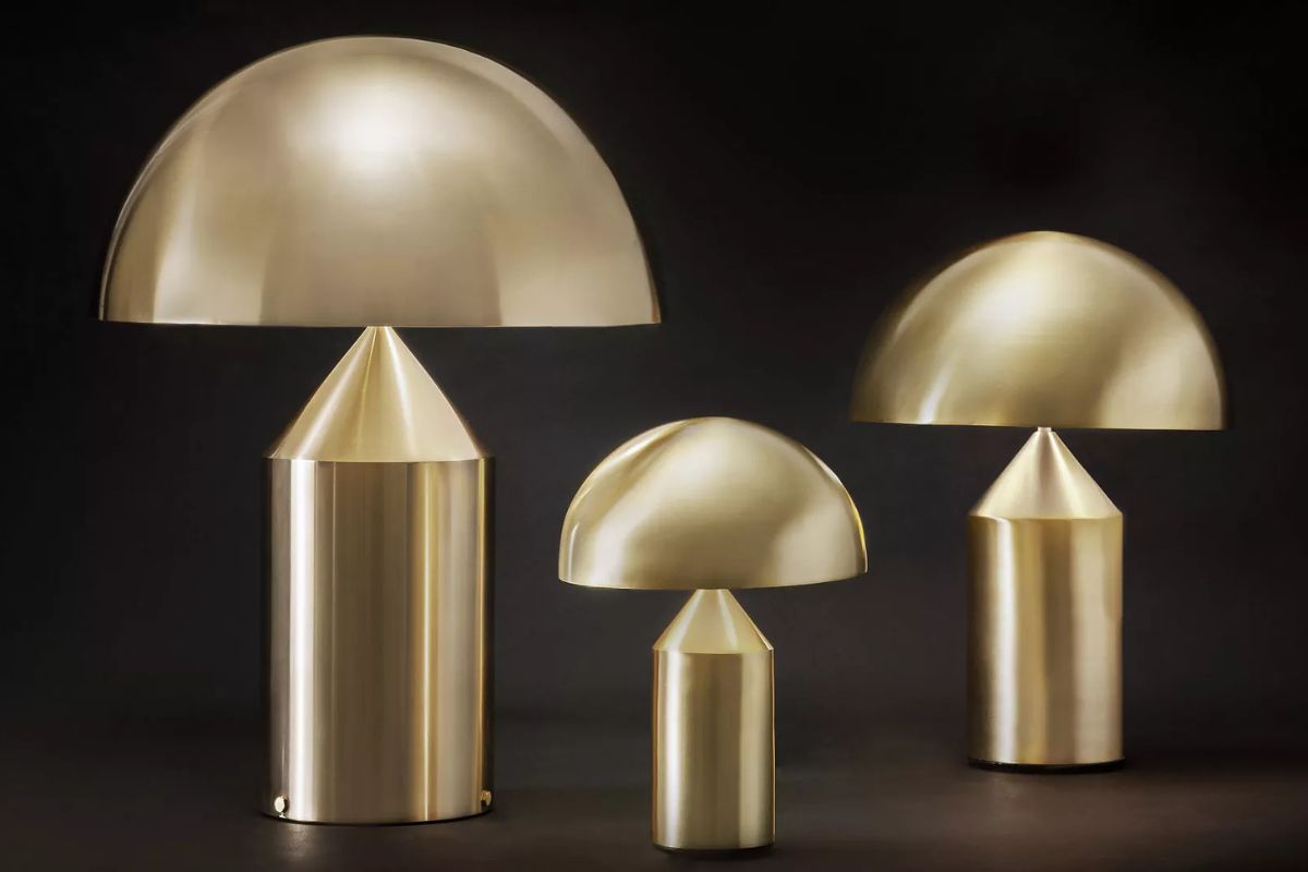
Rather than dwelling on decoration, Vico Magistretti worked on synthesis. The lamp is reduced to three elementary shapes—a cylinder, a cone and a hemisphere—and from this reduction emerges a figure of extraordinary authority. Atollo isn’t just beautiful. It is clear. And in design, clarity is a harder achievement than apparent originality. Looking at it, you get the feeling that the form already existed somewhere, waiting to be found. That is the mark of great design: it only looks simple after someone has made it so.
The Atollo sketch and the birth of the idea

To truly understand the stature of Atollo, it’s worth looking at its origins. Here, the sketch isn’t an archival footnote but a critical threshold. It shows that the project grew out of an idea of order, not a series of corrections. The lamp is already conceived as a primary construction, as a balance of masses and proportions, as an object in which form isn’t added to function but coincides with it.
This matters for a contemporary reading of the design, too. At a time when many products try to stand out by multiplying details, finishes, effects or references, Atollo is a reminder that identity can also come from discipline of line. The original sketch already shows the drive to turn the table lamp into a small architectural organism: stable at the base, tapered in the central body, complete in the upper dome. A self-sufficient figure, austere but not rigid.
How Atollo came about: a form that didn’t happen by chance
It would be convenient to describe Atollo as a sudden stroke of genius. The truth, however, is more interesting. The project belongs to an ongoing line of research that Vico Magistretti was already pursuing on the relationship between pure geometry, domestic objects and the quality of light. Atollo, then, didn’t come out of nowhere. It came from a gradual sharpening of focus.
Magistretti subtracted, clarified and brought to completion a line of thought that concerned not only the shape of the lamp but its place in the home and in design culture. The result is an object that looks radical without being aggressive, abstract without being conceptual, restrained without seeming timid. It is this balance that has made it so enduring.
Cylinder, cone and hemisphere: the geometry that set a standard

The critical history of Atollo is inseparable from its geometric structure. Its three component shapes—cylinder, cone and hemisphere—form the essential grammar through which the lamp builds its identity.
The cylindrical base provides stability and verticality. The cone introduces a sculptural tension that lightens the central body and draws the eye upward. Finally, the hemisphere closes the design with a full, almost archetypal gesture that shields the light source and gives the object its unmistakable silhouette. But what really matters isn’t the list of shapes; it’s the way they relate to one another. Atollo isn’t a sum of solids. It is a balance. And it is in this synthesis of geometric rigor and perceptual ease that the lamp continues to stand out as one of the great images of late 20th-century Italian design.
The light: not just form, but atmosphere
It would be reductive to see Atollo purely as a masterpiece of formal composition. Its authority also depends on how it organizes and modulates light. The design is about not only the silhouette but also the quality of the light it emits.
This is where Magistretti’s sensitivity shows in full. The lamp’s simplicity is never only visual: it is perceptual too. Atollo creates presence without intruding, atmosphere without lapsing into sentimentality, identity without theatrics. In the opal glass versions, the light tends to be softer, more diffused and enveloping; in the metal versions, the object’s character comes through more decisively and the lamp looks almost more sculptural. In both cases, though, the core of the design remains intact: a perfect match between form and the behavior of light.
Atollo lamp models: codes, sizes and the product family

One of the most interesting things about Atollo by Vico Magistretti for Oluce is that, despite being such a powerful icon, it has never hardened into a single canonical version. The official collection includes several models and sizes, proof of an adaptability rare for such a recognizable object. The catalog lists models 233, 235, 236, 237, 238 and 239, divided between metal versions and opal glass versions.
Model 233 is the large metal Atollo: a monumental presence, 70 cm high with a 50 cm diameter. Model 235 offers the same scale in opal glass. Versions 236 and 238 are the small size, in glass and metal respectively, 35 cm high with a 25 cm diameter. Models 237 and 239 occupy the middle range, 50 cm high with a 38 cm diameter. This range is no minor detail: it shows how Atollo has stayed true to itself while adapting to different needs in terms of space, proportion and placement.
Metal or glass Atollo: two characters, one idea
One of the most useful ways to read the collection is through its two main material families. Metal Atollo and opal glass Atollo aren’t simply two finishes of the same lamp: they are two different interpretations of the same design idea. The metal version makes the profile crisper, more architectural, more assertive. The solid surface holds in the light and brings the design itself to the fore—the relationship between volumes, the sculptural presence of the object.
The opal glass version, by contrast, softens the geometric severity and focuses more on diffusing light. The object remains instantly recognizable, but its character changes: it becomes more atmospheric, softer, at times even more domestic in the best sense of the word. The point isn’t to decide which version is better, but to understand how a single design can modulate its identity without betraying its original principle. It is further proof of Atollo’s quality: it doesn’t rely on a single effect, but on a structure strong enough to support different incarnations.
Colors and finishes: how the icon changes
In its metal versions, Atollo is now offered in several official finishes, including white, black, satin bronze and satin gold, as well as the more recent satin black nickel finish for some versions in the collection.
These finishes aren’t mere commercial details. White heightens the abstraction of the design and tends to turn Atollo into an almost absolute sign. Black accentuates its graphic, austere, crisp nature and pushes it toward a more rigorous reading. Satin bronze brings a warmer, more intimate and sophisticated temperature, making it especially interesting in textured, cultured, unostentatious interiors. Satin gold shifts the object into a more precious but never excessive register, while satin black nickel gives it a contemporary, technical, tauter vibration. In such a disciplined design, color doesn’t change the form, but it changes its voice.
Which Atollo lamp to choose: proportion, placement, style

With a design icon, the risk is assuming that owning it is enough to make it work. In reality, Atollo is an object that demands a precise relationship with space. The small versions, such as 236 and 238, work particularly well on substantial nightstands, console tables, bookshelves or side surfaces where the iconic presence needs to stay balanced. The medium sizes, 237 and 239, are perhaps the most versatile for many contemporary interiors: significant enough to become a focal point, but not so large that they require exceptional surfaces. The large 233 and 235, on the other hand, have an almost monumental scale and need room to breathe: large sideboards, generous tables, dramatic entryways, studies or living rooms where the lamp can be read as a true piece of small-scale domestic architecture.
The style of the interior matters, too. A white or black Atollo can pair beautifully with pared-back, modernist, rigorous spaces. Bronze and satin gold, by contrast, suit more textured or sophisticated settings, where light and metal interact with wood, stone, textiles or warm tones. Opal glass, for its part, has a softer, less emphatic quality and can be a particularly refined choice for nighttime spaces, bedrooms, reading corners or rooms where diffused light matters more than the crispness of the object.
Where to buy Atollo today
Another factor behind the object’s cultural longevity is its current presence in the high-end design market. Atollo naturally features in the official Oluce catalog, but it is also available through showrooms, dealers and retailers specializing in contemporary design. This is no marginal detail: it means the lamp hasn’t been confined to the past or to museums alone, but continues to live within the active circuit of design, furnishing and discerning clients.
Its availability today says something deeper than simple commercial continuity. It shows that Atollo is still seen as a necessary object, able to speak to the present without needing to be reinvented. In a landscape saturated with short-lived novelties, that is an extremely rare kind of authority.
Oluce: light as design culture

To fully understand Atollo by Vico Magistretti for Oluce, you also need to look at the brand that has produced and safeguarded it over time. Oluce, founded in 1945 by Giuseppe Ostuni, is the oldest Italian design company still active in lighting. It’s a significant fact, but it doesn’t explain the brand’s role on its own. The real importance of Oluce lies in having built, over the decades, a catalog that is not just a collection of lamps but a genuine narrative of Italian design culture.
Its history includes key figures such as Joe Colombo, Tito Agnoli, Marco Zanuso and, of course, Vico Magistretti. This constellation of designers explains why so many Oluce lamps are seen today as international classics rather than simple industrial products. Atollo, in this context, is one of the clearest expressions of the brand’s mission: turning light into form, function into language, the object into a cultural presence.
Vico Magistretti: the master of difficult simplicity
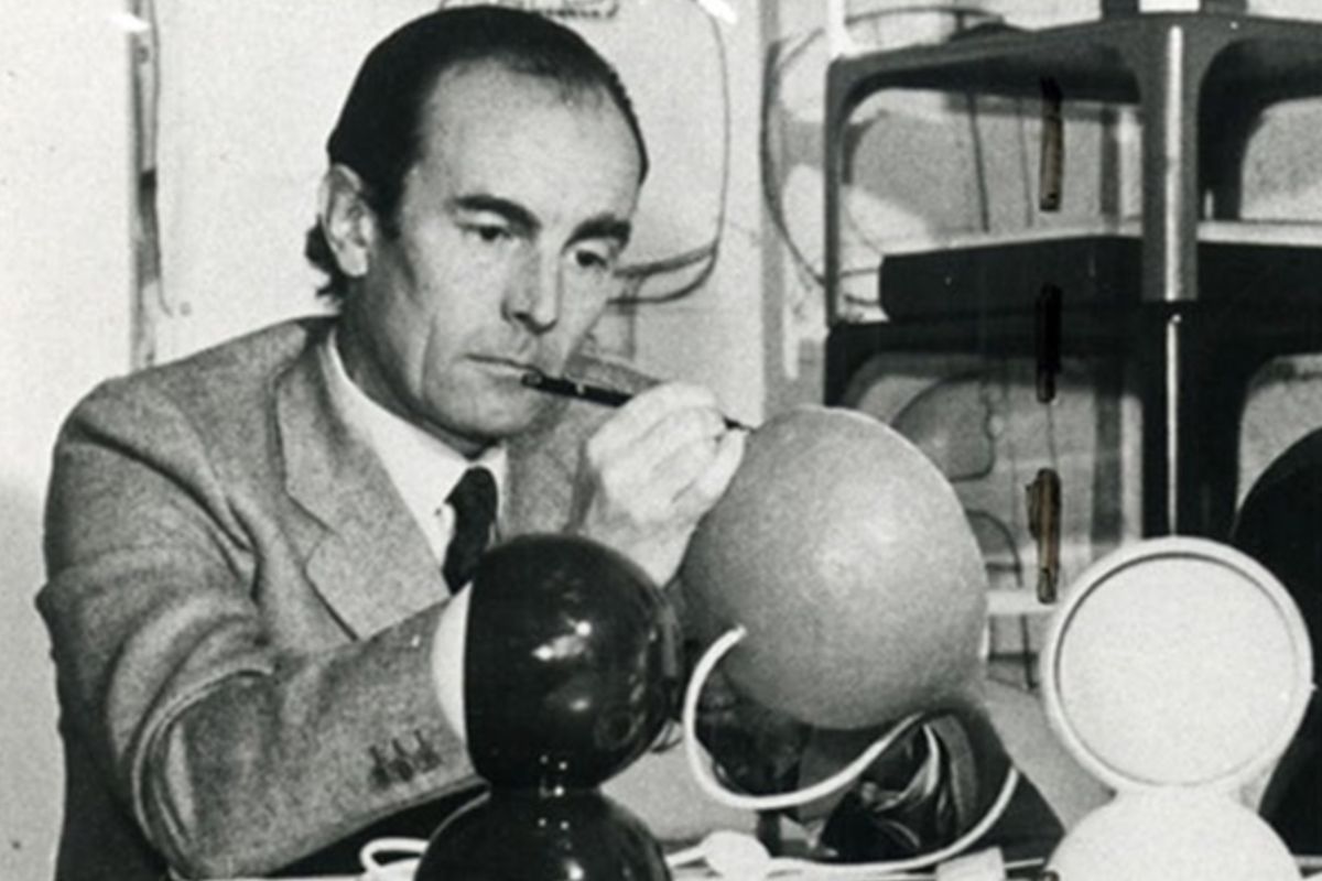
Behind Atollo, of course, stands Vico Magistretti, one of the great protagonists of 20th-century Italian design. Born in Milan in 1920 into a family of architects, Magistretti spanned the century working across architecture, product design, interiors and the culture of living, always with rare consistency.
But perhaps the finest trait of his work is something else: the ability to make what is actually the fruit of great precision seem natural. In Magistretti’s hands, simplicity is never banal. It is selection, discipline, measure. Atollo is a perfect demonstration. The object seems immediate, but its immediacy is constructed. It seems essential, but its essentialism is never poor. It seems timeless, but its longevity comes from a lucid commitment to how it is used today. This is also why Magistretti is still so widely studied: he didn’t chase effect; he looked for the right form.
From 1977 to today: the numbers behind a long run
In the end, a few hard numbers are enough to tell the story of Atollo’s extraordinary staying power. 1977: the year it was designed. 1979: the year of the ADI Compasso d’Oro. A collection that still spans several models, sizes and finishes. Production that has never stopped.
These are sober, almost spare numbers, and for that very reason they suit the nature of the object. Atollo never needed to shout about its iconic status. It built it over time, with the patience of great designs. For almost half a century it has stayed where only truly successful objects stay: in homes, catalogs, photographs, design schools and collective memory. And it continues to do so without losing either gravity or grace.
Perhaps this is the greatest lesson of Atollo by Vico Magistretti for Oluce: showing that an object can become legendary not when it desperately tries to impose itself, but when it manages, with complete naturalness, to seem definitive.
7 things you (probably) didn’t know about the Atollo lamp
Curiosity 1 – Atollo wasn’t born as an “abstract” object, but as a reinterpretation of the abat-jour
One of the most interesting things about Atollo by Vico Magistretti for Oluce is that its image, now seen as almost absolute and sculptural, actually grew out of a reflection on a very domestic, very bourgeois object: the abat-jour, the traditional shaded table lamp. In the catalog of the exhibition Italia Geniale and in the archive of the Fondazione Vico Magistretti, Atollo is read precisely as a reinterpretation of that familiar, ever-present fixture of 20th-century homes. Its radicalism, then, doesn’t lie in inventing an alien form, but in distilling an everyday object down to its essence until it becomes an icon.
Curiosity 2 – The technical details are deliberately hidden
Atollo’s formal purity doesn’t depend only on the geometry of its volumes. It also depends on a very precise design decision: the technical elements are concealed. The Magistretti archive points out that the essential quality of the composition is reinforced precisely by the treatment of the technical components, which stay hidden—continuing a line of research the designer had been pursuing since the 1960s, starting with the Mania lamp of 1963. It’s an important detail because it explains a crucial point: Atollo looks so pure not only because of what it shows, but also because of what it chooses not to display.
Curiosity 3 – The glass and methacrylate versions came later
Many people assume Atollo was born from the outset in all the versions we know today. That’s not quite the case. The Fondazione Vico Magistretti notes that the design, initially conceived in aluminum, later remained in production also in methacrylate and glass versions, capable of producing diffused light as well, and that these versions have been made since 1988. It’s an interesting fact because it shows that the icon wasn’t simply replicated, but developed over time through a reflection on material and the quality of light.
Curiosity 4 – Atollo has a very clear precedent: Sonora

Look closely at Magistretti’s work and Atollo doesn’t appear out of the blue. The Fondazione’s archive points to Sonora, from 1976, as a design that anticipates the configuration of Atollo. In particular, the hemispherical dome of the Sonora pendant prefigures one of the table lamp’s most recognizable elements. It’s a valuable detail because it lets us read Atollo not as an isolated intuition, but as the outcome of consistent research into lamp geometry in the 1970s.
Curiosity 5 – The Atollo in MoMA’s collection is model 233
When museums come up, the details often stay vague. In this case, however, there is a very precise fact: the lamp in the collection of the Museum of Modern Art in New York is the Atollo Table Lamp, model 233, manufactured by Oluce, Milan, and donated to the museum directly by the manufacturer. It isn’t only a symbolic consecration: it also reinforces the historical weight of model 233, the large metal version, as the most canonical incarnation of the object.
Curiosity 6 – Atollo won the Compasso d’Oro very quickly
Atollo was designed in 1977 and won the ADI Compasso d’Oro in 1979, Italy’s most prestigious design award. What’s remarkable is how quickly the design was recognized as exemplary. This isn’t an object rediscovered decades later, but a lamp that very soon established itself as a benchmark of Italian design. That helps explain how evident its strength was from the start, long before it became one of the most widely shared and cited images of late 20th-century design.
Curiosity 7 – Atollo belongs to Oluce’s history, not just Magistretti’s
A lesser-known but revealing detail concerns the production context. The Magistretti archive recalls that the designer was art director and principal designer at Oluce from 1973 to 1988/89. This means Atollo didn’t come from a one-off encounter between designer and company, but from within a deep, ongoing, almost structural relationship. In other words, Atollo is certainly a great Magistretti lamp, but it is also one of the highest achievements of a crucial period in Oluce’s history.