In his new collection for The Rug Company, six designs in ten colorways enlarge marker tests, brushstrokes, chalk marks and tailoring lines. It is not a simple transfer from fashion to the home: scale, color and craftsmanship change the meaning of the gesture.
A marker test, the trace left by tailor’s chalk before cutting, a brushstroke that never meant to become a pattern: The Studio, Christopher John Rogers’s new rug collection for The Rug Company, starts from what usually stays on the margins of a finished product. Launched on November 5, 2026, it comprises six designs in ten colorways, made with both hand-knotting and weaving techniques. The story isn’t just another fashion name moving into home furnishings. It’s the way the project takes the leftovers of the creative process seriously and forces them to change scale, material and lifespan.
The launch date should be kept separate from the dates of the coverage: ELLE Decor previewed the debut on November 4, announcing it for the following day, while Wallpaper* and Architectural Digest published their takes on November 5. The news, then, is the launch of the collection itself, not just the release of new images. And it matters now because it shows a cross-disciplinary collaboration in which craftsmanship isn’t used to stamp a recognizable signature, but to translate the irregularity of a gesture into a surface meant to be walked on, furnished around and lived with.
From a provisional mark to a permanent surface
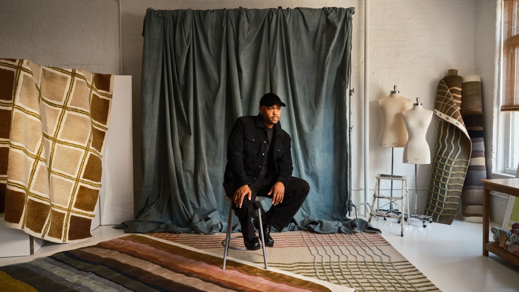
Rogers didn’t build an ornamental vocabulary from scratch. He looked through his own studio archives: color tests, brush studies, doodles and the markings used to construct garments. In Marker Test, a color trial made while developing a textile print is enlarged into a field of marks in wool and silk; Chalk Line preserves the grid of lines drawn before fabric is cut. Paintstroke stretches a swipe of wet pigment into bands reminiscent of desaturated watercolors.
The key move is enlargement. On a worktable, these marks are tools, checks or accidents; on the floor, they become geography. Scale reveals breaks, overlaps and shifts in pressure that an overly polished reproduction would erase. The collection’s official page talks about “happy accidents,” but the point isn’t to celebrate imperfection in general. It’s to keep the information contained in a mistake without turning it into an artificially spontaneous graphic effect.
There’s a practical lesson here for designers and brands. The richest archives don’t only hold successful products: they include rejected samples, trials, notes and intermediate steps. Moving them into another product category, though, takes real translation work. The original form isn’t enough; you have to decide which qualities survive, which change, and which only become visible thanks to the new material.
How color changes when it moves to the floor
Rogers is known for saturated hues and sharp contrasts, but for The Studio the palette has been toned down. Wallpaper* reports that the shades were adjusted during dyeing to suit the home: muted primaries, warm earth tones, cream grounds and transitions less assertive than those designed for a body in motion. It isn’t a retreat from color; it’s an acknowledgment that a rug occupies both visual and physical space, and stays exposed to light, furniture and foot traffic for far longer than a runway look.
This is where the collection gets interesting for interior design. The color of a horizontal surface is never read in isolation: it reflects onto the walls, alters the perceived size of a room and has to negotiate with wood, fabrics and metals. Lattoro, for example, uses a warped checkerboard with darker edges and a brighter center, a gradient that can accommodate a furniture layout rather than compete with it. For help choosing size and function, our guide to the best modern rug brands and the role of the rug in interior design offers broader practical context.
The decision to mute the palette also suggests a useful rule whenever a design language moves from one discipline to another: don’t automatically replicate its intensity. Fashion and interiors share color and touch, but they work with different distances, timescales and lighting conditions. Consistency doesn’t mean a perfect match.
Craftsmanship is not a graphic filter
The official spec sheets show how much the result depends on the method. Marker Test Magnolia is hand-knotted using an Indo-Nepalese technique, with a stated density of 80 knots, and combines wool and silk in a cut pile; Paintstroke Wool & Silk Rainbow rises to 100 knots, again in wool and silk. For Lattoro Coriander, by contrast, the sheet lists a Moroccan construction, 16 knots and wool only. Density, sheen and pile height aren’t incidental details: they determine whether a mark looks crisp or diffused, whether it shifts with the viewing angle, and how much of its energy the gesture retains.
Silk can make a line glow and respond to light; wool builds body, matte depth and durability. A stroke that is two-dimensional on paper thus gains relief and direction. It’s this materialization, more than the designer’s fashion background, that gives the collaboration substance.
The stated lead times also say something about the kind of product this is: for custom-size hand-knotted rugs, The Rug Company generally quotes sixteen to twenty-two weeks. That’s not a universal promise and should be confirmed when ordering, but it reminds interior designers and clients that a handcrafted surface enters the project schedule long before the decorating phase. Dimensions, furniture layout, circulation, maintenance and lighting need to be defined together, not tacked on at the end.
The Studio succeeds when the designer’s name stops being the headline. The color tests remain recognizable, but they aren’t simply photographed and printed; they pass through dyeing, knotting, pile and domestic scale. For anyone who designs or manufactures, the implication is clear: a cross-disciplinary collaboration gains value when technique changes the original idea. The mistake on the cutting table isn’t ennobled for the sake of rhetoric. It becomes design because craftsmanship gives it a new function, a different lifespan and a real place in the room.
Sources
- The Rug Company, “The Studio” and the official product pages for Marker Test Magnolia, Paintstroke Wool & Silk Rainbow and Lattoro Coriander, primary sources for designs, materials, techniques and indicative lead times.
- Wallpaper*, “Christopher John Rogers turns the ‘beautiful errors’ of making clothes into rugs”, published November 5, 2026: interview and context on translating color for interiors.
- Architectural Digest, “Fashion Maverick Christopher John Rogers Unveils Bold New Carpets for The Rug Company”, published November 5, 2026: independent confirmation of designs, techniques and sources of inspiration.
- ELLE Decor, “Christopher John Rogers Is Taking His Signature Color to the Floor”, published November 4, 2026: confirmation of the November 5 launch date.