Lime, clay and matt finishes: how to read specifications and samples to choose welcoming walls that suit the light and daily use of each room.
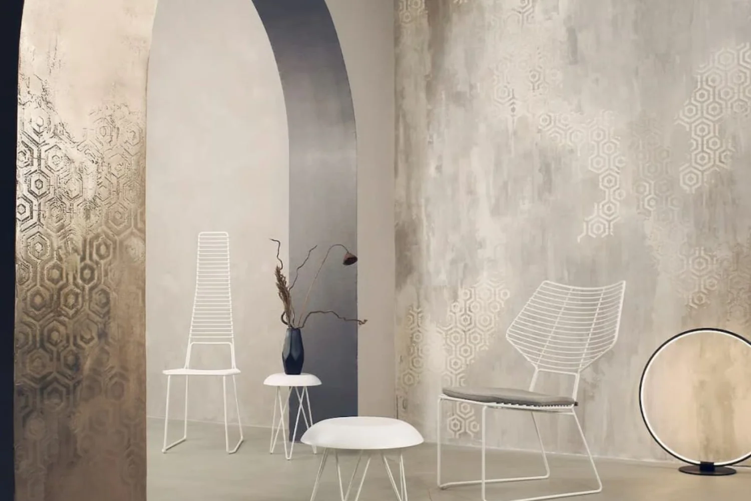
Choosing an interior paint has never been so simple… and so easy to make mistakes. Today the market is full of “washable” finishes, promises of high coverage and perfect colors in photos which, once on the wall, change tone, reflect the light in unexpected ways or highlight every imperfection. And then there is the less visible but decisive part: breathability, resistance to humidity, maintenance, durability.
In this guide we have collected the best brands of interior paints and, above all, the criteria that really matter when you want a beautiful and stable result over time. You will find a selection of brands appreciated by professionals and decorators, the differences between washable, breathable and anti-mold paints, realistic price ranges and the most common mistakes to avoid. The objective is one: to help you understand which paint makes sense for your home , not just which one is “in fashion”.
What are the best brands of interior paints
Before going into the technical criteria, let’s start from the most searched question: which are the truly reliable brands when it comes to interior paints. Here you will find a selection of brands appreciated by professionals, applicators and decorators, with a different profile depending on whether you are looking for a super clean finish, a high-performance paint or more tactile decorative finishes.
Sikkens
A brand very present in the professional world, appreciated for its consistency of performance and the solidity of the internal cycles. It is a sensible choice when you want a paint that “holds up” over time, with good performance on coverage, uniformity and resistance in lived-in rooms (especially if the wall is not perfect).
San Marco
Italian brand with a wide range: water-based paints for interiors, technical solutions and a more expressive decorative part. It is interesting when you want to work on a complete project, moving from “clean” painting to more characterizing finishes, maintaining system coherence and possibility of choice.
Novacolor
Very strong on the contemporary decorative front: textures, material effects and surfaces that become part of the interior design, not just “colour”. It makes sense if the wall must have presence (living room, entrances, focal walls) and you are looking for a more tailored result than classic water-based paint.
Caparol
Brand with a technical and professional imprint, often chosen for the quality of the system and the variety of solutions. It is useful when you need a balance between aesthetics and performance, with products suitable for different contexts and attention to color stability.
Farrow & Ball
Famous for the palette and for a very recognizable color language. It is a typical choice for those who want a “project-like” result, with deep colors and refined finishes. It should be considered above all for aesthetics and color identity, rather than for a generalist approach.
Little Greene
Interesting for those who love colors with personality and a cultural/heritage component. It is often chosen in residential contexts where the painting must dialogue with furnishings, wood paneling or period details, but it can also work in contemporary interiors if chromatic depth is sought.
Benjamin Moore
Very forts on color, coverage and uniformity, with a high reputation especially on the international market. It is a choice to evaluate when the project revolves around color and you want breadth of range, predictable rendering and clean finish.
Sigma Coatings
Brand oriented towards performance and reliability. It is useful for those looking for paints designed to hold up well on very worn walls or in projects where a more technical approach is needed, without necessarily chasing the decorative effect.
Oikos
Italian brand known for the decorative component and for finishes that add material and character. It is suitable when you want a wall that “works” with light, with more expressive effects and a less flat result than standard water-based paints.
Boero
Historic Italian brand with technical positioning and a good reputation in the world of paint systems. It is a sensible choice if you are looking for concrete and reliable solutions for interiors, especially when you want to work with products designed to last and maintain good performance over time.
Colorificio Toscano
Italian brand with a very “well done construction site” approach: good reputation in the professional world and a range designed for clean and reliable results. It is interesting when you are looking for a paint that works well on real (not perfect) walls, with uniform rendering and an overall “solid” feel rather than decorative. It makes sense especially for residential projects where you want concrete, controllable quality, with consistent and easy-to-manage interior finishes.
PPG
PPG is a strong name internationally in the world of coatings and paints, with a technical and performance focus. It is an option to consider when the focus is on performance and reliability (coverage, uniformity, resistance), especially in contexts where the wall must withstand daily use well. It is less “narrative” than the more iconic color brands, but for this reason it works well when you are looking for measurable results and a more professional approach.
Lime, clay and matt finishes for an inviting home
Choosing interior paint means deciding how a wall will look and how it can be maintained. Colour is part of that decision, alongside formulation, surface preparation, sheen and required durability. Lime, clay and matt finishes can contribute to an enveloping interior, but they are not interchangeable categories.
Start by defining the room and how it is used. A frequently touched hallway, bedroom and wall near a cooking area have different requirements. The most appealing sample may not be the most appropriate finish for the home’s hardest-working surface.
Lime: assess the complete system
Lime-based finishes can interest anyone seeking a mineral character and a surface that is not perfectly uniform. The effect depends on the product, substrate and application technique. A photograph showing pronounced movement does not describe every paint marketed as lime-based.
Ask which primers are required, what existing surfaces are compatible and how maintenance should be handled. Previously painted walls need a compatibility check; covering them with a naturally named product is not enough. A sample made using the intended system allows colour and surface movement to be considered together.
Clay: distinguish paint from a thicker coating
Clay can refer to different products, ranging from paints to coatings with more pronounced texture. Thickness, particle size and application method affect the result. Before choosing a shade, establish which product will actually be used and what its technical information states.
Do not automatically assign humidity-regulating properties or health benefits to every clay-based finish. Any performance claim should relate to the particular formulation and conditions of use. For walls exposed to frequent contact or splashes, check durability and permitted cleaning methods. The word “natural” does not replace that information.
Matt does not necessarily mean delicate
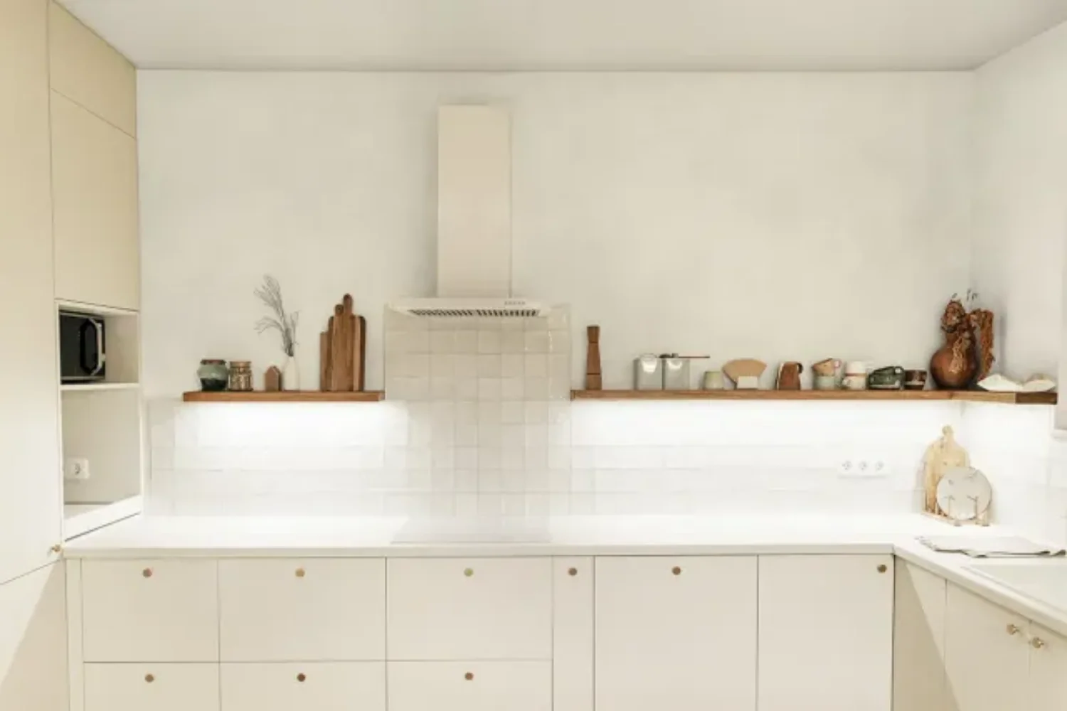
Sheen describes appearance; cleaning resistance describes performance. Read them separately. Ask how wet-scrub resistance is documented and which cleaning products are permitted. “Washable” should not be interpreted as permission to use any cleaner or any cleaning method.
A very matt finish can reduce some reflections, but it cannot eliminate an uneven substrate or poor preparation. Side lighting reveals defects that may be invisible on a small sample. Long walls beside windows therefore deserve particular attention to preparation and application, not only to the chosen colour.
Cocooning colours: choose a relationship
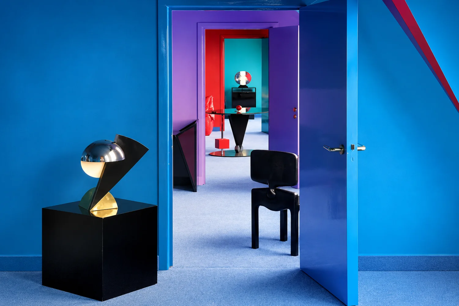
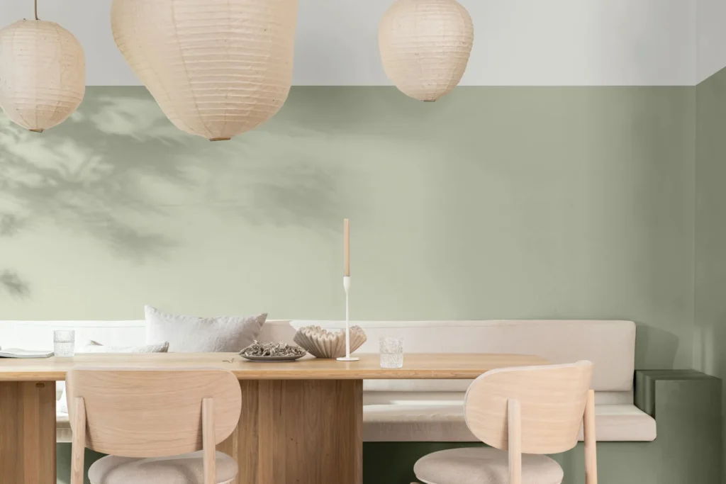
An enveloping colour does not have to be dark. Earthy neutrals, muted greens and deep blues can work when they relate to flooring and textiles. Identify the least changeable element of the room first and use it to guide the combination.
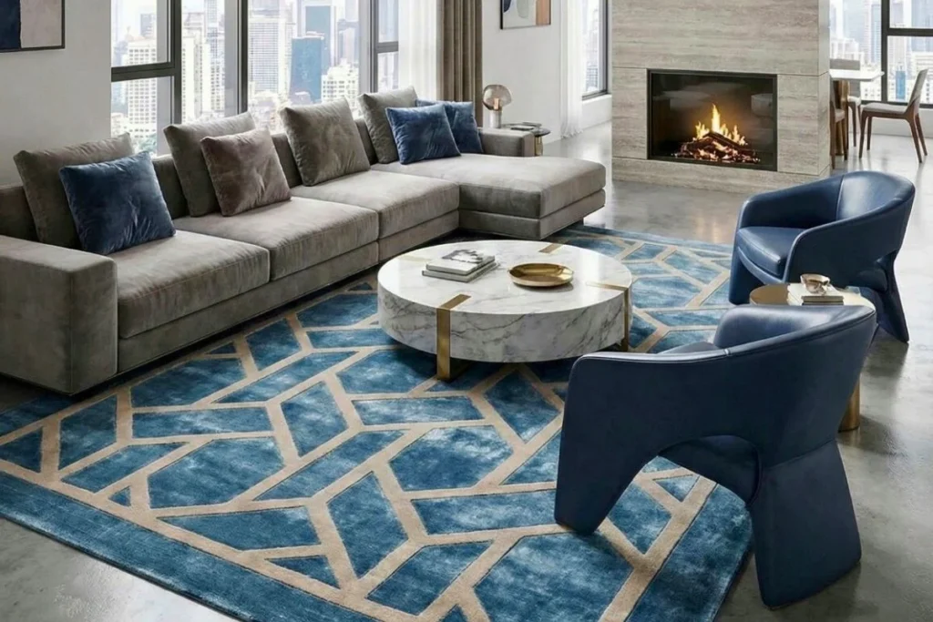
In a living room with a strong stone such as Rosso Levanto, test a quieter matt background. In a bedroom with pale timber, a dusty shade can provide continuity without imitating the wood. These are design possibilities: a sample in the actual room matters more than an evocative name on a colour card.
Brands: compare specific product ranges
Sikkens, San Marco, Caparol, Farrow & Ball, Little Greene, Benjamin Moore, Oikos and Novacolor can be starting points for research rather than a ranking valid for every wall. Compare the exact product, required system, colour availability and application support. Different ranges from one brand do not necessarily share a formulation or performance profile.
Request quotations based on the same surface area and preparation standard. Primer, specified coats, labour and protection of furniture all contribute to the complete cost. The price of a tin alone does not reveal the cost of the finished wall or how it will behave in everyday use.
Emissions and environmental information
The European Commission’s EU Ecolabel information for paints and varnishes provides an institutional starting point. It helps distinguish a verifiable label from broad descriptive language. Check certification for the chosen product instead of assuming that it covers an entire company catalogue.
Read the instructions for drying, ventilation and room use as well. Water-based formulation does not mean product precautions can be ignored. Where damp or mould recurs, identify the cause before selecting a decorative finish. Painting alone should not be treated as a solution to an unresolved building problem.
Make the sample resemble the finished work
Prepare a sufficiently large test using the intended primer, tools and number of coats. Observe it at different times and with evening lighting. Our guide to circadian lighting provides wider context on light and daily routines; when comparing paint colours, use the lamps that will actually illuminate the room.
If part of the room will be papered, place a wallpaper sample beside the paint. Examine the junction too. A convincing combination of small samples must still work when one finish covers a large wall and the other occupies a more limited area.
Confirm five things before ordering
Confirm the substrate, application system, colour, maintenance requirements and quantity calculated from the declared coverage. Keep the product name, colour reference and batch information for future work. A well-chosen paint combines the desired atmosphere with realistic conditions of use, without expecting the wall to perform beyond the product’s documented capabilities.
What really makes a paint suitable for interiors
Not all “interior” paints are the same: some focus on immediate coverage, others on resistance, still others on finishes and depth of color. To choose well, it is best to look at a few key parameters – those which, in real life, make the difference between a beautiful result only on the day of application and a wall that remains pleasant even after months.
Coverage, yield and duration over time
The first thing you notice is the coverage, but the real quality can be seen in the overall yield : color uniformity, absence of halos, ability to “hold” on less than perfect surfaces. A good paint not only covers, but does so evenly, without creating visible differences between brush strokes or rolls, especially with intense colors or on already marked walls.
Durability over time is the other theme: a high-quality paint maintains a stable appearance, resists small impacts better and does not “wear out” quickly in the most touched areas (entrances, corridors, walls behind chairs or sofas). In practice: it’s not just a question of “two hands”, but of the result after six months of real life.
Breathability, healthiness and critical environments
In an intErno, it’s not just aesthetics that count. Paint is a large and continuous surface: it can contribute to comfort or create problems, especially in damp or poorly ventilated homes. breathability is a real criterion, not a slogan: it is what helps manage steam and reduce the risk of condensation, especially in bathrooms, kitchens and poorly ventilated rooms.
Here low odor formulations, reduced emissions and specific cycles (for example anti-mold) also come into play when they are really needed. The point is to avoid the opposite mistake: using “hyper-technical” products in environments that don’t need them, or underestimating critical rooms thinking that an opaque color is enough to solve the problem.
Washability, maintenance and choice of finish
“Washable” is one of the most overused words. Concretely, the question to ask is: how long has that wall lived? In a bedroom, a more delicate but beautiful paint may be sufficient, while in an entrance or kitchen, greater resistance to marks and cleaning is useful.
The finish also has a huge impact on perception: the matt masks small imperfections and makes the environment softer; a more satin finish reflects light, is easier to clean but can highlight wall defects. The right choice isn’t “better matte or better gloss”: it’s understanding where you need aesthetic depth and where you need practicality.
Comparison table – best interior paint brands
| Brand | Profile / style | Strength | Approximate price range (€/L) |
|---|---|---|---|
| Sikkens | Pros / performance | Uniform yield, reliability and durability | €10–25/L |
| San Marco | Wide range / pro + decor | Complete system, many solutions and finishes | €8–22/L |
| Novacolor | Decorative / material | Contemporary textures and finishes | €20–60/L |
| Caparol | Pro / Technical | System quality, robustness and coverage | €9–22/L |
| Farrow & Ball | Premium / color | Iconic palette, depth and “design” finish | €35–55/L |
| Little Greene | Premium / heritage-colour | Rich colors and color identity | €30–50/L |
| Benjamin Moore | Premium / color | Coverage and color rendering (intl market) | €25–45/L |
| Sigma Coatings | Pro / performance | Resistance and performance on worn walls | €10–25/L |
| Oikos | Decorative / design | Decorative finishes, effects and materials | €18–55/L |
| Boero | Technical / Italian | Solid products, “construction site” approach | €7–18/L |
| Colorificio Toscano | Pro / Italian | Uniformity, made practical and reliable | €7–18/L |
| PPG | Technical / international | Performance, coverage and reliability | €12–28/L |
Note:
The price ranges are indicative and vary based on product line, finish (matt/satin), yield per m2 and purchasing channel.
How much does it cost to paint a room: project examples (m2, litres, budget)
After choosing the brand, the most concrete question is always the same: how much does it really cost me to paint a room? Here it is useful to think in scenarios, keeping in mind that the final cost depends on three main variables: surface to be painted , number of coats , product yield (m2/L) . To this we must add an often underestimated point: the preparation of the support (grouting, primer, fixative), which can affect more than the price of the paint.
Practical note: the yield declared on the label is often “ideal”. On absorbent or less than perfect walls, the actual yield may decrease and the required liters may increase.
Design scenario 1: small bedroom (12–14 m2)
-
Approximate wall surface area: 35–45 m2 (depends on doors/windows and height)
-
Paint required: approximately 6–9 liters for 2 coats (variable)
-
Painting budget (materials only):
-
medium/technical range: €50–150
-
premium range/colour: €180–350
-
decorative band: €250–500 (if you choose material finishes or special cycles)
-
Here the aesthetic effect usually counts a lot: soft matte, deep colour, uniform rendering. If the room is little lived in, extreme resistance is less important than the quality of the finish.
Design scenario 2: medium living room (20–25 m2)
-
Approximate wall surface area: 55–75 m2
-
Paint required: approximately 10–14 liters for 2 coats
-
Painting budget (materials only):
-
medium/technical range: €90–250
-
premium range/colour: €250–600
-
decorative band: €400–900 (if you introduce material or textured walls)
-
In the living room, light and imperfections have a greater impact: here a paint with good uniformity and a correct finish (matte or slightly satin) really changes the perceived quality of the entire space.
Design scenario 3: kitchen or bathroom (“critical” environments)
For kitchens and bathrooms it’s not just a color theme: what matters is management of humidity, condensation and cleaning .
-
Approximate wall surface area: 25–45 m2
-
Paint needed: 5–9 liters (depending on coats and medium)
-
Painting budget (materials only):
-
breathable/washable water-based paint: €60–220
-
specific cycles (anti-mould or high resistance): €120–350
-
decorative + protective (if applicable): €250–700
-
In these environments it is often better to invest more in the correct cycle (primer + adequate paint), because a wrong choice translates into maintenance and renovations.
What (really) makes the budget go up
-
Absorbent or irregular walls: increase consumption and the number of coats needed
-
Dark or highly saturated colors: often require more attention to coverage
-
Drastic color change: may require primer or additional coats
-
Choice of finish: some premium finishes cost more but improve performance and cleanliness
-
Preparation of the support: fixatives, primers, fillers (often decisive)
Common mistakes to avoid when choosing an interior paint
In the world of interior paints the most frequent mistake is not “choosing the wrong brand”, but choosing without considering the actual use of the room and the type of wall. Small technical details — finishing, preparation, lighting — often make the difference between a result that lasts years and one that tires you after a few weeks.
1) Choose only based on color (without considering light)
A color seen in the store or on a screen is not the same color on the wall at home. Natural light, exposure, the temperature of the lamps and the materials present in the environment change everything. The risk is finding yourself with a colder, duller or “heavier” tone than expected, especially on large surfaces.
2) Thinking that “washable” always means “better”
“Washable” is not a universal quality label: it is a useful feature in certain environments (entrances, kitchen, touched walls), but not always necessary. In a little-used room you may prefer a more elegant matt finish; in a corridor, however, more resistance is needed. The right choice is functional , not ideological.
3) Underestimating wall preparation
Many disappointing results arise before even opening the jar. If the wall is absorbent, dusty, stained or uneven, the paint may “draw” poorly, create streaks or lose uniformity. In some cases a fixative or primer (and some well-made grouting) is worth more than switching to a more expensive brand.
4) Wrong finish (matte, satin, glossy) compared to the wall
The finish is an aesthetic choice, but also a technical one. The matte tends to mask small imperfections and makes the environment softer; a more satin finish is often more cleanable, but can highlight wall defects, especially with grazing light. If the wall is not perfect, a wrong finish can “display” any sign.
5) Buy “by eye” without calculating coverage and coats
The calculation of liters is often done too much by feeling. There may be important differences between declared yield and actual yield, especially on absorbent walls or with marked color changes. It is better to carefully estimate the surface area and number of coats: spending a little more on the right material is almost always cheaper than finding yourself halfway through the job with the color not covering.
Frequently asked questions about interior paints
What is the best brand of interior paint?
There is no “absolute best” brand: it depends on what you need. If you are looking for performance and reliability on worn walls, look for brands with a professional profile; if the project revolves around color and finish, it makes more sense to choose brands known for their palette and aesthetic performance; for decorative walls, specific textures and cycles count. The best choice is the one consistent with the environment, light and daily use.
Which paint is best for interiors?
In general, water-based paints with good coverage and a stable finish work well for interiors. The choice depends on the environment: in bedrooms and living rooms you can favor aesthetics and opacity; in entrances and passage areas more resistance and cleanability are needed; in bathrooms and kitchens, a breathable paint or a specific cycle for humidity may be useful. “Better” means: suitable for the room and the wall, not just more expensive.
What are the best anti-mold paints for interiors?
Anti-mold paints make sense especially in poorly ventilated bathrooms, kitchens with condensation or cold walls subject to humidity. More than “the right paint”, what often counts is the complete cycle (preparation + primer + finish) and the cause of the mold: if you don’t resolve condensation and ventilation, even the best product may not be enough. For long-lasting results, it is useful to choose specific solutions for humid environments and follow the application instructions.
How much does a good interior paint cost?
Indicatively, a good interior paint can range from around €7–18/L in the reliable technical lines up to €25–55/L in the premium (color and finishes) or decorative ranges. The final cost depends on the yield per m2, number of coats and preparation of the wall: a more expensive but more covering paint may cost less when the job is finished than a cheap product that requires more coats.
A good paint finish can be seen over time: in the yield, maintenance and stability of the color. Choose based on room, light and finish, and the brand becomes a natural consequence of the project.
Images and credits. Photographers and rights holders can contact redazione@archieinteriors.com about image credits or requests to amend or remove an image. Please identify the article and the image concerned.