Large or small, in the corridor or overlooking the living room: the entrance area is the real calling card of the house . A symbolic and functional threshold, a passage in which we prepare to go out or free ourselves from coat, bag and thoughts. And it is precisely for this reason that even a …
Large or small, in the corridor or overlooking the living room: the entrance area is the real calling card of the house . A symbolic and functional threshold, a passage in which we prepare to go out or free ourselves from coat, bag and thoughts.
And it is precisely for this reason that even a simple opening, a free wall or a section of space deserve an intentional, harmonious and intelligent project .
The entrance is a moment. A gesture. A presentation.
A fraction of a second in which the house tells its story . Whether it is a small stretch of corridor or a direct opening onto the living room, this space defines the rhythm of living : it is the first greeting when you return and the last impression you leave on your guests.
Today many inspirations come from digital interior design magazines and from the moodboards curated on Pinterest , true contemporary archives of ideas for modern and scenographic entrances. But the value lies in translating these suggestions into a real project , measured on the space you actually have.
In international design the entrance is no longer an anonymous passage: it is an experience , a micro-scenography that combines aesthetics, order and atmosphere.
And it is also one of the simplest spaces to transform with smart interventions with a high visual impact .
Proportions, lightness and visual continuity

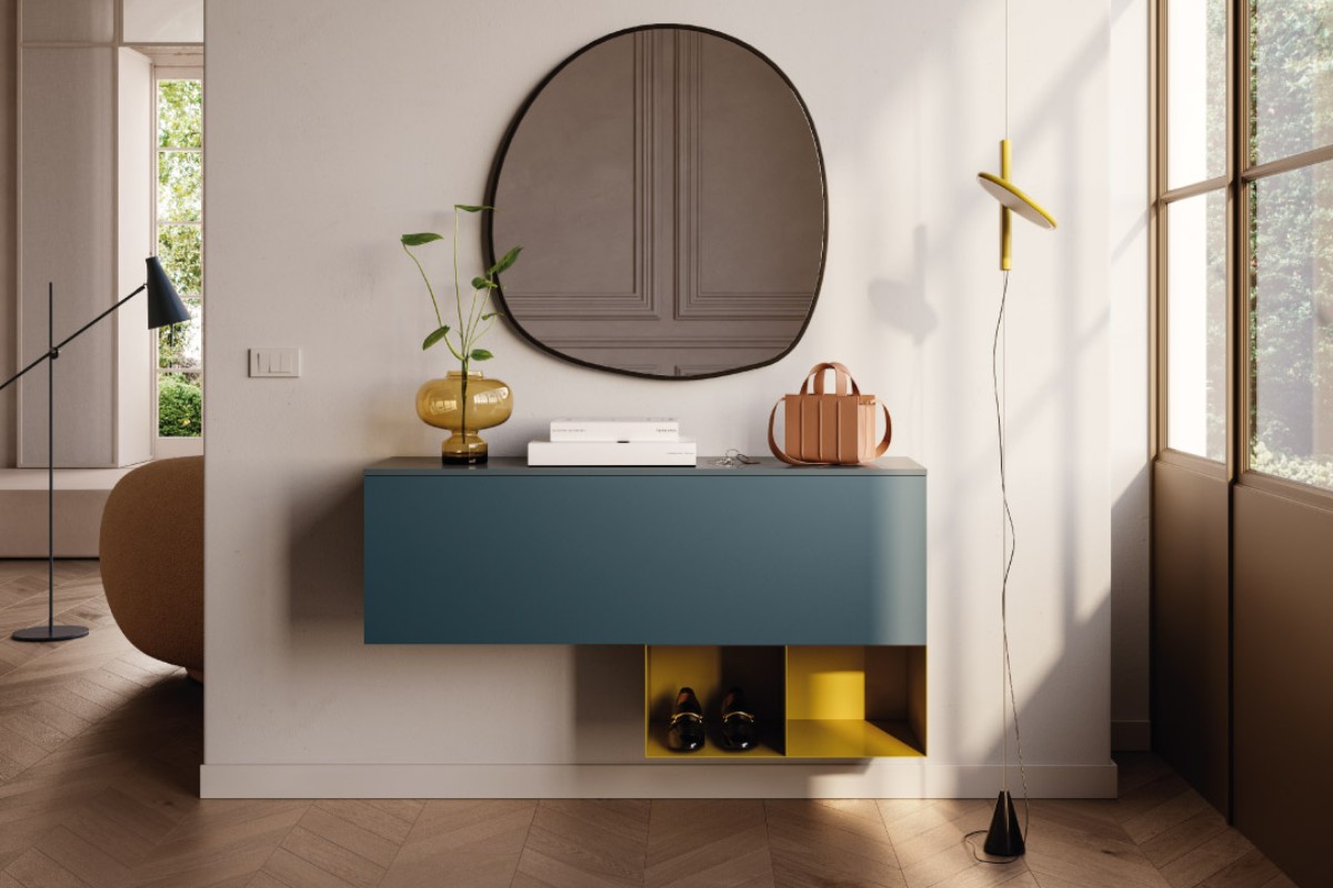
When the entrance is compact, the key word is lightness : thin surfaces, suspended furnishings, bright materials.
A minimal shelf that “floats” on the wall, a vertical mirror that lengthens the perspective, a small support surface for keys and daily routines.
And then there is the light.
A hidden LED bar that casts a soft glow along the wall, or a sculptural wall light that becomes a focal point, even when turned off. The light in an entrance is worth more than any piece of furniture.
If the entrance opens directly onto the living room, the objective is to give identity without closing .
Pass-through bookcases, filter panels or material carpets create an elegant threshold, a “visual pause” that introduces the next environment.
It is a logic that is often seen in the projects presented at Milan Design Week , where material continuity is lethal for styling.
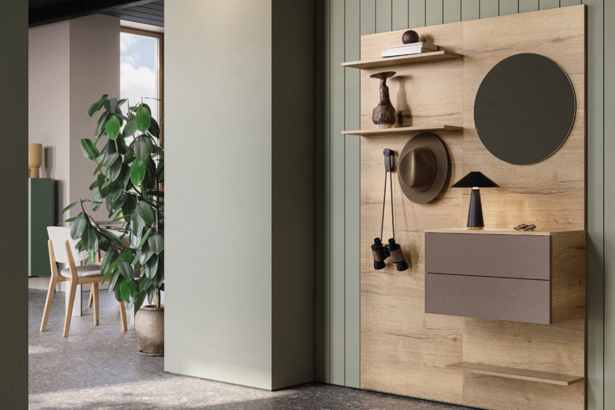
Ideas for the entrance: functional walls, scenographic niches and small architectural gestures
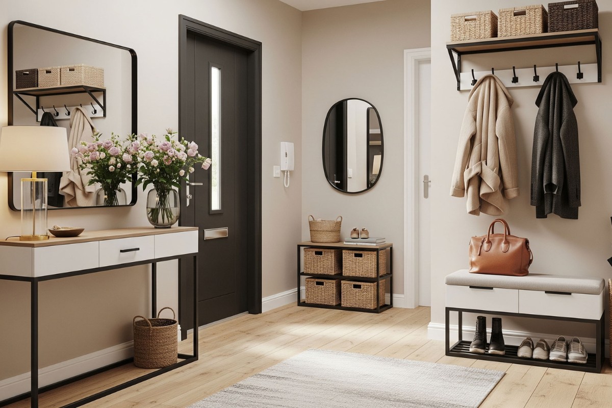
Many entrance areas develop along a single wall. Here a calibrated composition works:
a thin console , an important mirror, a containing column.
Symmetry , when possible, immediately adds a feeling of order and quality.
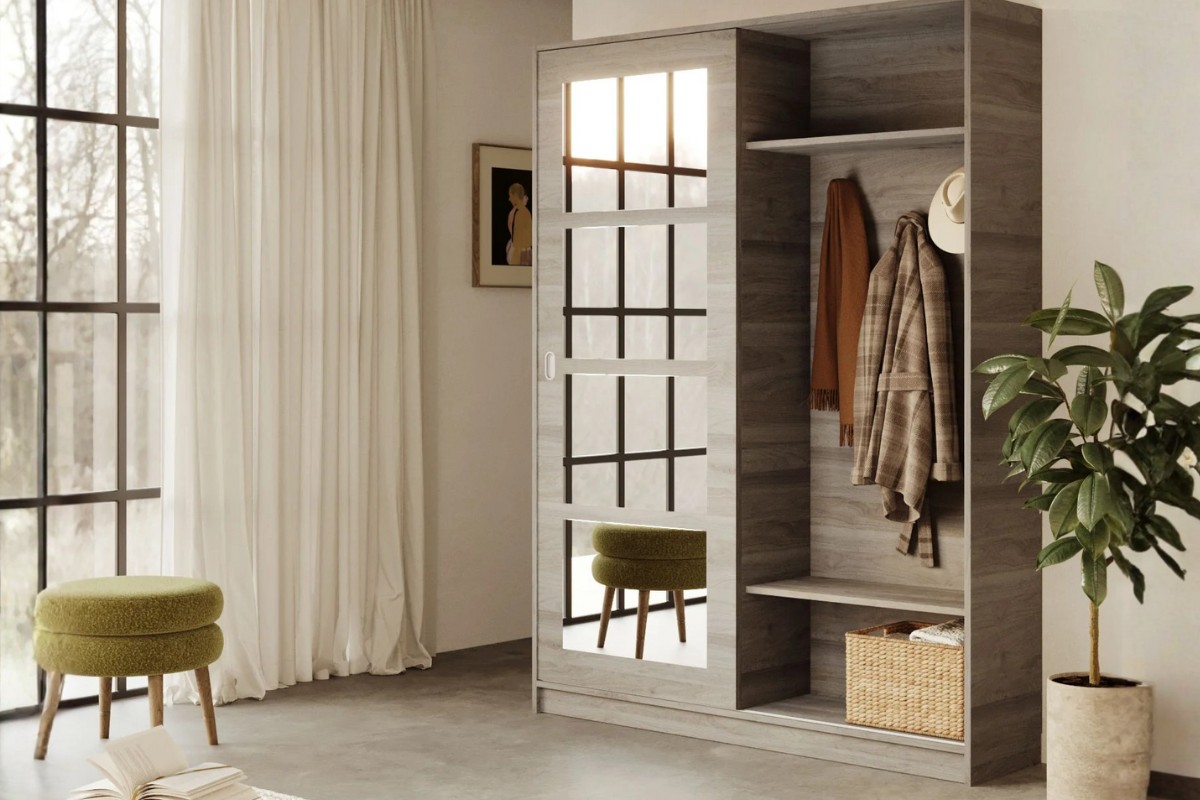
The niches , however, are a gold mine.
They can become a micro-wardrobe with flush-to-the-wall doors , completely integrated into the architecture, or an invisible compartment perfect for storing things that should not remain in sight.
An elegant, essential, clean solution in the most contemporary sense.
Even in long and narrow entrances the strategy is clear: remove, not add .
The wall is a line to be illuminated, lightened and made functional with slim and suspended furnishings .
Trend Box – What we will see in contemporary entrances
-
Material boiseries in light wood, walnut or micro-fabric concrete
-
Oversized mirrors with soft shapes and glasé edges
-
Integrated linear lighting (especially wall-mounted)
-
Irregular carpets that break the corridor axes
-
Color as an emotional filter : wise green, silk cream, mineral taupe
-
Hidden micro-wardrobes with coplanar doors
A concrete example: how to furnish a 120 × 180 cm entrance
For a really small space, here is a realistic and replicable solution:
-
On the long wall: 80100 cm suspended shelf in light wood.
-
Above: vertical mirror (from the floor or with a minimal frame).
-
Below: mini storage pouf or light stool.
-
Short wall: decorative hooks for coat and bag.
-
Light: linear LED at 3000K hidden behind a plaster frame.
-
Accessories: a tall vase or a stone tray.
Result:
tidy space, broader perception, coherent rhythm between function and style.
Design orientation table for the entrance
Each entrance has its own architectural identity: it can be an essential passage, a wall to be enhanced or a portion of the living room to be defined.
To orient yourself between different needs, and to understand which strategy to adopt, here is the map of solutions that really work .
| Type of space | What is really needed | Winning solution |
|---|---|---|
| Essential gap | Minimum support + brightness | Suspended shelf + vertical mirror |
| Entrance to living room | Define, don’t divide | Pass-through bookcase / scenographic carpet |
| Single wall | Graphic order | Central console + side column |
| Niche | Pure optimization | Flush-to-the-wall doors + equipped interior |
| Tight space | Visual continuity | Slim furnishings + linear light |
| Wide entrance | Enhancement | Boiserie + statement furnishings |
This matrix is not a rigid list, but a guide , a compass that allows you to transform every domestic threshold – even the smallest – into a coherent, functional and visually balanced space.
Materials and lights for an elegant and contemporary entrance
The contemporary style favors natural tones, material surfaces and satin metallic details .
Light wood, etched glass, champagne or matt black metal elevate the entrance without invasive interventions.
The light remains the true narrative tool: soft, warm, never aggressive.
And then the details: a photograph, an authoritative vase, a resistant plant like a zamioculcas.
It is these objects, carefully chosen and positioned, that transform the entrance into a recognizable and experienced place , not into a simple “passage point”.
The royal entrance: functional ideas when perfection is not possible
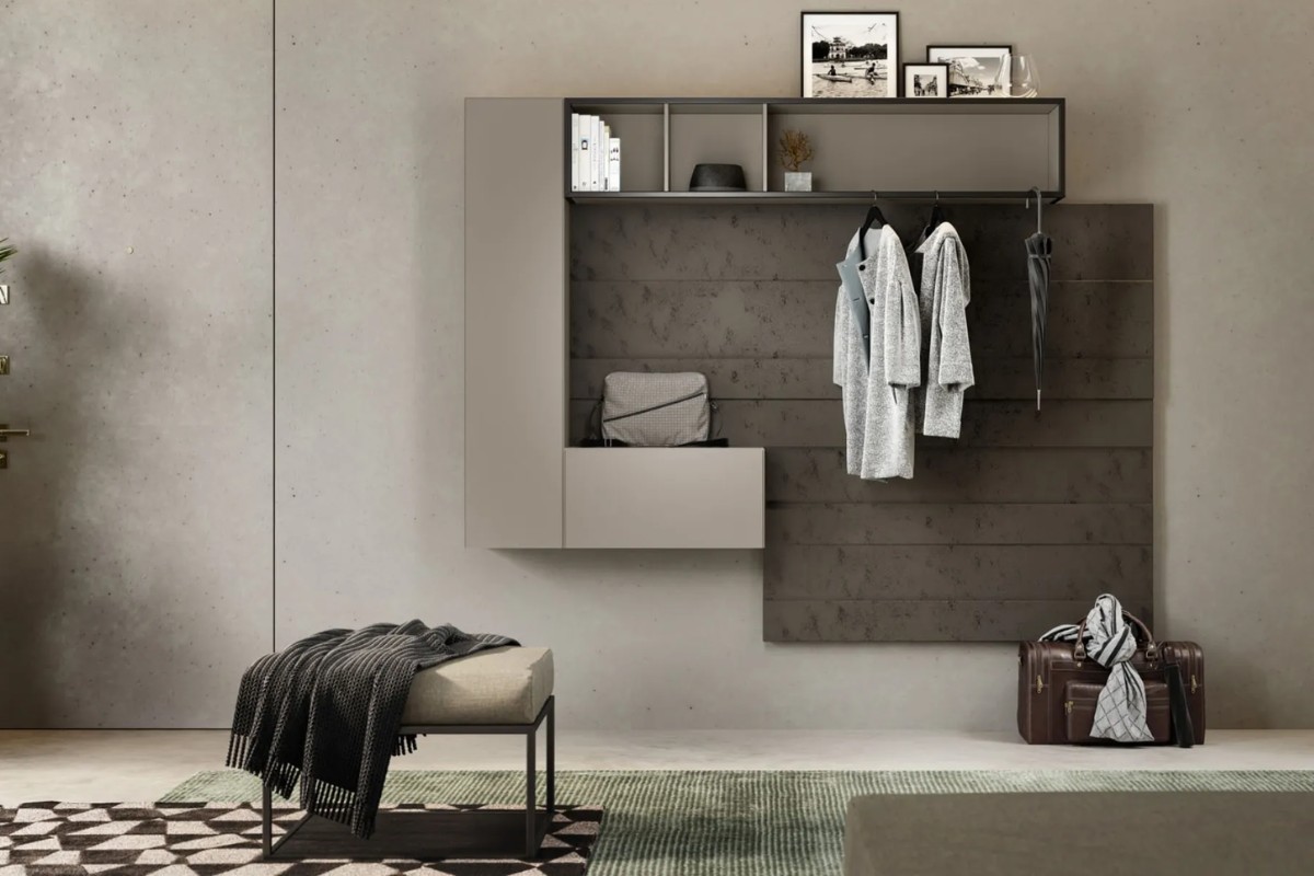
Not all entrances can afford the purity of a minimal boiserie or a thin console. In many homes the entrance is a truly operational space : there are those who place work bags, those who have children and strollers, those who use the entrance as a collection point for shoes, mail, helmets, umbrellas and technological devices.
In these cases the project does not aim at subtraction, but at intelligent functionality :
-
closed containers that hide the daily rhythm,
-
benches with internal compartment to reduce visual clutter,
-
slim columns for bags and jackets,
-
decorative hooks which become small design elements,
-
deep shelves just the right to accommodate everything you really need.
True elegance, here, is not perfection: it is being able to organize what is needed – without giving up style .
A full but well-designed entrance can be much more welcoming than an empty and impersonal one. Because it reflects those who live there, supports everyday life and still maintains aesthetic coherence.
Wellbeing and harmony: a touch of contemporary Feng Shui
Feng Shui, today reinterpreted in a contemporary key, does not require extremism: small balanced measures are enough to make the entrance more harmonious and welcoming.
No extremism, but small sensible gestures:
-
avoid accumulation
-
use light or pastel colors
-
choose a soft light
-
place a natural carpet
These are habits that improve the entry experience and make the home more welcoming, calmer, more comfortable.
How to give identity to knowledgedaughter of the house
Furnishing the entrance does not mean filling a space: it means creating a welcome .
It means designing a place that represents you and accompanies the rhythm of your daily life, with impeccable aesthetics and evident functionality.
Whether you live in a Milanese apartment, a New York loft or a penthouse in Dubai, the rule does not change: the first impression must always be light, refined and bright.