Wabi Sabi style, in contemporary interior design language, refers to pared-back spaces in which natural materials, traces of time, irregularity and unoccupied space acquire value. Yet the term comes from a Japanese cultural context far more complex than a beige palette or a minimalist home. Wabi evokes a simple, austere and understated beauty, while sabi …
Wabi Sabi style, in contemporary interior design language, refers to pared-back spaces in which natural materials, traces of time, irregularity and unoccupied space acquire value. Yet the term comes from a Japanese cultural context far more complex than a beige palette or a minimalist home. Wabi evokes a simple, austere and understated beauty, while sabi refers to the quality that can emerge through age, wear and patina. Applying these ideas to interiors therefore means focusing less on creating an “imperfect” look and more on accepting material, time and variation, choosing a limited number of elements that can be used, observed and allowed to evolve.
What Wabi Sabi really means
Speaking of Wabi Sabi as a “style” is already a Western simplification. Within Japanese aesthetics, wabi and sabi are distinct concepts that gradually became associated over time.
The Stanford Encyclopedia of Philosophy describes wabi as a form of simple and austere beauty and sabi as a quality associated with rustic patina and the passage of time. Japan House London, exploring the subject in 2026 through the relationship between craft and the Way of Tea, summarises the former through the beauty of simplicity and imperfection and the latter through the quiet dignity that emerges with time.
A fundamental part of this history developed within the culture of chanoyu, the Japanese tea ceremony. The Kyoto National Museum traces the emergence of wabicha during the Muromachi period: alongside refined objects imported from China, a form of tea practice emerged that also valued more humble, everyday utensils. In the sixteenth century, Sen no Rikyū would intensify this sensibility through austere spaces and a preference for Japanese ceramics that were often irregular or asymmetrical.
This is the most useful starting point when discussing interiors as well: not decorating with imperfection, but recognising value in things through a different way of seeing them.
Wabi Sabi is not a beige colour palette
One of the most superficial reinterpretations of Wabi Sabi style is to reduce it to sand-coloured walls, ecru sofas, matt ceramics and rough timber tables.
Those elements can certainly appear in a contemporary interior inspired by this sensibility, but they do not define it.
The tea tradition provides much more nuanced examples. The Metropolitan Museum holds black Raku bowls and ceramics characterised by irregular glazes, hand-shaped forms and surfaces marked by use. Their value does not come from belonging to a neutral colour range, but from the simplicity of the object, its material, asymmetry and the ability of time to alter its presence.
This means that a Wabi Sabi interior can include deep earth tones, browns, charcoal, blacks, muted greens, ochres and even stronger accents. The palette should not be chosen to reproduce an image found online, but should emerge from materials and the way they respond to light.
Material and patina: why time is part of the design
The concept of sabi makes the relationship with ageing particularly important.
Timber, clay, ceramics, stone, metal, plant fibres and mineral plasters do not necessarily remain unchanged throughout their lifespan. They can fade, darken, become smoother where they are most frequently touched, oxidise or develop small irregularities.
Japan House London emphasises precisely this ability of natural materials such as wood and clay to acquire different expressions through use and time. Transformation is not necessarily perceived as a loss compared with the object’s original state.
For contemporary design, the consequence is practical: a material that ages well can be more coherent than one designed to appear permanently new.
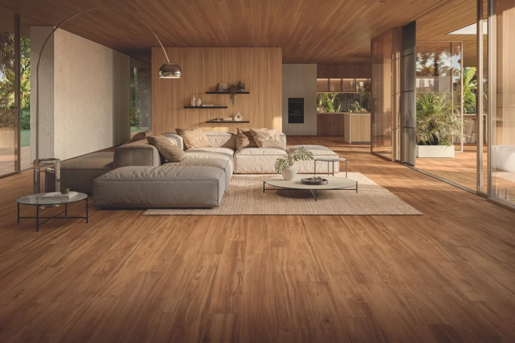
A timber floor that develops small marks, a stone worktop that acquires a patina consistent with its use, or a handmade ceramic piece with subtle variations can become more interesting over time.
This does not, however, mean glorifying decay, poor maintenance or technical defects. Damp, structural cracking, mould and deterioration do not become Wabi Sabi simply because they are imperfect.
Imperfection does not mean buying objects that look damaged
Irregularity is meaningful when it comes from the material, the production process or the genuine history of the object.
Raku ceramics associated with tea culture are emblematic. The Metropolitan Museum describes Raku as glazed earthenware shaped by hand rather than on a wheel, characterised by a deliberately understated presence. The variations are not decorative textures printed onto an industrial surface: they belong to the production process itself.
It is a useful distinction today as well.
A table showing the natural grain, knots and variation of timber is different from a laminate given an artificial “worn” effect. A handmade ceramic object can vary subtly from one piece to another without those differences being designed as simulated defects.
Wabi Sabi style becomes less convincing when imperfection is theatrical: deliberately chipped edges, artificially aged paint and surfaces manufactured to look antique as soon as they leave the factory.
Asymmetry, irregularity and compositions that avoid geometric perfection
Asymmetry recurs throughout the history of aesthetics associated with wabi. The Met explicitly connects Sen no Rikyū’s austere environments with utensils that were often imperfect or asymmetrical.
Translated into an interior, this sensibility does not require making everything crooked.
It can mean avoiding excessively symmetrical compositions: a coffee table can sit slightly off-centre from the sofa; two lamps do not necessarily need to match; a wall can hold a single artwork with generous space around it; a group of ceramics can include pieces of different forms and heights.
The aim is not to create disorder, but to reduce the need for every element to have a matching counterpart or be aligned to an absolute grid.
Empty space matters, but “ma” and Wabi Sabi are not synonyms
Visual calm is often automatically included in Western guides to Wabi Sabi. There is a plausible cultural connection, but distinct Japanese concepts should not be merged together.
The term ma (間) can be summarised as an interval, pause or space between things. Japan House Los Angeles and Japan House London treat it as an independent concept within Japanese aesthetics, connected not only to space but also to time.
It is therefore not another name for Wabi Sabi.
In interiors, however, both can suggest a useful lesson: unoccupied space can have a compositional function. A room does not have to be filled to its edges; the distance between objects makes their form, material and proportions easier to perceive.
Removing elements does not mean creating empty rooms as a principle. Visual calm comes from hierarchy, not from the total absence of objects.
Which colours work in a contemporary Wabi Sabi interior?
There is no codified Wabi Sabi colour palette.
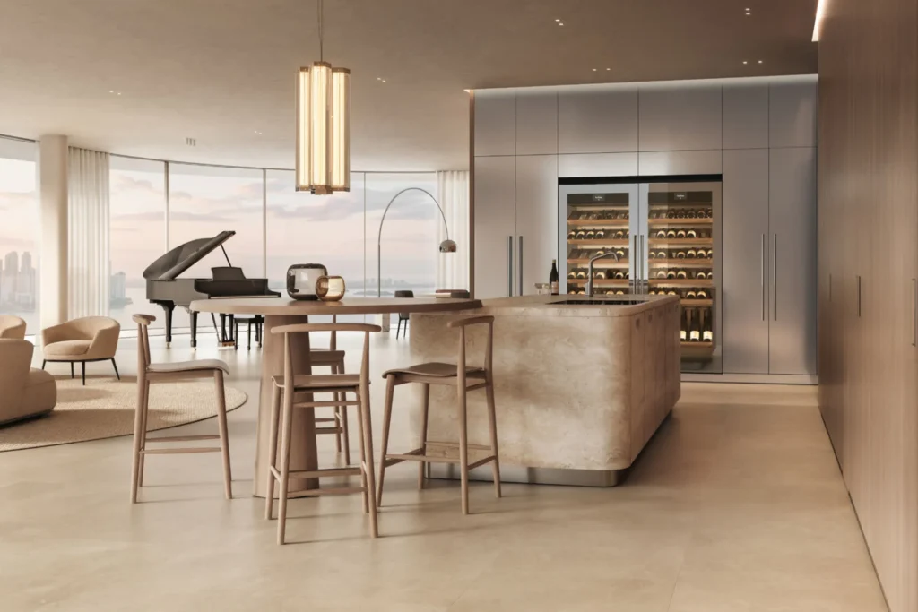
Low-saturation colours frequently appear in contemporary interiors because they pair easily with natural materials: lime white, ivory, linen, sand, clay, earth, ochre, taupe, brown, mineral grey, moss green and charcoal.
Yet an entirely beige interior can even work against the sensibility it is trying to evoke if every material is new, uniform and selected only for its colour.
A more convincing approach is to let colour emerge from the material itself: the reddish brown of terracotta, the grey of stone, the dark tone of timber, the black of a ceramic piece, the variation within a mineral plaster.
The palette then acquires subtle differences without the need to multiply decorative colours.
How to choose furniture and objects
A Wabi Sabi-inspired interior does not require Japanese furniture.
It is more useful to ask whether objects have legible materials, simple proportions and a quality capable of lasting beyond their initial appearance.
A solid timber table can reveal the structure of the material. A chair made from straw or cord can change slightly through use. A paper lamp introduces soft light without demanding attention. Handmade ceramics, blown glass, stone and metals capable of developing a patina can add variation without turning the room into a collection of “rustic pieces”.
Objects that are already owned can be particularly relevant too. An inherited cabinet, a repaired table or a ceramic piece kept for years has a history that does not need to be simulated.
What about kintsugi?
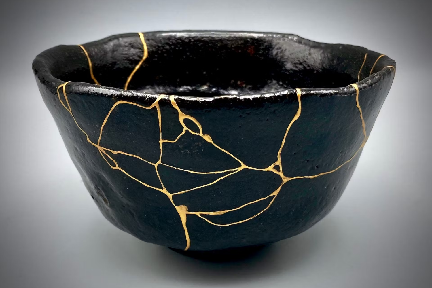
Kintsugi, the Japanese technique of repairing ceramics while making the fracture visible through lacquer, often combined with metallic powder, is frequently used as a universal symbol of Wabi Sabi.
The connection exists: Japan House London relates the practice to an appreciation of imperfection, time and transformation. But kintsugi and Wabi Sabi are not synonyms, nor does a home need to contain kintsugi-repaired ceramics in order to draw inspiration from this sensibility.
How Wabi Sabi is reinterpreted in contemporary architecture
A useful example for understanding the distance between the cultural concept and its architectural interpretation is the Wabi-Sabi Residence, completed in 2022 by Sparano + Mooney Architecture in Utah.
The studio explicitly refers to principles of imperfection, incompleteness and transience. The building uses vertical cedar boards, a relatively restrained material palette and dimensional strategies also developed to reduce waste; the design also connects the house with the mountain, vegetation and changing landscape.
It is important to read it for what it is: a contemporary American reinterpretation of the concept, not a model of traditional Japanese architecture.
The same applies to many apartments now published under the Wabi Sabi label. The Wabi Sabi Apartment by Makhno Studio in Kyiv, completed in 2019, uses clay, oak and tactile surfaces to create an intentionally simple and irregular interior. Here too, this is a contemporary international translation, useful for understanding how the term has entered the vocabulary of design but distinct from its historical origins.
Wabi Sabi, Japandi and Warm Minimalism are not the same thing
The images may appear similar, but the concepts are different.
Japandi is a modern term describing the combination of Japanese and Scandinavian design sensibilities: clean lines, functionality, natural materials and comfort. Architectural Digest explicitly defines it as a fusion of the two design cultures.
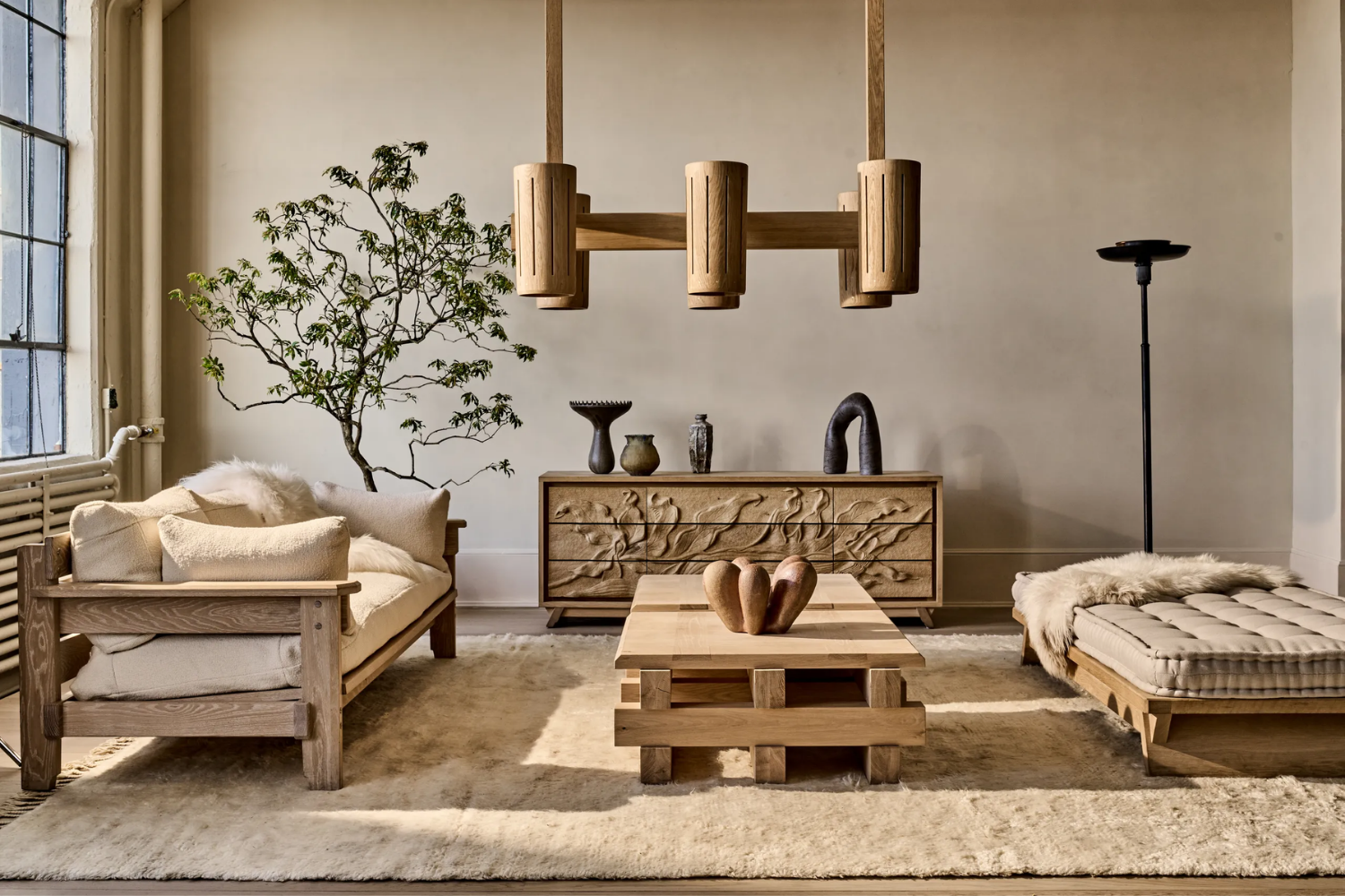
Warm Minimalism, by contrast, belongs to the contemporary vocabulary of interior design and essentially describes minimalism made more welcoming through materials, texture, light and warm tones.
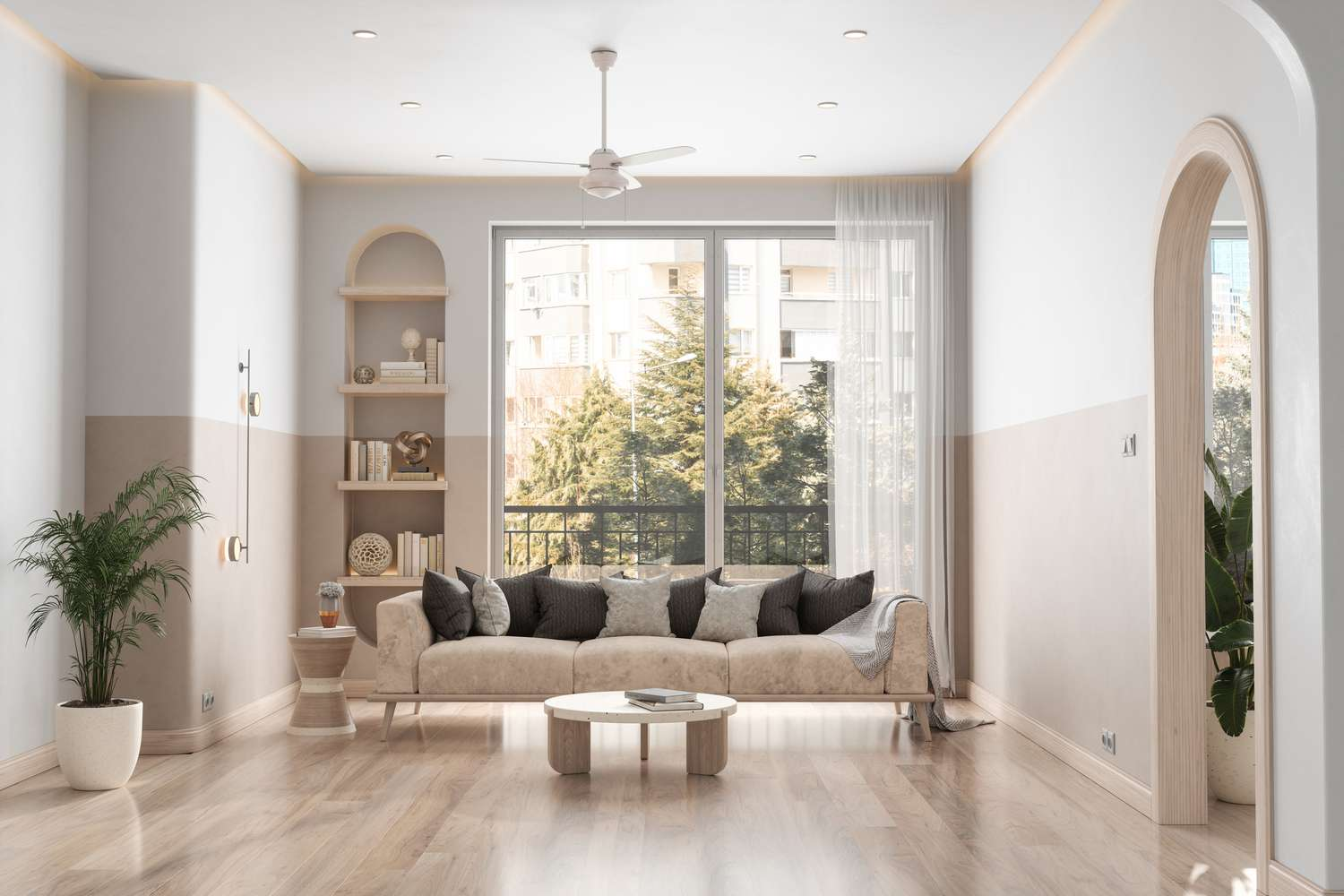
Wabi Sabi has different historical and cultural roots. Patina, impermanence and acceptance of variation over time are far more central than they are in the other two design languages.
An interior can naturally combine these influences, but using their names interchangeably makes their respective origins less clear.
Mistakes that turn Wabi Sabi into a decorative set
The first is reducing it to beige. No historical source defines Wabi Sabi through a compulsory colour palette.
The second is buying everything new as long as it looks old or handmade. Industrially simulated patina is not the same as the genuine passage of time.
The third is accumulating rough timber, linen, jute, ceramics, stone and textured plaster in the same room. Even natural materials can become a formula.
The fourth is confusing imperfection with neglect. A well-repaired object or an ageing surface does not justify technical problems or poor maintenance.
The fifth is turning Japan into a decorative catalogue of tatami, bonsai, lanterns, screens and Raku ceramics placed together without any relationship to the architecture.
The sixth is treating wabi, sabi, ma, minimalism and kintsugi as interchangeable terms. They are concepts that can intersect, but each has its own history and meaning.
Wabi Sabi style becomes more convincing in contemporary interiors precisely when the search for an immediately recognisable result is abandoned. A floor that can age, a table intended to be used for years, a mineral wall that is not perfectly uniform, a small number of objects chosen for their presence and enough space for them to be observed create a relationship with time that is far more meaningful than a predetermined palette.
The lesson that can be transferred to the contemporary home is therefore not “how to make an interior look Wabi Sabi”, but how to design a space capable of accepting use, change and imperfection without losing quality. It is a subtle distinction, but it is precisely what separates a cultural sensibility from a simple aesthetic to be replicated.