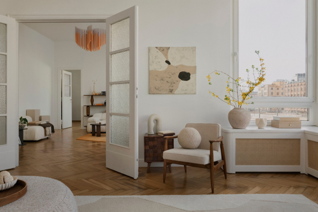
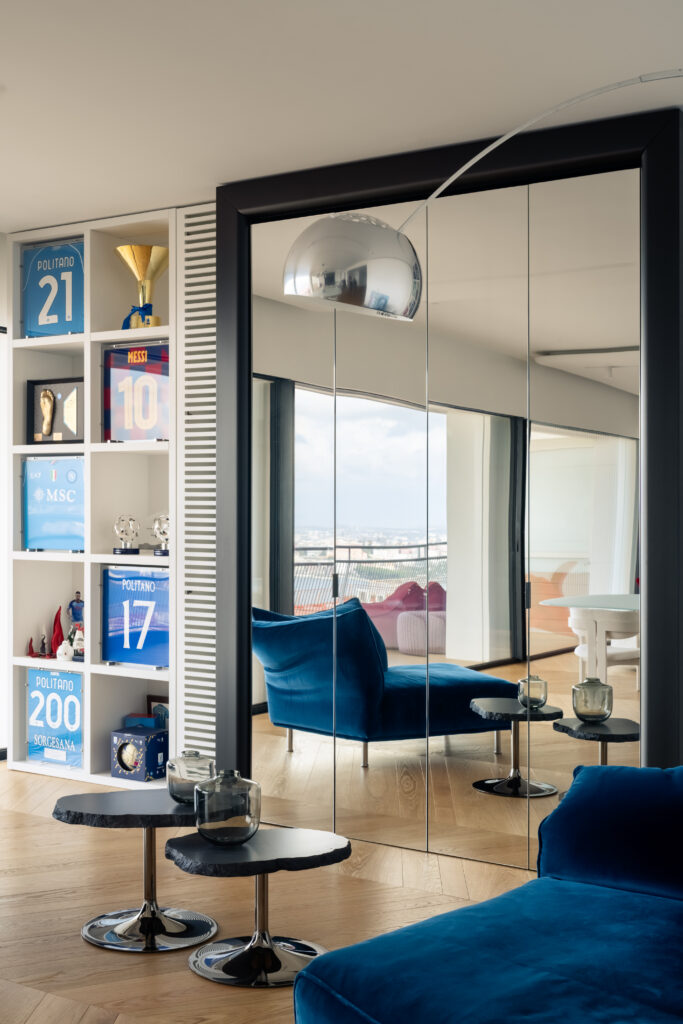
How to choose bedroom colours according to light, orientation, flooring and textiles: palettes, combinations, mistakes and what sleep research says.
Bedroom colour does not make you sleep on its own, but it shapes how the room receives light and how it feels in the evening. Colour families, combinations, common mistakes and what research actually tells us.
At the I Praticelli university residence in Pisa, six identical buildings are distinguished only by the colour of their interiors: violet, blue, green, yellow, orange and red. In a 2018 study, researchers from the universities of Bologna and Pisa surveyed 443 residents. Blue was the preferred colour and was associated with a calm mood.
This is a useful starting point for discussing bedroom colours, because it reveals both what we know and what we do not. We know that colour changes the perception of a room and the way people feel inside it; we do not have solid evidence that wall colour alone improves sleep. That study, for example, did not measure sleep at all.
Bedroom colour should therefore be chosen as lighting is chosen: in relation to orientation, room size, materials and the hours when the space is actually used, mainly evening and early morning. In the projects we feature, the most successful bedrooms almost always use concise palettes of no more than two or three colours and favour matt surfaces.
How should you choose a bedroom wall colour?
Choose a bedroom wall colour by starting with four factors: natural light, orientation, room size and the fact that the space is mainly used under low artificial light. Personal taste comes afterwards and, once these constraints are clear, can be expressed more freely.
Light and orientation
At Italian latitudes, a north-facing bedroom receives indirect, even and generally cool light. Cool, heavily greyed colours tend to look dull, while shades with yellow or pink undertones remain lively. South-facing rooms receive warm, intense light for many hours; it can push warm shades towards yellow, while grey greens, pale blues and deeper blues usually respond well. In east-facing rooms, gentle colours complement the morning sun. West-facing light warms the space at sunset, just when the bedroom is used in the evening, so an already warm colour can become noticeably orange.
Size and proportions
Light colours reflect more light and visually enlarge a small room, but they are not the only option. Applying a mid-tone or dark colour to every surface can make corners recede and turn a narrow bedroom into a cocoon-like space. In a long, narrow room, a darker end wall appears closer and helps correct the proportions.
A room for rest
Bedrooms are used relatively little in daylight, so samples should be assessed mainly in the evening with the bedside lamps switched on. This is when you discover whether a green becomes grey, a pink turns salmon or a white looks dingy. Highly saturated colours that energise a living room generally work better here in small doses, on a textile or object rather than across entire walls.
Colour and sleep: what the research actually says
There is currently no solid scientific evidence that one particular wall colour improves sleep. Research has, however, clearly demonstrated the effect of evening light on melatonin, the hormone that signals the approach of night to the body.
The Pisa study, published in Frontiers in Psychology by Marco Costa and colleagues, measured preferences, mood and perceptions of studying among students who had lived in the residence for a little over a year on average. In their rooms, the building colour occupies one wall, while the others and the ceiling are white. Blue was chosen by 34.7% of students and green by 23.1%. A preference for blue was linked to a calm mood, and blue was considered more favourable for studying than warm colours such as orange and red. One detail is especially useful for designers: for every colour, students would have preferred a lighter version than the one used. None of these measures, however, concerned sleep quality. Online rankings of the best colours for sleep generally come from commercial surveys, not sleep measurements, so we do not reproduce them.
The evidence on light is much stronger. In a 2011 study published in the Journal of Clinical Endocrinology and Metabolism, Joshua Gooley and colleagues compared 116 volunteers aged 18 to 30 who, in the hours before sleep, were exposed either to normal room light below 200 lux or to dim light below 3 lux. Under room light, the evening onset of melatonin was suppressed and delayed in 99% of participants, while the duration of secretion shortened by about 90 minutes. A Harvard experiment also found that, at the same intensity, blue light suppresses melatonin for about twice as long as green light and shifts the circadian rhythm by three hours rather than 1.5.
Wall colour plays an indirect role as a reflective surface: a white wall returns much of a lamp’s light, a dark wall absorbs more of it, and a warm wall gives it a warmer cast. This is a physical consequence that matters to design, not a demonstrated effect on sleep. The most effective measure remains low, warm evening lighting.
Restful bedroom colours: the main families
The colours best suited to bedrooms are generally low in saturation: warm neutrals, grey greens, dusty blues, earth tones, muted pinks and, for those who enjoy enclosed spaces, deep shades. Here, restful simply means visually quiet, not endowed with special powers.
The HEX codes in brackets are indicative and useful only as an on-screen reference. Every paint manufacturer uses its own shades, and the same formula changes with finish and light. Our home colour dictionary explains the individual names in more detail.
Warm neutrals: ivory, sand and taupe
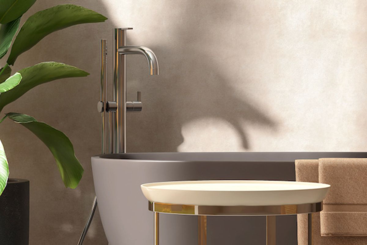
These are the safest base because they allow materials and textiles to take the lead. Ivory (approximately #F3EDE0) and sand (#D8C8AA) warm north-facing rooms without weighing them down. Taupe, a grey with brown and pink undertones (#B0A195), has a depth that white lacks and works with both light and dark woods. We explore it in our guide to decorating with taupe.
Greens: sage, eucalyptus and olive
Grey greens bring a sense of nature into the bedroom without the force of a pure green. Classic sage (#9CAF88) is the most versatile; eucalyptus (#8BA39B) is cooler and well suited to very bright rooms; olive (#858B62) warms north-facing bedrooms. Our article on sage green covers shades and combinations.
Blues: powder blue, muted mid-blue and midnight blue
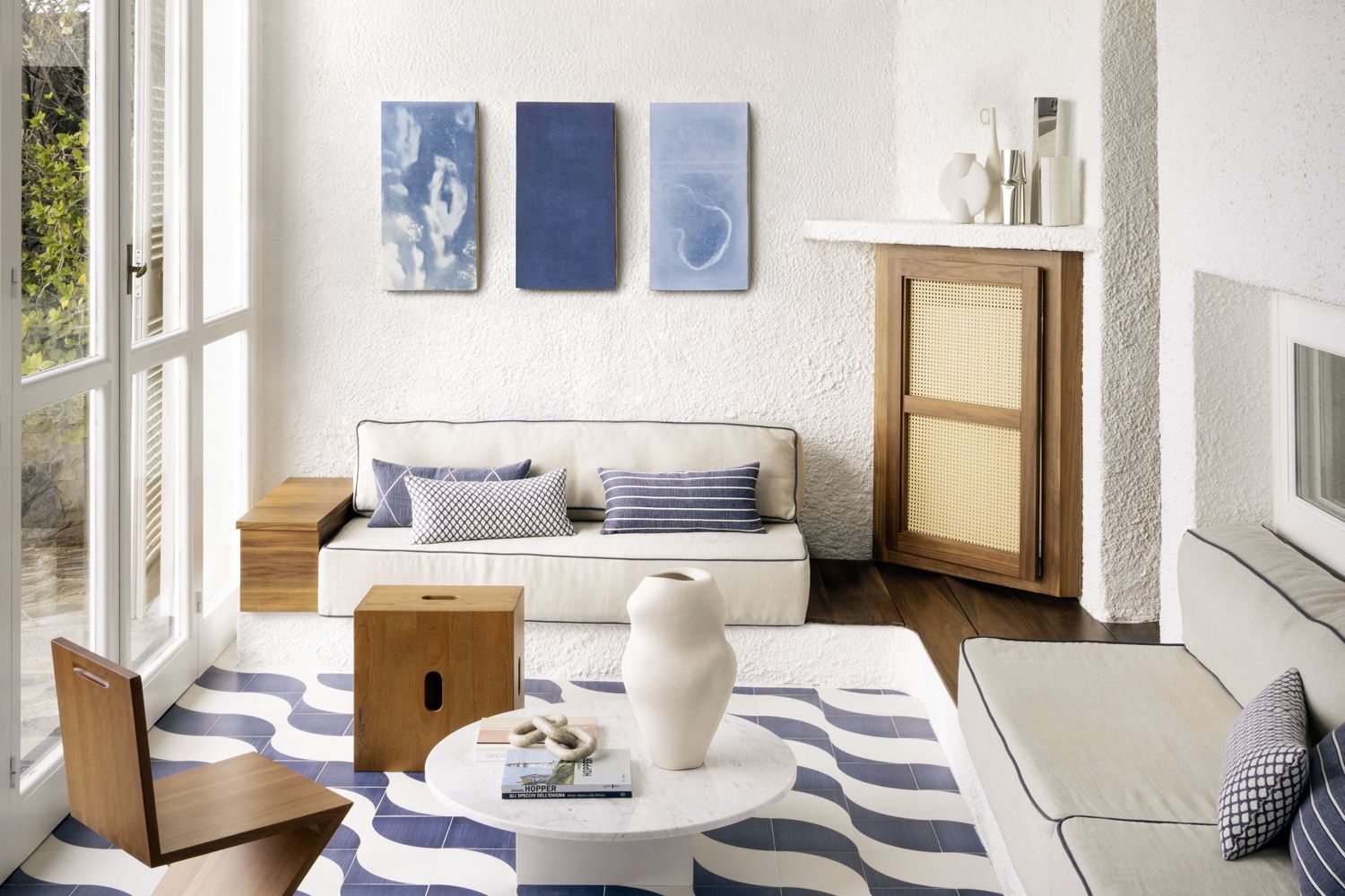
Powder blue (#A9BCC8) suits small, bright bedrooms. The muted mid-blue known in Italy as carta da zucchero (#4F6F8F) works especially well behind the bed, while midnight blue (#1F2A44) creates an enveloping evening room. In north-facing spaces, choose blues with green or warm-grey undertones so they do not turn cold and bruised. See our guide to blue in interiors for more variations.
Earth tones: clay, pale terracotta and muted ochre
Earth tones belong naturally to Mediterranean bedrooms and craft-led interiors. A pinkish clay (#C9A48C) or very pale terracotta warms north- and east-facing rooms and pairs with raw linen and wood. Muted ochres need restraint because warm artificial light can make them appear more yellow.
Dusty pink and blush
Desaturated pink, far removed from any childish association, is one of the most effective colours for an adult bedroom. Blush (#EFD9D3) behaves almost like a neutral, while antique pink (#C9A09A) is stronger and more wistful. Both pair well with sage green, taupe and walnut; our article on antique pink collects further combinations.
Modern bedroom colours: enveloping dark tones
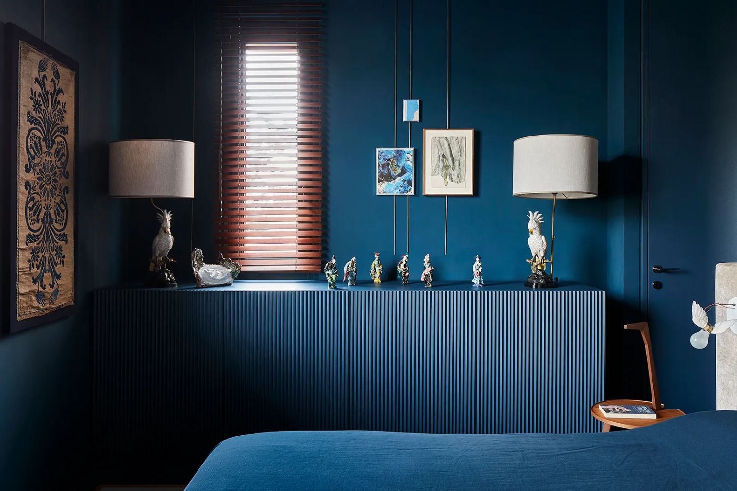
Midnight blue, forest green (#2F4A3A), burgundy (#6D1F2B) and chocolate (#4A3328) are contemporary choices for rooms mainly used in the evening. They absorb light, soften the room’s edges and set off the bed and pale textiles. They do, however, require good daylight, matt finishes and well-distributed evening lighting; otherwise the room can feel gloomy.
| Colour | Effect | Best suited to |
|---|---|---|
| Ivory, warm white | Bright and neutral; lets materials lead | Small or north-facing bedrooms and low ceilings |
| Taupe, sand | Soft, warm and nearly neutral | Large double bedrooms with light or dark wood |
| Sage green, eucalyptus | Quiet, natural and fresh | South- or east-facing bedrooms; organic or Mediterranean interiors |
| Powder blue, muted mid-blue | Calm, airy and fresh | Bright bedrooms and the headboard wall |
| Blush, antique pink | Warm, intimate and delicate | North-facing bedrooms and rooms with dark wood |
| Clay, pale terracotta | Warm, tactile and welcoming | North- and east-facing rooms; country or coastal homes |
| Midnight blue, forest green | Enveloping, intimate and suited to evening | Bedrooms with good daylight, including small rooms |
| Burgundy, chocolate | Intense, warm and theatrical | Large bedrooms, headboard walls or colour drenching |
The headboard wall: one wall or all of them?
The wall behind the headboard delivers the greatest effect with the least risk because it acts as a backdrop to the bed and defines the room on entry. One detail is often forgotten, however: you cannot see that wall while lying down. What you see are the opposite wall and the ceiling.
This leads to two strategies. For a dramatic entrance, concentrate colour behind the bed and leave the other walls neutral, as in the rooms at the Pisa residence. For visual calm, apply one gentle shade throughout the room so it feels coherent both on entry and from the bed. Between these approaches is a half-height band, painted to roughly 110-130 cm, which visually lowers the room and creates a more intimate setting around the bed. Another option is a painted headboard, using a rectangle or arch of colour to outline the bed on the wall.
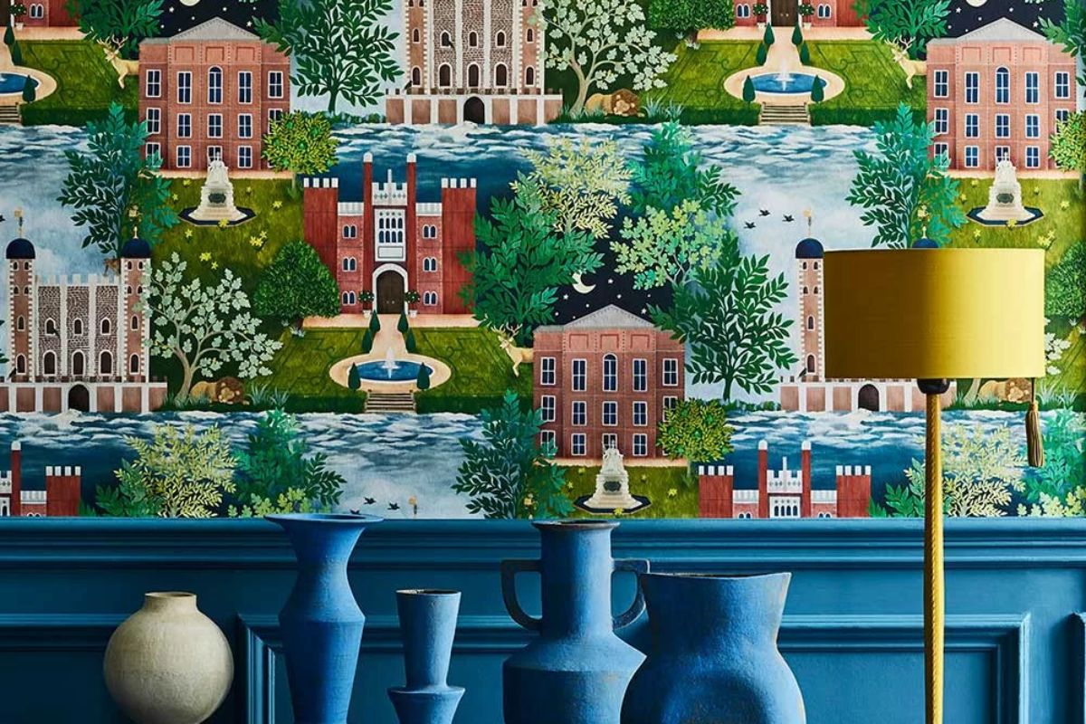
The headboard wall is also a natural place for wallpaper, especially large-scale patterns in muted colours that read from a distance as a single tone. See our article on bedroom wallpaper.
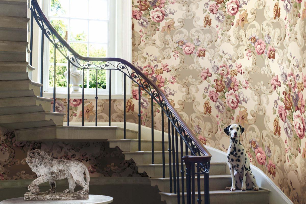
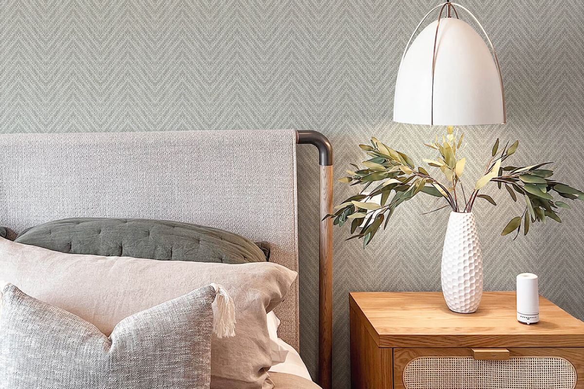
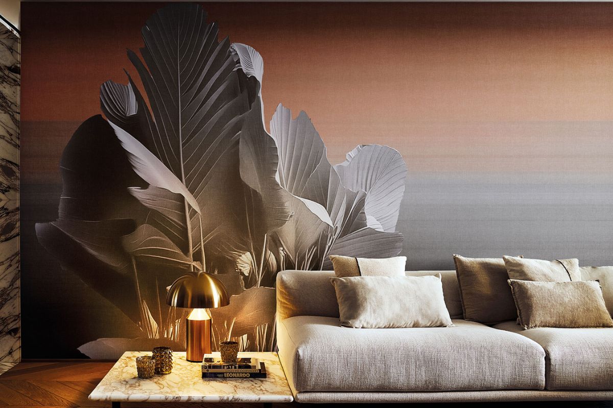
Three colour interpretations for the wall behind the bed. Images courtesy Mulberry Home, A Street Prints and LondonArt.
The ceiling and colour drenching in the bedroom
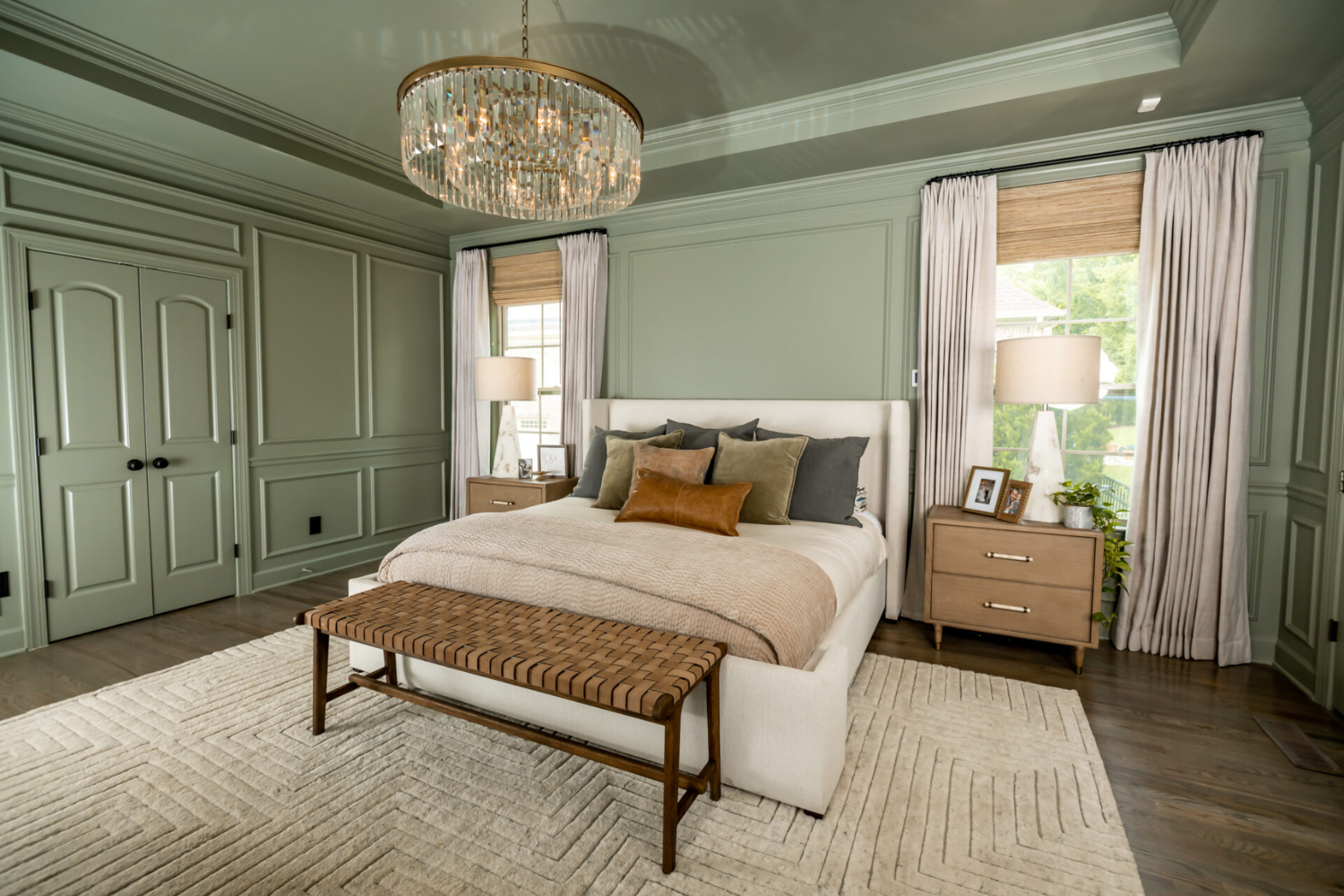
The ceiling is the surface you see most while lying in bed, so it deserves more attention here than elsewhere. A brilliant white ceiling above coloured walls creates a sharp break that can dominate the field of vision.
There are three main solutions. A warm white, subtly broken with the wall colour, is the most discreet. Continuing the wall colour onto the ceiling, either lighter or slightly darker, creates continuity and can make the room feel taller or more enclosed. The third is colour drenching: applying the same shade to walls, ceiling, skirting boards, doors and, where present, radiators. It works particularly well in bedrooms with mid-tone and dark colours because it dissolves the corners and turns the room into one soft volume. Use a matt finish on the walls and a slightly satin, washable finish on doors and skirting.
Bedroom colour combinations: wood and textiles
Bedroom colour combinations work when their temperatures are coherent: warm colours with warm woods, cooler colours with light or dark woods that do not have orange undertones. The floor is the room’s first colour and should be considered before the walls.
Natural oak, with its honey-yellow cast, works with almost everything and warms greens and blues. Brown, richly grained walnut is an ideal companion to antique pink, taupe and forest green; dark-stained ash brings graphic definition to light neutrals. Very orange parquet makes pinks and earth tones difficult, while dusty blue can provide a useful counterpoint.
Among textiles, washed linen, wool and matt cotton absorb light and deepen colour; velvet intensifies dark tones through its sheen. Bed linen, the largest coloured surface after the walls, should be treated as the palette’s second main colour. Our guide to furnishing a home explains how to build a palette from the floor, light and existing furniture.
Mistakes to avoid with bedroom colours
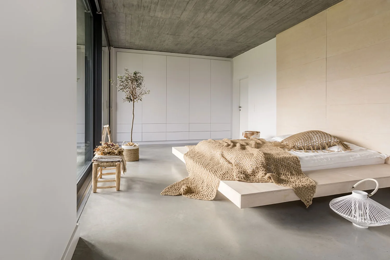
The most common mistake is choosing from a small swatch under shop lighting without testing the colour in the room and in the evening. Paint a sample at least the size of an A3 sheet and observe it on different walls in the morning, at sunset and with the lamps switched on; this prevents most disappointments.
The second mistake is unsuitable artificial light. Cool bulbs above 4000 K make greens and blues look harsh and drain pinks; in a bedroom, a temperature between 2700 and 3000 K with good colour rendering shows the selected shades more faithfully. The third is using highly saturated colours on every wall: they may appeal by day but feel tiring in the evening. Other common errors include glossy finishes on large surfaces, which reflect lamps and reveal every flaw in the plaster; brilliant cool whites beside warm wood; and palettes of four or five colours in a 12-14 square metre room. Restraint matters more in the bedroom than anywhere else.
Frequently asked questions about bedroom colours
What is the best colour for sleeping well?
No wall colour has been proven by solid scientific evidence to improve sleep. Research in a Pisa student residence associates blue with a calm mood, but it did not measure sleep. Light is what truly matters: keep it low and warm in the hours before bed. Low-saturation colours and matt surfaces help create the right atmosphere.
What colour should you use in a small bedroom?
There are two approaches. A light, warm colour such as ivory or sand reflects more light and expands the space. A mid-tone or dark shade extended across the walls and ceiling through colour drenching makes the corners recede and the room feel enclosed. The second approach needs good daylight and matt finishes.
Is it better to colour only the wall behind the bed?
It is the simplest and most reversible solution, and gives the room character as soon as you enter. From the bed, however, that wall is out of view; you see the ceiling and opposite wall. For greater visual calm, choose a gentle colour on every wall or paint a half-height band around the bed.
What colour should the bedroom ceiling be?
The ceiling is the surface you see most while lying in bed. Warm white is the most discreet choice; extending the wall colour onto the ceiling, either lighter or darker, creates continuity. Avoid brilliant white above coloured walls, as the sharp contrast dominates the view. With dark tones, colour drenching creates the most enveloping effect.
Which colours work with dark wooden bedroom furniture?
Walnut, wenge and dark oak work with colours that share their warmth: antique pink, taupe, sand, warm sage green and, for a stronger effect, forest green or burgundy. Cool greys can exaggerate the contrast and make the wood feel heavy. Pale linen textiles lighten the composition.