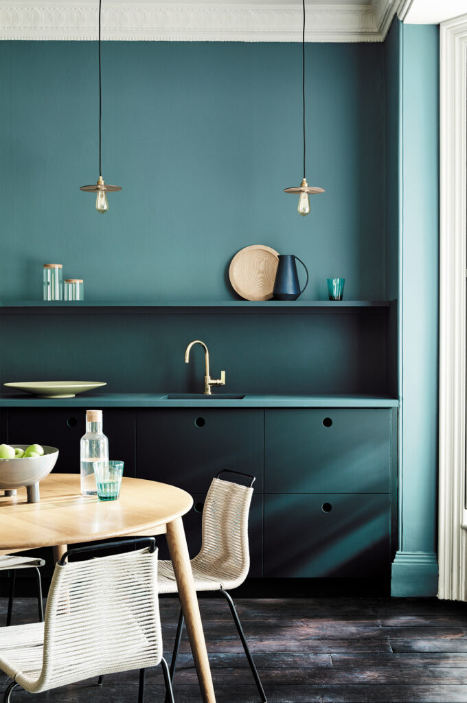
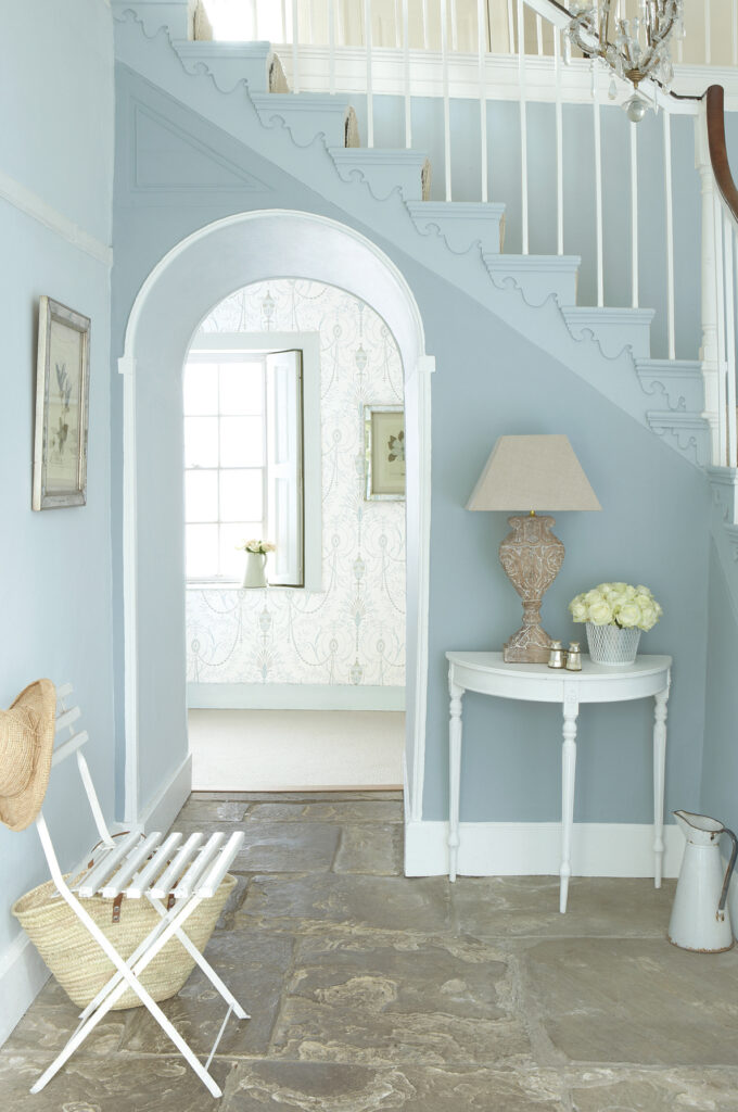
Sage green explained through shades, materials and complete room-by-room ideas. Compare real samples, build balanced combinations and avoid rigid rules about lighting.
A green softened by grey: what sage green really means, how to combine it with colour and materials, and how to bring it into a room without losing its quiet character.
Rub a sage leaf between your fingers and the origin of the colour becomes easy to understand. The Italian Treccani dictionary describes the leaves of Salvia officinalis as grey and covered in fine hairs. That soft surface veils the green, giving it the dusty appearance that inspires sage green interiors. The colour reference comes from a plant, but in paint and fabric it describes a family of shades rather than one fixed formula.
It has moved from the herb garden into living rooms, kitchen cabinetry and bedroom textiles. On 13 October 2021, Benjamin Moore announced October Mist 1495 as its Colour of the Year for 2022, describing a gently shaded sage. That is one documented commercial interpretation, not a universal specification for every sage-green product.
The appeal has a practical complication. A subtle green can look very different beside flooring, upholstery and neighbouring whites. The aim is not to make every surface match, but to choose the right shade for the particular light, balance its surrounding materials and test it beneath the lamps that will actually be used. These decisions matter more than the label on a colour card.
What colour is sage green?
Sage green usually means a muted grey-green, often in the light-to-medium range. Its restrained chromatic character separates it from a vivid grass green. Some versions lean towards yellow, others towards blue. It is therefore not invariably a midpoint between mint and olive, nor inherently neutral in temperature: the particular paint or textile has its own undertone.
A grass green and a sage green can share a broadly similar hue while differing considerably in saturation. The quieter version may behave almost like a neutral background. Beside white its green component can become more noticeable; near grey, terracotta or other greens, a different aspect may emerge. These are relationships to assess through samples, not predictable colour changes that happen in every room.
An older colour relationship
The language of interiors is contemporary, but muted grey-greens have a much longer visual history. Green earth, a mineral pigment, was used in medieval painting beneath pink flesh tones. The National Gallery documents green-earth underpainting in Duccio’s Maestà predella panels, including a worn face where the layer is now visible. This is a historical affinity, not a claim that a modern sage paint shares the same composition: Italian painters knew the value of a quiet green underneath warmer colours long before it became a wall-colour trend.
Shades of sage green: from pale to olive
Sage is a family distinguished by lightness and undertone. Looking at several versions together is more useful than searching for the one supposedly correct sage. A paler colour, a greyer one and an olive-leaning version can give the same room noticeably different characters.
The HEX and RGB values below are illustrative digital references, useful for comparing ideas on a screen. They are not commercial paint codes, colour matches or instructions for mixing pigments. Finish, substrate, lighting and display settings all affect appearance. Make the final choice with the actual product sample.
Pale sage, illustrated by #CDD5C0, RGB 205, 213, 192, approaches an off-white with a green cast. It can give large surfaces a gentle colour signal, including in compact rooms, although a darker shade is not automatically unsuitable for a small space. Classic sage, #9CAF88, RGB 156, 175, 136, illustrates a medium shade with a slightly yellow direction. Dusty sage, #B5B9A5, RGB 181, 185, 165, moves further towards grey and can provide a less conspicuous background.
On the bluer side, eucalyptus green, #8BA39B, RGB 139, 163, 155, suggests a cooler, more mineral direction that can relate to deeper blue-greens. Our guide to decorating with petrol green explores that deeper family. Towards yellow, olive sage, #858B62, RGB 133, 139, 98, gives a warmer, earthier interpretation. It is one option to test where a palette needs warmth, not an automatic answer for every north-facing room.
Why sage green appeals in interiors
Sage can suggest vegetation without the visual force of a highly saturated green. Its understated appearance works well with the preference for quieter palettes and visible material texture. That is an aesthetic quality rather than a promise that a paint colour will improve sleep or health.
One related influence is biophilic design. Edward O. Wilson’s book Biophilia, published by Harvard University Press in 1984, explored the idea of a human affinity with other living things. In architecture, nature-related design can involve daylight, plants, materials and spatial relationships. A foliage-inspired colour is one small element of that approach; painting a room green does not, by itself, make it a biophilic project.
Another influence is the preference for warm neutrals and discreet colour often discussed as quiet luxury: quality materials, limited visual noise and a palette that does not compete with every object. A third is organic modern style, combining clean-lined forms with natural materials. Sage can support both approaches when the material and shade are chosen deliberately. Related grey-greens also appear in our discussion of wall-colour trends for 2026 and in seasonal colour combinations.
Sage green colour combinations
Warm neutrals offer a useful starting point, with a few stronger colours added intentionally. Matching the temperature of the palette can help, but contrast can also be successful. Cool grey and bright white are not forbidden partners: what matters is how their undertones and relative areas interact with the chosen green.
Warm white and ivory can give sage a light, softened setting; the ivory colour guide examines that family in more detail. With taupe, sage can form a restrained, tonal composition because both colours may contain a substantial muted component. It is not strictly a monochromatic scheme, since green and grey-brown are different colour families. Our guide to taupe and dove-grey interiors develops the relationship with furniture and textiles.
Terracotta introduces an earthy warm counterpoint rather than a universally exact complementary hue. Muted antique pink creates a softer dialogue, particularly in a bedroom, and connects with the broader family of pastel colours. Midnight blue and black can add depth as controlled accents. Decide which surface leads and which supports before collecting several attractive shades.
Sage green and grey
This combination benefits from close comparison. A blue-leaning grey can make some sages seem less warm; a beige-leaning grey or a small anthracite detail may create a clearer relationship. Neither effect is universal. If grey flooring is already fixed, test several sages directly beside it, including both warmer and cooler versions. Choose the contrast that suits the whole room rather than assuming that adding yellow will always solve the problem.
| Combination | Possible character | Where to explore it |
|---|---|---|
| Sage and warm white or ivory | Light and softened | Living rooms, kitchens, compact spaces |
| Sage and taupe | Restrained, tonal, nearly neutral | Bedrooms and larger living areas |
| Sage and terracotta | Warm, earthy, Mediterranean | Kitchens, dining rooms, entrances |
| Sage and antique pink | Gentle and softly contrasting | Bedrooms and bathrooms |
| Sage and midnight blue | Deep and more defined | Studies, living rooms, upholstery |
| Sage and black | Graphic and contemporary | Kitchens, bathrooms, metal details |
| Sage and warm grey | Quiet and tonal | Living areas with grey flooring |
| Sage and gold-toned metal or brass | A warm reflective accent | Taps, handles and lighting |
Materials to combine with sage green
Timber, stone and fibres can emphasise the colour’s botanical reference through a contrast of textures. They are useful choices, not compulsory ones. Glazed ceramic, glass and other glossy surfaces can also belong in a sage scheme, provided their reflections and practical requirements are considered.
Natural or lightly oiled oak can introduce golden warmth, although the exact timber tone matters. Walnut gives a darker contrast. Among stones, travertine offers cream and beige variations; inspect the particular slab and cut rather than assuming every piece has the same pattern. White marble with grey veins can bring a different, cooler relationship into the composition.
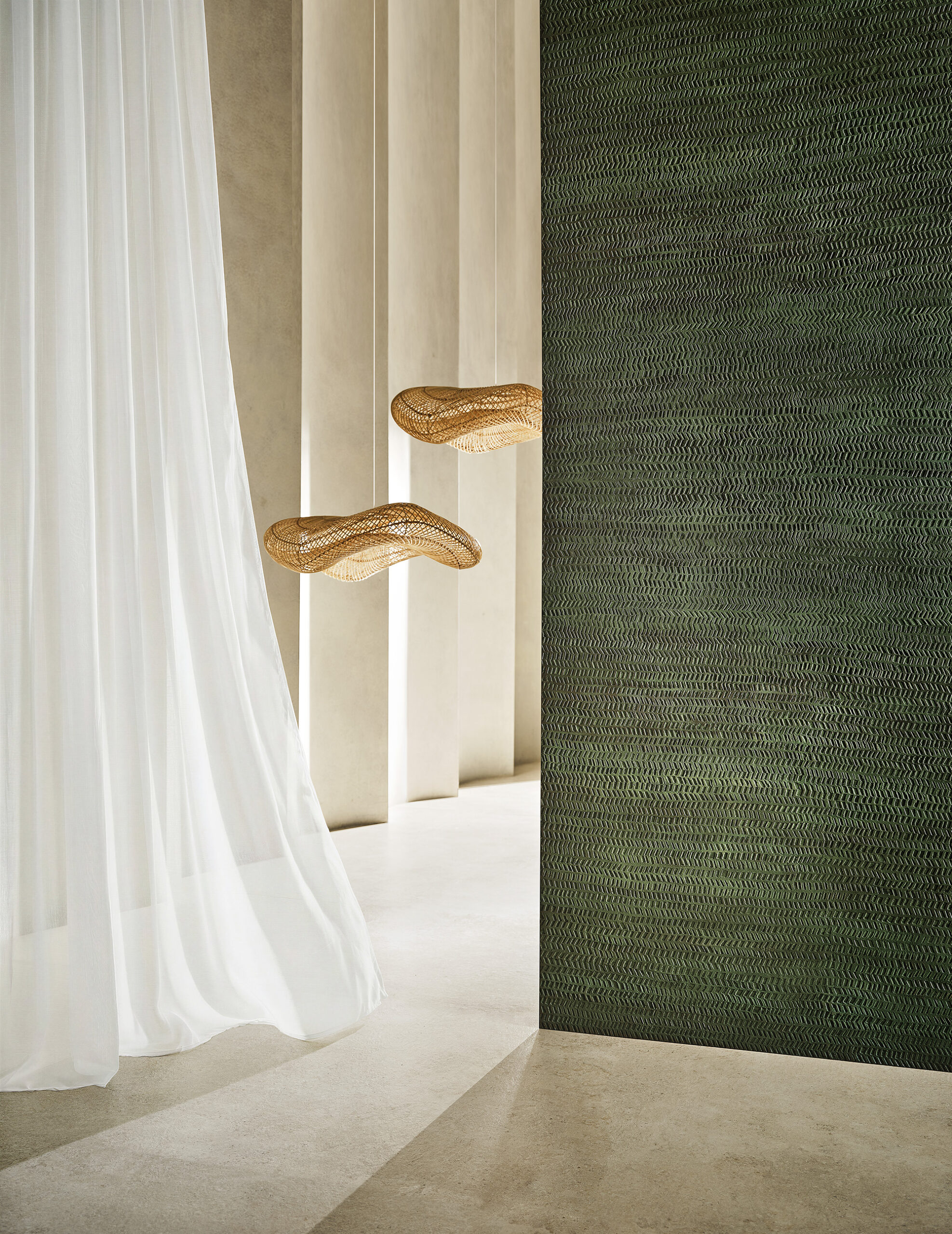
Washed linen, in a natural shade or a deliberately chosen dye, offers an understated textile partner. Cream bouclé fabric introduces a pronounced surface texture. Brushed brass can add warmth in handles, taps or lamps without occupying much visual space. Sample these materials together: a colour scheme is built from their relationship, not from a list of materials that supposedly always work.
Sage green walls: ideas room by room
The colour can play a different role in each part of the home: background in a living room, cabinetry colour in a kitchen, or a selected wall in a bedroom. Adjust the shade and proportion to the room’s light and use rather than expecting one formula to work everywhere.
Living room
Pale or dusty sage across the walls, paired with a tested warm white ceiling, can form a quiet setting for linen upholstery, pale timber and a wool rug. A more distinct classic sage behind the sofa or shelving gives one area greater emphasis. Check the view from adjoining rooms so that a feature wall does not become an unrelated colour panel.
Sage green kitchen
Matt-lacquered or painted timber doors with a pale stone or timber worktop and brass handles can suggest a crafted interior without making it rustic. In a compact kitchen, using sage on base units while keeping tall units lighter is one possible hierarchy. It is not a size rule: a continuous darker scheme can also work when light, proportions and the adjoining living area support it. Choose a finish suitable for the surface and expected cleaning.
Sage green bedroom
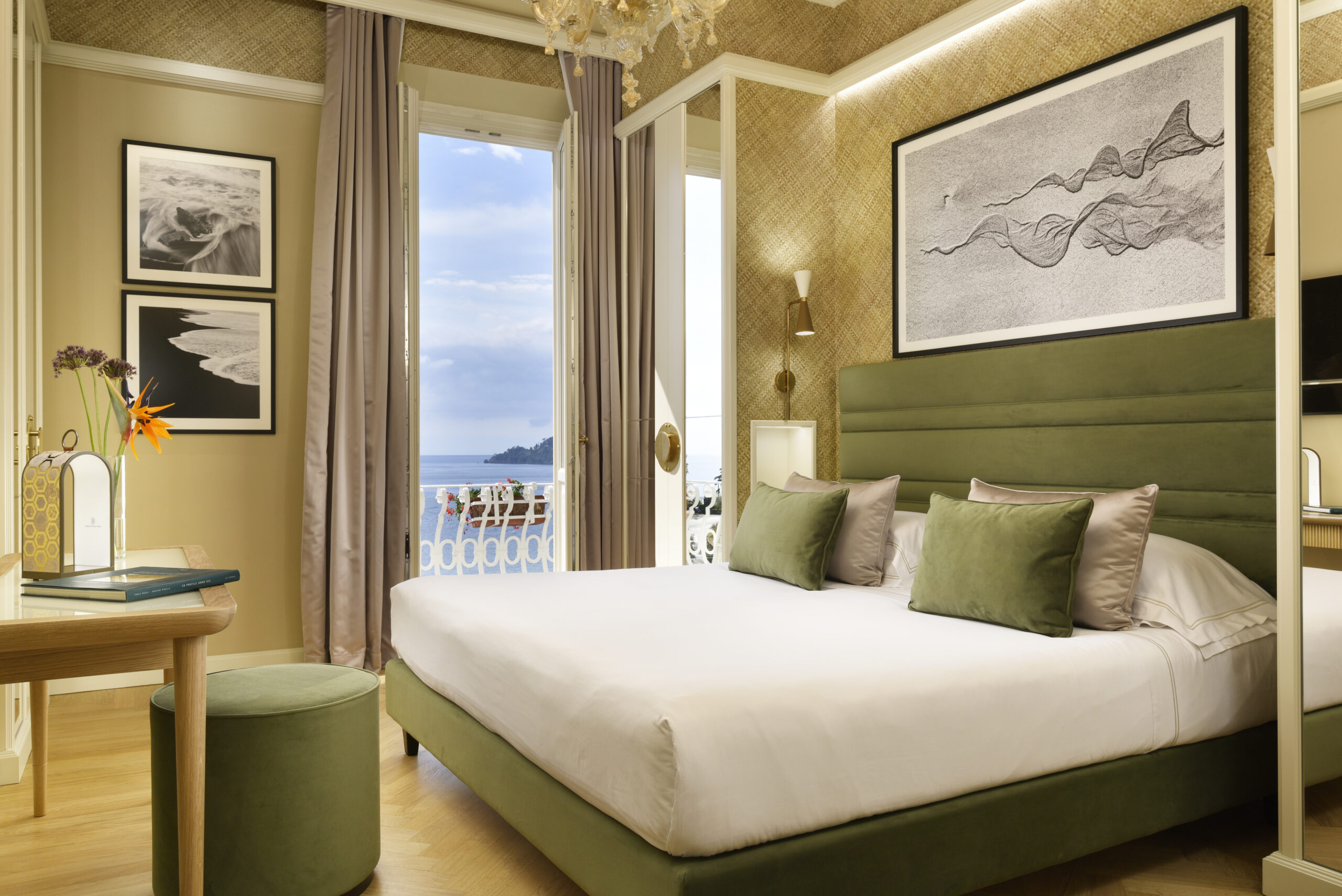
A wall behind the headboard, including a lower painted section, gives the colour a defined location. White or antique-pink linen and oak bedside furniture can complete a softly contrasting scheme. Choose evening light that suits both the room and the materials. A quiet palette may feel restful to its occupants, but colour alone does not guarantee better sleep.
Bathroom and entrance
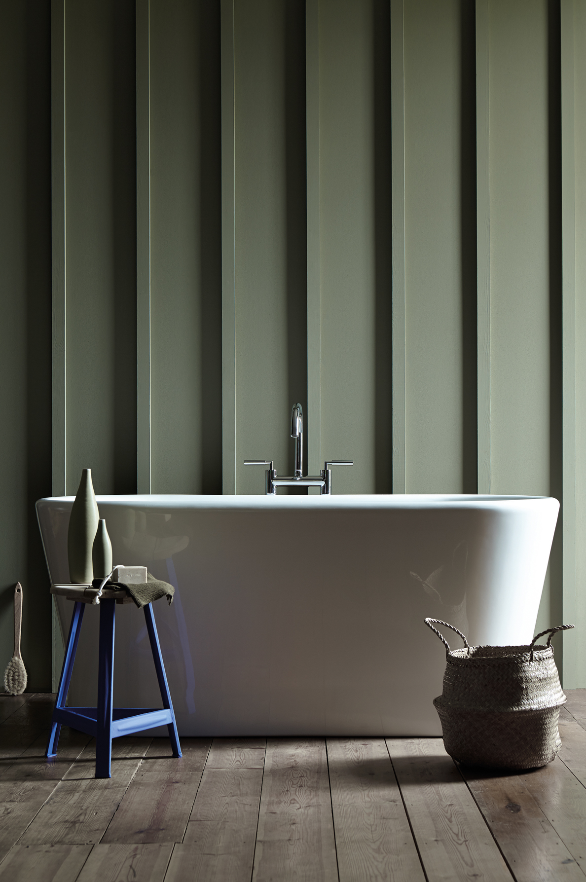
In a bathroom, explore sage through glazed tiles, suitable moisture-resistant wall finishes or painted vanity cabinetry. A selected brass fitting can supply a warmer detail. Product suitability and ventilation remain separate technical decisions; a green finish is not inherently more moisture-resistant than another colour.
An entrance may use a pale, warmer sage to maintain a light colour signal, or a deeper shade across walls, doors and ceiling through colour drenching. The latter can give a passage a deliberately enveloping character. A dark entrance does not have to imitate a bright room: choose its intended atmosphere, then check circulation, light and contrast.
How much sage green to use
The familiar 60-30-10 approach is an optional decorating heuristic: roughly 60 per cent dominant colour, 30 per cent secondary colour and 10 per cent accents. It is not a measured standard or the safest formula for every room. Sage can occupy any of these roles, with quite different results.
As the dominant wall or cabinetry colour, it may benefit from lighter counterpoints and varied textures so that the room does not become uniform. As a secondary colour on a sofa, curtain or selected wall, it provides a smaller commitment; the reversibility depends on the element, not the percentage. As an accent in a cushion or vessel, a very pale sage can become almost invisible against a similar background, but a stronger version can be effective through contrast.
For a project starting from scratch, our complete guide to furnishing a home explains how to build from the floor, light and existing furniture before choosing wall paint.
Mistakes to avoid with sage green
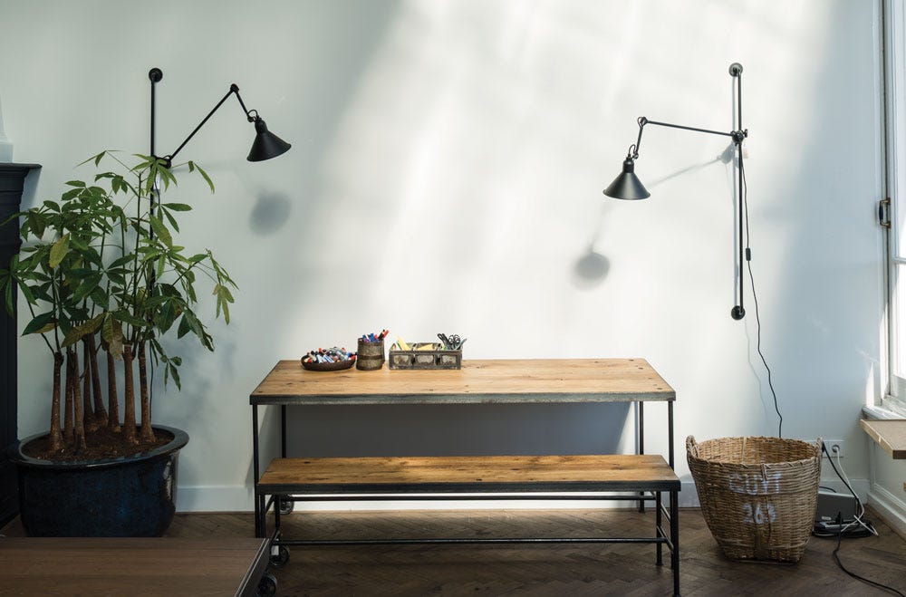
The most common mistake is selecting a shade under shop lighting without trying it in the room. A subtle green may look greener, greyer or warmer at different times and beside different materials. Prepare a generous sample, at least around A3 size as a useful practical starting point, and examine it on more than one wall.
North-facing light can be indirect, but orientation alone does not tell you whether sage will turn dull or which undertone will fix it. Glass, obstructions, reflected outdoor colours and weather all contribute. Compare warmer olive-leaning samples with greyer or bluer ones before deciding. Apply the same method in a south-facing room instead of assuming it always needs eucalyptus green.
Artificial lighting deserves the same attention. Kelvin describes correlated colour temperature, not the entire spectrum or how every colour will render. A lamp above 4000 K does not inevitably make sage look sickly, and 2700-3000 K does not guarantee fidelity. Test the intended sources, including their colour rendering, with the finished sample and other materials. Bright white, cool grey and glossy finishes are not intrinsic mistakes; using any of them without checking the actual relationship is the problem.
Frequently asked questions about sage green
What exactly is sage green?
It is a family of muted grey-greens inspired by the soft surface of sage leaves, often light to medium in depth. Some versions lean yellow, others blue. Its apparent character depends on the actual shade, material and surroundings.
Is there one code for sage green?
No. The name covers several shades. The example #9CAF88 is a digital illustration, not a universal paint specification. Choose a manufacturer’s actual product reference or an appropriate standardised colour reference, then verify it through a physical sample in the room.
Which colours go with sage green?
Warm white, ivory and taupe offer restrained options; terracotta and antique pink add a softer warm contrast. Midnight blue, black and brass can provide smaller accents. Cool grey or bright white can also work, but their undertones should be tested alongside the green.
Can sage green work in a north-facing room?
Yes, but there is no automatic shade for that orientation. Test pale, olive-leaning and cooler samples under the room’s actual daylight and lamps. Timber and cream fabrics are possible sources of warmth, not substitutes for checking the selected paint.
Will sage green go out of fashion?
No colour is guaranteed to remain fashionable. Its muted character can make it easier to adapt through changing furniture or accessories, especially in a well-considered material palette. Choosing it because it suits the home is a better starting point than relying on predictions about its longevity.
Historical pigment reference: National Gallery, Duccio’s Maestà predella panels.