Ruby-red velvet bows, sapphire-blue baubles and pine cones that look dipped in gold. Nine ways to bring the sparkle of Christmas home, from the first branch you decorate to the last place you set at the table. This Christmas, we’re looking forward to a little glitter: the way it catches on a gilded pine cone, …
Ruby-red velvet bows, sapphire-blue baubles and pine cones that look dipped in gold. Nine ways to bring the sparkle of Christmas home, from the first branch you decorate to the last place you set at the table.
This Christmas, we’re looking forward to a little glitter: the way it catches on a gilded pine cone, shifts colour on a blue glass bauble and lights up the edge of a fuchsia flower among the branches. We’re drawn to vivid colours, too, especially alongside light-absorbing velvet or a matt surface such as linen.
We’ve chosen nine Christmas colour combinations for 2026. Forest green and antique gold are the easiest to build around decorations passed down through the family. Lacquer red and butter yellow can change the feel of a tree with just a few additions. Pistachio green and peach pink come into their own at the table. You can start with a box of decorations you already own, a favourite tablecloth or even a length of gift ribbon.
1. Ruby red and sapphire blue, from velvet to glass
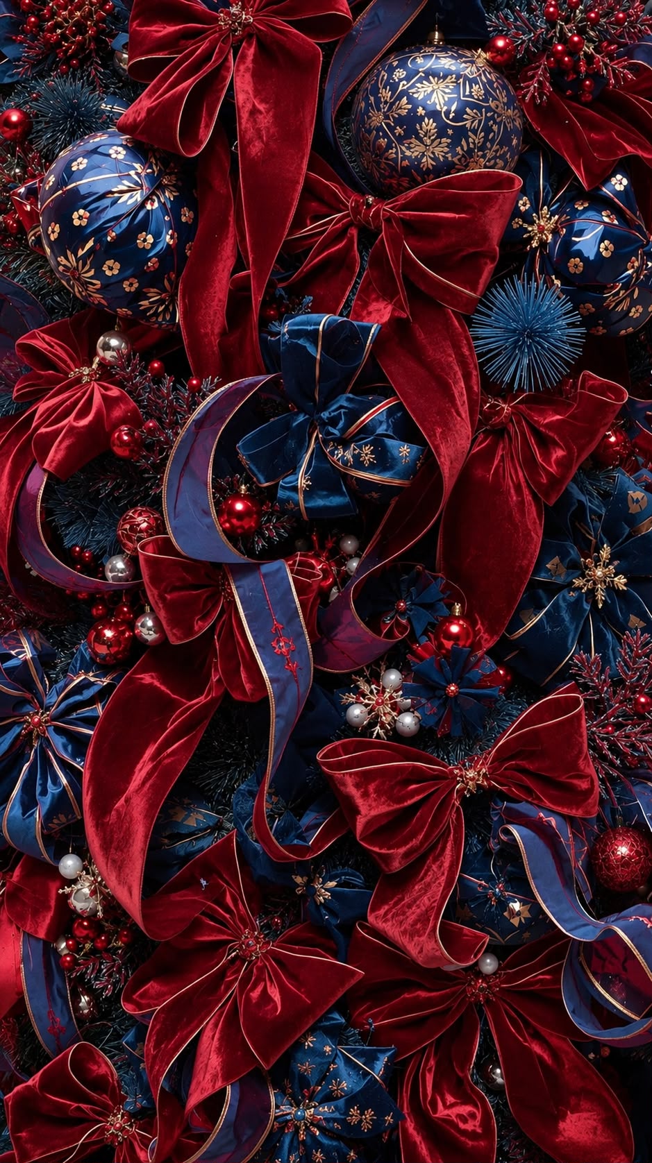
A large ruby-red bow changes colour at every fold. Where the light falls, the velvet glows a rich red, then darkens in the folds. That depth lets it hold its own against an equally intense sapphire blue.
Thread a blue ribbon through the tree, letting it trail in a couple of places, and tie the red bows to the most visible branch tips. If you already have patterned blue baubles, echo their colour in just a few other spots. At the table, try blue goblets and ruby ribbon tied around the napkins.
2. Forest green and antique gold, inspired by a gilded pine cone
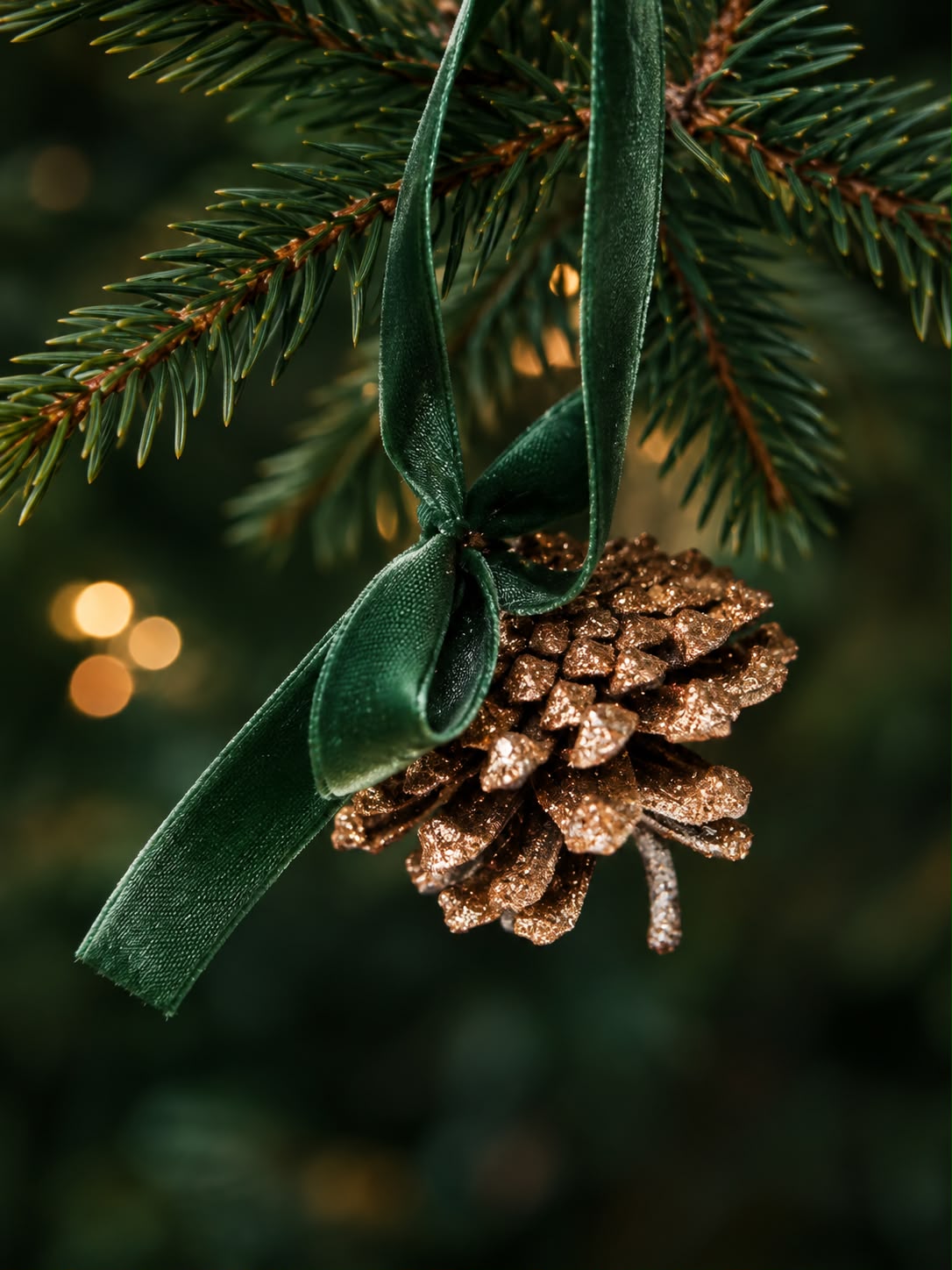
Forest green blends into the colour of the fir. That’s what makes a dark bow so beautiful among the branches. From across the room you see its outline, then up close you notice the light on the fabric. Hang a gilded pine cone from the same ribbon, low enough to move and catch the light.
Look for burnished, brushed or slightly uneven finishes to get that antique gold tone. A handful of ornaments can be shared between the tree and a wreath. At dinner, forest-green napkins and a pair of brass candleholders are enough to carry the palette across.
3. Chocolate brown and champagne, warm and understated
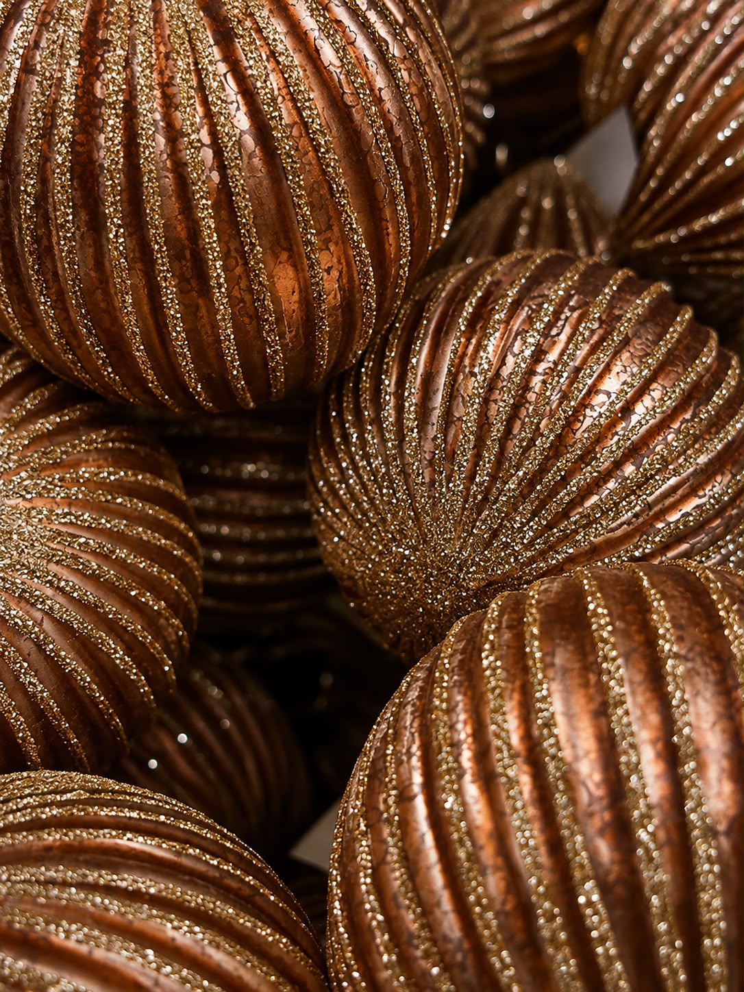
The colour of a ribbed brown bauble emerges when light falls across it. Chocolate deepens in the grooves, while champagne can be as subtle as a pale sheen on the ornament next to it. The pairing is especially at home with walnut furniture or warm-toned parquet.
Alternate brown baubles and champagne ornaments on the tree, mixing matt, satin and glitter finishes. For the table, start with a cocoa-coloured runner and champagne napkins. Brown paper and wide pale ribbons carry the same colours down to the presents beneath the branches.
4. Midnight blue and silver, made for low light

Midnight blue gives pinpoints of light a deep backdrop. Choose it if you want your tree to change after dusk, as silver ornaments catch the light from different angles.
Hang a few silver pieces near the lights and others farther out on the branch tips. Ribbed glass, satin-finish metal and mirrored surfaces each catch the light differently. At dinner, let the tablecloth supply the blue and use silver cutlery and candleholders to add reflections along the table.
5. Lacquer red and butter yellow, a softer light for red
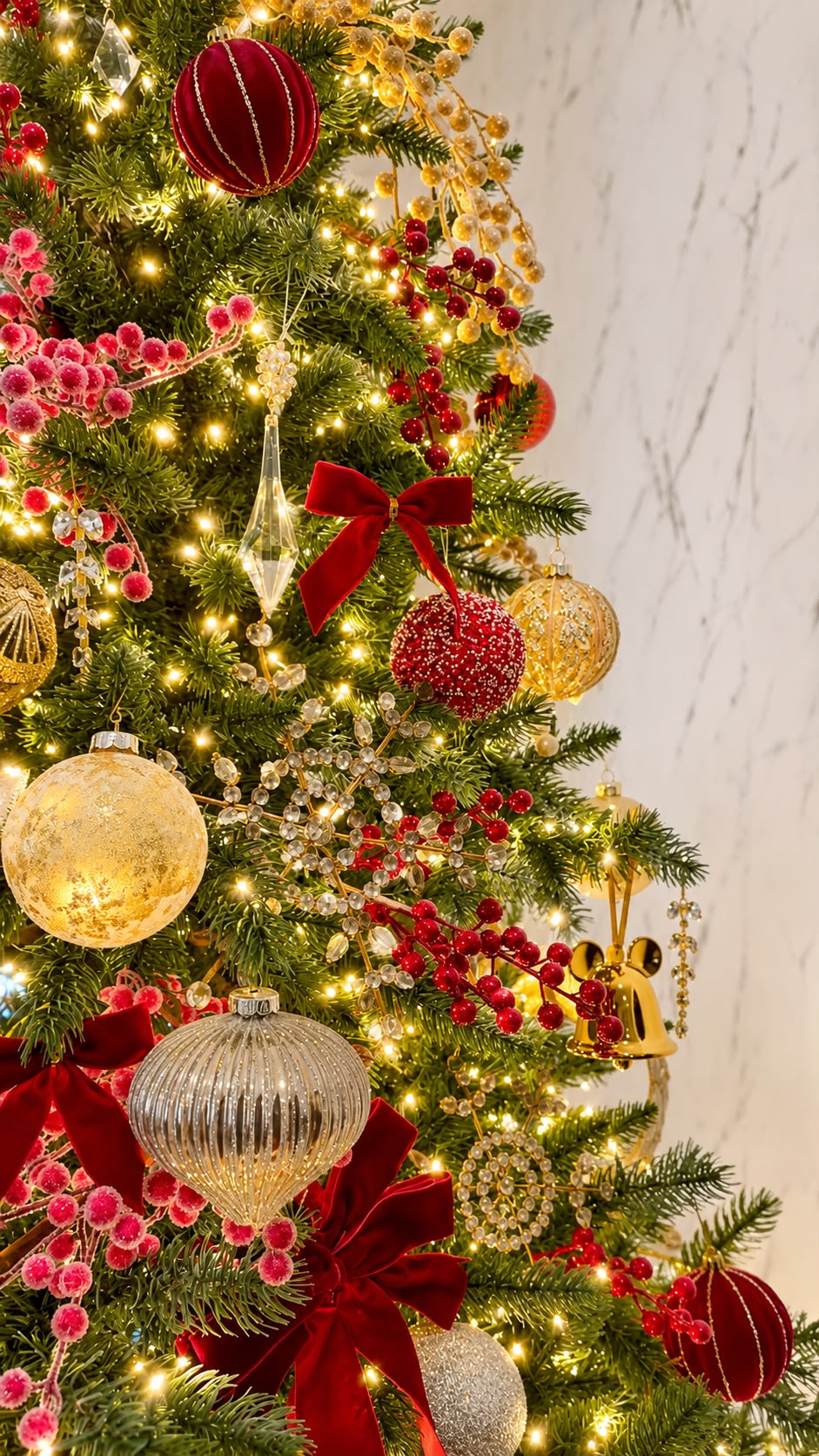
Butter yellow has the familiarity of an old greeting card or the glow from a fabric lampshade. Set beside the bright, glossy finish of lacquer red, it brings that softness to the decorations.
On a green fir, use butter yellow for the larger baubles and break up the repetition with a few red bows. For the table, a butter-yellow cloth and ivory plates leave room for red candles or ceramics. Look at the fabric in the evening, too: the palest yellows can look cream under very warm light.
6. Plum and dusty lilac, two shades of purple
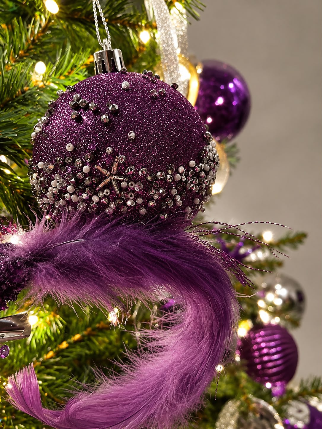
In low light, plum can look almost black. Put it next to a grey-toned lilac and the purple comes into focus. The contrast gives the pairing its character, even with a little glitter in the mix.
Give a glittered plum ornament room to stand out beside a matt lilac ribbon, long enough to drape over the branches. At the table, use lilac linen and plum glassware, which softens in colour where the light passes through it.
7. Pistachio green and peach pink, especially good at the table
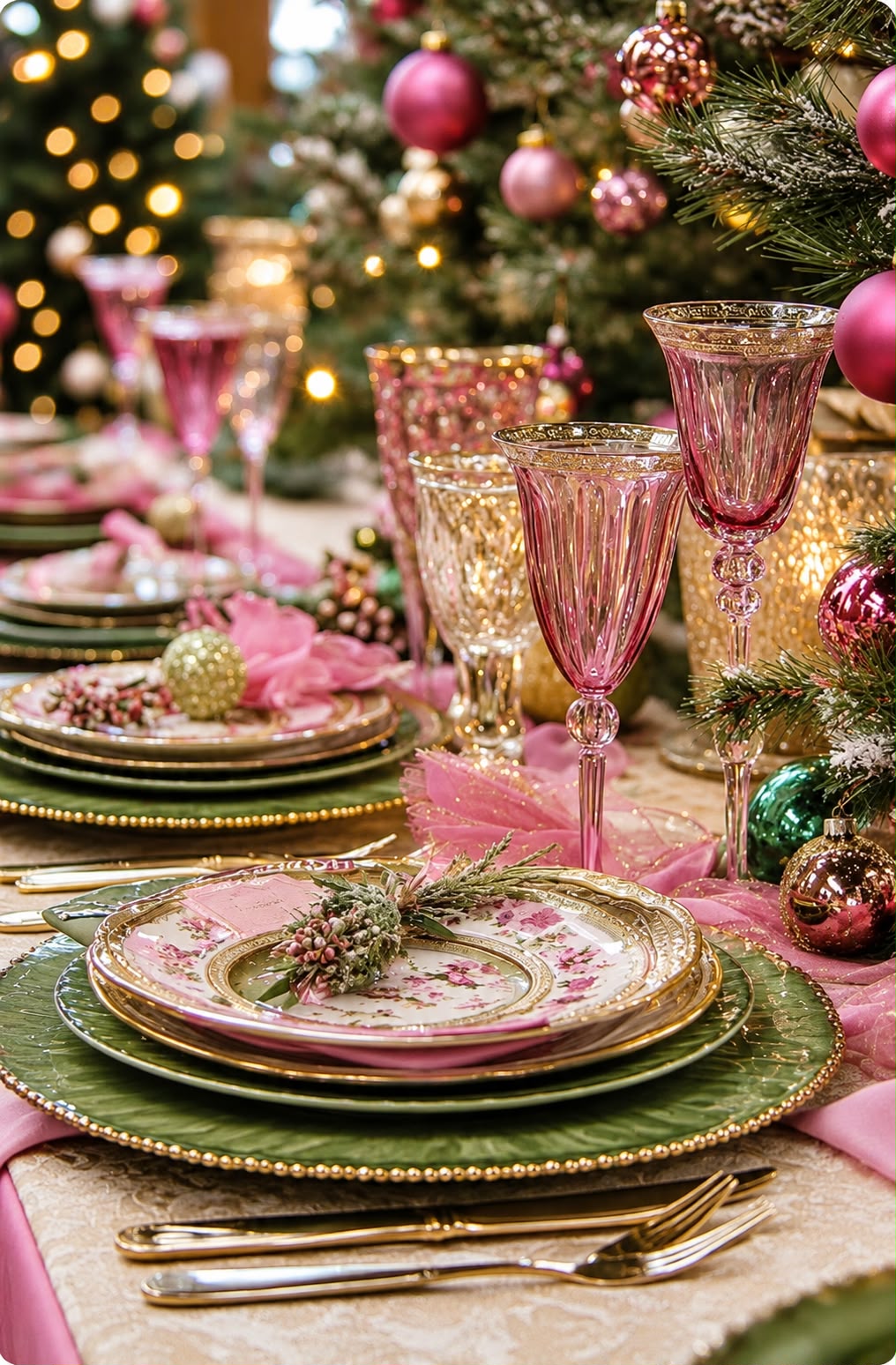
Here the colours appear in layers: the edge of a green plate, the pink of a goblet and a glimpse of tablecloth between place settings. Pistachio has a yellow undertone that suits the warmth of peach. Slightly irregular ceramics and translucent glass keep the table looking light, even with greenery and candles.
If you already have green plates, start there and try peach napkins or glasses. For the tree, choose satin baubles and narrow ribbons. A few well-spaced clusters are enough, especially if your fir is already dressed with family ornaments.
8. Terracotta and olive green, with citrus and linen
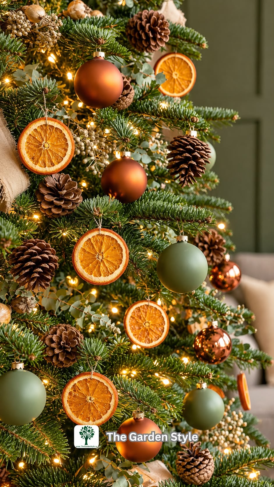
Terracotta is echoed in dried orange slices, dark around the edges and translucent in front of a fairy light. Olive green draws the warm citrus tones, branches and pine cones together. Here, the materials suggest the palette almost on their own.
Hang orange slices on fine thread next to terracotta baubles and olive bows. At dinner, pair a terracotta ceramic charger with an olive linen napkin. A wreath can carry the palette into another room, with olive ribbon tied between fir sprigs, pine cones and pieces of dried orange peel.
9. Fuchsia and emerald green, a flower you can see across the room
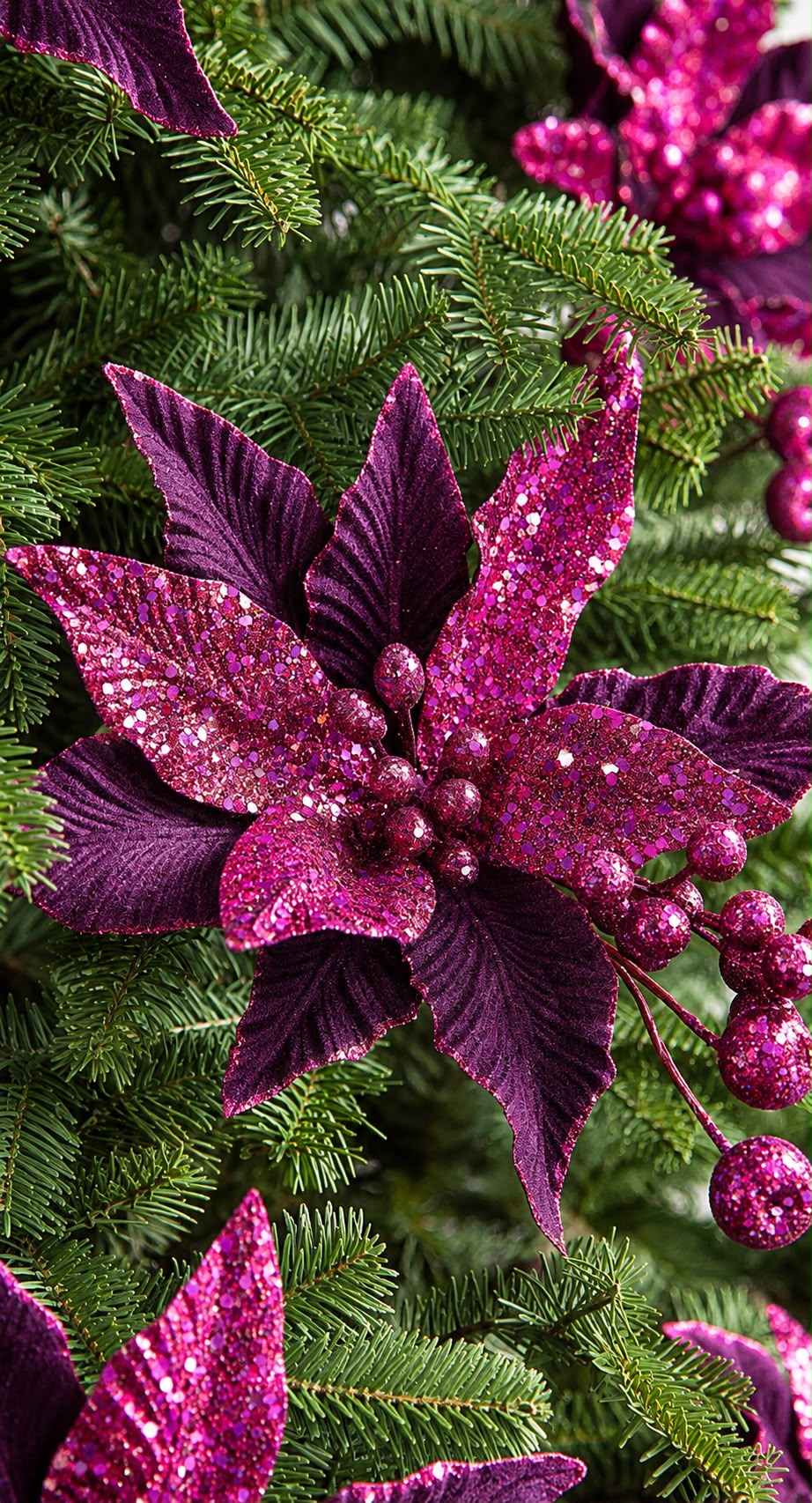
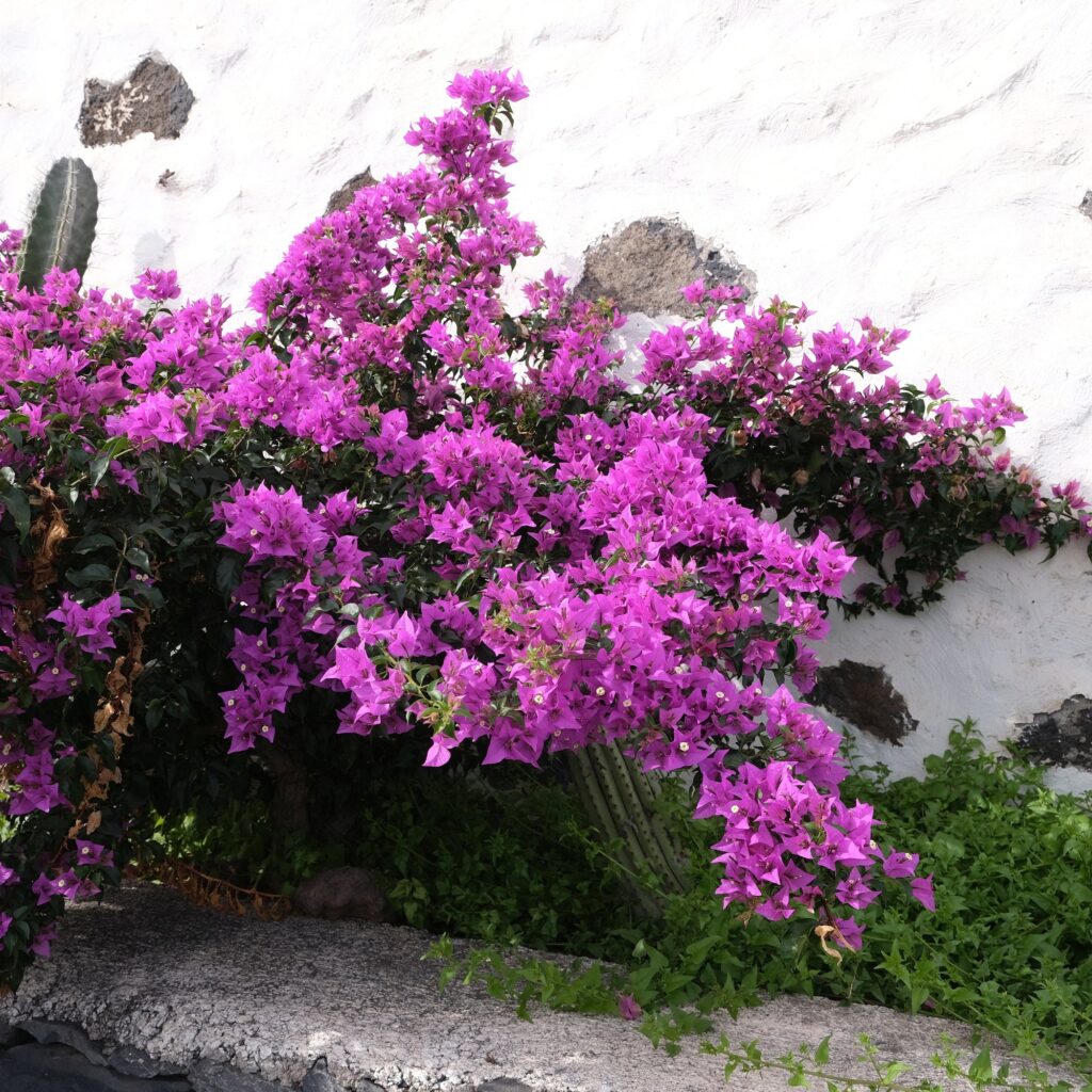
A fuchsia flower stands out among the branches. With a glittered finish, its petals can shift towards magenta as the light changes. Emerald gives it an equally rich background, which you can pick up in glass baubles or a wide ribbon.
A couple of large flowers at different heights are enough to give the tree a distinctive look. At the table, pair a green cloth with a small cluster of fuchsia flowers in a low vase, so guests can still see each other across it.
How to choose colours for your Christmas tree
Two colours are enough to build a palette. Give more space to the one you want to notice first and use the second to draw attention to a branch tip or the middle of a wreath. The green of the tree itself matters, too. A sapphire bauble on a dark fir may need a light nearby, while a champagne ribbon can stand out from the doorway.
Before buying anything new, set a couple of ornaments on a branch and look at them in the light you use at night. You can also carry a colour from the tree to the table by changing materials: the ruby of a velvet bow can become the ruby of a glass, and the champagne finish of a bauble can reappear in linen napkins.
For more ideas, see our guide to the Christmas Eve table and our Christmas design guide for lights and decorations elsewhere in the home.