Which colors go with blue? Nine surprising combinations for interiors, from cobalt with burgundy to petrol blue with olive green: ideas, materials and tips for decorating your home.
From cobalt to midnight blue, by way of sugar-paper blue and indigo: nine color pairings that point to a more personal, refined and surprising way of living with color.
Some colors simply decorate a room. And then there’s blue, which seems able to change its entire mood.
It can have the depth of the sky just before nightfall, the lightness of a summer morning, the intensity of pigment laid on canvas. It can be understated or absolute, effortlessly elegant or wonderfully eccentric. Above all, it is never really the same color twice.
Pair it with burgundy and its theatrical side comes out. Add chocolate brown and it turns more intimate. Next to powder pink it becomes romantic, without the nostalgia. Blue has a rare quality: it changes character depending on what it meets, yet remains instantly recognizable.
In the most interesting interiors, a pairing is never just about paint colors. Light matters, as do the patina of wood, the sheen of a lacquer and the hand of a fabric. These relationships are what make a room look natural even when nothing has been left to chance. To get to know the different tones, a good starting point is our guide to shades of blue in interiors.
So which colors go with blue? Here are nine color pairings to picture in your own home right away.
1. Cobalt blue and burgundy: the allure of bold contrast
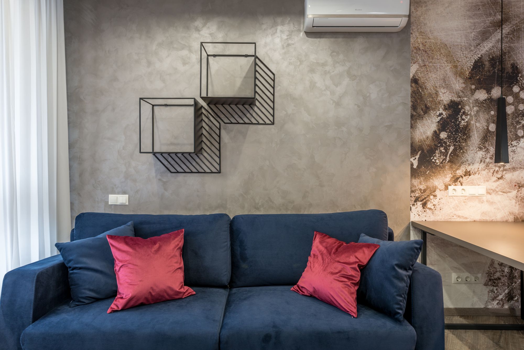
Cobalt is bright, assertive, almost electric. Burgundy has the depth of red wine, antique velvets and reinterpreted bourgeois interiors. Together they create a dramatic color tension, but one that is anything but random.
A cobalt wall can frame a generously shaped burgundy sofa; alternatively, a wine-colored room can be punctuated by the blue of an armchair or an artwork. The secret is to give the two colors different roles. One builds the backdrop, the other surprises. Dark wood, lacquer and velvet heighten the character of the whole.
Where it works: Living rooms, statement entryways and small sitting rooms.
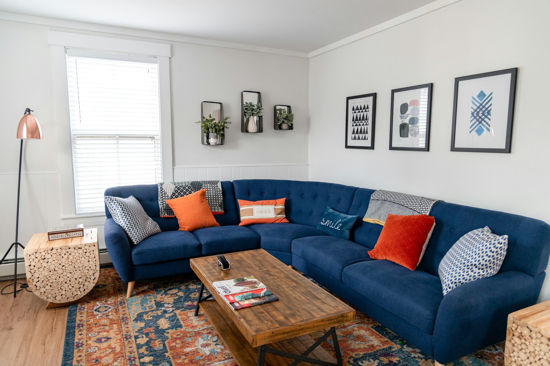
2. Dusty blue and chocolate brown: the elegance of simple things
The delicacy of dusty blue, lightly veiled in gray, finds a warm, reassuring and tactile presence in chocolate brown. This pairing isn’t after special effects: it feels like it belongs to a lived-in home, not a trend.
Picture a chocolate sofa against a dusty blue wall; desaturated blue fabrics, walnut furniture and lamps with soft light; a kitchen where blue cabinet doors meet the grain of the wood. Matte paint, worn leather, bouclé and dark parquet are the details that turn the palette into atmosphere.
Where it works: Bedrooms, studies, cozy living rooms.
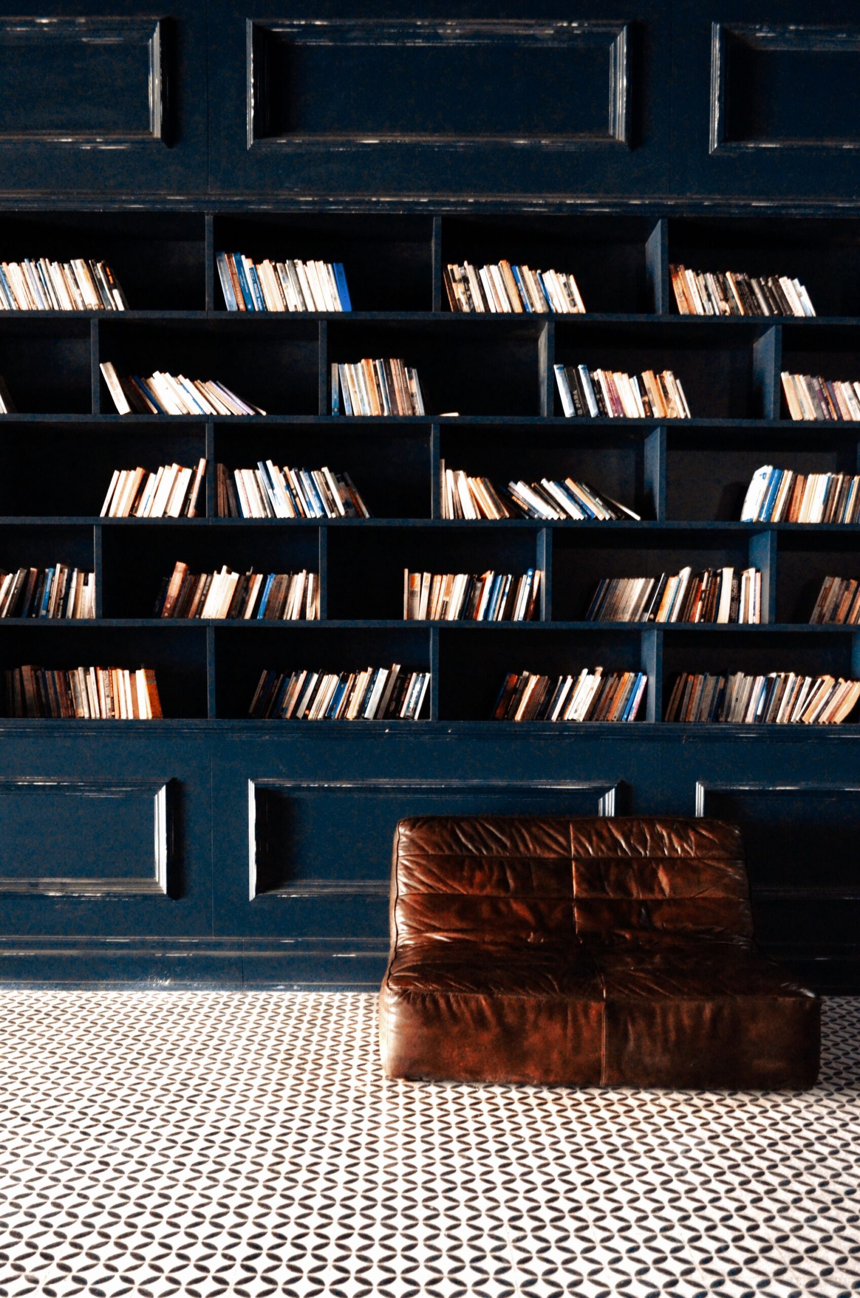
3. Navy blue and caramel: a classic that keeps surprising
Navy has the depth of dark colors along with a particular luminosity. Next to caramel it becomes soft and enveloping, almost tailored. It is an elegance that never needs to raise its voice.
Blue can cover wall paneling, a custom bookcase or the walls of a study. Caramel comes in through a leather armchair, a sofa with clean lines or a warm fabric. A detail in burnished brass, an oatmeal rug or a natural stone is all it takes to complete the look. Blue defines the space; caramel makes it livable.
Where it works: Home libraries, elegant living areas, kitchens.
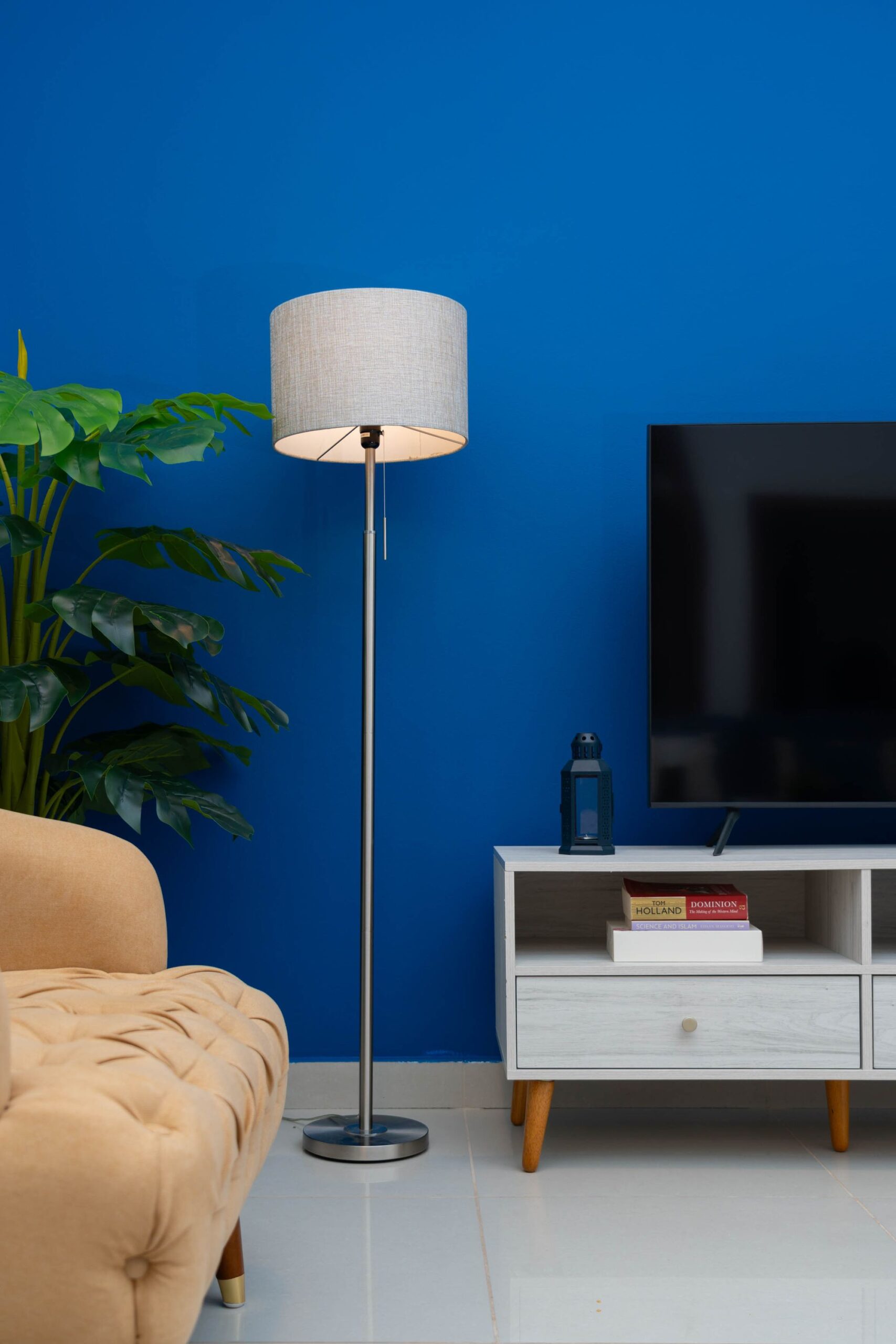
4. Petrol blue and olive green: where color meets nature
The line between blue and green is a fine one. Petrol blue, a deep blue-green teal, shifts with the light, revealing an aquatic quality or a mineral intensity; olive green, warmer and earthier, moves close to it without canceling it out. The result is a rich, enveloping and deeply natural combination.
Imagine a dining room with petrol blue walls and olive velvet chairs, or a living room with a green sofa and a blue bookcase. Stone, wood, linen and handmade ceramics make the pairing believable; a touch of satin brass adds light without excess. Like certain landscapes, where you can’t tell where the green ends and the blue begins.
Where it works: Living rooms, dining rooms and bedrooms.
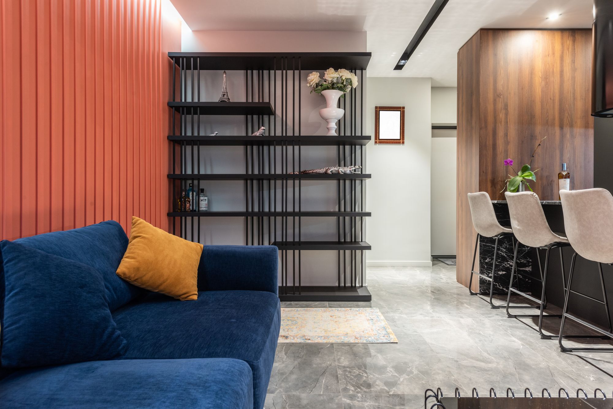
5. Midnight blue and terracotta: a pairing with Mediterranean character
Midnight blue belongs to the hours when the light changes and a room becomes intimate. Terracotta, by contrast, speaks of material: plaster, ceramics, Mediterranean architecture and sun-warmed surfaces. Two opposite moods that strike a surprising balance.
A midnight blue wall can serve as the backdrop for a rust sofa or an artwork in earthy tones. In a dining room it can meet terracotta tiles, wood and contemporary chairs. A dusty terracotta, closer to brick or cinnamon, works better than an overly bright orange. Raw linen and textured plaster add depth.
Where it works: Mediterranean homes, textured living rooms, bedrooms.
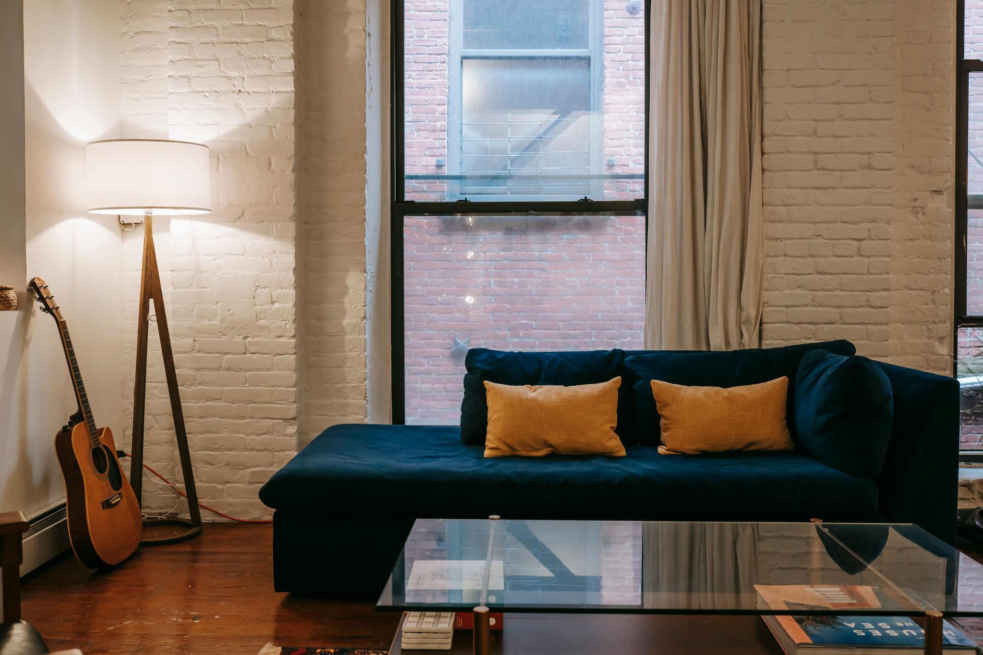
6. Sugar-paper blue and butter yellow: the beauty of lightness
Sugar-paper blue, a soft, slightly grayish powder blue known in Italy as “carta da zucchero,” adds depth without weighing a room down. With butter yellow it takes on a new freshness, delicate but never childish. A pairing that seems to belong to the light even before the objects.
Think of a kitchen with sugar-paper blue cabinets, cream walls and a butter yellow chair; or a living room with a pale blue sofa and a yellow lamp with a pared-back design. There’s no need to repaint everything: even a rug or a piece of ceramic can create the harmony. Brushed steel, oak and pale stone keep the whole from becoming too sweet. Read our in-depth guide to sugar-paper blue.
Where it works: Bright kitchens, bedrooms and casual living rooms.
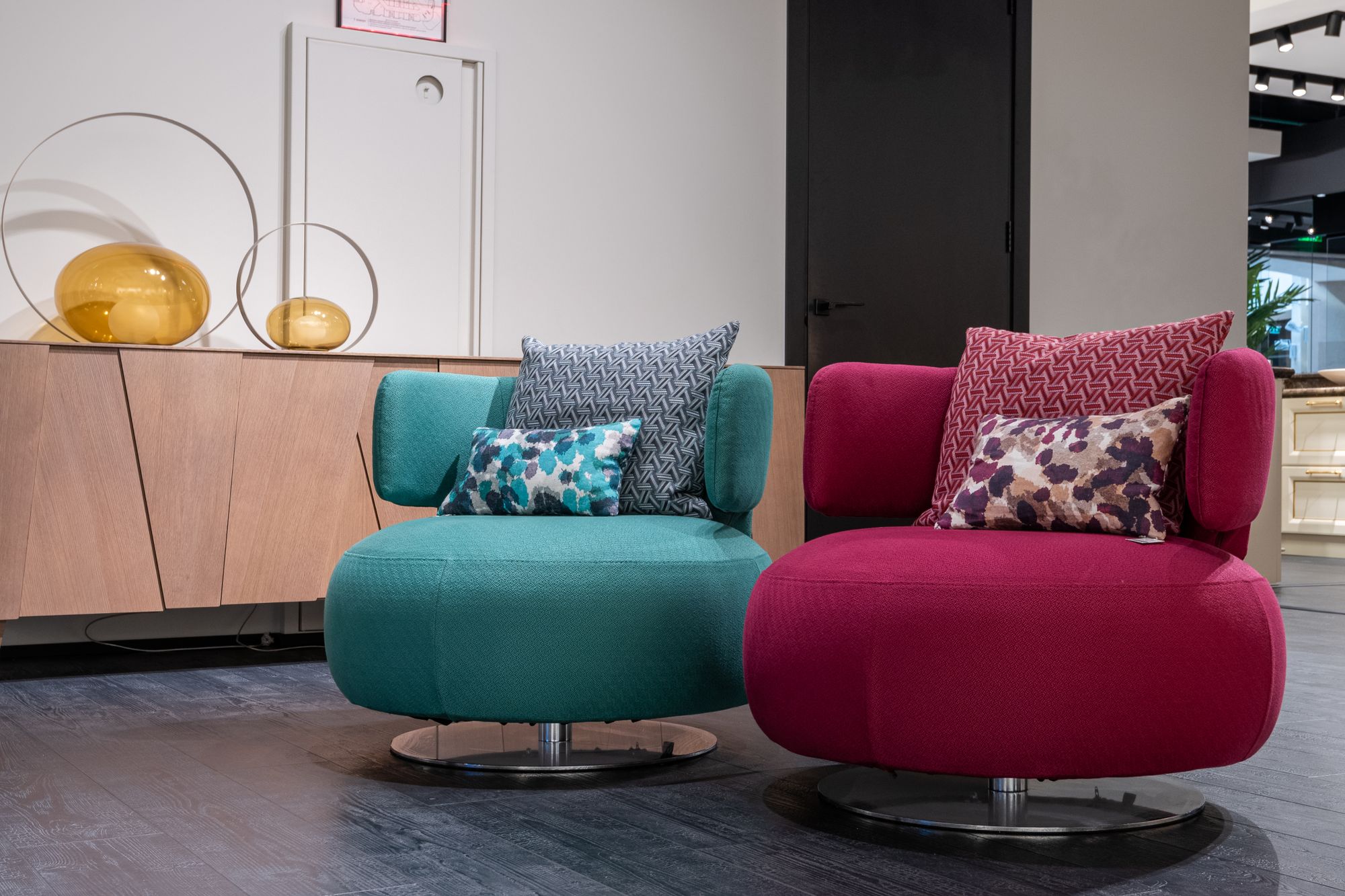
7. Electric blue and powder pink: contemporary romance
Powder pink has an unfairly delicate reputation. Electric blue seems born to upset the balance. Together they prove that romance can be decisive, even bold.
An intense blue armchair against dusty pink walls; a pinkish rug in a blue room; a cobalt lamp on a powder pink cabinet. The key here is not to pile on romantic details. Clean surfaces, architectural shapes and chrome add rigor. Pink softens blue, while blue keeps pink from becoming predictable.
Where it works: Creative living spaces, contemporary bedrooms, reading nooks.
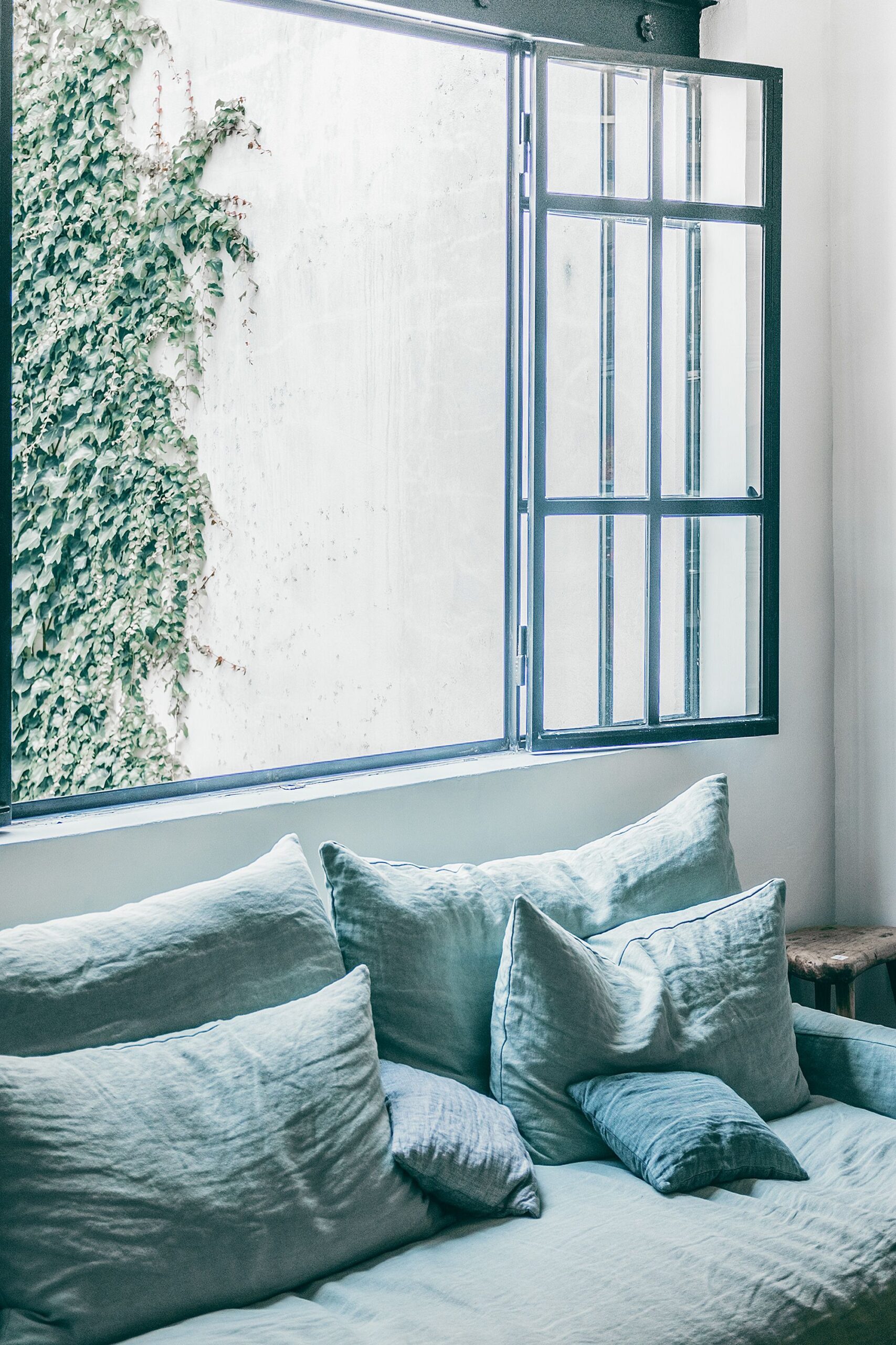
8. Denim blue and sand: the ease of timeless interiors
Some homes seem to breathe. Light filters through linen curtains and falls on worn textiles, matte surfaces and unpretentious furniture. Denim blue, less formal than navy and less intense than cobalt, finds a bright, natural base in sand.
A denim sofa with sand-colored walls, oak side tables and natural-fiber rugs; or faded blue bedding, a linen headboard and oatmeal surfaces. Washed cotton, matte ceramics and pale woods make the look relaxed but never sloppy. A kind of effortless elegance that knows no season.
Where it works: Bright living rooms, bedrooms, beach houses.
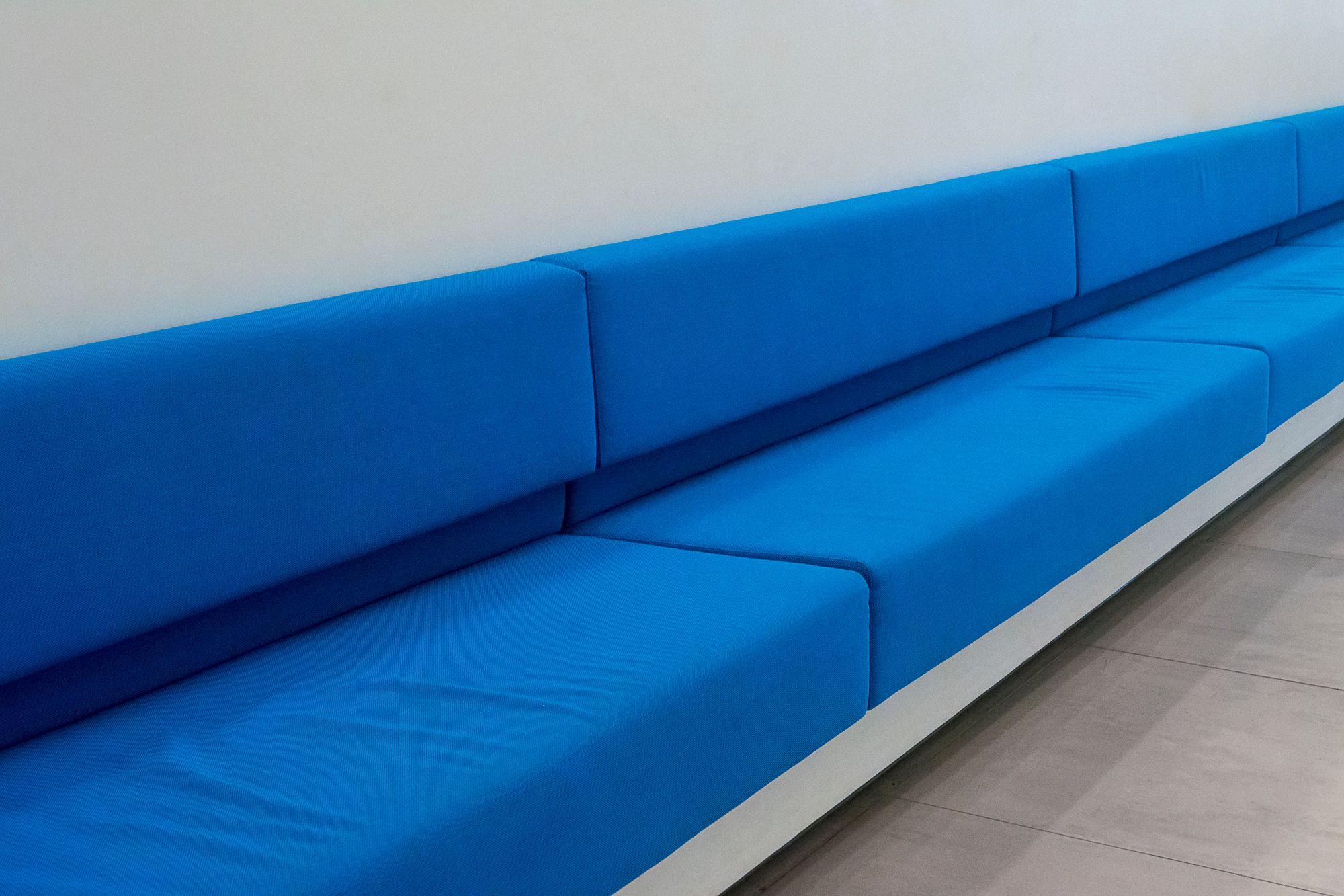
9. Indigo blue and cream: the sophistication of depth
Indigo is enigmatic: a blue with a violet undertone that changes noticeably with the light. Pairing it with cream gives it room to express itself without giving up warmth.
Indigo walls in a dining room can frame pale tables and cream chairs. An ivory sofa takes center stage in front of blue paneling; in a bedroom, cream bedding and opaline glass balance the depth of the walls. The difference from the usual blue and white is subtle but decisive: cream accompanies blue instead of contrasting sharply with it.
Where it works: Elegant bedrooms, dining rooms, paneled living rooms.
How to pair blue in your decor without getting it wrong
There is no single right way to use blue. If you love intense spaces, you might choose cobalt and burgundy or petrol blue and olive; if you prefer a quieter elegance, look to dusty blue and chocolate, navy and caramel, or indigo and cream. But the palette is only the starting point.
Look at the color in real light
A blue that looks beautiful in a photo can change dramatically on a north-facing wall. Before choosing a paint or a finish, it helps to look at large samples at different times of day, next to the materials actually present in the room.
Give the colors different roles
One shade can build the backdrop while the other acts as an accent. A blue room finds its focal point in a burgundy armchair; a sand-colored room can change character thanks to a large denim sofa. Proportion matters as much as the pairing itself.
Let materials do the talking
Midnight blue on a matte wall doesn’t create the same atmosphere as a glossy lacquer. And burgundy velvet is different from burgundy ceramic. Before adding a third color, try changing the texture. You’ll find more ideas in our dictionary of home colors.
Choose personality over a matchy-matchy look
An interesting home might hold an inherited piece of furniture, an oversized lamp, an armchair in an unexpected color. Harmony doesn’t require every element to be perfectly coordinated: it comes from the ability to make different things live together.
What colors go best with blue? Answers to the most common questions
What is the most elegant color to pair with blue?
Navy blue and caramel or indigo blue and cream are especially refined choices: the first is warmer and more tactile, the second pared-back and luminous.
What color goes with blue to make a room feel warmer?
Chocolate, caramel and terracotta bring in warmth that balances blue. Wood, leather and lighting also contribute to the atmosphere.
Do blue and green go together?
Yes. Petrol blue and olive green, for example, can create sophisticated spaces. It helps to vary textures and depth so that not every surface looks uniform.
What colors go with blue in a small home?
Sugar-paper blue and butter yellow, denim and sand, or dusty blue with light neutrals are all good options. Even a dark blue can work in a small room, provided the lighting is carefully planned.
How do you make blue decor look modern?
Through less predictable pairings, such as cobalt and burgundy or electric blue and powder pink, combined with contemporary materials, satin finishes and sculptural furniture.
Blue and the freedom to choose
Perhaps the most interesting way to live with blue is to forget, at least for a moment, the pairings we have always considered correct. Let burgundy meet cobalt. Let chocolate warm up a dusty blue. Let a hint of pink find its balance next to an almost electric blue.
Because colors, like the objects we choose to bring into our homes, are above all about affinity. Some are immediate. Others have to be discovered. And it is often the most unexpected ones that make an interior impossible to forget.