Explore dusty blue interiors through their historical name, real paint samples, lighting and combinations with timber, taupe, white, fabrics and warm accents.
A muted blue with a substantial grey component: where the Italian name carta da zucchero comes from, how to judge it under real light, and how to combine it with timber, textiles and furniture.
Dusty blue interiors begin with a colour family, not one universal shade. The Italian expression carta da zucchero commonly describes subdued blues with a more or less pronounced grey component. On walls, upholstery and cabinetry, they can relate to timber, taupe and warm whites. The balance changes with the actual shade, its finish and the surrounding materials; a north-facing room does not inevitably turn it grey, nor does southern light always make it brighter blue.
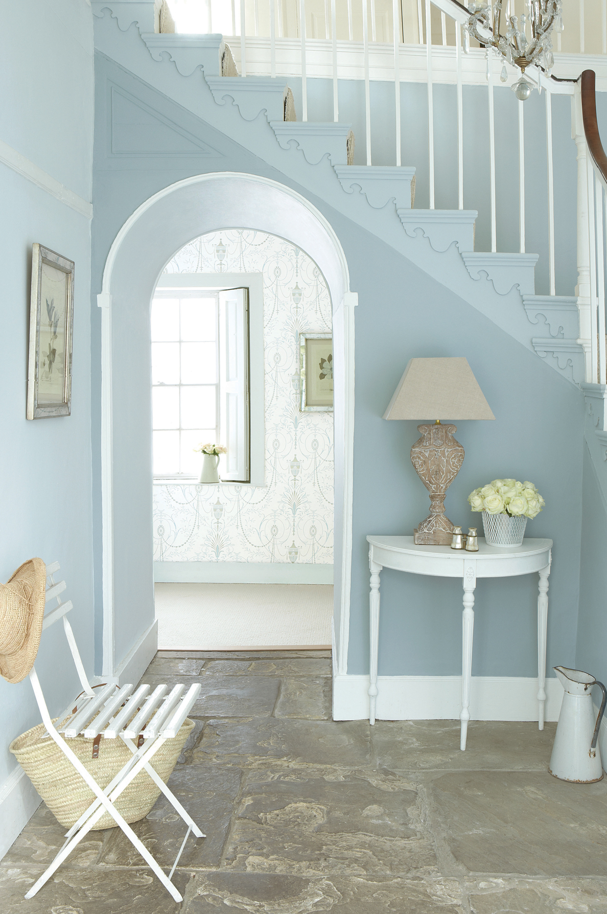
Choose the manufacturer’s actual reference and physical sample before making the colour a large part of the room. A useful approach combines generous test panels, the intended lamps and a palette assembled from the permanent surfaces. Adding warmth through timber or fabric is one option, not a compulsory correction for every muted blue.
Where the name carta da zucchero comes from
The Treccani dictionary records the historical use of heavy, dark-blue paper for wrapping sugar. The colour name grew from that everyday material. Its historical description is deeper than many pale blue-grey paints sold today; the shared name should not be taken as proof that all these shades are identical.
Grey and pale blues also have a place in historic Nordic interiors. The Old Kuopio Museum’s account of its Gustavian room places the style around the late eighteenth and early nineteenth centuries and describes pearl grey alongside pastel pink, blue and green. This gives a useful historical context for painted furniture and restrained palettes. The historical palette is a point of reference for looking at painted furniture, rather than a fixed formula for a contemporary room.
What colour is dusty blue in technical terms?
It is generally a blue softened by grey, with less chromatic intensity than a vivid blue. Some commercial interpretations are lighter, deeper, greener or more violet than others. NCS notation can specify a particular surface colour independently of a product’s evocative name, but the whole family does not occupy one fixed code. Neither an illustrative HEX value nor a single RAL reference is a universal equivalent of carta da zucchero.
Light Reflectance Value, or LRV, describes the reflectance of a specified surface on a scale generally expressed from 0 to 100. It is useful when comparing actual products, not as a prediction that a colour name will keep a room bright. Available light, geometry and other finishes also matter. Matt paint can emphasise a subdued surface; satin introduces different reflections. Neither finish automatically makes the colour warmer or cooler, and cleanability must be checked separately.
Room orientation and artificial light
Orientation helps you understand when a room receives sunlight, but does not determine one inevitable colour change. Glazing, obstructions, weather, time of day and reflected outdoor colours contribute to the light. In a north-facing room, compare several undertones rather than choosing a warmer paint by default. Timber or cream textiles can add a warm material contrast if that suits the intended composition.
Under artificial light, correlated colour temperature in kelvin is only part of the information. A 2700 K source does not invariably suppress the blue, and 3000 K does not guarantee a faithful match. The source spectrum and colour rendering also affect the appearance of materials. View the paint, timber and fabric samples beneath the lamps intended for the room, including reading and accent lights, instead of judging them only under shop lighting.
Combining dusty blue with timber, taupe and white
Timber can supply a warm counterpoint to grey-blue. Light, golden-toned wood suggests one relationship; darker timber creates a stronger contrast of material and depth. The species name alone is insufficient: inspect the actual finish and grain. Taupe offers a quieter transition to other neutrals, with a readable difference in lightness or undertone. Our taupe and dove-grey interiors guide explores that neighbouring family.
Mustard, cognac and terracotta introduce yellow-orange or reddish-earth accents. These can create a lively warm-cool relationship, but are not exact complementary colours for every blue sold under the same name. A muted pink gives a gentler contrast, particularly among bedroom textiles. Decide which surface leads before adding several accents: an orange chest against a pale wall makes a different statement from orange cushions repeated around a dark sofa.
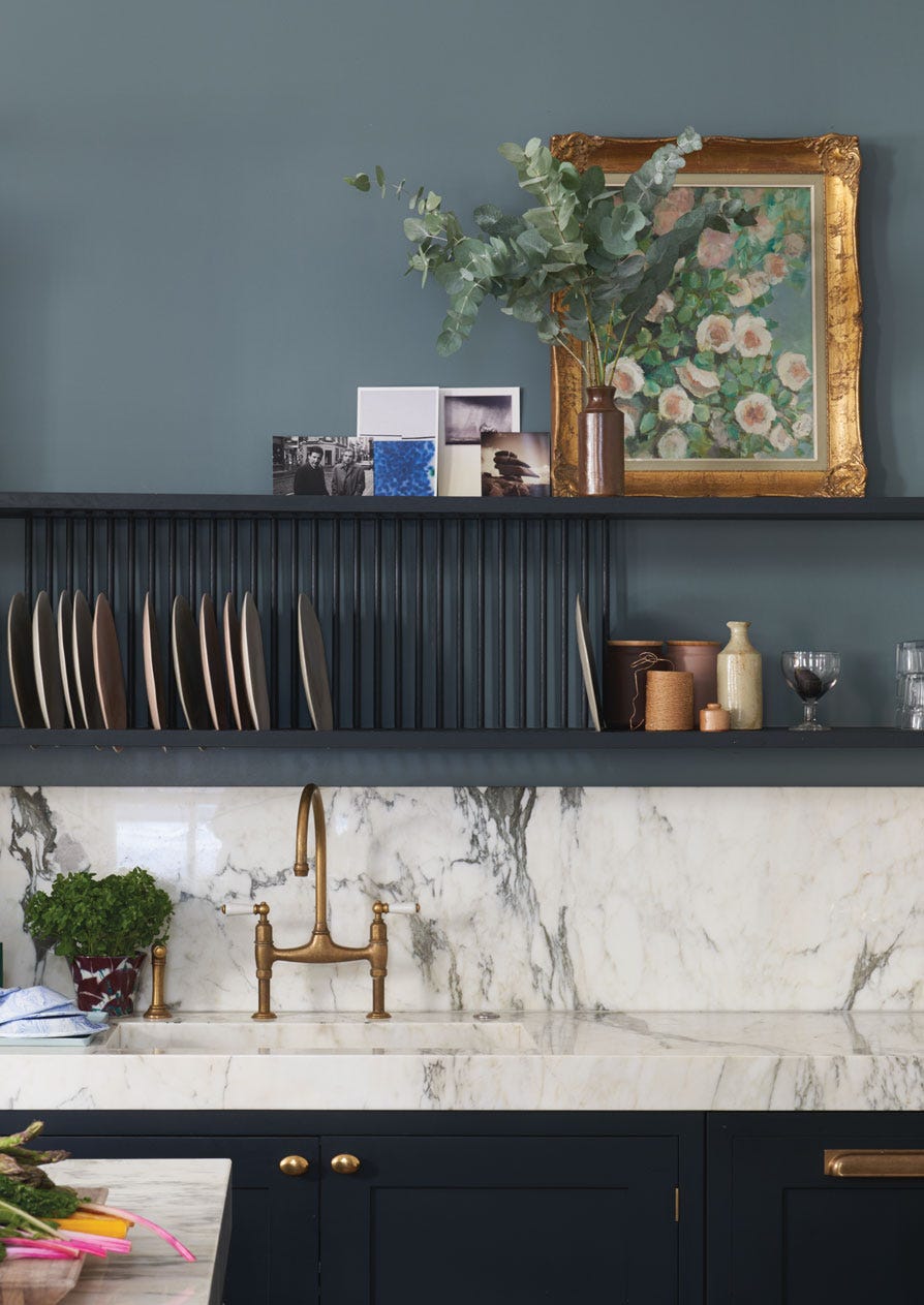
| Combination | Direction to explore | What to check |
|---|---|---|
| Light timber | A pale material contrast | Floor undertone and finish |
| Taupe | A restrained, muted palette | Difference in lightness and undertone |
| Warm white | A lighter background | The actual white beside the blue |
| Mustard, cognac or terracotta | A warm contrasting accent | Area, intensity and position |
| Brass | A small warm reflection | Sheen and surrounding materials |
How to test dusty blue on walls
A painted wall can form a backdrop for a sofa, headboard or timber shelving. Try a generous panel, for example around 50 cm square, using the proposed product and finish. That is a practical test size, not a technical threshold. Move it between walls and inspect it at several times of day. Compare it directly with flooring, skirting and upholstery rather than trying to remember a colour seen elsewhere.
Select ceiling, doors and trim at the same time. A sharper white may make the composition more graphic; a softer one may reduce the boundary between surfaces. Neither is inherently wrong. For paint performance, consult the product’s declared classification and cleaning instructions. EN 13300 concerns interior wall and ceiling paint classification; the colour or sheen label alone does not tell you whether a finish suits a frequently cleaned surface.
Dusty blue in bedrooms, living rooms, bathrooms and kitchens
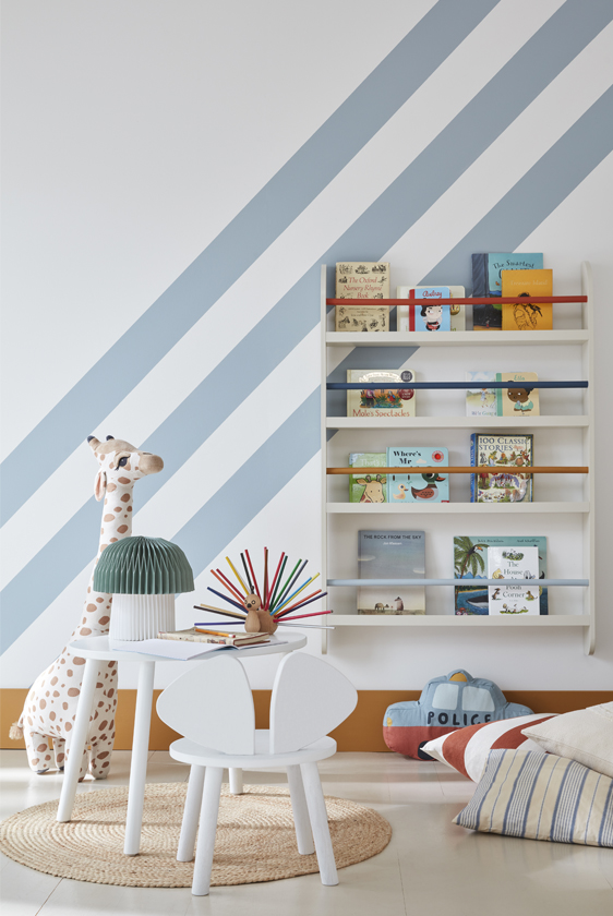
In a bedroom, a timber or upholstered headboard and lighter bedding can give the wall colour a defined role. Curtains and a bedspread need not match the paint exactly. Linen, wool and velvet introduce different textures, and fabric pile may alter the apparent shade with viewing direction. Our bedroom colours guide provides further context for light and combinations.
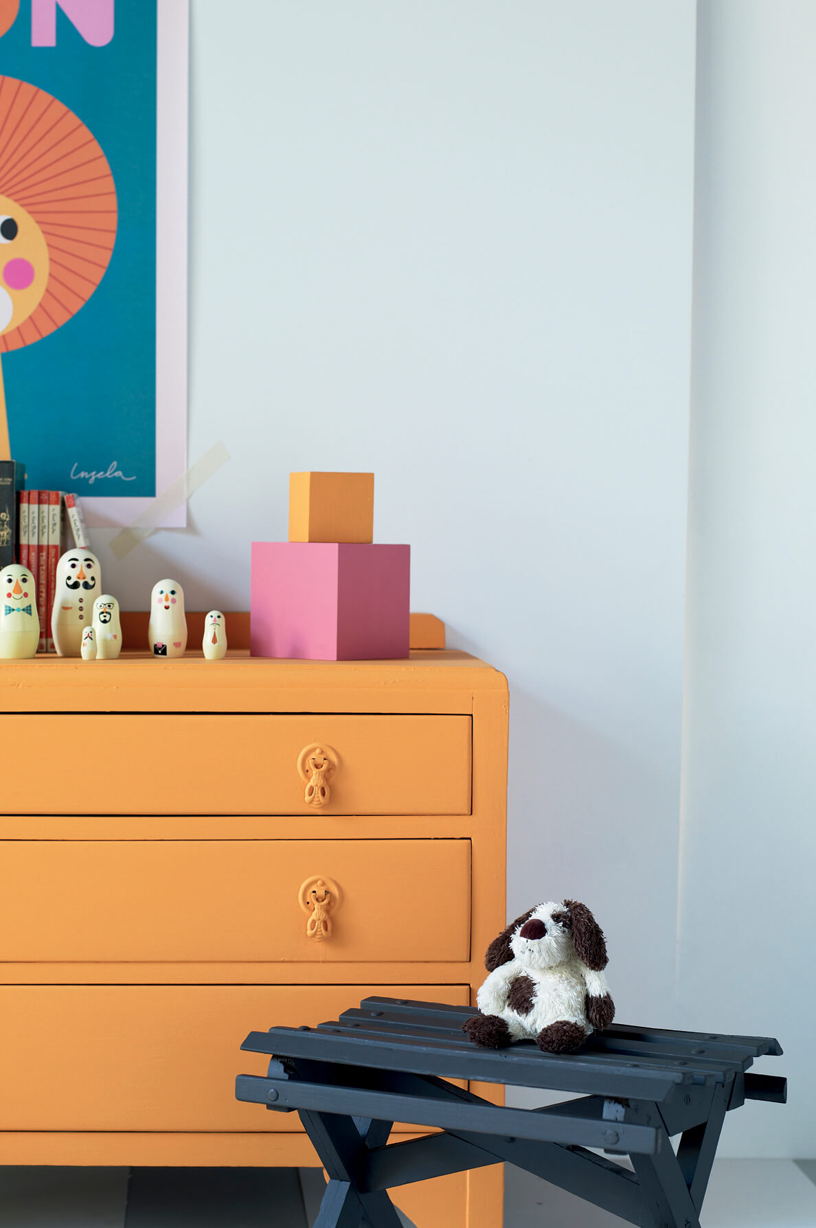
In a living room, a dusty-blue sofa introduces a coloured volume at a lower level. If the colour belongs on the wall instead, warm neutral or cognac upholstery can provide a counterpoint. In bathrooms and kitchens, choose lacquer, ceramic or paint for the surface’s practical requirements as well as its appearance. Veined stone or a discreet metal detail can add variety without repeating the blue on every element.
Within the wider blue family, compare pale grey-blue with deeper or greener directions using physical samples, not just their names. Turquoise and Tiffany-inspired palettes have a different visual emphasis and are not interchangeable specifications. Our published guide to decorating with petrol green explores deeper blue-greens. The useful comparison is between depth, undertone and material, not a ranking of colours.
Frequently asked questions about dusty blue
Why is it called carta da zucchero?
The Italian name comes from the dark-blue paper historically used to wrap sugar, as recorded by Treccani. In today’s interiors it is applied to several muted blues rather than one exact shade.
Is dusty blue warm or cool?
It belongs to the blue family and often reads as cool, but its grey component and particular undertone vary. Judge the chosen sample beside the actual whites, flooring and textiles.
Can it work in a north-facing room?
Yes. There is no automatic warmer version for that orientation. Compare samples under the room’s actual daylight and evening lamps; timber and warm textiles are possible partners, not a substitute for testing.
Which colours go with dusty blue?
Warm white, light or dark timber, taupe and muted pink offer useful relationships. Mustard, cognac, terracotta and brass can introduce warmer accents. Their proportions and precise shades determine the result.
Can dusty blue be used in a small room?
Yes, in pale or deeper versions depending on the intended atmosphere. The measured LRV can help compare surfaces, but does not guarantee brightness. Assess available light, contrasts and the furniture as well as floor area.
Opening photograph: Little Greene, Archi & Interiors archive.