Use Tiffany-inspired turquoise in interiors through balanced accents, wall samples and material combinations, without treating the brand colour as a paint code.
Tiffany-inspired colour in interiors is a light blue-green reference rather than a universal paint formula. To use it well, distinguish the official brand colour from commercially named shades, then assess saturation, light and the material carrying the colour.
Tiffany-inspired interiors usually bring to mind a clear, relatively bright blue with a green component. Its recognisable character calls for a considered role in the room. Across large areas, especially alongside ornate details, it can feel overly decorative; on a piece of furniture, a ceramic surface or a lacquered finish, with timber, plaster and metal around it, it can read as a crisp contemporary accent. The official colour of Tiffany & Co. and paints sold under the name Tiffany are not necessarily the same shade.
The starting point is the same as for any distinctive colour: physical samples, a check of the undertone, and an assessment of the light and the surface on which the colour will appear.
Tiffany Blue: the origins of a brand colour
The story begins in 1845, when Charles Lewis Tiffany chose the colour for the cover of the Blue Book, the New York jewellery house’s catalogue. The company connects that choice with the popularity of turquoise in nineteenth-century jewellery. The shade became part of its identity, was registered as a colour trademark in 1998 and was standardised with Pantone in 2001 as a custom colour, 1837 Blue, named after the year the company was founded.
It is an example of a proprietary colour that has also entered everyday visual language. In interiors, Tiffany often describes a family of light blue-greens inspired by that reference, not a reproducible paint recipe. The photographs here illustrate related turquoise and blue-green palettes in realised projects; none is presented as a verified application of official 1837 Blue.
Tiffany, turquoise and aquamarine: what is the difference?
Tiffany, turquoise and aquamarine describe neighbouring areas of blue-green, but they do not form a universal scale from light to dark. Paint and textile names can overlap. Compare hue, lightness and intensity on actual samples rather than assuming that turquoise is always greener or darker, or aquamarine always paler. Official Tiffany Blue is a custom brand colour called 1837 Blue, not the generic code for a wall paint.
Specify a colour using the manufacturer’s reference or a notation such as NCS, which describes perceived blackness, chromaticness and hue, not quantities of pigments. If the chosen product has an LRV, or Light Reflectance Value, consult that figure as well. The name Tiffany alone cannot tell you its LRV. Light reflectance describes the particular surface and does not replace a sample test in the room.
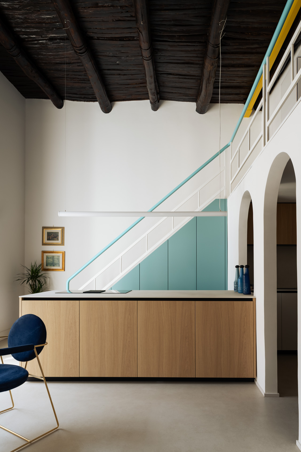
In Casa Iolascon, designed by LabiaDesign in Naples, blue-green is carried by the staircase and kitchen cabinetry. The oak island, timber ceiling and pale walls give it a clear framework. It does not need to be repeated on every accessory to remain recognisable.
Tiffany-inspired colour and materials: ceramic, lacquer and fabric
Material changes the way colour is perceived. Turquoise and blue-green ceramic glazes have a long decorative history; their depth, shine and variations offer a different effect from a flat coat of wall paint. A band of glazed tiles in a kitchen or bathroom can introduce the colour through a purposeful surface, not a collection of unrelated objects. The texture and sheen of the chosen glaze matter as much as its colour name.
A glossy lacquer can emphasise reflections, while a matt finish may look softer, but neither guarantees a fixed change in saturation. The same is true of fabric: linen, cotton and velvet carry colour differently because of their weave, surface and pile. Compare the actual material, including the direction of a velvet pile, in the intended light.
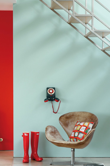
Timber offers a contrast of both colour and texture. Light, golden wood can make a blue-green composition feel fresh; a darker timber such as walnut can give it a stronger graphic outline. The particular wood sample remains important. One well-proportioned surface, such as a lacquered cabinet, sideboard or headboard, is often enough to establish the palette.
Colour combinations: warm counterpoints and neutrals
Reddish-orange shades such as coral, peach and terracotta can act as lively counterpoints to blue-green. The exact complementary relationship depends on the hue and colour system, so choose the pair together rather than relying on the names alone. Small accents can create contrast without turning the whole room into a bright two-colour scheme.
Warm neutrals such as milky white, sand and pale timber offer a gentler setting. A medium grey can produce a more graphic composition, while midnight blue brings a deeper related colour into the palette. Satin-finished brass adds warmth through a small, reflective detail. None of these pairings is automatic: undertones, quantity and finish decide the result.
| Pairing | Possible effect | What to check |
|---|---|---|
| Warm white | A light, softer composition | The undertone of the white surfaces |
| Medium grey | A graphic contrast | The balance of warm and cool elements |
| Timber | A contrast of colour and texture | The tone of the grain and finish |
| Satin-finished brass | A warm accent | The amount of metal and its reflections |
| Coral or terracotta | A strong warm counterpoint | The hue, saturation and relative area of each colour |
Using Tiffany-inspired colour in the bathroom and kitchen
Bathrooms and kitchens are useful places to explore this palette because glazed surfaces already have a practical role there. In a bathroom, a lacquered vanity or a band of ceramic wall covering introduces colour within a clear boundary. Check the product’s suitability for humidity and its cleaning requirements: colour alone says nothing about technical performance.
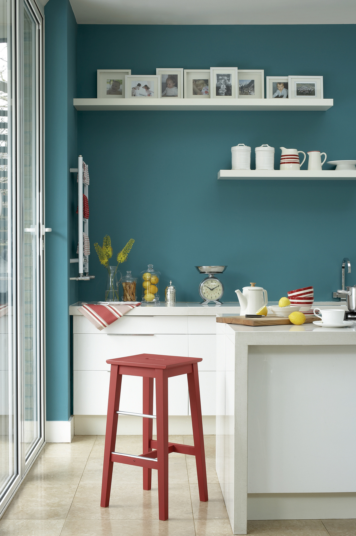
In a kitchen, a run of base units, an island or a glazed splashback can give blue-green a defined role. It need not extend to every wall cabinet. Compare samples of the fronts with the worktop and splashback; veined marble, grey engineered stone and timber create very different surroundings for the same colour. Our guide to choosing a kitchen colour explores this relationship between colour, volumes and permanent materials.
Bedroom and living room: start with one element
In a bedroom, the colour can appear in bedding, a headboard or a limited area of wall. Its appearance is not determined by north or south orientation alone. Observe a large sample at different times of day and under the intended lamps, taking glazing, shadows and reflected colours into account. Simple forms and a considered mix of materials can keep the result clear rather than overly themed.
In a living room, a velvet chair or a rug containing a Tiffany-inspired blue-green can become a focal point. Limit repetition if the room already contains strong patterns. It is useful to place the shade within the wider family of interior blues instead of treating it as an isolated signature. For a deeper blue-green direction, explore deep teal and timber combinations; for a restrained background, our guide to taupe walls and undertones offers a complementary approach.
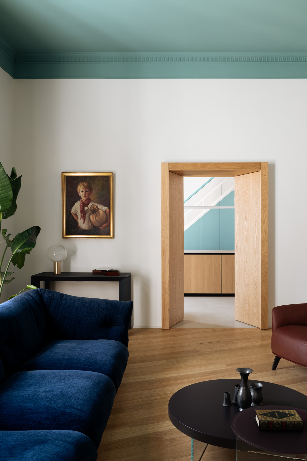
In the Casa Iolascon living room, aqua moves onto the ceiling and reappears in the kitchen seen through the doorway. The transition between rooms becomes part of the colour combination: assess ceilings, door frames, floors and seating together, not only a paint sample against a white wall. The deeper blue sofa provides a counterpoint rather than a copy of aqua; timber connects the two spaces.
Mistakes to avoid with Tiffany-inspired interiors
The first mistake is choosing paint from a screen image or confusing a commercial colour name with the official brand shade. Photographs are useful references for composition and material, not reliable paint matches. The second is scattering numerous small turquoise objects across the room, which can fragment the palette rather than give it a clear focus.
The third is neglecting light and finish. A blue-green can look different in daylight, beneath lamps and on differently textured surfaces. Give it a precise role: one surface, one material or one part of the room. Leave enough visual space around it for the colour and its neighbouring materials to be understood together.
Frequently asked questions about Tiffany-inspired colour
What colour is Tiffany Blue?
It is a distinctive blue-green used by Tiffany & Co. for the Blue Book in 1845 and later standardised with Pantone as the custom colour 1837 Blue. In interiors, Tiffany is also used more loosely for related light blue-green shades.
Is there a universal code for Tiffany wall paint?
No. The official brand colour and commercially named paints are not interchangeable. Specify the selected paint through its manufacturer’s reference or an appropriate colour notation, and confirm it with a physical sample.
What colours go with a Tiffany-inspired blue-green?
Warm whites, pale timber, medium grey and midnight blue can provide a considered setting. Coral, peach or terracotta can add a warm counterpoint, with a small amount of brass for reflective warmth. Test the actual shades together.
How does Tiffany differ from turquoise?
The names overlap in everyday interiors language. There is no universal rule that turquoise must be darker or greener, or aquamarine lighter. Compare real samples, and distinguish the official 1837 Blue brand reference from commercial paint names.
Which rooms suit Tiffany-inspired colour?
Bathrooms and kitchens offer opportunities through ceramic surfaces and cabinetry. Living rooms and bedrooms can use it on a selected piece of furniture, textile or wall area. The right choice depends on the room’s materials, lighting and proportions, not on the colour name alone.
Cover image: Casa Iolascon, Naples. Design by LabiaDesign. Photograph © Carlo Oriente, Archi & Interiors archive.