What colour is sand? Compare it with beige, ivory and taupe, and discover three palettes for walls, wood and natural stone.
Sand is a warm, typically light neutral in the beige family. Its undertones can be golden, pink or subtly grey, much like sand itself as it shifts from dry to wet. For this guide we’ve chosen #D8C8AA (RGB 216, 200, 170), a digital reference with a golden undertone. In a room, sand makes a soft backdrop for oak and linen. Pair it with a cooler stone and its warmth becomes more apparent.
How do sand, beige, ivory and taupe differ?
| Shade | Illustrative HEX | How it reads |
|---|---|---|
| Sand | #D8C8AA | Warm, with a golden undertone |
| Beige | #C9B79F | Richer and slightly browner in this sample |
| Ivory | #F3EDE0 | Lighter, close to a warm white |
| Taupe | #B0A195 | More muted, with a grey undertone |
Beige describes a broad family of colours. Sand usually sits at its lighter, warmer end. Names can vary between paint charts, even when the samples look similar. When choosing paint, start with the materials that will stay in the room. An ivory skirting board makes the depth of sand easier to see, while a taupe fabric brings out its golden undertone.
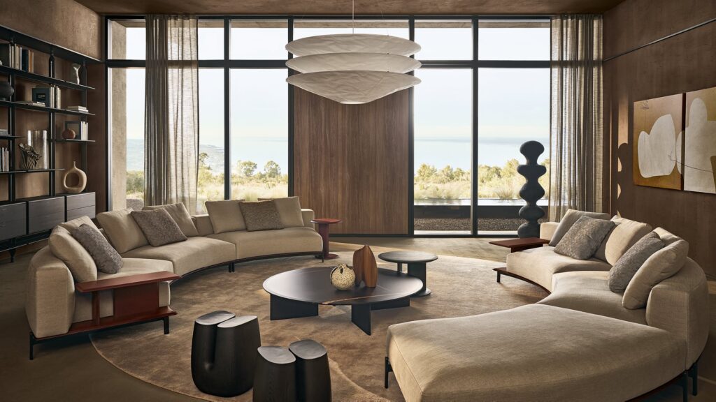
Light and dark sand, from linen to wet sand
A light sand such as #E7DAC4 works well on bedroom walls, leaving room for patterned textiles. Mid-tone sand #D8C8AA holds its own against pale doors. A deeper sand such as #B9A385 can bring out the back of a bookcase or the shape of a lacquered sideboard. These three digital references give an idea of the overall effect.
The RAL Classic range includes RAL 1002 Sand yellow. If that is the shade you want, check a physical RAL swatch. For paint sold as “sand”, use the manufacturer’s sample in your chosen finish. HEX describes the colour on a screen.
What colours go with sand?
Sand, ivory and natural oak
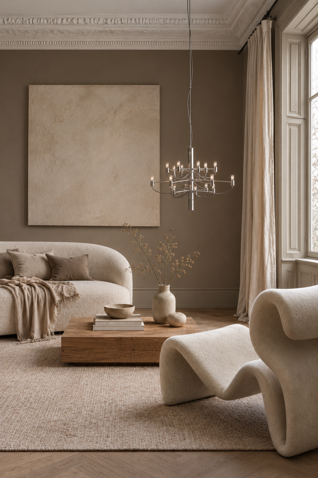
In the living room, use sand on the walls, ivory for textiles and oak for flooring or furniture. The difference in lightness between the walls and curtains gives each surface definition, even in a pale room. If the parquet has a strong golden cast, try a slightly greyed sand. Hold the sample against the skirting board to see whether the wall colour and the wood together read too yellow.
Sand, terracotta and walnut
Let sand take up the largest surface and bring in terracotta through a lamp, an armchair or a small tiled area. A walnut table or sideboard gives the palette depth. If you already have a terracotta floor, choose a less golden sand for the walls and echo the terracotta in one detail. The floor already brings plenty of warmth.
Sand, indigo and travertine
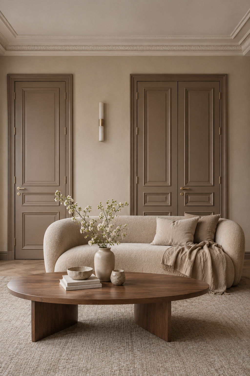
Travertine can form the top of a coffee table or line an alcove. Sand walls pick up the base colour of the stone, while indigo draws the eye to a velvet chair or headboard. Hold your paint sample against the lightest part of the slab so its veining still stands out. Explore more pairings in our guide to indigo (in Italian).
How to use sand on walls, furniture and finishes
Sand walls in the living room and bedroom
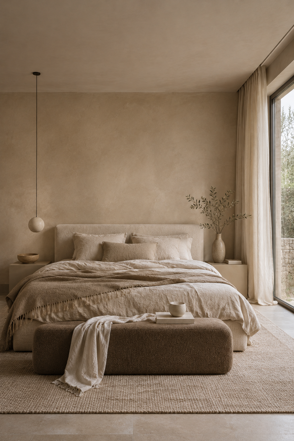
On a matt wall, sand makes a quiet backdrop for art, textiles and wood. In a bedroom, try a slightly deeper tone behind the headboard and see how it reads against the bed linen. In a living room with dark flooring, sample a mid-tone sand before reaching for the palest paint. The contrast with the floor may already make the walls appear lighter. Paint two generous samples and look at them in daylight and with the lamps on.
Sand-coloured kitchens with matt cabinetry and stone
If you’re choosing sand-coloured cabinet fronts, keep the lacquer sample to hand when selecting the worktop. Cream will carry the palette through, while grey-veined stone introduces a cooler note. View the samples in the positions they’ll occupy, with the cabinet front upright and the worktop flat. They catch the light at different angles and can look quite different from the way they did on the showroom counter.
Sand-coloured bathrooms, from tile to grout
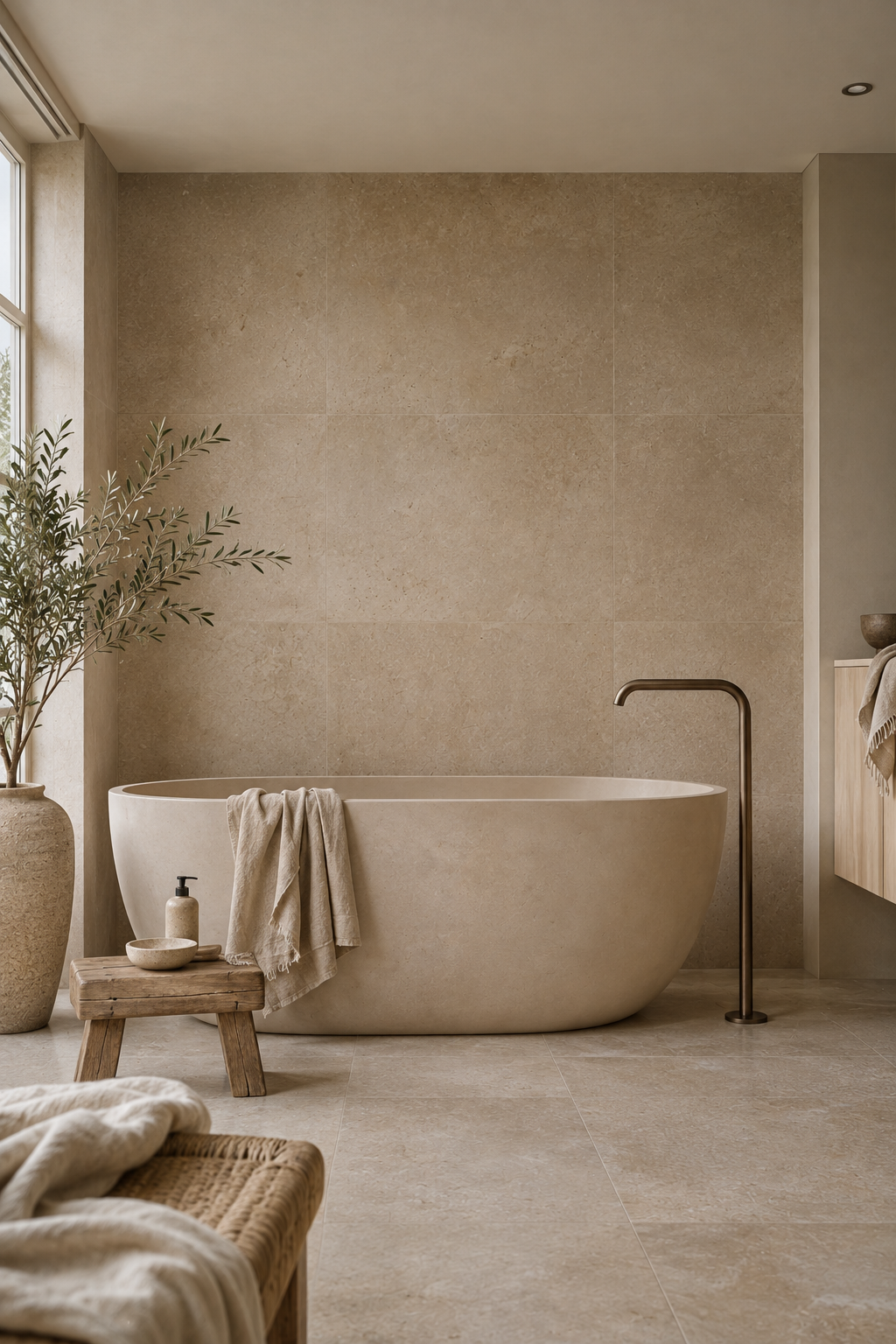
Sand-toned tiles can vary considerably from piece to piece. Ask to see several laid together and test the grout alongside them. A grout close to the base colour creates a more continuous surface. A lighter grout picks out the tile format. At the basin, the white ceramic gives you a useful reference for seeing whether the tile leans yellow or pink.
Frequently asked questions about sand colour
Is sand a warm or cool colour?
Usually warm. Shades with more grey look more muted and may sit better alongside grey stone or steel.
What white goes with sand?
Ivory blends gently with a golden sand. A crisper white gives mouldings and skirting boards more definition. Look at where the colours meet under the lighting you use in the evening.
How do you mix sand colour?
For a small test, start with a warm white and add a little ochre. A touch of brown can deepen the mix. Let the sample dry before judging it. If you’re painting a whole room, have the shade mixed using the manufacturer’s tinting system.
This guide is part of our interior colour dictionary. For a paler neutral, see our guide to ivory. Both guides are in Italian.