Thirty home colours explained through their names, undertones and material combinations. A complete dictionary with paint-sample advice, Pantone references and FAQs.
From ivory to forest green, thirty home-colour entries explained: what their names mean, where to explore them and how to choose a real finish. A practical map of shades, colour trends and the guides in our archive.
Many home colours retain the history of an object, place or plant. Italian carta da zucchero, or sugar-paper blue, takes its name from the dark blue paper once used to wrap sugar. Tortora evokes dove plumage; the Treccani dictionary describes a pale brown mixed with a slightly pinkish grey. Magenta was named after the town in Lombardy and became fashionable after the battle there in 1859.
These names are evocative but not precise product specifications. Sage or sand can describe different shades in different manufacturers’ collections. Light, finish and neighbouring surfaces also change how a chosen colour appears. This home colour dictionary defines the broad families, suggests useful applications and connects them with more detailed guides where an English edition is available.
The entries are grouped by colour family. HEX values are illustrative screen references for palette planning, not matches to commercial paints. RAL and NCS, in contrast, are standardised reference systems: the same code is not redefined by each brand. A product’s commercial name, physical reproduction and finish must still be checked against the actual reference and sample.
How to choose colours for a home
Begin with light and surface, then consider the name. Three useful tools are Light Reflectance Value, observation of the room’s lighting and a generous physical sample. None replaces the others, and none tells you that a particular colour will automatically suit a room.
LRV expresses the light reflectance of a specified surface, usually on a scale from 0 to 100. A higher value describes a more reflective surface; a lower one a less reflective surface. It does not independently predict room brightness, which also depends on available light, geometry and the other finishes. LRV can inform visual contrast between adjoining surfaces, such as a door and wall, but a general decorating palette is not an accessibility specification.
Orientation is only one influence on daylight. Glazing, obstructions, time, weather and reflected colours can alter the result. Our guide to natural light at home develops that relationship. Try a substantial sample, for example on an A3-size panel, in the intended finish. View it in several positions during the day and under the evening lamps.
For ways to organise coloured surfaces, explore colour drenching and colour capping; limewash offers a different material approach. Our guides to interior paint brands and wallpaper brands focus on the product and surface choices. Seasonal directions are considered in wall colours for 2026.
Whites and pale neutrals
Pale neutrals can form a relatively reflective background that lets materials and furniture remain prominent. Their undertones distinguish one from another. They do not automatically make a room larger or brighter, and the measured LRV belongs to the particular surface rather than its generic name.
Ivory
A warm off-white with a creamy yellow direction, illustrated by #F3EDE0, named after the material. It can soften a traditional interior or a room where a cooler white feels too sharp. It is not immune to greyish light or surrounding colours: compare the sample with the ceiling and flooring. Our ivory colour guide explores its variations.
Warm white
A white with a subtle yellow, red or creamy undertone; #F5F1E8 is an illustrative reference. It can provide a gentler contrast than a cooler white beside timber or textured fabric. Choose it alongside doors and skirting rather than as a default ceiling colour. Warm white is a broad family, not a precise equivalent of any Pantone or paint shade.
Ecru
From the French word for raw or unbleached: the colour of undyed thread or cloth, between grey and beige, illustrated by #E6DCC8. It is especially useful in linen, cotton and bouclé. Its textile origin also makes it a natural direction to explore on walls beside visibly textured materials.
Pearl grey
A very pale grey, illustrated by #D9D7D2, which may have a faint pinkish or bluish direction depending on the sample. It can create a restrained setting or relate to bathroom stone. Beside warm timber, compare several undertones rather than assuming the warmest grey is always necessary. Similar pale neutrals appear in our bathroom colour guide.
Sand
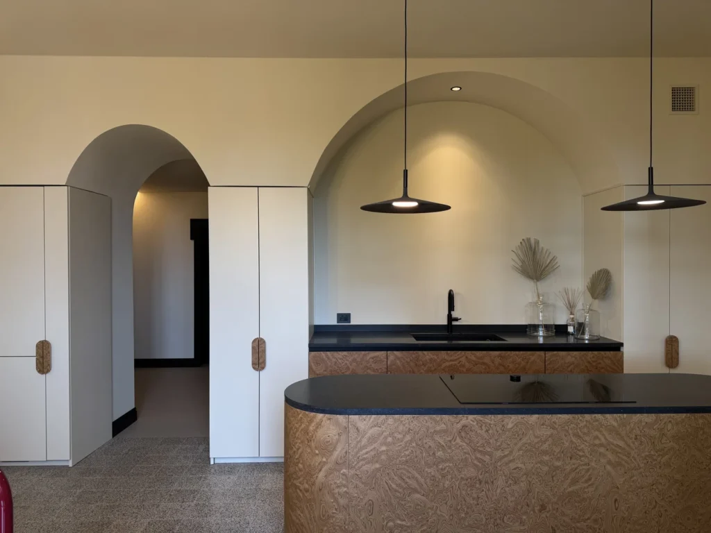
A light golden beige, illustrated by #D8C8AA, recalling dry sand. It can introduce visual warmth without the strength of an ochre or terracotta. Compare it with linen, oak and the cream variations of travertine. The combination is characteristic of a modern Mediterranean material palette, but the particular stone and wood decide the final relationship.
Beige, taupe and browns
Warm neutrals and browns connect readily with the visual language of timber, earth and fabric. They offer an alternative to cooler greys, not proof that grey interiors are obsolete. Choose the depth and undertone to suit the permanent materials and the intended atmosphere.
Chocolate
A deep brown, illustrated by #4A3328, which can create an intimate background on a wall, velvet upholstery or lacquered furniture. Cream, dusty pink and brass offer possible counterpoints. Balance the darker surface with the actual light and adjoining colours rather than restricting brown to very large rooms. It is one of the families explored in autumnal interior palettes.
Greige
A blend of the words grey and beige, illustrated by #BEB5A7. Its grey-brown balance may seem different under different light sources or beside neighbouring materials. It is useful in warm-minimalist interiors and when flooring and furniture have different colour temperatures. It does not automatically reconcile them: compare the samples together before treating it as a universal background.
Mocha Mousse
The softly warm coffee-and-cocoa brown selected by Pantone for 2025, with the reference 17-1230. Cream, pink and olive greens are possible companions on textiles, upholstery and painted surfaces. Our guide to furnishing with Mocha Mousse explores the furniture interpretation. A related brown is not automatically an exact match to the Pantone reference.
Taupe
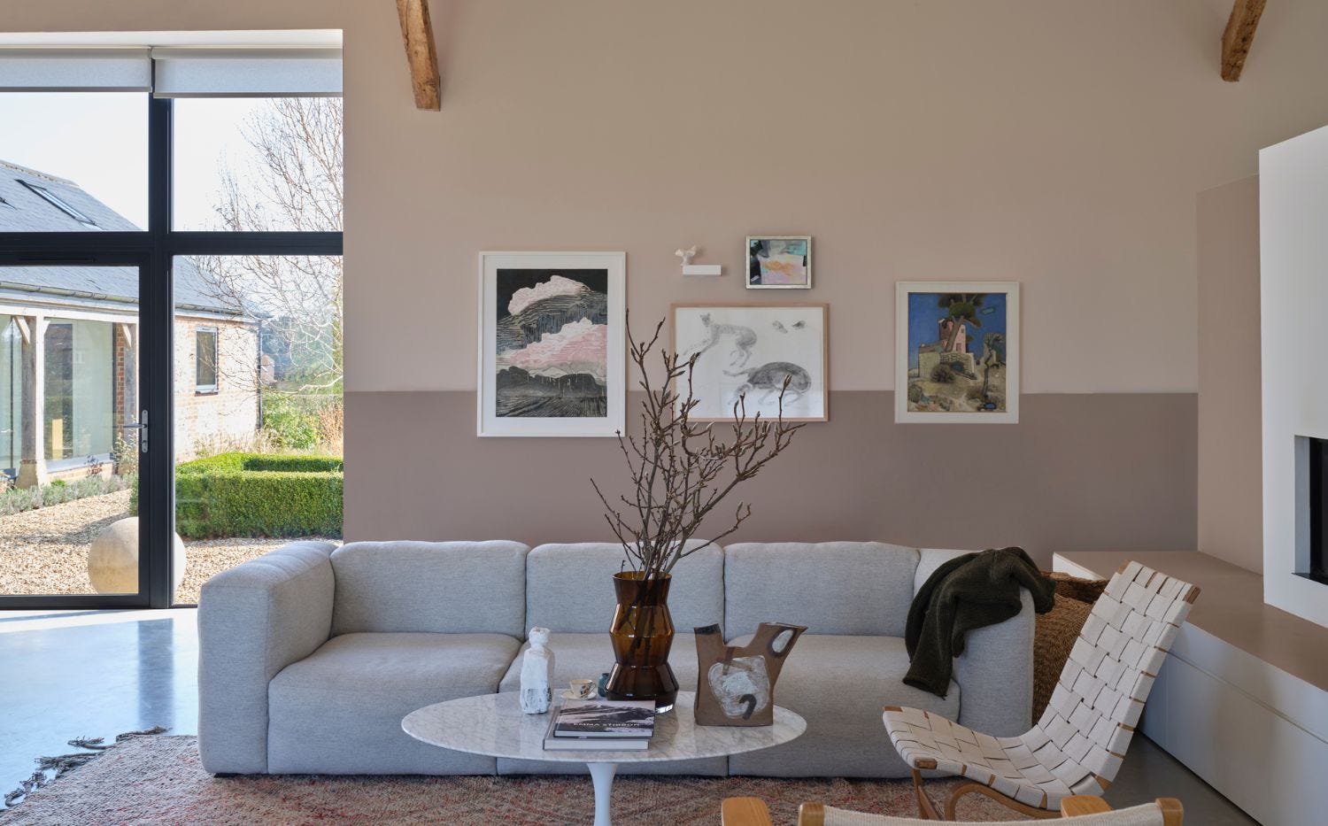
A broad grey-brown family associated in Italian with the dove, tortora. Treccani’s definition combines pale brown with a slightly pinkish grey; #B0A195 is only an illustrative example. It can relate to light or dark timber, provided its undertone is tested. See our guide to taupe and dove-grey interiors.
Earth colours, yellows and ochres
These names evoke mineral pigments, soil and fired clay. A matt, textured surface can emphasise that association, although the commercial paint may use a different formulation and the palette need not exclude glazed or glossy finishes. The material expression is a design choice, not an inherent property of the colour name.
Butter yellow
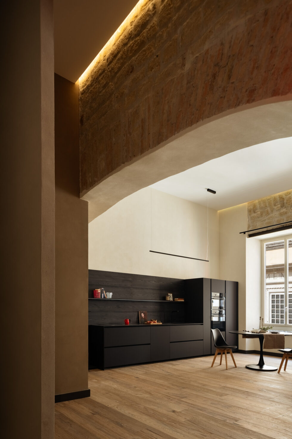
A pale, creamy yellow, illustrated by #F2E3B3, distinct from a sharp lemon yellow. It can introduce warmth in a kitchen or soften a light neutral scheme. Try it beside both the intended white and the worktop so that the yellow does not become an accidental cast. It belongs to the broad family of pastel colours.
Ochre
A brownish yellow associated with earth pigments; #C8913A illustrates one direction. In interiors it offers a warm accent beside timber and black, including palettes inspired by the 1950s and 1960s. Our mid-century modern guide discusses that context. Ochre can range from restrained and earthy to considerably brighter, so test the selected shade rather than relying on the name.
Rust
A brown-orange evoking oxidised metal, illustrated by #A0522D. It often suggests a deeper direction than a light terracotta, although the commercial families overlap. Explore it in velvet, wool or a selected wall in a bedroom or living room, with deeper blues and greens as counterpoints. Texture changes its character as much as the proportion used.
Mustard
A dark, sometimes slightly greenish yellow, illustrated by #C9A227, with a more muted character than a bright primary yellow. A chair, cushion or curtain can give it a clear role beside blue, grey or dark timber. Larger surfaces are possible when deliberately balanced. Our mustard colour guide examines its combinations.
Terracotta
The reddish-orange reference of fired clay, illustrated by #C0704D. Sage green, lime-like whites and timber can build a Mediterranean material dialogue around it. Paler versions offer a softer route in a bedroom; stronger ones make a clearer accent. Actual terracotta tiles vary with clay, firing and finish, so a generic screen colour is not a tile match.
Reds, pinks and purples
These families can change the focus of a room through a relatively small coloured area. Muted versions may be easier to integrate into a restrained scheme, but brighter versions are not inherently uninhabitable. Saturation, relative area and the materials around the colour decide how assertive it feels.
Burgundy
A dark wine red, illustrated by #6D1F2B, associated with the French wine region. On walls or velvet it can create a theatrical, enveloping character in a study, dining room or bedroom. Compare it with cream, timber and smaller metal details. Our guide to bedroom colours puts deeper shades in the context of light and material.
Powder pink
A pale, whitish pink, illustrated by #EFD9D3, sometimes close enough to an off-white to function as a quiet background. Light timber, warm grey and brass are possible companions. On a large surface, test how much pink remains visible in daylight and under the lamps; a small swatch can understate the effect across a whole wall.
Lilac
A light purple inspired by the flower, illustrated by #C8A8D0. It can read as soft in a bedroom or bathroom and more graphic beside olive green or anthracite. The selected purple undertone and saturation matter: not every paint called lilac has the same temperature. Our guide to lilac interiors explores the range.
Magenta
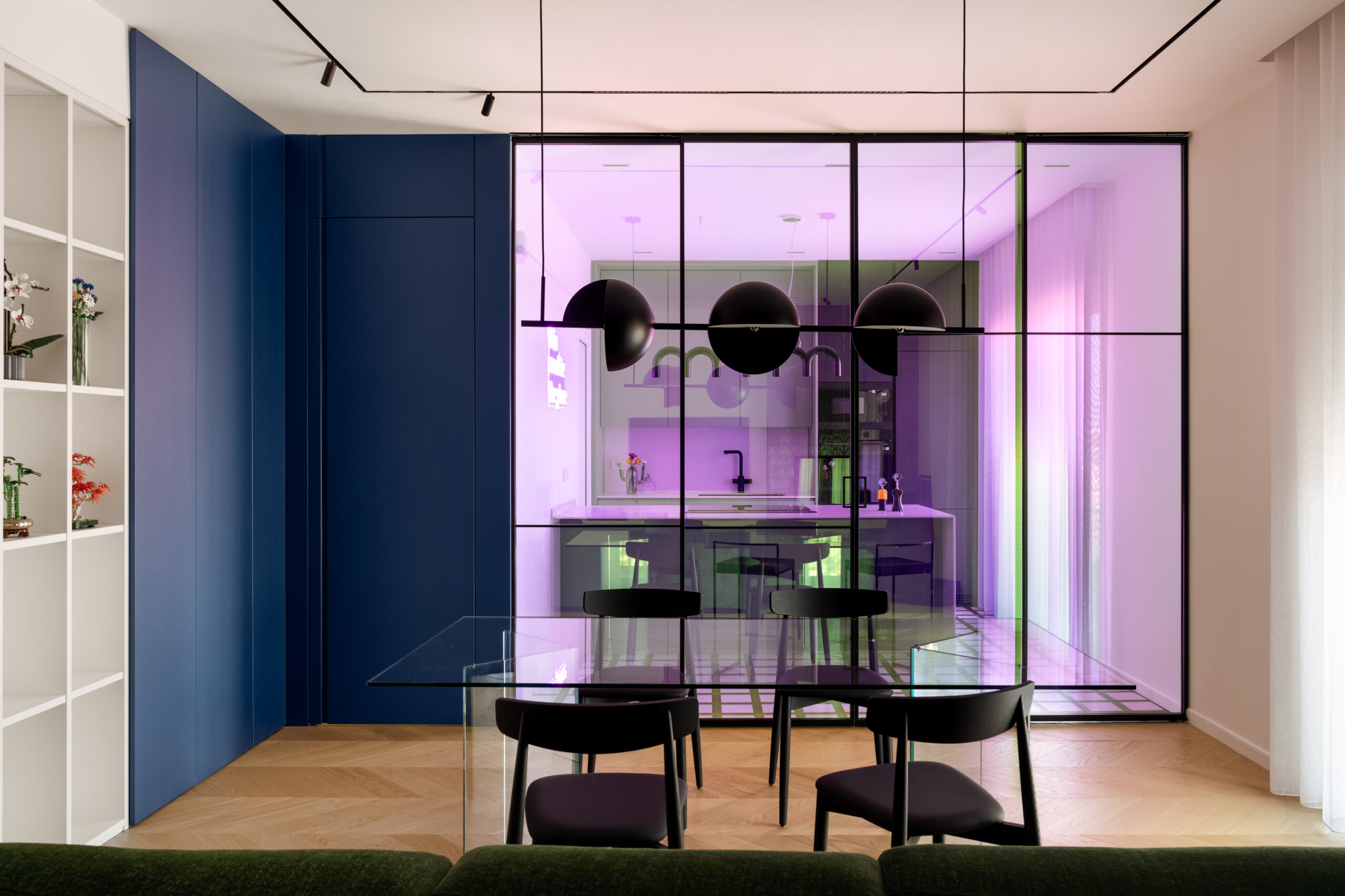
An intense reddish purple, one of the primary inks in subtractive colour printing alongside cyan and yellow. Its name comes from the Lombardy town and became established after the battle of 1859, as recorded by Treccani. In a home it can provide a strong accent. Explore its background in our history of magenta.
Peach
A soft pinkish orange recalling the fruit’s skin, illustrated by #F2C1A5. It can add warmth beside muted greens and blues, including in a room where a cooler neutral feels too sharp. Pantone selected one particular interpretation, Peach Fuzz 13-1023, for 2024. Generic peach paint and that named reference should not be assumed identical.
Antique pink
A muted pink with grey and brown notes, illustrated by #C9A09A. Compared with the example powder pink it is deeper and less pale, but commercial names overlap. Walnut, sage and brass offer a considered material palette for bedrooms or living rooms. Our antique pink guide develops the possible relationships.
Red
A strong colour signal, illustrated here by #B3261E. It is a primary in some colour models, not a universal primary in every system. A selected red object against a neutral setting is the premise of the unexpected red theory. For a more immersive approach, explore how Verner Panton used colour as space.
Greens
Green offers a broad nature-related palette, from greyed leaves to deep woodland shades. Muted greens can act as restrained backgrounds, while stronger shades can create a more distinctive surface. Neither adding grey nor choosing a darker version automatically makes a green easier to live with; light and material remain decisive.
Olive
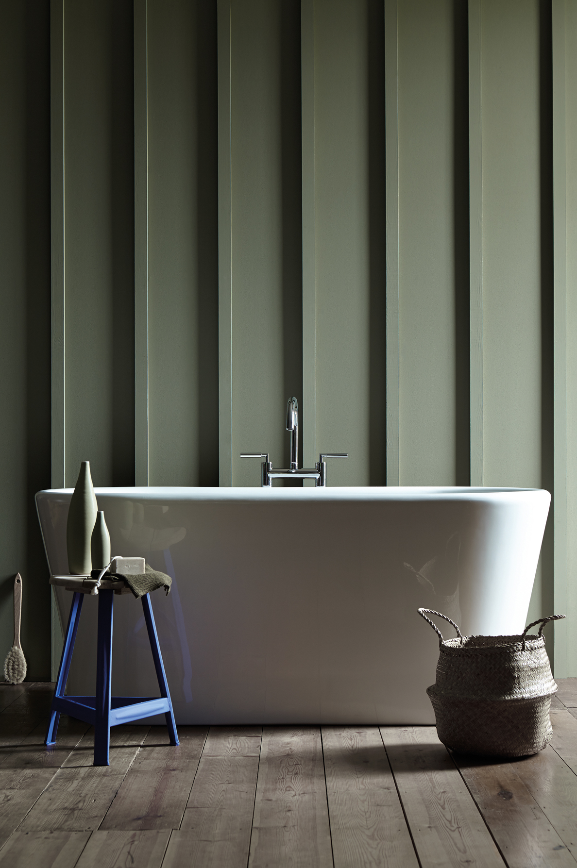
A yellow-leaning green with earthy or brown associations, illustrated by #7A7A45. Terracotta, cream and medium-toned timber are useful partners to test, particularly in a kitchen with a crafted material character. It is an option where warmth is desired, not a mandatory correction for north-facing light. Some olives are quiet and greyed; others are quite saturated.
Teal and petrol green
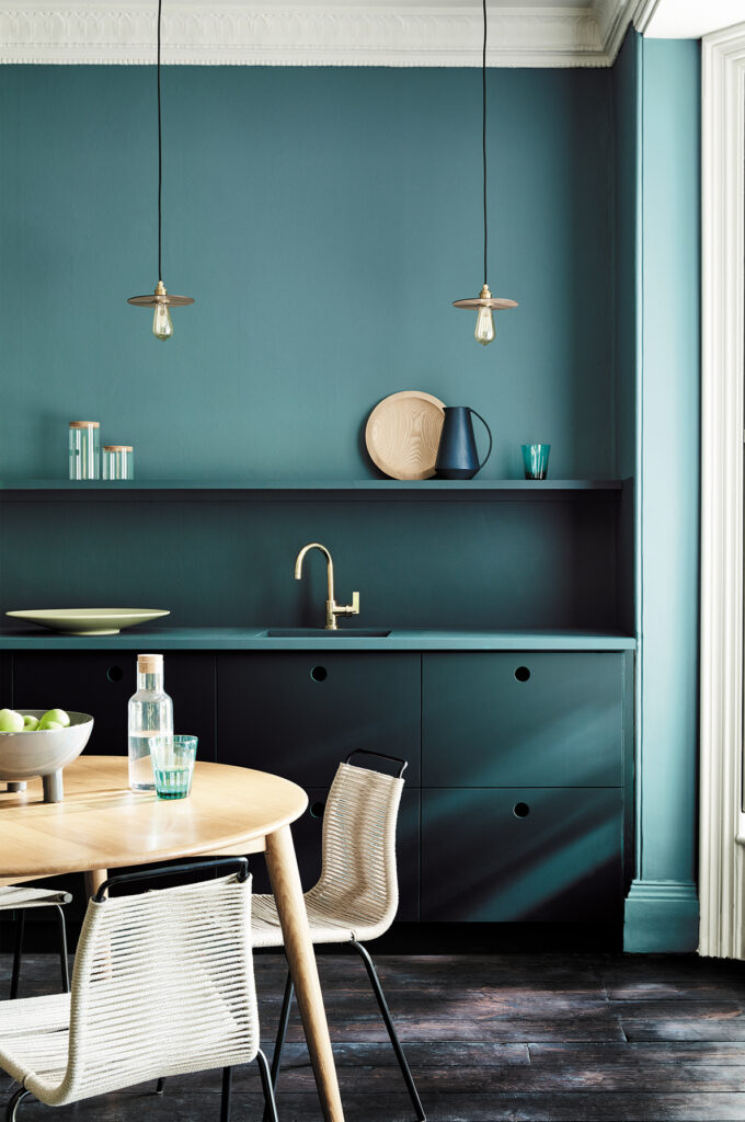
Overlapping names for deeper blue-greens, illustrated by #1F5A5E. Italian ottanio and verde petrolio do not establish a universal rule that one is always bluer and the other greener. Evaluate the actual shade on velvet, paint or lacquer. Our guide to petrol green interiors considers the deeper family.
Sage
A muted grey-green inspired by the leaves of Salvia officinalis, illustrated by #9CAF88. Warm whites, taupe and terracotta are possible companions, while different sages can lean yellow or blue. The colour’s near-neutral character depends on the particular shade and context. Assess it through physical samples, including the intended finish and evening light.
Forest green
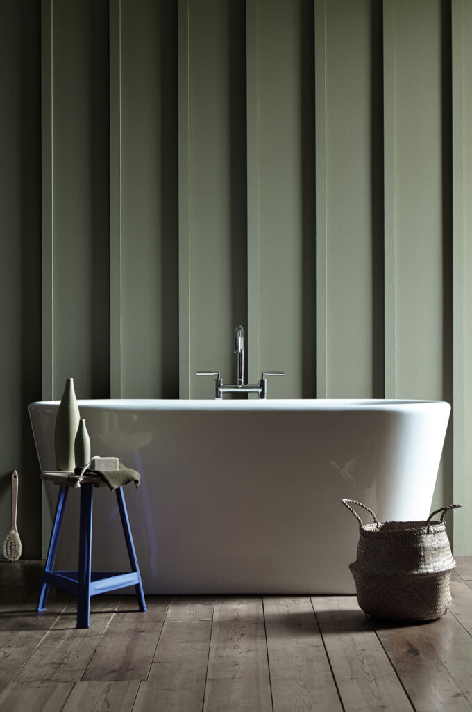
A deep green recalling shaded woodland, illustrated by #2F4A3A. It can give a library, panelled room or bedroom an enveloping background, with brass, walnut and cognac-coloured leather as possible counterpoints. The name does not guarantee a cool undertone or a particular reflectance. Test enough surface area to judge its depth in the room.
Blues and pale blues
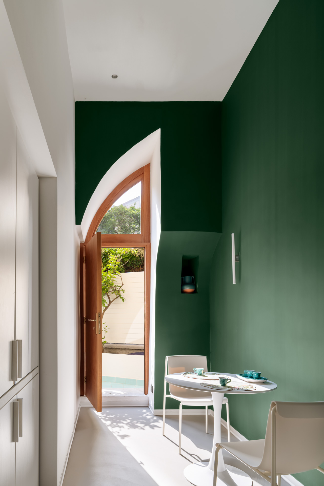
Blue provides a wide family of interior choices, from pale, greyed shades to colours approaching black. It need not be declared the most popular colour to be useful. Think about its position between warmer neutrals and greenish or purplish directions, then compare the selected blue with permanent materials.
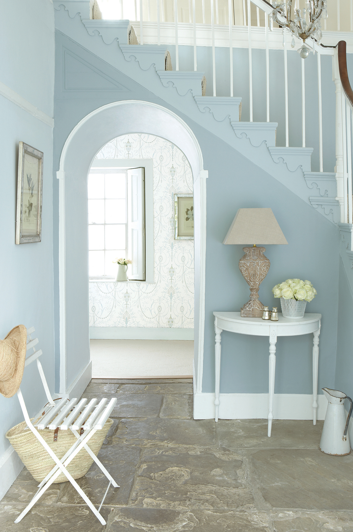
Dusty blue
A pale blue veiled with grey, illustrated by #A9BCC8. Warm whites and pale timber can create a softly contrasting scheme in a bathroom or bedroom. A bright room is one opportunity to explore it, but orientation and room size alone do not determine suitability. The degree of grey and the evening light can noticeably change its character.
Midnight blue
A very dark blue close to black, illustrated by #1F2A44. It can give living-room or bedroom walls depth while allowing lighter textiles, pictures and metal details to stand out. Colour drenching is one possible treatment; a selected wall or joinery surface offers another. Choose the intended contrast and atmosphere before deciding how much blue to use.
Sugar-paper blue
Italian carta da zucchero describes the dark blue of traditional sugar wrapping, documented in Treccani’s sugar entry. In interiors it often means a muted medium-to-deep blue; #4F6F8F illustrates one interpretation. Neutrals, cognac and mustard offer possible combinations. English colour names and commercial paint references do not give an exact universal equivalent.
Dark greys and blacks
Dark greys and blacks can give a pale scheme structure through frames, doors, cabinetry and smaller outlines. Their role is not confined to accents: larger surfaces can also work in a deliberate composition. The particular undertone, sheen and contrast determine whether the result is sharp or softly enveloping.
Anthracite
A very dark grey named after the coal, illustrated by #3A3D40. It is a useful direction for window frames, painted metal and contemporary cabinetry. Assess it beside worktops and flooring, not only beside white. Our guide to choosing a kitchen colour considers how surfaces and volumes work together.
Black
Interior blacks can have warm, brown, blue or other subtle undertones; #1E1D1B illustrates a warm interpretation, not the whole family. A wall, ceiling or frame can give a scheme a clear outline, especially beside pale timber and a tested white. Choose the actual finish and light carefully: matt and glossy black create quite different surfaces.
Pantone Colours of the Year and what they mean for a home
The Pantone Color Institute selects its Colour of the Year as an interpretation of current cultural influences. The programme began in 2000 with Cerulean. It is not a compulsory interior palette or a guarantee of longevity, but it can influence textiles, product collections and design discussion. The recent choices are summarised below.
| Year | Colour and reference | Further reading |
|---|---|---|
| 2023 | Viva Magenta 18-1750 | The history of magenta |
| 2024 | Peach Fuzz 13-1023 | The Peach entry in this dictionary |
| 2025 | Mocha Mousse 17-1230 | Furnishing with Mocha Mousse |
| 2026 | Cloud Dancer 11-4201 | Cloud Dancer and the interior palette |
| 2027 | Not yet announced at this article’s October 2026 review | Editorial predictions, not an official selection |
Cloud Dancer was announced in December 2025 as an airy white. It is a specific colour reference, not a synonym for every warm white paint. To see how a colour direction relates to an actual room, explore our living-room trends guide and the broader guide to furnishing a home. The useful starting point remains the floor, available light and furniture, not a yearly announcement.
Frequently asked questions about home colours
Which home colours are easiest to combine?
Ivory, warm white, sand, greige and taupe are useful starting points for restrained palettes. Muted sage and dusty blue can also act as quiet backgrounds. None is compatible with every timber or stone: compare the particular undertones and materials before assuming the colour is neutral enough to work everywhere.
What is a colour’s LRV?
Light Reflectance Value describes the reflectance of a specified surface on a scale from 0 to 100. Higher and lower values help compare surfaces; they do not guarantee a bright or dark room. Lighting, geometry and the wider material palette also affect the result.
Why does the same colour name vary between brands?
Names such as sage, sand or taupe are not standardised and can describe different interpretations. RAL and NCS references are standardised, although the actual paint, texture and finish still need verification. HEX references describe digital colours, not a universal commercial wall-paint formula.
What is the Pantone Colour of the Year for 2026?
It is Cloud Dancer, reference 11-4201, announced in December 2025 after Mocha Mousse for 2025. Pantone describes an airy white. Use it as a particular design reference rather than assuming that any off-white wall paint is an exact match.
Which colours suit a north-facing room?
There is no universal list. Ivory, sand, butter yellow, peach, light terracotta and olive are warmer directions to test, but cooler shades can also suit the intended atmosphere. Observe large samples under the actual daylight and lamps; neither orientation nor a kelvin value alone predicts every colour’s appearance.