What will Pantone 2027 be? Archi&Interiors explores yellow, cobalt blue, cherry red, earthy pink and olive green through design, interiors and cultural change.
What will Pantone 2027 be? There is no official answer yet, but our forecast points to several color families that deserve close attention: yellow, from butter to warmer amber shades, cobalt blue, cherry and burgundy reds, and dusty, earthy pinks.
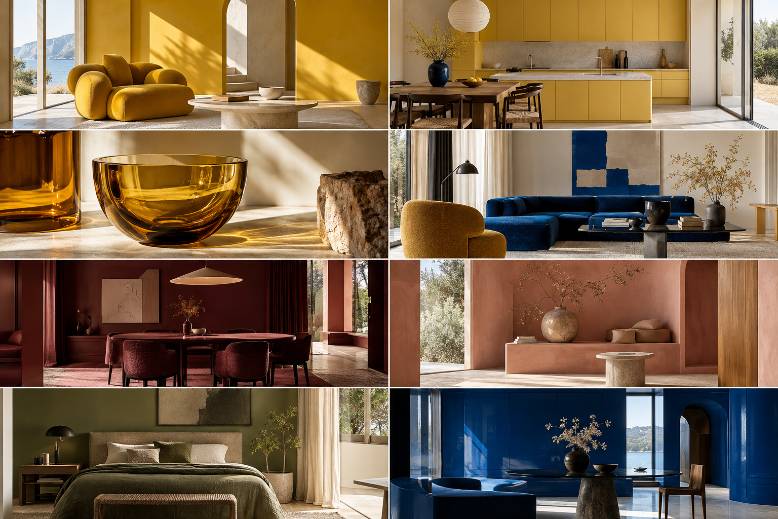
As we have done for the past ten years, Archi&Interiors’ Pantone 2027 forecast looks beyond the surface of trends. Color is certainly an aesthetic matter, but before that it is the result of something changing within our lives.
These changes are often quiet; they begin almost without being noticed. We choose different materials, rediscover shades we had forgotten, seek more intimate or brighter rooms, and save images we might have ignored only a few months earlier. Homes change, but first of all the way we want to feel inside them changes.
These shifts appear small only at first. Observed over time, they reveal a great deal about the direction the world is taking. Design, after all, is one of the most immediate expressions of everyday life. It speaks of taste, certainly, but also of desires, fears, aspirations, and our relationship with time, wellbeing, technology, money and memory. The choices we make for the spaces we inhabit often say more than we imagine.
This is why the Pantone Color of the Year interests us so much. Pantone takes on an ambitious task: trying to describe an entire cultural season through a single color. It does more than nominate a shade destined to become fashionable; it identifies a visual code capable of capturing the mood of the moment, what we are living through and, perhaps even more, what we are beginning to desire.
To understand what the 2027 Color of the Year might be, then, it is not enough to look at a color chart. We need to observe people.
Pantone Color of the Year: when a color tells the story of its time
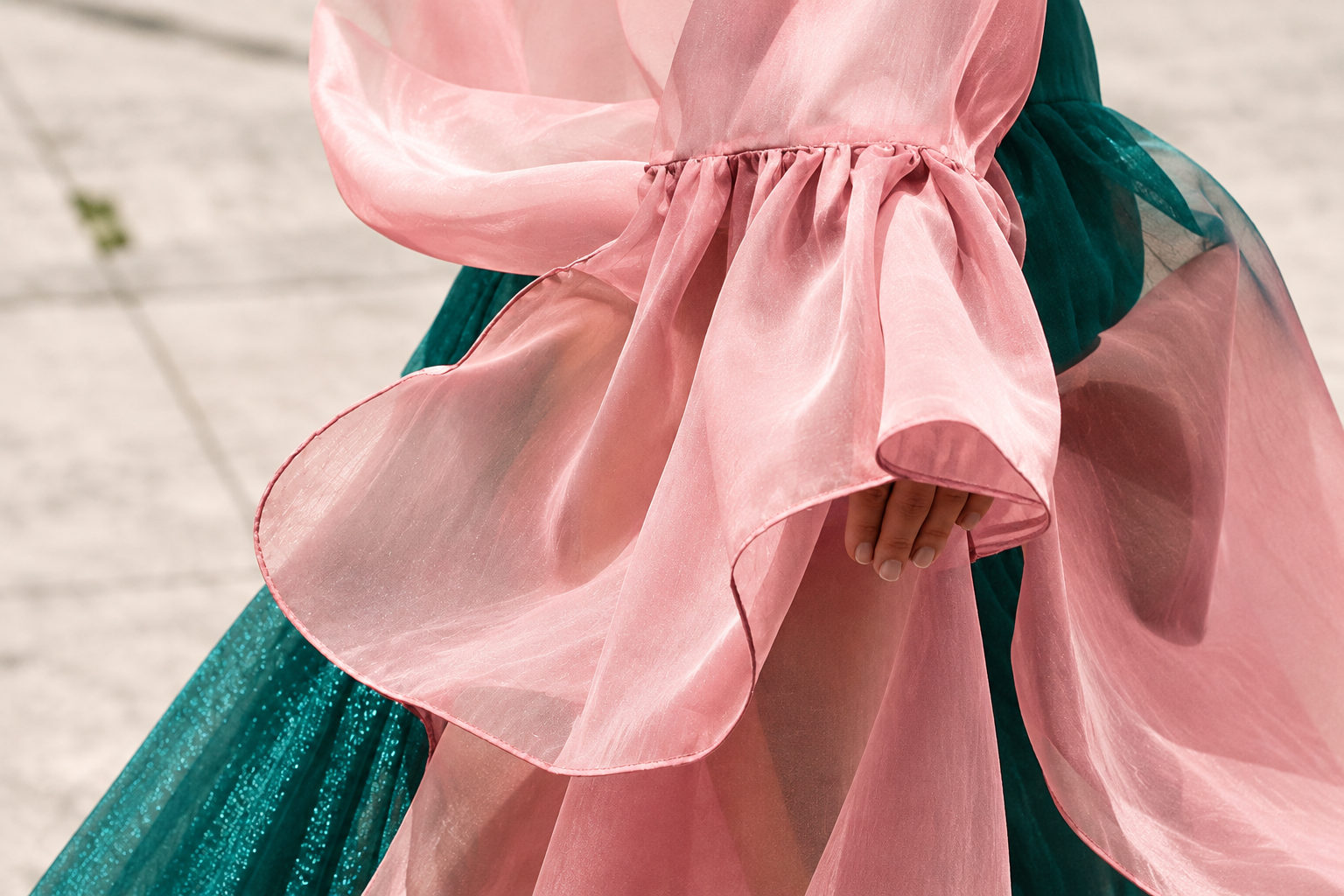
Pantone began as a color-coding system, a shared language used by designers, companies and manufacturers. Through the Pantone Color Institute and the Pantone Color of the Year program, however, color moves beyond its technical dimension and also becomes a way of reading the present.
Since 1999, Pantone has observed fashion, design, art, technology and social change to identify a shade capable of representing the mood of the moment. Over the years, the Pantone Color of the Year has become a kind of visual synthesis of society, influencing collections, interiors, products and communication.
Recent choices describe this evolution well. Viva Magenta 2023 spoke of energy and vitality; Peach Fuzz 2024 of care, closeness and empathy; Mocha Mousse 2025 of comfort, pleasure and domestic warmth. In 2026, with Cloud Dancer 11-4201, Pantone instead chose a gentle white associated with the need for quiet, clarity and space.
Taken together, these colors seem to trace a shift from a search for energy toward wellbeing and lightness. This is also why asking what Pantone 2027 will be means looking beyond a simple color trend: we need to understand which still-quiet changes are beginning to reshape the way we live and inhabit our homes.
Pantone 2027: how we built our forecast
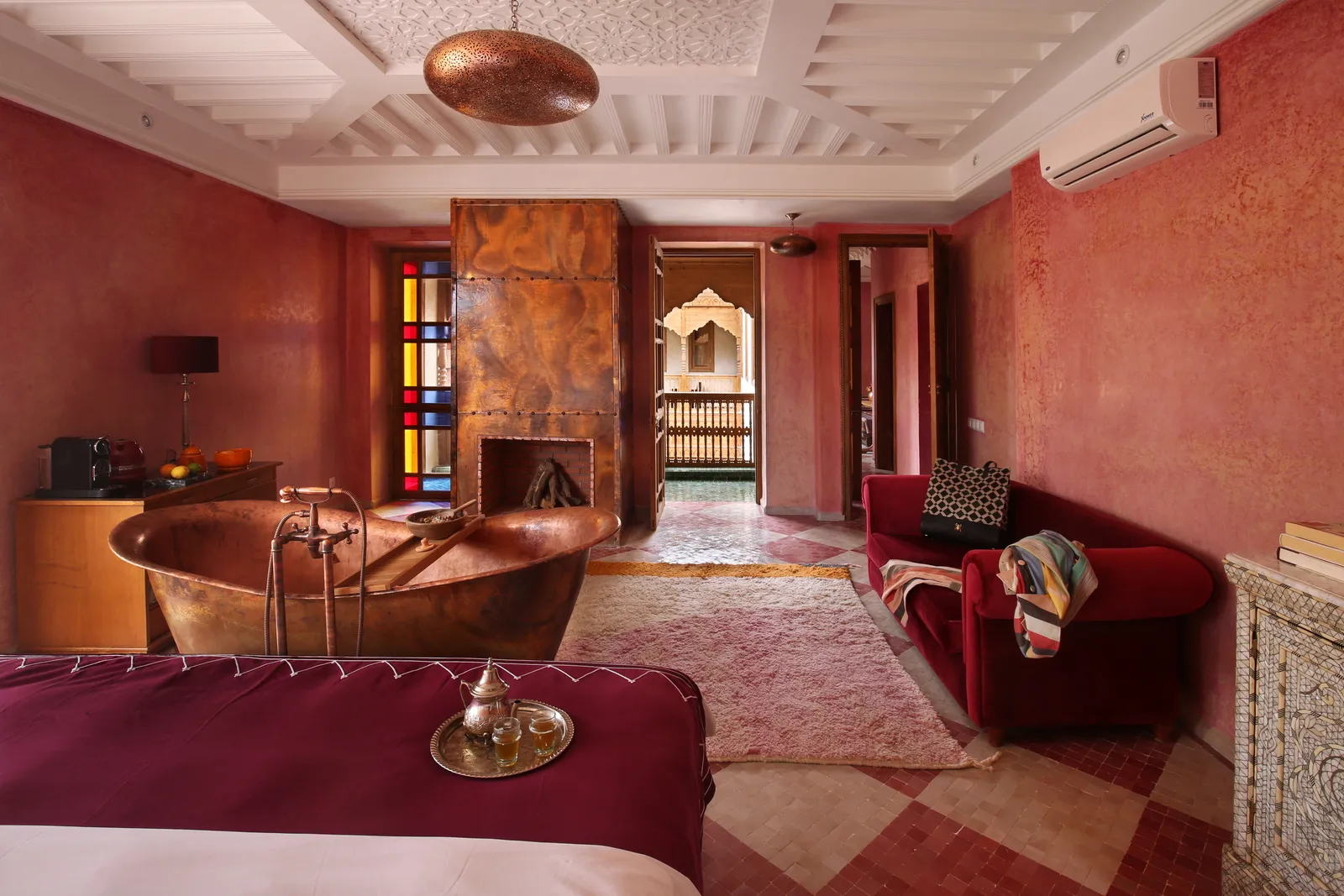
Making a forecast means, first of all, looking beyond a first impression. Yellow caught our attention immediately, but we chose to widen the view and verify which colors kept returning, in which settings and, above all, in which shades.
To develop our Pantone 2027 predictions, we began with the Salone del Mobile.Milano and Milan Design Week 2026, comparing what we saw with furniture catalogues, brand palettes, interiors published in recent months, hospitality, fashion and leading international forecasts. We also considered data on the preferences of designers and consumers, looking beyond the most visible color to find one capable of crossing different worlds and maintaining continuity.
Pinterest played an important role. While Instagram often reflects what has already become visible, Pinterest primarily gathers what people desire: the home they want to renovate, the room they hope to change, the color they would like to try. This makes it a particularly interesting observatory for 2027 color trends.
Finally, we examined individual shades in detail. Speaking only of yellow, blue, red or pink is not enough: undertones, materials, intensity and combinations all matter. Yellow can be butter, honey or saffron; blue can range from cornflower to cobalt; red becomes cherry or burgundy; pink moves closer to dust and clay.
It is from this overlap of signals that the color families worth watching for the 2027 Color of the Year began to emerge.
Color trends 2027: which shades are really emerging
Looking at new collections, recently published projects, catalogues and growing online searches together, no single color has yet managed to dominate the others. Perhaps that is the most interesting fact of this season.
Instead, 2027 appears to be taking shape through color families that are moving away from their clearest and most familiar versions. Pink becomes earthier, red deepens, blue returns with greater intensity, while yellow continues to shift register, moving from very pale tones to warmer, denser ones.
The first choices already announced for the coming year also reveal this variety: WGSN and Coloro are looking to blue, Graham & Brown has selected an earthy pink, and Behr an olive green. Rather than a single direction, there seems to be greater freedom in the way color is used and, above all, a search for more complex shades.
Yellow remains one of the most interesting signals
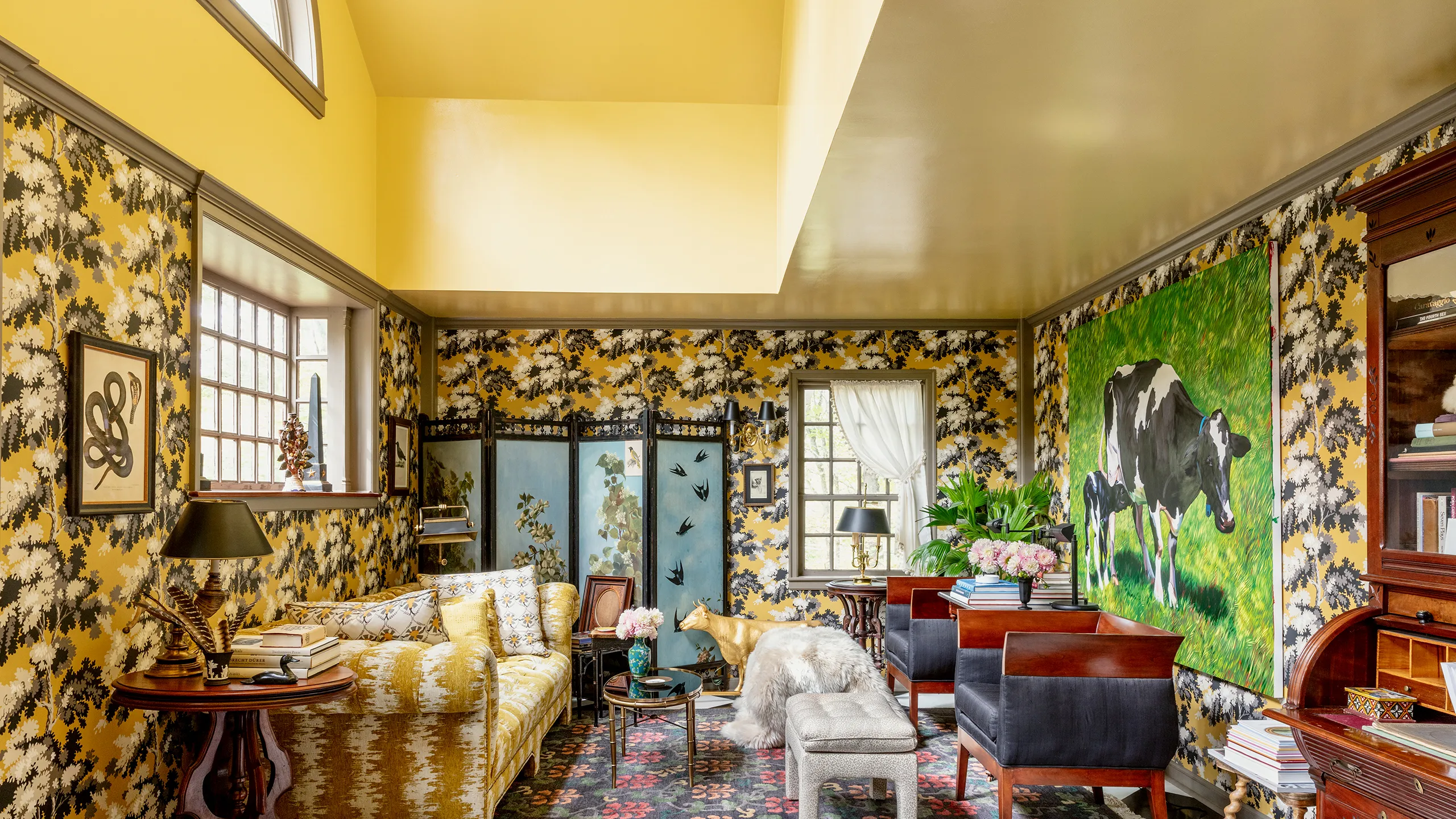
This is probably the color family we have watched most closely.
Butter yellow remains highly visible, and it would be premature to consider the trend over. In interiors, it works because of its soft, almost milky quality, which allows it to sit easily beside natural woods, steel, pale textiles and darker colors. It is an easy yellow to live with, very different from the bright, almost graphic version that for years was largely confined to decorative accents.
At Salone del Mobile 2026, however, yellow also appeared in bolder versions. Cassina, B&B Italia, Fendi Casa, Nilufar: canary, egg-yolk and more saturated yellows appeared often enough to become one of the week’s most recognizable color signals.
It is this movement that interests us. On one side, the delicacy of butter remains; on the other, fuller yellows appear, sometimes approaching honey, saffron and ochre. In certain materials, they come close to gold without becoming metallic.
Think of the surface of plaster warmed by sunlight, the amber glass of a lamp, or certain honey-colored stones. These shades belong to the same family, yet they create very different atmospheres.
For now, it would therefore be forced to speak of a single evolution of yellow. It seems more accurate to observe its persistence and see which shade achieves greater continuity over the coming months.
Blue: a more intense, less decorative presence
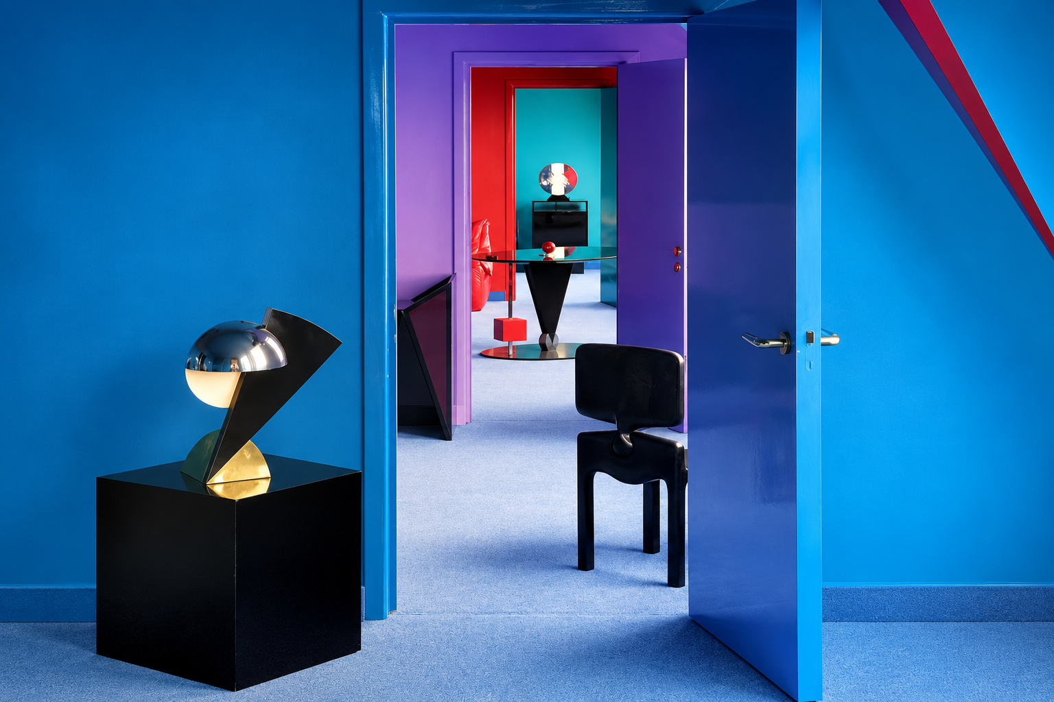
Blue is the other color family to watch closely. WGSN and Coloro have already named Luminous Blue their Colour of the Year 2027, choosing a shade close to cobalt and lapis lazuli. It is compelling because it brings together two very different worlds: the ancient imagery of mineral pigments and the contemporary language of technology.
In interiors, this dual nature works particularly well. Cobalt can be deeply decorative on ceramics, almost architectural on a lacquered kitchen, luminous in glass, and more austere on fabric.
Compared with the desaturated pale blues of recent years, the blue now returning has a stronger presence. It seems designed to do more than lighten a room; it helps shape its character. Cornflower blue is also continuing to grow in designers’ preferences, showing that interest in this color family extends beyond forecasting reports.
If Pantone 2027 were to tell the story of the relationship between the physical and digital worlds, blue would be a very credible choice.
Red moves toward cherry
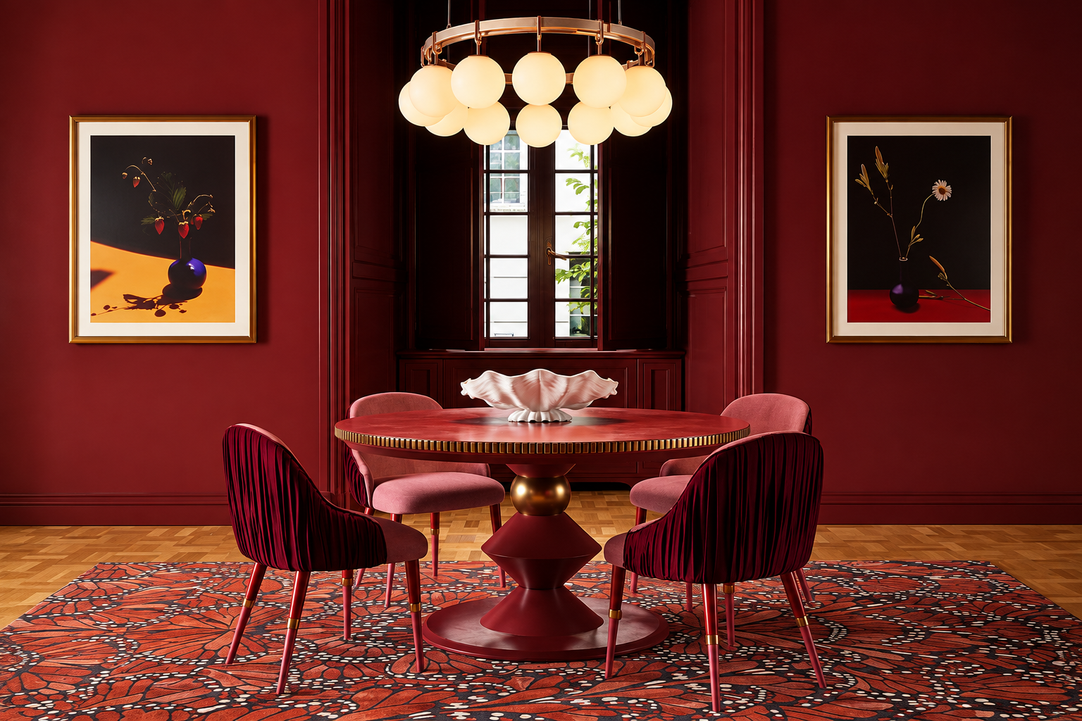
Red continues to appear, but its most interesting versions have grown darker. Cherry, burgundy, wine and oxblood all contain a brown or violet note that makes them deeper and much easier to use in interiors.
Burgundy, for example, rose significantly in the preferences recorded by 1stDibs, while Pinterest included Plum Noir among its emerging colors, a shade combining burgundy and brown.
It is easy to understand why this family is working so well now. Dark woods are returning, as are burl, gloss lacquers, smoked glass and colored stone. Cherry relates naturally to these materials and introduces a strong color without making a room excessively theatrical.
On velvet it becomes almost profound; on lacquer it gains a brighter quality; with walnut it can feel surprisingly natural. As a possible Pantone 2027, it remains a less immediate candidate, partly because of its relative proximity to Viva Magenta 2023. As an interior design trend, however, it is a shade we will certainly continue to see.
Pink loses sweetness and gains substance
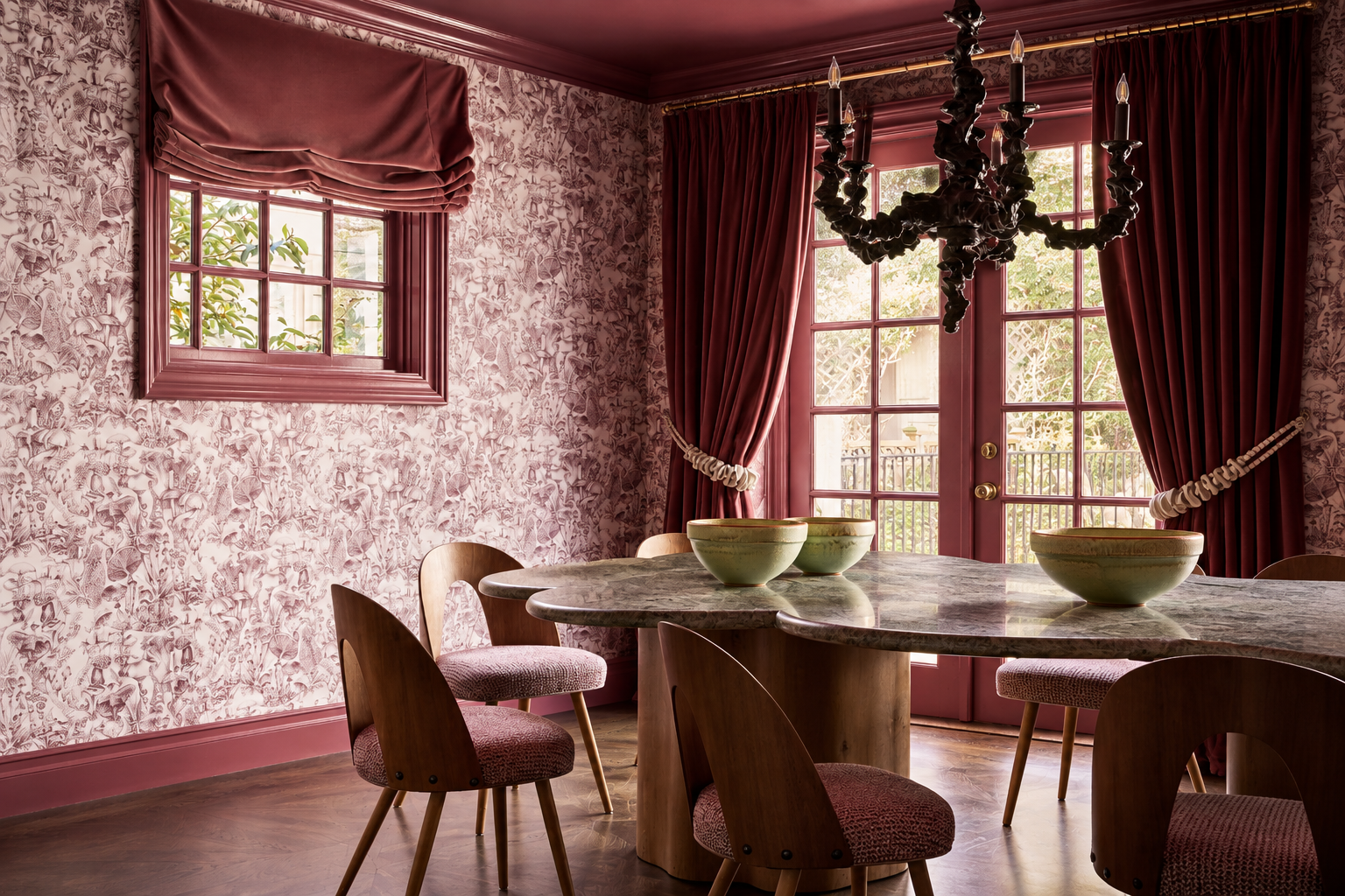
Pink is changing too. The versions that now seem most interesting are less sugary than those of previous years. They contain beige, brown, lime and, at times, almost a trace of terracotta.
Rose Earth, selected by Graham & Brown for 2027, moves precisely in this direction. It is a warm pink with an earthy component, capable of working almost as a neutral.
In interiors, this quality makes it far more versatile than its name might suggest. On matte plaster it can recall an old limewashed wall; beside dark wood it becomes more sophisticated; next to glass or steel it loses any overly romantic connotation.
The pink of 2027 therefore seems less interested in declaring itself as a color and more inclined to build an atmosphere.
Green remains a steady presence
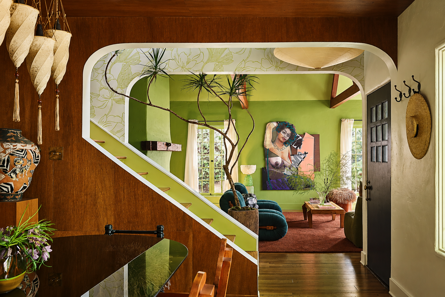
Finally, green has not ceased to matter. Behr selected Grounded as its Color of the Year 2027, a warm olive with brown undertones that confirms how strongly our connection with nature continues to influence choices for the home.
Sage, moss and olive have now become established parts of the contemporary interior vocabulary. For this very reason, we currently see them more as a consolidated presence than as a disruptive signal.
They nevertheless remain an important part of the 2027 color trends, especially when used in earthier, less cool versions.
A palette that remains open
The more we observe these color families, the less interested we become in reducing them to a ranking.
What keeps returning is something else: the most current shades almost always feel less clearly defined than those of the past.
Yellow can be butter, honey or ochre. Red slips toward wine. Pink approaches the earth. Green incorporates brown. Blue recovers the depth of pigments.
It is a less immediate palette, one that depends far more on materials, light and combinations.
And that is probably why it feels so contemporary.
We are no longer choosing only a color, but how we want to feel
One idea runs through almost all the trends considered so far, and it concerns the color itself less than the way we imagine a room. When we look for inspiration for a home, we rarely begin with a precise shade. More often, we have a feeling in mind: we want a warmer kitchen, a more intimate living room, a brighter bedroom, an elegant space that does not feel formal. Color comes later, together with materials, light and the objects we choose to keep.
This is probably why the most interesting palettes of 2027 appear so flexible. Butter yellow can belong to a very delicate interior, while the same color family, shifted toward honey or ochre, changes character completely. Cherry can make a room more intimate without necessarily dominating it. An earthy pink can replace beige while remaining just as easy to use, and a few points of cobalt can bring depth even to a very neutral room.
Color thus returns as part of a wider project in which everything around it matters. Wood, glass, stone, metal, fabric; matte or glossy surfaces; natural or artificial light. This relationship determines the final effect far more than a shade considered in isolation.
The 2027 furniture and interior trends also seem to be moving in this direction: fewer rooms built around a perfectly coordinated palette, more layering and greater freedom.
What the colors of 2027 reveal about how we are living
This is where color forecasting becomes most interesting to us. Homes absorb social change with surprising precision, even before that change becomes obvious. They do so slowly, through choices that can seem insignificant when taken one by one.
In recent years, we have primarily sought protection. Forms have softened, colors have quietened, and natural materials and everything with a tactile quality have returned. This was more than a matter of taste: after several very complex years, the home took on an even more important emotional role.
That need does not seem to have disappeared, but something else is being added to it.
There is less desire for uniformity. We are more interested in what carries a personal trace, in what does not look as though it was chosen simply because it belongs to a recognizable style. An inherited piece of furniture can live with a contemporary one, a color-wrapped wall with a restrained interior, handmade ceramics with a technological kitchen.
The same is true of colors.
Perfectly neutral shades still appeal to us, but they are no longer the only possible answer to the search for wellbeing. We are allowing a more emotional dimension back into the home without necessarily giving up the sense of calm we have gained in recent years.
It is a subtle balance.
We are experiencing rapid technological acceleration while almost instinctively returning to everything that feels physical, imperfect and recognizably human. Artificial intelligence can create flawless images in seconds; in interiors, however, value is increasingly attached to a stone with an unrepeatable vein, the uneven color of a limewashed wall, worked glass, and wood that changes over time.
It is not difficult to understand why shades, too, are becoming less absolute.
A pink containing earth feels more credible than a perfect pink. Red becomes more interesting as it darkens toward wine. Yellow changes completely when it loses brightness and meets amber. Blue recovers the ancient character of pigment precisely as it adapts perfectly to our digital imagination.
Perhaps the colors of 2027 are simply following what we already ask of objects: to offer more than one interpretation.
Pantone 2027: the Archi&Interiors forecast
After observing these directions, we still do not feel the need to name a precise shade.
It would be premature and, above all, would not reflect what we are seeing. If we were to narrow the field of our Pantone 2027 predictions today, yellow is the family on which we would continue to focus most closely.
The interesting point, however, does not concern one specific shade. Yellow appears at the same time in soft, almost creamy versions and in more intense ones. Butter yellow remains present; alongside it are canary, honey, saffron, ochre and colors that, especially when they meet glass, textiles or tactile surfaces, can acquire an almost golden quality.
We do not yet know which of these shades will have the strength to last. And that is as it should be. Blue remains a very serious possibility, supported by important international signals and an evident return of deeper tones. Cherry continues to convince us primarily in interior design, while earthy pinks appear to have found a maturity that will endure. Green also maintains a steady presence, now almost structural in the contemporary home.
The Pantone Color of the Year, however, is not selected simply by counting how often a color appears.
The shade chosen to represent 2027 will have to condense something that reaches beyond the taste of the moment. This is where we keep returning to yellow. Perhaps because, after years in which we asked interiors above all for quiet, comfort and protection, a different desire is beginning to emerge. It is not necessarily a desire for more colorful homes in an absolute sense, but for rooms capable of returning energy without losing softness.
Yellow holds both possibilities. It can be discreet as butter, familiar as honey, bright as sunlight, deep as saffron. It can almost disappear into the light or become the point around which a room is built.
For now, our forecast stops here.
With yellow, rather than a single shade. Ten years of observation have taught us that the most interesting changes are often the ones that are barely perceptible at first. A color begins to appear, shifts slightly, enters different settings. Then, at a certain point, we realize it had been in front of us for months.
Pantone 2027 has not yet been announced. But its story has probably already begun.
Pantone 2027: the questions readers are asking
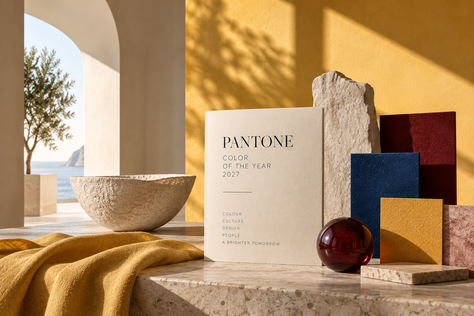
What will Pantone 2027 be?
Pantone has not yet announced the Color of the Year 2027. In the Archi&Interiors forecast, the yellow family is currently one of the most interesting directions, from butter yellow to sunnier, honeyed, amber and ochre shades. Blue, however, remains a strong candidate.
When will the Pantone Color of the Year 2027 be announced?
Pantone has not yet announced an official date. In recent years, the Color of the Year has been presented toward the end of the year, generally in December.
What will the 2027 color trends be?
The first 2027 color trends show a varied landscape: butter and warmer yellows, cobalt and cornflower blues, cherry and burgundy reds, dusty and earthy pinks, olive greens and deep browns. Rather than one dominant palette, greater freedom with color is emerging.
Which colors will be trending in interiors in 2027?
In 2027 interiors, color will be increasingly connected to materiality. Yellows, deep blues, cherry, earthy pinks, greens and browns meet wood, stone, colored glass, velvet, lacquer and plaster, creating rooms that feel less uniform and more personal.
Will butter yellow still be on trend in 2027?
Butter yellow remains highly visible, and there is currently no reason to consider the trend over. In 2027, it may coexist with brighter or warmer yellows, from honey and saffron to ochre and amber tones.
This analysis will evolve over the coming months as the 2027 color trends develop and, of course, when the official Pantone Color of the Year is announced.