From Japan in 1980 to its Italian stores: MUJI’s history, name meaning, no-brand philosophy, designers and iconic products.
MUJI is one of contemporary design’s most unusual cases: a globally recognisable company whose identity grew from the idea of keeping the brand itself out of sight. Ordered shelves, pared-back packaging, neutral colours and everyday objects appear to speak a simple language. Behind that visual calm is a precise project connecting manufacturing, communication and the culture of living.
| A few curious facts about MUJI |
|---|
| MUJI began in Japan in 1980 with 40 products: 9 household goods and 31 food items. |
| The full name Mujirushi Ryohin means “no-brand quality goods”. |
| The first directly managed store opened in Tokyo’s Aoyama district in 1983. |
| Ryohin Keikaku Co., Ltd. has operated the business since 1990. |
| MUJI has more than 1,400 stores worldwide and now works across hospitality, housing, food and spatial design. |
| There are five MUJI stores in Italy: three in Milan, one in Turin and one in Bologna. |
What MUJI is and what the name means
MUJI is short for Mujirushi Ryohin (無印良品), an expression the company translates as “no-brand quality goods”. The name does not promise complete anonymity. It rejects decoration, logos and status as the main reasons for buying an object.
Recognition comes from consistency instead. Materials, proportions, typography, labels and displays follow a shared system. This is MUJI’s paradox: the refusal to project a loud identity has produced one of retail’s most recognisable identities. The company’s What Is MUJI? page describes its simple products as “empty vessels”, forms that leave room for different people and ways of living.
How MUJI began: from 1980s Japan to a global business
MUJI’s history starts in 1980 inside Seiyu, a Japanese retail chain. It was created as a private label by a team of professionals rather than by a single designer-founder. The first collection contained 40 essentials: nine household goods and 31 food products. Its purpose was to provide dependable goods at reasonable prices by removing processes and packaging that added no real quality.
The context mattered. Japan was experiencing expanding consumption, a growing number of brands and increasingly abundant production. MUJI chose another direction: fewer decorative variations, more efficient processes and materials allowed to look like themselves. In 1983, MUJI Aoyama opened as the first directly managed store, occupying only 103 square metres.
Ryohin Keikaku’s official history records the following milestones. International production and procurement began in 1986; Ryohin Keikaku Co., Ltd. was established in 1989; and Seiyu transferred the MUJI business to it in 1990. The first UK store opened with Liberty in 1991, while MUJI Italia was established in 2004.
Who shaped MUJI’s identity
Asking who founded MUJI often produces an answer that is too simple. Seiyu created the label; Ryohin Keikaku has operated and developed it since 1990; its design culture grew through a collective effort. Graphic designer Ikko Tanaka was MUJI’s first art director and established a restrained visual language that gave simplicity authority.
Kenya Hara assumed the art direction in 2002 and interpreted MUJI through the idea of emptiness. Here emptiness is not formal poverty, but space left for the user’s experience. In the official MUJI and Creators account, Hara uses the legged mattress as an example: it may become a bed, a sofa or a raised platform because its form does not dictate a single domestic scene.
An Advisory Board also helps maintain this continuity by discussing products, stores, advertising and cultural direction. The company lists Kazuko Koike, Kenya Hara, Naoto Fukasawa and Reiko Sudo among its members. It is an unusual structure for a large retailer and explains why MUJI is perceived as a system of thought as well as a catalogue.
MUJI’s philosophy: quality without ornament
MUJI’s method rests on three principles that have remained stable since the beginning: selection of materials, streamlining of processes and simplification of packaging. These are not merely aesthetic decisions. Using unbleached paper, skipping unnecessary polishing or reducing a package can lower costs, waste and material use without taking function away from the product.
The best-known phrase is “This will do”. It does not express resignation. It describes rational satisfaction: an object should persuade through adequacy, durability and clarity instead of excess. In this sense, simplicity is the outcome of many decisions rather than the absence of design.
This also clarifies MUJI’s relationship with price. The company does not automatically offer the cheapest product. Its original promise is a balance between quality and cost achieved by removing superfluous processing or communication. When materials, manufacturing or distribution change, prices may move away from the idea of an inexpensive brand that many customers still hold.
Is MUJI really minimalism?
Calling MUJI “minimalist” is useful, but incomplete. Clean lines and a neutral palette are its most visible characteristics; everyday use is the project’s core. A modular container, shelf, shirt or kettle should settle into different homes without demanding to dominate them.
Japanese visual culture is one of the brand’s roots, though MUJI cannot stand for the whole of Japanese design. Our guide to Japanese-style interiors looks more closely at materials, proportions and spatial organisation. MUJI should also be distinguished from wabi sabi, where time, patina and imperfection carry particular weight, and from Japandi, a contemporary meeting of Japanese and Scandinavian sensibilities.
A neutral colour is therefore not enough to make something “MUJI style”. Clear hierarchy, modularity, ease of use and honest material expression matter more. It is an approach close to good industrial design: every detail needs a reason, even when the final object appears almost inevitable.
Iconic MUJI products and designers: when the author stays in the background
MUJI works with major designers without always turning their names into sales arguments. This is consistent with the no-brand principle: the object should convince through the way it works, rather than through a signature printed on the box.
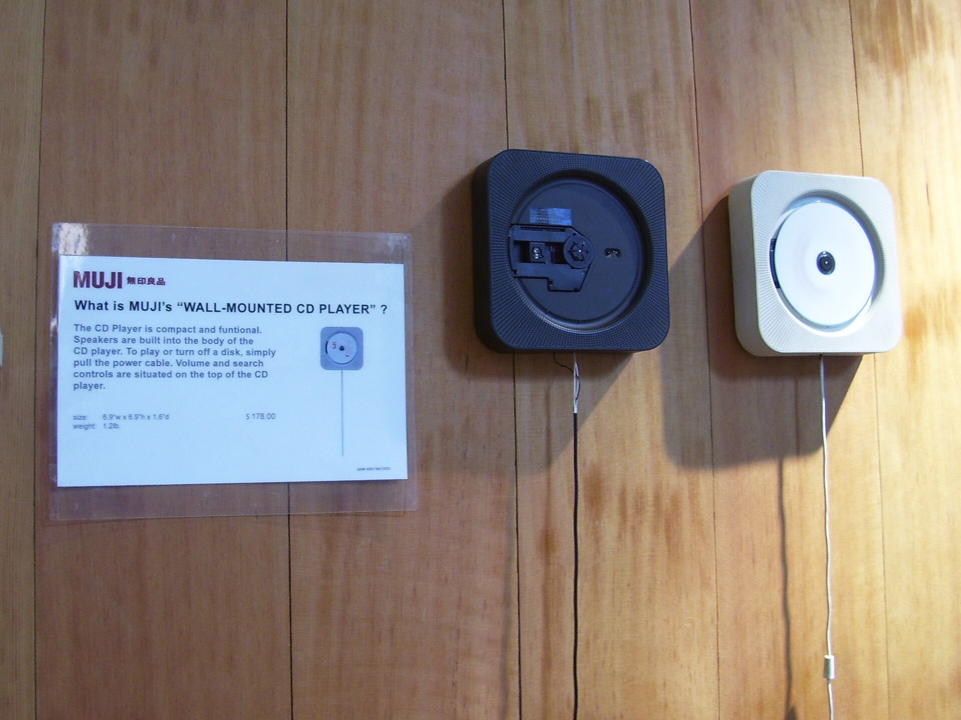
The wall-mounted CD player designed by Naoto Fukasawa is the best-known example. The disc remains visible and a pull cord starts the music, much like switching on a fan. The gesture is immediate, the technology is reduced to what is necessary and the object gains character without decoration. MUJI has presented it among the products that explain its principles, alongside the aroma diffuser, right-angle socks and Body Fit Cushion.
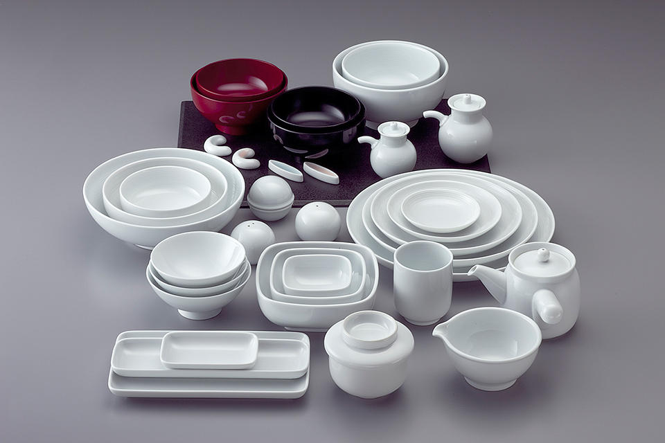
Other families became recognisable without spectacular forms: stackable polypropylene storage, unbleached-paper notebooks, acrylic boxes, modular furniture and tableware. Masahiro Mori’s tableware collection expresses the same balance. Elementary forms and carefully judged proportions allow pieces to combine easily and outlast seasonal trends.
Stores and architecture as part of the project
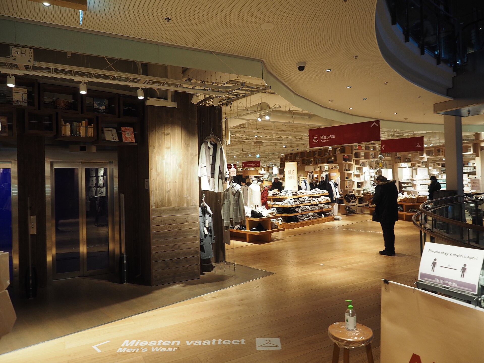
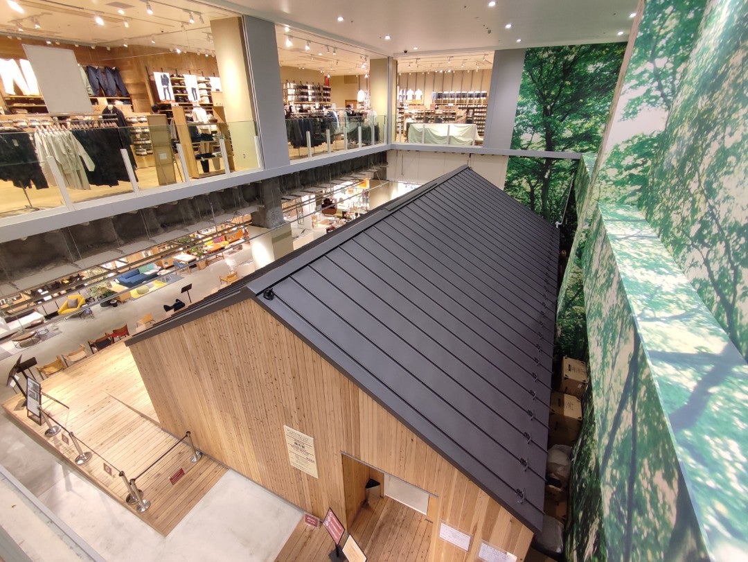
In MUJI stores the philosophy becomes space. Timber, metal, paper, raw textiles and restrained signage connect very different product categories. Lighting is diffuse, routes are easy to read and objects are grouped by use. The aim is to make a possible order for daily life visible.
Retail has gradually expanded beyond shelving. In 2019 the Ginza flagship combined a store, food spaces and Japan’s first MUJI HOTEL. At Tokyo Ariake, opened in 2020, home-related services and a full-scale model house show how products can become part of a spatial system. The company’s work in architecture and spatial design is now a business in its own right.
Where MUJI products are made
MUJI is a Japanese company, but that does not mean every product is made in Japan. International production and procurement began in 1986, and the company now works with a global network of partners. Country of origin and composition vary by category, material and market; the label or product page is the reliable place to check a specific item.
This distinction resolves a common misunderstanding: “Japanese design” describes the system’s cultural and design origins, not a single manufacturing geography. Ryohin Keikaku publishes a production partner list and a code of conduct covering human rights, environmental standards, safety and working conditions. Transparency should also be judged by the coverage, audits and monitoring results behind that list.
Sustainability: what to look for beyond a natural aesthetic
Waste reduction has belonged to MUJI’s project from the beginning, but beige packaging or timber furniture is not proof of sustainability in itself. More useful criteria can be measured: origin of materials, longevity, repairability, virgin material use, supply-chain conditions, collection and reuse at the end of a product’s life.
One declared initiative is ReMUJI, a programme that collects selected used products for resale, transformation or recycling. Clothing collection began in 2010. PET bottles, plastic storage products, duvets and other categories were added later, and the ReMUJI name was expanded across the project in 2025.
For raw materials, the group publishes guidelines covering fibres, timber, paper, plastic, leather and other resources, alongside a target of reaching 100% responsible procurement for selected key materials by fiscal 2030. These commitments need to be followed through the published data over time. Simplicity gains environmental value when it produces verifiable outcomes across the whole life cycle.
MUJI in Italy: where the stores are
MUJI Italia was established in 2004. The current official store locator lists five locations: Milano Corso Buenos Aires, Milano Porta Nuova Garibaldi, Milano Via Torino Duomo, Torino Via Garibaldi and Bologna. Addresses, opening hours and services should be checked there because they can change more quickly than the company’s history.
The physical presence is concentrated in northern Italy, while e-commerce makes the wider catalogue accessible. MUJI is also a useful retail-design case: each store acts as a three-dimensional manifesto, close to the concept-store logic explored in our selection of the best furniture stores in Italy.
Why MUJI still matters in contemporary design
MUJI turned an apparent refusal into a strong position. Removing the logo from the object does not remove the design; it redirects attention towards proportion, material, cost, use and longevity. That coherence, more than the neutral palette, made the company influential.
Its most useful lesson concerns the way we choose things. An everyday object can be discreet without becoming anonymous, accessible without feeling poor and simple without being banal. When form, process and communication express the same idea, even a pen, box or shelf can become part of design culture.