Choose a taupe wall colour by comparing undertones, daylight and flooring. Practical combinations with timber, stone, white and muted colours.
Taupe wall colour is a family of warm grey-brown neutrals, not a single shade. Physical samples, a careful reading of undertones and tools such as NCS notation and Light Reflectance Value help you choose it with greater precision.
Taupe walls sit in the broad territory between grey and beige, often overlapping with the shades described as greige. Depending on the selected paint, the undertone may lean towards yellow, pink or green. This ambiguity makes taupe useful but also easy to misjudge: the same commercial name can describe different colours, while a chosen shade may look different beside a new floor or under the room’s evening lighting.
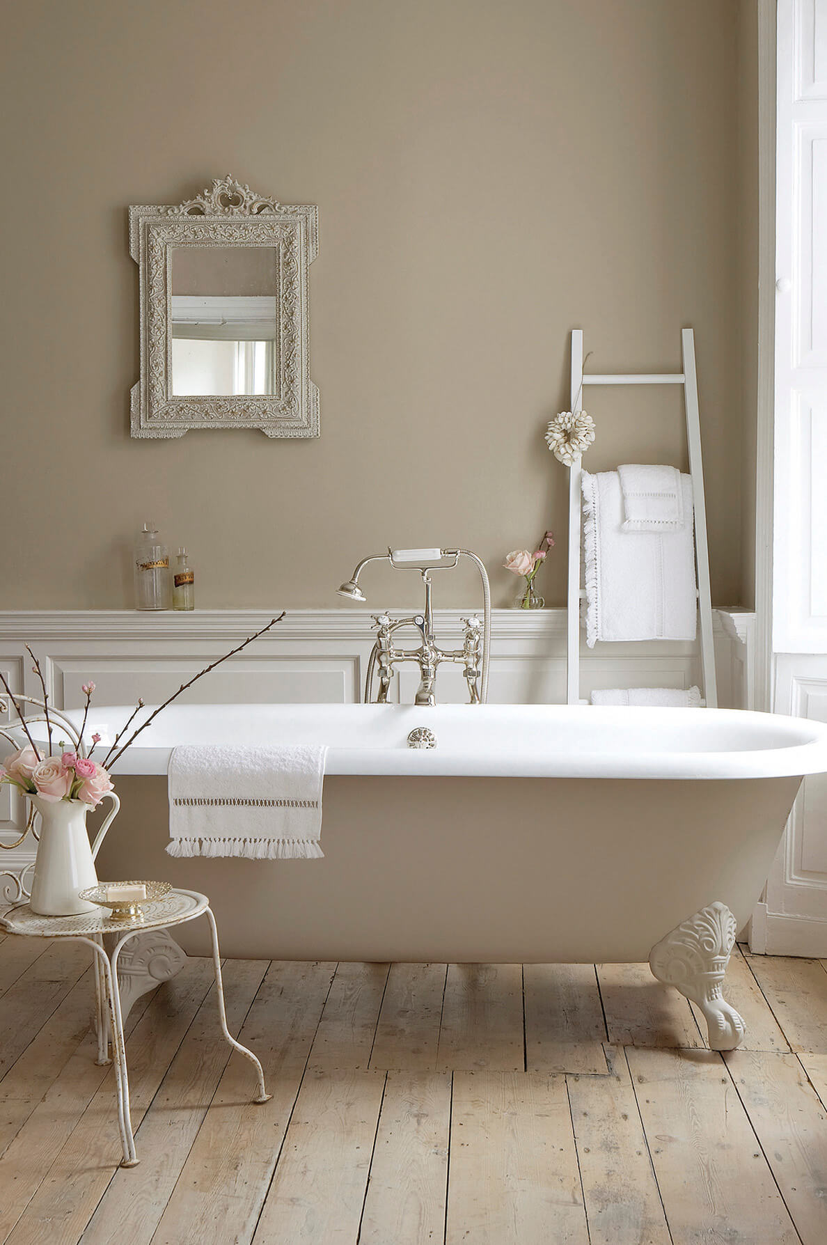
Do not choose taupe from its name alone. Start with the actual product sample and, where useful, an independent colour reference. These help avoid a familiar disappointment: a paint that looked warm on the colour card reads unexpectedly grey on a full wall, or a supposedly grey neutral develops a strong beige cast beside the flooring.
Taupe wall colour: what it is and why it is popular
The Italian term tortora refers to the bird whose plumage suggests a grey softened by brown. It is used for a broad neutral family rather than a universally agreed formula. Its role in contemporary interiors fits a preference for warmer backgrounds alongside natural timber, travertine and textured fabric. A relatively pale version can provide a quiet setting for furniture and art, but neither reflectance nor compatibility is guaranteed by the name.
That versatility is also a limitation. Choosing taupe as an automatic neutral for everything can produce an indistinct room. The shade becomes convincing when its undertone relates to the materials that will remain, starting with the floor. It need not match them exactly; it needs a clear relationship.
Reading the undertone: NCS and sample comparison
Place samples beside one another and against a neutral white background. Two apparently similar taupes can then reveal different yellow, pink or green tendencies. In the Natural Color System, a notation such as S 2005-Y30R describes 20 per cent perceived blackness, 5 per cent chromaticness and a yellow hue with a 30 per cent red component. These are perceptual colour attributes, not instructions to mix those quantities of pigments.
Low chromaticness is common in greige shades, so small differences can change how the paint relates to nearby materials. NCS offers a useful description, but the finish and product sample still need to be checked. It is not a substitute for observing the surface in the room.
A second useful figure is LRV, or Light Reflectance Value, usually expressed on a scale from 0 to 100. Where the manufacturer supplies it, it allows you to compare the light reflectance of particular colours or surfaces. It cannot, on its own, predict how bright the completed room will feel: available light, geometry and neighbouring finishes also matter. A screen image provides a visual direction, not a measurement or a dependable paint match.
Testing samples before painting
Prepare generous movable panels, for example around 50 centimetres square, using the intended primer and finish in accordance with the manufacturer’s instructions. View them on different walls in the morning, afternoon and evening. Keep them close to the actual flooring and joinery rather than inspecting them only in the middle of an otherwise empty room.
Orientation is a clue, not a guaranteed colour forecast. Glazing, shadows, weather, reflected colours and the lamps all affect what reaches the wall. North-facing light does not invariably turn taupe grey, nor south-facing light invariably beige. Test the specific combination instead of trying to correct the room from a compass direction alone.
Also check how two samples behave together under different sources. They may appear to match under one light and differ under another, an example of illuminant metamerism. The changing appearance of a single wall is not, by itself, enough to establish metamerism. This distinction matters when matching paint with upholstery, stone or a pre-existing door finish.
Finish and durability are separate decisions. EN 13300 classifies characteristics of paints for interior walls and ceilings, including sheen and wet-scrub resistance. A matt paint can be washable; a satin finish is not automatically easier to maintain. Read the selected product’s technical sheet and cleaning instructions. Low-reflectance finishes can make some surface irregularities less conspicuous, while a shinier surface can emphasise them in raking light.
Taupe and flooring: timber, stone and porcelain
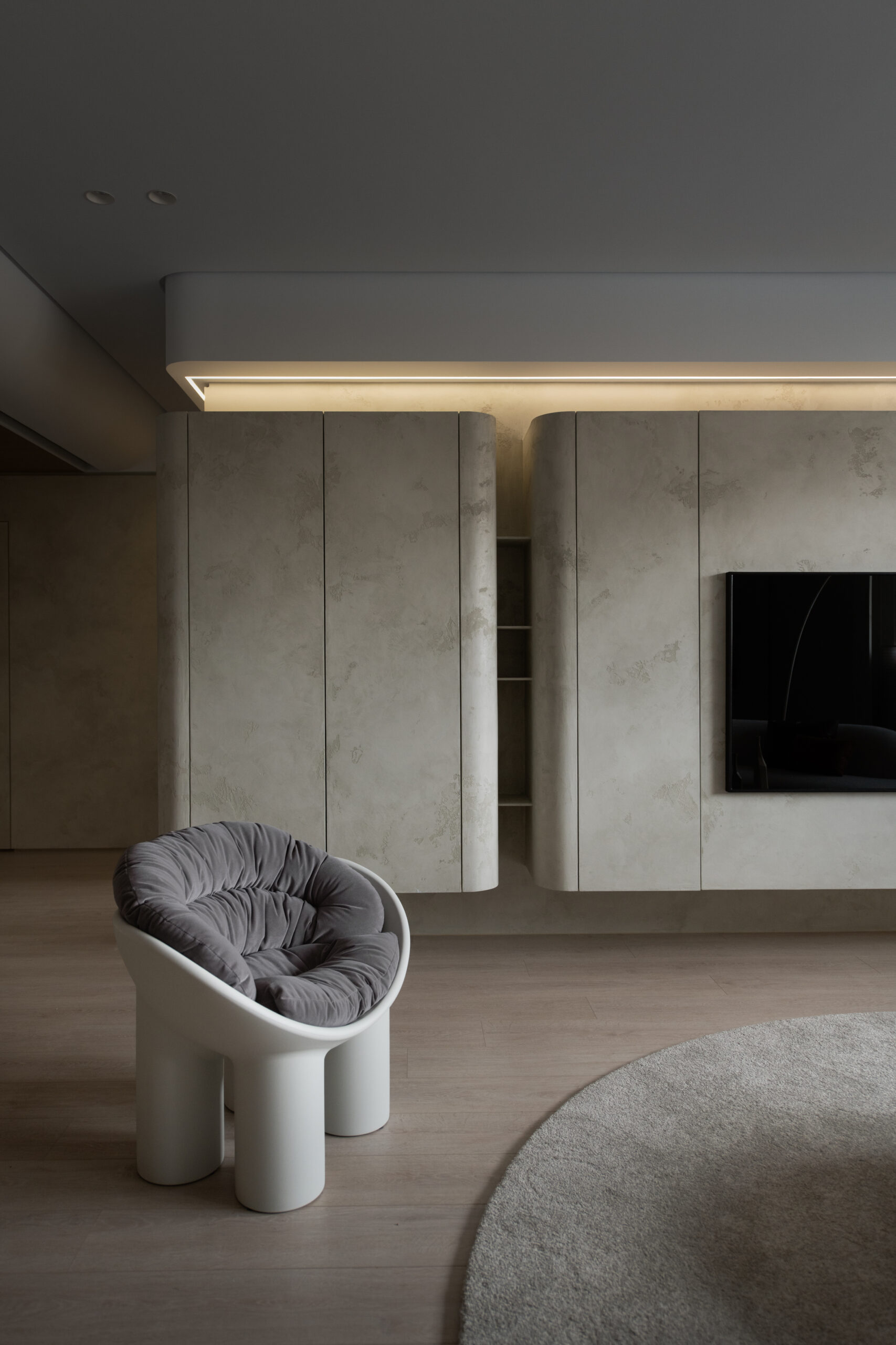
Flooring occupies a large part of the view and can reflect coloured light towards the walls. With pale, golden timber, a strongly yellow taupe may create a very uniform palette; a greyer version can give a clearer separation. With dark wood, a medium taupe can create an intimate setting, while a lighter paint can maintain contrast. These are directions to test, not prescriptions for every species of wood.
For stone and porcelain, assess the background and veins rather than only the dominant colour. A floor containing grey, beige and pink gives several possible points of connection. Choose which one the wall will relate to. A controlled difference in lightness can make the room’s surfaces legible without requiring identical colours.
| Neighbouring surface | Direction to explore | What to check |
|---|---|---|
| Pale golden timber | A greyer taupe | Whether the whole palette becomes too yellow |
| Dark timber | A light or medium taupe | The particular LRV and available light |
| Veined stone | An undertone related to one component of the stone | The paint sample beside the actual slab |
| Cool grey porcelain | A taupe with a warmer component | Balance with the other permanent neutrals |
Taupe and white: choose the white as well
Ceilings, doors and skirting boards participate in the colour scheme. A cool white may sharpen the contrast with a warm taupe; a softer white may reduce it. The effect depends on the actual shades and light. If existing doors and window frames will remain, their white becomes a fixed reference to include in the sample comparison.
To soften the wall-to-ceiling transition, choose a separately formulated lighter colour from the same family. Do not try to make the paint lighter simply by watering it down: dilution should follow the manufacturer’s application instructions, not function as a colour-mixing method. Our guide to furnishing with taupe and dove-grey shades extends the discussion to furniture and textiles.
Taupe walls in the living room and bedroom
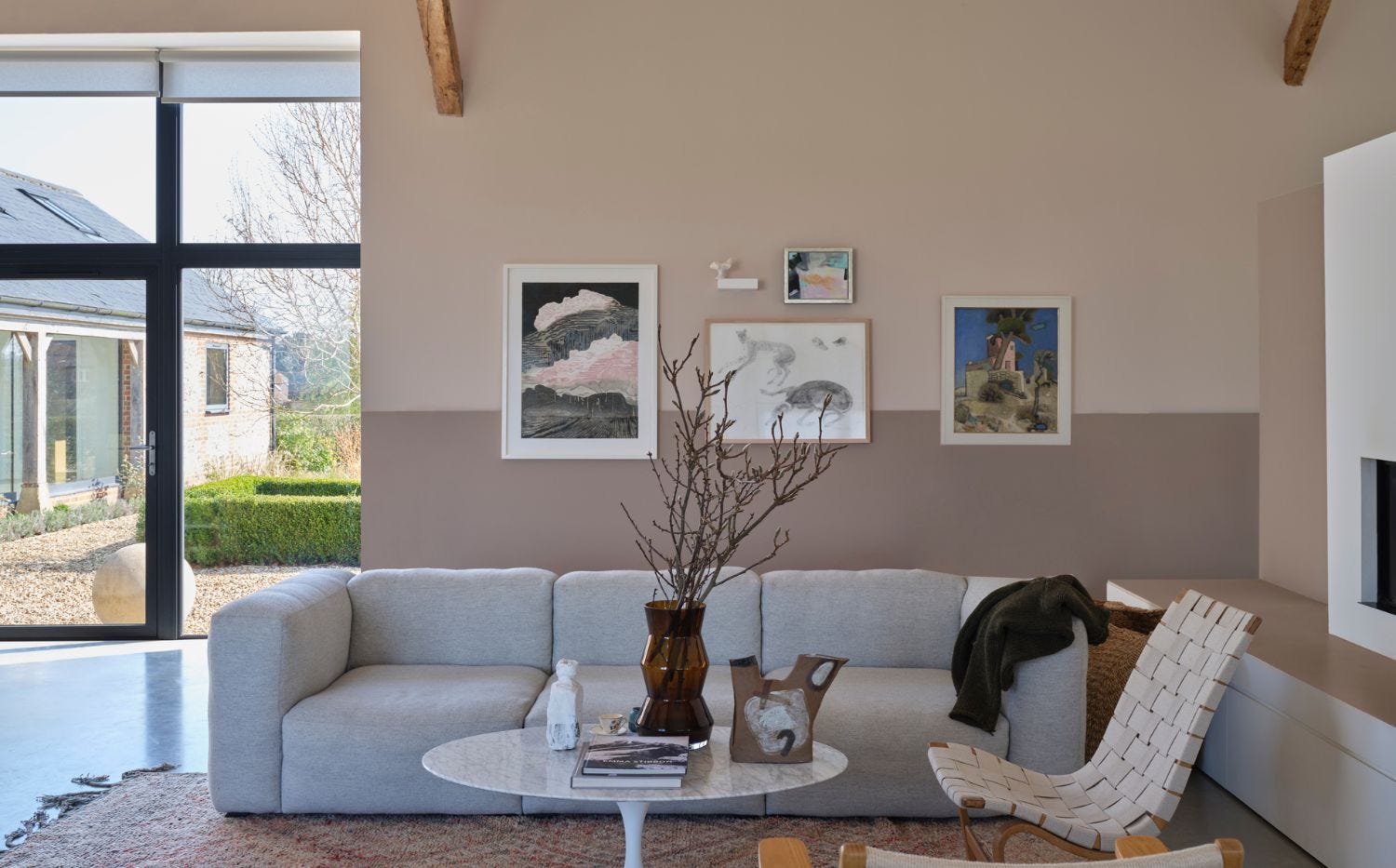
In a living room, taupe can form a background for coloured furniture, timber shelving and artwork. Prevent the scheme from becoming flat through differences in texture: woven fabric, visible timber grain and burnished metal offer distinct surfaces. If the wall and sofa have similar colours, include enough difference in lightness or texture for the upholstered form to remain readable.
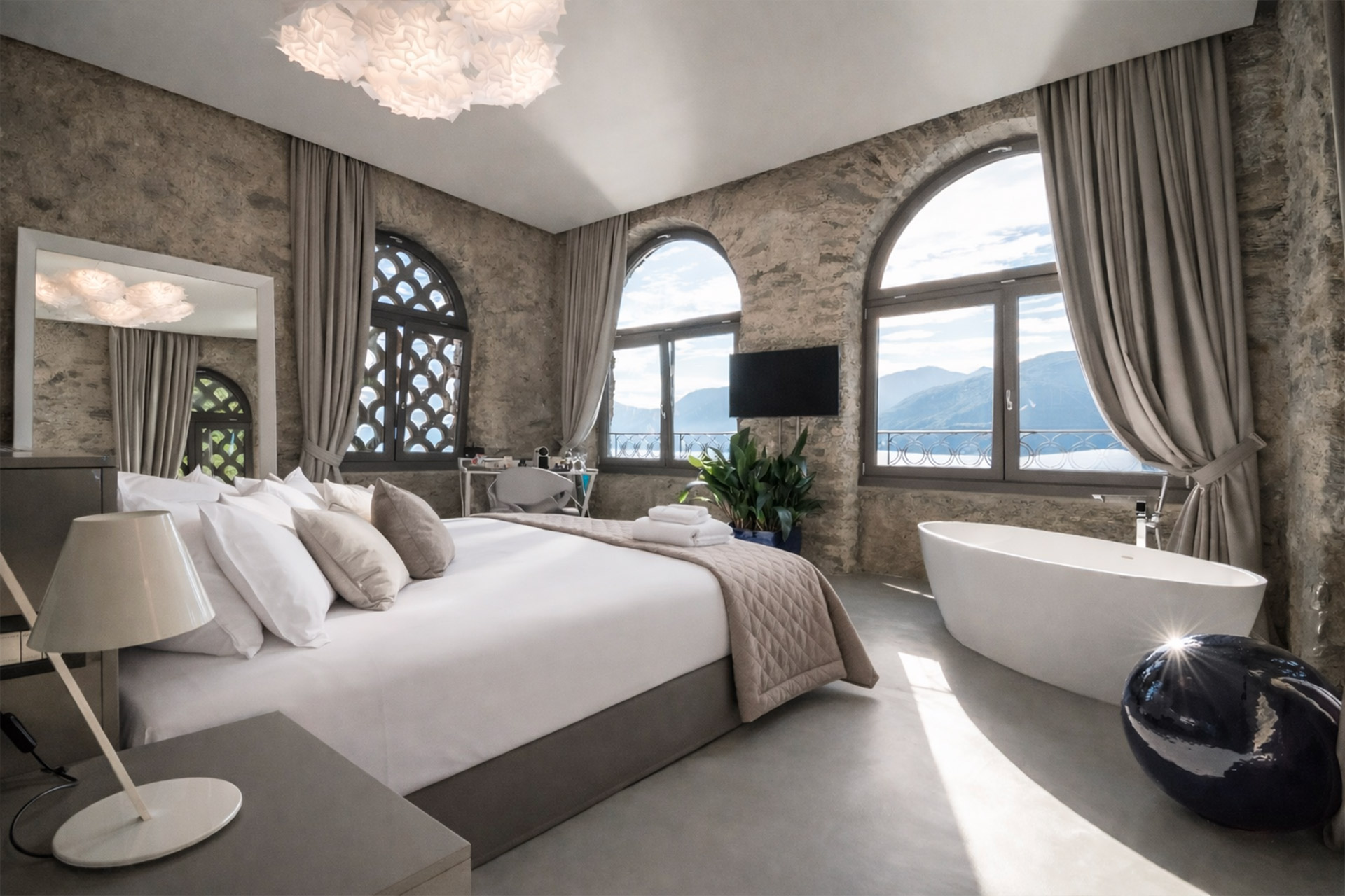
In a bedroom, a deeper shade behind the headboard can define the sleeping area; a paler version can connect wardrobes and walls. Our guide to bedroom colours explores colour, light and materials. Think about the room’s layout and bed dimensions at the same time as the colour, especially when large furniture leaves only narrow areas of painted surface visible. Colour cannot compensate for furniture that does not fit the room.
Three mistakes to avoid with taupe
The first is choosing it because it supposedly goes with everything, without checking its undertone against the floor. The second is accumulating several beige, grey and taupe surfaces without a hierarchy of lightness or texture. A restrained palette still needs deliberate differences, not simply a collection of similar neutrals.
The third is judging the scheme only in daylight. Correlated colour temperature, measured in kelvin, is useful information but does not fully describe how a lamp renders every material. Its spectrum, colour rendering, intensity and the room’s reflections also matter. Test the paint, floor and fabrics under the actual intended lamps. A relationship that looks convincing during the day may look different in the evening.
Frequently asked questions about taupe walls
Is taupe a warm or cool colour?
It depends on the selected shade. Taupe covers grey-brown and greige neutrals with different undertones. Compare samples against a neutral background and in the room to decide how warm or cool a particular product appears.
Is there a universal RAL code for taupe?
No single RAL code covers every paint called taupe. RAL and NCS references describe standardised colour references, while commercial names can describe broader families. Confirm the selected reference through the actual paint and finish sample.
What is a paint’s LRV?
Light Reflectance Value expresses the reflectance of the specified surface on a scale from 0 to 100. It helps compare more and less reflective colours, but the completed room’s brightness also depends on available light, proportions and neighbouring materials.
Why does a wall colour look different under different lights?
The light reaching it changes with shadows, reflections, glazing and lamps. Two different samples may also match under one source and differ under another, a metameric mismatch. Orientation alone does not predict either result reliably.
Is matt or satin better?
Choose according to appearance and maintenance needs. A matt finish may make some irregularities less obvious, while greater sheen can highlight them. Washability is not determined by sheen: check the product’s wet-scrub resistance and cleaning instructions.
Opening image: Little Greene.