Cocoa and pale blue, olive and burgundy, expressive woods and worked textiles: autumn 2026 interior design trends interpreted through colours, materials and domestic architecture. Between a desire for beauty, access to housing and lasting choices.
Cocoa and pale blue, olive and burgundy, veined woods and reflective metals: autumn 2026 interior design trends are best read through combinations. The season’s directions encompass colour and material, but also privacy, the work of care and the possibility of living without starting again from scratch.
A cocoa-coloured living room can be bolder than a room full of colours. It depends on proportions, light and that single pale-blue surface that changes the character of the whole. It is in combinations, even before individual objects, that we should read autumn 2026 interior design trends.
Heimtextil Trends 26/27 textile research, curated by Alcova, and the experimental interiors of Milan Design Week 2026 offer different indications: earth tones and synthetic colours, manual processes and digital tools, generous upholstery and rigorous structures. Archi&Interiors brings these into relation to interpret the season, distinguishing designers’ proposals from residents’ habits. A new idea presented at a fair is not yet a choice shared by every home.
It is precisely in this transition that design becomes interesting. A sofa needs to find its place beside a bookcase that is already full; a new wall meets a floor that will remain; the desire to be together coexists with the need to close a door. Colours, materials, forms and styles gain meaning when they can take all this into account.
Autumn 2026 interior colours: palettes are built through contrast
The Heimtextil Trends 26/27 palettes curated by Alcova pair sand, clay, olive and bark tones with acid-green, lilac and bright-blue accents. It is an interesting direction because it avoids reducing autumn to the familiar sequence of beige, rust and brown.
To translate this diversity into interiors, we propose three combinations. They are not formulas to apply to an empty room: they work as tools for reconsidering a floor, a piece of furniture or a covering that already exists.
Cocoa, ivory and pale blue: depth without heaviness
Brown can become a project’s principal colour rather than being left solely to timber. On a wall, bookcase or sofa, it introduces a depth different from black; the result changes considerably depending on whether the shade is tobacco, chocolate or closer to leather.
For a living room, one combination to explore is cocoa, ivory and dusty pale blue: a dark base, a sufficiently extensive light surface and a cool element that distinguishes the whole. A pale-blue armchair in front of a brown bookcase can be more striking than many small accessories scattered around the room.
It is worth working on finishes too. Velvet, matt timber and a metallic detail allow the palette’s perception to vary without adding more colours. Filling everything with soft materials and caramel tones, by contrast, risks erasing the differences that make the pairing interesting.
Olive, mineral pink and burgundy: a less predictable autumn
Olive green offers a direction different from sage green: denser and less airy. In our proposal, it meets a plaster-like pink and burgundy used on a limited surface, such as a chair seat or a cabinet door.
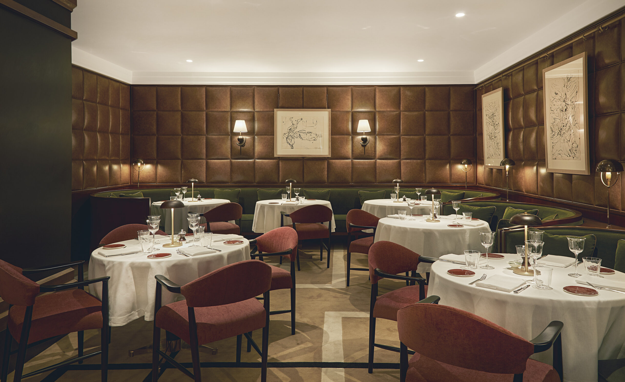
It is a combination to consider especially when the home already has warm woods, terracotta or floors with a strong presence. The design can start with these elements, without trying to neutralise them beneath a second skin of beige.
Distribution matters as much as the colour choice. A space dominated by olive with a wine-coloured accent will be very different from a burgundy room lightened by pinkish curtains. Choosing a palette means establishing hierarchies, not allocating the same amount of space to every colour.
Butter yellow, tobacco and blue: light enters the composition
Yellow allows us to imagine a luminous autumn, far from any obligation to darken every surface. We can begin with a pale butter shade on the walls and let tobacco-coloured furniture, a blue ceramic or an amber textile give the room depth.
For a stronger intervention, the same colour family can be explored through ochre and honey. We suggest choosing a precise direction, however: accumulating warm yellows, orange-toned woods and golden metals can make the whole more uniform than it appears on a colour chart.
These possibilities intersect with our Pantone 2027 predictions and the colour families to watch, which remain an editorial reading, distinct from the official choice of the colour of the year.
Materials and surfaces: the value of differences
A material deserves a more precise question than “is it on trend?” How much space will it occupy? How will it be touched? What maintenance will it require? A stone used on a side-table top and the same stone extended across every wall involve very different decisions.
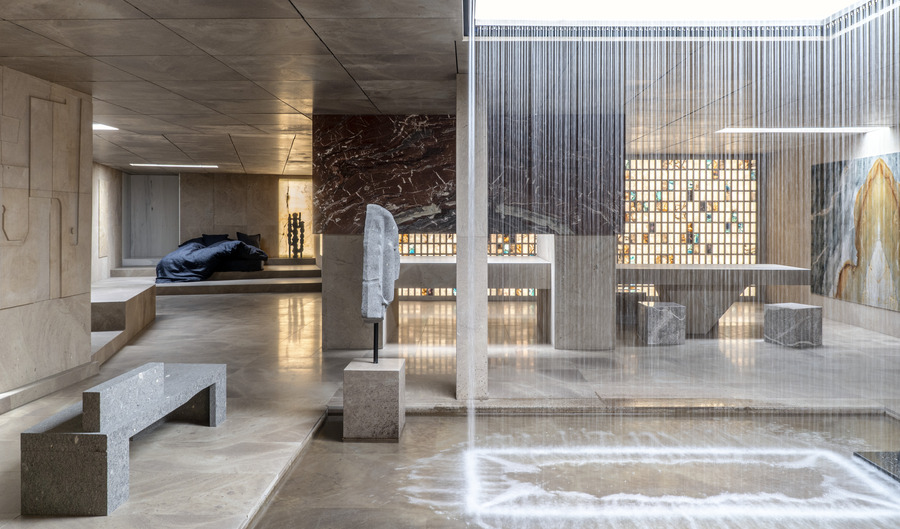
For autumn 2026, the direction we propose is to work on differences between surfaces, avoiding turning the home into a sample collection. Timber with pronounced veining can find balance beside a uniform lacquer; a densely woven fabric can accompany a lively stone without imitating its pattern.
Timber, beyond the label of a warm material
Oak and walnut can belong to radically different interiors. The cut, finish, proportions of the furniture and the way timber meets other materials all matter. A flat door, a thin-edged top and an upright framework express three different ideas, even when they share the same wood species.
Before replacing a sideboard because it seems too dark, it is worth trying it against a different background. An inherited piece can lose its severe character beside a pale wall and a contemporary lamp. Reuse thus becomes an exercise in composition rather than a sentimental obligation to keep everything.
When buying a new piece, asking about its construction, the origin of the materials and the possibility of refinishing helps assess what a photograph does not show.
Stone, glass and metal: look at how they are used
Two Milan projects from 2026 offer very tangible ideas. In Casa di Marmo, Hannes Peer explores stone with Margraf as an element capable of creating entire environments. In The Intimacy, Studiopepe inserts steel niches and enamelled-copper surfaces into an apartment with stucco decoration and herringbone floors. Both are included in our selection of Milan’s best interior design projects of 2026.
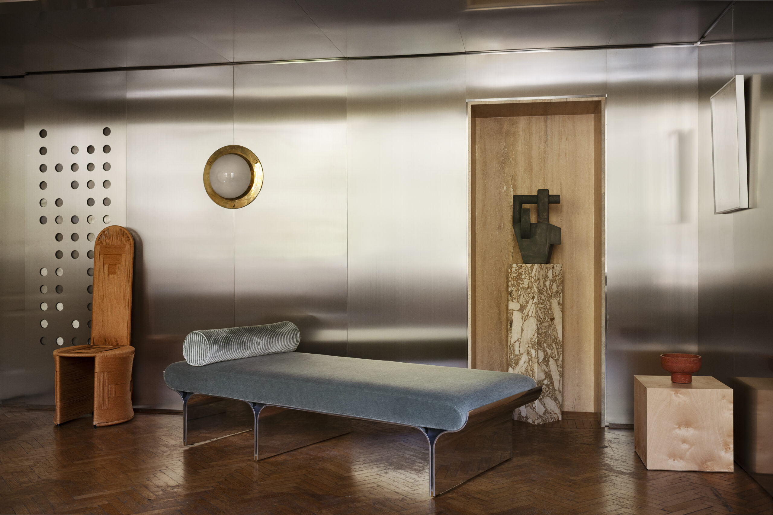
The lesson to bring into an ordinary home concerns the relationship with context. A metallic detail can coexist with a historic shell; a stone can suggest the design of a volume rather than simply covering it.
We can also experiment on a small scale: a glass side table beside a substantial sofa, a steel shelf inside a niche, a reclaimed slab for bespoke furniture. Contrast gains meaning when it helps us read the elements more clearly, without obliging them to resemble one another.
Autumn 2026 textiles: weave, pattern and traces of making
Heimtextil’s research for 2026/27 features visible seams, knotting, irregular dyeing and small decorative interventions. Craftsmanship is also explored alongside digital tools, through processes that move from drawing to code and back to the hand.
For interiors, this research suggests a possibility: choosing textiles also for the way they are constructed. A curtain can have a recognisable edge, a rug a less predictable geometry, an upholstery fabric a weave that deserves close observation.
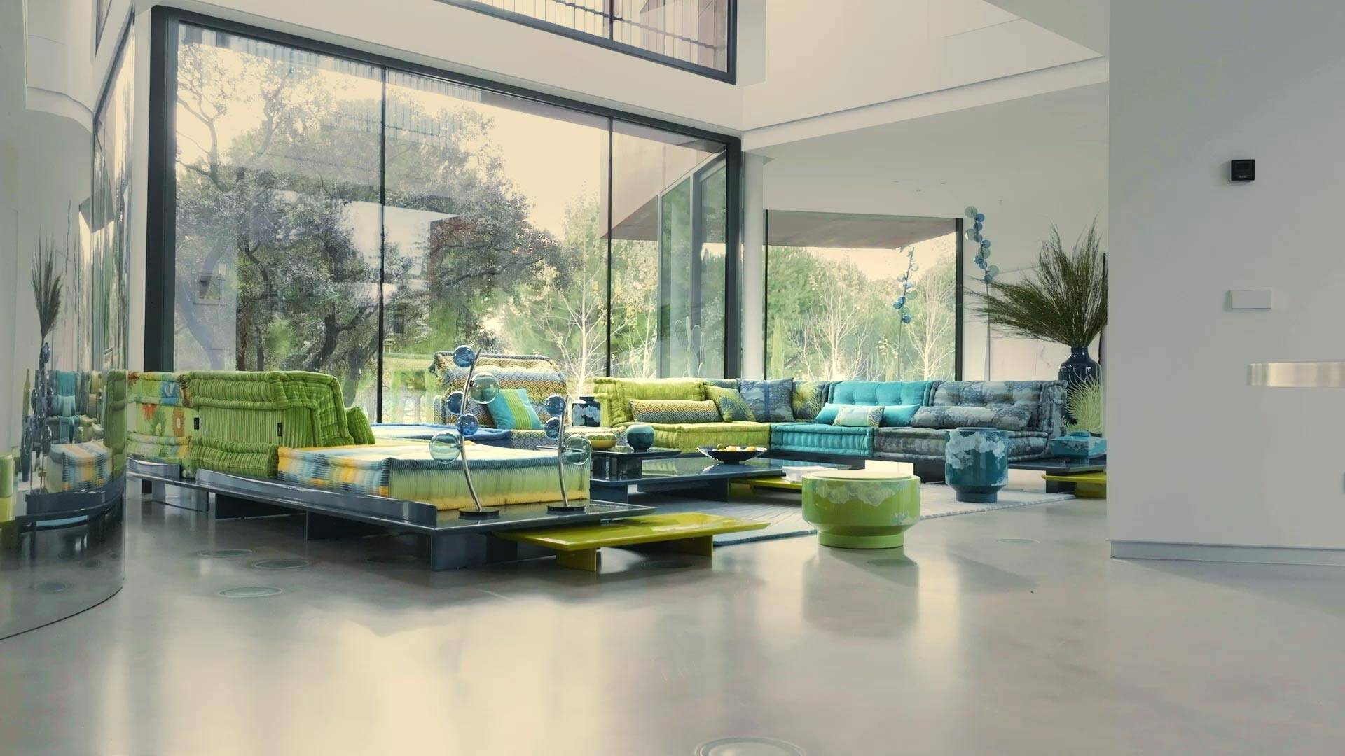
Attention to making, however, demands more precision than a generic celebration of imperfection. An intentionally irregular object does not automatically convey an artisanal process. Asking who produces it, where and through which stages makes the choice more informed than an aesthetic label alone.
At home, use remains the first criterion. Before choosing a living-room fabric, it is worth checking cleaning instructions, considering whether covers can be removed and imagining the real life of that seat. A beautiful weave that forces us to watch over the sofa constantly is unlikely to improve the experience of the room.
Forms and furniture: curves, geometries and modular sofas
A curve alone is not enough to define an interior. In Studiopepe’s project apartment The Intimacy, sinuous seating coexists with wall panelling, stucco decoration and herringbone floors. The furniture’s soft profiles meet architecture with a recognisable structure: it is the relationship between these elements, more than the shape of a single sofa, that gives the room character.
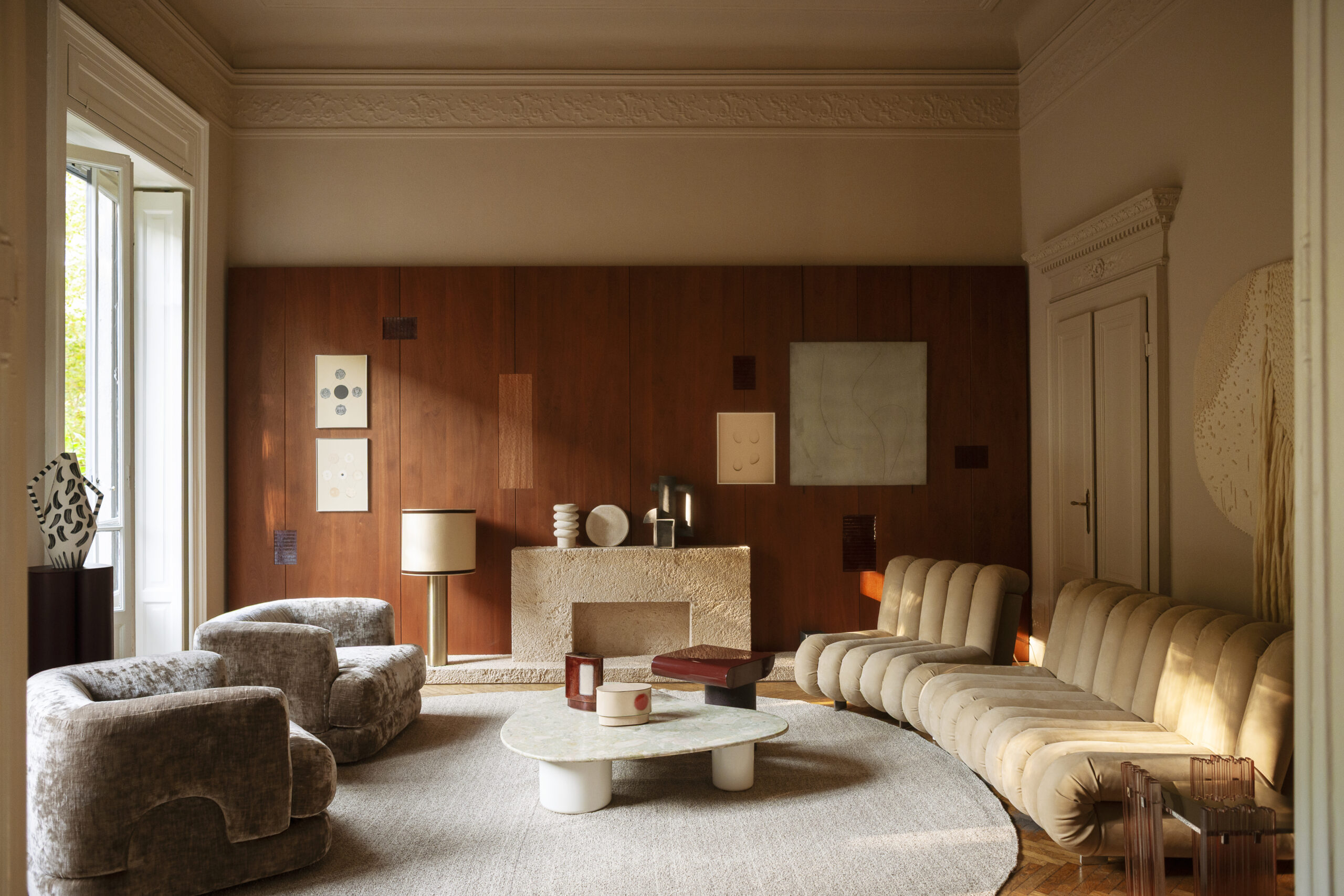
It is a useful reference for composing a living room: generous seating can coexist with a rigorous table, a rounded armchair with an orthogonal bookcase. There is no need to soften every profile to achieve a welcoming space.
Form should be checked on the floor plan. A curved sofa can create an interesting conversation area, but does not automatically resolve a difficult room. Before buying, draw its footprint, consider circulation and check how windows, bookcases and other seats can be reached.
The same applies to modularity: it is useful when it genuinely allows a configuration to change, an element to be replaced or a move to be accommodated. It is worth asking which transformations are possible, rather than stopping at the promise of a “flexible” system.
Autumn 2026 interior trends and styles: three ways to build a personal home
Proclaiming the end of minimalism or the triumph of maximalism offers little to someone deciding how to live in a room. For autumn, we propose three directions to interpret through the furniture you own, the light and the home’s actual proportions.
Warm modernism: rigour and depth
Warm modernism retains clarity of layout, measured proportions and a few well-defined materials. Its richness can lie in a wood, a deep colour or the quality of a curtain. One possible composition pairs a walnut bookcase, a simply designed sofa and a metal lamp: the rigour remains, without requiring every surface to disappear into beige.
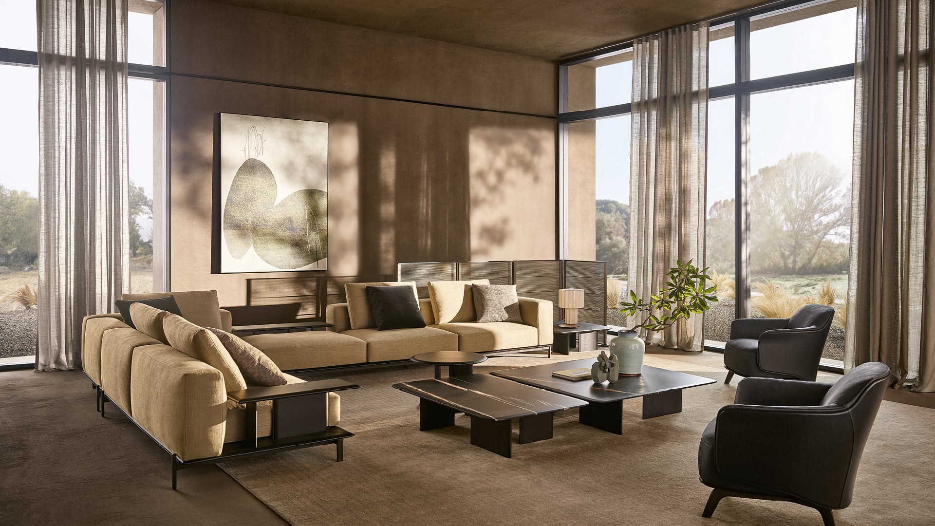
Informed eclecticism: bringing different periods together
Informed eclecticism allows different periods and origins to coexist. For it to work, there needs to be a legible relationship: a proportion, a recurring colour, a well-calibrated distance. An inherited sideboard can meet contemporary chairs and an artwork chosen without seeking literal correspondences. The risk is treating every object as the protagonist: sometimes one piece needs to be removed to make the others comprehensible.
Mediterranean sensibility: material and light without folklore
A Mediterranean sensibility can begin with material and light without becoming a repertoire of arches and rustic pots. A retained floor, a simple curtain, a carefully chosen ceramic and a mineral colour offer a more interesting starting point than the literal reproduction of a holiday home. To bring this into autumn, we suggest working on the substance of textiles and an olive or tobacco accent, leaving room for pale surfaces.
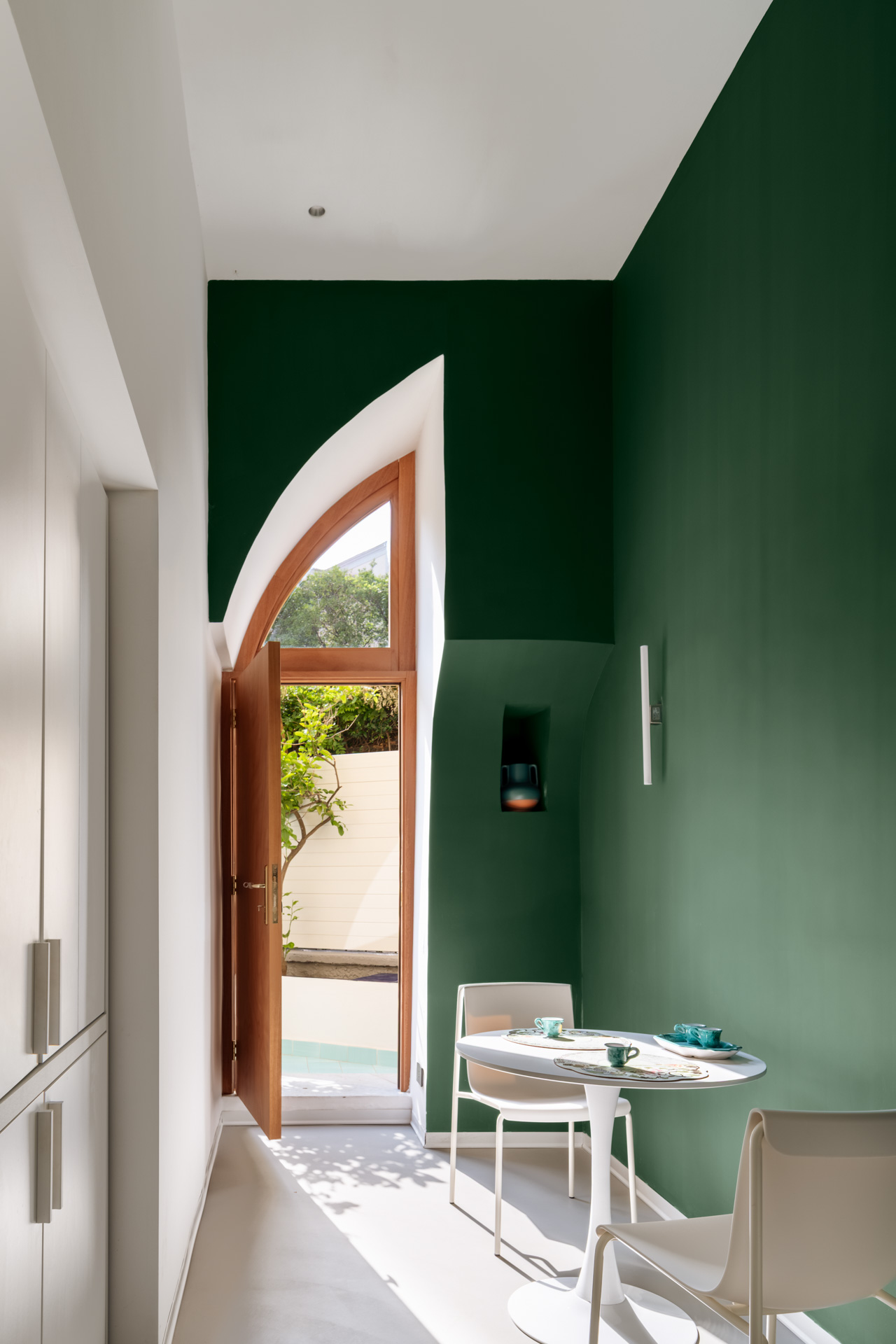
In all three cases, taste is exercised through selection. It does not depend on the number of recognisable references placed in the same photograph.
Domestic architecture: open spaces, but not always
Interior design has a task that decoration alone cannot perform: organising coexistence. In the reflections on compact living published by the Salone in 2026, the possibility of adapting spaces to different uses plays a central role.
In a shared home, this means asking where one person can work while another cooks, where something can be left without needing to be tidied immediately, and how to receive a guest without exposing every room.
Open-plan living remains a possibility, not an obligation. A sliding door, a small hallway or a storage wall can be worth more than a few square metres apparently gained by removing every separation. The solution should be chosen according to habits, not the prestige attributed to an open plan.
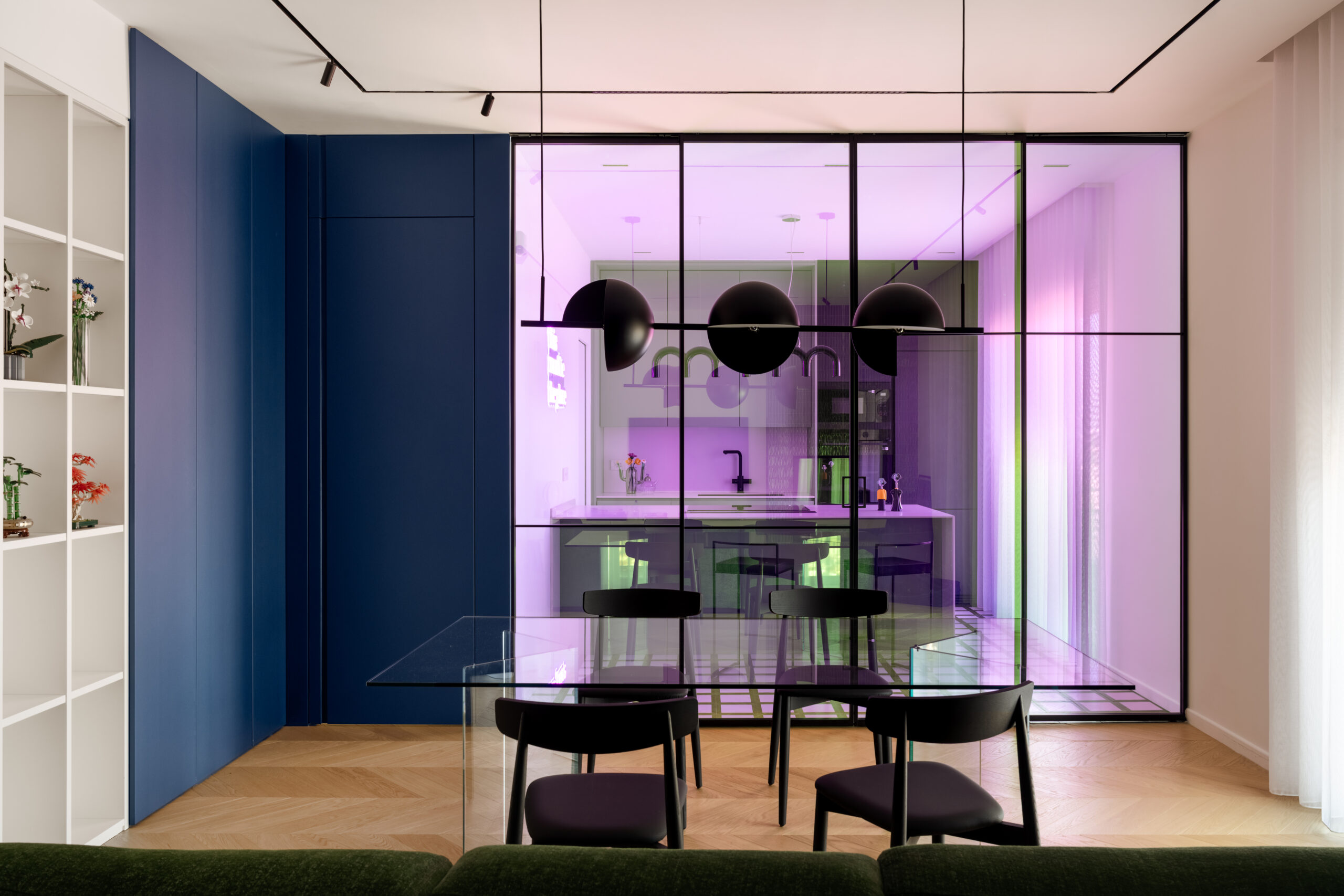
Colour can also contribute to the design of the architecture. Colour capping, which relates walls, cornices and ceilings through tonal variations, invites us to consider the room as a whole. Before painting, it is worth checking the effect with large samples and observing the relationship with floors, doors and available light.
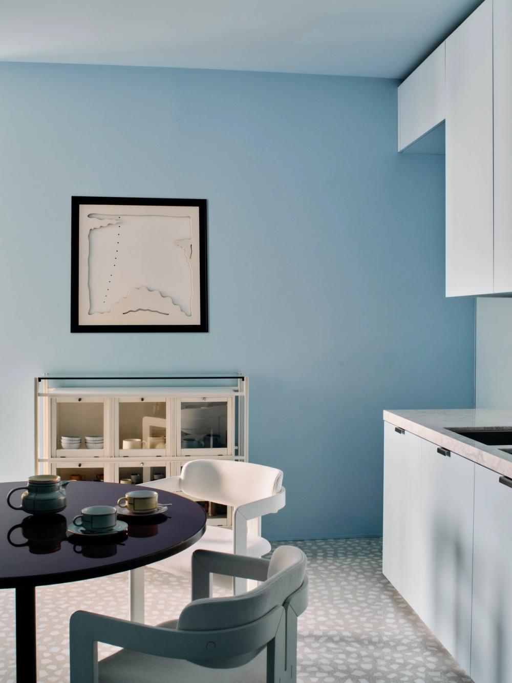
Lighting deserves an equally precise design. In the living room, we can provide a light for reading, one for the table and a more diffuse presence for other activities, avoiding asking a single source to solve everything. The atmosphere should be able to change along with the room’s use.
The social meaning of trends: who can choose how to live?
Every discussion of the home should reckon with the possibility of having one. According to Eurostat data on young people leaving the parental home, in 2024 the average age was 30.1 years in Italy, compared with 26.2 years in the European Union.
These figures do not explain a preference for a colour or a shape. They remind us, however, how partial it is to discuss living while imagining only homeowners free to renovate. A rented room, a shared home and an owned apartment allow very different degrees of intervention.
This is why an interesting trend should also be translatable through reversible choices: furniture that can accompany a move, a freestanding lamp, a table usable in several ways. Personalisation should not necessarily require construction work.
There is also the question of time. A delicate surface, a demanding fabric and many objects on display involve care work. Who will do it? With how much time available? Considering this part of the design means taking seriously the people who will inhabit those images.
Comfort also includes the freedom not to be constantly at the service of your own home.
Sustainability and longevity: a natural aesthetic is not enough
A rough surface, an earthy colour or a matt finish does not, on its own, constitute evidence of environmental responsibility. Judging a material should go beyond its image. For a new purchase, we ask for information about origin, composition, maintenance instructions and the availability of documentation supporting the manufacturer’s claims.
Construction deserves attention too: how is the furniture dismantled? Can the upholstery be replaced? Are spare parts available? What happens if just one part is damaged? Assessing these aspects before buying allows us at least to distinguish a generic promise from concrete possibilities for working on an object. The same examination should be applied to what we already own: a solid structure may deserve new upholstery, while a complicated restoration requires an assessment of condition and costs.
How to refresh your home in autumn 2026 without starting from scratch
The first intervention can be an assessment, not a purchase. It is worth identifying what really causes difficulty: the arrangement of seats, insufficient light, a lack of storage, a colour that does not work with the floor. Buying a new object without clarifying the problem risks simply adding another presence.
In the living room: start with what will remain
A terracotta floor, a dark bookcase or a sofa still in good condition can guide the palette. Before ordering new furniture, we suggest trying a different arrangement and observing where a seat or light source is genuinely needed. An olive textile can accompany terracotta; a pale-blue element can stand out beside walnut. When choosing, it is better to compare samples in the room than rely solely on images.
In the bedroom: colour, curtains and reading light
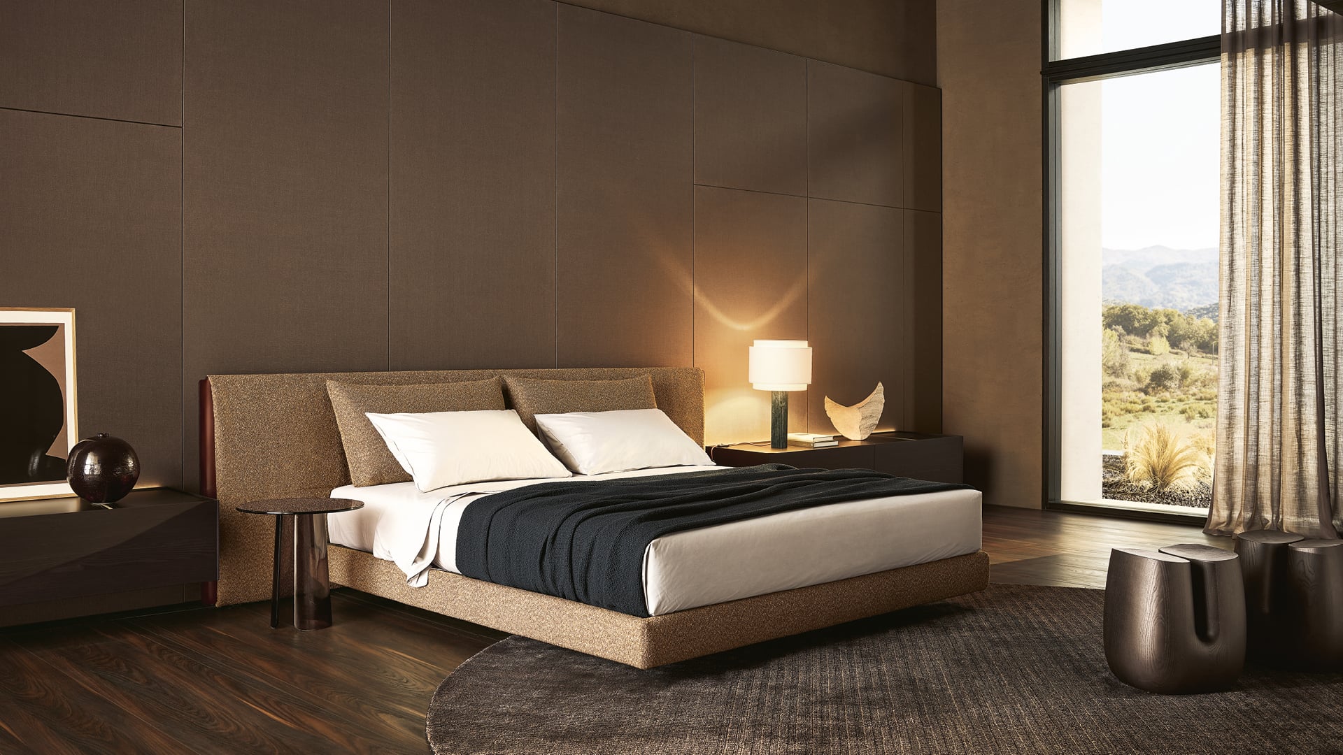
The design can focus on the relationship between bed, curtains and lighting. One proposal is to keep bed linen pale and give depth to the headboard or wall; another, more intimate, works with related tones and textiles of different substance. Before adding decorative elements, check that the light allows reading and that curtains and bedside tables respond to the habits of those using the room.
In the kitchen: free up space before adding objects
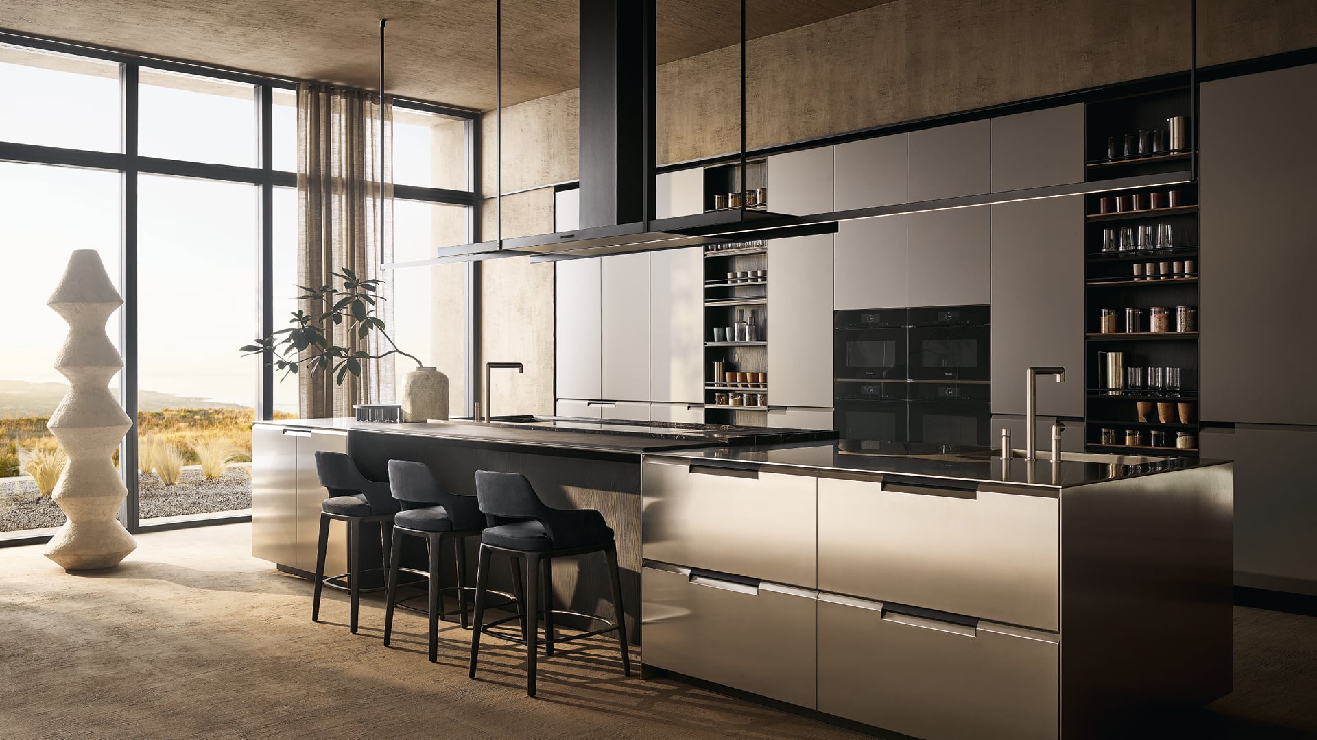
Here, colour must find its place among equipment, storage and work surfaces. We can introduce it through chairs or textiles without making every countertop into a composition to be kept intact. Before buying new accessories, it is worth checking what always remains on view for lack of a suitable place: an intervention in storage can affect the kitchen’s appearance more than many small objects.
Longevity concerns taste too. A highly recognisable piece of furniture deserves to be chosen because it genuinely appeals, not simply because it often appears in the images we see. A home does not need to prove that it knows every autumn 2026 interior design trend.
It can welcome one, transform another and ignore the rest. The table that stays, a light finally in the right place, the colour that makes us appreciate a room again: the most successful change might be no more than this.