Travertine, Rosso Levanto, Ceppo di Gré and onyx: four stone characters to explore through cutting, lighting, material combinations and maintenance.
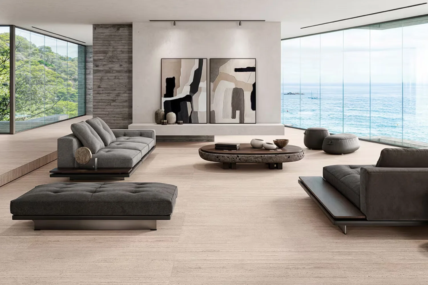
Stone can make an interior feel visually warm without belonging to a beige palette. A deep red slab, the texture of Ceppo or a pale surface beside timber can create different forms of welcome. Here, “warm” describes the overall visual impression, not an insulating property or a guaranteed temperature to the touch.
Travertine, Rosso Levanto, Ceppo di Gré and onyx provide four starting points. Selection should go beyond the most appealing photograph: the actual piece, finish, application and care requirements matter. A decorative wall and a heavily used worktop ask different questions of a material.
Travertine: the cut helps define the pattern
Travertine is worth considering when the aim is a readable material presence without strong colour contrast. There is no single “travertine colour”, however. Tone, cavities and pattern vary. Ask about the cutting direction and whether the material is filled to understand the sample and anticipate a larger surface.
On a wall, the pattern can emphasise height or length. On a side table, edges and junctions reveal how the piece is made. One pairing we suggest is pale travertine, oak without a strong yellow cast and a textured fabric. Check samples together, especially where existing flooring already has a pronounced undertone.
Rosso Levanto: a strong presence in a small area
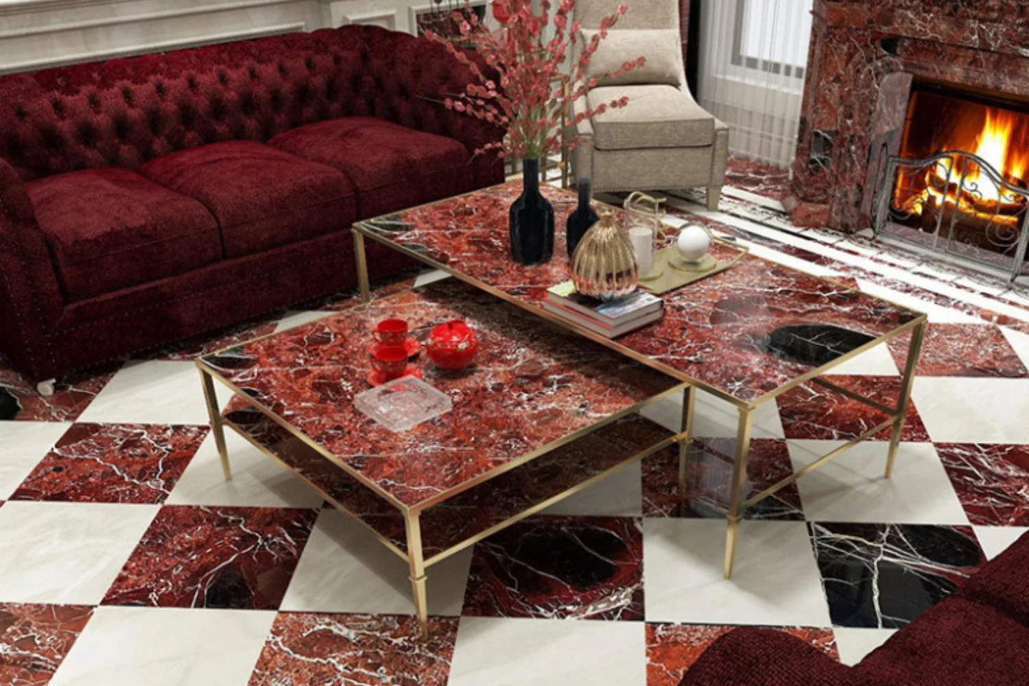
Rosso Levanto in interiors introduces rich colour and veining capable of guiding a whole room. It can occupy a limited surface while retaining an important role. A top, shelf or table may be enough without repeating the stone across every wall.
To support it, consider a relatively quiet matt background: linen, soft brown or a light shade that is not too cold. Select the complete slab when its pattern matters. Do not assume the delivered piece will match a small generic sample; request confirmation of the material allocated to the project.
Ceppo di Gré: a grey defined by texture
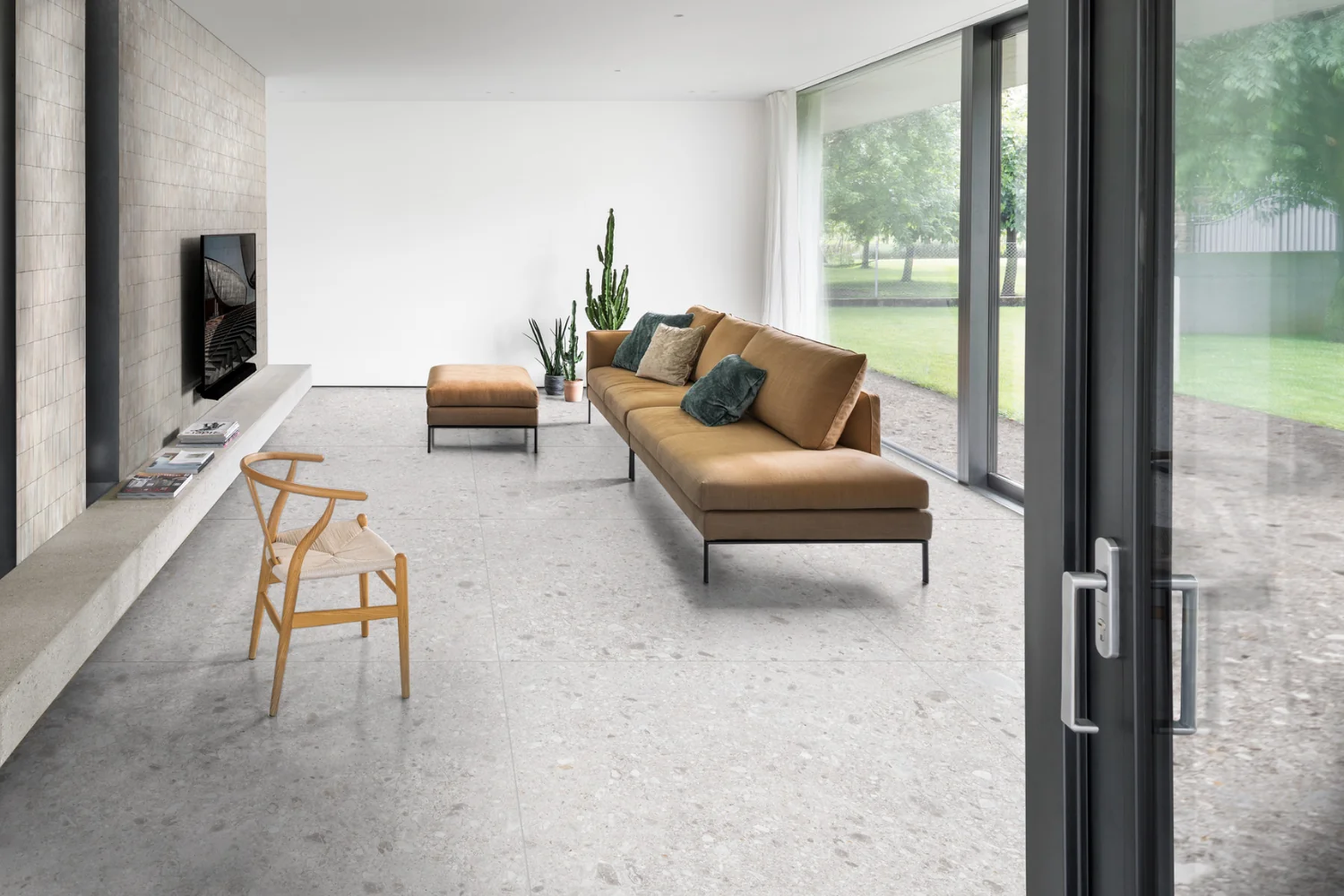
Ceppo di Gré shows that an inviting interior does not necessarily require golden stone. Its fragmented structure can work with timber and soft fabrics. The Bergamo Chamber of Commerce describes Ceppo di Gré and its origin, helping distinguish the actual material from products with similar names or appearances.
Our guide to Ceppo di Gré in interior design explores its use further. Compare the pattern’s scale with the intended element: a visually large fragment may dominate a small top. A complex texture benefits from quieter neighbouring materials so that the overall composition remains clear.
Onyx: design the lighting first
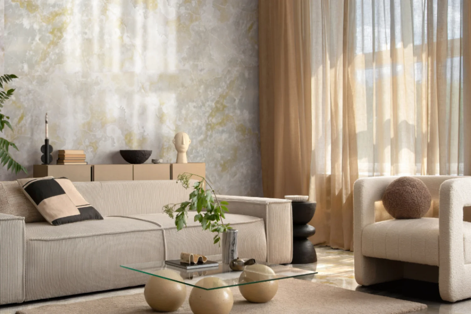
Decorative onyx is interesting for its pattern and, in suitable varieties and thicknesses, its ability to transmit light. A backlit photograph is not enough to predict the result. Request a test using the actual slab or a representative sample with the proposed lighting arrangement.
Backlighting requires technical space, even diffusion and maintenance access. The stone should not become an illuminated panel that cannot be repaired. For a more restrained approach, consider it without backlighting and allow the room’s light to reveal its variations. Neither solution should be approved without seeing an appropriate sample.
A commercial name is not a complete specification
Terms such as marble and onyx can be used more broadly in commerce than in geology. The British Geological Survey explains the distinction between commercial and geological uses of marble. Homeowners need not become geologists, but should request a precise name, origin, technical information and application limits.
Apply the same care to treatments. Ask what has been applied, how it must be maintained and whether it changes the surface’s appearance or behaviour. A protective treatment is not a promise of indestructibility or a complete absence of maintenance.
Start with three materials
A useful starting point is stone, timber and one matt surface, followed by textiles. A limited palette makes differences easier to read. If the stone has a strong pattern, the wall colour can pick up a secondary shade without attempting an exact match.
Our guide to interior paint finishes helps complete the comparison between tone and surface character. Examine samples in the intended orientation: a horizontal slab receives different light from a vertical wall. Check the combination in the evening too, rather than approving an arrangement that only works in daylight.
Maintenance belongs in the final decision
Before confirming the material, request instructions for routine cleaning, stains and products to avoid. Do not experiment with acids, descalers or abrasives without checking compatibility. For uncertainty or existing marks, consult the supplier or a stone specialist before attempting treatment.
Discuss how the material will be used as well as how it looks. A household seeking minimal intervention may make a different choice from one comfortable with visible change over time. Neither preference needs to be disguised by unrealistic promises about a finish.
The right stone is one whose conditions of use you accept. Bring the actual sample, installation detail, complete quotation and care instructions together before deciding. The warmth of the interior will emerge from the whole composition, rather than from the material’s name alone.
Images and credits. Photographers and rights holders can contact redazione@archieinteriors.com about image credits or requests to amend or remove an image. Please identify the article and the image concerned.