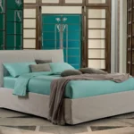
Cinnamon, deep blue, mineral green and dusty pink: build combinations through light, finishes and materials, moving beyond familiar seasonal palettes.
As the days shorten, a room changes even when nothing moves. Timber flooring takes on a different tone, an apparently white wall reveals a pink undertone, and a lamp switched on before dinner changes the relationship between the sofa and curtains. Choosing autumn 2026 interior colours begins with these shifts, rather than adding orange accessories to an otherwise unchanged room.
Archi & Interiors proposes a less predictable autumn: mineral greens, deep blues, muted yellows, plum, cinnamon and neutrals whose character comes from their materials. The five palettes in this guide are editorial suggestions, not an official trend ranking. They are starting points for a personal interior that remains interesting beyond the season.
Read the room before choosing a colour
The first sample to consider is not paint, but the floor. Terrazzo with green chips, honey-toned oak or grey stone already establishes a colour temperature. Windows, doors, radiators, large pieces of furniture and finishes you intend to keep add to it. Ignoring them can produce a palette that looks beautiful on screen but feels unresolved at home.
Photograph the room in daylight, without filters, from three positions: the entrance, your usual seat and the view towards the next room. Note what you want to retain. A painting, an inherited sideboard or an upholstered chair can become the starting point. Colour gains interest by connecting different objects, not making them identical.
Next, decide how you want the room to feel. A dining room might be intimate and theatrical, a kitchen bright and precise, a study quiet without feeling dull. The whole house need not feel uniformly warm. Decide where to increase intensity and where to let the eye rest. That rhythm, more than the number of colours, creates coherence.
Five autumn palettes to make your own
1. Cinnamon, chalk and wood: warmth without a rustic look
Cinnamon becomes more interesting when it is not surrounded by other browns. Pair it with chalky white, natural linen curtains and one clearly defined dark element: a metal edge, a lamp or an artwork’s frame. The contrast stops the room becoming an indistinct sequence of beige.
In a living room with warm timber flooring, cinnamon upholstery on an armchair or bench may be enough. If you choose paint, let it follow an identifiable architectural element: an entire recess, the bookcase wall or the backdrop to the dining area. A painted patch unrelated to the architecture can feel like a decorative afterthought.
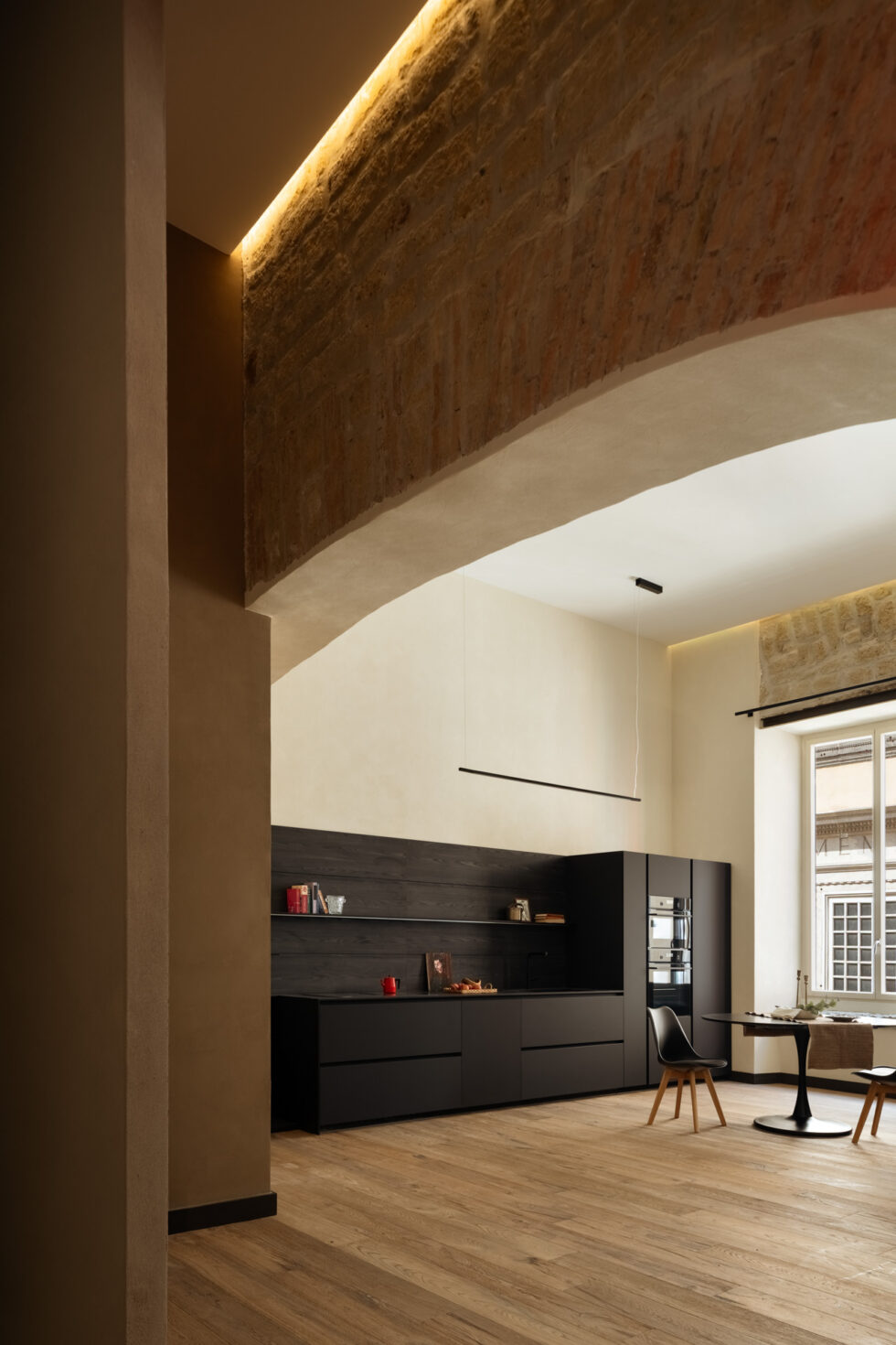
Materials to consider: densely woven wool, timber with a restrained sheen and matt ceramics. An unexpected accent: pale blue or clear glass. Avoid: automatically combining cinnamon, terracotta, rust and cognac across every major surface.
2. Deep blue, oat and stone: a crisp autumn palette
Blue is not reserved for seaside homes. A deep, almost inky shade can give an autumn living room an elegant density without relying on brown. Oat and stone grey lighten the composition; warm timber connects it to the floor.
It works particularly well when the blue has a clear role: a sofa, a bookcase or a run of cabinet doors. Surround it with less saturated, varied surfaces. A visibly textured rug and a pale, slightly pink wall can do more than numerous matching cushions. Blue should converse with the other colours, not become a theme repeated everywhere.
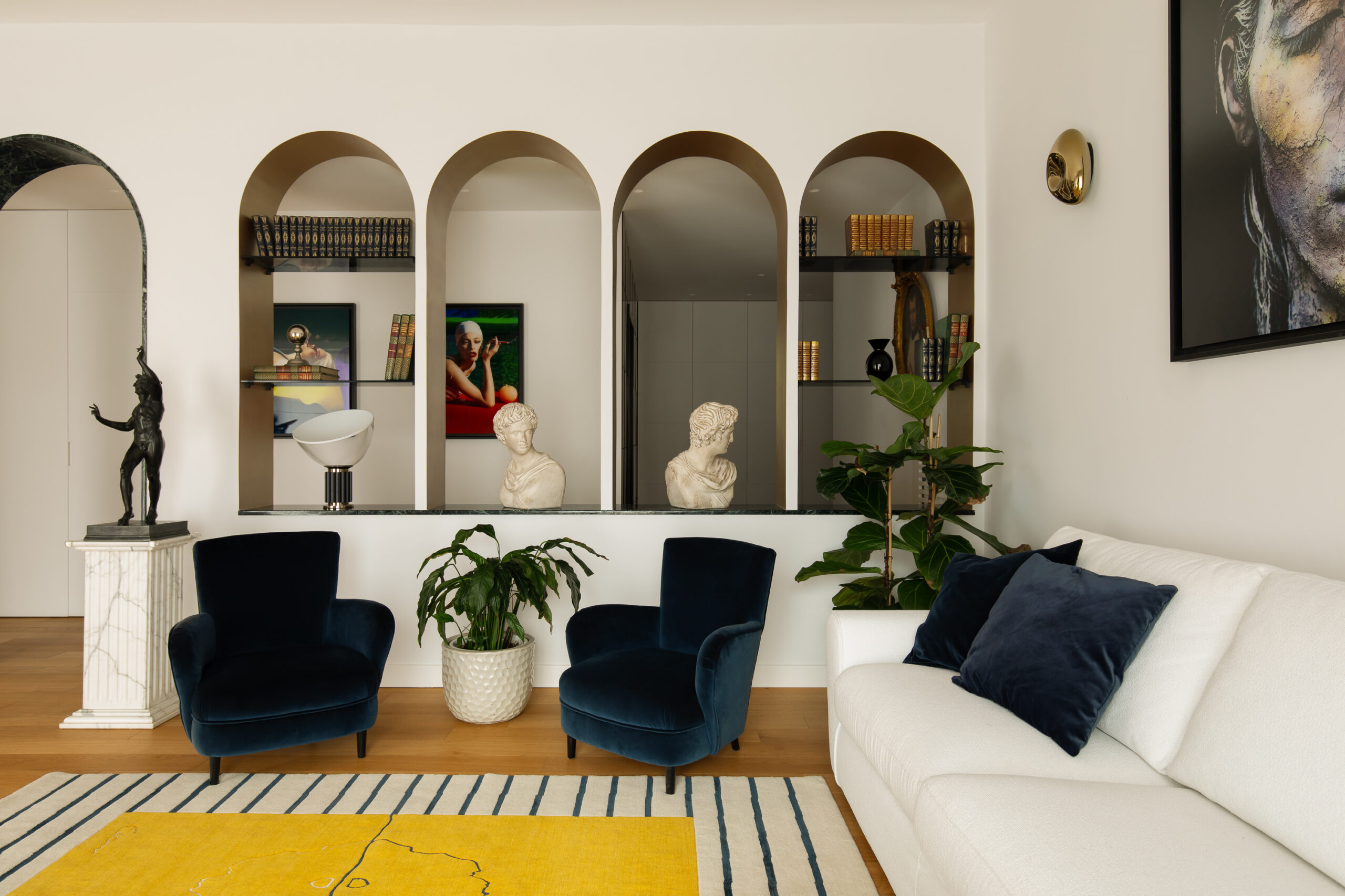
Materials to consider: visibly woven fabric, pale stone and satin-finished metal. An unexpected accent: dusty pink or muted yellow. Check: how blue reads in the evening, when insufficient light can make its nuances disappear.
3. Mineral green, linen and patinated metal: measured depth
A mineral green need not imitate a forest. Look for a shade with a grey or blue undertone, then pair it with low-saturation textiles and metal without a high shine. The result can feel refined in an urban flat, far removed from country-house imagery.
In the photographed dining room at Barker Architecture Office’s 12th Street Townhouse, green sits alongside white beams, a pale fireplace and mustard chairs. It is a lesson in contrast: the wall is intense without eclipsing everything else. Our palette draws on that relationship, rather than suggesting an exact replica of the project.
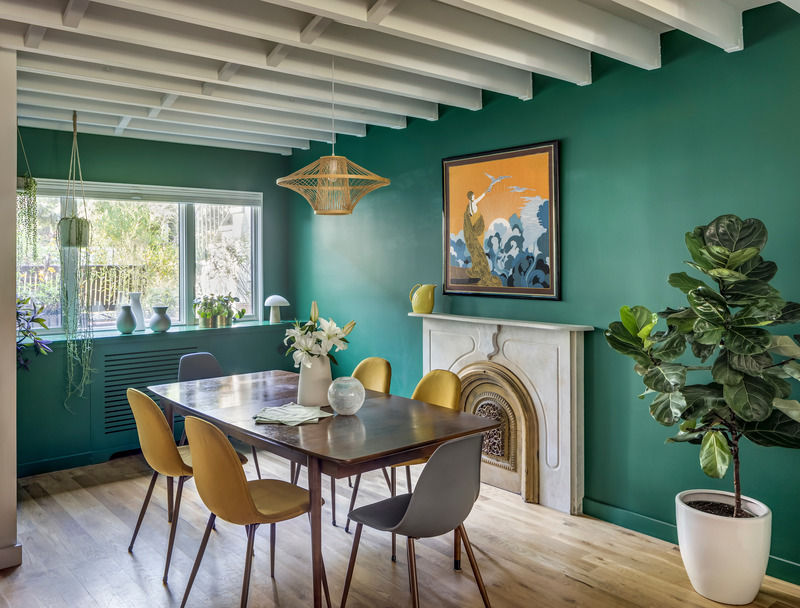
Materials to consider: linen, oak and patinated metal. An unexpected accent: a small butter-yellow surface or an aubergine ceramic. Avoid: choosing a green simply because it is called sage, without examining its undertone in your own light.
4. Plum, dusty pink and red marble: the most theatrical palette
Plum, burgundy and pink can create an intense room without making it sugary. Proportion and material make the difference. A dense plum fabric, a low-saturation pink wall and a detail in Rosso Levanto marble behave differently: one absorbs light, another diffuses it, and the stone introduces veining and reflections.
A real reference is the 1920s Milan apartment designed by Guia Bartolozzi and Ludovica Donvito, featured by AD Italia with photography by Giulia Maretti. Pink, green and burgundy accompany retained elements of the home. The lesson is not to copy a colour, but to let new choices coexist with existing parquet, doors and furniture. This is a reference for colour relationships, not evidence that the project uses Rosso Levanto.
The Spiga dining room below offers a different reference for balancing pink with darker tones. Its green banquettes and brown wall panelling belong to another combination: the photograph illustrates contrast and proportion, not the complete plum, dusty pink and red marble palette.
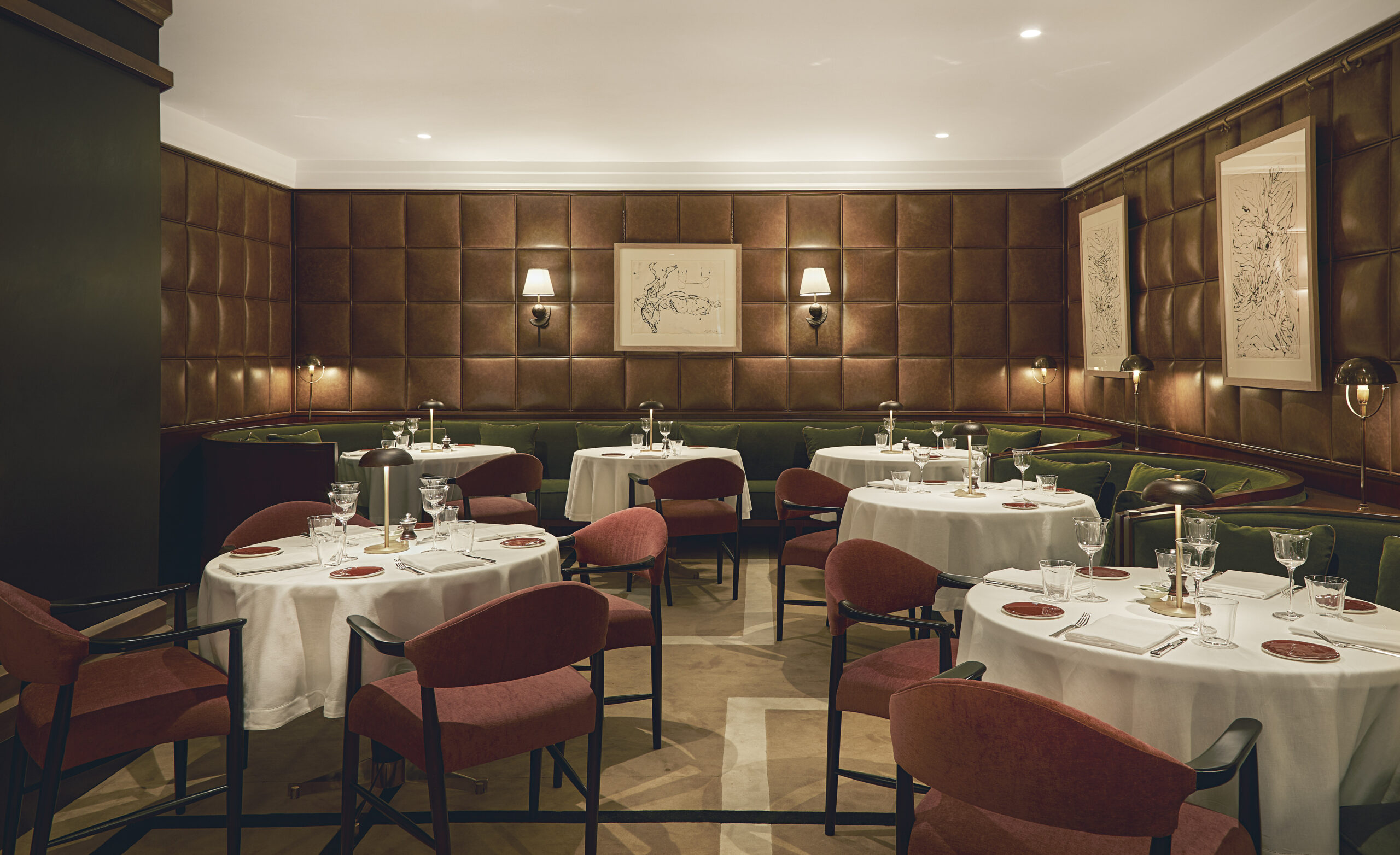
Materials to consider: understated velvet, lacquer on a limited surface and veined stone. An unexpected accent: very pale green or a silvery surface. Avoid: combining numerous glossy fabrics with multiple gold finishes, which can tip the room into unintended excess.
5. Neutrals, oak and muted yellow: colour through materials
Not every autumn interior needs dark walls. In a light-filled home, the scheme can grow from plaster, timber and stone, with a muted yellow as a variation. Neutrals gain richness when surfaces differ: a weave, a vein or fluting adds depth without increasing the number of colours.
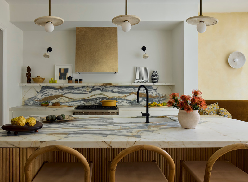
In the Adelphi Townhouse kitchen, oak and marble surfaces meet a yellow backdrop. It shows why neutral does not mean characterless. At home, the same thinking could translate into a timber table, pale curtains and one coloured surface, without buying every item in the photograph.
Materials to consider: worked timber, natural fabric and stone with legible veining. An unexpected accent: cobalt blue on a small object. Avoid: calling a room minimalist when every surface shares the same beige and the same degree of mattness.
The five palettes at a glance
| Palette | Where to start | Material contrast |
|---|---|---|
| Cinnamon, chalk, wood | An armchair or defined wall | Wool, pale plaster, matt ceramics |
| Deep blue, oat, stone | A sofa or bookcase | Woven fabric, pale stone, satin metal |
| Mineral green, linen, patinated metal | A dining-room wall | Linen, oak, low-shine metal |
| Plum, dusty pink, red marble | One leading surface | Velvet, restrained lacquer, veined stone |
| Neutrals, oak, muted yellow | Existing timber and stone | Fluting, natural textiles, a coloured backdrop |
A finish changes the colour
Two surfaces in a similar shade can look very different. Matt paint creates a diffuse backdrop; lacquer draws attention to reflections and irregularities; velvet changes with the direction of its pile; timber brings natural variation. Build a palette with material samples, not just rectangles of colour.
Stone samples require particular care: a small tile may not reveal how veining is distributed across the slab to be installed. For substantial work, ask for photographs and identification of the actual material, and check its suitability and maintenance requirements. The same applies to timber and fabrics: variants and batches can change the overall impression.
If the room already contains abundant veining, choose a quieter fabric. If broad, uniform surfaces dominate, texture or pattern can introduce rhythm. This is not a rigid rule, but a way to identify what is missing before adding another element.
From entrance to bedroom: where colour belongs
Entrance and corridor
An intense colour can mark a threshold and give the transition into the home an identity. Consider its continuity with doors, visibility from the living area and available light. An upholstered bench or coloured cabinet offers a reversible change; extending paint across walls and panelling requires closer attention to details.
Living and dining rooms
The main colour can belong to the sofa, not necessarily the wall. Study seating, rug and table together, especially in an open-plan room: the two zones should feel distinct without resembling separate flats. A small, non-identical echo, such as a fabric border or artwork, is often more interesting than perfect coordination.
Kitchen
Before changing doors or walls, consider the worktop, splashback, appliances and floor. They occupy much of the view. The chosen finish must suit the material’s preparation and maintenance requirements: ask for an appropriate finishing system, rather than selecting a colour name alone.
Bedroom and study
In the bedroom, test the palette around the headboard and view it while lying down. A curtain or overly lustrous fabric can become more dominant than it appears from standing height. In a study, assess contrast around the screen and work surface: atmosphere should not compromise everyday comfort.
Test a palette without relying on a screen
- Gather the fixed elements. Include the floor, door timber, kitchen worktop and sofa fabric in your assessment.
- Prepare generously sized samples. Use movable boards with the intended paint system and, where possible, the final finish. Small swatches help shortlist colours, not make the final decision.
- Move them around the room. Compare the lit wall, the shaded side and the area beside window frames. Different surfaces receive different light.
- Look at different times. Check morning, afternoon and evening with your usual lamps. A noon-only test does not reflect how a home is used in autumn.
- Compare two options at a time. Too many make it difficult to remember what genuinely appeals. Take photographs for reference, but decide in person.
Our guide to interior paint brands can help with products and finishes. Do not seek an exact match to an online photograph: exposure, image processing and your display can alter perceived colour.
Six mistakes that make a palette less interesting
- Starting with accessories. Establish the relationship between large surfaces first, then choose details.
- Treating a percentage as a formula. The 60/30/10 rule can be a preliminary sketch, not a substitute for observing the room.
- Confusing warmth with darkness. A pale room can be welcoming; a dark one can still feel cold when materials and light fail to work together.
- Repeating everything. Curtains, cushions, rug and vase in the same shade can flatten the scheme.
- Forgetting neighbouring rooms. The view through a doorway forms part of the interior you are furnishing.
- Turning autumn into a themed display. The palette should still appeal when leaves, pumpkins and seasonal decorations disappear.
Three levels of change, without redoing the whole house
Reversible: change a few cushion covers, move an artwork, choose fabric for a bench or try a different arrangement on the table. This is the right scale for discovering how much colour you genuinely want.
Targeted: repaint one room, reupholster an armchair, replace curtains or introduce a rug. These changes need samples, measurements and a view of the whole, not unrelated purchases made on different days.
Structural: alter the kitchen, panelling, flooring or wall finishes. Colour then belongs to the interior design project and must be coordinated with technical details, light, maintenance and budget. This is not a seasonal update, but a lasting decision.
Alongside colour, consider the practical changes that prepare a home for autumn comfort.
Autumn interior colours: frequently asked questions
Which colours suit an elegant autumn living room?
Start with existing surfaces. Deep blue and oat, mineral green and linen, or plum and low-saturation pink are possible combinations; none works automatically in every home. Testing samples in the actual light is decisive.
Can dark colours work in a small room?
Yes, but size is not the only consideration. Light, geometry, furniture and the desired atmosphere matter. An intimate small room may suit an intense shade; a workspace may need different contrasts. Test first, rather than treating colour as a universal solution.
Should terracotta be avoided?
No. Avoid automatic choices, not the colour itself. Terracotta can work beautifully beside an unexpected element, a cool tone or a pale material. This guide offers alternatives, not a declaration that a shade is out of fashion.
Do you need to change the whole palette for autumn?
No. A well-designed interior can move through the seasons with a few reversible changes. Textiles, light and the arrangement of objects alter perception without requiring new furniture every year.
Are these official colour trends for 2026?
No. They are editorial proposals from Archi & Interiors. The photographed projects are real references identified in their captions, and are not presented as new 2026 work when they belong to another year.
Images and credits. Photographers and rights holders can contact redazione@archieinteriors.com about image credits or requests to amend or remove an image. Please identify the article and the image concerned.