Every colour of the year 2027 announced by Dulux, Sherwin-Williams, Behr, Valspar and more: greens, smoky blues and earth tones, room by room.
Every paint brand colour of the year 2027 announced so far, what the shades have in common and how to use them in the living room, kitchen, bedroom and bathroom. A designer’s reading, shade by shade, while we wait for Pantone in December.
Every autumn the paint makers move first. Between August and October they unveil their colour of the year, weeks before Pantone closes the season in December. This year the picture is already broad enough to read a direction, and the direction is clear. The colour of the year 2027 picks leave behind both the safe white and the moody, dramatic tones of recent seasons in favour of a family of in-between shades: silvery and herbal greens, smoky blues, earthy pinks, clay browns. These are colours designed to replace the neutral, not to sit beside it.
Here is the short answer. Dulux has chosen Soulful Sage, a silvery sage green; Sherwin-Williams Celery, a bright herbal green; Behr Grounded, a mossy olive; Valspar Cottage Door, a lived-in blue grey; Glidden and Pittsburgh Paints Artifact, a warm, smoky blue; Graham & Brown Rose Earth, an earthy pink; Little Greene Marle, a soft clay brown. The rest of this piece explains how to read them and how to use them without turning your home into a colour card.
Which 2027 colours of the year have been announced?
As of October 2026, seven major paint brands have named their official 2027 colour of the year, alongside a handful of smaller labels. We take them in the order that is most useful for anyone planning a scheme: greens first, as they are the clear majority, then blues, then earth tones.
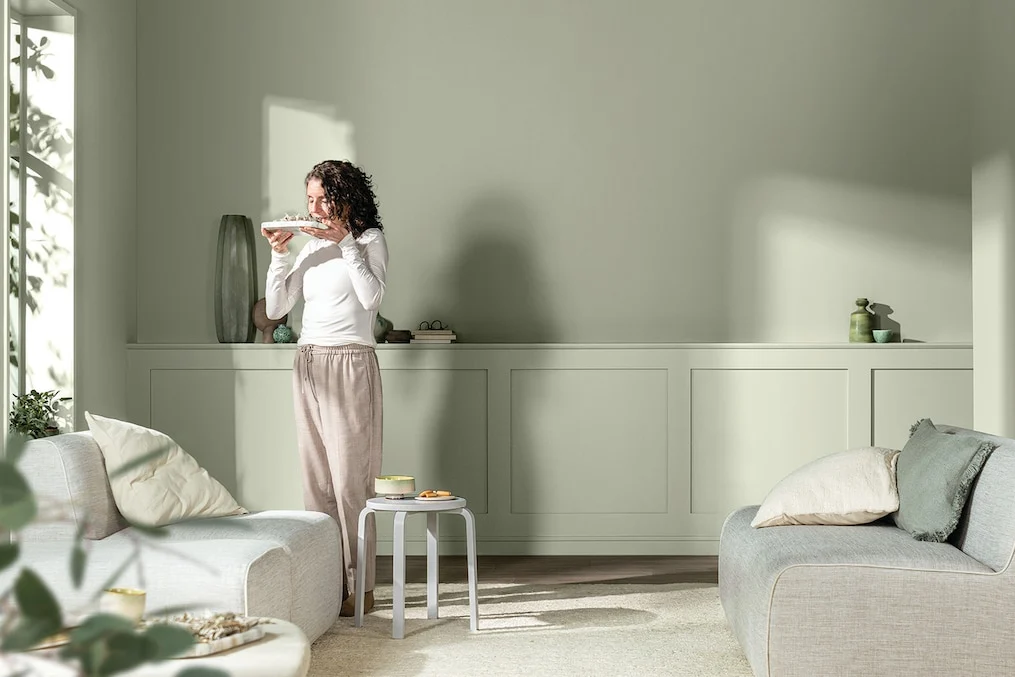
Soulful Sage, Dulux’s silvery green
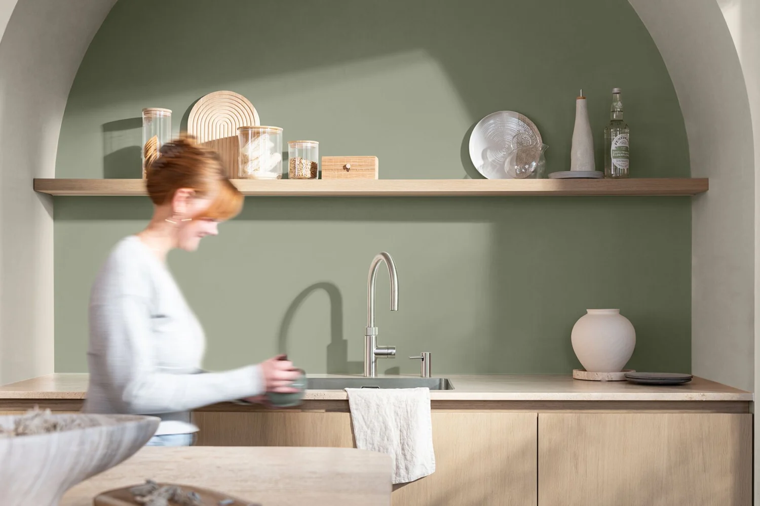
Unveiled on 8 September 2026, Soulful Sage is the colour of the year from AkzoNobel, the group behind Dulux and, across much of continental Europe, Sikkens. It is a pale sage with a silvery note, soft and luminous, chosen at the end of the annual ColourFutures research, the forum where the group’s Global Aesthetic Center brings together in-house experts, architects, designers and journalists. The key idea is lightness: lighter spaces for a lighter life, at a time when many people feel weighed down by world events and information overload. Three palettes have been built around it, Glow with earthy tones, Light with quiet pales and a few darks, and Lift with more joyful shades.
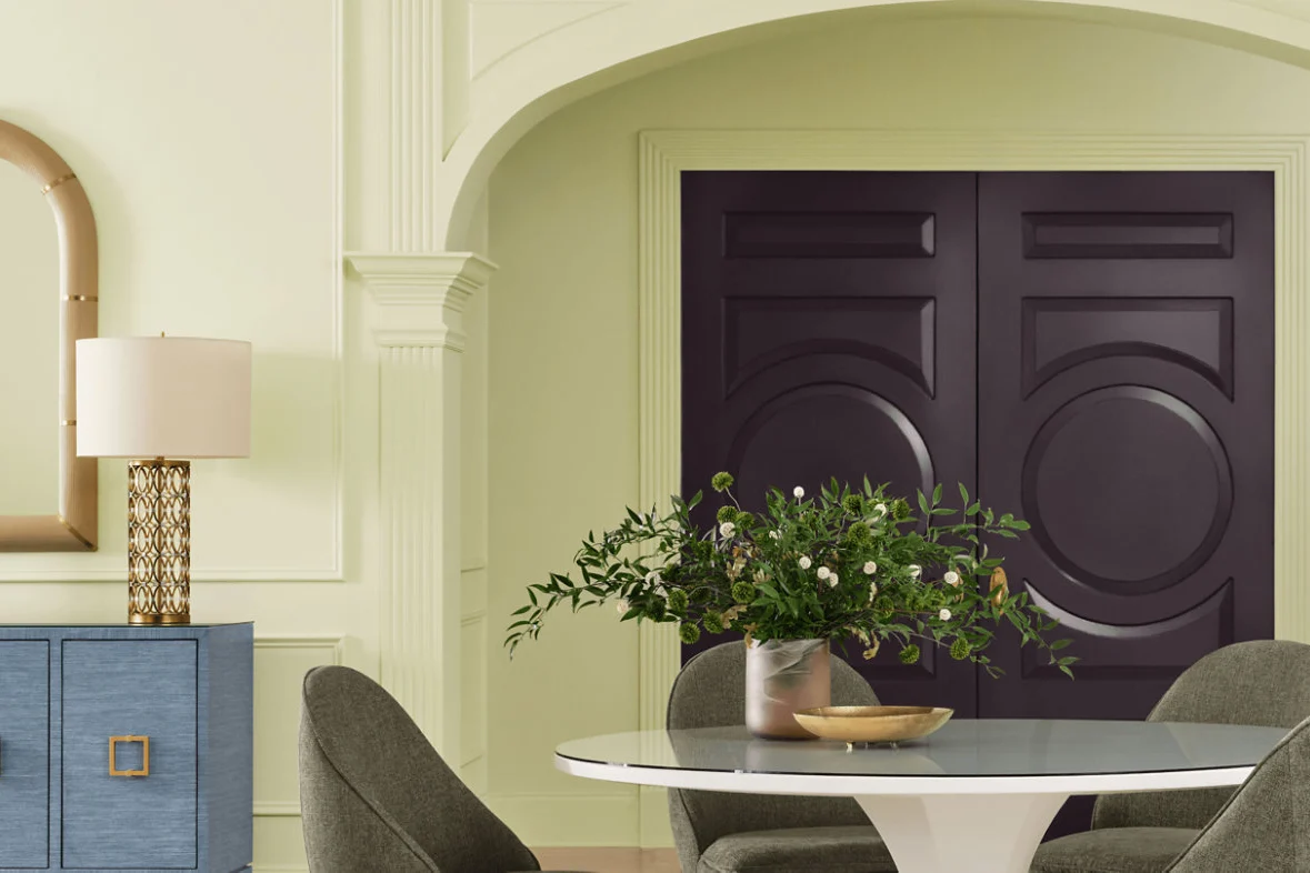
Celery, Sherwin-Williams’ herbal green
Announced on 15 September 2026, Celery SW 6421 is an airy herbal green with a yellow undertone, halfway between a pastel and a botanical green. It is the freshest and least predictable pick of the season: after a year devoted to a sandy neutral, Universal Khaki, the American company has moved to a genuine colour, one that speaks of wellbeing, balance and connection with nature. The accompanying palette is surprising and very contemporary, with a dusty purple, a cherry red, a plum brown and a flour white.
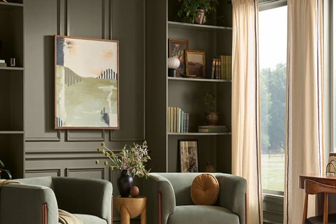
Grounded, Behr’s mossy olive
With Grounded T27-01, revealed on 26 August 2026, Behr marks ten years of its colour of the year programme with the deepest shade of the group. It is an olive green that drifts towards moss, with brown undertones: in well-lit rooms it behaves almost like a neutral, while in low light it becomes enveloping. The brand describes it as a “living neutral”, a definition designers can take quite literally.
Cottage Door, Valspar’s lived-in blue
It was the first to arrive, in early August. Cottage Door 8004-38E is a mid-tone blue grey that balances warm and cool undertones, with the slightly faded quality of washed denim or a country door weathered by the sun. Valspar presents it as a “colourful new neutral” and pairs it with a creamy apricot pink, a very pale grey and light woods.
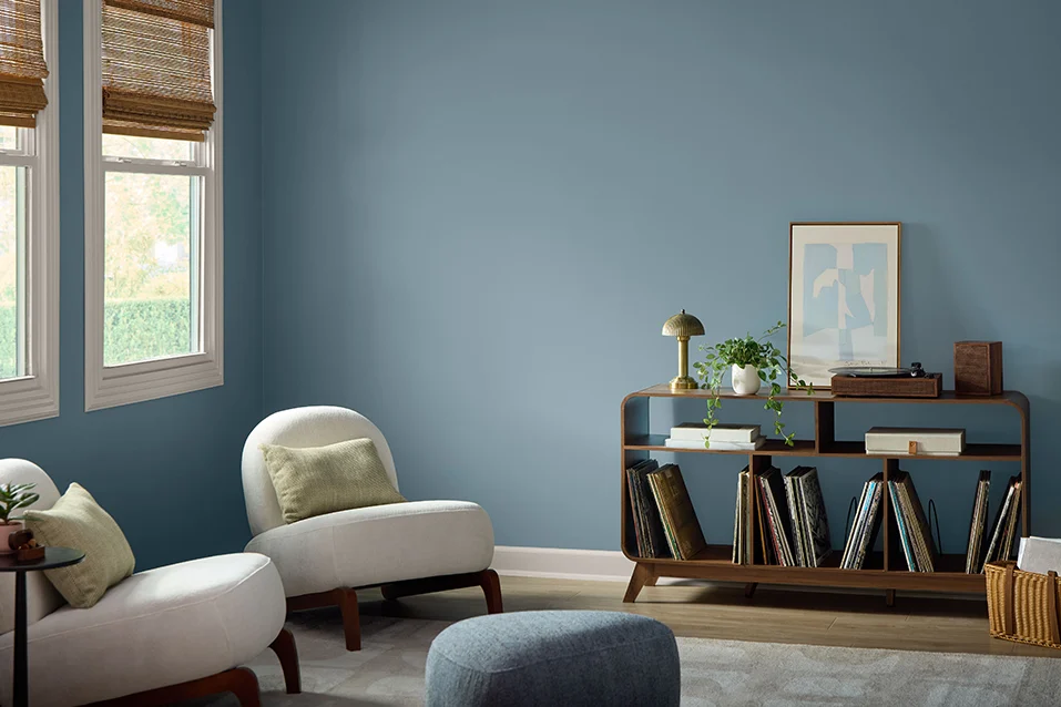
Artifact, the smoky blue from Glidden and Pittsburgh Paints
Glidden and Pittsburgh Paints, which belong to the same group, jointly chose Artifact PPG10-16, announced in mid-September. It is a warm, smoky blue, a mid-tone that reads as a backdrop on walls and takes centre stage on a piece of furniture or panelling. The official description dwells on its sense of refuge and its link with water, shifting in tone as the light changes.
Rose Earth, Graham & Brown’s rosy clay
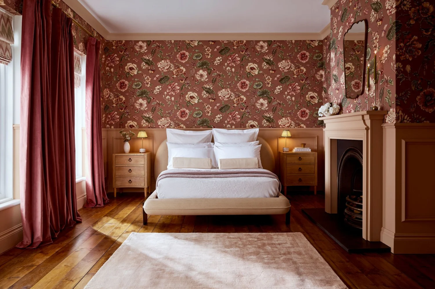
In early September the British brand unveiled Rose Earth, a warm, earthy pink with notes of clay and plaster. The inspiration is telling: the natural mineral pigments traditionally drawn from clay deposits in Italy, the same family as sienna and the earth pigments that have coloured Tuscan villages for centuries. Graham & Brown pairs it with a floral wallpaper hand-painted in gouache, Roselle Grove, and with two fresher shades to cool it down.
Marle, Little Greene’s clay brown
Among the latest arrivals is Marle, Little Greene’s colour of the year 2027: a soft mid-tone brown built on a yellow ochre base, desaturated with black and warmed by a touch of red oxide. Once again, the reference is clay. It is the most architectural colour of the season, ideal for anyone who loves neutrals but has grown tired of beige.
Deep Rooted and the rest: terracotta, plum and coffee
A few choices from smaller brands complete the picture and show where taste is heading. Dutch Boy has named Deep Rooted 311-7DB, an orange-tinged terracotta like a flowerpot in the sun; C2 Paint has picked Pueblo, a rosy plum that shifts with the light; Dunn-Edwards French Press Coffee, a deep brown with violet undertones. On the forecasting side, WGSN and Coloro named Luminous Blue, a cobalt blue, as their Colour of the Year 2027 back in 2025, although their focus is mainly fashion and product. Still to come are Benjamin Moore, which usually announces in October, and Pantone.
What about Pantone’s Colour of the Year 2027?
Pantone will announce its Color of the Year 2027 in early December, as it does every year. Until then there are only forecasts: ours, built on signals from trade fairs and catwalks, are gathered in our piece on Pantone 2027 predictions. It is worth remembering that Pantone is not a paint manufacturer: its colour of the year is a cross-industry cultural signal, whereas the paint brands’ picks are made to go on a wall, which often makes them more useful if you are about to redecorate.
What colour will be popular in 2027?
The colour of 2027 will be green, and more broadly a family of mid-tone shades that behave like neutrals. Three of the seven major brands have chosen a green, two a blue grey and two a warm earth tone. None has gone for a white, a grey or a saturated colour.
The common thread is just as clear in the official statements, which use almost the same words: calm, balance, nature, lightness, refuge. The 2027 colour trends answer a need for restful rooms, but without the coldness of all-white schemes or the weight of very dark tones. These are muted colours, softened by a measure of grey or brown, that still read as colour yet sit comfortably with any material. It is the same tactile, sensory direction we saw at the Salone del Mobile and described in our 2027 furniture trends report.
How do the 2027 colours differ from 2026?
Compared with 2026, the colours of the year are lighter and fresher. A year ago the scene was split between Pantone’s soft white, Cloud Dancer, and a series of dark or neutral shades: Benjamin Moore’s charcoal Silhouette, Sherwin-Williams’ khaki, Graham & Brown’s burgundy Divine Damson and Dulux’s trio of blues. The full overview is in our piece on 2026 wall colour trends.
In 2027 the centre of gravity shifts in three ways. First, from sandy neutral to pale green, which becomes the new backdrop colour. Second, the return of mid-tone blue, dusty and lived-in, in place of deep navy. Third, the evolution of warm tones: burgundy and chocolate give way to earthy pink and clay brown, lighter and easier to use across large surfaces. In short, 2027 asks for less daring and more design.
How to use the 2027 colour trends at home
The most effective way to use the 2027 shades is to treat them as neutrals, as the base colour for whole rooms rather than as accent walls. They are made to cover large surfaces and look their best when they wrap walls, ceiling and woodwork. This table sums up, by colour family, where they work best and with what.
| Colour family | Best rooms | Materials and pairings | Watch out for |
|---|---|---|---|
| Silvery sage green | Living room, kitchen, bedroom | Pale oak, linen, white ceramics, brushed brass | North-facing light can turn it grey: choose the warmer version |
| Bright herbal green | Dining room, study, bathroom | Plum, cherry red, warm white, wicker | The yellow undertone grows stronger under warm bulbs |
| Mossy olive | Large living room, library, bedroom | Walnut, cognac leather, wool, burnished iron | In small, dark rooms keep it to ceilings and panelling |
| Blue grey and smoky blue | Bedroom, bathroom, kitchen with painted units | Light woods, apricot pink, milk white, stone | In cool light, warm it up with textiles and wood |
| Earthy pink and clay brown | Living room, bedroom, hallway | Travertine, terracotta, forest green, cream | Avoid floors in the same tone, which flatten it |
In the living room
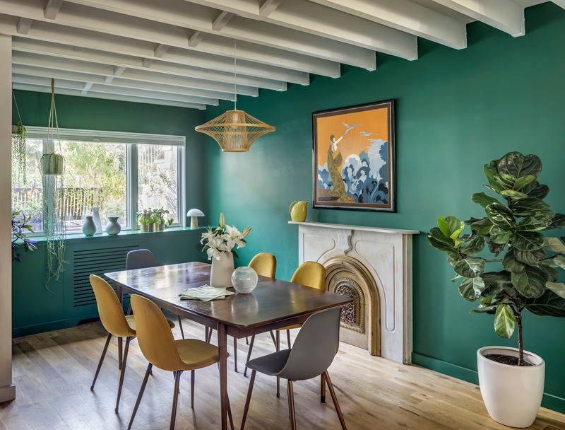
The living room is where the 2027 colours perform best, precisely because they are designed for long hours of everyday life. A sage green or blue grey on every wall, with the ceiling in a lighter tint of the same colour, creates a calm, bright room that suits both pale timber floors and stone. If you prefer a more intimate mood, choose olive or clay brown, perhaps carrying the colour onto built-in shelving. For choosing by light and orientation, see our guide to living room paint colours.
In the kitchen
In the kitchen, the greens and blues of 2027 work better on cabinetry than on walls. Base units painted sage or smoky blue, with pale stone worktops and milk-white walls, are the most elegant take on the trend; for a bolder effect, use the herbal green on an island or inside an arched alcove. Earthy pinks, on the other hand, suit the walls of kitchens with natural wood units. How to choose a shade according to the architecture of the space is covered in our guide to kitchen colours.
In the bedroom
The bedroom is the ideal place for the season’s deeper shades, because it is lived in mostly by low light. A blue grey or an olive on the headboard wall, carried up onto the ceiling, creates a cocooning effect that encourages rest; an earthy pink or clay brown warms the room without weighing it down. This is the room where colour drenching makes most sense, with the same colour on walls, ceiling, doors and skirting. Pairings and undertones are explored in our piece on bedroom colours.
In the bathroom
In the bathroom, the 2027 colours support the move towards a more domestic, less clinical room. Herbal green and smoky blue look good above a dado of white tiles or pale marble; earthy pink pairs well with travertine and brass taps. In a windowless bathroom, stick to the lighter tones, sage and celery, which make the most of what little light there is. For the wider picture, our 2026 bathroom colour dossier still applies, and 2027 is its natural evolution.
Which materials go with the 2027 colour trends?
The 2027 colours call for natural, matt materials. Wood is the obvious partner: pale oak and ash with light greens and blues, walnut and smoked woods with olive and browns. Stone works in the same register, with travertine perfect beside pinks and earth tones, and green or grey marbles alongside sage and blue.
Among textiles, linen, bouclé wool and corduroy bring out the chalky character of these shades, while the best metals are brushed or burnished ones, brass, bronze and iron, rather than polished chrome. The wall finish matters too: limewash gives a sage green or a clay pink a soft, cloudy movement that no wipeable emulsion can imitate. Finally, the ceiling: painting it in the same shade as the walls or in a lighter variation, the technique known as colour capping, is the gesture that makes these colours feel truly contemporary.
How to test a colour of the year before you paint
A colour of the year should be tested on the wall, not on a screen. Look up names and codes in the manufacturers’ fan decks or ask your paint supplier, who may be able to tint a close match; either way, always check the result with a sample of at least 50 by 50 centimetres, applied in two coats and viewed in morning light, afternoon light and under lamps. Mid-tone shades like those of 2027 change a great deal with orientation: a silvery sage tends towards grey in north light, while a blue grey in a south-facing room can read almost as sky blue.
Product quality counts as well, because muted colours need good pigments if they are not to look dull: our comparison of the leading interior paint brands will help you choose. If you want to take the colour outside, onto a front door or a façade as Valspar and Glidden suggest, you can start with an exterior house colour visualiser, bearing in mind that in many historic towns, in Italy and elsewhere in Europe, exterior colours are governed by local planning rules.
FAQ: colour of the year 2027
What is the colour of the year 2027?
There is no single colour of the year 2027: each brand chooses its own. Dulux has picked Soulful Sage, Sherwin-Williams Celery, Behr Grounded, Valspar Cottage Door, Glidden and Pittsburgh Paints Artifact, Graham & Brown Rose Earth and Little Greene Marle. Pantone will announce its choice in December 2026.
What are the 2027 colour trends for walls?
The 2027 wall colour trends are pale, silvery greens such as sage, herbal greens, mossy olives, mid-tone blue greys and smoky blues, earthy pinks and clay browns. They are shades softened with grey or brown, designed to replace traditional neutrals.
When will Pantone announce its 2027 colour?
Pantone announces its Color of the Year every year in early December. The 2027 colour will therefore be revealed in December 2026, after the paint brands, which announce between August and October.
Is sage green still in fashion in 2027?
Yes, and it becomes the reference colour of the season: Dulux has made it its colour of the year 2027 in the form of Soulful Sage, lighter and more silvery than the sage of recent years. Alongside it come fresher, more yellow greens such as Celery and deeper ones such as the olive Grounded.
What colours go with sage green in 2027?
The 2027 sage green pairs well with warm whites, light woods, ochre and terracotta for a warm effect, with dusty pinks and lilac for a more contemporary look, and with darker greens for a tone-on-tone scheme. In terms of materials, think oak, linen, ceramics and brushed brass.